flex布局 css3
https://blog.csdn.net/weixin_45112114/article/details/124366223 flex 布局详解
### flex布局
一般在移动端基本都采用flex的布局方式
display:flex;(此时内部容器、内容会强制一行)
display:flex;
flex-wrap: wrap;(使用flex特性 不强制一行)
例子:![]()


左边固定 右边自适应
父 display:flex;
子 左 width:20%; 子 右 flex:1
-------------------------------------------------------------------- 分割线 ----------------------------------------------------------------------------------------
display:flex;
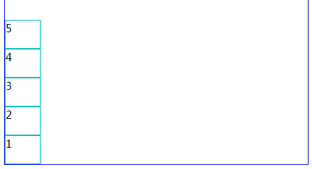
flex-direction:column; //子容器排列方式 column(上下) column-reverse(下上) inherit(默认) initial(从左往右) row(从左往右) row-reverse(从右往左)
display:flex;
//横向(flex布局中 元素与容器等同)
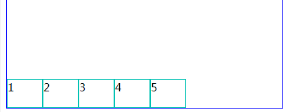
justify-content: center; center (类似 text-align:center);
justify-content:flex-start ( 类似 text-align:left);
justify-content:flex-end( 类似 text-align:right);
justify-content:space-between(两端对齐 两个元素就是左浮动 右浮动)
justify-content:space-around; (两端间距对齐)

//纵向 (flex布局中 元素与容器等同)
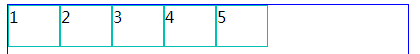
align-items:stretch; (默认)
align-items: center 纵向居中 (子容器,子元素 的纵向居中)
align-items:flex-start; (上对齐,和默认差不多)
align-items:flex-end; (下对齐)
-------------------华丽分割线------------------------
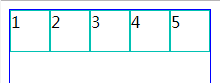
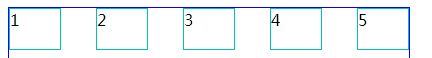
一、flex-direction: (元素排列方向)
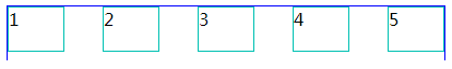
※ flex-direction:row (横向从左到右排列==左对齐)
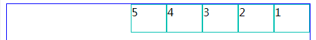
※ flex-direction:row-reverse (与row 相反)
※ flex-direction:column (从上往下排列==顶对齐)
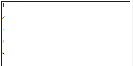
※ flex-direction:column-reverse (与column 相反)
二、flex-wrap: (内容一行容不下的时候才有效)
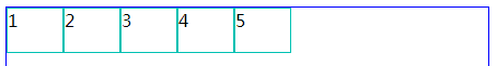
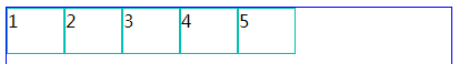
※ flex-wrap:nowrap (超出不换行,很奇怪里面的宽度会变成100%)
※ flex-wrap:wrap (超出按父级的高度平分)

※ flex-wrap:wrap-reverse(与wrap 相反)

三、justify-content: (水平对齐方式)
※ flex-start (水平左对齐)
※ justify-content:flex-end; (水平右对齐)
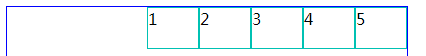
※ justify-content:center; (水平居中对齐)
※ justify-content:space-between; (两端对齐)
※ justify-content:space-around; (两端间距对其)
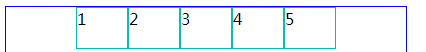
四、align-items: (垂直对齐方式)
※ align-items:stretch; (默认)
※ align-items:flex-start; (上对齐,和默认差不多)
※ align-items:flex-end; (下对齐)
※ align-items:center;(居中对齐)
※ align-items:baseline; (基线对齐)
还没搞明白基线对齐是什么意思。
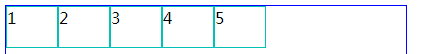
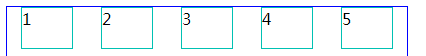
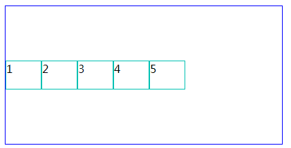
以上是对flex的简单介绍。下面有个小例子,
大家经常用到的,某个div里面水平垂直居中,


<!DOCTYPE html>
<html>
<head>
<meta charset="UTF-8">
<title></title>
<style type="text/css">
#box{
display: flex;
display: -webkit-flex;
border: 1px solid #0000FF;
height: 200px;
width: 400px;
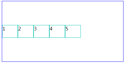
align-items:center;
justify-content:center;
}
.item{
width: 50px;
height: 40px;
border: 1px solid #00C1B3;
}
</style>
</head>
<body>
<div id="box">
<div class="item">1</div>
<div class="item">2</div>
<div class="item">3</div>
<div class="item">4</div>
<div class="item">5</div>
</div>
</body>
</html>

 浙公网安备 33010602011771号