Python|使用PyECharts库进行数据可视化分析
一、PyEcharts简介
概况
ECharts是一款基于JavaScript的数据可视化图表库,提供直观,生动,可交互,可个性化定制的数据可视化图表。ECharts最初由百度团队开源,并于2018年初捐赠给Apache基金会,成为ASF孵化级项目。 ECharts官网:https://echarts.apache.org/zh/index.html PyEcharts 是一个用于生成 Echarts 图表的类库。 Python 是一门富有表达力的语言,很适合用于数据处理。当数据分析遇上数据可视化时,PyEcharts 诞生了。
特性
- 简洁的 API 设计,使用如丝滑般流畅,支持链式调用
- 囊括了 30+ 种常见图表,应有尽有
- 支持主流 Notebook 环境,Jupyter Notebook 和 JupyterLab
- 可轻松集成至 Flask,Django 等主流 Web 框架
- 高度灵活的配置项,可轻松搭配出精美的图表
- 详细的文档和示例,帮助开发者更快的上手项目
- 多达 400+ 地图文件以及原生的百度地图,为地理数据可视化提供强有力的支持
版本
pyecharts 分为 v0.5.X 和 v1 两个大版本,v0.5.X 和 v1 间不兼容,v1 是一个全新的版本
pyecharts可以展示动态图,在线报告使用比较美观,并且展示数据方便,鼠标悬停在图上,即可显示数值、标签等。
官方文档地址地址:pyecharts - A Python Echarts Plotting Library built with love.
示例代码地址:Document (pyecharts.org)
二、快速开始
pyecharts.org 不做版本管理,官网提供的文档均为最新版文档,若文档与当前版本出现不一致情况,需要更新 pyecharts。
1. 如何安装
下载安装
pip install pyecharts
2. 五分钟上手
首先开始来绘制你的第一个图表
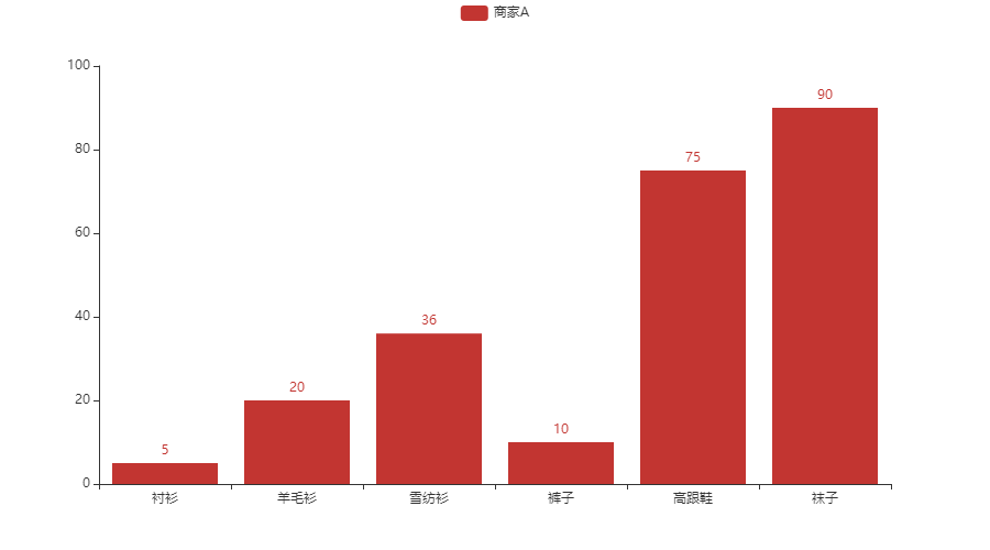
from pyecharts.charts import Bar

bar = Bar(init_opts=opts.InitOpts(bg_color='white'))
bar.add_xaxis(["衬衫", "羊毛衫", "雪纺衫", "裤子", "高跟鞋", "袜子"])
bar.add_yaxis("商家A", [5, 20, 36, 10, 75, 90])
# render 会生成本地 HTML 文件,默认会在当前目录生成 render.html 文件
# 也可以传入路径参数,如 bar.render("mycharts.html")
bar.render()
pyecharts 所有方法均支持链式调用。
from pyecharts.charts import Bar

bar = (
    Bar()
    .add_xaxis(["衬衫", "羊毛衫", "雪纺衫", "裤子", "高跟鞋", "袜子"])
    .add_yaxis("商家A", [5, 20, 36, 10, 75, 90])
)
bar.render()
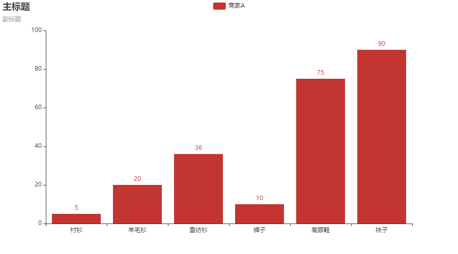
使用 options 配置项,在 pyecharts 中,一切皆 Options。
from pyecharts.charts import Bar
from pyecharts import options as opts

# V1 版本开始支持链式调用

bar = (
    Bar(init_opts=opts.InitOpts(bg_color='white'))
    .add_xaxis(["衬衫", "羊毛衫", "雪纺衫", "裤子", "高跟鞋", "袜子"])
    .add_yaxis("商家A", [5, 20, 36, 10, 75, 90])
    .set_global_opts(title_opts=opts.TitleOpts(title="主标题", subtitle="副标题"))
    # 或者直接使用字典参数
    # .set_global_opts(title_opts={"text": "主标题", "subtext": "副标题"})
)
bar.render()

# 同时依旧可以单独调用方法
bar = Bar()
bar.add_xaxis(["衬衫", "羊毛衫", "雪纺衫", "裤子", "高跟鞋", "袜子"])
bar.add_yaxis("商家A", [5, 20, 36, 10, 75, 90])
bar.set_global_opts(title_opts=opts.TitleOpts(title="主标题", subtitle="副标题"))
bar.render()
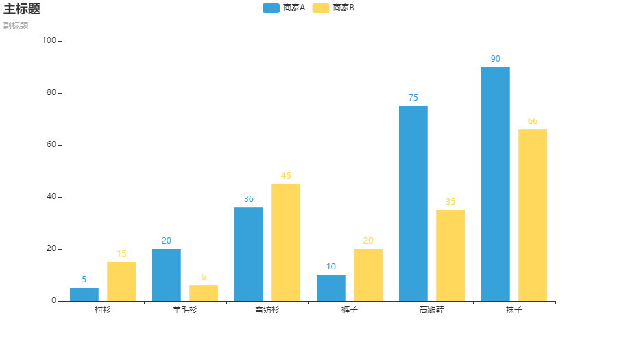
图表在初始化时可以进行初始化配置,设置画布大小,主题等参数。
from pyecharts.charts import Bar
from pyecharts import options as opts
# 内置主题类型可查看 pyecharts.globals.ThemeType
from pyecharts.globals import ThemeType

bar = (
    Bar(init_opts=opts.InitOpts(theme=ThemeType.LIGHT, bg_color='white'))
    .add_xaxis(["衬衫", "羊毛衫", "雪纺衫", "裤子", "高跟鞋", "袜子"])
    .add_yaxis("商家A", [5, 20, 36, 10, 75, 90])
    .add_yaxis("商家B", [15, 6, 45, 20, 35, 66])
    .set_global_opts(title_opts=opts.TitleOpts(title="主标题", subtitle="副标题"))
)
渲染成图片文件,这部分内容可以在官方文档的进阶话题-渲染图片中查看。
from pyecharts.charts import Bar
from pyecharts.render import make_snapshot

# 使用 snapshot-selenium 渲染图片
from snapshot_selenium import snapshot

bar = (
    Bar()
    .add_xaxis(["衬衫", "羊毛衫", "雪纺衫", "裤子", "高跟鞋", "袜子"])
    .add_yaxis("商家A", [5, 20, 36, 10, 75, 90])
)
make_snapshot(snapshot, bar.render(), "bar.png")
四、pyecharts中的Faker详解
下面的很多图是使用 pyecharts中的Faker模块随机生成的数据,因此在示例之前,对pyecharts中的Faker模块做一个简单的介绍:
1. Faker中方法的介绍
| 函数名称 | 对应内容 |
|---|---|
| Faker.clothes | [“衬衫”, “毛衣”, “领带”, “裤子”, “风衣”, “高跟鞋”, “袜子”] |
| Faker.drinks | [“可乐”, “雪碧”, “橙汁”, “绿茶”, “奶茶”, “百威”, “青岛”] |
| Faker.phones | [“小米”, “三星”, “华为”, “苹果”, “魅族”, “VIVO”, “OPPO”] |
| Faker.fruits | [“草莓”, “芒果”, “葡萄”, “雪梨”, “西瓜”, “柠檬”, “车厘子”] |
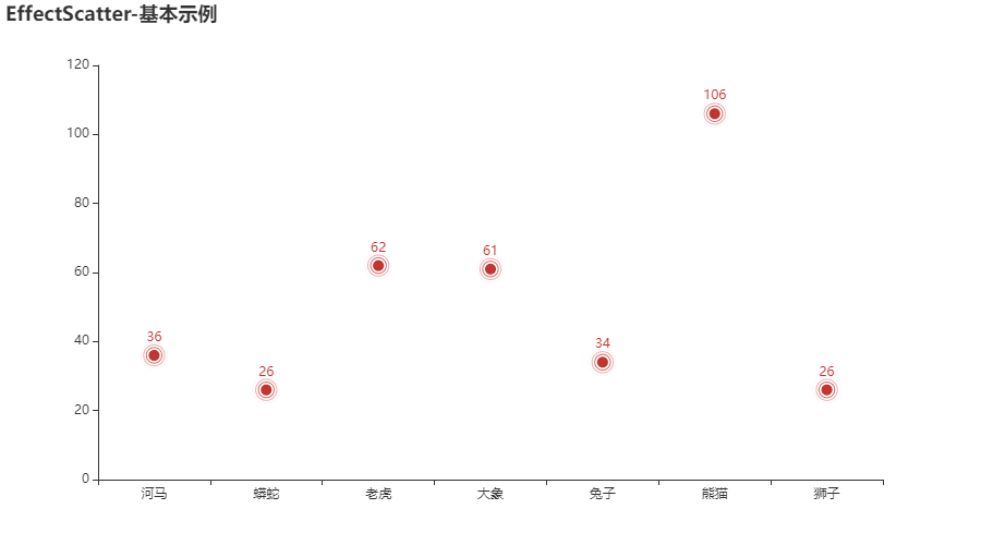
| Faker.animal | [“河马”, “蟒蛇”, “老虎”, “大象”, “兔子”, “熊猫”, “狮子”] |
| Faker.days_values | 生成的从1-30之间的随机天数,顺序是打乱的,排序后是1-30 |
| Faker.cars | [“宝马”, “法拉利”, “奔驰”, “奥迪”, “大众”, “丰田”, “特斯拉”] |
| Faker.dogs | [“哈士奇”, “萨摩耶”, “泰迪”, “金毛”, “牧羊犬”, “吉娃娃”, “柯基”] |
| Faker.week | [“周一”, “周二”, “周三”, “周四”, “周五”, “周六”, “周日”] |
| Faker.week_en | [‘Saturday’, ‘Friday’, ‘Thursday’, ‘Wednesday’, ‘Tuesday’, ‘Monday’, ‘Sunday’] |
| Faker.clock | [‘12a’,‘1a’,‘2a’,‘3a’,‘4a’,‘5a’,‘6a’,‘7a’,‘8a’,‘9a’,‘10a’,‘11a’,‘12p’,‘1p’,‘2p’,‘3p’,‘4p’,‘5p’,‘6p’,‘7p’,‘8p’,‘9p’,‘10p’,‘11p’] |
| Faker.visual_color | [ “#313695”, “#4575b4”, “#74add1”, “#abd9e9”, “#e0f3f8”,"#ffffbf","#fee090","#fdae61","#f46d43", “#d73027”,"#a50026"] |
| Faker.months | [‘1月’, ‘2月’, ‘3月’, ‘4月’, ‘5月’, ‘6月’, ‘7月’, ‘8月’, ‘9月’, ‘10月’, ‘11月’, ‘12月’]即 ["{}月".format(i) for i in range(1, 13)] |
| Faker.provinces | [“广东”, “北京”, “上海”, “江西”, “湖南”, “浙江”, “江苏”] |
| Faker.guangdong_city | [“汕头市”, “汕尾市”, “揭阳市”, “阳江市”, “肇庆市”, “广州市”, “惠州市”] |
| Faker.country | [‘China’, ‘Canada’, ‘Brazil’, ‘Russia’, ‘United States’, ‘Africa’, ‘Germany’] |
| Faker.days_attrs | [‘0天’,‘1天’,‘2天’,‘3天’,‘4天’,‘5天’,‘6天’, ‘7天’,‘8天’,‘9天’,‘10天’,‘11天’,‘12天’,‘13天’, ‘14天’,‘15天’,‘16天’,‘17天’,‘18天’,‘19天’,‘20天’, ‘21天’,‘22天’,‘23天’,‘24天’,‘25天’,‘26天’,‘27天’,‘28天’,‘29天’]即 ["{}天".format(i) for i in range(30)] |
2. Faker.choose()的介绍
Faker.choose()生成的结果是从Faker.clothes, Faker.drinks, Faker.phones, Faker.fruits, Faker.animal, Faker.dogs, Faker.week这几个中随机生成的一个结果,并且生成的数量都是7个
from pyecharts.faker import Faker
print(Faker.choose())
print(Faker.choose())
print(Faker.choose())
print(Faker.choose())
print(Faker.choose())
输出结果为:
['河马', '蟒蛇', '老虎', '大象', '兔子', '熊猫', '狮子']
['小米', '三星', '华为', '苹果', '魅族', 'VIVO', 'OPPO']
['衬衫', '毛衣', '领带', '裤子', '风衣', '高跟鞋', '袜子']
['可乐', '雪碧', '橙汁', '绿茶', '奶茶', '百威', '青岛']
['周一', '周二', '周三', '周四', '周五', '周六', '周日']
3. Faker.choose()介绍
Faker.values()
生成7个随机整数,这7个随机整数一般是两位数和三位数的组合
五、图表示例
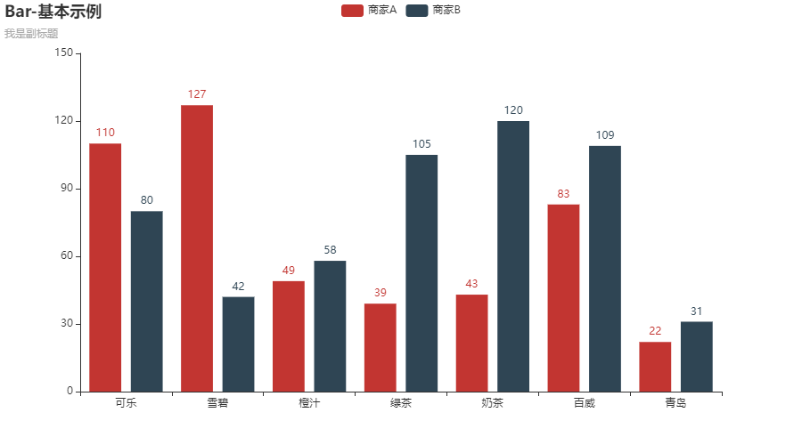
1. 柱状图 Bar
(1) 基本柱形图
# -*- coding: utf-8 -*-
"""
PROJECT_NAME: PLOT
FILE_NAME: Bar_base
AUTHOR: welt
E_MAIL: tjlwelt@foxmail.com
DATE: 2022/10/15
"""

from pyecharts import options as opts
from pyecharts.charts import Bar
from pyecharts.faker import Faker

if __name__ == '__main__':
	bar_base = (
		Bar(init_opts=opts.InitOpts(bg_color='white'))
			.add_xaxis(Faker.choose())
			.add_yaxis("商家A", Faker.values())
			.add_yaxis("商家B", Faker.values())
			.set_global_opts(
			title_opts=opts.TitleOpts(title="Bar-基本示例", subtitle="我是副标题")
		)
		.render("bar_base.html")
	)
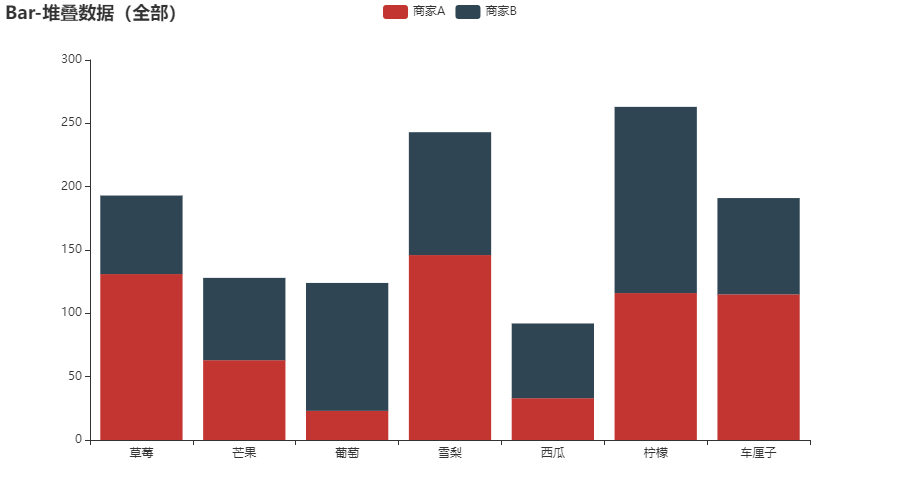
(2) 柱状图数据堆叠
# -*- coding: utf-8 -*-
"""
PROJECT_NAME: PLOT
FILE_NAME: Bar_stack
AUTHOR: welt
E_MAIL: tjlwelt@foxmail.com
DATE: 2022/10/15
"""

from pyecharts import options as opts
from pyecharts.charts import Bar
from pyecharts.faker import Faker


if __name__ == '__main__':
    bar_stack = (
        Bar(init_opts=opts.InitOpts(bg_color="white"))
        .add_xaxis(Faker.choose())
        .add_yaxis("商家A", Faker.values(), stack="stack1")
        .add_yaxis("商家B", Faker.values(), stack="stack1")
        .set_series_opts(label_opts=opts.LabelOpts(is_show=False))
        .set_global_opts(title_opts=opts.TitleOpts(title="Bar-堆叠数据(全部)"))
        .render("bar_stack0.html")
    )
2. 3D 柱状图 Bar3D
点击查看代码
import pyecharts.options as opts
from pyecharts.charts import Bar3D


hours = [
    "12a",
    "1a",
    "2a",
    "3a",
    "4a",
    "5a",
    "6a",
    "7a",
    "8a",
    "9a",
    "10a",
    "11a",
    "12p",
    "1p",
    "2p",
    "3p",
    "4p",
    "5p",
    "6p",
    "7p",
    "8p",
    "9p",
    "10p",
    "11p",
]
days = ["Saturday", "Friday", "Thursday", "Wednesday", "Tuesday", "Monday", "Sunday"]

data = [
    [0, 0, 5],
    [0, 1, 1],
    [0, 2, 0],
    [0, 3, 0],
    [0, 4, 0],
    [0, 5, 0],
    [0, 6, 0],
    [0, 7, 0],
    [0, 8, 0],
    [0, 9, 0],
    [0, 10, 0],
    [0, 11, 2],
    [0, 12, 4],
    [0, 13, 1],
    [0, 14, 1],
    [0, 15, 3],
    [0, 16, 4],
    [0, 17, 6],
    [0, 18, 4],
    [0, 19, 4],
    [0, 20, 3],
    [0, 21, 3],
    [0, 22, 2],
    [0, 23, 5],
    [1, 0, 7],
    [1, 1, 0],
    [1, 2, 0],
    [1, 3, 0],
    [1, 4, 0],
    [1, 5, 0],
    [1, 6, 0],
    [1, 7, 0],
    [1, 8, 0],
    [1, 9, 0],
    [1, 10, 5],
    [1, 11, 2],
    [1, 12, 2],
    [1, 13, 6],
    [1, 14, 9],
    [1, 15, 11],
    [1, 16, 6],
    [1, 17, 7],
    [1, 18, 8],
    [1, 19, 12],
    [1, 20, 5],
    [1, 21, 5],
    [1, 22, 7],
    [1, 23, 2],
    [2, 0, 1],
    [2, 1, 1],
    [2, 2, 0],
    [2, 3, 0],
    [2, 4, 0],
    [2, 5, 0],
    [2, 6, 0],
    [2, 7, 0],
    [2, 8, 0],
    [2, 9, 0],
    [2, 10, 3],
    [2, 11, 2],
    [2, 12, 1],
    [2, 13, 9],
    [2, 14, 8],
    [2, 15, 10],
    [2, 16, 6],
    [2, 17, 5],
    [2, 18, 5],
    [2, 19, 5],
    [2, 20, 7],
    [2, 21, 4],
    [2, 22, 2],
    [2, 23, 4],
    [3, 0, 7],
    [3, 1, 3],
    [3, 2, 0],
    [3, 3, 0],
    [3, 4, 0],
    [3, 5, 0],
    [3, 6, 0],
    [3, 7, 0],
    [3, 8, 1],
    [3, 9, 0],
    [3, 10, 5],
    [3, 11, 4],
    [3, 12, 7],
    [3, 13, 14],
    [3, 14, 13],
    [3, 15, 12],
    [3, 16, 9],
    [3, 17, 5],
    [3, 18, 5],
    [3, 19, 10],
    [3, 20, 6],
    [3, 21, 4],
    [3, 22, 4],
    [3, 23, 1],
    [4, 0, 1],
    [4, 1, 3],
    [4, 2, 0],
    [4, 3, 0],
    [4, 4, 0],
    [4, 5, 1],
    [4, 6, 0],
    [4, 7, 0],
    [4, 8, 0],
    [4, 9, 2],
    [4, 10, 4],
    [4, 11, 4],
    [4, 12, 2],
    [4, 13, 4],
    [4, 14, 4],
    [4, 15, 14],
    [4, 16, 12],
    [4, 17, 1],
    [4, 18, 8],
    [4, 19, 5],
    [4, 20, 3],
    [4, 21, 7],
    [4, 22, 3],
    [4, 23, 0],
    [5, 0, 2],
    [5, 1, 1],
    [5, 2, 0],
    [5, 3, 3],
    [5, 4, 0],
    [5, 5, 0],
    [5, 6, 0],
    [5, 7, 0],
    [5, 8, 2],
    [5, 9, 0],
    [5, 10, 4],
    [5, 11, 1],
    [5, 12, 5],
    [5, 13, 10],
    [5, 14, 5],
    [5, 15, 7],
    [5, 16, 11],
    [5, 17, 6],
    [5, 18, 0],
    [5, 19, 5],
    [5, 20, 3],
    [5, 21, 4],
    [5, 22, 2],
    [5, 23, 0],
    [6, 0, 1],
    [6, 1, 0],
    [6, 2, 0],
    [6, 3, 0],
    [6, 4, 0],
    [6, 5, 0],
    [6, 6, 0],
    [6, 7, 0],
    [6, 8, 0],
    [6, 9, 0],
    [6, 10, 1],
    [6, 11, 0],
    [6, 12, 2],
    [6, 13, 1],
    [6, 14, 3],
    [6, 15, 4],
    [6, 16, 0],
    [6, 17, 0],
    [6, 18, 0],
    [6, 19, 0],
    [6, 20, 1],
    [6, 21, 2],
    [6, 22, 2],
    [6, 23, 6],
]
data = [[d[1], d[0], d[2]] for d in data]


(
    Bar3D(init_opts=opts.InitOpts(width="1600px", height="800px"))
    .add(
        series_name="",
        data=data,
        xaxis3d_opts=opts.Axis3DOpts(type_="category", data=hours),
        yaxis3d_opts=opts.Axis3DOpts(type_="category", data=days),
        zaxis3d_opts=opts.Axis3DOpts(type_="value"),
    )
    .set_global_opts(
        visualmap_opts=opts.VisualMapOpts(
            max_=20,
            range_color=[
                "#313695",
                "#4575b4",
                "#74add1",
                "#abd9e9",
                "#e0f3f8",
                "#ffffbf",
                "#fee090",
                "#fdae61",
                "#f46d43",
                "#d73027",
                "#a50026",
            ],
        )
    )
    .render("bar3d_punch_card.html")
)
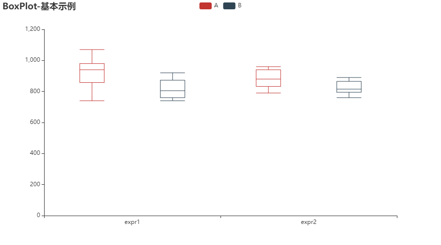
3. 箱形图 Boxplot
# -*- coding: utf-8 -*-
"""
PROJECT_NAME: PLOT
FILE_NAME: Boxplot_base
AUTHOR: welt
E_MAIL: tjlwelt@foxmail.com
DATE: 2022/10/15
"""

from pyecharts import options as opts
from pyecharts.charts import Boxplot

v1 = [
    [850, 740, 900, 1070, 930, 850, 950, 980, 980, 880, 1000, 980],
    [960, 940, 960, 940, 880, 800, 850, 880, 900, 840, 830, 790],
]
v2 = [
    [890, 810, 810, 820, 800, 770, 760, 740, 750, 760, 910, 920],
    [890, 840, 780, 810, 760, 810, 790, 810, 820, 850, 870, 870],
]
c = Boxplot(init_opts=opts.InitOpts(bg_color="white"))
b = c.prepare_data(v1)
c.add_xaxis(["expr1", "expr2"])
c.add_yaxis("A", c.prepare_data(v1))
c.add_yaxis("B", c.prepare_data(v2))
c.set_global_opts(title_opts=opts.TitleOpts(title="BoxPlot-基本示例"))
c.render("boxplot_base.html")
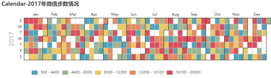
4. 日历图 Calendar
# -*- coding: utf-8 -*-
"""
PROJECT_NAME: PLOT
FILE_NAME: Calendar_base
AUTHOR: welt
E_MAIL: tjlwelt@foxmail.com
DATE: 2022/10/16
"""

import datetime
import random

from pyecharts import options as opts
from pyecharts.charts import Calendar


begin = datetime.date(2017, 1, 1)
end = datetime.date(2017, 12, 31)
data = [
    [str(begin + datetime.timedelta(days=i)), random.randint(1000, 25000)]
    for i in range((end - begin).days + 1)
]

c = (
    Calendar(init_opts=opts.InitOpts(bg_color="white"))
    .add("", data, calendar_opts=opts.CalendarOpts(range_="2017"))
    .set_global_opts(
        title_opts=opts.TitleOpts(title="Calendar-2017年微信步数情况"),
        visualmap_opts=opts.VisualMapOpts(
            max_=20000,
            min_=500,
            orient="horizontal",
            is_piecewise=True,
            pos_top="230px",
            pos_left="100px",
        ),
    )
    .render("calendar_base.html")
)
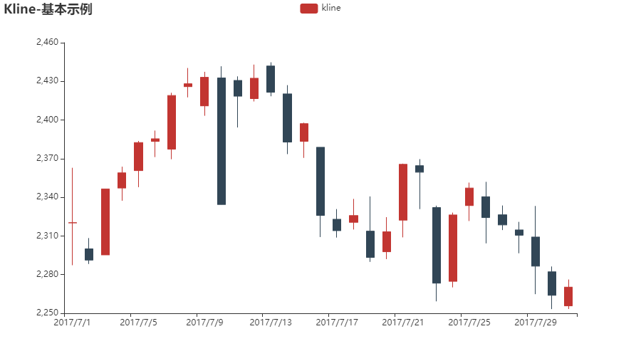
5. K 线图 Candlestick
# -*- coding: utf-8 -*-
"""
PROJECT_NAME: PLOT
FILE_NAME: Kline_base
AUTHOR: welt
E_MAIL: tjlwelt@foxmail.com
DATE: 2022/10/16
"""

from pyecharts import options as opts
from pyecharts.charts import Kline

data = [
    [2320.26, 2320.26, 2287.3, 2362.94],
    [2300, 2291.3, 2288.26, 2308.38],
    [2295.35, 2346.5, 2295.35, 2345.92],
    [2347.22, 2358.98, 2337.35, 2363.8],
    [2360.75, 2382.48, 2347.89, 2383.76],
    [2383.43, 2385.42, 2371.23, 2391.82],
    [2377.41, 2419.02, 2369.57, 2421.15],
    [2425.92, 2428.15, 2417.58, 2440.38],
    [2411, 2433.13, 2403.3, 2437.42],
    [2432.68, 2334.48, 2427.7, 2441.73],
    [2430.69, 2418.53, 2394.22, 2433.89],
    [2416.62, 2432.4, 2414.4, 2443.03],
    [2441.91, 2421.56, 2418.43, 2444.8],
    [2420.26, 2382.91, 2373.53, 2427.07],
    [2383.49, 2397.18, 2370.61, 2397.94],
    [2378.82, 2325.95, 2309.17, 2378.82],
    [2322.94, 2314.16, 2308.76, 2330.88],
    [2320.62, 2325.82, 2315.01, 2338.78],
    [2313.74, 2293.34, 2289.89, 2340.71],
    [2297.77, 2313.22, 2292.03, 2324.63],
    [2322.32, 2365.59, 2308.92, 2366.16],
    [2364.54, 2359.51, 2330.86, 2369.65],
    [2332.08, 2273.4, 2259.25, 2333.54],
    [2274.81, 2326.31, 2270.1, 2328.14],
    [2333.61, 2347.18, 2321.6, 2351.44],
    [2340.44, 2324.29, 2304.27, 2352.02],
    [2326.42, 2318.61, 2314.59, 2333.67],
    [2314.68, 2310.59, 2296.58, 2320.96],
    [2309.16, 2286.6, 2264.83, 2333.29],
    [2282.17, 2263.97, 2253.25, 2286.33],
    [2255.77, 2270.28, 2253.31, 2276.22],
]


c = (
    Kline(init_opts=opts.InitOpts(bg_color='white'))
    .add_xaxis(["2017/7/{}".format(i + 1) for i in range(31)])
    .add_yaxis("kline", data)
    .set_global_opts(
        yaxis_opts=opts.AxisOpts(is_scale=True),
        xaxis_opts=opts.AxisOpts(is_scale=True),
        title_opts=opts.TitleOpts(title="Kline-基本示例"),
    )
    .render("kline_base.html")
)
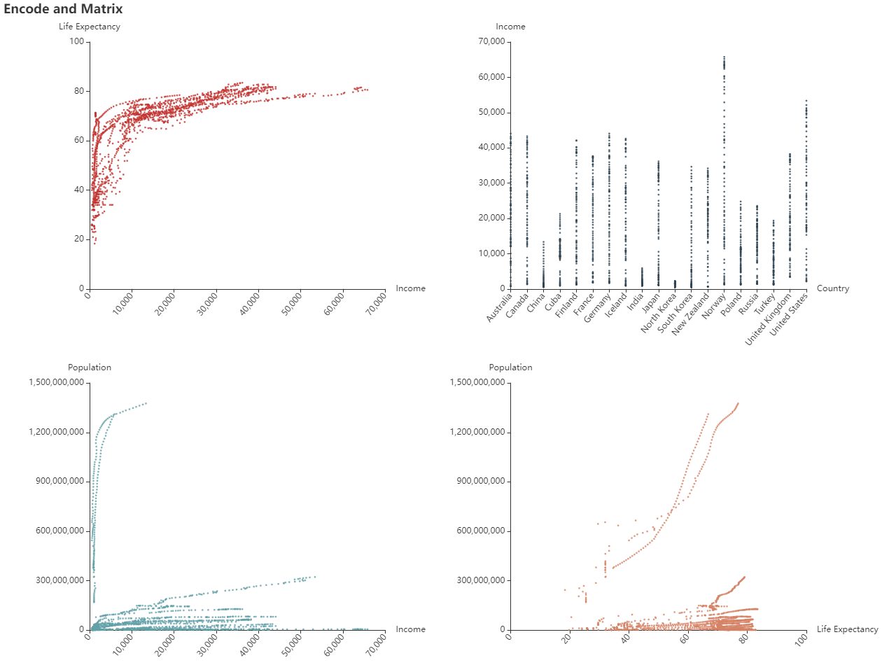
6. 数据集 Dataset
点击查看代码
import json

from pyecharts import options as opts
from pyecharts.charts import Grid, Scatter

with open("life-expectancy-table.json", "r", encoding="utf-8") as f:
    j = json.load(f)

l1_1 = (
    Scatter()
    .add_dataset(
        dimensions=[
            "Income",
            "Life Expectancy",
            "Population",
            "Country",
            {"name": "Year", "type": "ordinal"},
        ],
        source=j,
    )
    .add_yaxis(
        series_name="",
        y_axis=[],
        symbol_size=2.5,
        xaxis_index=0,
        yaxis_index=0,
        encode={"x": "Income", "y": "Life Expectancy", "tooltip": [0, 1, 2, 3, 4]},
        label_opts=opts.LabelOpts(is_show=False),
    )
    .set_global_opts(
        xaxis_opts=opts.AxisOpts(
            type_="value",
            grid_index=0,
            name="Income",
            axislabel_opts=opts.LabelOpts(rotate=50, interval=0),
        ),
        yaxis_opts=opts.AxisOpts(type_="value", grid_index=0, name="Life Expectancy"),
        title_opts=opts.TitleOpts(title="Encode and Matrix"),
    )
)

l1_2 = (
    Scatter()
    .add_dataset()
    .add_yaxis(
        series_name="",
        y_axis=[],
        symbol_size=2.5,
        xaxis_index=1,
        yaxis_index=1,
        encode={"x": "Country", "y": "Income", "tooltip": [0, 1, 2, 3, 4]},
        label_opts=opts.LabelOpts(is_show=False),
    )
    .set_global_opts(
        xaxis_opts=opts.AxisOpts(
            type_="category",
            grid_index=1,
            name="Country",
            boundary_gap=False,
            axislabel_opts=opts.LabelOpts(rotate=50, interval=0),
        ),
        yaxis_opts=opts.AxisOpts(type_="value", grid_index=1, name="Income"),
    )
)

l2_1 = (
    Scatter()
    .add_dataset()
    .add_yaxis(
        series_name="",
        y_axis=[],
        symbol_size=2.5,
        xaxis_index=2,
        yaxis_index=2,
        encode={"x": "Income", "y": "Population", "tooltip": [0, 1, 2, 3, 4]},
        label_opts=opts.LabelOpts(is_show=False),
    )
    .set_global_opts(
        xaxis_opts=opts.AxisOpts(
            type_="value",
            grid_index=2,
            name="Income",
            axislabel_opts=opts.LabelOpts(rotate=50, interval=0),
        ),
        yaxis_opts=opts.AxisOpts(type_="value", grid_index=2, name="Population"),
    )
)

l2_2 = (
    Scatter()
    .add_dataset()
    .add_yaxis(
        series_name="",
        y_axis=[],
        symbol_size=2.5,
        xaxis_index=3,
        yaxis_index=3,
        encode={"x": "Life Expectancy", "y": "Population", "tooltip": [0, 1, 2, 3, 4]},
        label_opts=opts.LabelOpts(is_show=False),
    )
    .set_global_opts(
        xaxis_opts=opts.AxisOpts(
            type_="value",
            grid_index=3,
            name="Life Expectancy",
            axislabel_opts=opts.LabelOpts(rotate=50, interval=0),
        ),
        yaxis_opts=opts.AxisOpts(type_="value", grid_index=3, name="Population"),
    )
)

grid = (
    Grid(init_opts=opts.InitOpts(width="1280px", height="960px"))
    .add(
        chart=l1_1,
        grid_opts=opts.GridOpts(pos_right="57%", pos_bottom="57%"),
        grid_index=0,
    )
    .add(
        chart=l1_2,
        grid_opts=opts.GridOpts(pos_left="57%", pos_bottom="57%"),
        grid_index=1,
    )
    .add(
        chart=l2_1,
        grid_opts=opts.GridOpts(pos_right="57%", pos_top="57%"),
        grid_index=2,
    )
    .add(
        chart=l2_2, grid_opts=opts.GridOpts(pos_left="57%", pos_top="57%"), grid_index=3
    )
    .render("dataset_professional_scatter.html")
)
7. 涟漪散点图 EffectScatter
# -*- coding: utf-8 -*-
"""
PROJECT_NAME: PLOT
FILE_NAME: Effectscatter_base
AUTHOR: welt
E_MAIL: tjlwelt@foxmail.com
DATE: 2022/10/16
"""

from pyecharts import options as opts
from pyecharts.charts import EffectScatter
from pyecharts.faker import Faker

c = (
    EffectScatter(init_opts=opts.InitOpts(bg_color='white'))
    .add_xaxis(Faker.choose())
    .add_yaxis("", Faker.values())
    .set_global_opts(title_opts=opts.TitleOpts(title="EffectScatter-基本示例"))
    .render("effectscatter_base.html")
)
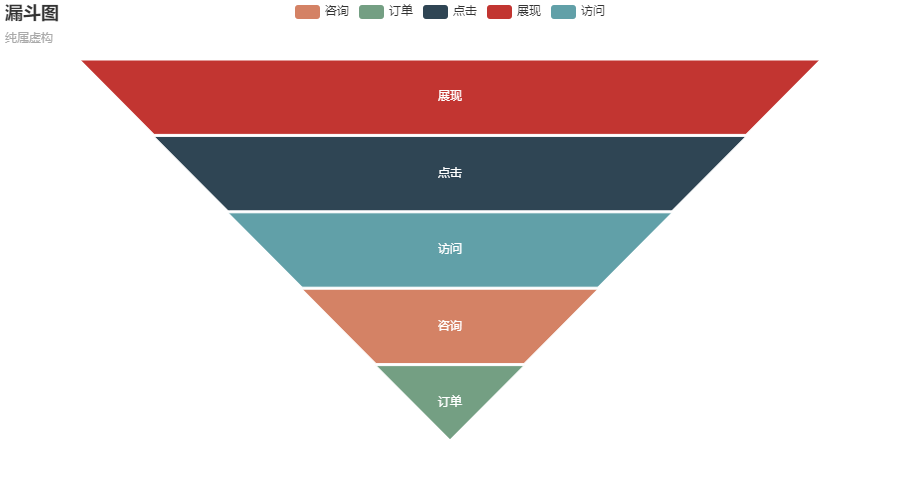
8. 漏斗图 Funnel
# -*- coding: utf-8 -*-
"""
PROJECT_NAME: PLOT
FILE_NAME: Funnel_chart
AUTHOR: welt
E_MAIL: tjlwelt@foxmail.com
DATE: 2022/10/16
"""

import pyecharts.options as opts
from pyecharts.charts import Funnel


x_data = ["展现", "点击", "访问", "咨询", "订单"]
y_data = [100, 80, 60, 40, 20]

data = [[x_data[i], y_data[i]] for i in range(len(x_data))]

(
    Funnel(init_opts=opts.InitOpts(bg_color='white'))
    .add(
        series_name="",
        data_pair=data,
        gap=2,
        tooltip_opts=opts.TooltipOpts(trigger="item", formatter="{a} <br/>{b} : {c}%"),
        label_opts=opts.LabelOpts(is_show=True, position="inside"),
        itemstyle_opts=opts.ItemStyleOpts(border_color="#fff", border_width=1),
    )
    .set_global_opts(title_opts=opts.TitleOpts(title="漏斗图", subtitle="纯属虚构"))
    .render("funnel_chart.html")
)
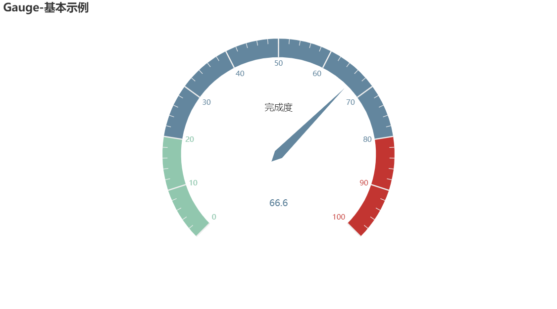
9. 仪表盘 Gauge
# -*- coding: utf-8 -*-
"""
PROJECT_NAME: PLOT
FILE_NAME: Gauge_base
AUTHOR: welt
E_MAIL: tjlwelt@foxmail.com
DATE: 2022/10/16
"""

from pyecharts import options as opts
from pyecharts.charts import Gauge

c = (
    Gauge(init_opts=opts.InitOpts(bg_color='white'))
    .add(
        series_name='',
        data_pair=[('完成度', 66.6)],
        detail_label_opts=opts.GaugeDetailOpts(formatter="{value}",offset_center=[0, 80])
         )
    .set_global_opts(title_opts=opts.TitleOpts(title="Gauge-基本示例"))
    .render("gauge_base.html")
)
10. 地理坐标 Geo
使用前需要安装额外的地图扩展
$ pip install echarts-countries-pypkg
$ pip install echarts-china-provinces-pypkg
$ pip install echarts-china-cities-pypkg
$ pip install echarts-china-counties-pypkg
$ pip install echarts-china-misc-pypkg
$ pip install echarts-united-kingdom-pypkg
- 全球国家地图: echarts-countries-pypkg (1.9MB):世界地图和 213 个国家,包括中国地图。
- 中国省级地图: echarts-china-provinces-pypkg (730KB):23 个省,5 个自治区。
- 中国市级地图: echarts-china-cities-pypkg (3.8MB):370 个中国城市。
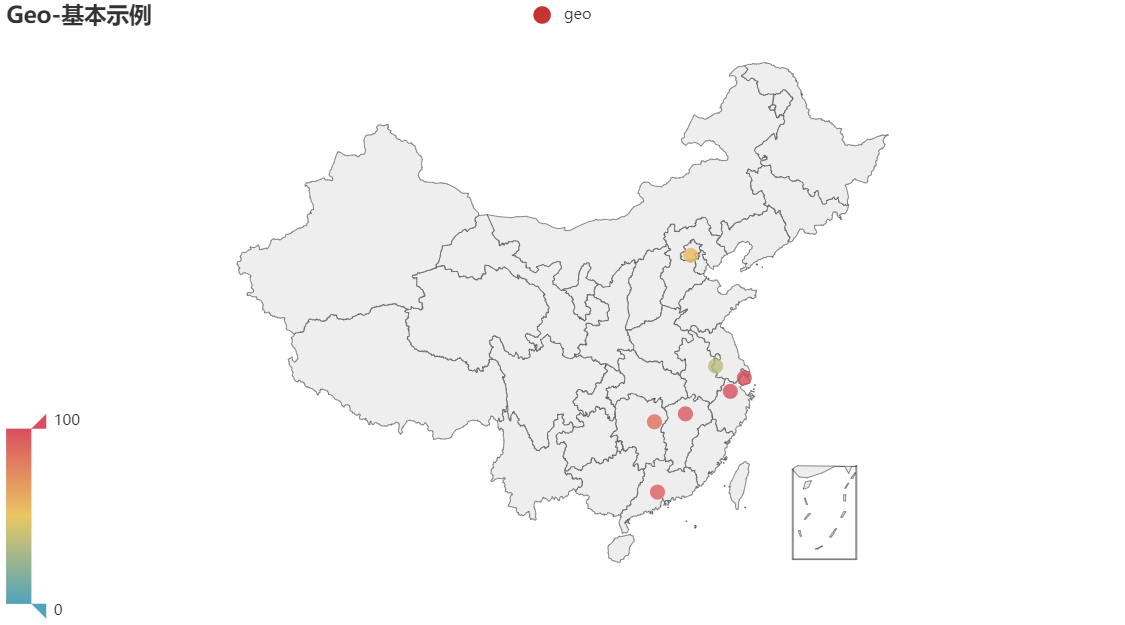
(1) 点状要素
from pyecharts import options as opts
from pyecharts.charts import Geo
from pyecharts.faker import Faker

c = (
    Geo()
    .add_schema(maptype="china")
    .add("geo", [list(z) for z in zip(Faker.provinces, Faker.values())])
    .set_series_opts(label_opts=opts.LabelOpts(is_show=False))
    .set_global_opts(
        visualmap_opts=opts.VisualMapOpts(), title_opts=opts.TitleOpts(title="Geo-基本示例")
    )
    .render("geo_base.html")
)
(2) 点与点间的流动图
from pyecharts import options as opts
from pyecharts.charts import Geo
from pyecharts.globals import ChartType, SymbolType

c = (
    Geo()
    .add_schema(maptype="china")
    .add(
        "",
        [("广州", 55), ("北京", 66), ("杭州", 77), ("重庆", 88)],
        type_=ChartType.EFFECT_SCATTER,
        color="white",
    )
    .add(
        "geo",
        [("广州", "上海"), ("广州", "北京"), ("广州", "杭州"), ("广州", "重庆")],
        type_=ChartType.LINES,
        effect_opts=opts.EffectOpts(
            symbol=SymbolType.ARROW, symbol_size=6, color="blue"
        ),
        linestyle_opts=opts.LineStyleOpts(curve=0.2),
    )
    .set_series_opts(label_opts=opts.LabelOpts(is_show=False))
    .set_global_opts(title_opts=opts.TitleOpts(title="Geo-Lines"))
    .render("geo_lines.html")
)
11. 关系图 Graph
(1) 基本关系图
from pyecharts import options as opts
from pyecharts.charts import Graph

nodes = [
    {"name": "结点1", "symbolSize": 10},
    {"name": "结点2", "symbolSize": 20},
    {"name": "结点3", "symbolSize": 30},
    {"name": "结点4", "symbolSize": 40},
    {"name": "结点5", "symbolSize": 50},
    {"name": "结点6", "symbolSize": 40},
    {"name": "结点7", "symbolSize": 30},
    {"name": "结点8", "symbolSize": 20},
]
links = []
for i in nodes:
    for j in nodes:
        links.append({"source": i.get("name"), "target": j.get("name")})
c = (
    Graph()
    .add("", nodes, links, repulsion=8000)
    .set_global_opts(title_opts=opts.TitleOpts(title="Graph-基本示例"))
    .render("graph_base.html")
)
(2) 弦图
import json

from pyecharts import options as opts
from pyecharts.charts import Graph


with open("les-miserables.json", "r", encoding="utf-8") as f:
    j = json.load(f)
    nodes = j["nodes"]
    links = j["links"]
    categories = j["categories"]

c = (
    Graph(init_opts=opts.InitOpts(width="1000px", height="600px"))
    .add(
        "",
        nodes=nodes,
        links=links,
        categories=categories,
        layout="circular",
        is_rotate_label=True,
        linestyle_opts=opts.LineStyleOpts(color="source", curve=0.3),
        label_opts=opts.LabelOpts(position="right"),
    )
    .set_global_opts(
        title_opts=opts.TitleOpts(title="Graph-Les Miserables"),
        legend_opts=opts.LegendOpts(orient="vertical", pos_left="2%", pos_top="20%"),
    )
    .render("graph_les_miserables.html")
)
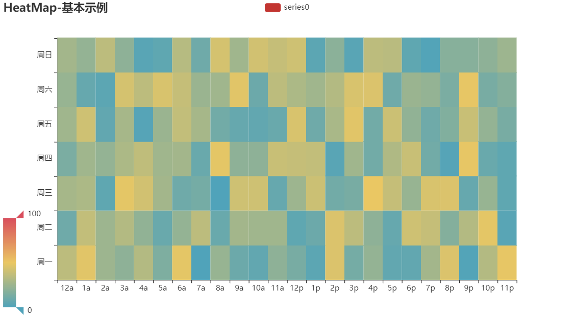
12. 热力图 Heatmap
import random

from pyecharts import options as opts
from pyecharts.charts import HeatMap
from pyecharts.faker import Faker

value = [[i, j, random.randint(0, 50)] for i in range(24) for j in range(7)]
c = (
    HeatMap()
    .add_xaxis(Faker.clock)
    .add_yaxis(
        "series0",
        Faker.week,
        value,
        label_opts=opts.LabelOpts(is_show=True, position="inside"),
    )
    .set_global_opts(
        title_opts=opts.TitleOpts(title="HeatMap-Label 显示"),
        visualmap_opts=opts.VisualMapOpts(),
    )
    .render("heatmap_with_label_show.html")
)
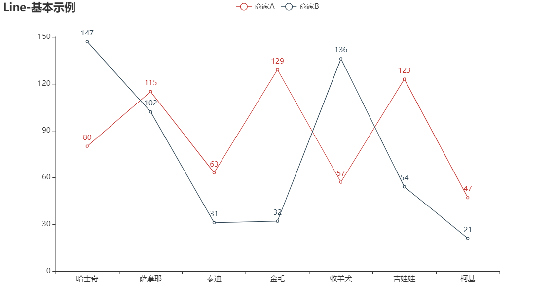
13. 折线图 Line
(1) 基础折线图
# -*- coding: utf-8 -*-
"""
PROJECT_NAME: PLOT
FILE_NAME: Line_base
AUTHOR: welt
E_MAIL: tjlwelt@foxmail.com
DATE: 2022/10/16
"""

import pyecharts.options as opts
from pyecharts.charts import Line
from pyecharts.faker import Faker

c = (
    Line(init_opts=opts.InitOpts(bg_color='white'))
    .add_xaxis(Faker.choose())
    .add_yaxis("商家A", Faker.values())
    .add_yaxis("商家B", Faker.values())
    .set_global_opts(title_opts=opts.TitleOpts(title="Line-基本示例"))
    .render("line_base.html")
)
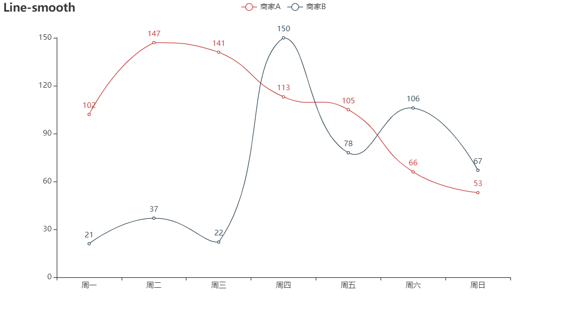
(2) 平滑折线图
# -*- coding: utf-8 -*-
"""
PROJECT_NAME: PLOT
FILE_NAME: Line_smooth
AUTHOR: welt
E_MAIL: tjlwelt@foxmail.com
DATE: 2022/10/16
"""

import pyecharts.options as opts
from pyecharts.charts import Line
from pyecharts.faker import Faker

c = (
    Line(init_opts=opts.InitOpts(bg_color='white'))
    .add_xaxis(Faker.choose())
    .add_yaxis("商家A", Faker.values(), is_smooth=True)
    .add_yaxis("商家B", Faker.values(), is_smooth=True)
    .set_global_opts(title_opts=opts.TitleOpts(title="Line-smooth"))
    .render("line_smooth.html")
)
(3) 多X轴折线图
点击查看代码
import pyecharts.options as opts
from pyecharts.charts import Line
from pyecharts.commons.utils import JsCode


js_formatter = """function (params) {
        console.log(params);
        return '降水量  ' + params.value + (params.seriesData.length ? ':' + params.seriesData[0].data : '');
    }"""

(
    Line(init_opts=opts.InitOpts(width="1600px", height="800px"))
    .add_xaxis(
        xaxis_data=[
            "2016-1",
            "2016-2",
            "2016-3",
            "2016-4",
            "2016-5",
            "2016-6",
            "2016-7",
            "2016-8",
            "2016-9",
            "2016-10",
            "2016-11",
            "2016-12",
        ]
    )
    .extend_axis(
        xaxis_data=[
            "2015-1",
            "2015-2",
            "2015-3",
            "2015-4",
            "2015-5",
            "2015-6",
            "2015-7",
            "2015-8",
            "2015-9",
            "2015-10",
            "2015-11",
            "2015-12",
        ],
        xaxis=opts.AxisOpts(
            type_="category",
            axistick_opts=opts.AxisTickOpts(is_align_with_label=True),
            axisline_opts=opts.AxisLineOpts(
                is_on_zero=False, linestyle_opts=opts.LineStyleOpts(color="#6e9ef1")
            ),
            axispointer_opts=opts.AxisPointerOpts(
                is_show=True, label=opts.LabelOpts(formatter=JsCode(js_formatter))
            ),
        ),
    )
    .add_yaxis(
        series_name="2015 降水量",
        is_smooth=True,
        symbol="emptyCircle",
        is_symbol_show=False,
        # xaxis_index=1,
        color="#d14a61",
        y_axis=[2.6, 5.9, 9.0, 26.4, 28.7, 70.7, 175.6, 182.2, 48.7, 18.8, 6.0, 2.3],
        label_opts=opts.LabelOpts(is_show=False),
        linestyle_opts=opts.LineStyleOpts(width=2),
    )
    .add_yaxis(
        series_name="2016 降水量",
        is_smooth=True,
        symbol="emptyCircle",
        is_symbol_show=False,
        color="#6e9ef1",
        y_axis=[3.9, 5.9, 11.1, 18.7, 48.3, 69.2, 231.6, 46.6, 55.4, 18.4, 10.3, 0.7],
        label_opts=opts.LabelOpts(is_show=False),
        linestyle_opts=opts.LineStyleOpts(width=2),
    )
    .set_global_opts(
        legend_opts=opts.LegendOpts(),
        tooltip_opts=opts.TooltipOpts(trigger="none", axis_pointer_type="cross"),
        xaxis_opts=opts.AxisOpts(
            type_="category",
            axistick_opts=opts.AxisTickOpts(is_align_with_label=True),
            axisline_opts=opts.AxisLineOpts(
                is_on_zero=False, linestyle_opts=opts.LineStyleOpts(color="#d14a61")
            ),
            axispointer_opts=opts.AxisPointerOpts(
                is_show=True, label=opts.LabelOpts(formatter=JsCode(js_formatter))
            ),
        ),
        yaxis_opts=opts.AxisOpts(
            type_="value",
            splitline_opts=opts.SplitLineOpts(
                is_show=True, linestyle_opts=opts.LineStyleOpts(opacity=1)
            ),
        ),
    )
    .render("multiple_x_axes.html")
)
(4) 峰期与谷期分析图
点击查看代码
# -*- coding: utf-8 -*-
"""
PROJECT_NAME: PLOT
FILE_NAME: Distribution_of_electricity
AUTHOR: welt
E_MAIL: tjlwelt@foxmail.com
DATE: 2022/10/16
"""

import pyecharts.options as opts
from pyecharts.charts import Line

x_data = [
    "00:00",
    "01:15",
    "02:30",
    "03:45",
    "05:00",
    "06:15",
    "07:30",
    "08:45",
    "10:00",
    "11:15",
    "12:30",
    "13:45",
    "15:00",
    "16:15",
    "17:30",
    "18:45",
    "20:00",
    "21:15",
    "22:30",
    "23:45",
]
y_data = [
    300,
    280,
    250,
    260,
    270,
    300,
    550,
    500,
    400,
    390,
    380,
    390,
    400,
    500,
    600,
    750,
    800,
    700,
    600,
    400,
]

(
    Line(init_opts=opts.InitOpts(width="1600px", height="800px"))
    .add_xaxis(xaxis_data=x_data)
    .add_yaxis(
        series_name="用电量",
        y_axis=y_data,
        is_smooth=True,
        label_opts=opts.LabelOpts(is_show=False),
        linestyle_opts=opts.LineStyleOpts(width=2),
    )
    .set_global_opts(
        title_opts=opts.TitleOpts(title="一天用电量分布", subtitle="纯属虚构"),
        tooltip_opts=opts.TooltipOpts(trigger="axis", axis_pointer_type="cross"),
        xaxis_opts=opts.AxisOpts(boundary_gap=False),
        yaxis_opts=opts.AxisOpts(
            axislabel_opts=opts.LabelOpts(formatter="{value} W"),
            splitline_opts=opts.SplitLineOpts(is_show=True),
        ),
        visualmap_opts=opts.VisualMapOpts(
            is_piecewise=True,
            dimension=0,
            pieces=[
                {"lte": 6, "color": "green"},
                {"gt": 6, "lte": 8, "color": "red"},
                {"gt": 8, "lte": 14, "color": "green"},
                {"gt": 14, "lte": 17, "color": "red"},
                {"gt": 17, "color": "green"},
            ],
        ),
    )
    .set_series_opts(
        markarea_opts=opts.MarkAreaOpts(
            data=[
                opts.MarkAreaItem(name="早高峰", x=("07:30", "10:00")),
                opts.MarkAreaItem(name="晚高峰", x=("17:30", "21:15")),
            ]
        )
    )
    .render("distribution_of_electricity.html")
)
14. 水球图 Liquid
from pyecharts import options as opts
from pyecharts.charts import Liquid

c = (
    Liquid()
    .add("lq", [0.6, 0.7])
    .set_global_opts(title_opts=opts.TitleOpts(title="Liquid-基本示例"))
    .render("liquid_base.html")
)
15. 地图 Map
(1) 基础地图
from pyecharts import options as opts
from pyecharts.charts import Map
from pyecharts.faker import Faker

c = (
    Map()
    .add("商家A", [list(z) for z in zip(Faker.provinces, Faker.values())], "china")
    .set_global_opts(title_opts=opts.TitleOpts(title="Map-基本示例"))
    .render("map_base.html")
)
(2) 分段地图
from pyecharts import options as opts
from pyecharts.charts import Map
from pyecharts.faker import Faker

c = (
    Map()
    .add("商家A", [list(z) for z in zip(Faker.provinces, Faker.values())], "china")
    .set_global_opts(
        title_opts=opts.TitleOpts(title="Map-VisualMap(分段型)"),
        visualmap_opts=opts.VisualMapOpts(max_=200, is_piecewise=True),
    )
    .render("map_visualmap_piecewise.html")
)
(3) 连续地图
from pyecharts import options as opts
from pyecharts.charts import Map
from pyecharts.faker import Faker

c = (
    Map()
    .add("商家A", [list(z) for z in zip(Faker.provinces, Faker.values())], "china")
    .set_global_opts(
        title_opts=opts.TitleOpts(title="Map-VisualMap(连续型)"),
        visualmap_opts=opts.VisualMapOpts(max_=200),
    )
)
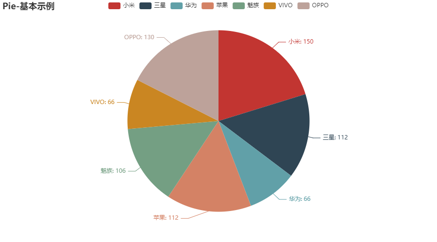
16. 饼图
(1) 基本饼状图
# -*- coding: utf-8 -*-
"""
PROJECT_NAME: PLOT
FILE_NAME: Pie_base
AUTHOR: welt
E_MAIL: tjlwelt@foxmail.com
DATE: 2022/10/16
"""

from pyecharts import options as opts
from pyecharts.charts import Pie
from pyecharts.faker import Faker

c = (
    Pie(init_opts=opts.InitOpts(bg_color="white"))
    .add("", [list(z) for z in zip(Faker.choose(), Faker.values())])
    .set_global_opts(title_opts=opts.TitleOpts(title="Pie-基本示例"))
    .set_series_opts(label_opts=opts.LabelOpts(formatter="{b}: {c}"))
    .render("pie_base.html")
)
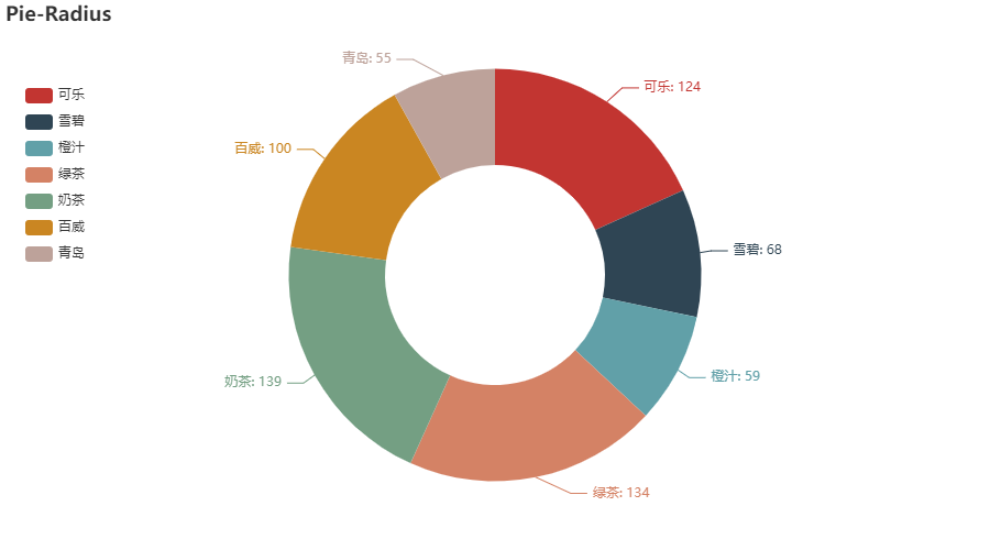
(2) 圆环图
from pyecharts import options as opts
from pyecharts.charts import Pie
from pyecharts.faker import Faker

c = (
    Pie()
    .add(
        "",
        [list(z) for z in zip(Faker.choose(), Faker.values())],
        radius=["40%", "75%"],
    )
    .set_global_opts(
        title_opts=opts.TitleOpts(title="Pie-Radius"),
        legend_opts=opts.LegendOpts(orient="vertical", pos_top="15%", pos_left="2%"),
    )
    .set_series_opts(label_opts=opts.LabelOpts(formatter="{b}: {c}"))
    .render("pie_radius.html")
)
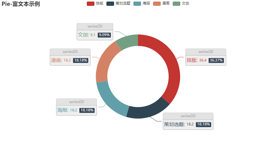
(3) 带文本标签的圆环图
# -*- coding: utf-8 -*-
"""
PROJECT_NAME: PLOT
FILE_NAME: Pie_rich_label
AUTHOR: welt
E_MAIL: tjlwelt@foxmail.com
DATE: 2022/10/15
"""

from pyecharts import options as opts
from pyecharts.charts import Pie
from pyecharts.faker import Faker

c = (
    Pie(init_opts=opts.InitOpts(bg_color="white"))
    .add(
        "",

        [list(z) for z in zip(['排版', '策划选题', '海报', '漫画', '文创'], ['36.4', '18.2', '18.2', '18.2', '9.1'])],
        radius=["40%", "55%"],
        label_opts=opts.LabelOpts(
            position="outside",
            formatter="{a|{a}}{abg|}\n{hr|}\n {b|{b}: }{c}  {per|{d}%}  ",
            background_color="#eee",
            border_color="#aaa",
            border_width=1,
            border_radius=4,
            rich={
                "a": {"color": "#999", "lineHeight": 22, "align": "center"},
                "abg": {
                    "backgroundColor": "#e3e3e3",
                    "width": "100%",
                    "align": "right",
                    "height": 22,
                    "borderRadius": [4, 4, 0, 0],
                },
                "hr": {
                    "borderColor": "#aaa",
                    "width": "100%",
                    "borderWidth": 0.5,
                    "height": 0,
                },
                "b": {"fontSize": 16, "lineHeight": 33},
                "per": {
                    "color": "#eee",
                    "backgroundColor": "#334455",
                    "padding": [2, 4],
                    "borderRadius": 2,
                },
            },
        ),
    )
    .set_global_opts(title_opts=opts.TitleOpts(title="Pie-富文本示例"))
    .render("pie_rich_label.html")
)
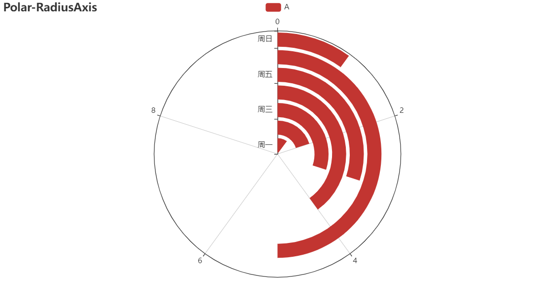
17. 极坐标系 Polar
from pyecharts import options as opts
from pyecharts.charts import Polar
from pyecharts.faker import Faker

c = (
    Polar()
    .add_schema(
        radiusaxis_opts=opts.RadiusAxisOpts(data=Faker.week, type_="category"),
        angleaxis_opts=opts.AngleAxisOpts(is_clockwise=True, max_=10),
    )
    .add("A", [1, 2, 3, 4, 3, 5, 1], type_="bar")
    .set_global_opts(title_opts=opts.TitleOpts(title="Polar-RadiusAxis"))
    .set_series_opts(label_opts=opts.LabelOpts(is_show=True))
    .render("polar_radius.html")
)
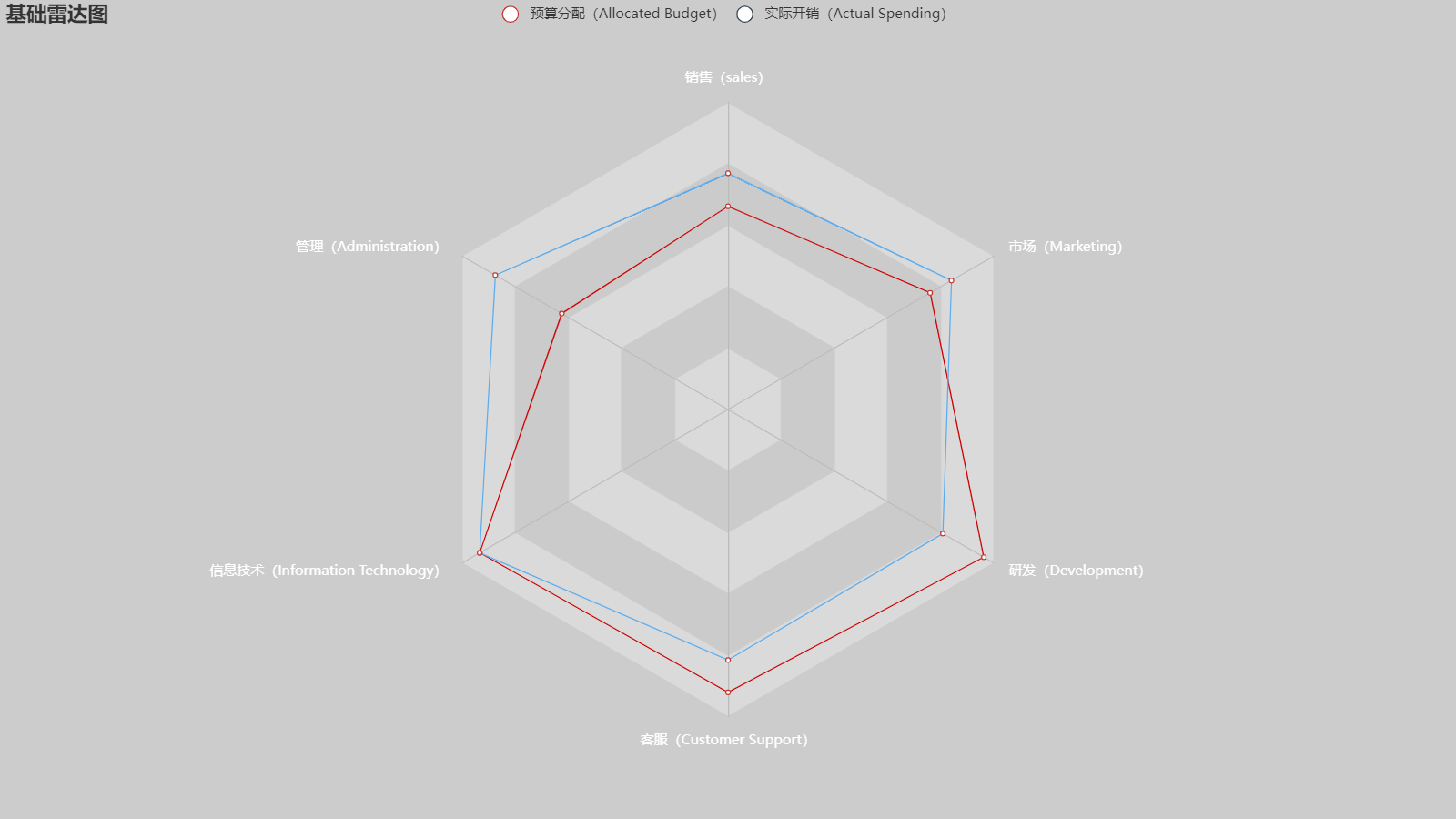
18. 雷达图
import pyecharts.options as opts
from pyecharts.charts import Radar


v1 = [[4300, 10000, 28000, 35000, 50000, 19000]]
v2 = [[5000, 14000, 28000, 31000, 42000, 21000]]

(
    Radar(init_opts=opts.InitOpts(width="1280px", height="720px", bg_color="#CCCCCC"))
    .add_schema(
        schema=[
            opts.RadarIndicatorItem(name="销售(sales)", max_=6500),
            opts.RadarIndicatorItem(name="管理(Administration)", max_=16000),
            opts.RadarIndicatorItem(name="信息技术(Information Technology)", max_=30000),
            opts.RadarIndicatorItem(name="客服(Customer Support)", max_=38000),
            opts.RadarIndicatorItem(name="研发(Development)", max_=52000),
            opts.RadarIndicatorItem(name="市场(Marketing)", max_=25000),
        ],
        splitarea_opt=opts.SplitAreaOpts(
            is_show=True, areastyle_opts=opts.AreaStyleOpts(opacity=1)
        ),
        textstyle_opts=opts.TextStyleOpts(color="#fff"),
    )
    .add(
        series_name="预算分配(Allocated Budget)",
        data=v1,
        linestyle_opts=opts.LineStyleOpts(color="#CD0000"),
    )
    .add(
        series_name="实际开销(Actual Spending)",
        data=v2,
        linestyle_opts=opts.LineStyleOpts(color="#5CACEE"),
    )
    .set_series_opts(label_opts=opts.LabelOpts(is_show=False))
    .set_global_opts(
        title_opts=opts.TitleOpts(title="基础雷达图"), legend_opts=opts.LegendOpts()
    )
    .render("basic_radar_chart.html")
)
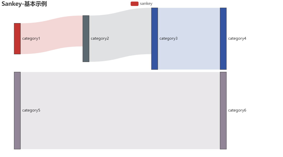
19. 桑基图 Sankey
from pyecharts import options as opts
from pyecharts.charts import Sankey

nodes = [
    {"name": "category1"},
    {"name": "category2"},
    {"name": "category3"},
    {"name": "category4"},
    {"name": "category5"},
    {"name": "category6"},
]

links = [
    {"source": "category1", "target": "category2", "value": 10},
    {"source": "category2", "target": "category3", "value": 15},
    {"source": "category3", "target": "category4", "value": 20},
    {"source": "category5", "target": "category6", "value": 25},
]
c = (
    Sankey()
    .add(
        "sankey",
        nodes,
        links,
        linestyle_opt=opts.LineStyleOpts(opacity=0.2, curve=0.5, color="source"),
        label_opts=opts.LabelOpts(position="right"),
    )
    .set_global_opts(title_opts=opts.TitleOpts(title="Sankey-基本示例"))
    .render("sankey_base.html")
)
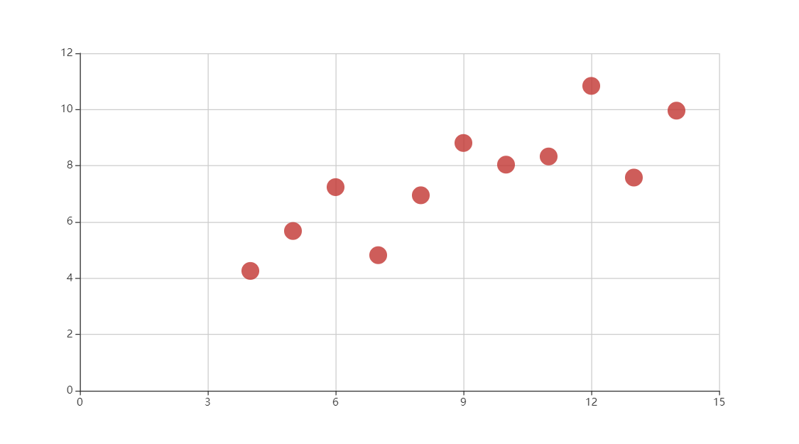
20. 散点图 Scatter
(1) 基础散点图
import pyecharts.options as opts
from pyecharts.charts import Scatter


data = [
    [10.0, 8.04],
    [8.0, 6.95],
    [13.0, 7.58],
    [9.0, 8.81],
    [11.0, 8.33],
    [14.0, 9.96],
    [6.0, 7.24],
    [4.0, 4.26],
    [12.0, 10.84],
    [7.0, 4.82],
    [5.0, 5.68],
]
data.sort(key=lambda x: x[0])
x_data = [d[0] for d in data]
y_data = [d[1] for d in data]

(
    Scatter(init_opts=opts.InitOpts(width="1600px", height="1000px"))
    .add_xaxis(xaxis_data=x_data)
    .add_yaxis(
        series_name="",
        y_axis=y_data,
        symbol_size=20,
        label_opts=opts.LabelOpts(is_show=False),
    )
    .set_series_opts()
    .set_global_opts(
        xaxis_opts=opts.AxisOpts(
            type_="value", splitline_opts=opts.SplitLineOpts(is_show=True)
        ),
        yaxis_opts=opts.AxisOpts(
            type_="value",
            axistick_opts=opts.AxisTickOpts(is_show=True),
            splitline_opts=opts.SplitLineOpts(is_show=True),
        ),
        tooltip_opts=opts.TooltipOpts(is_show=False),
    )
    .render("basic_scatter_chart.html")
)
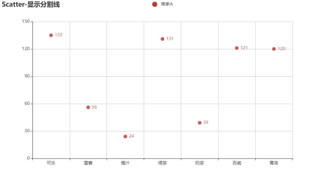
(2) 显示分割线的散点图
from pyecharts import options as opts
from pyecharts.charts import Scatter
from pyecharts.faker import Faker

c = (
    Scatter()
    .add_xaxis(Faker.choose())
    .add_yaxis("商家A", Faker.values())
    .set_global_opts(
        title_opts=opts.TitleOpts(title="Scatter-显示分割线"),
        xaxis_opts=opts.AxisOpts(splitline_opts=opts.SplitLineOpts(is_show=True)),
        yaxis_opts=opts.AxisOpts(splitline_opts=opts.SplitLineOpts(is_show=True)),
    )
    .render("scatter_splitline.html")
)
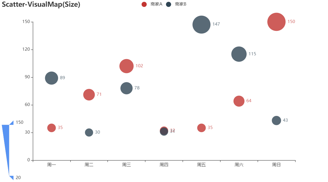
(3) 根据属性确定点的大小的散点图
from pyecharts import options as opts
from pyecharts.charts import Scatter
from pyecharts.faker import Faker

c = (
    Scatter()
    .add_xaxis(Faker.choose())
    .add_yaxis("商家A", Faker.values())
    .add_yaxis("商家B", Faker.values())
    .set_global_opts(
        title_opts=opts.TitleOpts(title="Scatter-VisualMap(Size)"),
        visualmap_opts=opts.VisualMapOpts(type_="size", max_=150, min_=20),
    )
    .render("scatter_visualmap_size.html")
)
21. 旭日图 Sunburst
点击查看代码
from pyecharts.charts import Sunburst
from pyecharts import options as opts
data = [
{
"name": "Flora",
"itemStyle": {"color": "#da0d68"},
"children": [
{"name": "Black Tea", "value": 1, "itemStyle": {"color": "#975e6d"}},
{
"name": "Floral",
"itemStyle": {"color": "#e0719c"},
"children": [
{
"name": "Chamomile",
"value": 1,
"itemStyle": {"color": "#f99e1c"},
},
{"name": "Rose", "value": 1, "itemStyle": {"color": "#ef5a78"}},
{"name": "Jasmine", "value": 1, "itemStyle": {"color": "#f7f1bd"}},
],
},
],
},
{
"name": "Fruity",
"itemStyle": {"color": "#da1d23"},
"children": [
{
"name": "Berry",
"itemStyle": {"color": "#dd4c51"},
"children": [
{
"name": "Blackberry",
"value": 1,
"itemStyle": {"color": "#3e0317"},
},
{
"name": "Raspberry",
"value": 1,
"itemStyle": {"color": "#e62969"},
},
{
"name": "Blueberry",
"value": 1,
"itemStyle": {"color": "#6569b0"},
},
{
"name": "Strawberry",
"value": 1,
"itemStyle": {"color": "#ef2d36"},
},
],
},
{
"name": "Dried Fruit",
"itemStyle": {"color": "#c94a44"},
"children": [
{"name": "Raisin", "value": 1, "itemStyle": {"color": "#b53b54"}},
{"name": "Prune", "value": 1, "itemStyle": {"color": "#a5446f"}},
],
},
{
"name": "Other Fruit",
"itemStyle": {"color": "#dd4c51"},
"children": [
{"name": "Coconut", "value": 1, "itemStyle": {"color": "#f2684b"}},
{"name": "Cherry", "value": 1, "itemStyle": {"color": "#e73451"}},
{
"name": "Pomegranate",
"value": 1,
"itemStyle": {"color": "#e65656"},
},
{
"name": "Pineapple",
"value": 1,
"itemStyle": {"color": "#f89a1c"},
},
{"name": "Grape", "value": 1, "itemStyle": {"color": "#aeb92c"}},
{"name": "Apple", "value": 1, "itemStyle": {"color": "#4eb849"}},
{"name": "Peach", "value": 1, "itemStyle": {"color": "#f68a5c"}},
{"name": "Pear", "value": 1, "itemStyle": {"color": "#baa635"}},
],
},
{
"name": "Citrus Fruit",
"itemStyle": {"color": "#f7a128"},
"children": [
{
"name": "Grapefruit",
"value": 1,
"itemStyle": {"color": "#f26355"},
},
{"name": "Orange", "value": 1, "itemStyle": {"color": "#e2631e"}},
{"name": "Lemon", "value": 1, "itemStyle": {"color": "#fde404"}},
{"name": "Lime", "value": 1, "itemStyle": {"color": "#7eb138"}},
],
},
],
},
{
"name": "Sour/\nFermented",
"itemStyle": {"color": "#ebb40f"},
"children": [
{
"name": "Sour",
"itemStyle": {"color": "#e1c315"},
"children": [
{
"name": "Sour Aromatics",
"value": 1,
"itemStyle": {"color": "#9ea718"},
},
{
"name": "Acetic Acid",
"value": 1,
"itemStyle": {"color": "#94a76f"},
},
{
"name": "Butyric Acid",
"value": 1,
"itemStyle": {"color": "#d0b24f"},
},
{
"name": "Isovaleric Acid",
"value": 1,
"itemStyle": {"color": "#8eb646"},
},
{
"name": "Citric Acid",
"value": 1,
"itemStyle": {"color": "#faef07"},
},
{
"name": "Malic Acid",
"value": 1,
"itemStyle": {"color": "#c1ba07"},
},
],
},
{
"name": "Alcohol/\nFremented",
"itemStyle": {"color": "#b09733"},
"children": [
{"name": "Winey", "value": 1, "itemStyle": {"color": "#8f1c53"}},
{"name": "Whiskey", "value": 1, "itemStyle": {"color": "#b34039"}},
{
"name": "Fremented",
"value": 1,
"itemStyle": {"color": "#ba9232"},
},
{"name": "Overripe", "value": 1, "itemStyle": {"color": "#8b6439"}},
],
},
],
},
{
"name": "Green/\nVegetative",
"itemStyle": {"color": "#187a2f"},
"children": [
{"name": "Olive Oil", "value": 1, "itemStyle": {"color": "#a2b029"}},
{"name": "Raw", "value": 1, "itemStyle": {"color": "#718933"}},
{
"name": "Green/\nVegetative",
"itemStyle": {"color": "#3aa255"},
"children": [
{
"name": "Under-ripe",
"value": 1,
"itemStyle": {"color": "#a2bb2b"},
},
{"name": "Peapod", "value": 1, "itemStyle": {"color": "#62aa3c"}},
{"name": "Fresh", "value": 1, "itemStyle": {"color": "#03a653"}},
{
"name": "Dark Green",
"value": 1,
"itemStyle": {"color": "#038549"},
},
{
"name": "Vegetative",
"value": 1,
"itemStyle": {"color": "#28b44b"},
},
{"name": "Hay-like", "value": 1, "itemStyle": {"color": "#a3a830"}},
{
"name": "Herb-like",
"value": 1,
"itemStyle": {"color": "#7ac141"},
},
],
},
{"name": "Beany", "value": 1, "itemStyle": {"color": "#5e9a80"}},
],
},
{
"name": "Other",
"itemStyle": {"color": "#0aa3b5"},
"children": [
{
"name": "Papery/Musty",
"itemStyle": {"color": "#9db2b7"},
"children": [
{"name": "Stale", "value": 1, "itemStyle": {"color": "#8b8c90"}},
{
"name": "Cardboard",
"value": 1,
"itemStyle": {"color": "#beb276"},
},
{"name": "Papery", "value": 1, "itemStyle": {"color": "#fefef4"}},
{"name": "Woody", "value": 1, "itemStyle": {"color": "#744e03"}},
{
"name": "Moldy/Damp",
"value": 1,
"itemStyle": {"color": "#a3a36f"},
},
{
"name": "Musty/Dusty",
"value": 1,
"itemStyle": {"color": "#c9b583"},
},
{
"name": "Musty/Earthy",
"value": 1,
"itemStyle": {"color": "#978847"},
},
{"name": "Animalic", "value": 1, "itemStyle": {"color": "#9d977f"}},
{
"name": "Meaty Brothy",
"value": 1,
"itemStyle": {"color": "#cc7b6a"},
},
{"name": "Phenolic", "value": 1, "itemStyle": {"color": "#db646a"}},
],
},
{
"name": "Chemical",
"itemStyle": {"color": "#76c0cb"},
"children": [
{"name": "Bitter", "value": 1, "itemStyle": {"color": "#80a89d"}},
{"name": "Salty", "value": 1, "itemStyle": {"color": "#def2fd"}},
{
"name": "Medicinal",
"value": 1,
"itemStyle": {"color": "#7a9bae"},
},
{
"name": "Petroleum",
"value": 1,
"itemStyle": {"color": "#039fb8"},
},
{"name": "Skunky", "value": 1, "itemStyle": {"color": "#5e777b"}},
{"name": "Rubber", "value": 1, "itemStyle": {"color": "#120c0c"}},
],
},
],
},
{
"name": "Roasted",
"itemStyle": {"color": "#c94930"},
"children": [
{"name": "Pipe Tobacco", "value": 1, "itemStyle": {"color": "#caa465"}},
{"name": "Tobacco", "value": 1, "itemStyle": {"color": "#dfbd7e"}},
{
"name": "Burnt",
"itemStyle": {"color": "#be8663"},
"children": [
{"name": "Acrid", "value": 1, "itemStyle": {"color": "#b9a449"}},
{"name": "Ashy", "value": 1, "itemStyle": {"color": "#899893"}},
{"name": "Smoky", "value": 1, "itemStyle": {"color": "#a1743b"}},
{
"name": "Brown, Roast",
"value": 1,
"itemStyle": {"color": "#894810"},
},
],
},
{
"name": "Cereal",
"itemStyle": {"color": "#ddaf61"},
"children": [
{"name": "Grain", "value": 1, "itemStyle": {"color": "#b7906f"}},
{"name": "Malt", "value": 1, "itemStyle": {"color": "#eb9d5f"}},
],
},
],
},
{
"name": "Spices",
"itemStyle": {"color": "#ad213e"},
"children": [
{"name": "Pungent", "value": 1, "itemStyle": {"color": "#794752"}},
{"name": "Pepper", "value": 1, "itemStyle": {"color": "#cc3d41"}},
{
"name": "Brown Spice",
"itemStyle": {"color": "#b14d57"},
"children": [
{"name": "Anise", "value": 1, "itemStyle": {"color": "#c78936"}},
{"name": "Nutmeg", "value": 1, "itemStyle": {"color": "#8c292c"}},
{"name": "Cinnamon", "value": 1, "itemStyle": {"color": "#e5762e"}},
{"name": "Clove", "value": 1, "itemStyle": {"color": "#a16c5a"}},
],
},
],
},
{
"name": "Nutty/\nCocoa",
"itemStyle": {"color": "#a87b64"},
"children": [
{
"name": "Nutty",
"itemStyle": {"color": "#c78869"},
"children": [
{"name": "Peanuts", "value": 1, "itemStyle": {"color": "#d4ad12"}},
{"name": "Hazelnut", "value": 1, "itemStyle": {"color": "#9d5433"}},
{"name": "Almond", "value": 1, "itemStyle": {"color": "#c89f83"}},
],
},
{
"name": "Cocoa",
"itemStyle": {"color": "#bb764c"},
"children": [
{
"name": "Chocolate",
"value": 1,
"itemStyle": {"color": "#692a19"},
},
{
"name": "Dark Chocolate",
"value": 1,
"itemStyle": {"color": "#470604"},
},
],
},
],
},
{
"name": "Sweet",
"itemStyle": {"color": "#e65832"},
"children": [
{
"name": "Brown Sugar",
"itemStyle": {"color": "#d45a59"},
"children": [
{"name": "Molasses", "value": 1, "itemStyle": {"color": "#310d0f"}},
{
"name": "Maple Syrup",
"value": 1,
"itemStyle": {"color": "#ae341f"},
},
{
"name": "Caramelized",
"value": 1,
"itemStyle": {"color": "#d78823"},
},
{"name": "Honey", "value": 1, "itemStyle": {"color": "#da5c1f"}},
],
},
{"name": "Vanilla", "value": 1, "itemStyle": {"color": "#f89a80"}},
{"name": "Vanillin", "value": 1, "itemStyle": {"color": "#f37674"}},
{"name": "Overall Sweet", "value": 1, "itemStyle": {"color": "#e75b68"}},
{"name": "Sweet Aromatics", "value": 1, "itemStyle": {"color": "#d0545f"}},
],
},
]
c = (
Sunburst(init_opts=opts.InitOpts(width="1000px", height="600px"))
.add(
"",
data_pair=data,
highlight_policy="ancestor",
radius=[0, "95%"],
sort_="null",
levels=[
{},
{
"r0": "15%",
"r": "35%",
"itemStyle": {"borderWidth": 2},
"label": {"rotate": "tangential"},
},
{"r0": "35%", "r": "70%", "label": {"align": "right"}},
{
"r0": "70%",
"r": "72%",
"label": {"position": "outside", "padding": 3, "silent": False},
"itemStyle": {"borderWidth": 3},
},
],
)
.set_global_opts(title_opts=opts.TitleOpts(title="Sunburst-官方示例"))
.set_series_opts(label_opts=opts.LabelOpts(formatter="{b}"))
.render("drink_flavors.html")
)
22. 时间轴组件 Timeline
from pyecharts import options as opts
from pyecharts.charts import Pie, Timeline
from pyecharts.faker import Faker

attr = Faker.choose()
tl = Timeline()
for i in range(2015, 2020):
    pie = (
        Pie()
        .add(
            "商家A",
            [list(z) for z in zip(attr, Faker.values())],
            rosetype="radius",
            radius=["30%", "55%"],
        )
        .set_global_opts(title_opts=opts.TitleOpts("某商店{}年营业额".format(i)))
    )
    tl.add(pie, "{}年".format(i))
tl.render("timeline_pie.html")
23. 矩形树图 Treemap
点击查看代码
import re
import asyncio
from aiohttp import TCPConnector, ClientSession

import pyecharts.options as opts
from pyecharts.charts import TreeMap


async def get_json_data(url: str) -> dict:
    async with ClientSession(connector=TCPConnector(ssl=False)) as session:
        async with session.get(url=url) as response:
            return await response.json()


# 获取官方的数据
data = asyncio.run(
    get_json_data(
        url="https://echarts.apache.org/examples/data/asset/data/"
        "ec-option-doc-statistics-201604.json"
    )
)

tree_map_data: dict = {"children": []}


def convert(source, target, base_path: str):
    for key in source:
        if base_path != "":
            path = base_path + "." + key
        else:
            path = key
        if re.match(r"/^\$/", key):
            pass
        else:
            child = {"name": path, "children": []}
            target["children"].append(child)
            if isinstance(source[key], dict):
                convert(source[key], child, path)
            else:
                target["value"] = source["$count"]


convert(source=data, target=tree_map_data, base_path="")


(
    TreeMap(init_opts=opts.InitOpts(width="1280px", height="720px"))
    .add(
        series_name="option",
        data=tree_map_data["children"],
        visual_min=300,
        leaf_depth=1,
        # 标签居中为 position = "inside"
        label_opts=opts.LabelOpts(position="inside"),
    )
    .set_global_opts(
        legend_opts=opts.LegendOpts(is_show=False),
        title_opts=opts.TitleOpts(
            title="Echarts 配置项查询分布", subtitle="2016/04", pos_left="leafDepth"
        ),
    )
    .render("echarts_option_query.html")
)
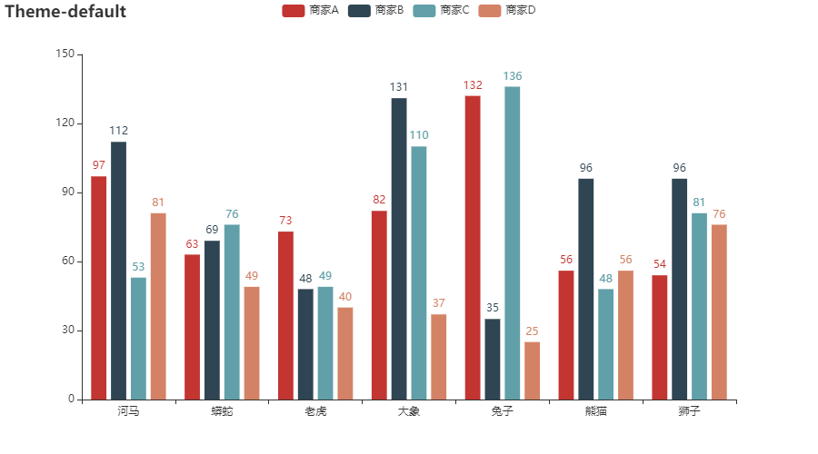
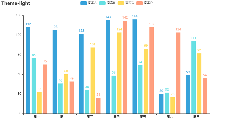
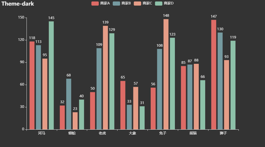
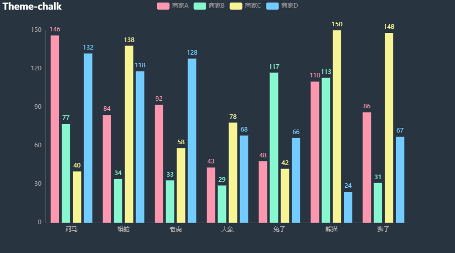
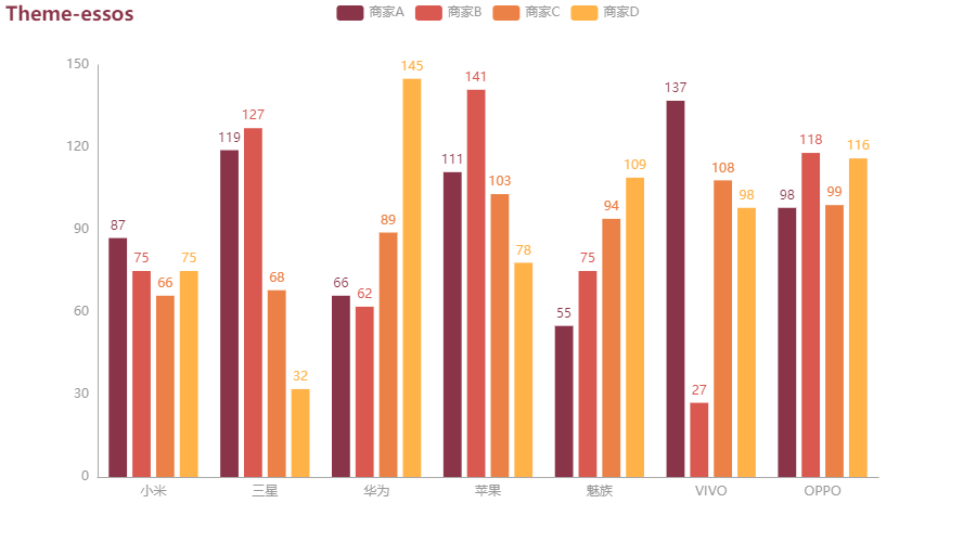
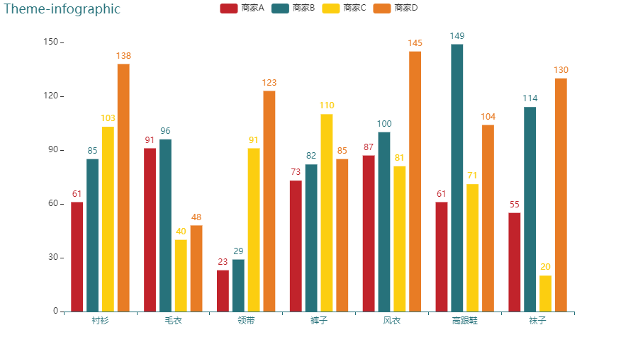
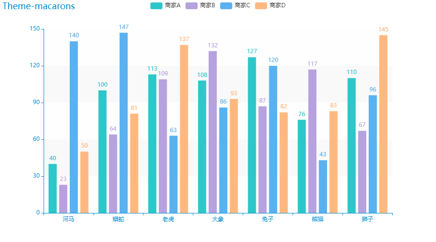
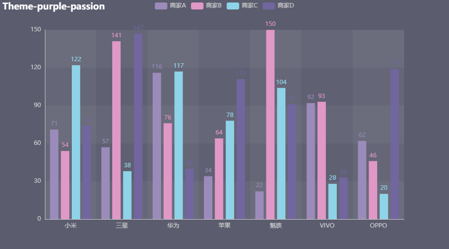
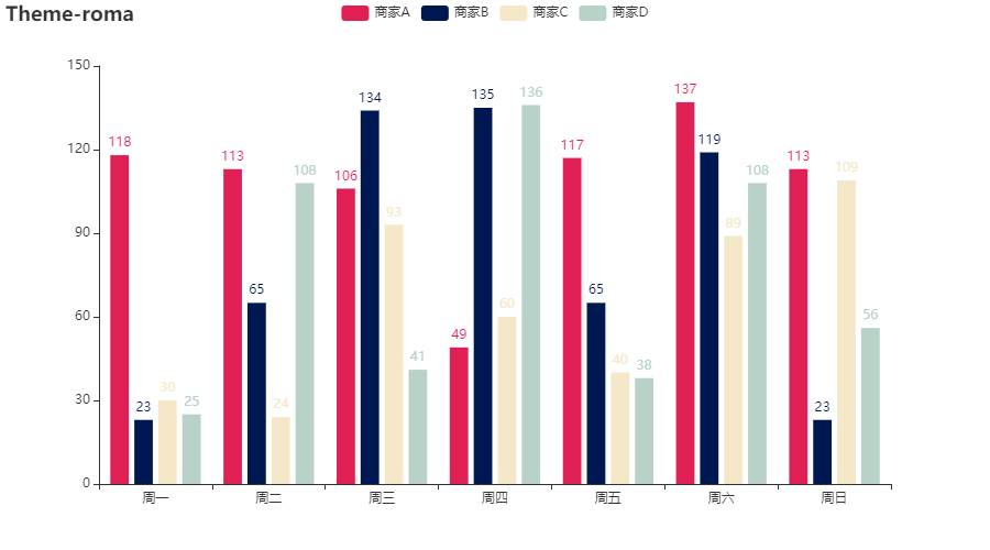
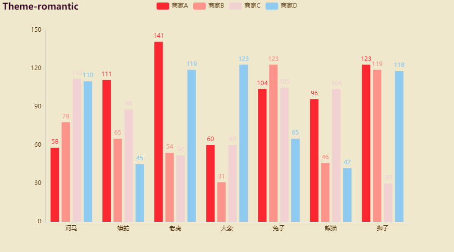
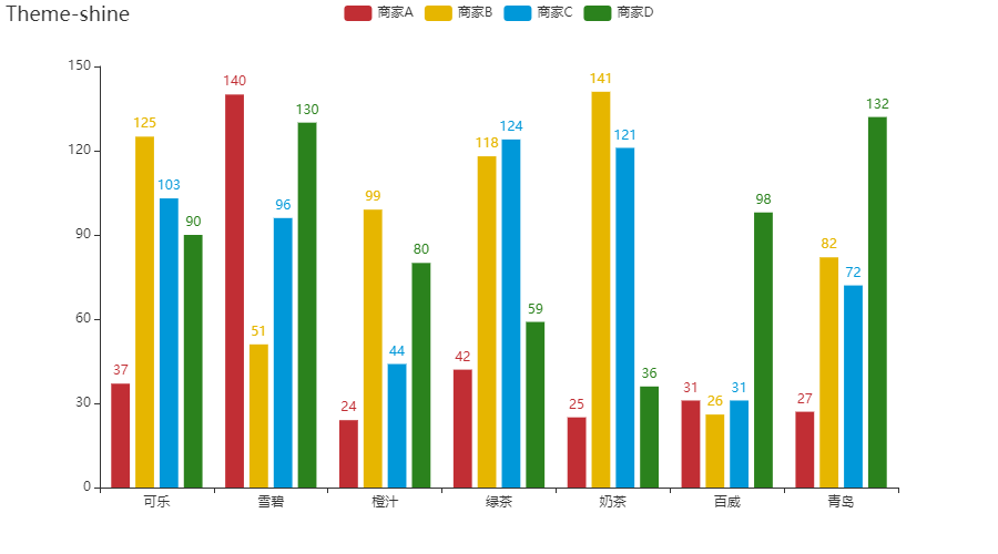
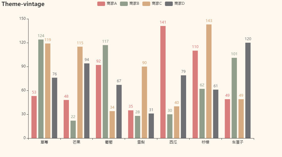
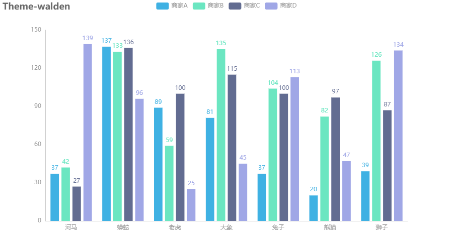
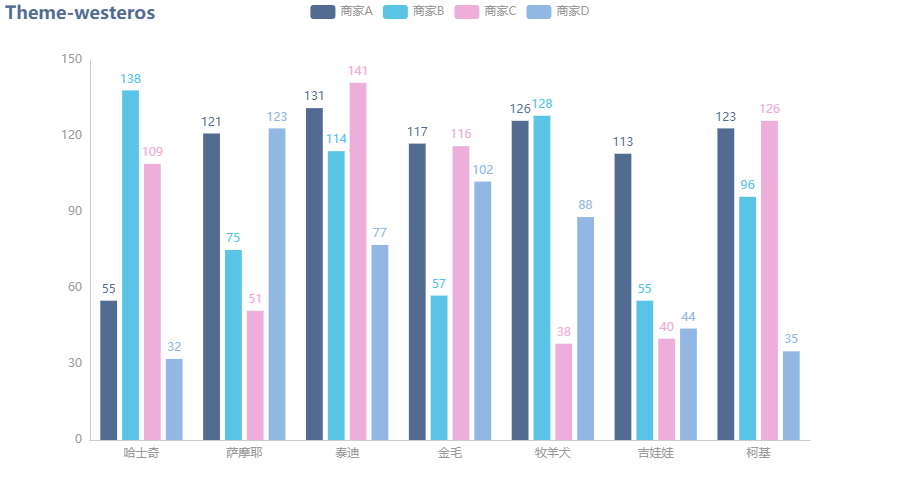
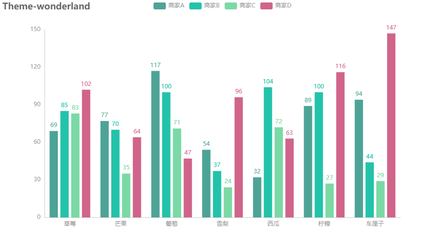
六、主题组件示例
PyEcharts自带的所有主题组件效果如下:

 浙公网安备 33010602011771号