
CSS-2
元素的显示与隐藏
选择器 {
  display: none | block;  /*none 隐藏,不占有位置*/
}
选择器 {
  visibility: hidden | visible; /* hidden 隐藏,原位置保留 */
}
选择器 {
  /* hidden 溢出部分隐藏
      visible  溢出部分不隐藏
      scroll   显示滚动条,以显示全部内容
   */
  overflow: hidden | scroll | visible;
}
案例:鼠标悬停显示播放按钮
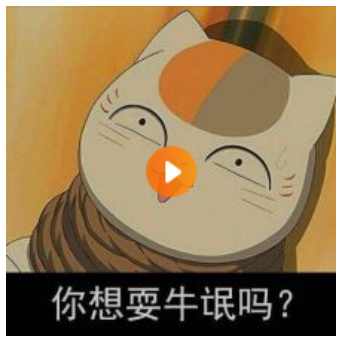
<!DOCTYPE html>
<html lang="en">
<head>
    <meta charset="UTF-8">
    <title>元素显示与隐藏</title>
    <style>
        .box {
            position: relative;  /*父相*/
            width: 220px;
            height: 220px;
        }

        .box img {
            width: 100%;
            height: 100%;
        }

        .box .arr {
            display: none;  /*隐藏*/
            position: absolute; /*子绝*/
            left :0;
            top: 0;
            width: 100%;
            height: 100%;
            background-color:rgba(0,0,0,0.2);
            background-image: url(arr.png);
            background-repeat: no-repeat;
            background-position: center center;
        }

        .box a:hover .arr{
            display: block;  /*显示*/
        }
    </style>
</head>
<body>
    <div class="box">
        <a href="#">
            <img src="3.jpg" />
            <div class="arr"></div>
        </a>
    </div>
</body>
</html>
用户界面样式 主要用于提高用户体验
选择器 {
   cursor: default | pointer | text | move | not-allowed; /*鼠标样式:默认 小手 文本 移动 禁止*/
}
选择器 {
    /*通常用于去除表单轮廊线 outline:0; 或 outline:none;*/
    outline: outline-color | outline-style | outline-width; /*轮廓线 : 颜色 样式 宽度*/
}
选择器 {
  resize: none; /*通常用于防止拖拽文本域*/
}
垂直居中对齐
选择器 {
   /*仅对行内元素、行内块元素有效*/
   vertical-align: baseline | top | middle | bottom;  /*基线(默认) 顶线 中线(垂直居中) 底线(去除图片底部空隙)*/
}
溢出文字省略号显示
选择器 {
  white-space : nowrap; /*强制一行内显示文本*/
  overflow:hidden; /*超出部分隐藏*/
  text-overflow: ellipsis;  /*文字超出部分用省略号代替*/
}
精灵图技术 有效减少服务器接收和发送请求的次数,提高网页的加载速度
将网页中的一些小背景图像整合到一张大图中,网页中元素需要某个小背景图时,通过背景定位来获取相应的小背景图像。
滑动门 使各种特殊形状的背景能够自由拉伸滑动,以适应元素内部的文本
核心 :精灵图技术+padding
综合案例:微信导航

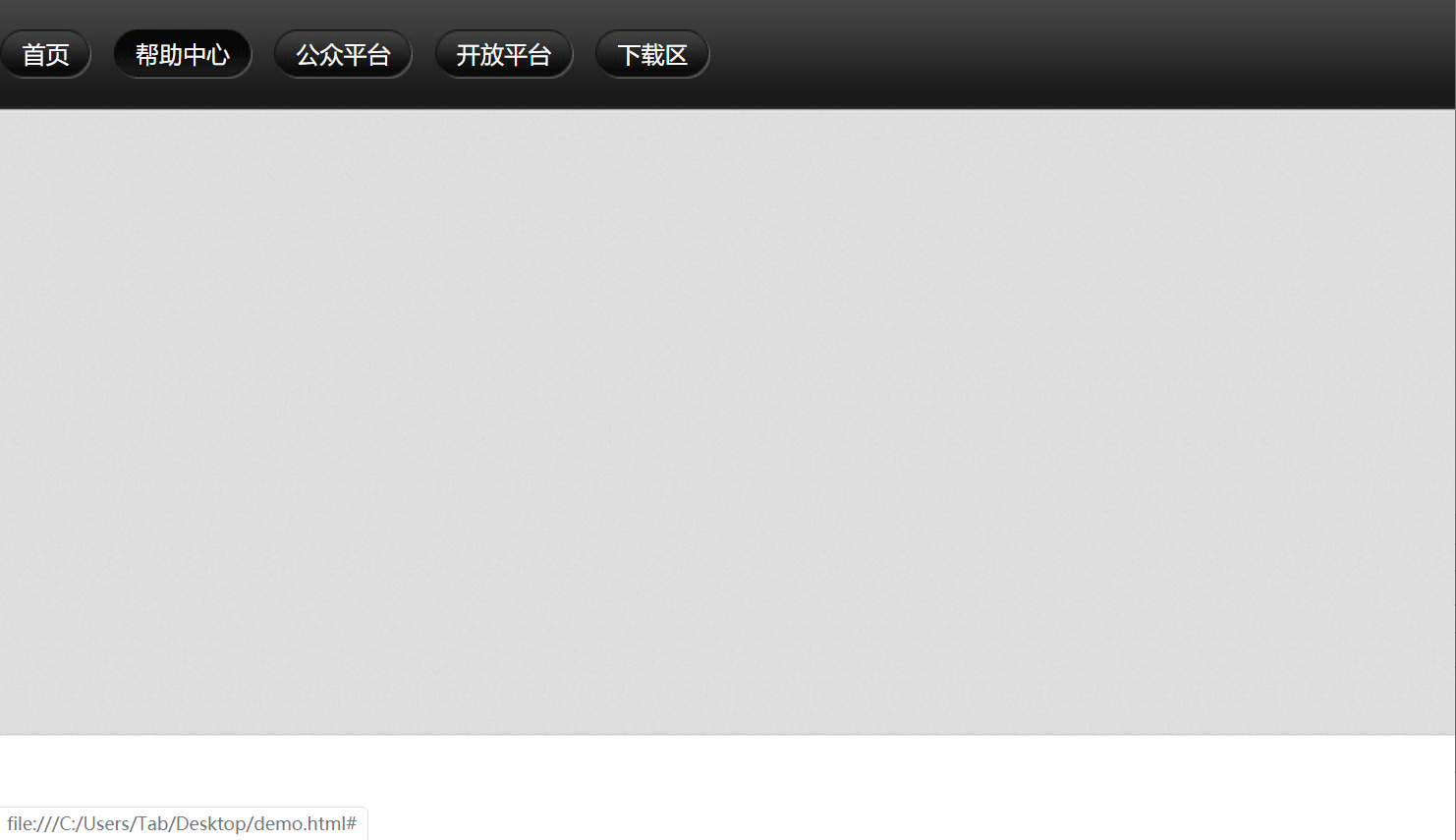
<!DOCTYPE html>
<html lang="en">
<head>
    <meta charset="UTF-8">
    <title>滑动门</title>
    <style>
        * {margin:0;padding:0;}
        body {background:url(wx.jpg) repeat-x; /*x轴平铺*/}
        .nav ul {margin-top:20px;}
        .nav ul li {float:left;list-style:none;margin-right:15px;}
        .nav ul li a {
            display:inline-block; /*行内块*/
            /*文本垂直居中*/
            height: 33px;
            line-height: 33px;
            padding-left: 15px;
            color:#fff;
            text-decoration:none;
            background: url(to.png);
        }
        .nav ul li a span {
            display: inline-block;
            padding-right: 15px;
            height: 33px;
            background: url(to.png) right top;  /*调整背景位置对齐右上顶点*/
        }
        /*鼠标悬停更锦背景图片*/
        .nav ul li a:hover ,
        .nav ul li a:hover span {
            background-image: url(ao.png);
        }

    </style>
</head>
<body>
    <div class="nav">
        <ul>
            <li><a href="#"><span>首页</span></a></li>
            <li><a href="#"><span>帮助中心</span></a></li>
            <li><a href="#"><span>公众平台</span></a></li>
            <li><a href="#"><span>开放平台</span></a></li>
            <li><a href="#"><span>下载区</span></a></li>
        </ul>
    </div>
</body>
</html>
三角形效果
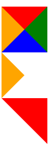
<!DOCTYPE html>
<html lang="en">
<head>
    <meta charset="UTF-8">
    <title>三角形效果</title>
    <style>
        .one {
            width: 0;
            height: 0;
            border-top: 30px solid red;
            border-right: 30px solid green;
            border-bottom: 30px solid blue;
            border-left: 30px solid orange;
        }

        .two {
            width: 0;
            height: 0;
            border-width: 30px;
            border-style: solid;
            /*不显示的边需要使用透明色隐藏,但不能省略*/
            border-color: transparent transparent transparent orange;
            font-size: 0;
            line-height: 0;
        }

        .three {
            width: 0;
            height: 0;
            border-width: 30px;
            border-style: solid;
            border-color: red red transparent transparent;
            font-size: 0;
            line-height: 0;
        }
    </style>
</head>
<body>
    <div class="one"></div>
    <div class="two"></div>
    <div class="three"></div>
</body>
</html>

 浙公网安备 33010602011771号