

伪元素before after
什么是伪元素(Pseudo element)?
伪元素不是真正的元素,不存在与文档之中,所以js无法操作他。那为什么叫他“元素”?因为我们可以对其进行跟元素几乎无差别的操作。
伪元素有哪些?
before,after,first-letter,first-line。
我们为什么需要伪元素?
伪元素是创造关于文档语言能够指定的文档树之外的抽象。例如文档语言不能提供访问元素内容第一字或者第一行的机制。伪元素允许设计师引用它们,否则这是难以办到的。伪元素还提供样式设计师给在源文档中不存在的内容分配样式(例如::before和:after能够访问产生的内容)——百度百科。
怎样表示伪元素?最好使用双冒号,防止与伪类混淆。
hey::before{
    }
hey::after{
}
before与after的用法总结
before定位的基准是其主元素的右上角,after定位的基准是主元素的结尾处。当主元素没有内容时before与after仍会正常工作,属性为inline元素,若需要设置高宽度等属性需要display:block;。
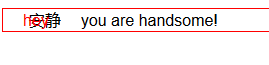
<!DOCTYPE html>
<html lang="en">
<head>
    <meta charset="UTF-8">
    <title>Document</title>
    <style>
    p{
    border:1px red solid;
    }
        p:before{content: "hey ";
        position: relative;
        left: 20px;}
        p:after{content: "you are handsome!";
        position: relative;
        left:20px;
        }
    </style>
</head>
<body>
     <p>安静!</p>
</body>
</html>
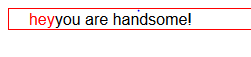
content是伪元素必需的属性,其内容可以分为几类:字符串/attr/url/counter(计算器)。若伪元素没有内容,需赋值为空格:content:' ';
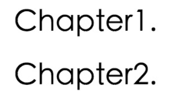
 <h2></h2>
    <h2></h2>
    <style>
        body {counter-reset:section;}
        h2:before {
            counter-increment: section;
            content: "Chapter"  counter(section) ".";
        }
    </style>
before与after的主要用途是对元素默认样式的的美化:美化时需要结合定位于内容。一般讲主元素设置为position:relative,伪元素设置为position:absolute,以方便对伪元素定位。
  a {
    position: relative;
    display: inline-block;
    outline: none;
    text-decoration: none;
    color: #000;
    font-size: 32px;
    padding: 5px 10px;
    }

    a:hover::before, a:hover::after { position: absolute; }
    a:hover::before { content: "\5B"; left: -20px; }
    a:hover::after { content: "\5D"; right:  -20px; }
更多效果点这里:这里这里
对checkbox/radio美化:
    .magic-checkbox {
          position: absolute;
          display: none;  //先隐藏真正的checkboxbox
     }
     .magic-checkbox + label {//为与checkbox搭配的label使用样式
          position: relative; //相对定位,方便其内容的伪元素进行定位
          display: block; //块元素
          padding-left: 30px;
          cursor: pointer;
          vertical-align: middle;
     }
    .magic-checkbox + label:before { //label添加:before伪元素,用于生成一个带边界的正方形,模拟复选框的轮廓
            position: absolute;
            top: 0;
            left: 0;
            display: inline-block;
            width: 20px;
            height: 20px;
            content: '';
            border: 1px solid #c0c0c0;
            border-radius: 3px;
        }
        //为checkbox添加:after伪元素,作用是生成一个√图形,模拟checkbox选中状态,未选中状态下会被隐藏
        .magic-checkbox + label:after {
              top: 2px;
              left: 7px;
              box-sizing: border-box;
              width: 6px;  //实现√图形很简单:设置一个长方形,去掉其上边界和左边界,剩下的2个边界旋转45度就得到√形状
              height: 12px;
              transform: rotate(45deg);
              border-width: 2px;
              border-style: solid;
              border-color: #fff;
              border-top: 0;
              border-left: 0;
              position: absolute;
              display: none; //√形状先隐藏
              content: '';
          }
        //单击label,隐藏的checkbox为checked状态,这时设置checked状态下搭配label的:before伪元素背景和边界颜色
         .magic-checkbox:checked + label:before {
                animation-name: none;
                border: #3e97eb;
                background: #3e97eb;
            }
        //checked状态的checkbox搭配的label伪元素:after此时设置显示,那么√就显示出来了
         .magic-checkbox:checked + label:after {
              display: block;
         }
实际效果点击:这里这里
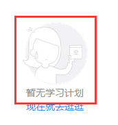
利用:after属性还可以对主元素进行批注:
   .empty__bg {
            display: inline-block;
            width: 95px;
            height: 92px;
            background: url(http://7tszky.com1.z0.glb.clouddn.com/FvD_sYY4Fmp_yKS0E07H-5jhuKTB) no-repeat;
            background-size: 95px 92px;
            position: relative;
            margin-bottom: 16px;/*注意这里需要留好位置放置after元素(它是absolute进去的)*/
        }
        .empty__bg:after {
            content: "暂无学习计划";
            display: block;
            font-size: 14px;
            line-height: 24px;
            text-align: center;
            width: 100%;
            color: #909090;
            position: absolute;
            top: 100%;
            left: 0;
        }
    }

 浙公网安备 33010602011771号