总结垂直居中的几种方法
一、line-height的值和height一致
只对文本有效(块级元素无效),文本会默认在自己行高内垂直居中。
范例如下图:
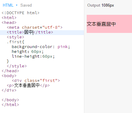
代码如下:
 1 <style>
 2  .first{
 3   background-color: pink;
 4   height:60px;
 5   line-height:60px;
 6   }
 7 </style>
 8 <div class="first">
 9   <p>文本垂直居中</p>
10 </div>
二、绝对定位垂直居中
绝对定位又分为以下三种情况:
1.有固定宽度和高度,position:absolute,父元素设为相对定位,left和top偏移50%,负margin自身宽度和高度的一半,为具体数值
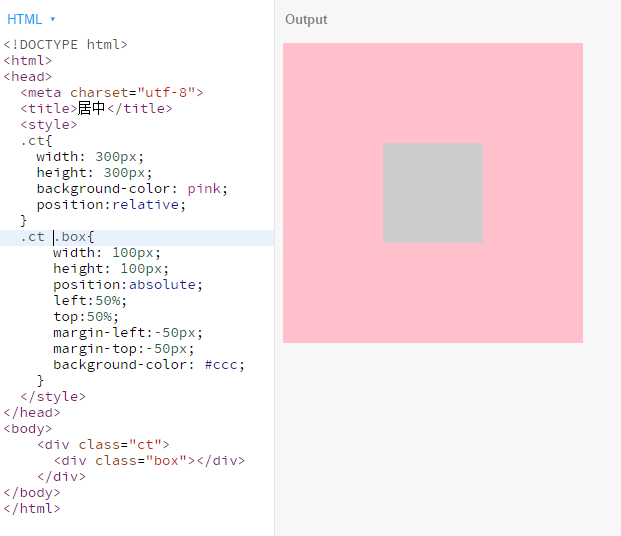
代码如下:
 1 <div class="ct">
 2    <div class="box"></div>
 3 </div>
 4 <style>
 5  .ct{
 6    width: 300px;
 7    height: 300px;
 8    background-color: pink;
 9    position:relative;
10    }
11  .ct .box{
12    width: 100px;
13    height: 100px;
14    display: inline-block;
15    position:absolute;
16    left:50%;
17    top:50%;
18    margin-left:-50px;
19    margin-top:-50px;
20    background-color: #ccc;
21    }
22 </style>
2.有固定宽度和高度的块元素,设置top:0; bottom:0; left:0; right:0; margin:auto;
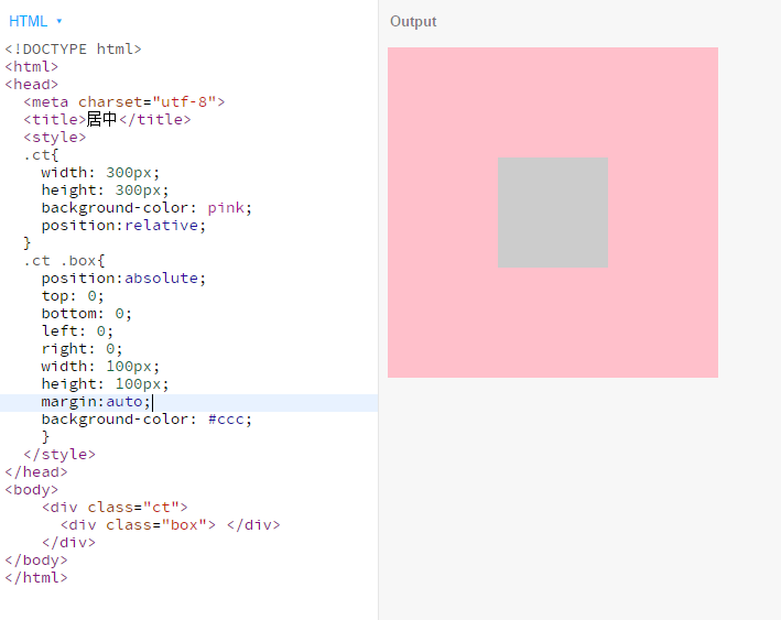
代码如下:
 1 <div class="ct">
 2    <div class="box"> </div>
 3 </div>
 4 <style>
 5   .ct{
 6     width: 300px;
 7     height: 300px;
 8     background-color: pink;
 9     position:relative;
10   }
11   .ct .box{
12     position:absolute;
13     top: 0;
14     bottom: 0;
15     left: 0;
16     right: 0;
17     width: 100px;
18     height: 100px;
19     margin:auto;
20     background-color: #ccc;
21     }
22 </style>
3.没有固定宽度和高度,position:absolute,父元素设为相对定位,left和top偏移50%,负margin自身宽度和高度的50%(不兼容ie8)
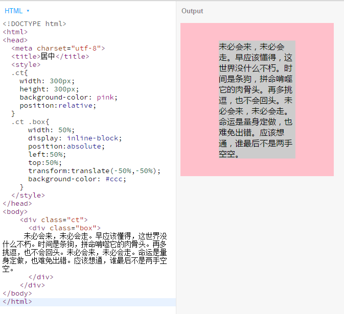
代码如下:
 1  <div class="ct">
 2     <div class="box">
 3      未必会来,未必会走。早应该懂得,这世界没什么不朽。时间是条狗,拼命啃噬它的肉骨头。再多挑逗,也不会回头。未必会来,未必会走。命运是量身定做,也难免出错。应该想通,谁最后不是两手空空。
 4     </div>
 5  </div>
 6  <style>
 7   .ct{
 8     width: 300px;
 9     height: 300px;
10     background-color: pink;
11     position:relative;
12   }
13   .ct .box{
14     width: 50%;
15     display: inline-block;
16     position:absolute;
17     left:50%;
18     top:50%;
19     transform:translate(-50%,-50%);
20     background-color: #ccc;
21     }
22 </style>
三、display:table-cell垂直居中(兼容ie8)
把元素的显示方式设置为表格table-cell,我们可以使用表格的 vertical-align属性middle来设置垂直居中(如果子元素不是img元素,可以把子元素设置为display:inline-block就可以水平居中)
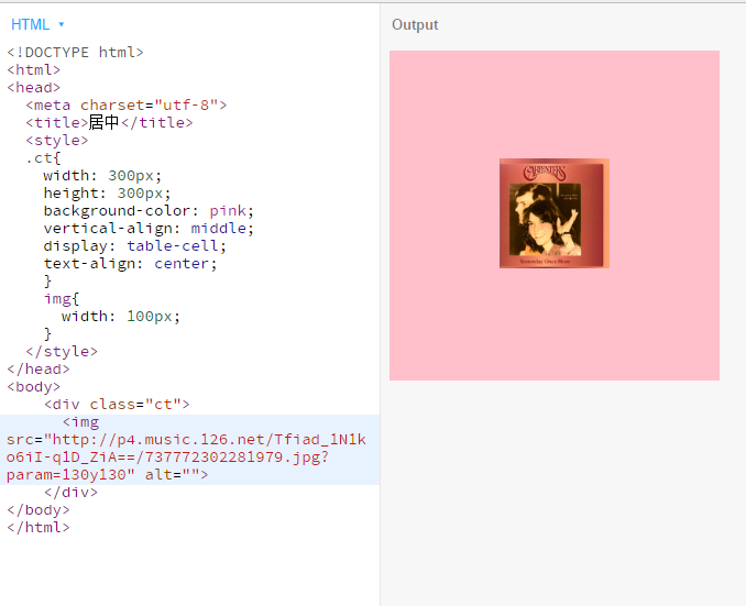
代码如下:
 1 <div class="ct">
 2   <img src="http://p4.music.126.net/Tfiad_1N1ko6iI-q1D_ZiA==/737772302281979.jpg?param=130y130" alt="">
 3 </div>
 4 <style>
 5 .ct{
 6   width: 300px;
 7   height: 300px;
 8   background-color: pink;
 9   vertical-align: middle;
10   display: table-cell;
11   text-align: center;
12   }
13 </style>
四、vertical-align:midlle垂直居中
vertical-align实现居中的元素必须是行内元素或者行内块元素,此方法是给元素添加一个行内块元素的伪类,高度设为父元素的宽度,和元素一起设为vertical-align为middle
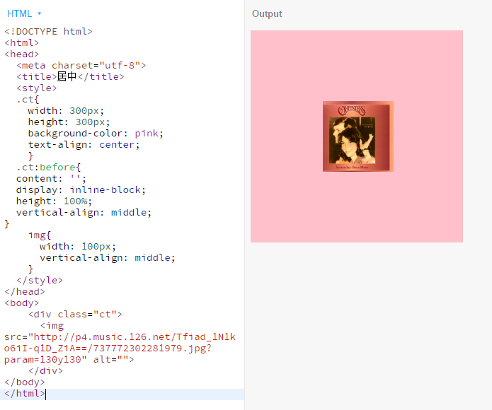
代码如下:
 1 <div class="ct">
 2    <img src="http://p4.music.126.net/Tfiad_1N1ko6iI-q1D_ZiA==/737772302281979.jpg?param=130y130" alt="">
 3 </div>
 4 <style>
 5   .ct{
 6     width: 300px;
 7     height: 300px;
 8     background-color: pink;
 9     text-align: center;
10     }
11   .ct:before{
12     content: '';
13     display: inline-block;
14     height: 100%;
15     vertical-align: middle;
16     }
17   img{
18     width: 100px;
19     vertical-align: middle;
20     }
21 </style>
五、flex垂直居中
不兼容ie8的一种方法,但却是最简便的方法,也是日后越来越普遍的一种解决方案
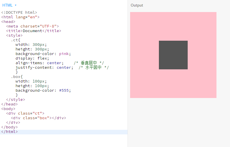
代码如下:
 1 <style>
 2   .ct{
 3     width: 300px;
 4     height: 300px;
 5     background-color: pink;
 6     display: flex;
 7     align-items: center;    /* 垂直居中 */
 8     justify-content: center;  /* 水平居中 */
 9     }
10   .box{
11     width: 100px;
12     height: 100px;
13     background-color: #555;
14     }
15 </style>
16 <body>
17   <div class="ct">
18     <div class="box"></div>
19   </div>
20 </body>
本文首发在个人博客,欢迎访问。


 浙公网安备 33010602011771号