移动端 transition动画函数的封装(仿Zepto)以及 requestAnimationFrame动画函数封装(仿jQuery)
移动端 css3 transition 动画 ,requestAnimationFrame 动画 对于性能的要求,h5优先考虑;
移动端 单页有时候 制作只用到简单的css3动画即可,我们封装一下,没必要引入zepto框架,把zepto的动画模块从Zepto 扒下来,加以改造独立;用于生产环境;下面是 Demo栗子;
上面图片对应的 js
         var leftsbox=document.getElementById("leftsbox");
	  var boxdiv=leftsbox.getElementsByTagName("div");
	  leftsbox.onclick=function(){
		   for(var i=0;i<boxdiv.length;i++){
			         var that=boxdiv[i];
			 			 transform(that,{ translate3d:'220px,10px,0',left:'1em',opacity:0.2,perspective:'400px', rotateY:'30deg'},800,'cubic-bezier(0.15, 0.5, 0.25, 1.0)',function(){
							   this.innerHTML='结束回调'+this.innerHTML;
						},100*i);
			} //for
再看看另外一种 常见的 如下图
上面对用的 js 代码
                       var nav=document.querySelector(".nav");
			var nava=nav.getElementsByTagName("li");
			var content=document.querySelector(".content");
			var ulcontent=document.getElementById("ulcontent");
			ulcontent.style.width=nav.offsetWidth*nava.length+'px';
			for(var i=0;i<nava.length;i++) {
				nava[i].index=i;
				nava[i].onclick=function(){
					var that=this;
					var now=-(that.index)*content.offsetWidth+'px';

					 transform(ulcontent,{translate3d:''+now+',0,0',},'linear',function(){
					//console.log('success   回调函数');
					})
				}//click end
			}
htm结构
 <ul class="nav">
	        <li ><a >首页</a></li>
	        <li ><a >插件</a></li>
	        <li ><a >新闻</a></li>
	        <li ><a >其他</a></li>
	    </ul>

     <div class="content">
        <ul id="ulcontent" >
        <li ><img src="../../images/1a.jpg"></li>
        <li ><img src="../../images/2a.jpg"></li>
        <li ><img src="../../images/3a.jpg"></li>
        <li style="background:#ddd;" >44444444444</li>
        </ul>
     </div>
基于zepto动画独立出来,原先zepto 动画书写方式
$("#banners").animate(
    {
        translate3d:'220px,10px,0',
		left:'1em',
		opacity:0.2,
		perspective:'400px',
		rotateY:'30deg'
    },
    800,
   'cubic-bezier(0.15, 0.5, 0.25, 1.0)',
    function(){  alert('回调'); },
   1000
)
改写后 独立与zepto的 动画函数 语法如下
transform(dom元素,{ transitionProperty:css值},transitionDuration(单位:毫秒),transitionTiming,transitionend回调,transitionDelay(单位:毫秒));
transform(dom元素,animationName,animationDuration(单位:毫秒),animationTiming,animationend回调,animationDelay(单位:毫秒));
/*
* js transfrom
* @param obj {obj}    原生dom对象
* @param properties  {json} ||string     { translate3d:'220px,10px,0',left:'1em',opacity:0.2, rotateY:'30deg'} || animationName 多个可以以逗号分割 如 'fadeIn,sliderDown';
* @param duration {number}      css3持续时间 秒 默认400毫秒
* @param ease {str}           默认linear 支持  cubic-bezier(0.42,0,1,1)写法;
* @param callback {function}    回调函数
* @param delay {number}    延迟时间

*/
/* http://www.cnblogs.com/surfaces/
    * @param properties 为  {}  或者 string     ;如果 properties= string 为animation-name
    * transform(elem, properties)
    * transform(elem, properties, ease)
    * transform(elem, properties, ease, delay)
    * transform(elem, properties, ease, callback, delay)
    * transform(elem, properties, callback)
    * transform(elem, properties, callback, delay)
    * transform(elem, properties, duration )
    * transform(elem, properties, duration, ease)
    * transform(elem, properties, duration, delay)
    * transform(elem, properties, duration, callback)
    * transform(elem, properties, duration, callback,delay)
    * transform(elem, properties, duration, ease, delay)
    * transform(elem, properties, duration, ease, callback)
    * transform(elem, properties, duration, ease, callback,delay)

    transform(elem,{translateX:'150px',left:'1em',opacity:0.2, rotateY:'40deg'},600,'linear',function(){  console.log('结束回调') },200) ;

    transform(elem, keyframesName,600,'linear',function(){  console.log('结束回调') },200) ;
*/
关于兼容性:几乎与zepto一致 ,也支持 动画帧 keyframe,个人觉得 keyframe移动端 兼容性不是很好,尤其手机自带的浏览器(原生app 调用 内嵌H5页面,小问题还是蛮多的),适合无关dom数据操作,只显示美化用;
另外,我们需要了解下 css3 transition-duration的属性写法有多种;如下
1). 过渡单个属性:
 transition-property:opacity;
transition-duration:2s;
transition-timing-function:ease-in;
transition-delay:0;
2). 过渡多个属性:
[1]. 上下一一对应型:
transition-property:opacity left;
transition-duration:2s, 4s;
transition-timing-function:ease-in;
transition-delay:0;
此时:opacity过渡时间为2s,left过渡时间为4s。
[2]. 循环对应型:
transition-property:opacity left width height;
transition-duration:2s, 4s;
transition-timing-function:ease-in;
transition-delay:0;
此时:opacity和width过渡时间为2s,left和height过渡时间为4s。
3). transition简写模式:
顺序为:transition-property transition-duration transition-timing-function transition-delay
/*单个属性:*/
-moz-transition:background 0.5s ease-out 0s;
/*多个属性:*/
-moz-transition:background, 0.5s ease-out 0s, color 0.4 ease-out 0s;
过渡持续时间
transition-duration 属性规定了一个过渡从初始状态到目标状态的持续时间。它接受以秒或毫秒的值(例如,2.3S和2300ms都是指2.3秒)。
尽管规范明确规定了过渡值必须为正数,但 Opera 仍接受-5S的值,至少对于getComputedStyle()来说是这样的。虽然规范中并没有限制属性值的大小,但 Opera 和 IE 不接受低于10ms的值。而 WebKit 在 getComputedStyle()执行中有个小bug,例如:返回值0.009999999776482582s会取代0.01s。
过渡延迟时间
transition-delay 属性规定了在执行一个过渡之前的等待时间,同样使用值。Delay 可以是负值,但这会导致动画无法平滑过渡。
IE 和 Opera 不接受 transition-duration 在-10ms和10ms之间的值。WebKit 的 floating point 也会在这儿出现。
http://www.cnblogs.com/surfaces/
另外属性相似点 animation-name:keyfrmaes1,keyfrmaes2;以逗号分割;
其他的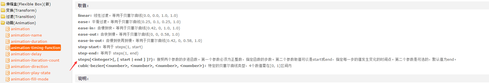
zepto核心动画但是实现了大部分常用的动画;在阅读器zepto核心动画源码的 时候,自己手动封装 实践;就机会发现 看似读懂其实不懂;自己正真封装调试后;才发现哪些巧;
封装后的 transform.js 源码如下
参数说明
/*
* js transfrom
* @param obj {obj}    原生dom对象
* @param properties  {json} || string     { translate3d:'220px,10px,0',left:'1em',opacity:0.2,perspective:'400px', rotateY:'30deg'} ||animation-name
* @param duration {number}      css3持续时间 秒 默认400毫秒
* @param ease {str}         transition-timing-function  默认linear 支持  cubic-bezier(0.42,0,1,1)写法;
* @param callback {function}    回调函数
* @param delay {number}    延迟时间

*/
使用方法
   /* http://www.cnblogs.com/surfaces/
    * @param properties 为  {}  或者 string     ;如果 properties= string 为animation-name
    * transform(elem, properties)
    * transform(elem, properties, ease)
    * transform(elem, properties, ease, delay)
    * transform(elem, properties, ease, callback, delay)
    * transform(elem, properties, callback)
    * transform(elem, properties, callback, delay)
    * transform(elem, properties, duration )
    * transform(elem, properties, duration, ease)
    * transform(elem, properties, duration, delay)
    * transform(elem, properties, duration, callback)
    * transform(elem, properties, duration, callback,delay)
    * transform(elem, properties, duration, ease, delay)
    * transform(elem, properties, duration, ease, callback)
    * transform(elem, properties, duration, ease, callback,delay)

    transform(elem,{translateX:'150px',left:'1em',opacity:0.2,perspective:'400px', rotateY:'40deg'},600,'linear',function(){  console.log('结束回调') },200) ;
    transform(elem, keyframesName,600,'linear',function(){  console.log('结束回调') },200) ;
*/
移动端 transform.js 源码如下;双击直接复制即可;
;(function(window,document,undefined){var prefix=function(){var div=document.createElement("div");var cssText="-webkit-transition:all .1s;-moz-transition:all .1s; -Khtml-transition:all .1s; -o-transition:all .1s; -ms-transition:all .1s; transition:all .1s;";div.style.cssText=cssText;var style=div.style;var dom="";if(style.webkitTransition){dom="webkit"}else{if(style.MozTransition){dom="moz"}else{if(style.khtmlTransition){dom="Khtml"}else{if(style.oTransition){dom="o"}else{if(style.msTransition){dom="ms"}}}}}div=null;if(dom){return{dom:dom,lowercase:dom,css:"-"+dom+"-",js:dom[0].toUpperCase()+dom.substr(1)}}else{return false}}();var transitionEnd=function(){var el=document.createElement("div");var transEndEventNames={WebkitTransition:"webkitTransitionEnd",MozTransition:"transitionend",OTransition:"oTransitionEnd",msTransition:"MSTransitionEnd",transition:"transitionend"};for(var name in transEndEventNames){if(el.style[name]!==undefined){return transEndEventNames[name]}}el=null;return false}();var animationEnd=(function(){var eleStyle=document.createElement("div").style;var verdors=["a","webkitA","MozA","OA","msA"];var endEvents=["animationend","webkitAnimationEnd","animationend","oAnimationEnd","MSAnimationEnd"];var animation;for(var i=0,len=verdors.length;i<len;i++){animation=verdors[i]+"nimation";if(animation in eleStyle){return endEvents[i]}}return"animationend"}());var supportedTransforms=/^((translate|rotate|scale)(X|Y|Z|3d)?|matrix(3d)?|perspective|skew(X|Y)?)$/i;var dasherize=function(str){return str.replace(/::/g,"/").replace(/([A-Z]+)([A-Z][a-z])/g,"$1_$2").replace(/([a-z\d])([A-Z])/g,"$1_$2").replace(/_/g,"-").toLowerCase()};function transform(obj,properties,duration,ease,callback,delay){if(!obj){return}if(typeof duration=="undefined"){duration=400;ease="linear";callback=undefined;delay=undefined}if(typeof duration=="string"){if(typeof ease=="number"){delay=ease;callback=undefined}if(typeof ease=="function"){delay=callback;callback=ease}ease=duration;duration=400}else{if(typeof duration=="function"){if(typeof ease=="number"){delay=ease}callback=duration;duration=400;ease="linear"}else{if(typeof duration=="number"){if(typeof ease=="undefined"){ease="linear"}else{if(typeof ease=="string"){ease=ease}else{if(typeof ease=="function"){if(typeof callback=="number"){delay=callback}callback=ease;ease="linear"}else{if(typeof ease=="number"){delay=ease;ease="linear"}}}}if(typeof callback=="number"){delay=callback;callback=undefined}}}}delay=(typeof delay=="number")?delay:0;var endEvent=transitionEnd;var nowTransition=prefix.js+"Transition";var nowTransform=prefix.js+"Transform";var prefixcss=prefix.css;if(!prefix.js){nowTransition="transition";nowTransform="transform";prefixcss=""}var transitionProperty,transitionDuration,transitionTiming,transitionDelay;var animationName,animationDuration,animationTiming,animationDelay;var key,cssValues={},cssProperties,transforms="";var transform;var cssReset={};var css="";var cssProperties=[];transform=prefixcss+"transform";cssReset[transitionProperty=prefixcss+"transition-property"]=cssReset[transitionDuration=prefixcss+"transition-duration"]=cssReset[transitionTiming=prefixcss+"transition-timing-function"]=cssReset[transitionDelay=prefixcss+"transition-delay"]=cssReset[animationName=prefixcss+"animation-name"]=cssReset[animationDuration=prefixcss+"animation-duration"]=cssReset[animationTiming=prefixcss+"animation-timing-function"]=cssReset[animationDelay=prefixcss+"animation-delay"]="";if(typeof properties=="string"){cssValues[animationName]=properties;cssValues[animationDuration]=duration+"ms";cssValues[animationTiming]=(ease||"linear");cssValues[animationDelay]=(delay)+"ms";endEvent=animationEnd}else{endEvent=transitionEnd;for(key in properties){if(supportedTransforms.test(key)){transforms+=key+"("+properties[key]+") "}else{cssValues[key]=properties[key],cssProperties.push(dasherize(key))}}if(transforms){cssValues[transform]=transforms,cssProperties.push(transform)}if(duration>0&&typeof properties==="object"){cssValues[transitionProperty]=cssProperties.join(", ");cssValues[transitionDuration]=duration+"ms";cssValues[transitionTiming]=(ease||"linear");cssValues[transitionDelay]=(delay)+"ms"}}for(var attr in cssValues){css+=dasherize(attr)+":"+cssValues[attr]+";"}obj.style.cssText=obj.style.cssText+";"+css;obj.clientLeft;if(!callback){return}var fired=false;var handler=function(event){if(typeof event!=="undefined"){if(event.target!==event.currentTarget){fired=true;return}}callback&&callback.apply(obj,arguments);fired=true;obj.removeEventListener(endEvent,arguments.callee,false)};if(obj.addEventListener){obj.addEventListener(endEvent,handler,false)}if(!endEvent||duration<=0){setTimeout(function(){handler()});return}setTimeout(function(){if(fired){return}handler()},parseInt((duration+delay)+25))}window.transform=transform})(window,document);
部分示例 使用代码
<style>
*{ margin:0; padding:0;}
ul,li{ list-style:none; margin:0; padding:0;}
html{-webkit-touch-callout:none;-webkit-user-select:none;-webkit-text-size-adjust:100%;-webkit-tap-highlight-color:transparent; font-size:62.5%; }
body{ font-size:14px;}
#leftsbox{ width:88%; height:auto; overflow:hidden; border:2px solid red; margin:0 auto; padding:30px 0;}
#leftsbox div{ width:80px; height:80px; background:#6C6; margin-bottom:10px; position:relative; left:0; backface-visibility:hidden;
-webkit-animation-fill-mode:forwards;
animation-fill-mode:forwards;
}
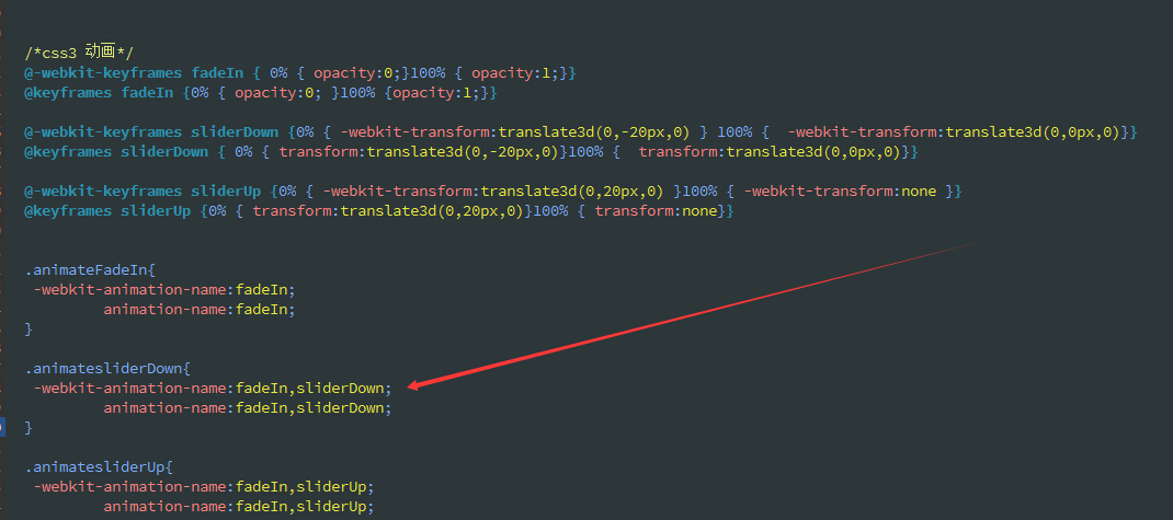
@keyframes keyframesName{
0%{ transform:translateX(0)}
100%{transform:translateX(600px) }
}
@-webkit-keyframes keyframesName{
0%{ -webkit-transform:translateX(0)}
100%{-webkit-transform:translateX(600px) }
}
</style>
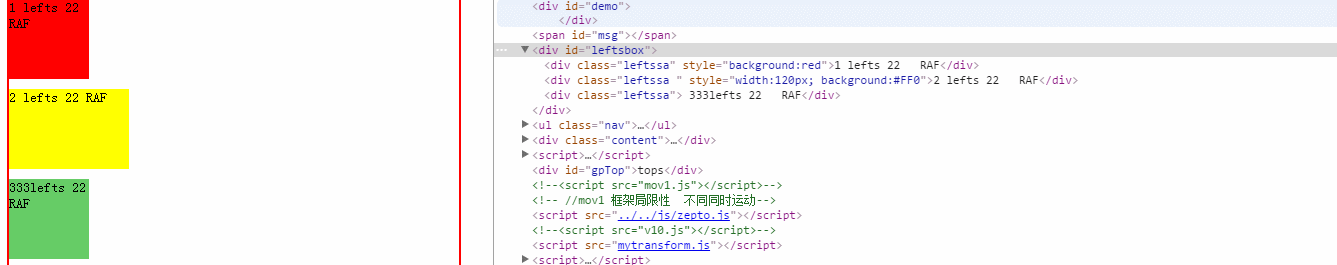
<div id="leftsbox">
<div class="leftssa" style="background:red">1 lefts 22 RAF</div>
<div class="leftssa " style="width:120px; background:#FF0">2 lefts 22 RAF</div>
<div class="leftssa"> 333lefts 22 RAF</div>
</div>
<script>
var leftsbox=document.getElementById("leftsbox");
var boxdiv=leftsbox.getElementsByTagName("div");
leftsbox.onclick=function(e){
for(var i=0;i<boxdiv.length;i++){
var that=boxdiv[i];
// transform(that,{ translate3d:'220px,10px,0',left:'1em',opacity:0.2,perspective:'400px', width:'200px', rotateY:'30deg'},800,'cubic-bezier(0.15, 0.5, 0.25, 1.0)',function(){
// this.innerHTML='结束回调'+this.innerHTML;
// },1000*i);
/* properties json(css3 属性) 或者 string(css3动画名称)
* transform(elem, properties)
* transform(elem, properties, ease)
* transform(elem, properties, ease, delay)
* transform(elem, properties, ease, callback, delay)
* transform(elem, properties, callback)
* transform(elem, properties, callback, delay)
* transform(elem, properties, duration )
* transform(elem, properties, duration, ease)
* transform(elem, properties, duration, delay)
* transform(elem, properties, duration, callback)
* transform(elem, properties, duration, callback,delay)
* transform(elem, properties, duration, ease, delay)
* transform(elem, properties, duration, ease, callback)
* transform(elem, properties, duration, ease, callback,delay)
*/
//测试 properties为 keyframes
var keyframes='keyframesName';
//transform(that, keyframes)
//transform(that, keyframes,'ease')
//transform(that, keyframes,'ease',1000*i)
//transform(that, keyframes,'ease',function(){ this.innerHTML='结束回调'+this.innerHTML;},1000*i)
//transform(that, keyframes,function(){ this.innerHTML='结束回调'+this.innerHTML;})
//transform(that, keyframes,function(){ this.innerHTML='结束回调'+this.innerHTML;},1000*i)
//transform(that, keyframes,600)
//transform(that, keyframes,600,ease')
//transform(that, keyframes,600,1000*i) ;
//transform(that, keyframes,600,function(){ this.innerHTML='结束回调'+this.innerHTML;}) ;
//transform(that, keyframes,600,function(){ this.innerHTML='结束回调'+this.innerHTML;},1000*i) ;
//transform(that, keyframes,600,'ease',1000*i)
// transform(that, keyframes,600,'ease',function(){ this.innerHTML='结束回调'+this.innerHTML;}) ;
// transform(that, keyframes,600,function(){ this.innerHTML='结束回调'+this.innerHTML;},1020*i) ;
// transform(that, keyframes,600,function(){ this.innerHTML='结束回调'+this.innerHTML;},-20*i) ; //css3 animation-delay 支持负数 直接进入到时间点
//测试 properties为 Json
var json={translate3d:'600px,10px,0',left:'1em',opacity:0.2,perspective:'400px', width:'200px', rotateY:'30deg'}
//transform(that,json);
// transform(that, json,'ease')
//transform(that, json,'ease',1000*i)
//transform(that, json,'ease',function(){ this.innerHTML='结束回调'+this.innerHTML;},1000*i)
//transform(that, json,function(){ this.innerHTML='结束回调'+this.innerHTML;})
//transform(that, json,function(){ this.innerHTML='结束回调'+this.innerHTML;},1000*i)
//transform(that, json,600)
//transform(that, json,600,'ease')
//transform(that, json,600,1000*i) ;
//transform(that, json,600,function(){ this.innerHTML='结束回调'+this.innerHTML;}) ;
// transform(that, json,600,function(){ this.innerHTML='结束回调'+this.innerHTML;},1000*i) ;
//transform(that, json,600,'ease',1000*i)
//transform(that, json,600,'ease',function(){ this.innerHTML='结束回调'+this.innerHTML;}) ;
transform(that, json,600,'ease',function(){ this.innerHTML='结束回调'+this.innerHTML;},1000*i) ;
//transform(that, json,600,'ease',function(){ this.innerHTML='结束回调'+this.innerHTML;},-100*i) ; ////css3 transition-delay 支持负数 直接进入到时间点
} //for end
}
</script>
唯一的缺点 scrollTop 缓动不支持; 这里有个简易的 函数 类似jquery 语法几乎一样 基于时间 算法 使用 requestAnimationFrame
先看效果

相关布局
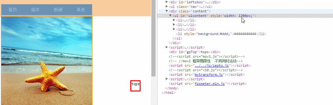
<ul id="inner" >
        <li><a class="on" >护肤</a></li>
        <li><a >彩妆</a></li>
        <li><a >洗护</a></li>
        <li><a >套装</a></li>
    </ul>

     <ul class="uls" id="uls">
        <li id='li1'></li>
         <li id='li12'></li>
         <li id='li3'></li>

 </ul>


 <div class="box22">
 <div class="boxs">1111111111111111111111111111111111</div>
  <div class="boxs">22222222222222222222222222222</div>

   <div class="boxs">33333333333333333333333</div>
  <div class="boxs" style="height:100px;">4444444444444444444最后一个 </div>
 </div>


 <div id="gpTop">tops</div>
上图相关js
  document.getElementById("gpTop").onclick=function(e){
              var  that=this;
                 startMove(that,{"scrollTop":0},function(){
                    that.innerHTML='到顶了';
                     });  //width: 206px; height: 101px; opacity: 0.3;
                }


                var inner=document.getElementById("inner");
                var inlione=inner.getElementsByTagName("li");
                var box=document.querySelectorAll(".boxs");

                for(var i=0;i<inlione.length;i++) {
                 inlione[i].index=i;
                 inlione[i].onclick=function(e){
                 var that=this;
                // console.log(that.index);
                 var box2=box[that.index];
                 var nowTop=getOffest(box2).top;
                // console.log(nowTop);

                  animate(window,{"scrollTop":nowTop},function(){
                    //console.log('success');
                    });
           }

        }
如果通过原生js 获取 jquey的offset().top 的值呢 如下 这里
var getOffest=function (obj){
var top=0,left=0;
if(obj){
 while(obj.offsetParent){
      top += obj.offsetTop;
      left += obj.offsetLeft;
      obj = obj.offsetParent;
   }
 }

  return{
  top : top,
  left : left
  }
}
animate.js基于 requestAnimationFrame 兼容ie8+ (单位px 未做rem 兼容处理 ,没有jquery的 stop()处理)
语法如下
animate(dom元素,{"left":1300,"opacity":90},持续时间(毫秒),缓动形式(tween函数),回调函数);
			  animate(element,{"left":1300,"opacity":90},2000,'easeOut',function sa(){
			  console.log('回调函数');
			 });
为什么要用 requestAnimationFrame 。
浏览器可以优化并行的动画动作,更合理的重新排列动作序列,并把能够合并的动作放在一个渲染周期内完成,从而呈现出更流畅的动画效果。比如,通过requestAnimationFrame(),JS动画能够和CSS动画/变换或SVG SMIL动画同步发生。另外,如果在一个浏览器标签页里运行一个动画,当这个标签页不可见时,浏览器会暂停它,这会减少CPU,内存的压力,节省电池电量。
相信日后 requestAnimationFrame 在移动端发展的前景是相当不错的,目前安卓上感觉还是有点丢帧。抖动明显;
requestAnimationFrame 一个简单的例子
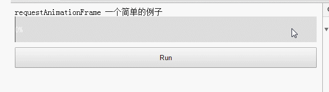
var start = null;
var ele = document.getElementById("j_precent");
var progress = 0;

function step() {
    progress += 1;
    ele.style.width = progress + "%";
    ele.innerHTML=progress + "%";
    if (progress < 100) {
        requestAnimationFrame(step);
    }
}

document.getElementById("btn_run").addEventListener("click", function() {
    ele.style.width = "1px";
    progress = 0;
     step()
}, false);
如下 jQuery1.6.2还用 requestAnimationFrame;
// Start an animation from one number to another
custom: function( from, to, unit ) {
    var self = this,
        fx = jQuery.fx,
        raf;

    this.startTime = fxNow || createFxNow();
    this.start = from;
    this.end = to;
    this.unit = unit || this.unit || ( jQuery.cssNumber[ this.prop ] ? "" : "px" );
    this.now = this.start;
    this.pos = this.state = 0;

    function t( gotoEnd ) {
        return self.step(gotoEnd);
    }

    t.elem = this.elem;

    if ( t() && jQuery.timers.push(t) && !timerId ) {
        // Use requestAnimationFrame instead of setInterval if available
        if ( requestAnimationFrame ) {
            timerId = true;
            raf = function() {
                // When timerId gets set to null at any point, this stops
                if ( timerId ) {
                    requestAnimationFrame( raf );
                    fx.tick();
                }
            };
            requestAnimationFrame( raf );
        } else {
            timerId = setInterval( fx.tick, fx.interval );
        }
    }
},
http://stackoverflow.com/questions/7999680/why-doesnt-jquery-use-requestanimationframe
为啥jquery 放弃,上面说的比较完善;
animate源码如下
;(function() {

  var lastTime = 0;
  var vendors = ['ms', 'moz', 'webkit', 'o'];

  for(var x = 0; x < vendors.length && !window.requestAnimationFrame; ++x) {
    window.requestAnimationFrame = window[vendors[x]+'RequestAnimationFrame'];
    window.cancelAnimationFrame = window[vendors[x]+'CancelAnimationFrame'] || window[vendors[x]+'CancelRequestAnimationFrame'];
  }

  if (!window.requestAnimationFrame) {
    window.requestAnimationFrame = function(callback, element) {
      var currTime = new Date().getTime();
      var timeToCall = Math.max(0, 16 - (currTime - lastTime));
      var id = window.setTimeout(function() { callback(currTime + timeToCall); },
        timeToCall);
      lastTime = currTime + timeToCall;
      return id;
    };
  }

  if (!window.cancelAnimationFrame) {
    window.cancelAnimationFrame = function(id) {
      clearTimeout(id);
    };
  }

}());

var getStyle=function (obj,attr){
    return obj.currentStyle ? obj.currentStyle[attr]:getComputedStyle(obj)[attr];
}

var Tween = {
    linear: function (t, b, c, d){  //匀速
        return c*t/d + b;
    },
    easeIn: function(t, b, c, d){  //加速曲线
        return c*(t/=d)*t + b;
    },
    easeOut: function(t, b, c, d){  //减速曲线
        return -c *(t/=d)*(t-2) + b;
    },
    easeBoth: function(t, b, c, d){  //加速减速曲线
        if ((t/=d/2) < 1) {
            return c/2*t*t + b;
        }
        return -c/2 * ((--t)*(t-2) - 1) + b;
    },
    easeInStrong: function(t, b, c, d){  //加加速曲线
        return c*(t/=d)*t*t*t + b;
    },
    easeOutStrong: function(t, b, c, d){  //减减速曲线
        return -c * ((t=t/d-1)*t*t*t - 1) + b;
    },
    easeBothStrong: function(t, b, c, d){  //加加速减减速曲线
        if ((t/=d/2) < 1) {
            return c/2*t*t*t*t + b;
        }
        return -c/2 * ((t-=2)*t*t*t - 2) + b;
    },
    elasticIn: function(t, b, c, d, a, p){  //正弦衰减曲线(弹动渐入)
        if (t === 0) {
            return b;
        }
        if ( (t /= d) == 1 ) {
            return b+c;
        }
        if (!p) {
            p=d*0.3;
        }
        if (!a || a < Math.abs(c)) {
            a = c;
            var s = p/4;
        } else {
            var s = p/(2*Math.PI) * Math.asin (c/a);
        }
        return -(a*Math.pow(2,10*(t-=1)) * Math.sin( (t*d-s)*(2*Math.PI)/p )) + b;
    },
    elasticOut: function(t, b, c, d, a, p){    //正弦增强曲线(弹动渐出)
        if (t === 0) {
            return b;
        }
        if ( (t /= d) == 1 ) {
            return b+c;
        }
        if (!p) {
            p=d*0.3;
        }
        if (!a || a < Math.abs(c)) {
            a = c;
            var s = p / 4;
        } else {
            var s = p/(2*Math.PI) * Math.asin (c/a);
        }
        return a*Math.pow(2,-10*t) * Math.sin( (t*d-s)*(2*Math.PI)/p ) + c + b;
    },
    elasticBoth: function(t, b, c, d, a, p){
        if (t === 0) {
            return b;
        }
        if ( (t /= d/2) == 2 ) {
            return b+c;
        }
        if (!p) {
            p = d*(0.3*1.5);
        }
        if ( !a || a < Math.abs(c) ) {
            a = c;
            var s = p/4;
        }
        else {
            var s = p/(2*Math.PI) * Math.asin (c/a);
        }
        if (t < 1) {
            return - 0.5*(a*Math.pow(2,10*(t-=1)) *
                    Math.sin( (t*d-s)*(2*Math.PI)/p )) + b;
        }
        return a*Math.pow(2,-10*(t-=1)) *
                Math.sin( (t*d-s)*(2*Math.PI)/p )*0.5 + c + b;
    }
}


function animate(obj,json,times,fx,fn){

    if( typeof times == 'undefined' ){
        times = 400;
        fx = 'linear';
    }

    if( typeof times == 'string' ){
        if(typeof fx == 'function'){
            fn = fx;
        }
        fx = times;
        times = 400;
    }
    else if(typeof times == 'function'){
        fn = times;
        times = 400;
        fx = 'linear';
    }
    else if(typeof times == 'number'){
        if(typeof fx == 'function'){
            fn = fx;
            fx = 'linear';
        }
        else if(typeof fx == 'undefined'){
            fx = 'linear';
        }
    }


    var iCur = {};
    var startTime = +new Date();

    for(var attr in json){
        iCur[attr] = 0;

        if( attr == 'opacity' ){
            if(Math.round(getStyle(obj,attr)*100) == 0){
                iCur[attr] = 0;
            }
            else{
                iCur[attr] = Math.round(getStyle(obj,attr)*100) || 100;
            }
        }
        else if(attr == 'scrollTop' ){
                 iCur[attr]=window.scrollY||document.documentElement.scrollTop || window.pageYOffset || document.body.scrollTop;;
            }
        else{
            iCur[attr] = parseInt(getStyle(obj,attr)) || 0;
        }

    }


        if(obj.timer){
        cancelAnimationFrame(obj.timer)
        }
        //obj.timer=null;

    function update(){

        var changeTime = +new Date();
        var scale = 1 - Math.max(0,startTime - changeTime + times)/times;

        for(var attr in json){

            var value = Tween[fx](scale*times, iCur[attr] , json[attr] - iCur[attr] , times );

            if(attr == 'opacity'){
                obj.style.filter = 'alpha(opacity='+ value +')';
                obj.style.opacity = value/100;
            }else if(attr == 'scrollTop'){
                 window.scrollTo(0, value);
           }else{
                obj.style[attr] = value + 'px';
            }

        }

        if(scale == 1){
                cancelAnimationFrame(obj.timer);
                 fn&&fn.apply(this, arguments);
        }else{
             //setup_fps_meters();
            obj.timer=requestAnimationFrame(arguments.callee);
            }

   }//update  end
   //    requestAnimationFrame(update);  //某些时候 画的过快  有bug
    update();

}
Tween.js
/*

* t : time 已过时间
* b : begin 起始值
* c : count 总的运动值
* d : duration 持续时间
* */

//Tween.linear();
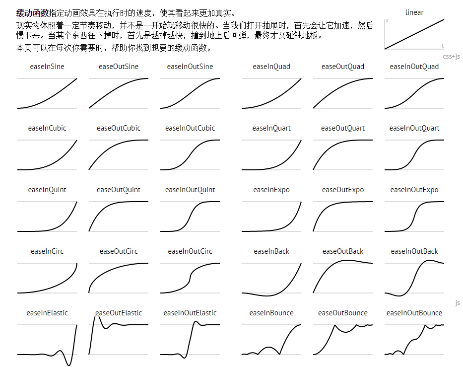
css cubic-bezier 缓动备份查看 注意点:x1,x2,y1,y2的值范围在[0, 1]。
var easingMap = {
  "linear": [0.250, 0.250, 0.750, 0.750],
  "ease": [0.250, 0.100, 0.250, 1.000],
  "easeIn": [0.420, 0.000, 1.000, 1.000],
  "easeOut": [0.000, 0.000, 0.580, 1.000],
  "easeInOut": [0.420, 0.000, 0.580, 1.000],
  "easeInQuad": [0.550, 0.085, 0.680, 0.530],
  "easeInCubic": [0.550, 0.055, 0.675, 0.190],
  "easeInQuart": [0.895, 0.030, 0.685, 0.220],
  "easeInQuint": [0.755, 0.050, 0.855, 0.060],
  "easeInSine": [0.470, 0.000, 0.745, 0.715],
  "easeInExpo": [0.950, 0.050, 0.795, 0.035],
  "easeInCirc": [0.600, 0.040, 0.980, 0.335],
  "easeInBack": [0.600, -0.280, 0.735, 0.045],
  "easeOutQuad": [0.250, 0.460, 0.450, 0.940],
  "easeOutCubic": [0.215, 0.610, 0.355, 1.000],
  "easeOutQuart": [0.165, 0.840, 0.440, 1.000],
  "easeOutQuint": [0.230, 1.000, 0.320, 1.000],
  "easeOutSine": [0.390, 0.575, 0.565, 1.000],
  "easeOutExpo": [0.190, 1.000, 0.220, 1.000],
  "easeOutCirc": [0.075, 0.820, 0.165, 1.000],
  "easeOutBack": [0.175, 0.885, 0.320, 1.275],
  "easeInOutQuad": [0.455, 0.030, 0.515, 0.955],
  "easeInOutCubic": [0.645, 0.045, 0.355, 1.000],
  "easeInOutQuart": [0.770, 0.000, 0.175, 1.000],
  "easeInOutQuint": [0.860, 0.000, 0.070, 1.000],
  "easeInOutSine": [0.445, 0.050, 0.550, 0.950],
  "easeInOutExpo": [1.000, 0.000, 0.000, 1.000],
  "easeInOutCirc": [0.785, 0.135, 0.150, 0.860],
  "easeInOutBack": [0.680, -0.550, 0.265, 1.550],
  "custom": [0.000, 0.350, 0.500, 1.300],
  "random": [Math.random().toFixed(3),
      Math.random().toFixed(3),
      Math.random().toFixed(3),
      Math.random().toFixed(3)]
    }
This curve contains values out of range. But fear not young padawan! Just use cubic-bezier(.25,.1,.39,1) as well for Webkit until the bug #45761 fix propagates to Safari.
接近ios 原生 的切换 cubic-bezier(0.42, 0, 0.58, 1.0)
http://www.cnblogs.com/surfaces/
 // transform兼容
    function preTransform() {
        var cssPrefix,
        vendors = {
          '': '',
          Webkit: 'webkit',
          Moz: '',
          O: 'o',
          ms: 'ms'
        },
        testEle = document.createElement('p'),
        cssSupport = {};

         // 嗅探特性
        Object.keys(vendors).some(function(vendor) {
            if (testEle.style[vendor + (vendor ? 'T' : 't') + 'ransform'] !== undefined) {
              cssPrefix = vendor ? '-' + vendor.toLowerCase() + '-' : '';
              return true;
            }
        });

      function normalizeCss(name) {
        name = name.toLowerCase();
        return cssPrefix ? cssPrefix + name : name;
      }

      cssSupport = {
        transform: normalizeCss('Transform'),
      }

      return cssSupport.transform;
    }
}());
使用tween 单独的 , easeIn1 自定义的,
var easeIn1= Tween.easeIn=function(t, b, c, d){  //加速曲线
        return c*(t/=d)*t + b;
    }
https://stackoverflow.com/questions/8917921/cross-browser-javascript-not-jquery-scroll-to-top-animation/16136789#16136789
document.getElementById("asdad").onclick = function() {
					function easeInOutQuad(t, b, c, d) {
						t /= d / 2;
						if (t < 1) return c / 2 * t * t + b;
						t--;
						return -c / 2 * (t * (t - 2) - 1) + b;
					};

					function easeIn1(currentTime, start, change, duration) {
						currentTime /= duration / 2;
						if (currentTime < 1) {
							return change / 2 * currentTime * currentTime + start;
						}
						currentTime -= 1;
						return -change / 2 * (currentTime * (currentTime - 2) - 1) + start;
					}
					console.log("body goTop", document.scrollingElement.scrollTop)
					//  scrollTo(document.scrollingElement, 0, 1250,easeIn1);
					scrollTo(document.scrollingElement, 100, 1250, easeIn1);
				}


				function scrollTo(element, to, duration, easefn) {
					var start = element.scrollTop,
						change = to - start,
						increment = 20;
					var easefn = easefn
					//console.log(start,document.body.scrollTop,easefn===easeInOut,"easefn",typeof easefn)
					var animateScroll = function(elapsedTime) {
						elapsedTime += increment;
						var position = easefn(elapsedTime, start, change, duration);
						element.scrollTop = position;
						if (elapsedTime < duration) {
							setTimeout(function() {
								animateScroll(elapsedTime);
							}, increment);
						}
					};

					animateScroll(0);
				}
示例
<!DOCTYPE HTML>
<html>
<head>
<meta http-equiv="Content-Type" content="text/html; charset=utf-8">
<meta name="viewport" content="initial-scale=1.0,user-scalable=no,maximum-scale=1,width=device-width" />
<title>scrollAnimate</title>
</head>
<style>
* {
margin: 0;
padding: 0;
}
ul,
li {
margin: 0;
padding: 0;
list-style: none;
}
.scroll-box {
background-color: #EEEEEE;
border: 1px solid red;
height: 500px;
overflow-y: hidden;
touch-action: pan-y;
;
}
.scroll-box p {
min-height: 50px;
;
}
.scroll-box p:nth-child(odd) {
background-color: #999;
}
</style>
<body>
<p style="margin: 20px auto; text-align: center;">------ -------start- <button
id="j_dom">点击观察</button>-----------------</p>
<div class="scroll-box " id="j_target" style="width: 80%; height: 400px;; margin: 0 auto;">
<p style="height: 100px;background-color: red;;">111111111111111</p>
<p>22222</p>
<p style="height: 600px;background-color: #ddd;;">33</p>
<p>44</p>
<p style="height: 100px; background-color: red;">55</p>
</div>
<p style="margin: 20px auto; text-align: center;">------ -------end------------------</p>
<script>
window.onload = function() {
function getArrlist(len, height) {
var strHtml = ""
var len = 500;
var height = 100;
for (var i = 0; i < len; i++) {
var str = '';
if (i == 0) {
str = "开始"
} else
if (i == len - 1) {
str = "最后"
} else {
str = i
}
strHtml += '<p index="' + i + '">' + str + '</p>'
}
return strHtml;
}
function moveTo(element, start, to, prop, duration, easing, endFn, stepFn) {
var prop = prop;
var start = start || 0;
var change = to - start;
var duration = duration;
var easeInOut = easing;
var increment = 13;
console.log("moveTo", start, "easefn", easeInOut)
var animateScroll = function(elapsedTime) {
elapsedTime += increment;
var value = easeInOut(elapsedTime, start, change, duration);
element.style[prop] = value + 'px';
stepFn && stepFn.call(this, value);
if (elapsedTime < duration) {
setTimeout(function() {
animateScroll(elapsedTime);
}, increment);
} else {
element.style[prop] = to + 'px';
endFn && endFn.call(this, value);
}
};
animateScroll(0);
}
function scrollAnimate(element, start, to, prop, duration, easing, endFn, stepFn) {
var prop = prop;
var start = start || 0;
var change = parseInt(to - start)
var duration = duration;
var easeInOut = easing;
var startTime = (+new Date);
//var currentY= parseInt(element.scrollTop);
console.log("scrollAnimate", start, "easefn", easeInOut)
step();
//结束时间的计算
function step() {
var changeTime = +new Date();
var scale = 1 - Math.max(0, startTime - changeTime + duration) / duration;
var value = easeInOut(scale * duration, start, change, duration);
// var easingFunc = BezierEasing(.42, 0, 1, 1);
// var percent = easingFunc(scale);
// var value = start + to * percent;
//console.log("scrollAnimate", scale, "percent", percent)
// var value = Tween[easing](scale*duration,targetY,change,duration);
//var value = easeInOut(scale * duration, start, change, duration);
//console.log("scale",scale,"已过时间",(changeTime-startTime),"总时间",duration,"已过时间百分比",(changeTime-startTime)/duration,'change距离',change)
// console.log(value,"scale",scale,"已过时间百分比",(changeTime-startTime)/duration,'change距离',change)
//得到新的坐标值后我们继续通过left/top或者transform来完成计算就可以了
element.style[prop] = value + 'px';
stepFn && stepFn.call(this, value);
if (scale == 1) {
// console.log("运动结束");
cancelAnimationFrame(element.timer);
endFn && endFn.call(this, value);
return;
} else {
element.timer = requestAnimationFrame(step);
}
}
//https://github.com/alvarotrigo/fullPage.js/blob/master/src/fullpage.js
}
function easeInOutQuad(t, b, c, d) {
t /= d / 2;
if (t < 1) return c / 2 * t * t + b;
t--;
return -c / 2 * (t * (t - 2) - 1) + b;
};
var j_target = document.getElementById("j_target");
var j_dom = document.getElementById("j_dom")
j_target.innerHTML = getArrlist();
j_target.scrollTop = 100;
j_dom.addEventListener("click", function() {
console.log("click ", j_target);
//scrollAnimate(element, start, to, prop, duration, easing, endFn, stepFn)
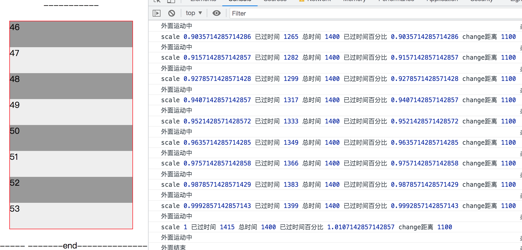
scrollAnimate(j_target, 0, 1200, "scrollTop", 1400, easeInOutQuad, function() {
//console.log("外面运动中");
}, function(val) {
j_target.scrollTop = val;
console.log("外面运动中");
})
return false;
})
}
</script>
<script>
</script>
</body>
BezierEasing 开源库
/**
 * https://github.com/gre/bezier-easing
 * BezierEasing - use bezier curve for transition easing function
 * by Gaëtan Renaudeau 2014 - 2015 – MIT License
 */

// These values are established by empiricism with tests (tradeoff: performance VS precision)
var NEWTON_ITERATIONS = 4;
var NEWTON_MIN_SLOPE = 0.001;
var SUBDIVISION_PRECISION = 0.0000001;
var SUBDIVISION_MAX_ITERATIONS = 10;

var kSplineTableSize = 11;
var kSampleStepSize = 1.0 / (kSplineTableSize - 1.0);

var float32ArraySupported = typeof Float32Array === 'function';

function A (aA1, aA2) { return 1.0 - 3.0 * aA2 + 3.0 * aA1; }
function B (aA1, aA2) { return 3.0 * aA2 - 6.0 * aA1; }
function C (aA1)      { return 3.0 * aA1; }

// Returns x(t) given t, x1, and x2, or y(t) given t, y1, and y2.
function calcBezier (aT, aA1, aA2) { return ((A(aA1, aA2) * aT + B(aA1, aA2)) * aT + C(aA1)) * aT; }

// Returns dx/dt given t, x1, and x2, or dy/dt given t, y1, and y2.
function getSlope (aT, aA1, aA2) { return 3.0 * A(aA1, aA2) * aT * aT + 2.0 * B(aA1, aA2) * aT + C(aA1); }

function binarySubdivide (aX, aA, aB, mX1, mX2) {
  var currentX, currentT, i = 0;
  do {
    currentT = aA + (aB - aA) / 2.0;
    currentX = calcBezier(currentT, mX1, mX2) - aX;
    if (currentX > 0.0) {
      aB = currentT;
    } else {
      aA = currentT;
    }
  } while (Math.abs(currentX) > SUBDIVISION_PRECISION && ++i < SUBDIVISION_MAX_ITERATIONS);
  return currentT;
}

function newtonRaphsonIterate (aX, aGuessT, mX1, mX2) {
 for (var i = 0; i < NEWTON_ITERATIONS; ++i) {
   var currentSlope = getSlope(aGuessT, mX1, mX2);
   if (currentSlope === 0.0) {
     return aGuessT;
   }
   var currentX = calcBezier(aGuessT, mX1, mX2) - aX;
   aGuessT -= currentX / currentSlope;
 }
 return aGuessT;
}

function LinearEasing (x) {
  return x;
}

module.exports = function bezier (mX1, mY1, mX2, mY2) {
  if (!(0 <= mX1 && mX1 <= 1 && 0 <= mX2 && mX2 <= 1)) {
    throw new Error('bezier x values must be in [0, 1] range');
  }

  if (mX1 === mY1 && mX2 === mY2) {
    return LinearEasing;
  }

  // Precompute samples table
  var sampleValues = float32ArraySupported ? new Float32Array(kSplineTableSize) : new Array(kSplineTableSize);
  for (var i = 0; i < kSplineTableSize; ++i) {
    sampleValues[i] = calcBezier(i * kSampleStepSize, mX1, mX2);
  }

  function getTForX (aX) {
    var intervalStart = 0.0;
    var currentSample = 1;
    var lastSample = kSplineTableSize - 1;

    for (; currentSample !== lastSample && sampleValues[currentSample] <= aX; ++currentSample) {
      intervalStart += kSampleStepSize;
    }
    --currentSample;

    // Interpolate to provide an initial guess for t
    var dist = (aX - sampleValues[currentSample]) / (sampleValues[currentSample + 1] - sampleValues[currentSample]);
    var guessForT = intervalStart + dist * kSampleStepSize;

    var initialSlope = getSlope(guessForT, mX1, mX2);
    if (initialSlope >= NEWTON_MIN_SLOPE) {
      return newtonRaphsonIterate(aX, guessForT, mX1, mX2);
    } else if (initialSlope === 0.0) {
      return guessForT;
    } else {
      return binarySubdivide(aX, intervalStart, intervalStart + kSampleStepSize, mX1, mX2);
    }
  }

  return function BezierEasing (x) {
    // Because JavaScript number are imprecise, we should guarantee the extremes are right.
    if (x === 0 || x === 1) {
      return x;
    }
    return calcBezier(getTForX(x), mY1, mY2);
  };
};
var easing = BezierEasing(0, 0, 1, 0.5);
// easing allows to project x in [0.0,1.0] range onto the bezier-curve defined by the 4 points (see schema below).
console.log(easing(0.0)); // 0.0
console.log(easing(0.5)); // 0.3125
console.log(easing(1.0)); // 1.0
腾讯的一个例子 http://alloyteam.github.io/AlloyFinger/example/picture/
var To=function (el, property, value, time, ease, onEnd,onChange ) {
    var current = el[property];
    var dv = value - current;
    var beginTime = new Date();
    var self = this;
    var currentEase=ease||function(a){return a };
    this.tickID=null;
    var toTick = function () {
        var dt = new Date() - beginTime;
        if (dt >= time) {
            el[property] = value;
            onChange && onChange(value);
            onEnd && onEnd(value);
            cancelAnimationFrame(self.tickID);
            self.toTick=null;
            return;
        }
        el[property] = dv * currentEase(dt / time) + current;
        self.tickID=requestAnimationFrame(toTick);
        //self.tickID = requestAnimationFrame(toTick);
        //cancelAnimationFrame������ tickID = requestAnimationFrame(toTick);���
        onChange && onChange(el[property]);
    };
    toTick();
    To.List.push(this);
};

To.List=[];

To.stopAll=function(){
    for(var i= 0,len=To.List.length;i<len;i++){
        cancelAnimationFrame(To.List[i].tickID);
    }
    To.List.length=0;
};

To.stop=function(to) {
    cancelAnimationFrame(to.tickID);
};
调用方式 new To(el, "translateX", x, 500, ease);
<!DOCTYPE html>
<html>
<head>
    <title>AlloyFinger</title>
    <meta name="viewport" content="width=device-width,minimum-scale=1.0,maximum-scale=1.0,user-scalable=no"/>
    <style>
        .ribbon {
            top: 3.2em;
            right: -4.7em;
            -webkit-transform: rotate(45deg);
            -moz-transform: rotate(45deg);
            -ms-transform: rotate(45deg);
            -o-transform: rotate(45deg);
            transform: rotate(45deg);
            color:#fff;
            display: block;
            padding: .6em 3.5em;
            position: fixed;
            text-align: center;
            text-decoration: none;
            -webkit-user-select: none;
            -moz-user-select: none;
            -ms-user-select: none;
            user-select: none;
            background-color: green;
            z-index: 10000;
        }
    </style>
</head>
<body>
    <a href="https://github.com/AlloyTeam/AlloyFinger" class="ribbon">Fork me on Github</a>
    <script src="../../asset/transform.js"></script>
    <script src="../../alloy_finger.js"></script>
    <script src="../../asset/image_loaded.js"></script>
    <script src="../../asset/to.js"></script>
    <div id="imgBox" style="position:fixed;width: 100%;height: 100%;left:0;top:0;
     background:black;display: none;">
        <img src="../../asset/cover.jpg" id="testImg" alt="" style="width: 100%;position: absolute; " />
    </div>

    <script>
        var topPx;
        imageLoaded("#testImg",function(w,h){
            document.querySelector("#imgBox").style.display="block";
            topPx=window.innerHeight/2-(h*window.innerWidth/w)/2;
            this.style.top=topPx+"px";
        });


        function ease(x) {
            return Math.sqrt(1 - Math.pow(x - 1, 2));
        }

        var el = document.getElementById("testImg");
        Transform(el);
        var initScale = 1;
        new AlloyFinger(el, {
            multipointStart: function () {
                To.stopAll();
                initScale = el.scaleX;
            },
            rotate: function (evt) {
                el.rotateZ += evt.angle;
            },
            pinch: function (evt) {
                el.scaleX = el.scaleY = initScale * evt.zoom;
            },
            multipointEnd: function () {
                To.stopAll();
                if (el.scaleX < 1) {

                    new To(el, "scaleX", 1, 500, ease);
                    new To(el, "scaleY", 1, 500, ease);
                }
                if (el.scaleX > 2) {

                    new To(el, "scaleX", 2, 500, ease);
                    new To(el, "scaleY", 2, 500, ease);
                }
                var rotation = el.rotateZ % 360;

                if (rotation < 0)rotation = 360 + rotation;
                el.rotateZ=rotation;

                if (rotation > 0 && rotation < 45) {
                    new To(el, "rotateZ", 0, 500, ease);
                } else if (rotation >= 315) {
                    new To(el, "rotateZ", 360, 500, ease);
                } else if (rotation >= 45 && rotation < 135) {
                    new To(el, "rotateZ", 90, 500, ease);
                } else if (rotation >= 135 && rotation < 225) {
                    new To(el, "rotateZ", 180, 500, ease);
                } else if (rotation >= 225 && rotation < 315) {
                    new To(el, "rotateZ", 270, 500, ease);
                }
            },
            pressMove: function (evt) {
                el.translateX += evt.deltaX;
                el.translateY += evt.deltaY;
                evt.preventDefault();
            },
            tap: function (evt) {
                //console.log(el.scaleX + "_" + el.scaleY + "_" + el.rotateZ + "_" + el.translateX + "_" + el.translateY);
                //console.log("tap");
            },
            doubleTap: function (evt) {
                To.stopAll();
                if (el.scaleX > 1.5) {

                    new To(el, "scaleX", 1, 500, ease);
                    new To(el, "scaleY", 1, 500, ease);
                    new To(el, "translateX", 0, 500, ease);
                    new To(el, "translateY", 0, 500, ease);
                } else {
                    var box = el.getBoundingClientRect();
                    var y = box.height - (( evt.changedTouches[0].pageY - topPx) * 2) - (box.height / 2 - ( evt.changedTouches[0].pageY - topPx));

                    var x = box.width - (( evt.changedTouches[0].pageX) * 2) - (box.width / 2 - ( evt.changedTouches[0].pageX));
                    new To(el, "scaleX", 2, 500, ease);
                    new To(el, "scaleY", 2, 500, ease);
                    new To(el, "translateX", x, 500, ease);
                    new To(el, "translateY", y, 500, ease);
                }
                //console.log("doubleTap");
            },
            longTap: function (evt) {
                //console.log("longTap");
            },
            swipe: function (evt) {
                //console.log("swipe" + evt.direction);
            }

        });

    </script>
</body>
</html>
anime 动画框架
/*
 * anime.js v3.2.2
 * (c) 2023 Julian Garnier
 * Released under the MIT license
 * animejs.com
 */

'use strict';

// Defaults

var defaultInstanceSettings = {
  update: null,
  begin: null,
  loopBegin: null,
  changeBegin: null,
  change: null,
  changeComplete: null,
  loopComplete: null,
  complete: null,
  loop: 1,
  direction: 'normal',
  autoplay: true,
  timelineOffset: 0
};

var defaultTweenSettings = {
  duration: 1000,
  delay: 0,
  endDelay: 0,
  easing: 'easeOutElastic(1, .5)',
  round: 0
};

var validTransforms = ['translateX', 'translateY', 'translateZ', 'rotate', 'rotateX', 'rotateY', 'rotateZ', 'scale', 'scaleX', 'scaleY', 'scaleZ', 'skew', 'skewX', 'skewY', 'perspective', 'matrix', 'matrix3d'];

// Caching

var cache = {
  CSS: {},
  springs: {}
};

// Utils

function minMax(val, min, max) {
  return Math.min(Math.max(val, min), max);
}

function stringContains(str, text) {
  return str.indexOf(text) > -1;
}

function applyArguments(func, args) {
  return func.apply(null, args);
}

var is = {
  arr: function (a) { return Array.isArray(a); },
  obj: function (a) { return stringContains(Object.prototype.toString.call(a), 'Object'); },
  pth: function (a) { return is.obj(a) && a.hasOwnProperty('totalLength'); },
  svg: function (a) { return a instanceof SVGElement; },
  inp: function (a) { return a instanceof HTMLInputElement; },
  dom: function (a) { return a.nodeType || is.svg(a); },
  str: function (a) { return typeof a === 'string'; },
  fnc: function (a) { return typeof a === 'function'; },
  und: function (a) { return typeof a === 'undefined'; },
  nil: function (a) { return is.und(a) || a === null; },
  hex: function (a) { return /(^#[0-9A-F]{6}$)|(^#[0-9A-F]{3}$)/i.test(a); },
  rgb: function (a) { return /^rgb/.test(a); },
  hsl: function (a) { return /^hsl/.test(a); },
  col: function (a) { return (is.hex(a) || is.rgb(a) || is.hsl(a)); },
  key: function (a) { return !defaultInstanceSettings.hasOwnProperty(a) && !defaultTweenSettings.hasOwnProperty(a) && a !== 'targets' && a !== 'keyframes'; },
};

// Easings

function parseEasingParameters(string) {
  var match = /\(([^)]+)\)/.exec(string);
  return match ? match[1].split(',').map(function (p) { return parseFloat(p); }) : [];
}

// Spring solver inspired by Webkit Copyright © 2016 Apple Inc. All rights reserved. https://webkit.org/demos/spring/spring.js

function spring(string, duration) {

  var params = parseEasingParameters(string);
  var mass = minMax(is.und(params[0]) ? 1 : params[0], .1, 100);
  var stiffness = minMax(is.und(params[1]) ? 100 : params[1], .1, 100);
  var damping = minMax(is.und(params[2]) ? 10 : params[2], .1, 100);
  var velocity =  minMax(is.und(params[3]) ? 0 : params[3], .1, 100);
  var w0 = Math.sqrt(stiffness / mass);
  var zeta = damping / (2 * Math.sqrt(stiffness * mass));
  var wd = zeta < 1 ? w0 * Math.sqrt(1 - zeta * zeta) : 0;
  var a = 1;
  var b = zeta < 1 ? (zeta * w0 + -velocity) / wd : -velocity + w0;

  function solver(t) {
    var progress = duration ? (duration * t) / 1000 : t;
    if (zeta < 1) {
      progress = Math.exp(-progress * zeta * w0) * (a * Math.cos(wd * progress) + b * Math.sin(wd * progress));
    } else {
      progress = (a + b * progress) * Math.exp(-progress * w0);
    }
    if (t === 0 || t === 1) { return t; }
    return 1 - progress;
  }

  function getDuration() {
    var cached = cache.springs[string];
    if (cached) { return cached; }
    var frame = 1/6;
    var elapsed = 0;
    var rest = 0;
    while(true) {
      elapsed += frame;
      if (solver(elapsed) === 1) {
        rest++;
        if (rest >= 16) { break; }
      } else {
        rest = 0;
      }
    }
    var duration = elapsed * frame * 1000;
    cache.springs[string] = duration;
    return duration;
  }

  return duration ? solver : getDuration;

}

// Basic steps easing implementation https://developer.mozilla.org/fr/docs/Web/CSS/transition-timing-function

function steps(steps) {
  if ( steps === void 0 ) steps = 10;

  return function (t) { return Math.ceil((minMax(t, 0.000001, 1)) * steps) * (1 / steps); };
}

// BezierEasing https://github.com/gre/bezier-easing

var bezier = (function () {

  var kSplineTableSize = 11;
  var kSampleStepSize = 1.0 / (kSplineTableSize - 1.0);

  function A(aA1, aA2) { return 1.0 - 3.0 * aA2 + 3.0 * aA1 }
  function B(aA1, aA2) { return 3.0 * aA2 - 6.0 * aA1 }
  function C(aA1)      { return 3.0 * aA1 }

  function calcBezier(aT, aA1, aA2) { return ((A(aA1, aA2) * aT + B(aA1, aA2)) * aT + C(aA1)) * aT }
  function getSlope(aT, aA1, aA2) { return 3.0 * A(aA1, aA2) * aT * aT + 2.0 * B(aA1, aA2) * aT + C(aA1) }

  function binarySubdivide(aX, aA, aB, mX1, mX2) {
    var currentX, currentT, i = 0;
    do {
      currentT = aA + (aB - aA) / 2.0;
      currentX = calcBezier(currentT, mX1, mX2) - aX;
      if (currentX > 0.0) { aB = currentT; } else { aA = currentT; }
    } while (Math.abs(currentX) > 0.0000001 && ++i < 10);
    return currentT;
  }

  function newtonRaphsonIterate(aX, aGuessT, mX1, mX2) {
    for (var i = 0; i < 4; ++i) {
      var currentSlope = getSlope(aGuessT, mX1, mX2);
      if (currentSlope === 0.0) { return aGuessT; }
      var currentX = calcBezier(aGuessT, mX1, mX2) - aX;
      aGuessT -= currentX / currentSlope;
    }
    return aGuessT;
  }

  function bezier(mX1, mY1, mX2, mY2) {

    if (!(0 <= mX1 && mX1 <= 1 && 0 <= mX2 && mX2 <= 1)) { return; }
    var sampleValues = new Float32Array(kSplineTableSize);

    if (mX1 !== mY1 || mX2 !== mY2) {
      for (var i = 0; i < kSplineTableSize; ++i) {
        sampleValues[i] = calcBezier(i * kSampleStepSize, mX1, mX2);
      }
    }

    function getTForX(aX) {

      var intervalStart = 0;
      var currentSample = 1;
      var lastSample = kSplineTableSize - 1;

      for (; currentSample !== lastSample && sampleValues[currentSample] <= aX; ++currentSample) {
        intervalStart += kSampleStepSize;
      }

      --currentSample;

      var dist = (aX - sampleValues[currentSample]) / (sampleValues[currentSample + 1] - sampleValues[currentSample]);
      var guessForT = intervalStart + dist * kSampleStepSize;
      var initialSlope = getSlope(guessForT, mX1, mX2);

      if (initialSlope >= 0.001) {
        return newtonRaphsonIterate(aX, guessForT, mX1, mX2);
      } else if (initialSlope === 0.0) {
        return guessForT;
      } else {
        return binarySubdivide(aX, intervalStart, intervalStart + kSampleStepSize, mX1, mX2);
      }

    }

    return function (x) {
      if (mX1 === mY1 && mX2 === mY2) { return x; }
      if (x === 0 || x === 1) { return x; }
      return calcBezier(getTForX(x), mY1, mY2);
    }

  }

  return bezier;

})();

var penner = (function () {

  // Based on jQuery UI's implemenation of easing equations from Robert Penner (http://www.robertpenner.com/easing)

  var eases = { linear: function () { return function (t) { return t; }; } };

  var functionEasings = {
    Sine: function () { return function (t) { return 1 - Math.cos(t * Math.PI / 2); }; },
    Expo: function () { return function (t) { return t ? Math.pow(2, 10 * t - 10) : 0; }; },
    Circ: function () { return function (t) { return 1 - Math.sqrt(1 - t * t); }; },
    Back: function () { return function (t) { return t * t * (3 * t - 2); }; },
    Bounce: function () { return function (t) {
      var pow2, b = 4;
      while (t < (( pow2 = Math.pow(2, --b)) - 1) / 11) {}
      return 1 / Math.pow(4, 3 - b) - 7.5625 * Math.pow(( pow2 * 3 - 2 ) / 22 - t, 2)
    }; },
    Elastic: function (amplitude, period) {
      if ( amplitude === void 0 ) amplitude = 1;
      if ( period === void 0 ) period = .5;

      var a = minMax(amplitude, 1, 10);
      var p = minMax(period, .1, 2);
      return function (t) {
        return (t === 0 || t === 1) ? t :
          -a * Math.pow(2, 10 * (t - 1)) * Math.sin((((t - 1) - (p / (Math.PI * 2) * Math.asin(1 / a))) * (Math.PI * 2)) / p);
      }
    }
  };

  var baseEasings = ['Quad', 'Cubic', 'Quart', 'Quint'];

  baseEasings.forEach(function (name, i) {
    functionEasings[name] = function () { return function (t) { return Math.pow(t, i + 2); }; };
  });

  Object.keys(functionEasings).forEach(function (name) {
    var easeIn = functionEasings[name];
    eases['easeIn' + name] = easeIn;
    eases['easeOut' + name] = function (a, b) { return function (t) { return 1 - easeIn(a, b)(1 - t); }; };
    eases['easeInOut' + name] = function (a, b) { return function (t) { return t < 0.5 ? easeIn(a, b)(t * 2) / 2 :
      1 - easeIn(a, b)(t * -2 + 2) / 2; }; };
    eases['easeOutIn' + name] = function (a, b) { return function (t) { return t < 0.5 ? (1 - easeIn(a, b)(1 - t * 2)) / 2 :
      (easeIn(a, b)(t * 2 - 1) + 1) / 2; }; };
  });

  return eases;

})();

function parseEasings(easing, duration) {
  if (is.fnc(easing)) { return easing; }
  var name = easing.split('(')[0];
  var ease = penner[name];
  var args = parseEasingParameters(easing);
  switch (name) {
    case 'spring' : return spring(easing, duration);
    case 'cubicBezier' : return applyArguments(bezier, args);
    case 'steps' : return applyArguments(steps, args);
    default : return applyArguments(ease, args);
  }
}

// Strings

function selectString(str) {
  try {
    var nodes = document.querySelectorAll(str);
    return nodes;
  } catch(e) {
    return;
  }
}

// Arrays

function filterArray(arr, callback) {
  var len = arr.length;
  var thisArg = arguments.length >= 2 ? arguments[1] : void 0;
  var result = [];
  for (var i = 0; i < len; i++) {
    if (i in arr) {
      var val = arr[i];
      if (callback.call(thisArg, val, i, arr)) {
        result.push(val);
      }
    }
  }
  return result;
}

function flattenArray(arr) {
  return arr.reduce(function (a, b) { return a.concat(is.arr(b) ? flattenArray(b) : b); }, []);
}

function toArray(o) {
  if (is.arr(o)) { return o; }
  if (is.str(o)) { o = selectString(o) || o; }
  if (o instanceof NodeList || o instanceof HTMLCollection) { return [].slice.call(o); }
  return [o];
}

function arrayContains(arr, val) {
  return arr.some(function (a) { return a === val; });
}

// Objects

function cloneObject(o) {
  var clone = {};
  for (var p in o) { clone[p] = o[p]; }
  return clone;
}

function replaceObjectProps(o1, o2) {
  var o = cloneObject(o1);
  for (var p in o1) { o[p] = o2.hasOwnProperty(p) ? o2[p] : o1[p]; }
  return o;
}

function mergeObjects(o1, o2) {
  var o = cloneObject(o1);
  for (var p in o2) { o[p] = is.und(o1[p]) ? o2[p] : o1[p]; }
  return o;
}

// Colors

function rgbToRgba(rgbValue) {
  var rgb = /rgb\((\d+,\s*[\d]+,\s*[\d]+)\)/g.exec(rgbValue);
  return rgb ? ("rgba(" + (rgb[1]) + ",1)") : rgbValue;
}

function hexToRgba(hexValue) {
  var rgx = /^#?([a-f\d])([a-f\d])([a-f\d])$/i;
  var hex = hexValue.replace(rgx, function (m, r, g, b) { return r + r + g + g + b + b; } );
  var rgb = /^#?([a-f\d]{2})([a-f\d]{2})([a-f\d]{2})$/i.exec(hex);
  var r = parseInt(rgb[1], 16);
  var g = parseInt(rgb[2], 16);
  var b = parseInt(rgb[3], 16);
  return ("rgba(" + r + "," + g + "," + b + ",1)");
}

function hslToRgba(hslValue) {
  var hsl = /hsl\((\d+),\s*([\d.]+)%,\s*([\d.]+)%\)/g.exec(hslValue) || /hsla\((\d+),\s*([\d.]+)%,\s*([\d.]+)%,\s*([\d.]+)\)/g.exec(hslValue);
  var h = parseInt(hsl[1], 10) / 360;
  var s = parseInt(hsl[2], 10) / 100;
  var l = parseInt(hsl[3], 10) / 100;
  var a = hsl[4] || 1;
  function hue2rgb(p, q, t) {
    if (t < 0) { t += 1; }
    if (t > 1) { t -= 1; }
    if (t < 1/6) { return p + (q - p) * 6 * t; }
    if (t < 1/2) { return q; }
    if (t < 2/3) { return p + (q - p) * (2/3 - t) * 6; }
    return p;
  }
  var r, g, b;
  if (s == 0) {
    r = g = b = l;
  } else {
    var q = l < 0.5 ? l * (1 + s) : l + s - l * s;
    var p = 2 * l - q;
    r = hue2rgb(p, q, h + 1/3);
    g = hue2rgb(p, q, h);
    b = hue2rgb(p, q, h - 1/3);
  }
  return ("rgba(" + (r * 255) + "," + (g * 255) + "," + (b * 255) + "," + a + ")");
}

function colorToRgb(val) {
  if (is.rgb(val)) { return rgbToRgba(val); }
  if (is.hex(val)) { return hexToRgba(val); }
  if (is.hsl(val)) { return hslToRgba(val); }
}

// Units

function getUnit(val) {
  var split = /[+-]?\d*\.?\d+(?:\.\d+)?(?:[eE][+-]?\d+)?(%|px|pt|em|rem|in|cm|mm|ex|ch|pc|vw|vh|vmin|vmax|deg|rad|turn)?$/.exec(val);
  if (split) { return split[1]; }
}

function getTransformUnit(propName) {
  if (stringContains(propName, 'translate') || propName === 'perspective') { return 'px'; }
  if (stringContains(propName, 'rotate') || stringContains(propName, 'skew')) { return 'deg'; }
}

// Values

function getFunctionValue(val, animatable) {
  if (!is.fnc(val)) { return val; }
  return val(animatable.target, animatable.id, animatable.total);
}

function getAttribute(el, prop) {
  return el.getAttribute(prop);
}

function convertPxToUnit(el, value, unit) {
  var valueUnit = getUnit(value);
  if (arrayContains([unit, 'deg', 'rad', 'turn'], valueUnit)) { return value; }
  var cached = cache.CSS[value + unit];
  if (!is.und(cached)) { return cached; }
  var baseline = 100;
  var tempEl = document.createElement(el.tagName);
  var parentEl = (el.parentNode && (el.parentNode !== document)) ? el.parentNode : document.body;
  parentEl.appendChild(tempEl);
  tempEl.style.position = 'absolute';
  tempEl.style.width = baseline + unit;
  var factor = baseline / tempEl.offsetWidth;
  parentEl.removeChild(tempEl);
  var convertedUnit = factor * parseFloat(value);
  cache.CSS[value + unit] = convertedUnit;
  return convertedUnit;
}

function getCSSValue(el, prop, unit) {
  if (prop in el.style) {
    var uppercasePropName = prop.replace(/([a-z])([A-Z])/g, '$1-$2').toLowerCase();
    var value = el.style[prop] || getComputedStyle(el).getPropertyValue(uppercasePropName) || '0';
    return unit ? convertPxToUnit(el, value, unit) : value;
  }
}

function getAnimationType(el, prop) {
  if (is.dom(el) && !is.inp(el) && (!is.nil(getAttribute(el, prop)) || (is.svg(el) && el[prop]))) { return 'attribute'; }
  if (is.dom(el) && arrayContains(validTransforms, prop)) { return 'transform'; }
  if (is.dom(el) && (prop !== 'transform' && getCSSValue(el, prop))) { return 'css'; }
  if (el[prop] != null) { return 'object'; }
}

function getElementTransforms(el) {
  if (!is.dom(el)) { return; }
  var str = el.style.transform || '';
  var reg  = /(\w+)\(([^)]*)\)/g;
  var transforms = new Map();
  var m; while (m = reg.exec(str)) { transforms.set(m[1], m[2]); }
  return transforms;
}

function getTransformValue(el, propName, animatable, unit) {
  var defaultVal = stringContains(propName, 'scale') ? 1 : 0 + getTransformUnit(propName);
  var value = getElementTransforms(el).get(propName) || defaultVal;
  if (animatable) {
    animatable.transforms.list.set(propName, value);
    animatable.transforms['last'] = propName;
  }
  return unit ? convertPxToUnit(el, value, unit) : value;
}

function getOriginalTargetValue(target, propName, unit, animatable) {
  switch (getAnimationType(target, propName)) {
    case 'transform': return getTransformValue(target, propName, animatable, unit);
    case 'css': return getCSSValue(target, propName, unit);
    case 'attribute': return getAttribute(target, propName);
    default: return target[propName] || 0;
  }
}

function getRelativeValue(to, from) {
  var operator = /^(\*=|\+=|-=)/.exec(to);
  if (!operator) { return to; }
  var u = getUnit(to) || 0;
  var x = parseFloat(from);
  var y = parseFloat(to.replace(operator[0], ''));
  switch (operator[0][0]) {
    case '+': return x + y + u;
    case '-': return x - y + u;
    case '*': return x * y + u;
  }
}

function validateValue(val, unit) {
  if (is.col(val)) { return colorToRgb(val); }
  if (/\s/g.test(val)) { return val; }
  var originalUnit = getUnit(val);
  var unitLess = originalUnit ? val.substr(0, val.length - originalUnit.length) : val;
  if (unit) { return unitLess + unit; }
  return unitLess;
}

// getTotalLength() equivalent for circle, rect, polyline, polygon and line shapes
// adapted from https://gist.github.com/SebLambla/3e0550c496c236709744

function getDistance(p1, p2) {
  return Math.sqrt(Math.pow(p2.x - p1.x, 2) + Math.pow(p2.y - p1.y, 2));
}

function getCircleLength(el) {
  return Math.PI * 2 * getAttribute(el, 'r');
}

function getRectLength(el) {
  return (getAttribute(el, 'width') * 2) + (getAttribute(el, 'height') * 2);
}

function getLineLength(el) {
  return getDistance(
    {x: getAttribute(el, 'x1'), y: getAttribute(el, 'y1')},
    {x: getAttribute(el, 'x2'), y: getAttribute(el, 'y2')}
  );
}

function getPolylineLength(el) {
  var points = el.points;
  var totalLength = 0;
  var previousPos;
  for (var i = 0 ; i < points.numberOfItems; i++) {
    var currentPos = points.getItem(i);
    if (i > 0) { totalLength += getDistance(previousPos, currentPos); }
    previousPos = currentPos;
  }
  return totalLength;
}

function getPolygonLength(el) {
  var points = el.points;
  return getPolylineLength(el) + getDistance(points.getItem(points.numberOfItems - 1), points.getItem(0));
}

// Path animation

function getTotalLength(el) {
  if (el.getTotalLength) { return el.getTotalLength(); }
  switch(el.tagName.toLowerCase()) {
    case 'circle': return getCircleLength(el);
    case 'rect': return getRectLength(el);
    case 'line': return getLineLength(el);
    case 'polyline': return getPolylineLength(el);
    case 'polygon': return getPolygonLength(el);
  }
}

function setDashoffset(el) {
  var pathLength = getTotalLength(el);
  el.setAttribute('stroke-dasharray', pathLength);
  return pathLength;
}

// Motion path

function getParentSvgEl(el) {
  var parentEl = el.parentNode;
  while (is.svg(parentEl)) {
    if (!is.svg(parentEl.parentNode)) { break; }
    parentEl = parentEl.parentNode;
  }
  return parentEl;
}

function getParentSvg(pathEl, svgData) {
  var svg = svgData || {};
  var parentSvgEl = svg.el || getParentSvgEl(pathEl);
  var rect = parentSvgEl.getBoundingClientRect();
  var viewBoxAttr = getAttribute(parentSvgEl, 'viewBox');
  var width = rect.width;
  var height = rect.height;
  var viewBox = svg.viewBox || (viewBoxAttr ? viewBoxAttr.split(' ') : [0, 0, width, height]);
  return {
    el: parentSvgEl,
    viewBox: viewBox,
    x: viewBox[0] / 1,
    y: viewBox[1] / 1,
    w: width,
    h: height,
    vW: viewBox[2],
    vH: viewBox[3]
  }
}

function getPath(path, percent) {
  var pathEl = is.str(path) ? selectString(path)[0] : path;
  var p = percent || 100;
  return function(property) {
    return {
      property: property,
      el: pathEl,
      svg: getParentSvg(pathEl),
      totalLength: getTotalLength(pathEl) * (p / 100)
    }
  }
}

function getPathProgress(path, progress, isPathTargetInsideSVG) {
  function point(offset) {
    if ( offset === void 0 ) offset = 0;

    var l = progress + offset >= 1 ? progress + offset : 0;
    return path.el.getPointAtLength(l);
  }
  var svg = getParentSvg(path.el, path.svg);
  var p = point();
  var p0 = point(-1);
  var p1 = point(+1);
  var scaleX = isPathTargetInsideSVG ? 1 : svg.w / svg.vW;
  var scaleY = isPathTargetInsideSVG ? 1 : svg.h / svg.vH;
  switch (path.property) {
    case 'x': return (p.x - svg.x) * scaleX;
    case 'y': return (p.y - svg.y) * scaleY;
    case 'angle': return Math.atan2(p1.y - p0.y, p1.x - p0.x) * 180 / Math.PI;
  }
}

// Decompose value

function decomposeValue(val, unit) {
  // const rgx = /-?\d*\.?\d+/g; // handles basic numbers
  // const rgx = /[+-]?\d+(?:\.\d+)?(?:[eE][+-]?\d+)?/g; // handles exponents notation
  var rgx = /[+-]?\d*\.?\d+(?:\.\d+)?(?:[eE][+-]?\d+)?/g; // handles exponents notation
  var value = validateValue((is.pth(val) ? val.totalLength : val), unit) + '';
  return {
    original: value,
    numbers: value.match(rgx) ? value.match(rgx).map(Number) : [0],
    strings: (is.str(val) || unit) ? value.split(rgx) : []
  }
}

// Animatables

function parseTargets(targets) {
  var targetsArray = targets ? (flattenArray(is.arr(targets) ? targets.map(toArray) : toArray(targets))) : [];
  return filterArray(targetsArray, function (item, pos, self) { return self.indexOf(item) === pos; });
}

function getAnimatables(targets) {
  var parsed = parseTargets(targets);
  return parsed.map(function (t, i) {
    return {target: t, id: i, total: parsed.length, transforms: { list: getElementTransforms(t) } };
  });
}

// Properties

function normalizePropertyTweens(prop, tweenSettings) {
  var settings = cloneObject(tweenSettings);
  // Override duration if easing is a spring
  if (/^spring/.test(settings.easing)) { settings.duration = spring(settings.easing); }
  if (is.arr(prop)) {
    var l = prop.length;
    var isFromTo = (l === 2 && !is.obj(prop[0]));
    if (!isFromTo) {
      // Duration divided by the number of tweens
      if (!is.fnc(tweenSettings.duration)) { settings.duration = tweenSettings.duration / l; }
    } else {
      // Transform [from, to] values shorthand to a valid tween value
      prop = {value: prop};
    }
  }
  var propArray = is.arr(prop) ? prop : [prop];
  return propArray.map(function (v, i) {
    var obj = (is.obj(v) && !is.pth(v)) ? v : {value: v};
    // Default delay value should only be applied to the first tween
    if (is.und(obj.delay)) { obj.delay = !i ? tweenSettings.delay : 0; }
    // Default endDelay value should only be applied to the last tween
    if (is.und(obj.endDelay)) { obj.endDelay = i === propArray.length - 1 ? tweenSettings.endDelay : 0; }
    return obj;
  }).map(function (k) { return mergeObjects(k, settings); });
}


function flattenKeyframes(keyframes) {
  var propertyNames = filterArray(flattenArray(keyframes.map(function (key) { return Object.keys(key); })), function (p) { return is.key(p); })
  .reduce(function (a,b) { if (a.indexOf(b) < 0) { a.push(b); } return a; }, []);
  var properties = {};
  var loop = function ( i ) {
    var propName = propertyNames[i];
    properties[propName] = keyframes.map(function (key) {
      var newKey = {};
      for (var p in key) {
        if (is.key(p)) {
          if (p == propName) { newKey.value = key[p]; }
        } else {
          newKey[p] = key[p];
        }
      }
      return newKey;
    });
  };

  for (var i = 0; i < propertyNames.length; i++) loop( i );
  return properties;
}

function getProperties(tweenSettings, params) {
  var properties = [];
  var keyframes = params.keyframes;
  if (keyframes) { params = mergeObjects(flattenKeyframes(keyframes), params); }
  for (var p in params) {
    if (is.key(p)) {
      properties.push({
        name: p,
        tweens: normalizePropertyTweens(params[p], tweenSettings)
      });
    }
  }
  return properties;
}

// Tweens

function normalizeTweenValues(tween, animatable) {
  var t = {};
  for (var p in tween) {
    var value = getFunctionValue(tween[p], animatable);
    if (is.arr(value)) {
      value = value.map(function (v) { return getFunctionValue(v, animatable); });
      if (value.length === 1) { value = value[0]; }
    }
    t[p] = value;
  }
  t.duration = parseFloat(t.duration);
  t.delay = parseFloat(t.delay);
  return t;
}

function normalizeTweens(prop, animatable) {
  var previousTween;
  return prop.tweens.map(function (t) {
    var tween = normalizeTweenValues(t, animatable);
    var tweenValue = tween.value;
    var to = is.arr(tweenValue) ? tweenValue[1] : tweenValue;
    var toUnit = getUnit(to);
    var originalValue = getOriginalTargetValue(animatable.target, prop.name, toUnit, animatable);
    var previousValue = previousTween ? previousTween.to.original : originalValue;
    var from = is.arr(tweenValue) ? tweenValue[0] : previousValue;
    var fromUnit = getUnit(from) || getUnit(originalValue);
    var unit = toUnit || fromUnit;
    if (is.und(to)) { to = previousValue; }
    tween.from = decomposeValue(from, unit);
    tween.to = decomposeValue(getRelativeValue(to, from), unit);
    tween.start = previousTween ? previousTween.end : 0;
    tween.end = tween.start + tween.delay + tween.duration + tween.endDelay;
    tween.easing = parseEasings(tween.easing, tween.duration);
    tween.isPath = is.pth(tweenValue);
    tween.isPathTargetInsideSVG = tween.isPath && is.svg(animatable.target);
    tween.isColor = is.col(tween.from.original);
    if (tween.isColor) { tween.round = 1; }
    previousTween = tween;
    return tween;
  });
}

// Tween progress

var setProgressValue = {
  css: function (t, p, v) { return t.style[p] = v; },
  attribute: function (t, p, v) { return t.setAttribute(p, v); },
  object: function (t, p, v) { return t[p] = v; },
  transform: function (t, p, v, transforms, manual) {
    transforms.list.set(p, v);
    if (p === transforms.last || manual) {
      var str = '';
      transforms.list.forEach(function (value, prop) { str += prop + "(" + value + ") "; });
      t.style.transform = str;
    }
  }
};

// Set Value helper

function setTargetsValue(targets, properties) {
  var animatables = getAnimatables(targets);
  animatables.forEach(function (animatable) {
    for (var property in properties) {
      var value = getFunctionValue(properties[property], animatable);
      var target = animatable.target;
      var valueUnit = getUnit(value);
      var originalValue = getOriginalTargetValue(target, property, valueUnit, animatable);
      var unit = valueUnit || getUnit(originalValue);
      var to = getRelativeValue(validateValue(value, unit), originalValue);
      var animType = getAnimationType(target, property);
      setProgressValue[animType](target, property, to, animatable.transforms, true);
    }
  });
}

// Animations

function createAnimation(animatable, prop) {
  var animType = getAnimationType(animatable.target, prop.name);
  if (animType) {
    var tweens = normalizeTweens(prop, animatable);
    var lastTween = tweens[tweens.length - 1];
    return {
      type: animType,
      property: prop.name,
      animatable: animatable,
      tweens: tweens,
      duration: lastTween.end,
      delay: tweens[0].delay,
      endDelay: lastTween.endDelay
    }
  }
}

function getAnimations(animatables, properties) {
  return filterArray(flattenArray(animatables.map(function (animatable) {
    return properties.map(function (prop) {
      return createAnimation(animatable, prop);
    });
  })), function (a) { return !is.und(a); });
}

// Create Instance

function getInstanceTimings(animations, tweenSettings) {
  var animLength = animations.length;
  var getTlOffset = function (anim) { return anim.timelineOffset ? anim.timelineOffset : 0; };
  var timings = {};
  timings.duration = animLength ? Math.max.apply(Math, animations.map(function (anim) { return getTlOffset(anim) + anim.duration; })) : tweenSettings.duration;
  timings.delay = animLength ? Math.min.apply(Math, animations.map(function (anim) { return getTlOffset(anim) + anim.delay; })) : tweenSettings.delay;
  timings.endDelay = animLength ? timings.duration - Math.max.apply(Math, animations.map(function (anim) { return getTlOffset(anim) + anim.duration - anim.endDelay; })) : tweenSettings.endDelay;
  return timings;
}

var instanceID = 0;

function createNewInstance(params) {
  var instanceSettings = replaceObjectProps(defaultInstanceSettings, params);
  var tweenSettings = replaceObjectProps(defaultTweenSettings, params);
  var properties = getProperties(tweenSettings, params);
  var animatables = getAnimatables(params.targets);
  var animations = getAnimations(animatables, properties);
  var timings = getInstanceTimings(animations, tweenSettings);
  var id = instanceID;
  instanceID++;
  return mergeObjects(instanceSettings, {
    id: id,
    children: [],
    animatables: animatables,
    animations: animations,
    duration: timings.duration,
    delay: timings.delay,
    endDelay: timings.endDelay
  });
}

// Core

var activeInstances = [];

var engine = (function () {
  var raf;

  function play() {
    if (!raf && (!isDocumentHidden() || !anime.suspendWhenDocumentHidden) && activeInstances.length > 0) {
      raf = requestAnimationFrame(step);
    }
  }
  function step(t) {
    // memo on algorithm issue:
    // dangerous iteration over mutable `activeInstances`
    // (that collection may be updated from within callbacks of `tick`-ed animation instances)
    var activeInstancesLength = activeInstances.length;
    var i = 0;
    while (i < activeInstancesLength) {
      var activeInstance = activeInstances[i];
      if (!activeInstance.paused) {
        activeInstance.tick(t);
        i++;
      } else {
        activeInstances.splice(i, 1);
        activeInstancesLength--;
      }
    }
    raf = i > 0 ? requestAnimationFrame(step) : undefined;
  }

  function handleVisibilityChange() {
    if (!anime.suspendWhenDocumentHidden) { return; }

    if (isDocumentHidden()) {
      // suspend ticks
      raf = cancelAnimationFrame(raf);
    } else { // is back to active tab
      // first adjust animations to consider the time that ticks were suspended
      activeInstances.forEach(
        function (instance) { return instance ._onDocumentVisibility(); }
      );
      engine();
    }
  }
  if (typeof document !== 'undefined') {
    document.addEventListener('visibilitychange', handleVisibilityChange);
  }

  return play;
})();

function isDocumentHidden() {
  return !!document && document.hidden;
}

// Public Instance

function anime(params) {
  if ( params === void 0 ) params = {};


  var startTime = 0, lastTime = 0, now = 0;
  var children, childrenLength = 0;
  var resolve = null;

  function makePromise(instance) {
    var promise = window.Promise && new Promise(function (_resolve) { return resolve = _resolve; });
    instance.finished = promise;
    return promise;
  }

  var instance = createNewInstance(params);
  var promise = makePromise(instance);

  function toggleInstanceDirection() {
    var direction = instance.direction;
    if (direction !== 'alternate') {
      instance.direction = direction !== 'normal' ? 'normal' : 'reverse';
    }
    instance.reversed = !instance.reversed;
    children.forEach(function (child) { return child.reversed = instance.reversed; });
  }

  function adjustTime(time) {
    return instance.reversed ? instance.duration - time : time;
  }

  function resetTime() {
    startTime = 0;
    lastTime = adjustTime(instance.currentTime) * (1 / anime.speed);
  }

  function seekChild(time, child) {
    if (child) { child.seek(time - child.timelineOffset); }
  }

  function syncInstanceChildren(time) {
    if (!instance.reversePlayback) {
      for (var i = 0; i < childrenLength; i++) { seekChild(time, children[i]); }
    } else {
      for (var i$1 = childrenLength; i$1--;) { seekChild(time, children[i$1]); }
    }
  }

  function setAnimationsProgress(insTime) {
    var i = 0;
    var animations = instance.animations;
    var animationsLength = animations.length;
    while (i < animationsLength) {
      var anim = animations[i];
      var animatable = anim.animatable;
      var tweens = anim.tweens;
      var tweenLength = tweens.length - 1;
      var tween = tweens[tweenLength];
      // Only check for keyframes if there is more than one tween
      if (tweenLength) { tween = filterArray(tweens, function (t) { return (insTime < t.end); })[0] || tween; }
      var elapsed = minMax(insTime - tween.start - tween.delay, 0, tween.duration) / tween.duration;
      var eased = isNaN(elapsed) ? 1 : tween.easing(elapsed);
      var strings = tween.to.strings;
      var round = tween.round;
      var numbers = [];
      var toNumbersLength = tween.to.numbers.length;
      var progress = (void 0);
      for (var n = 0; n < toNumbersLength; n++) {
        var value = (void 0);
        var toNumber = tween.to.numbers[n];
        var fromNumber = tween.from.numbers[n] || 0;
        if (!tween.isPath) {
          value = fromNumber + (eased * (toNumber - fromNumber));
        } else {
          value = getPathProgress(tween.value, eased * toNumber, tween.isPathTargetInsideSVG);
        }
        if (round) {
          if (!(tween.isColor && n > 2)) {
            value = Math.round(value * round) / round;
          }
        }
        numbers.push(value);
      }
      // Manual Array.reduce for better performances
      var stringsLength = strings.length;
      if (!stringsLength) {
        progress = numbers[0];
      } else {
        progress = strings[0];
        for (var s = 0; s < stringsLength; s++) {
          var a = strings[s];
          var b = strings[s + 1];
          var n$1 = numbers[s];
          if (!isNaN(n$1)) {
            if (!b) {
              progress += n$1 + ' ';
            } else {
              progress += n$1 + b;
            }
          }
        }
      }
      setProgressValue[anim.type](animatable.target, anim.property, progress, animatable.transforms);
      anim.currentValue = progress;
      i++;
    }
  }

  function setCallback(cb) {
    if (instance[cb] && !instance.passThrough) { instance[cb](instance); }
  }

  function countIteration() {
    if (instance.remaining && instance.remaining !== true) {
      instance.remaining--;
    }
  }

  function setInstanceProgress(engineTime) {
    var insDuration = instance.duration;
    var insDelay = instance.delay;
    var insEndDelay = insDuration - instance.endDelay;
    var insTime = adjustTime(engineTime);
    instance.progress = minMax((insTime / insDuration) * 100, 0, 100);
    instance.reversePlayback = insTime < instance.currentTime;
    if (children) { syncInstanceChildren(insTime); }
    if (!instance.began && instance.currentTime > 0) {
      instance.began = true;
      setCallback('begin');
    }
    if (!instance.loopBegan && instance.currentTime > 0) {
      instance.loopBegan = true;
      setCallback('loopBegin');
    }
    if (insTime <= insDelay && instance.currentTime !== 0) {
      setAnimationsProgress(0);
    }
    if ((insTime >= insEndDelay && instance.currentTime !== insDuration) || !insDuration) {
      setAnimationsProgress(insDuration);
    }
    if (insTime > insDelay && insTime < insEndDelay) {
      if (!instance.changeBegan) {
        instance.changeBegan = true;
        instance.changeCompleted = false;
        setCallback('changeBegin');
      }
      setCallback('change');
      setAnimationsProgress(insTime);
    } else {
      if (instance.changeBegan) {
        instance.changeCompleted = true;
        instance.changeBegan = false;
        setCallback('changeComplete');
      }
    }
    instance.currentTime = minMax(insTime, 0, insDuration);
    if (instance.began) { setCallback('update'); }
    if (engineTime >= insDuration) {
      lastTime = 0;
      countIteration();
      if (!instance.remaining) {
        instance.paused = true;
        if (!instance.completed) {
          instance.completed = true;
          setCallback('loopComplete');
          setCallback('complete');
          if (!instance.passThrough && 'Promise' in window) {
            resolve();
            promise = makePromise(instance);
          }
        }
      } else {
        startTime = now;
        setCallback('loopComplete');
        instance.loopBegan = false;
        if (instance.direction === 'alternate') {
          toggleInstanceDirection();
        }
      }
    }
  }

  instance.reset = function() {
    var direction = instance.direction;
    instance.passThrough = false;
    instance.currentTime = 0;
    instance.progress = 0;
    instance.paused = true;
    instance.began = false;
    instance.loopBegan = false;
    instance.changeBegan = false;
    instance.completed = false;
    instance.changeCompleted = false;
    instance.reversePlayback = false;
    instance.reversed = direction === 'reverse';
    instance.remaining = instance.loop;
    children = instance.children;
    childrenLength = children.length;
    for (var i = childrenLength; i--;) { instance.children[i].reset(); }
    if (instance.reversed && instance.loop !== true || (direction === 'alternate' && instance.loop === 1)) { instance.remaining++; }
    setAnimationsProgress(instance.reversed ? instance.duration : 0);
  };

  // internal method (for engine) to adjust animation timings before restoring engine ticks (rAF)
  instance._onDocumentVisibility = resetTime;

  // Set Value helper

  instance.set = function(targets, properties) {
    setTargetsValue(targets, properties);
    return instance;
  };

  instance.tick = function(t) {
    now = t;
    if (!startTime) { startTime = now; }
    setInstanceProgress((now + (lastTime - startTime)) * anime.speed);
  };

  instance.seek = function(time) {
    setInstanceProgress(adjustTime(time));
  };

  instance.pause = function() {
    instance.paused = true;
    resetTime();
  };

  instance.play = function() {
    if (!instance.paused) { return; }
    if (instance.completed) { instance.reset(); }
    instance.paused = false;
    activeInstances.push(instance);
    resetTime();
    engine();
  };

  instance.reverse = function() {
    toggleInstanceDirection();
    instance.completed = instance.reversed ? false : true;
    resetTime();
  };

  instance.restart = function() {
    instance.reset();
    instance.play();
  };

  instance.remove = function(targets) {
    var targetsArray = parseTargets(targets);
    removeTargetsFromInstance(targetsArray, instance);
  };

  instance.reset();

  if (instance.autoplay) { instance.play(); }

  return instance;

}

// Remove targets from animation

function removeTargetsFromAnimations(targetsArray, animations) {
  for (var a = animations.length; a--;) {
    if (arrayContains(targetsArray, animations[a].animatable.target)) {
      animations.splice(a, 1);
    }
  }
}

function removeTargetsFromInstance(targetsArray, instance) {
  var animations = instance.animations;
  var children = instance.children;
  removeTargetsFromAnimations(targetsArray, animations);
  for (var c = children.length; c--;) {
    var child = children[c];
    var childAnimations = child.animations;
    removeTargetsFromAnimations(targetsArray, childAnimations);
    if (!childAnimations.length && !child.children.length) { children.splice(c, 1); }
  }
  if (!animations.length && !children.length) { instance.pause(); }
}

function removeTargetsFromActiveInstances(targets) {
  var targetsArray = parseTargets(targets);
  for (var i = activeInstances.length; i--;) {
    var instance = activeInstances[i];
    removeTargetsFromInstance(targetsArray, instance);
  }
}

// Stagger helpers

function stagger(val, params) {
  if ( params === void 0 ) params = {};

  var direction = params.direction || 'normal';
  var easing = params.easing ? parseEasings(params.easing) : null;
  var grid = params.grid;
  var axis = params.axis;
  var fromIndex = params.from || 0;
  var fromFirst = fromIndex === 'first';
  var fromCenter = fromIndex === 'center';
  var fromLast = fromIndex === 'last';
  var isRange = is.arr(val);
  var val1 = isRange ? parseFloat(val[0]) : parseFloat(val);
  var val2 = isRange ? parseFloat(val[1]) : 0;
  var unit = getUnit(isRange ? val[1] : val) || 0;
  var start = params.start || 0 + (isRange ? val1 : 0);
  var values = [];
  var maxValue = 0;
  return function (el, i, t) {
    if (fromFirst) { fromIndex = 0; }
    if (fromCenter) { fromIndex = (t - 1) / 2; }
    if (fromLast) { fromIndex = t - 1; }
    if (!values.length) {
      for (var index = 0; index < t; index++) {
        if (!grid) {
          values.push(Math.abs(fromIndex - index));
        } else {
          var fromX = !fromCenter ? fromIndex%grid[0] : (grid[0]-1)/2;
          var fromY = !fromCenter ? Math.floor(fromIndex/grid[0]) : (grid[1]-1)/2;
          var toX = index%grid[0];
          var toY = Math.floor(index/grid[0]);
          var distanceX = fromX - toX;
          var distanceY = fromY - toY;
          var value = Math.sqrt(distanceX * distanceX + distanceY * distanceY);
          if (axis === 'x') { value = -distanceX; }
          if (axis === 'y') { value = -distanceY; }
          values.push(value);
        }
        maxValue = Math.max.apply(Math, values);
      }
      if (easing) { values = values.map(function (val) { return easing(val / maxValue) * maxValue; }); }
      if (direction === 'reverse') { values = values.map(function (val) { return axis ? (val < 0) ? val * -1 : -val : Math.abs(maxValue - val); }); }
    }
    var spacing = isRange ? (val2 - val1) / maxValue : val1;
    return start + (spacing * (Math.round(values[i] * 100) / 100)) + unit;
  }
}

// Timeline

function timeline(params) {
  if ( params === void 0 ) params = {};

  var tl = anime(params);
  tl.duration = 0;
  tl.add = function(instanceParams, timelineOffset) {
    var tlIndex = activeInstances.indexOf(tl);
    var children = tl.children;
    if (tlIndex > -1) { activeInstances.splice(tlIndex, 1); }
    function passThrough(ins) { ins.passThrough = true; }
    for (var i = 0; i < children.length; i++) { passThrough(children[i]); }
    var insParams = mergeObjects(instanceParams, replaceObjectProps(defaultTweenSettings, params));
    insParams.targets = insParams.targets || params.targets;
    var tlDuration = tl.duration;
    insParams.autoplay = false;
    insParams.direction = tl.direction;
    insParams.timelineOffset = is.und(timelineOffset) ? tlDuration : getRelativeValue(timelineOffset, tlDuration);
    passThrough(tl);
    tl.seek(insParams.timelineOffset);
    var ins = anime(insParams);
    passThrough(ins);
    children.push(ins);
    var timings = getInstanceTimings(children, params);
    tl.delay = timings.delay;
    tl.endDelay = timings.endDelay;
    tl.duration = timings.duration;
    tl.seek(0);
    tl.reset();
    if (tl.autoplay) { tl.play(); }
    return tl;
  };
  return tl;
}

anime.version = '3.2.2';
anime.speed = 1;
// TODO:#review: naming, documentation
anime.suspendWhenDocumentHidden = true;
anime.running = activeInstances;
anime.remove = removeTargetsFromActiveInstances;
anime.get = getOriginalTargetValue;
anime.set = setTargetsValue;
anime.convertPx = convertPxToUnit;
anime.path = getPath;
anime.setDashoffset = setDashoffset;
anime.stagger = stagger;
anime.timeline = timeline;
anime.easing = parseEasings;
anime.penner = penner;
anime.random = function (min, max) { return Math.floor(Math.random() * (max - min + 1)) + min; };

module.exports = anime;

 浙公网安备 33010602011771号