数据分析,先通过画图来掌握数据大概是什么样子(以预测温度为例)
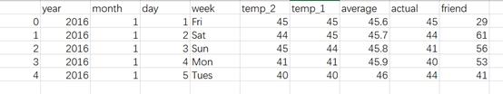
``` 数据格式
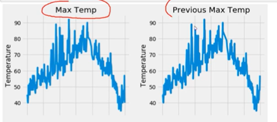
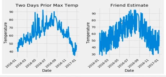
针对测温的数据集进行画图,包括四个子图,分别展示最高温度图,前一天的温度,前两天的温度,效果如图所示。
代码如下:
#指定默认风格
plt.style.use(‘fivethirtyeight’)
#设置布局
fig, ((ax1,ax2),(ax3,ax4))=plt.subplots(nrows=2, ncols=2,figsize=(10,10))
fig.autofmt_xdate(rotation=45)
#标签值
ax1.plot(dates, features[‘actual’])
ax1.set_xlabel(''); ax1.set_ylabel('Temperature'); ax1.set_title(‘Max Temp’)

#昨天
ax2.plot(dates, features[‘temp_1’])
ax2.set_xlabel(''); ax2.set_ylabel('Temperature'); ax2.set_title(‘Previous Max Temp’)

#前天
ax3.plot(dates, features[‘temp_2’])
ax3.set_xlabel('Date'); ax3.set_ylabel('Temperature'); ax3.set_title(‘Two Days Prior Max Temp’)

#朋友
ax4.plot(dates, features[‘friend’])
ax4.set_xlabel('Date'); ax4.set_ylabel('Temperature'); ax4.set_title(‘Friend Estimate’)


plt.tight_layout(pad=2)

 浙公网安备 33010602011771号