fitflex: CSS布局就是这么简单
您是否还在为如何实现DOM元素的垂直居中对齐而挠头呢?别担心,朋友。Fitflex为您提供了一种只需少量Javascript代码和配置就能轻松实现响应式布局的方法。还有一件事,它可以适应各种屏幕尺寸的手机、平板电脑、台式电脑……你对此感到兴奋吗?
github
npm
让我们现在就盘它吧!
UI交互的例子
大致看完文档后,你可以盘下这个例子,挺有意思的,绝对让你对CSS布局有更新的认识。
下载
npm install fitflex
在浏览器中使用
<script src="fitflex.js"></script>
然后配置选项来调整元素。
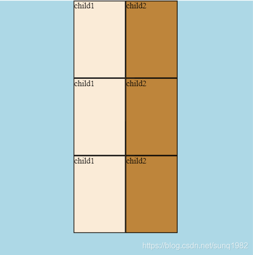
<body>
    <div id='box'>
        <div class='child1'>child1</div>
        <div class='child1'>child1</div>
        <div class='child1'>child1</div>
        <div class='child2'>child2</div>
        <div class='child2'>child2</div>
        <div class='child2'>child2</div>
    </div>
    <script src="fitflex.js"></script>
    <script>
        var option = {
          location:'vertical',
          center:'cross'
        }
        fit('#box').flex(option);
    </script>
</body
检查你的浏览器。看,垂直居中!
容器
容器是parentNode,其中childNodes由fitflex来配置。它的用法与jquery $("p").add("div")类似。
fit(container).flex(option)
配置项
var option = {
            children: "",
            location: "",
            center: "",
            adjust: "",
            gapRatio: {
                left: 0,
                right: 0,
                top: 0,
                bottom: 0,
                outerAll: 0,
                innerWidth: 0,
                innerHeight: 0
            },
            screenWidth: { min: 0, max: Infinity },
            flexWhenResize: true
        };
| Key | Type | Value |
|---|---|---|
| children | String |Array | 被选中的 childNodes |
| location | String | horizontal, vertical |
| center | String | forward, cross, bothway |
| adjust | String | 三个合并的字符串: oneline|multiline + outerfit|innerfit + forward|cross|bothway. |
| gapRatio | Object | 属性: left, right, top, bottom, outerall, innerWidth, innerHeight |
| screenWidth | Object | min: numbers, max: numbers |
children
参与布局的子节点。默认情况下,所有的子节点都将被涉及。
该值可以是elementID或className,例如.child、#child或数组["child1"., ".child2", ".child3"]。
如果您想指定childNodes的宽度和高度,那么[{d:.child1, w:0.1, h: 0.2}, {d:".child2", w:0.2, height: 0.1}]。
您甚至可以使用二维数组,这样您就可以将childnode分组到不同的行中,例如[[{d:".child1," w:0.1, h: 0.2}], [{d:".child2", w:0.2, h: 0.1}]]。
请注意,w和h的值不是px,而是childnode的宽高和parentNode宽高之比。
location
horizontal(default) and vertical.
center
forward:以x轴为中心的子节点;
cross:以y轴为中心;
bothway: 以X轴和Y轴为中心.
adjust
此选项用于调整childNodes 边界和parentNodes 边界的关系,以便可以使childNodes和parentNodes宽高自动相互匹配。
设置基于3个字符串组合,如:onelineOuterfitForward或multilineInnerfitCross,大小写不敏感。
oneline:将选择的子节点强制放到一行中。
multiline: childNodes的放置是基于以前的选项设置。
outerfit: 调整parentNodes内边界,使之和childNodes外边界重合
innerfit:调整childNodes 的外边界,使之和parentNodes的内边界重合。
forward: 在X-Axis居中.
cross: 围绕Y-Axis居中
bothway:围绕both X 和 Y Axis居中
gapRatio
childNodes和parentNodes之间(left, right,top,bottom,outerall)或childNodes之间(innerwidth,innerheight)的间隔距离。请注意,值不是px,它是childNodes宽高与parentNode宽高之比。您也可以设置一个或两个如下:
innerWidth: 'fit', innerHeight:`fit`
然后,childNode之间的间隙距离最大,使得最外面的childNodes边界与ParentNodes内边界重合。
您还可以通过设置数组值来进一步调整子节点之间的行间距或列间距,达到精细的控制。
innerWidth: [0.05, 0.03,...], innerHeight:[0.01, 0.02,...]
请注意,数组单元格值是childNode宽高与parentNode宽高之比。
screenWidth
用于响应式布局,设置屏幕宽度
flexWhenResize
调整屏幕宽度时调整布局。
响应式布局
通过使用option array 而不是一个option,您可以使不同的布局适应于不同的屏幕宽度。
<script>
        var opt1 = {
            location:'vertical',
            center:'cross',
            screenWidth: { min: 501, max: Infinity }
        };

        var opt2 = {
            location:'horizontal',
            center:'forward',
            screenWidth: { min: 0 , max: 500}
        };

        var optArray = [opt1, opt2]
        fit('#box').flex(optArray);
    </script>

 浙公网安备 33010602011771号