腾讯//不同路径

一个机器人位于一个 m x n 网格的左上角 (起始点在下图中标记为“Start” )。

机器人每次只能向下或者向右移动一步。机器人试图达到网格的右下角(在下图中标记为“Finish”)。

问总共有多少条不同的路径?

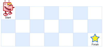
例如,上图是一个7 x 3 的网格。有多少可能的路径?

说明:m 和 的值均不超过 100。

示例 1:

输入: m = 3, n = 2
输出: 3
解释:
从左上角开始,总共有 3 条路径可以到达右下角。
1. 向右 -> 向右 -> 向下
2. 向右 -> 向下 -> 向右
3. 向下 -> 向右 -> 向右

示例 2:

输入: m = 7, n = 3
输出: 28
class Solution {
    public int uniquePaths(int m, int n) {
        int [][]dp = new int[n][m];
        dp[0][0] = 1;
        for(int i = 1; i < m; i++){
            dp[0][i] = 1;
        }
        for(int i = 1; i < n; i++){
            dp[i][0] = 1;
        }
        for(int i = 1; i < n; i++){
            for(int j = 1; j < m; j++){
                dp[i][j] = dp[i-1][j] + dp[i][j-1];
            }
        }
        return dp[n-1][m-1];
    }
}
class Solution {
public:
    int uniquePaths(int m, int n) {
        vector<int> dp(n, 1);
        for(int i = 1; i < m; i++){
            for(int j = 1; j < n; j++){
                dp[j] += dp[j-1];
            }
        }
        return dp[n-1];
    }
};


posted @ 2018-11-02 22:57  strawqqhat  阅读(88)  评论(0编辑  收藏  举报
#home h1{ font-size:45px; } body{ background-image: url("放你的背景图链接"); background-position: initial; background-size: cover; background-repeat: no-repeat; background-attachment: fixed; background-origin: initial; background-clip: initial; height:100%; width:100%; } #home{ opacity:0.7; } .wall{ position: fixed; top: 0; left: 0; bottom: 0; right: 0; } div#midground{ background: url("https://i.postimg.cc/PP5GtGtM/midground.png"); z-index: -1; -webkit-animation: cc 200s linear infinite; -moz-animation: cc 200s linear infinite; -o-animation: cc 200s linear infinite; animation: cc 200s linear infinite; } div#foreground{ background: url("https://i.postimg.cc/z3jZZD1B/foreground.png"); z-index: -2; -webkit-animation: cc 253s linear infinite; -o-animation: cc 253s linear infinite; -moz-animation: cc 253s linear infinite; animation: cc 253s linear infinite; } div#top{ background: url("https://i.postimg.cc/PP5GtGtM/midground.png"); z-index: -4; -webkit-animation: da 200s linear infinite; -o-animation: da 200s linear infinite; animation: da 200s linear infinite; } @-webkit-keyframes cc { from{ background-position: 0 0; transform: translateY(10px); } to{ background-position: 600% 0; } } @-o-keyframes cc { from{ background-position: 0 0; transform: translateY(10px); } to{ background-position: 600% 0; } } @-moz-keyframes cc { from{ background-position: 0 0; transform: translateY(10px); } to{ background-position: 600% 0; } } @keyframes cc { 0%{ background-position: 0 0; } 100%{ background-position: 600% 0; } } @keyframes da { 0%{ background-position: 0 0; } 100%{ background-position: 0 600%; } } @-webkit-keyframes da { 0%{ background-position: 0 0; } 100%{ background-position: 0 600%; } } @-moz-keyframes da { 0%{ background-position: 0 0; } 100%{ background-position: 0 600%; } } @-ms-keyframes da { 0%{ background-position: 0 0; } 100%{ background-position: 0 600%; } }