


Applying white space in UI design
Applying white space in UI design
https://uxdesign.cc/whitespace-in-ui-design-44e332c8e4a
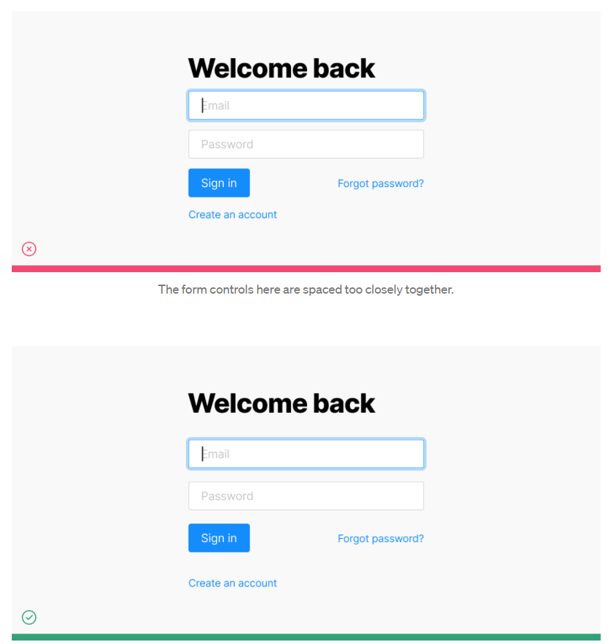
Follow the Law of Proximity
-
相关元素应该间隔更近。相反,不相关的元素应该间隔得更远
-
相同“类型”的元素应该均匀地间隔开
Start from a baseline of generous white space
-
元素和元素之前不能太靠近,会很有压迫感
-
如果元素数量很少,那么空间就应该再多些,至少善用整体空间
Use white space to focus attention on particular design elements.
-
空间可以让用户更加聚焦在元素
-
让用户聚焦不只是通过放大元素而已
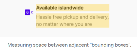
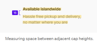
Use the same method for measuring space in both design and implementation.
-
2 种衡量距离的方法
-
给元素一个 bounding box
-
不给元素 bounding box
-
设计最好是使用第二个,因为视觉不会去假设你有 bounding box
-
市场大部分都是第一个,因为设计字体的人,会给不同的 line height
-
好在 w3c 有在准备 leading track(可能是几年后的事了)
Use a spacing system

-
和颜色概念一样,拥有一套固定的标准
-
固定的倍数
Avoid using spacing values that are visually too similar

-
避免使用靠近的距离
-
用户没有像素眼,看不出 1 ~ 2px 的差别
-
设计规范是为了更好的去执行同个设计系统,如果设计出来在视觉上看不出差别,那么需要例外对待
-
不同元素会影响我们的视觉,不能只是 follow spec 而已!
Reduce the line-height (ie. leading) as text size increases

-
字体越大,空间越多
-
市场上几乎都会特别对待 line height 当遇上较大的字号,同样的 letter space 也是
In an information-dense UI, rely on other techniques besides white space to convey how elements in the UI relate to one another.

-
在信息密集的 UI 中,除了 “空白” 之外,还可以用其他方式去区分
-
Border
-
字和字之间放个 “空中点”
-
颜色

 浙公网安备 33010602011771号