css3 选择器(三)
这篇和前两篇内容相关性不大,主要是涉及到一些css3的状态选择器,所以标题从一开始。
一、【:enabled】选择器
一看这个属性就知道是专为表单元素提供的。在表单中输入框,密码框,复选框都有可用(:enabled)和不可用(:disabled)状态,默认情况,这些表单元素都处在可用状态。可通过选择器:enabled为这些表单元素设置样式。
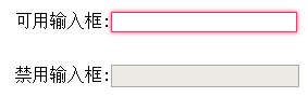
举例:可用输入框设置样式。
<meta charset="utf-8">
<style>
div {
    margin: 30px;
}
input[type="text"]:enabled {
    border: 1px solid #f36;
    box-shadow: 0 0 5px #f36;
}
</style>

<form action="#">
<div>
<label>可用输入框:<input type="text"/></label>
</div>
<div>
<label>禁用输入框:<input type="text" disabled="disabled"/></label>
</div>
</form>
二、【:disabled】选择器
看到有【:enabled】选择器,就知道肯定有【:disabled】选择器了。看名字就知道:disabled选择器和:enabled选择器相反,用来匹配不可用的表单元素。要使用:disabled选择器,需要在表单元素中设置"disbled"属性。
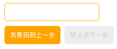
举例:
<meta charset="utf-8">
<style type="text/css">
form {
    margin: 30px;
}
div {
    margin: 10px;
}
input {
    padding: 10px;
    border: 1px solid orange;
    background: #fff;
    border-radius: 5px;
}
input[type="submit"] {
    background: orange;
    color: #fff;
}
input[type="submit"]:disabled {
    background: #eee;
    border-color: #eee;
    color: #ccc;
}
</style>

<form action="#">
<div><input type="text"/></div>
<div>
<input type="submit"value="我要回到上一步"/>
<input type="submit"value="禁止点下一步"disabled />
</div>
</form>
三、【:checked】 选择器
在表单元素中,单选按钮和复选按钮都有选中和未选中状态。如果有做过尝试就知道,要设置这两个按钮默认样式是比较困难的。而在css3中,可以通过:checked选择器配合其他标签实现自定义样式。而:checked表示的是选中状态。
这个是个大招,可以省不少功夫。
举例:使用:checked选择器模拟实现复选框样式。【坑:点选框时无法选中,必须点文字才能选中】update:15/10/23


<meta charset="utf-8">
<style type="text/css">
form {
  border: 1px solid #ccc;
  padding: 20px;
  width: 300px;
  margin: 30px auto;
}

.wrapper {
  margin-bottom: 10px;
}

.box {
  display: inline-block;
  width: 20px;
  height: 20px;
  margin-right: 10px;
  position: relative;
  border: 2px solid orange;
  vertical-align: middle;
}

.box input {
  opacity: 0;
}

.box span {
  position: absolute;
  top: -10px;
  right: 3px;
  font-size: 30px;
  font-weight: bold;
  font-family: Arial;
  -webkit-transform: rotate(30deg);
  transform: rotate(30deg);
  color: orange;
}

input[type="checkbox"] + span {
  opacity: 0;
}

input[type="checkbox"]:checked + span {
  opacity: 1;
}
</style>

<form action="#">
  <div class="wrapper">
    <div class="box">
      <input type="checkbox" checked="checked" id="username" /><span>√</span>
    </div>
    <label for="username">我是选中状态</label>
  </div>

  <div class="wrapper">
    <div class="box">
      <input type="checkbox"  id="userpwd" /><span>√</span>
    </div>
    <label for="userpwd">我是未选中状态</label>
  </div>
</form>
模拟实现一个选中和未选中的样式。
没有样式时的效果图如下,
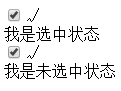
最终添加样式后效果如下。

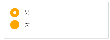
举例::checked状态选择器模拟单选按钮样式。
<meta charset="utf-8">
<style type="text/css">
form {
    border: 1px solid #ccc;
    padding: 20px;
    width: 300px;
    margin: 30px auto;
}
.wrapper {
    margin-bottom: 10px;
}
.box {
    display: inline-block;
    width: 30px;
    height: 30px;
    margin-right: 10px;
    position: relative;
    background: orange;
    vertical-align: middle;
    border-radius: 100%;
}
.box input {
    opacity: 0;
    position: absolute;
    top: 0;
    left: 0;
    width: 100%;
    height: 100%;
    z-index: 10;/*使input按钮在span的上一层,不加点击区域会出现不灵敏*/
}
.box span {
    display: block;
    width: 10px;
    height: 10px;
    border-radius: 100%;
    position: absolute;
    background: #fff;
    top: 50%;
    left: 50%;
    margin: -5px 0  0 -5px;
    z-index: 1;
}
input[type="radio"] + span {
    opacity: 0;
}
input[type="radio"]:checked + span {
    opacity: 1;
}
</style>

<form action="#">
<div class="wrapper">
<div class="box">
<input type="radio" checked="checked" id="male" name="gender"/>
<span></span>
</div>
<label for="male">男</label>
</div>

<div class="wrapper">
<div class="box">
<input type="radio" id="female" name="gender"/>
<span></span>
</div>
<label for="female">女</label>
</div>
</form>
四、【::selection】 选择器
设置选中文本样式,详情见CSS3 ::selection选择器,用的好也可以出奇制胜。
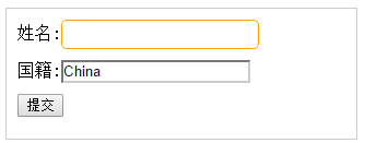
五、【:read-only】选择器
:read-only选择器用来指定处于只读状态元素的样式。简单说就是设置了“readonly”=readonly的元素。
举例:
<!DOCTYPE HTML>
<meta charset="utf-8"/>
<style type="text/css">
form {
  width: 300px;
  padding: 10px;
  border: 1px solid #ccc;
  margin: 50px auto;
}
form > input {
  margin-bottom: 10px;
}

input[type="text"] {
    border: 1px solid orange;
    padding: 5px;
    background: #fff;
    border-radius: 5px;
}
input[type="text"]:-moz-read-only {
    border-color: #ccc;
}
input[type="text"]:read-only {
    border-color: #ccc;
}
</style>

<form>
姓名:<input type="text"name="fullname"/>
<br />
国籍:<input type="text"name="country"value="China"readonly="readonly"/>
<br />
<input type="submit"value="提交"/>
</form>

</body>
</html>

六、【:read-write】选择器
有了【:read-only】,再来个与之相反的【:read-write】意思很明确,就是即可读,也可写的元素设置样式。我觉得这个选择器可能只是充数的,为了让css3选择器成为一个体系而加的,因为默认情况就是可读可写的啊。
上面的例子中如果改一点样式:给input[type="text"]加上:read-write选择器
input[type="text"]:read-write{
    border: 1px solid orange;
    padding: 5px;
    background: #fff;
    border-radius: 5px;
}
效果如下:
即无法给国籍这个输入框添加圆角之类的样式。
七、【::before】和【::after】
慕课网这样讲:
::before和::after这两个伪元素主要用来给元素的前面或者后面插入内容,和“content” 配合使用,使用的场景最多的就是清除浮动。
其实::before和::after内容还是比较多的,了解更多可参考::before和::after伪元素的用法。
PS:每次看到慕课网这种偶巴,好厉害。的东东,就有种淡淡的忧桑,有木有想过妹子们的感受。
本文作者starof,因知识本身在变化,作者也在不断学习成长,文章内容也不定时更新,为避免误导读者,方便追根溯源,请诸位转载注明出处:http://www.cnblogs.com/starof/p/4717826.html有问题欢迎与我讨论,共同进步。
如果觉得本文对您有帮助~可以微信支持一下:


 浙公网安备 33010602011771号