
09. 常用控件
一、Qt Quick的常用控件
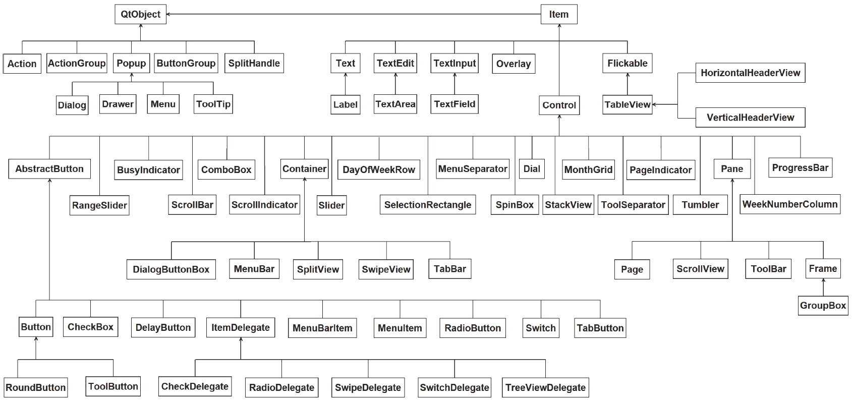
Control 是用户界面控件的基类型,Qt Quick 的 Controls 模块中的大部分控件都继承自 Control,而 Control 继承自 Item,一般不直接使用该类型,而是使用它的众多子控件类型。Control 从窗口系统接收输入事件并在屏幕上绘制自身。
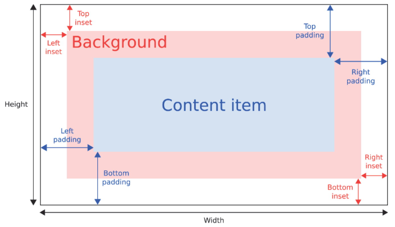
控件的隐式大小 implicitWidth 和 implicitHeight 通常基于背景 background 和内容项 contentItem 的隐式大小以及四周的 insets 和 paddings 等属性的值,当没有明确指定控件的 width 和 height 属性时,会通过这些值来决定控件的大小。背景的 insets 相关属性可以在不影响控件的视觉外观的情况下扩展其可交互区域,这对于较小的控件非常有用。
我们可以在终端中使用 pip 安装 PySide6 模块。默认是从国外的主站上下载,因此,我们可能会遇到网络不好的情况导致下载失败。我们可以在 pip 指令后通过 -i 指定国内镜像源下载。
pip install pyside6 -i https://mirrors.aliyun.com/pypi/simple
国内常用的 pip 下载源列表:
- 阿里云 https://mirrors.aliyun.com/pypi/simple
- 清华大学 https://pypi.tuna.tsinghua.edu.cn/simple
- 中国科学技术大学 http://pypi.mirrors.ustc.edu.cn/simple
二、标签控件
QML 中 Label 和 Qt Widget 中的 QLabel 类似,它继承自 Text,可以拥有一个可视化的 background 作为背景。要使用 Label,需要引入 import QtQuick.Controls。
background : Item // 背景项
我们新建一个 template.py 文件。
import sys

from PySide6.QtWidgets import QApplication
from PySide6.QtQml import QQmlApplicationEngine

if __name__ == "__main__":
    app = QApplication(sys.argv)                                                # 1.创建一个QApplication类的实例
    engine = QQmlApplicationEngine()                                            # 2.创建QML引擎对象
    engine.load("template.qml")                                                 # 3.加载QML文件
    sys.exit(app.exec())                                                        # 4.进入程序的主循环并通过exit()函数确保主循环安全结束
我们新建一个 template.qml 文件。
import QtQuick.Window
import QtQuick.Controls

// Window控件表示一个顶级窗口
// 在QML中,元素是通过大括号{}内的属性来配置的。
Window {
    width: 800                                                                  // 窗口的宽度
    height: 600                                                                 // 窗口的高度
    visible: true                                                               // 显示窗口
    color: "lightgray"                                                          // 窗口的背景颜色

    // 创建一个标签
    Label {
        color: "#9999FF"                                                        // 字体的颜色

        background: Rectangle {                                                 // 创建一个矩形
            anchors.fill: parent                                                // 填充父元素
            color: "#CCCCFF"                                                    // 背景颜色
            radius: 30                                                          // 圆角
        }

        font {
            family: "楷体"                                                       // 字体族
            bold: true                                                          // 字体是否加粗
            pixelSize: 32                                                       // 字体从上面皇帝大小
        }

        text: "没问题!无论发生什么事,我都会用笑容去面对的!"                          // 显示的文本
    }
}
三、按钮类控件
3.1、按键控件
QML 中的 Button 和 Qt Widget 中的 QPushButton 类似。要使用 Button,需要引入 import QtQuick.Controls。Button 常用的属性如下:
text : string                                                                   // 按钮文字

icon                                                                            // 按钮的图标

checkable : bool                                                                // 按钮是否可选
checked : bool                                                                  // 按钮是否被选中

display : enumeration                                                           // 按钮的显示方式

pressed : bool                                                                  // 按钮的按下状态
pressX : real                                                                   // 按钮按下时的X坐标
pressY : real                                                                   // 按钮按下时的Y坐标
Button 的 icon 属性是一个属性组,它的常用属性如下:
icon.source : url                                                               // 图标的URL
icon.name : string                                                              // 图标名称
icon.cache : bool                                                               // 是否缓存图标
icon.color : color                                                              // 图标颜色
icon.height : int                                                               // 图标高度
icon.width : int                                                                // 图标宽度
Button 的常用信号如下:
clicked()                                                                       // 单击按键触时发信号
doubleClicked()                                                                 // 双击按键时触发信号
pressAndHold()                                                                  // 按下按键时未释放时触发信号
pressed()                                                                       // 按下按键时触发信号
released()                                                                      // 释放按键时触发信号
toggled()                                                                       // 按键状态切换时触发信号
修改 template.qml 文件的内容。
import QtQuick.Window
import QtQuick.Controls
import QtQuick.Controls.Material

// Window控件表示一个顶级窗口
// 在QML中,元素是通过大括号{}内的属性来配置的。
Window {
    width: 800                                                                  // 窗口的宽度
    height: 600                                                                 // 窗口的高度
    visible: true                                                               // 显示窗口
    color: "lightgray"                                                          // 窗口的背景颜色

    Label {
        id: labelId                                                             // 标签的id标识符

        anchors.top: parent.top                                                 // 标签顶部与父容器顶部对齐
        anchors.topMargin: 20                                                   // 标签顶部与父容器顶部的间距
        anchors.horizontalCenter: parent.horizontalCenter                       // 标签水平居中对齐

        font {
            family: "楷体"                                                      // 字体族
            pointSize: 32                                                       // 字体大小
        }
    }

    // 创建一个按钮
    Button {
        id: buttonId

        width: 150                                                              // 按钮的宽度
        height: 70                                                              // 按钮的高度
        anchors.centerIn: parent                                                // 按钮居中

        font {
            family: "楷体"                                                      // 字体
            pointSize: 14                                                       // 字体大小
            bold: true                                                          // 字体加粗
            italic: true                                                        // 斜体
        }

        text: "Click me"                                                        // 按钮的文字

        background: Rectangle {
            radius: 30
            color: {
                if (buttonId.pressed) {
                    return "#6699FF"
                } else if (buttonId.hovered) {
                    return "#CCFFFF"
                } else {
                    return "#99CCFF"
                }
            }
        }

        // 按钮点击时触发信号
        onClicked: {
            labelId.text = "你单击了按钮"
        }

        // 按钮双击时触发信号
        onDoubleClicked: {
            labelId.text = "你双击了按钮"
        }

        // 按钮按下时触发信号
        onPressed: {
            labelId.text = "你按下了按钮"
        }

        // 按钮释放时触发信号
        onReleased: {
            labelId.text = "你释放了按钮"
        }

        // 按钮按下未释放时触发信号
        onPressAndHold: {
            labelId.text = "你按下了但还没有释放按钮"
        }
    }
}
我们在自定义背景时,可能会报如下错误,此时,我们需要导入 Basic、Fusion 或 Material。
QML QQuickRectangle: The current style does not support customization of this control (property: "background" item: QQuickRectangle(0x21c5cab1040, parent=0x0, geometry=0,0 0x0)). Please customize a non-native style (such as Basic, Fusion, Material, etc). For more information, see: https://doc.qt.io/qt-6/qtquickcontrols2-customize.html#customization-reference
3.2、单选按钮控件
QML 中的 RadioButton 和 Qt Widget 中的 QRadioButton 类似,用于多选一的场景。要使用 RadioButton,需要引入 import QtQuick.Controls。使用时还需要通过 exclusiveGroup 属性为其 指定一个分组。它也可以和 GroupBox 结合使用。RadioButton 常用的属性基本和 Button 一致。
ExclusiveGroup(互斥分组)本身是不可见元素,用于将若干个可选择元素组合在一起,供用户选择其中的一个选项。我们可以在 ExclusiveGroup 对象中定义 RadioButton、CheckBox、Action 等元素,此时不需要设置它们的 exclusiveGroup 属性。我们也可以定义一个只设置了 id 属性的 ExclusiveGroup 对象,在别处定义 RadioButton、CheckBox、Action 等元素时通过 id 初始化这些元素的 exclusiveGroup 属性。current 属性 指向互斥分组中第一个选中的元素。
修改 template.qml 文件的内容。
import QtQuick.Window
import QtQuick.Controls

// Window控件表示一个顶级窗口
// 在QML中,元素是通过大括号{}内的属性来配置的。
Window {
    width: 800                                                                  // 窗口的宽度
    height: 600                                                                 // 窗口的高度
    visible: true                                                               // 显示窗口
    color: "lightgray"                                                          // 窗口的背景颜色

    // 定义一个Column,用于垂直布局
    Column {
        id: columnId                                                            // 定义一个id
        anchors.centerIn: parent                                                // 居中对齐
        spacing: 30                                                             // 用于设置子元素之间的间隔

        property string fontName: "楷体"                                        // 定义一个属性,用于存储字体名
        property int fontSize: 32                                               // 定义一个属性,用于存储字体大小
    }

    // 定义一个Row,用于水平布局
    Row {
        parent: columnId                                                        // 设置父元素容器
        spacing: 10                                                             // 用于设置子元素之间的间隔

        // 创建一个标签
        Label {
            id: genderLabelId
            font {
                family: columnId.fontName                                       // 字体族
                pointSize: columnId.fontSize                                    // 字体大小
            }

            text: "性别:"                                                      // 文本内容
        }

        // 创建一个单选按钮
        RadioButton {
            font: genderLabelId.font                                            // 字体
            text: "男"                                                          // 按钮的文字
        }

        // 创建一个单选按钮
        RadioButton {
            font: genderLabelId.font                                            // 字体
            text: "女"                                                          // 按钮的文字
        }
    }

    Row {
        parent: columnId                                                        // 设置父元素容器
        spacing: 10                                                             // 用于设置子元素之间的间隔

        Label {
            font: genderLabelId.font                                            // 字体
            text: "爱好:"                                                       // 文本内容
        }

        RadioButton {
            font: genderLabelId.font                                            // 字体
            text: "绘画"                                                         // 按钮的文字
        }

        RadioButton {
            font: genderLabelId.font                                            // 字体
            text: "唱歌"                                                         // 按钮的文字
        }
    }
}
3.3、多选框控件
QML 中的 CheckBox 和 Qt Widget 中的 QCheckBox 类似,你可以在一组选项中选择一个或多个选项,这些选项之间互不影响。CheckBox 可以显示一个提示选中与否的小图标,以及一行简单的文本。
相比 RadioButton,CheckBox 多了几个属性:
tristate : bool                                                                 // 是否为三态按钮
checkState : enumeration                                                        // 按钮的状态
nextCheckState : function                                                       // 回调函数,该函数返回按钮的下一个状态
CheckBox 的 checkState 属性用来 记录选中状态,它是一个枚举值,可以取值如下:
Qt.Unchecked                                                                    // 该复选框处于未选中状态
Qt.PartiallyChecked                                                             // 该复选框处于部分选中状态。这种状态仅在三态功能启用时才会使用。
Qt.Checked                                                                      // 该复选框处于选中状态
修改 template.qml 文件的内容。
import QtQuick.Window
import QtQuick.Controls

// Window控件表示一个顶级窗口
// 在QML中,元素是通过大括号{}内的属性来配置的。
Window {
    width: 800                                                                  // 窗口的宽度
    height: 600                                                                 // 窗口的高度
    visible: true                                                               // 显示窗口
    color: "lightgray"

    // ButtonGroup是一个非视觉形式的、相互独立的按钮组。
    // 它与诸RadioButton(单选按钮)CheckBox(复选框)等控件一起使用,其中每次只能选择其中一个选项。
    ButtonGroup {
        id: infoButtonGroupId                                                   // 定义一个id
        exclusive: false                                                        // 设置为互斥组
        checkState: infoChcekBoxId.checkState                                   // 绑定复选框的状态
    }

    // 定义一个Column,用于垂直布局
    Column {
        id: columnId                                                            // 定义一个id
        spacing: 10                                                             // 用于设置子元素之间的间隔

        anchors.horizontalCenter: parent.horizontalCenter                       // 水平居中
        anchors.top: parent.top                                                 // 将顶部的锚点定位到父元素的
        anchors.topMargin: 20                                                   // 设置顶部边距为20像素

        property string fontName: "楷体"                                        // 定义一个属性,用于存储字体名
        property int fontSize: 32                                               // 定义一个属性,用于存储字体大小

        CheckBox {
            id: infoChcekBoxId                                                  // 定义一个id

            font {
                family: columnId.fontName                                       // 字体
                pointSize: columnId.fontSize                                    // 字体大小
            }

            text: "请选择你的爱好:"                                              // 文本内容
        }

        // 创建一个复选框
        CheckBox {
            font: infoChcekBoxId.font                                           // 字体
            text: "绘画"                                                        // 按钮的文字
            checkState: Qt.PartiallyChecked                                     // 设置复选框的初始状态

            ButtonGroup.group: infoButtonGroupId                                // 绑定按钮组
        }

        CheckBox {
            font: infoChcekBoxId.font                                           // 字体
            text: "唱歌"                                                        // 按钮的文字

            ButtonGroup.group: infoButtonGroupId                                // 绑定按钮组
        }

        // 创建一个复选框
        CheckBox {
            font: infoChcekBoxId.font                                           // 字体
            text: "跳舞"                                                        // 按钮的文字

            ButtonGroup.group: infoButtonGroupId                                // 绑定按钮组
        }
    }
}
3.4、延迟按钮控件
QML 中的 DelayButton 是一个 延时按钮,需要长按才能触发,这种延迟可以防止意外按压。活触发所需的时间以 毫秒 为单位,可以使用 delay 属性进行设置。当前的激活进度由按钮上的进度指示器指示,当前激活进度进度表示为 0.0 到 1.0 之间的十进制值。
delay : int                                                                     // 延迟时间
progress : real                                                                 // 保存了当前进度值,其范围在0到1之间
修改 template.qml 文件的内容。
import QtQuick.Window
import QtQuick.Controls

// 如果想要进度条占满整个按钮,则需要导入样式
import QtQuick.Controls.Universal

// Window控件表示一个顶级窗口
// 在QML中,元素是通过大括号{}内的属性来配置的。
Window {
    width: 800                                                                  // 窗口的宽度
    height: 600                                                                 // 窗口的高度
    visible: true                                                               // 显示窗口
    color: "lightgray"

    Label {
        id: labelId                                                             // 定义一个id

        anchors.top: parent.top                                                 // 设置顶部锚点
        anchors.topMargin: 20                                                   // 顶部边距
        anchors.horizontalCenter: parent.horizontalCenter                       // 水平居中对齐

        font {
            family: "楷体"                                                      // 字体族
            pointSize: 32                                                       // 字体像素大小
        }
    }

    DelayButton {
        width: 300                                                              // 宽度
        height: 50                                                              // 高度
        anchors.centerIn: parent                                                // 居中对齐

        delay: 5000                                                             // 延迟时间,单位毫秒
        text: "点击我"                                                           // 按钮文本

        // 按钮按下的信号处理器
        onPressed: {
            labelId.text = "点击了按钮"
        }

        // 按钮激活的信号处理器
        onActivated: {
            labelId.text = "按钮激活"
        }
    }
}
3.5、Switch开关
Switch 是一个选项按钮,可以拖动或切换为打开(选中)或关闭(未选中)。开关通常用于在两种状态之间进行选择。
修改 template.qml 文件的内容。
import QtQuick.Window
import QtQuick.Controls

// Window控件表示一个顶级窗口
// 在QML中,元素是通过大括号{}内的属性来配置的。
Window {
    width: 800                                                                  // 窗口的宽度
    height: 600                                                                 // 窗口的高度
    visible: true                                                               // 显示窗口
    color: "lightgray"

    Label {
        id: labeId                                                              // 标签的ID
        anchors.top: parent.top                                                 // 设置顶部描点
        anchors.topMargin: 20                                                   // 顶部的间距
        anchors.horizontalCenter: parent.horizontalCenter                       // 水平居中对齐

        font.family: "楷体"                                                     // 字体族
        font.pointSize: 32                                                      // 字体像素大小
    }

    Switch {
        anchors.centerIn: parent
        checked: true                                                           // 初始状态为选中
        text: "开关"

        onCheckedChanged: {
            if (checked) {
                labeId.text = "开关已打开"
            } else {
                labeId.text = "开关已关闭"
            }
        }
    }
}
四、文本编辑类控件
4.1、单行文本编辑控件
QML 中的 TextField 和 Qt Widget 中的 QLineEdit。要使用 TextField,需要引入 import QtQuick.Controls。TextInput 没有背景,是透明的,能够与父控件无缝结合。而 TextField 有背景,其背景色可通过 background 属性来设定。它的常用属性如下:
background : Item                                                               // 背景

placeholderText : string                                                        // 占位符文本
placeholderTextColor : color                                                    // 占位符文本的颜色

hoverEnabled : bool                                                             // 文本字段是否能接收鼠标悬停事件。默认值为false
修改 template.qml 文件的内容。
import QtQuick.Window
import QtQuick.Controls
import QtQuick.Controls.Fusion

// Window控件表示一个顶级窗口
// 在QML中,元素是通过大括号{}内的属性来配置的。
Window {
    width: 800                                                                  // 窗口的宽度
    height: 600                                                                 // 窗口的高度
    visible: true                                                               // 显示窗口
    color: "lightgray"

    // 创建一个标签
    Label {
        id: infoLabelId

        anchors.top: parent.top                                                 // 顶部对齐父元素的顶部
        anchors.topMargin: 20                                                   // 顶部外边距
        anchors.horizontalCenter: parent.horizontalCenter                       // 水平居中对齐父元素的水平中心

        color: "#9999FF"                                                    // 字体的颜色
        font.family: "楷体"                                                     // 字体族
        font.pixelSize: 32                                                      // 字体大小
    }

    // 定义一个Column,用于垂直布局
    Grid {
        anchors.centerIn: parent                                                // 居中

        columns: 2                                                              // 列数
        spacing: 10                                                             // 用于设置子元素之间的间隔

        // 创建一个标签
        Label {
            font: infoLabelId.font
            color: infoLabelId.color
            text: "用户名"
        }

        // 创建一个文本输入框
        TextField {
            id: userNameTextFieldId

            width: 600                                                          // 宽度

            font: infoLabelId.font
            color: infoLabelId.color

            background: Rectangle {                                             // 背景
                color: "#99CCFF"                                                // 背景颜色
                border.color: "#0000FF"                                         // 边框颜色
                border.width: 2                                                 // 边框宽度
            }

            placeholderText: "请输入用户名"                                      // 占位符文本
            placeholderTextColor: "#9933CC"                                     // 占位符文本颜色

            validator: RegularExpressionValidator {                             // 创建一个正则表达式验证器
                regularExpression: /^[a-zA-Z0-9_\.]{3, 16}$/                    // 正则表达式,用于验证用户名
            }

            // 当文本输入框的输入完成时触发信号
            onEditingFinished: {
                infoLabelId.text = "用户名:" + text
            }
        }

        Text {
            font: infoLabelId.font
            color: infoLabelId.color
            text: "密码"
        }

        TextField {
            width: userNameTextFieldId.width                                    // 宽度

            font: infoLabelId.font
            color: infoLabelId.color

            echoMode: TextInput.Password                                        // 密码输入模式
            validator: userNameTextFieldId.validator                            // 验证器

            background: Rectangle {                                             // 背景
                color: "#99CCFF"                                                // 背景颜色
                border.color: "#0000FF"                                         // 边框颜色
                border.width: 2                                                 // 边框宽度
            }

            placeholderText: "请输入密码"                                        // 占位符文本
            placeholderTextColor: userNameTextFieldId.placeholderTextColor      // 占位符文本颜色

            // 当文本输入框的输入完成时触发信号
            onEditingFinished: {
                infoLabelId.text = "密码:" + text
            }
        }

        Text {
            font: infoLabelId.font
            color: infoLabelId.color
            text: "年龄"
        }

        TextField {
            width: userNameTextFieldId.width                                    // 宽度

            font: infoLabelId.font
            color: infoLabelId.color

            background: Rectangle {                                             // 背景
                color: "#99CCFF"                                                // 背景颜色
                border.color: "#0000FF"                                         // 边框颜色
                border.width: 2                                                 // 边框宽度
            }

            placeholderText: "请输入年龄"                                        // 占位符文本
            placeholderTextColor: userNameTextFieldId.placeholderTextColor      // 占位符文本颜色

            validator: IntValidator {                                           // 创建一个正则表达式验证器
                bottom: 0                                                       // 最小数值
                top: 300                                                        // 最大数值
            }

            // 当文本输入框的输入完成时触发信号
            onEditingFinished: {
                infoLabelId.text = "年龄:" + text
            }
        }

        Text {
            font: infoLabelId.font
            color: infoLabelId.color
            text: "序列号"
        }

        TextField {
            width: userNameTextFieldId.width                                    // 宽度

            font: infoLabelId.font
            color: infoLabelId.color

            inputMask:">AAAAA-AAAAA-AAAAA-AAAAA-AAAAA;#"                        // 输入掩码

            background: Rectangle {                                             // 背景
                color: "#99CCFF"                                                // 背景颜色
                border.color: "#0000FF"                                         // 边框颜色
                border.width: 2                                                 // 边框宽度
            }

            // 当文本输入框的输入完成时触发信号
            onEditingFinished: {
                infoLabelId.text = "序列号:" + text
            }
        }
    }
}
4.2、文本框控件
QML 中的 TextArea 和 Qt Widget 中的 QTextEdit。要使用 TextArea,需要引入 import QtQuick.Controls。TextEdit 没有背景,是透明的,能够与父控件无缝结合。而 TextArea 有背景,其背景色可通过 background 属性来设定。它的常用属性如下:
background : Item                                                               // 背景

placeholderText : string                                                        // 占位符文本
placeholderTextColor : color                                                    // 占位符文本的颜色

hoverEnabled : bool                                                             // 文本字段是否能接收鼠标悬停事件。默认值为false
修改 template.qml 文件的内容。
import QtQuick.Window
import QtQuick.Controls
import QtQuick.Layouts

// Window控件表示一个顶级窗口
// 在QML中,元素是通过大括号{}内的属性来配置的。
Window {
    width: 800                                                                  // 窗口的宽度
    height: 600                                                                 // 窗口的高度
    visible: true                                                               // 显示窗口
    color: "lightgray"                                                          // 窗口的背景颜色

    ColumnLayout {
        anchors.fill: parent

        // 创建滚动区域
        ScrollView {
            Layout.fillWidth: true
            Layout.fillHeight: true

            // 创建一个文本框
            TextArea {
                Layout.fillWidth: true
                Layout.fillHeight: true

                font: infoLabelId.font                                          // 字体
                color: infoLabelId.color                                        // 字体的颜色

                wrapMode: TextEdit.WordWrap                                     // 文本自动换行模式
                textFormat: TextEdit.RichText                                   // 富文本
                text: "<a href='https://www.baidu.com'>百度一下</a><br/>"       // 显示的文本

                // 点击链接时触发信号
                onLinkActivated : function(link){
                    infoLabelId.text = "点击了链接:【" + link + "】"
                    Qt.openUrlExternally(link)                                  // 默认浏览器打开链接
                }

                // 鼠标悬停链接时触发信号
                onLinkHovered : function(link){
                    if (link != "")
                    {
                        infoLabelId.text = "在【" + link + "】链接处悬停"
                    }
                }
            }
        }

        Label {
            id: infoLabelId

            color: "#9999FF"                                                    // 字体的颜色
            font.family: "楷体"                                                 // 字体族
            font.pixelSize: 32                                                  // 字体大小
        }
    }
}
五、数字选择控件
QML 中的 SpinBox 和 Qt Widget 中的 QSpinBox。要使用 SpinBox,需要引入 import QtQuick.Controls。它的常用属性如下:
displayText : string                                                            // 只读属性,文本框的显示文本
value : int                                                                     // 当前值

editable : bool                                                                 // 是否可编辑
from : int                                                                      // 最小值,默认是 0
to : int                                                                        // 最大值
stepSize : int                                                                  // 步长
wrap : bool                                                                     // 是否循环

validator : Validator                                                           // 验证器
在设置步长之后,我们可以使用 decrease() 方法 减少数值,使用 increase() 方法 增加数值。
在 SpinBox 的数值改变后,发送一个 valueModified() 信号,我们可以在 onValueModified 信号处理器中处理。
修改 template.qml 文件的内容。
import QtQuick.Window
import QtQuick.Controls

// Window控件表示一个顶级窗口
// 在QML中,元素是通过大括号{}内的属性来配置的。
Window {
    width: 800                                                                  // 窗口的宽度
    height: 600                                                                 // 窗口的高度
    visible: true                                                               // 显示窗口
    color: "lightgray"                                                          // 窗口的背景颜色

    Text {
        id: labelId                                                             // 标签的ID

        anchors.top: parent.top                                                 // 顶部对齐
        anchors.topMargin: 10                                                   // 顶部的间距
        anchors.horizontalCenter: parent.horizontalCenter                       // 水平居中

        font.family: "楷体"                                                     // 字体
        font.pointSize: 32                                                      // 字体大小
        text: "Hello World"                                                     // 标签的文本
    }

    // 创建一个数字选择控件
    SpinBox {
        width: 300                                                              // 宽度
        height: 50                                                              // 高度
        anchors.centerIn: parent                                                // 居中

        from: 0                                                                 // 最小值
        to: 10                                                                  // 最大值
        stepSize: 1                                                             // 步长
        editable: true                                                          // 可编辑
        value: 5                                                                // 数值

        validator: IntValidator{                                                // 整数验证器
            bottom: 0                                                           // 最小值
            top: 10
        }

        // 数值改变时触发信号
        onValueChanged: {
            labelId.text = "value: " + value
        }
    }
}
六、下拉组合框
QML 中的 ComboBox 和 Qt Widget 中的 QComboBox。要使用 ComboBox,需要引入 import QtQuick.Controls。组合框由一个 列表框 和一个 标签控件(或编辑控件)组成。列表框部分可以是一直显示的,也可以是隐藏的,在用户点击编辑控件边上的按钮(下拉箭头)时显示下拉列表框。列表框中当前选中的项(如果有的话)显示在标签控件或编辑控件中。ComboBox 的下拉列表是使用 Menu 实现的,列表内的每个条目对应一个 MenuItem。
ComboBox 常用的属性如下:
count : int                                                                     // 只读属性,组合框中的项目数量

currentIndex : int                                                              // 当前选中项的索引
currentText : string                                                            // 当前选中项的文本
currentValue : var                                                              // 当前选中项的值

displayText : string                                                            // 保存着组合框按钮上所显示的文本内容

editText : string                                                               // 此属性将文本存储在可编辑组合框的文本字段中

validator : Validator                                                           // 验证器
当 编辑完成 时,ComboBox 会发射 accepted() 信号。当我们点击下拉按钮 弹出下拉列表框 后,用户 选择列表中的一个条目,此时 currentIndex 属性、currentText 属性就会变化,同时 activated() 信号也会发射。
ComboBox 的 find() 方法用于 查找列表中是否存在指定的字符串,对于可编辑的 ComboBox,向列表中添加条目时可以使用此方法来滤重。textAt() 方法 返回指定索引位置的字符串。selectAll() 方法可以 选中可编辑 ComboBox 的编辑框内的所有文本。
下拉列表的数据从 model 属性来。model 可以是一个简单的 字符串列表,如 ["TV","CD Player","Set Top Box","Router"],也可以是 ListModel。当使用 ListModel 时,可以通过 textRole 属性指 定列表条目对应的 model 内的 role,如果不设定,则默认使用第一个 role。
修改 template.qml 文件的内容。
import QtQuick.Window
import QtQuick.Controls

// Window控件表示一个顶级窗口
// 在QML中,元素是通过大括号{}内的属性来配置的。
Window {
    width: 800                                                                  // 窗口的宽度
    height: 600                                                                 // 窗口的高度
    visible: true                                                               // 显示窗口
    color: "lightgray"                                                          // 窗口的背景颜色

    Label {
        id: labelId                                                             // 标签的ID
        anchors.top: parent.top                                                 // 顶部对齐
        anchors.topMargin: 10                                                   // 顶部的间距
        anchors.horizontalCenter: parent.horizontalCenter                       // 水平居中

        font.family: "楷体"                                                     // 字体族
        font.pixelSize: 32                                                      // 字体大小
        color: "#99CCFF"                                                        // 标签颜色
    }

    // 创建一个下拉组合框
    ComboBox {
        id: comboBoxId                                                          // 下拉组合框的ID

        width: 300                                                              // 宽度
        height: 50                                                              // 高度
        anchors.centerIn: parent                                                // 居中

        font: labelId.font                                                      // 字体

        editable: true                                                          // 可编辑
        model: ["木之本樱", "御坂美琴", "夏娜"]                                    // 下拉组合框的数据源

        // 选择选项后发送信号
        onActivated: {
            labelId.text = "你选择了【" + comboBoxId.currentText  + "】选项"
        }

        // 编辑完成时发送信号
        onAccepted: {
            labelId.text = "你编辑了【" + comboBoxId.currentText  + "】选项,编辑后的选项为:【" + comboBoxId.editText + "】"
        }
    }
}
七、滑块类控件
7.1、滑块控件
QML 中的 Slider 和 Qt Widget 中的 QSlider。要使用 QTextEdit,需要引入 import QtQuick.Controls。Slider 类代表一个水平或垂直的滑块控件,通常用于让用户在某个取值范围内选择一个值。它的常用属性如下:
from : real                                                                     // 起始值,默认值为0
to : real                                                                       // 结束值,默认值为1
stepSize : real                                                                 // 步长
value : real                                                                    // 当前值,默认值为0
orientation : enumeration                                                       // 方向,默认值为Qt.Horizontal
在设置步长之后,我们可以使用 decrease() 方法 减少数值,使用 increase() 方法 增加数值。
Slider 的 orientation 属性用来 设置控件的方向,可以取值如下:
Qt.Horizontal                                                                   // 水平的
Qt.Vertical                                                                     // 垂直的
当我们移动滑块后,会触发 move() 信号。
修改 template.qml 文件的内容。
import QtQuick.Window
import QtQuick.Controls

// Window控件表示一个顶级窗口
// 在QML中,元素是通过大括号{}内的属性来配置的。
Window {
    width: 800                                                                  // 窗口的宽度
    height: 600                                                                 // 窗口的高度
    visible: true                                                               // 显示窗口
    color: "lightgray"

    Text {
        id: label                                                               // 标签的ID
        anchors.top: parent.top                                                 // 设置顶部描点
        anchors.topMargin: 10                                                   // 顶部的间距
        anchors.horizontalCenter: parent.horizontalCenter                       // 水平居中对齐

        font.family: "楷体"                                                      // 字体族
        font.pointSize: 32                                                      // 字体像素大小
        text: "初始值:" + sliderId.value
    }

    // 创建一个滑块控件
    Slider {
        id: sliderId                                                            // 滑块的ID
        anchors.centerIn: parent                                                // 居中对齐

        orientation: Qt.Vertical                                                // 垂直方向

        from: 0                                                                 // 最小值
        to: 10                                                                  // 最大值
        stepSize: 1                                                             // 步长
        value: 5                                                                // 数值

        // 移动滑块时发送信号
        onMoved: {
            label.text = "value: " + value
        }
    }
}
7.2、旋钮控件
QML 中的 Dial 和 Qt Widget 中的 QDial。要使用 Dial,需要引入 import QtQuick.Controls。仪表盘控件本质上类似于一个滑块控件,只是显示的样式不同。它的常用属性如下:
angle : real                                                                    // 只读属性,保存着旋钮的顺时针角
value : real                                                                    // 当前值
startAngle : real                                                               // 起始角度
endAngle : real                                                                 // 结束角度

wrap                                                                            // 最大值刻度和最小值刻度是否重合
当我们 旋转滑块 的时候,会触发 move() 信号,我们可以在 onMove() 信号处理器中处理。
修改 template.qml 文件的内容。
import QtQuick.Window
import QtQuick.Controls

// Window控件表示一个顶级窗口
// 在QML中,元素是通过大括号{}内的属性来配置的。
Window {
    width: 800                                                                  // 窗口的宽度
    height: 600                                                                 // 窗口的高度
    visible: true                                                               // 显示窗口
    color: "lightgray"

    Text {
        id: label                                                               // 标签的ID
        anchors.top: parent.top                                                 // 顶部对齐
        anchors.topMargin: 10                                                   // 顶部的间距
        anchors.horizontalCenter: parent.horizontalCenter                       // 水平居中

        font.family: "楷体"                                                     // 字体
        font.pointSize: 32                                                      // 字体大小
        text: "初始值: " + dialId.value                                          // 标签的文本
    }

    // 创建一个旋钮控件
    Dial {
        id: dialId                                                              // 旋钮的ID
        anchors.centerIn: parent                                                // 居中对齐

        from: 0                                                                 // 最小值
        to: 10                                                                  // 最大值
        stepSize: 1                                                             // 步长
        value: 5                                                                // 数值

        startAngle: 15                                                          // 起始角度
        endAngle: 345                                                           // 结束角度

        wrap: true                                                              // 循环

        // 移动滑块时发送信号
        onMoved: {
            label.text = "value: " + value
        }
    }
}
7.3、区间滑块控件
RangeSlider 是有两个滑块的滑动条,拖动两个滑块可以确定值范围。我们可以通过 from 属性和 to 属性定义 滑块的值范围。在定义完范围之后,我们可以使用 first.value 属性和 second.value 属性 设置两个滑块的初始位置。然后,我们还可以通过 stepSize 属性 设置滑块的步值。同样,我们可以通过 orientation 属性 设置控件的方向。当我们 移动第一个滑块 的时候,会触发 first.onMoved() 信号。当我们 移动第二个滑块 时会触发 second.onMoved() 信号。
修改 template.qml 文件的内容。
import QtQuick.Window
import QtQuick.Controls

// Window控件表示一个顶级窗口
// 在QML中,元素是通过大括号{}内的属性来配置的。
Window {
    width: 800                                                                  // 窗口的宽度
    height: 600                                                                 // 窗口的高度
    visible: true                                                               // 显示窗口
    color: "lightgray"

    Text {
        id: label                                                               // 标签的ID
        anchors.top: parent.top                                                 // 设置顶部描点
        anchors.topMargin: 10                                                   // 顶部的间距
        anchors.horizontalCenter: parent.horizontalCenter                       // 水平居中对齐

        font.family: "楷体"                                                      // 字体族
        font.pointSize: 32                                                      // 字体像素大小
    }

    // 创建一个滑块控件
    RangeSlider {
        id: rangeSliderId                                                       // 滑块的ID
        anchors.centerIn: parent                                                // 居中对齐

        orientation: Qt.Vertical                                                // 垂直方向

        from: 0                                                                 // 最小值
        to: 10                                                                  // 最大值
        stepSize: 1                                                             // 步长

        first.value: 3                                                          // 第一个值
        second.value: 7                                                         // 第二个值

        // 移动第一个滑块时发送信号
        first.onMoved: {
            label.text = "firstValue: " + first.value
        }

        // 移动第一个滑块时发送信号
        second.onMoved: {
            label.text = "secondValue: " + second.value
        }
    }
}
八、进度条控件
QML 中的 ProgressBar 和 Qt Widget 中的 QProgressBar。要使用 ProgressBar,需要引入 import QtQuick.Controls。进度条控件控件主要显示任务的执行进度。它的常用属性如下:
from : real                                                                     // 起始值
to : real                                                                       // 结束值
value : real                                                                    // 当前值
修改 template.qml 文件的内容。
import QtQuick.Window
import QtQuick.Controls

// Window控件表示一个顶级窗口
// 在QML中,元素是通过大括号{}内的属性来配置的。
Window {
    width: 800                                                                  // 窗口的宽度
    height: 600                                                                 // 窗口的高度
    visible: true                                                               // 显示窗口
    color: "lightgray"

    Text {
        id: label                                                               // 标签的ID

        anchors.top: parent.top                                                 // 顶部对齐
        anchors.topMargin: 10                                                   // 顶部的间距
        anchors.horizontalCenter: parent.horizontalCenter                       // 水平居中

        font.family: "楷体"                                                     // 字体
        font.pointSize: 32                                                      // 字体大小
        text: "Hello World"                                                     // 标签的文本
    }

    // 创建一个进度条控件
    ProgressBar {
        id: progressBar                                                         // 定义id

        width: parent.width
        anchors.centerIn: parent                                                // 居中

        from: 0                                                                 // 最小值
        to: 100                                                                 // 最大值
        value: 5                                                                // 数值

        // 移动滑块时发送信号
        onValueChanged: {
            label.text = "value: " + value
        }
    }

    // 定义一个按钮
    Button{
        id: start_button                                                        // 定义一个标识

        width: 200                                                              // 按钮的宽度
        height: 50                                                              // 按钮的高度

        // 使用锚点(anchors)系统来定位文本元素
        anchors.left: parent.left                                               // 将左边的锚点定位到父元素的左边
        anchors.leftMargin: 20                                                  // 设置左侧边距为20像素
        anchors.bottom: parent.bottom                                           // 将底部的锚点定位到父元素的底部
        anchors.bottomMargin: 20                                                // 设置底部边距为20像素

        text: "开始加载"                                                         // 按钮的文本

        // 按键点击时触发
        onClicked: {
            if (start_button.text == "开始加载") {
                progressBar.value = 0                                           // 重置计数
                timer.start()                                                   // 开启定时器
                start_button.text = "暂停加载"
            } else if (start_button.text == "暂停加载") {
                timer.stop()
                start_button.text = "继续加载"
            } else if (start_button.text == "继续加载") {
                timer.start()
                start_button.text = "暂停加载"
            }
        }
    }

    Button{
        width: 200                                                              // 按钮的宽度
        height: 50                                                              // 按钮的高度

        anchors.right: parent.right                                             // 将右边的锚点定位到父元素的右边
        anchors.rightMargin: 20                                                 // 设置右侧边距为20像素
        anchors.bottom: parent.bottom                                           // 将底部的锚点定位到父元素的底部
        anchors.bottomMargin: 20                                                // 设置底部边距为20像素

        text: "重置"                                                            // 按钮的文本

        // 按键点击时触发
        onClicked: {
            progressBar.value = 0                                                    // 重置计数
        }
    }

    // 定义一个定时器
    Timer{
        id: timer                                                               // 定时器id
        interval: 100                                                           // 定义定时器间隔
        running: false                                                          // 定时器默认不运行
        repeat: true                                                            // 定时器是否可以重复触发

        // 当定时器触发时执行
        onTriggered: {
            progressBar.value = progressBar.value + 1                           // 更新进度条
            if (progressBar.value >= 100) {
                timer.stop()                                                    // 如果进度值超过最大值,停止定时器
                start_button.text = "开始加载"                                   // 重置开始按钮的文本
            }
        }
    }
}
九、容器类控件
9.1、分组框
QML 中的 GroupBox 和 Qt Widget 中的 QGroupBox。要使用 GroupBox,需要引入 import QtQuick.Controls。GroupBox(分组框),用于将其它的窗口部件组合在一起显示,最常用的是将单选按钮或复选框放在分组框中显示,不过也可以将任何控件放在分组框内。
分组框一般在顶部有一个标题(title 属性),说明其用途。默认带有边框,不过可以设置 flat 属性为 true 来去掉左、右、底三条边的边框。
分组框的尺寸根据它的孩子们的尺寸计算而来。如果你想使用锚布局来管理分组框的孩子们,则需要显式指定分组框本身的尺寸。
contentItem 指向一个 Item 对象,代表分组框的内容区,在分组框内声明的孩子们,它们的父控件会被自动设置为 contentItem。而如果你动态创建分组框的孩子们,则需要显式地将 contentItem 指定为它们的父控件。
修改 template.qml 文件的内容。
import QtQuick.Window
import QtQuick.Controls

// Window控件表示一个顶级窗口
// 在QML中,元素是通过大括号{}内的属性来配置的。
Window {
    width: 800                                                                  // 窗口的宽度
    height: 600                                                                 // 窗口的高度
    visible: true                                                               // 显示窗口
    color: "lightgray"

    GroupBox {
        id: groupBoxId                                                          // 创建一个GroupBox

        anchors.left: parent.left                                               // 设置左锚点
        anchors.leftMargin: 30                                                  // 设置左边距
        anchors.top: parent.top                                                 // 设置上锚点
        anchors.topMargin: 30                                                   // 设置上边距

        font {
            family: "楷体"                                                       // 字体族
            pointSize: 32                                                       // 字体像素大小
        }
        title: "请选择你的爱好:"                                                 // 文本内容
    }

    // 定义一个Column,用于垂直布局
    Column {
        id: genderRadioButtonId                                                 // 定义一个id
        parent: groupBoxId.contentItem                                          // 设置父元素

        anchors.top: parent.top                                                 // 将顶部的锚点定位到父元素的
        anchors.topMargin: 20                                                   // 设置顶部边距为20像素

        spacing: 10                                                             // 用于设置子元素之间的间

        // 创建一个复选框
        CheckBox {
            font: groupBoxId.font                                               // 字体
            text: "绘画"                                                         // 按钮的文字
            tristate : true                                                     // 设置复选框为三态
            checkState: Qt.PartiallyChecked                                     // 设置复选框的初始状态
        }

        // 创建一个复选框
        CheckBox {
            font: groupBoxId.font                                               // 字体
            text: "唱歌"                                                        // 按钮的文字
        }

        // 创建一个复选框
        CheckBox {
            font: groupBoxId.font                                               // 字体
            text: "跳舞"                                                        // 按钮的文字
        }
    }
}
9.2、框架控件
框架用于在可视框架内布局一组逻辑控件。Frame 不提供自己的布局,但需要您定位其内容,例如通过创建 RowLayout 或ColumnLayout。声明为 Frame 的子元素的项会自动成为 Frame 的contentItem 的父元素。动态创建的项需要显式地添加到 contentItem 中。如果在一个框架中只使用一个项目,它将调整大小以适合其包含的项目的隐式大小。这使得它特别适合与布局一起使用。
修改 template.qml 文件的内容。
import QtQuick.Window
import QtQuick.Controls

// Window控件表示一个顶级窗口
// 在QML中,元素是通过大括号{}内的属性来配置的。
Window {
    width: 800                                                                  // 窗口的宽度
    height: 600                                                                 // 窗口的高度
    visible: true                                                               // 显示窗口
    color: "lightgray"

    Frame {
        width: 100
        height: 300
        anchors.centerIn: parent

        Column {
            anchors.centerIn: parent
            spacing: 10

            Button {
                width: 80
                height: 30
                text: "按钮1"
            }

            Button {
                width: 80
                height: 30
                text: "按钮2"
            }

            Button {
                width: 80
                height: 30
                text: "按钮3"
            }
        }
    }
}
9.3、分割器控件
SplitView 是一个控件,可以水平或垂直地布局项目,每个项目之间都有一个可拖动的分条器。用户可以通过拖动分隔条来调整子项的大小。。用户可以通过拖动分隔条来调整子项的大小。
在 QML 中使用 SplitView 时,我们可以通过设置 orientation 属性来定义布局的方向(水平或垂直)。然后我们可以通过附加属性SplitView.minimumWidth、SplitView.minimumHeight、SplitView.preferredWidth、SplitView.preferredHeight、SplitView.maximumWidth、SplitView.maximumHeight 设置各个子项的最小、首选和最大尺寸。
修改 template.qml 文件的内容。
import QtQuick.Window
import QtQuick.Controls

// Window控件表示一个顶级窗口
// 在QML中,元素是通过大括号{}内的属性来配置的。
Window {
    width: 800                                                                  // 窗口的宽度
    height: 600                                                                 // 窗口的高度
    visible: true                                                               // 显示窗口
    color: "lightgray"                                                          // 窗口的背景颜色

    SplitView {
        id: splitViewId
        anchors.fill: parent
        orientation: Qt.Horizontal

        // Repeater是一个用于根据模型(通常是列表或数组)动态生成一组子元素的有用工具
        Repeater {
            id: repeaterId
            // 定义了数据源,通常是一个列表或数组。
            model: 3                                                            // 设置重复的次数

            // 定义了如何显示模型中的每个项目,它是一个包含要实例化的 QML 元素的组件。
            delegate: Rectangle {
                color: Qt.rgba(Math.random(), Math.random(), Math.random(), 1)
                SplitView.minimumWidth: 50                                      // 每个控件的最小宽度
                SplitView.preferredWidth: windowId.width / repeaterId.model     // 每个控件的首选宽度
            }
        }
    }
}
9.4、Page控件
Page 是一个容器控件,它可以方便地向页面添加页眉和页脚项。我们可以通过 head 属性 设置页眉,footer 属性 设置页脚。
修改 template.qml 文件的内容。
import QtQuick.Window
import QtQuick.Controls

// Window控件表示一个顶级窗口
// 在QML中,元素是通过大括号{}内的属性来配置的。
Window {
    width: 800                                                                  // 窗口的宽度
    height: 600                                                                 // 窗口的高度
    visible: true                                                               // 显示窗口
    color: "lightgray"

    Page {
        anchors.fill: parent

        // 页眉
        header: Rectangle {
            height: 50
            color: "#FF99CC"
            Text {
                text: "页眉"
                font.family: "楷体"
                font.pointSize: 16
                anchors.centerIn: parent
            }
        }

        // 内容区域
        contentItem: Rectangle {
            anchors.fill: parent
            color: "#99CCFF"
            Text {
                text: "内容"
                font.family: "楷体"
                font.pointSize: 32
                anchors.centerIn: parent
            }
        }

        // 页脚
        footer: Rectangle {
            height: 50
            color: "#FF9999"
            Text {
                text: "页脚"
                font.family: "楷体"
                font.pointSize: 16
                anchors.centerIn: parent
            }
        }
    }
}
9.5、SwipeView控件
SwipeView 用一组页面填充。一次只能看到一个页面。用户可以通过横向滑动来在页面之间导航。SwipeView 本身是完全非可视的,因此建议将其与 PageIndicator 结合使用,以便为用户提供有多个页面的视觉线索。PageIndicator 用于指示由多个页面组成的容器中当前活动的页面。此时,我们需要将 interactive 属性设置为 true 交互切换页面。
import QtQuick.Window
import QtQuick.Controls

// Window控件表示一个顶级窗口
// 在QML中,元素是通过大括号{}内的属性来配置的。
Window {
    width: 800                                                                  // 窗口的宽度
    height: 600                                                                 // 窗口的高度
    visible: true                                                               // 显示窗口
    color: "lightgray"                                                          // 窗口的背景颜色

    property int count: 10

    // 创建选项卡
    TabBar {
        id: tabBarId
        anchors.top: parent.top
        currentIndex: 0                                                         // 当前选中的选项卡索引

        // Repeater是一个用于根据模型(通常是列表或数组)动态生成一组子元素的有用工具
        Repeater {
            // 定义了数据源,通常是一个列表或数组。
            model: windowId.count                                               // 设置重复的次数

            // 定义了如何显示模型中的每个项目,它是一个包含要实例化的 QML 元素的组件。
            // 创建一个选项卡按钮
            delegate: TabButton {
                // TabBar中的附加属性index保存了TabBar中每个子条目的索引
                text: "页面 " + index
                font.pointSize: 14
            }
        }

        // 选项卡索引改变时触发信号
        onCurrentIndexChanged: {
            swipeViewId.currentIndex = tabBarId.currentIndex
            pageIndicatorId.currentIndex = tabBarId.currentIndex
        }
    }

    SwipeView {
        id: swipeViewId
        width: parent.width
        height: parent.height - tabBarId.height
        anchors.top: tabBarId.bottom

        currentIndex: 0                                                         // 当前显示的页面索引

        // Repeater是一个用于根据模型(通常是列表或数组)动态生成一组子元素的有用工具
        Repeater {
            // 定义了数据源,通常是一个列表或数组。
            model: windowId.count                                               // 设置重复的次数

            // 定义了如何显示模型中的每个项目,它是一个包含要实例化的 QML 元素的组件。
            delegate: Page {
                Label {
                    // SwipeView中的附加属性index保存了SwipeView中每个子条目的索引
                    text: "页面 " + index
                    font.pointSize: 32
                    anchors.centerIn: parent
                }
            }
        }
    }

    PageIndicator {
        id: pageIndicatorId
        anchors.bottom: parent.bottom
        anchors.horizontalCenter: parent.horizontalCenter

        interactive: true                                                       // 是否可交互切换页面
        count: swipeViewId.count                                                // 页面指示器的数量
        currentIndex: 0                                                         // 当前选中的选项卡索引

        // 选项卡索引改变时触发信号
        onCurrentIndexChanged: {
            tabBarId.currentIndex = pageIndicatorId.currentIndex
            swipeViewId.currentIndex = pageIndicatorId.currentIndex
        }
    }
}
9.6、Flickable控件
Flickable 控件将其子控件放置在可以拖动和轻弹的表面上,从而使得子项上的视图滚动。
Flickable 控件 的 contentWidth、contentHeight 属性存储 Flickable 控制的 Item 的实际大小,如果你不设置它们,Flickable 会自动根据 contentItem 的 childrenRect.width 和 childrenRect.height 来设置它们。Flickable 控件的 contentX、contentY 保存被 Flickable 控制的 Item 所代表的对象处在 Flickable 对象左上角的坐标。
当用户开始拖动 Flickable 对象时发出 movementStarted() 信号。当用户释放鼠标(或手指),拖动结束时,如果 Flickable 控制的 Item 的边界还没显示出来,就直接发射 movementEnded() 信号。如果 Flickable 控制的 Item 边界显露出来了,并且拖离了 Flickable 的边界,此时用户释放鼠标或手指,则 flickStarted() 信号发射,然后,被控制的 Item 会弹动一阵子(具体时间由 horizontalVelocity、verticalVelocity、flickDeceleration 等属性决定),最后静止下来,此时发射 flickEnded() 信号,紧接着发射 movementEnded() 信号。
修改 template.qml 文件的内容。
import QtQuick.Window
import QtQuick.Controls

// Window控件表示一个顶级窗口
// 在QML中,元素是通过大括号{}内的属性来配置的。
Window {
    width: 800                                                                  // 窗口的宽度
    height: 600                                                                 // 窗口的高度
    visible: true                                                               // 显示窗口
    color: "lightgray"

    Flickable {
        anchors.fill: parent
        contentHeight: columnId.implicitHeight                                  // 内容高度

        // 附加属性,添加垂直滚动条
        ScrollBar.vertical: ScrollBar {}

        Column {
            id: columnId
            anchors.fill: parent

            // Repeater是一个用于根据模型(通常是列表或数组)动态生成一组子元素的有用工具
            Repeater {
                // 定义了数据源,通常是一个列表或数组。
                model: 10                                                           // 设置重读的次数

                // 定义了如何显示模型中的每个项目,它是一个包含要实例化的 QML 元素的组件。
                delegate: Rectangle {
                    width: parent.width
                    height: 200
                    color: Qt.rgba(Math.random(), Math.random(), Math.random(), 1)

                    Text {
                        text: "Page " + index
                        font.pointSize: 32
                        anchors.centerIn: parent
                    }
                }
            }
        }
    }
}
9.7、Drawer控件
Drawer 是 Qt Quick Controls 提供的一个用于实现侧边导航栏的 QML 类型。它是一个可以通过滑动手势打开和关闭的侧边面板,通常用于触控界面上,提供一个中央位置用于导航。
此时,我们需要将 interactive 属性设置为 true 交互切换页面。我们可以通过 dragMargin 属性 设置 Drawer 控件与屏幕边缘的距离,在该距离内拖动操作将打开 Drawer,如果 dragMargin 属性 设置为 小于等于 0,则 可禁用通过拖动打开 Drawer。
import QtQuick.Window
import QtQuick.Controls

// Window控件表示一个顶级窗口
// 在QML中,元素是通过大括号{}内的属性来配置的。
Window {
    width: 800                                                                  // 窗口的宽度
    height: 600                                                                 // 窗口的高度
    visible: true                                                               // 显示窗口
    color: "lightgray"                                                          // 窗口的背景颜色

    Drawer {
        id: drawerId

        width: 0.33 * parent.width
        height: parent.height

        dragMargin: 100                                                         // 抽屉与窗口的距离
        interactive: true                                                       // 设置是否可交互

        Column {
            anchors.fill: parent
            spacing: 10

            Button {
                width: parent.width
                height: 60

                font.pointSize: 16
                text: "关闭抽屉"

                onClicked: {
                    drawerId.close()                                            // 关闭抽屉
                }
            }
        }
    }
}

 浙公网安备 33010602011771号