
04. 布局管理
一、什么是布局
在 Qt Quick 中有两套与元素布局相关的类库,一套叫作 Item Positioner(定位器),一套叫作 Item Layout(布局)。其实在 Qt Quick 中还有一个 锚布局,它通过 Item 的 anchors 属性实现,是 Qt Quick 中非常灵活的一种布局方式。
我们可以在终端中使用 pip 安装 PySide6 模块。默认是从国外的主站上下载,因此,我们可能会遇到网络不好的情况导致下载失败。我们可以在 pip 指令后通过 -i 指定国内镜像源下载。
pip install pyside6 -i https://mirrors.aliyun.com/pypi/simple
国内常用的 pip 下载源列表:
- 阿里云 https://mirrors.aliyun.com/pypi/simple
- 清华大学 https://pypi.tuna.tsinghua.edu.cn/simple
- 中国科学技术大学 http://pypi.mirrors.ustc.edu.cn/simple
二、锚布局
在 QML 中,锚点(anchors)是一种用于定义元素之间相对位置和大小关系的机制。锚点允许你指定一个元素相对于其父元素或其他元素的位置和尺寸。通过使用锚点,你可以创建响应式布局,使 QML 界面能够根据不同屏幕尺寸和分辨率进行自适应调整。
QML 中的每个元素都有一个隐式的锚点系统,你可以通过 anchors 属性来访问它。anchors 属性提供了多个属性来设置锚点的位置。
每个 Item 都有 7 条不可见的锚线:上(top)、下(bottom)、左(left)、右(right)、水平中心(horizontalCenter)、垂直中心(verticalCenter)和 基线(baseline)。
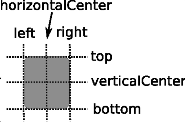
baseline是指文本所在的线,如果Item没有文字,则baseline就和top的位置相同。
我们还可以使用 margins 属性设置四个边的边距。
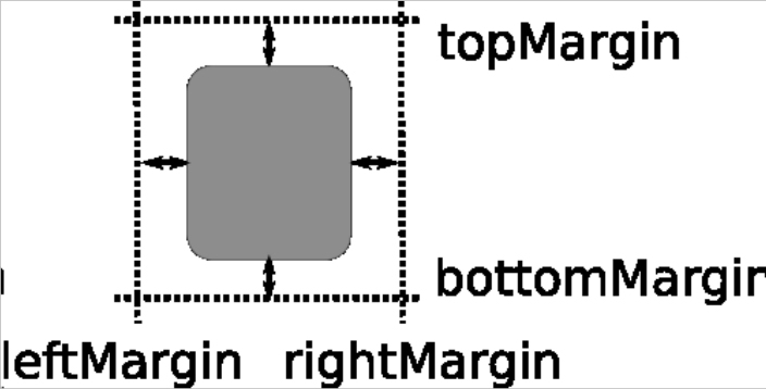
anchors.top : AnchorLine                                                        // 将元素的顶部锚点锚定到某个参考点
anchors.topMargin : real                                                        // 顶部锚点距离参考点的边距

anchors.right : AnchorLine                                                      // 将元素的右边锚点锚定到某个参考点
anchors.rightMargin : real                                                      // 右边锚点距离参考点的边距

anchors.bottom : AnchorLine                                                     // 将元素的底部锚点锚定到某个参考点
anchors.bottomMargin : real                                                     // 底部锚点距离参考点的边距

anchors.left : AnchorLine                                                       // 将元素的左边锚点锚定到某个参考点
anchors.leftMargin : real                                                       // 左边锚点距离参考点的边距

anchors.horizontalCenter : AnchorLine                                           // 将元素的水平中心锚定到某个参考点
anchors.horizontalCenterOffset : real                                           // 水平中心锚点距离参考点的水平偏移量

anchors.verticalCenter : AnchorLine                                             // 将元素的垂直中心锚定到某个参考点
anchors.verticalCenterOffset : real                                             // 垂直中心锚点距离参考点的垂直偏移量

anchors.baseline : AnchorLine                                                   // 将元素的基线锚定到某个参考点
anchors.baselineOffset : real                                                   // 基线锚点距离参考点的垂直偏移量

anchors.centerIn : Item                                                         // 将元素的中心锚定到父元素的中心
anchors.fill : Item                                                             // 使元素填充其父元素或参考元素的整个区域

// 默认为true,强制居中锚点对齐到整个像素。如果居中项的宽度或高度为奇数,则该项将被定位在整个像素上,而不是半像素上
anchors.alignWhenCentered : bool
我们新建一个 template.py 文件。
import sys

from PySide6.QtWidgets import QApplication
from PySide6.QtQml import QQmlApplicationEngine

if __name__ == "__main__":
    app = QApplication(sys.argv)                                                # 1.创建一个QApplication类的实例
    engine = QQmlApplicationEngine()                                            # 2.创建QML引擎对象
    engine.load("template.qml")                                                 # 3.加载QML文件
    sys.exit(app.exec())                                                        # 4.进入程序的主循环并通过exit()函数确保主循环安全结束
我们新建一个 template.qml 文件。
import QtQuick.Window

// Window控件表示一个顶级窗口
// 在QML中,元素是通过大括号{}内的属性来配置的。
Window {
    width: 800                                                                  // 窗口的宽度
    height: 600                                                                 // 窗口的高度
    visible: true                                                               // 显示窗口
    color: "lightgray"                                                          // 窗口的背景颜色

    // 定义一个文本(Text)元素
    Text {
        id: titleTextId                                                         // 定义一个标识

        // 使用锚点(anchors)系统来定位文本元素
        anchors.top: parent.top                                                 // 将顶部的锚点定位到父元素的顶部
        anchors.topMargin: 20                                                   // 设置顶部边距为20像素
        anchors.horizontalCenter: parent.horizontalCenter                       // 水平居中

        text: "Custom Layout Example"                                           // 设置文本元素的内容
        font.pointSize: 24                                                      // 设置文本的字体大小
        color: "#FFCCCC"                                                        // 设置字体颜色
    }

    // 定义一个文本(Text)元素
    Text {
        // 使用锚点(anchors)系统来定位文本元素
        anchors.top: titleTextId.bottom                                         // 将顶部的锚点定位到指定控件父的底部
        anchors.topMargin: 20                                                   // 设置顶部边距为20像素
        anchors.horizontalCenter: parent.horizontalCenter                       // 水平居中

        text: "This is an exmaple of using anchors for layout."                 // 设置文本元素的内容
        font.pointSize: 18                                                      // 设置文本的字体大小
        color: "#FF99CC"                                                        // 设置字体颜色
    }

    // 定义一个Item元素
    Item {
        width: 300                                                              // 宽度
        height: 300                                                             // 高度

        // 使用锚点(anchors)系统来定位文本元素,这里中心的锚点定位到其父元素的中心
        anchors.centerIn: parent

        Rectangle {
            anchors.fill: parent                                                // 填充父容器对象

            color: "#FF6666"                                                    // 设置矩形颜色

            Text {
                anchors.top: parent.top                                         // 将顶部的锚点定位到指定控件父的顶部
                anchors.topMargin: 10                                           // 设置顶部边距为10像素
                anchors.horizontalCenter: parent.horizontalCenter               // 水平居中

                text: "Hello Sakura!"
                font.pointSize: 18
                color: "#FFFFFF"
            }
        }
    }

    // 定义一个矩形元素
    Rectangle {
        width: 100                                                              // 宽度
        height: 50                                                              // 高度

        // 使用锚点(anchors)系统来定位文本元素
        anchors.left: parent.left                                               // 将左侧的锚点定位到父元素的左侧
        anchors.leftMargin: 20                                                  // 设置左侧边距为20像素
        anchors.bottom: parent.bottom                                           // 将底部的锚点定位到父元素的底部
        anchors.bottomMargin: 20                                                // 设置底部边距为20像素

        color: "#99CCFF"                                                        // 设置矩形颜色
    }

    // 定义一个矩形元素
    Rectangle {
        width: 100                                                              // 宽度
        height: 50                                                              // 高度

        anchors.right: parent.right                                             // 将右侧的锚点定位到父元素的右侧
        anchors.rightMargin: 20                                                 // 设置右侧边距为20像素
        anchors.bottom: parent.bottom                                           // 将底部的锚点定位到父元素的底部
        anchors.bottomMargin: 20                                                // 设置底部边距为20像素

        color: "#CCCCFF"                                                        // 设置矩形颜色
    }
}
当你使用锚点时,请确保你指定的参考点是其父元素或兄弟元素,并且它们在布局中是可见的,否则会报:
QML Rectangle: Cannot anchor to an item that isn't a parent or sibling.错误。锚点系统是基于父元素或参考元素的坐标系统来工作的,因此如果父元素或参考元素的大小或位置发生变化,依赖于它们的子元素也会相应地发生变化。
在使用锚点时,要注意避免循环依赖或相互冲突的锚点设置,这可能会导致布局问题或不可预测的行为。
三、定位器
定位器 是一种 容器元素,专门用来管理界面中的其它元素。如果定位器中的子项目不可见(visible 为 false)、宽度或者高度为0,那么该子项目不会显示,也不会被布局。定位器可以自动布局其子项目,也就是说,其子项目不再需要显式设置 x、y 等属性或使用锚 anchors 进行布局。
定位器 不会改变它管理的元素的大小,即便用户调整了界面尺寸,它也坚持不干涉孩子们的尺寸,这可能与你的期望不同,不过如果你希望使用“自动根据界面尺寸变化调整孩子们的尺寸”这种特性,可以使用 Qt Quick 中的 布局管理器。
定位器 包括 Row(行定位器)、Column(列定位器)、Grid(栅格定位器)、Flow(流式定位器)。
3.1、行定位器
Row 沿着一行安置它的孩子们。一旦你把一个 Item 交给 Row 来管理,那就不要再使用 Item 的 x、y、anchors 等属性了。Row 的常用属性如下:
spacing : real                                                                  // 单元格的间距,默认为0
layoutDirection : enumeration                                                   // 布局方向,默认为从左到右

padding : real                                                                  // 元素的内边距
topPadding : real                                                               // 元素的顶部内边距
rightPadding : real                                                             // 元素的右侧内边距
bottomPadding : real                                                            // 元素的底部内边距
leftPadding : real                                                              // 元素的左侧内边距
我们可以使用 layoutDirection 属性,可以指定 布局方向,它是一个枚举值,可以取值如下:
Qt.LeftToRight                                                                  // 默认行为,从左到右放置Item
Qt.RightToLeft                                                                  // 从右向左放置 Item
在一个 Row 内的 Item,可以使用 Positioner 附加属性来获知自己在 Row 中的详细位置信息。Positioner 附加属性的常用属性如下:
index : int                                                                     // 当前项的索引
isFirstItem : bool                                                              // 是否是第一项
isLastItem : bool                                                               // 是否是最后一项
修改 template.qml 文件的内容。
import QtQuick.Window
// Window控件表示一个顶级窗口
// 在QML中,元素是通过大括号{}内的属性来配置的。
Window {
width: 800 // 窗口的宽度
height: 600 // 窗口的高度
visible: true // 显示窗口
color: "lightgray" // 窗口的背景颜色
// 定义一个Row,用于水平布局
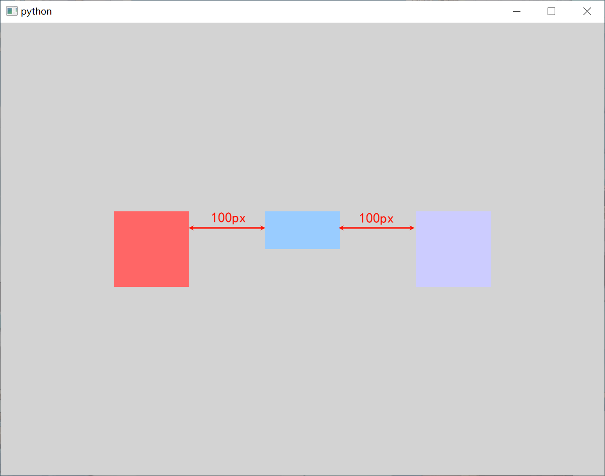
Row {
anchors.centerIn: parent // 将中心的锚点定位到父元素的中心
spacing: 100 // 用于设置子元素之间的间隔
layoutDirection: Qt.RightToLeft // 设置布局的显示方向为从右到左
Rectangle {
width : 100 // 宽度
height: 100 // 高度
color: "#CCCCFF" // 设置矩形颜色
}
Rectangle {
width : 100 // 宽度
height: 50 // 高度
color: "#99CCFF" // 设置矩形颜色
}
Rectangle {
width : 100 // 宽度
height: 100 // 高度
color: "#FF6666" // 设置矩形颜色
}
}
}
Row本身也是一个Item,可以使用anchors布局来决定它在父Item中的位置。如果
Row中的Item不是visible,或者其宽度或高度为 0,则该项目将不会布局,在行中也不可见。
3.2、列定位器
Column 与 Row 类似,不过是在垂直方向上安排它的子 Item。Column 的 spacing 属性描述子 Item 之间的间隔。
修改 template.qml 文件的内容。
import QtQuick.Window
// Window控件表示一个顶级窗口
// 在QML中,元素是通过大括号{}内的属性来配置的。
Window {
width: 800 // 窗口的宽度
height: 600 // 窗口的高度
visible: true // 显示窗口
color: "lightgray" // 窗口的背景颜色
// 定义一个Column,用于垂直布局
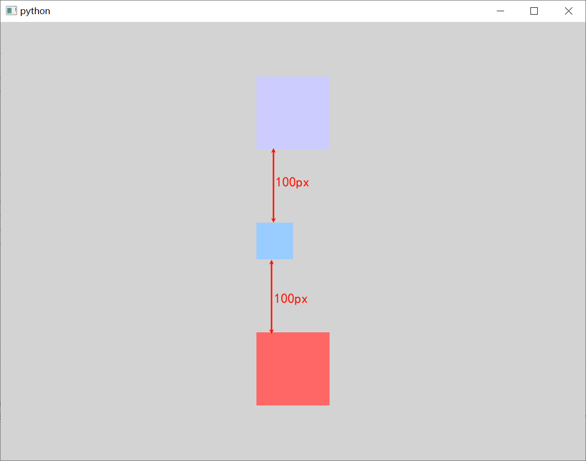
Column {
anchors.centerIn: parent // 将中心的锚点定位到父元素的中心
spacing: 100 // 用于设置子元素之间的间隔
Rectangle {
width : 100 // 宽度
height: 100 // 高度
color: "#CCCCFF" // 设置矩形颜色
}
Rectangle {
width : 50 // 宽度
height: 50 // 高度
color: "#99CCFF" // 设置矩形颜色
}
Rectangle {
width : 100 // 宽度
height: 100 // 高度
color: "#FF6666" // 设置矩形颜色
}
}
}
3.3、栅格定位器
Grid 在一个网格上安置它的子 Item,它会创建一个拥有很多单元格的栅格,足够容纳它的所有子 Item。Grid 会从左到右、从上到下把它的子 Item 一个个塞到单元格里。Item 默认会被放在一个单元格左上角,即 (0, 0) 位置。Grid 的常用属性如下:
rows : int                                                                      // 栅格的行
columns : int                                                                   // 栅格的列,默认列数为4

layoutDirection : enumeration                                                   // 布局方向,默认从上到下,从左到右
flow : enumeration                                                              // 流布局方向,默认从上到下,从左到右

spacing : real                                                                  // 单元格间距,默认值为0
rowSpacing : real                                                               // 行间距,如果没有设置,则使用spacing属性的值
columnSpacing : real                                                            // 列间距,如果没有设置,则使用spacing属性的值

horizontalItemAlignment : enumeration                                           // 水平方向上的对齐方式
verticalItemAlignment : enumeration                                             // 垂直方向上的对齐方式

padding : real                                                                  // 元素的内边距
topPadding : real                                                               // 元素的顶部内边距
rightPadding : real                                                             // 元素的右侧内边距
bottomPadding : real                                                            // 元素的底部内边距
leftPadding : real                                                              // 元素的左侧内边距
我们可以通过 Grid 的 rows 和 columns 属性 设置网格的行、列数。如果不设置,默认只有 4 列,而行数则会根据实际的 Item 数量自动计算。rowSpacing 和 columnSpacing 属性用来 指定行、列间距,单位是像素。
我们可以使用 layoutDirection 属性 设置网格的布局方向,它是每一枚举值,可以取值如下:
Qt.LeftToRight                                                                  // 默认值,从上到下、从左到右进行排列
Qt.RightToLeft                                                                  // 从上到下、从右到左进行排列
我们可以使用 flow 属性 设置网格的流模式,它是每一枚举值,可以取值如下:
Grid.LeftToRight                                                                // 项目从左到右一次排列,然后换行至下一行中
Grid.TopToBottom                                                                // 项目从上到下一次排列,然后换行至下一列中
我们可以使用 horizontalItemAlignment 属性 设置单元格的水平对齐方式,它是一个枚举值,可以取值如下:
Grid.AlignLeft                                                                  // 左对齐
Grid.AlignRight                                                                 // 右对齐
Grid.AlignHCenter                                                               // 水平居中对齐
我们可以使用 verticalItemAlignment 属性 设置单元格的垂直对齐方式,它是一个枚举值,可以取值如下:
Grid.AlignTop                                                                   // 顶部对齐
Grid.AlignBottom                                                                // 底部对齐
Grid.AlignVCenter                                                               // 垂直居中对齐
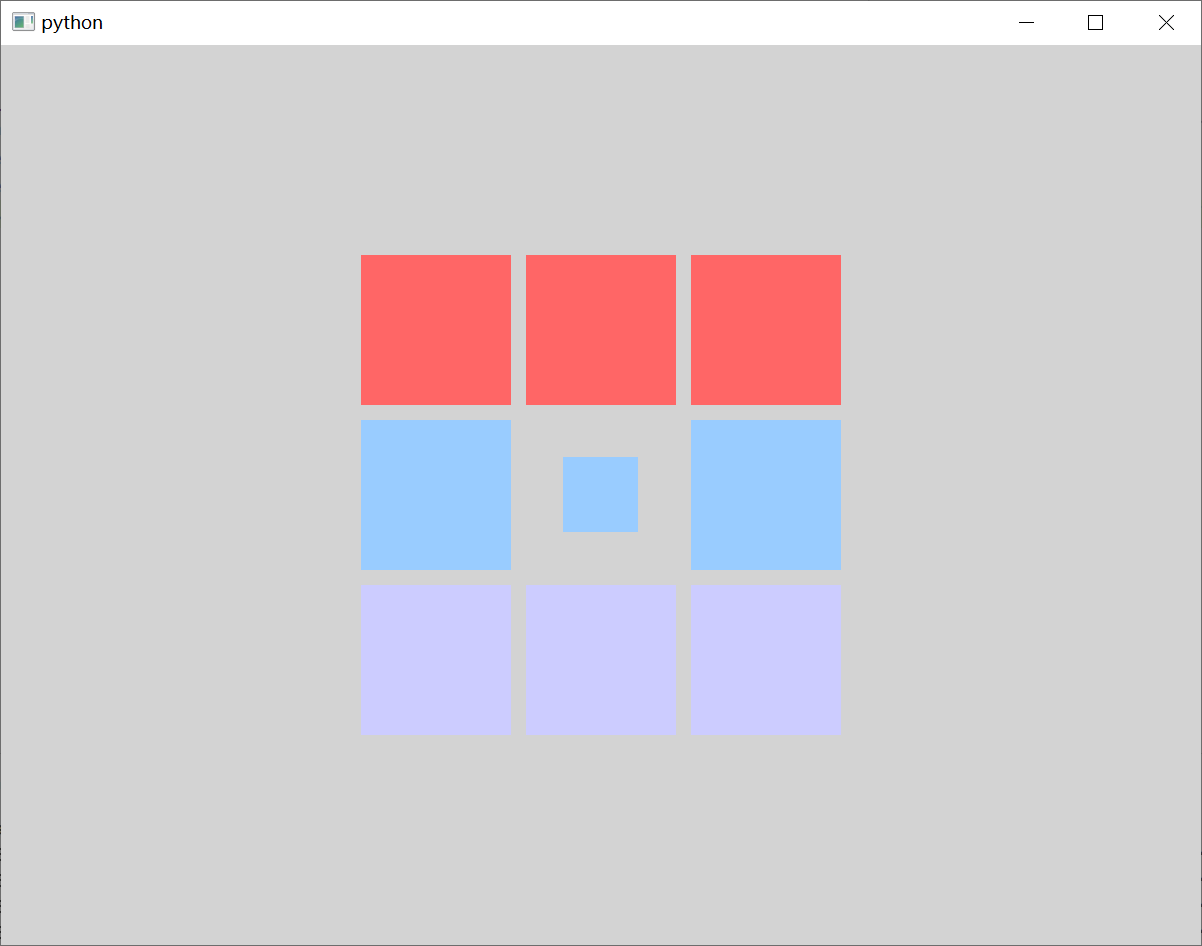
修改 template.qml 文件的内容。
import QtQuick.Window

// Window控件表示一个顶级窗口
// 在QML中,元素是通过大括号{}内的属性来配置的。
Window {
    width: 800                                                                  // 窗口的宽度
    height: 600                                                                 // 窗口的高度
    visible: true                                                               // 显示窗口
    color: "lightgray"                                                          // 窗口的背景颜色

    // 定义一个GridLayout,用于网格布局
    Grid {
        horizontalItemAlignment: Grid.AlignHCenter                              // 设置水平对齐方式
        verticalItemAlignment: Grid.AlignVCenter                                // 设置垂直对齐方式

        anchors.centerIn: parent                                                // 将中心的锚点定位到父元素的中心

        rows: 3                                                                 // 设置行数
        columns: 3                                                              // 设置列数
        rowSpacing: 10                                                          // 设置行间距
        columnSpacing: 10                                                       // 设置列间距

        Rectangle {
            width : 100                                                         // 宽度
            height: 100                                                         // 高度
            color: "#FF6666"                                                    // 设置矩形颜色
        }

        Rectangle {
            width : 100                                                         // 宽度
            height: 100                                                         // 高度
            color: "#FF6666"                                                    // 设置矩形颜色
        }

        Rectangle {
            width : 100                                                         // 宽度
            height: 100                                                         // 高度
            color: "#FF6666"                                                    // 设置矩形颜色
        }

        Rectangle {
            width : 100                                                         // 宽度
            height: 100                                                         // 高度
            color: "#99CCFF"                                                    // 设置矩形颜色
        }

        Rectangle {
            width : 50                                                          // 宽度
            height: 50                                                          // 高度
            color: "#99CCFF"                                                    // 设置矩形颜色
        }

        Rectangle {
            width : 100                                                         // 宽度
            height: 100                                                         // 高度
            color: "#99CCFF"                                                    // 设置矩形颜色
        }

        Rectangle {
            width : 100                                                         // 宽度
            height: 100                                                         // 高度
            color: "#CCCCFF"                                                    // 设置矩形颜色
        }

        Rectangle {
            width : 100                                                         // 宽度
            height: 100                                                         // 高度
            color: "#CCCCFF"                                                    // 设置矩形颜色
        }

        Rectangle {
            width : 100                                                         // 宽度
            height: 100                                                         // 高度
            color: "#CCCCFF"                                                    // 设置矩形颜色
        }
    }
}
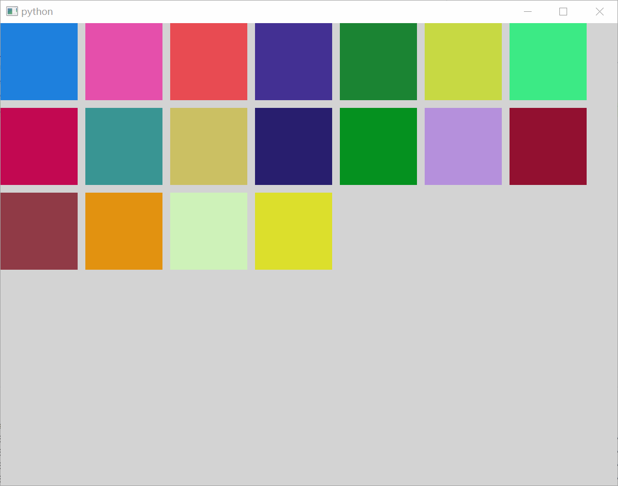
3.4、流式定位器
在 QML 中,Flow 是一种非常灵活的布局方式,它允许元素根据容器的尺寸和元素的尺寸自动进行排列,类似于文本排版中的 “流” 概念,元素会按照指定的方向(通常是水平或垂直)依次排列,当一行或一列无法容纳更多元素时,会自动换行或换列。Flow 的常用属性如下:
spacing : real                                                                  // 单元格间距,默认值为0

flow : enumeration                                                              // 流布局方向
layoutDirection : enumeration                                                   // 布局方向

padding : real                                                                  // 元素的内边距
topPadding : real                                                               // 元素的顶部内边距
rightPadding : real                                                             // 元素的右侧内边距
bottomPadding : real                                                            // 元素的底部内边距
leftPadding : real                                                              // 元素的左侧内边距
我们可以使用 layoutDirection 属性 设置布局方向,它是每一枚举值,可以取值如下:
Qt.LeftToRight                                                                  // 默认值,从上到下、从左到右进行排列
Qt.RightToLeft                                                                  // 从上到下、从右到左进行排列
我们可以使用 flow 属性 设置流布局方向,它是一个枚举值,可以取值如下:
Flow.LeftToRight                                                                // 默认值,从左到右依次排列,直到流的宽度达到上限时才会换行至下一行
Flow.TopToBottom                                                                // 从上到下一次排列,直至流的总高度达到上限时,才会换行至下一列
修改 template.qml 文件的内容。
import QtQuick.Window

// Window控件表示一个顶级窗口
// 在QML中,元素是通过大括号{}内的属性来配置的。
Window {
    width: 800                                                                  // 窗口的宽度
    height: 600                                                                 // 窗口的高度
    visible: true                                                               // 显示窗口
    color: "lightgray"                                                          // 窗口的背景颜色

    // 定义一个Flow,用于流式布局
    Flow {
        width: parent.width                                                     // 宽度
        height: parent.height                                                   // 高度
        anchors.centerIn: parent                                                // 将中心的锚点定位到父元素的
        spacing: 100                                                            // 用于设置子元素之间的间隔

        // Repeater是一个用于根据模型(通常是列表或数组)动态生成一组子元素的有用工具
        Repeater{
            // 定义了数据源,通常是一个列表或数组。
            model: 18                                                           // 设置重复的次数
            // 定义了如何显示模型中的每个项目,它是一个包含要实例化的 QML 元素的组件。
            delegate: Rectangle {
                width: 100
                height: 100
                color: Qt.rgba(Math.random(), Math.random(), Math.random(), 1)
            }
        }
    }
}
四、布局管理器
Qt Quick 中的 布局管理器 是一组用于在用户界面中排列项目的类型。布局管理器 不仅进行布局,而且会改变子 Item 的大小,所以更适用于需要改变用户界面大小的应用。因为布局管理器也是继承自 Item,所以它们可以嵌套。布局管理器 包括 行布局(RowLayout)、列布局(ColumnLayout)、栅格布局(GridLayout)、栈布局(StackLayout)。
4.1、水平布局管理器
在 QML 中,水平布局通常是通过 RowLayout 来实现的。RowLayout 是一种布局管理器,它允许你将子元素水平地排列在一行中。它的常用属性如下:
layoutDirection : enumeration                                                   // 布局方向
spacing : real                                                                  // 单元格间距,默认值为5
uniformCellSizes : bool                                                         // 如果为真,则布局将会强制所有单元格保持相同的大小
我们可以使用 layoutDirection 属性 设置布局方向,它是一个枚举值,可以取值如下:
Qt.LeftToRight                                                                  // 默认行为,从左到右放置Item
Qt.RightToLeft                                                                  // 从右向左放置 Item
在 RowLayout 中,我们可以使用 Layout 附加属性来设置单个单元格,它的常用属性如下:
Layout.minimumWidth : real                                                      // 布局中一个元素的最小宽度。
Layout.minimumHeight : real                                                     // 布局中一个元素的最小高度

Layout.preferredWidth : real                                                     // 布局中一个元素的首选宽度
Layout.preferredHeight : real                                                    // 布局中一个元素的首选高度

Layout.maximumWidth : real                                                      // 布局中一个元素的最大宽度
Layout.maximumHeight : real                                                     // 布局中一个元素的最大高度

Layout.fillWidth : bool                                                         // 布局中一个元素是否填充宽度
Layout.fillHeight : bool                                                        // 布局中一个元素是否填充高度

Layout.alignment : Qt.Alignment                                                 // 布局中一个元素的对齐方式

Layout.margins : real                                                           // 布局中一个元素的外边距
Layout.topMargin : real                                                         // 布局中一个元素的上外边距
Layout.rightMargin : real                                                       // 布局中一个元素的右外边距
Layout.bottomMargin : real                                                      // 布局中一个元素的下外边距
Layout.leftMargin : real                                                        // 布局中一个元素的左外边距

Layout.horizontalStretchFactor : int                                            // 布局中一个元素的水平拉伸因子
Layout.verticalStretchFactor : int                                              // 布局中一个元素的垂直拉伸因子
修改 template.qml 文件的内容。
import QtQuick.Window
import QtQuick.Layouts

// Window控件表示一个顶级窗口
// 在QML中,元素是通过大括号{}内的属性来配置的。
Window {
    width: 800                                                                  // 窗口的宽度
    height: 600                                                                 // 窗口的高度
    visible: true                                                               // 显示窗口
    color: "lightgray"                                                          // 窗口的背景颜色

    // 定义一个RowLayout,用于水平布局
    RowLayout {
        anchors.fill: parent                                                    // 填充父元素
        layoutDirection: Qt.RightToLeft                                         // 设置布局的显示方向为从右到左

        Rectangle {
            implicitWidth : 100                                                 // 设置矩形的隐式宽度
            implicitHeight: 100                                                 // 设置矩形的隐式高度
            color: "#CCCCFF"                                                    // 设置矩形颜色
        }

        Rectangle {
            Layout.preferredWidth : 150                                         // 设置矩形的首选宽度
            Layout.preferredHeight : 50                                         // 设置矩形的首选高度
            color: "#99CCFF"                                                    // 设置矩形颜色
        }

        Rectangle {
            implicitWidth : 100                                                 // 设置矩形的隐式宽度
            Layout.preferredHeight: 100                                         // 设置矩形的首选高度
            color: "#FF6666"                                                    // 设置矩形颜色
        }
    }
}
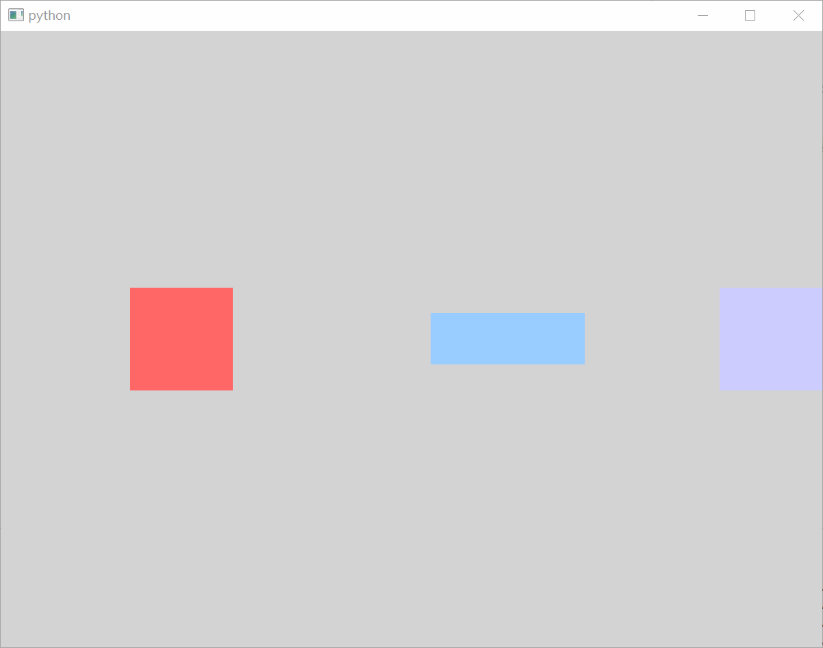
在布局中如何要设置 Item 的宽度和高度,推荐使用
implicitWidth属性 和implicitHeight属性设置,或者使用Layout.preferredWidth和Layout.preferredHeight设置。
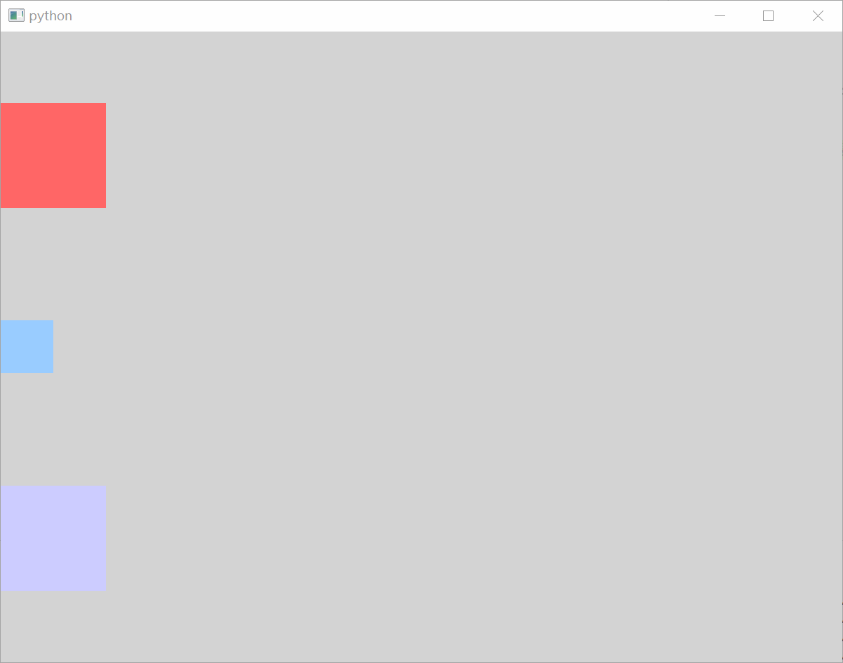
4.2、垂直布局管理器
在 QML 中,垂直布局通常是通过 ColumnLayout 来实现的。这些布局管理器允许你将子元素垂直地排列在一起。ColumnLayout 本身也是一个 Item,可以使用 anchors 布局来决定它在父 Item 中的位置。ColumnLayout 的 spacing 属性描述 子 Item 之间的间隔。
修改 template.qml 文件的内容。
import QtQuick.Window
import QtQuick.Layouts

// Window控件表示一个顶级窗口
// 在QML中,元素是通过大括号{}内的属性来配置的。
Window {
    width: 800                                                                  // 窗口的宽度
    height: 600                                                                 // 窗口的高度
    visible: true                                                               // 显示窗口
    color: "lightgray"                                                          // 窗口的背景颜色

    // 定义一个ColumnLayout,用于垂直布局
    ColumnLayout {
        anchors.fill: parent                                                    // 填充父元素

        Rectangle {
            implicitWidth : 100                                                 // 设置矩形的隐式宽度
            implicitHeight: 100                                                 // 设置矩形的隐式高度
            color: "#FF6666"                                                    // 设置矩形颜色
        }

        Rectangle {
            Layout.preferredWidth : 50                                          // 设置矩形的首选宽度
            Layout.preferredHeight : 50                                         // 设置矩形的首选高度
            color: "#99CCFF"                                                    // 设置矩形颜色
        }

        Rectangle {
            implicitWidth : 100                                                 // 设置矩形的隐式宽度
            Layout.preferredHeight: 100                                         // 设置矩形的首选高度
            color: "#CCCCFF"                                                    // 设置矩形颜色
        }
    }
}
4.3、栅格布局管理器
在 QML 中,栅格布局是通过 GridLayout 来实现的。GridLayout 允许你将子元素放置在一个二维的网格中,并且可以指定网格的行数和列数,并控制每个元素在网格中的位置、大小和跨越多个单元格的能力。它的常用属性如下:
rows : int                                                                      // 栅格的行
columns : int                                                                   // 栅格的列

rowSpacing : real                                                               // 栅格的行间距,默认值为5
columnSpacing : real                                                            // 栅格的列间距,默认值为5

layoutDirection : enumeration                                                   // 布局的方向
flow : enumeration                                                              // 流布局

uniformCellWidths : bool                                                        // 栅格的单元格是否具有统一的宽度,默认值为false
uniformCellHeights : bool                                                       // 栅格的单元格是否具有统一的高度,默认值为false
我们可以使用 layoutDirection 属性 设置布局方向,它是每一枚举值,可以取值如下:
Qt.LeftToRight                                                                  // 默认值,从上到下、从左到右进行排列
Qt.RightToLeft                                                                  // 从上到下、从右到左进行排列
我们可以使用 flow 属性 设置流布局方向,它是一个枚举值,可以取值如下:
GridLayout.LeftToRight                                                          // 默认值,从左到右依次排列,直到流的宽度达到上限时才会换行至下一行
GridLayout.TopToBottom                                                          // 从上到下一次排列,直至流的总高度达到上限时,才会换行至下一列
在每个 Item 项中,我们还可以通过 Layout.row 和 Layout.column 属性 指定该项在栅格布局中的位置。我们还可以通过 Layout.rowSpan 和 Layout.columnSpan 属性 指定合并的行和列。
Layout.row : int                                                                // 行索引
Layout.column : int                                                             // 列索引

Layout.rowSpan : int                                                            // 行跨度,默认值为1
Layout.columnSpan : int                                                         // 列跨度,默认值为1
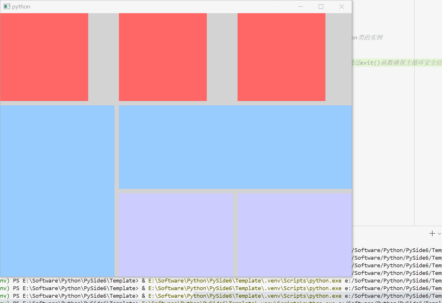
修改 template.qml 文件的内容。
import QtQuick.Window
import QtQuick.Layouts

// Window控件表示一个顶级窗口
// 在QML中,元素是通过大括号{}内的属性来配置的。
Window {
    width: 800                                                                  // 窗口的宽度
    height: 600                                                                 // 窗口的高度
    visible: true                                                               // 显示窗口
    color: "lightgray"                                                          // 窗口的背景颜色

    // 定义一个GridLayout,用于网格布局
    GridLayout {
        anchors.fill: parent                                                    // 填充父元素

        rows: 3                                                                 // 设置行数
        columns: 3                                                              // 设置列数
        rowSpacing: 10                                                          // 设置行间距
        columnSpacing: 10                                                       // 设置列间距

        Rectangle {
            color: "#FF6666"                                                    // 设置矩形颜色

            implicitWidth: 200                                                  // 设置矩形的隐式宽度
            implicitHeight: 200                                                 // 设置矩形的隐式高度

            Layout.row: 0                                                       // 设置矩形所在的行
            Layout.column: 0                                                    // 设置矩形所在的列
        }

        Rectangle {
            color: "#FF6666"                                                    // 设置矩形颜色

            Layout.preferredWidth: 200                                          // 设置矩形的首选宽度
            Layout.preferredHeight: 200                                         // 设置矩形的首选高度

            Layout.row: 0                                                       // 设置矩形所在的行
            Layout.column: 1                                                    // 设置矩形所在的列
        }

        Rectangle {
            color: "#FF6666"                                                    // 设置矩形颜色

            implicitWidth: 200                                                  // 设置矩形的隐式宽度
            Layout.preferredHeight: 200                                         // 设置矩形的首选高度

            Layout.row: 0                                                       // 设置矩形所在的行
            Layout.column: 2                                                    // 设置矩形所在的列
        }

        Rectangle {
            color: "#99CCFF"                                                    // 设置矩形颜色

            Layout.row: 1                                                       // 设置矩形所在的行
            Layout.column: 0                                                    // 设置矩形所在的列
            Layout.rowSpan: 2                                                   // 占用二行
            Layout.columnSpan: 1                                                // 占用一列
            Layout.fillWidth: true                                              // 设置矩形填充Column布局的宽度
            Layout.fillHeight: true                                             // 设置矩形填充Column布局的高度
        }

        Rectangle {
            color: "#99CCFF"                                                    // 设置矩形颜色

            Layout.row: 1                                                       // 设置矩形所在的行
            Layout.column: 1                                                    // 设置矩形所在的列
            Layout.rowSpan: 1                                                   // 占用一行
            Layout.columnSpan: 2                                                // 占用两列
            Layout.fillWidth: true                                              // 设置矩形填充Column布局的宽度
            Layout.fillHeight: true                                             // 设置矩形填充Column布局的高度
        }

        Rectangle {
            color: "#CCCCFF"                                                    // 设置矩形颜色

            Layout.row: 2                                                       // 设置矩形所在的行
            Layout.column: 1                                                    // 设置矩形所在的列
            Layout.fillWidth: true                                              // 设置矩形填充Column布局的宽度
            Layout.fillHeight: true                                             // 设置矩形填充Column布局的高度
        }

        Rectangle {
            color: "#CCCCFF"                                                    // 设置矩形颜色

            Layout.row: 2                                                       // 设置矩形所在的行
            Layout.column: 2                                                    // 设置矩形所在的列
            Layout.fillWidth: true                                              // 设置矩形填充Column布局的宽度
            Layout.fillHeight: true                                             // 设置矩形填充Column布局的高度
        }
    }
}
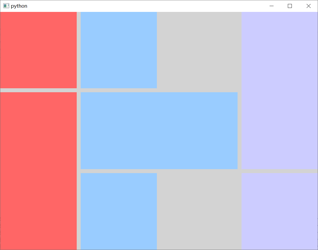
修改 template.qml 文件的内容。
import QtQuick.Window
import QtQuick.Layouts

// Window控件表示一个顶级窗口
// 在QML中,元素是通过大括号{}内的属性来配置的。
Window {
    width: 800                                                                  // 窗口的宽度
    height: 600                                                                 // 窗口的高度
    visible: true                                                               // 显示窗口
    color: "lightgray"                                                          // 窗口的背景颜色

    // 定义一个GridLayout,用于网格布局
    GridLayout {
        anchors.fill: parent                                                    // 填充父元素

        rows: 3                                                                 // 设置行数
        columns: 3                                                              // 设置列数
        rowSpacing: 10                                                          // 设置行间距
        columnSpacing: 10                                                       // 设置列间距
        flow: Grid.TopToBottom                                                  // 设置布局方式

        Rectangle {
            color: "#FF6666"                                                    // 设置矩形颜色

            Layout.fillWidth: true                                              // 设置矩形填充Column布局的宽度
            Layout.fillHeight: true                                             // 设置矩形填充Column布局的高度
        }

        Rectangle {
            color: "#FF6666"                                                    // 设置矩形颜色

            Layout.rowSpan: 2                                                   // 占用二行
            Layout.columnSpan: 1                                                // 占用一列
            Layout.fillWidth: true                                              // 设置矩形填充Column布局的宽度
            Layout.fillHeight: true                                             // 设置矩形填充Column布局的高度
        }

        Rectangle {
            color: "#99CCFF"                                                    // 设置矩形颜色

            Layout.rowSpan: 1                                                   // 占用一行
            Layout.columnSpan: 2                                                // 占用二列
            Layout.fillWidth: true                                              // 设置矩形填充Column布局的宽度
            Layout.fillHeight: true                                             // 设置矩形填充Column布局的高度
        }

        Rectangle {
            color: "#99CCFF"                                                    // 设置矩形颜色

            Layout.fillWidth: true                                              // 设置矩形填充Column布局的宽度
            Layout.fillHeight: true                                             // 设置矩形填充Column布局的高度
        }

        Rectangle {
            color: "#CCCCFF"                                                    // 设置矩形颜色

            Layout.rowSpan: 2                                                   // 占用二行
            Layout.columnSpan: 1                                                // 占用一列

            Layout.fillWidth: true                                              // 设置矩形填充Column布局的宽度
            Layout.fillHeight: true                                             // 设置矩形填充Column布局的高度
        }

        Rectangle {
            color: "#CCCCFF"                                                    // 设置矩形颜色

            Layout.fillWidth: true                                              // 设置矩形填充Column布局的宽度
            Layout.fillHeight: true                                             // 设置矩形填充Column布局的高度
        }
    }
}
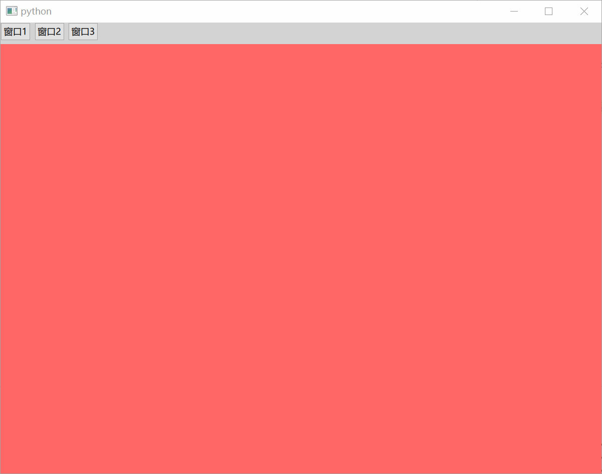
4.4、栈布局管理器
栈布局管理器 StackLayout 可以管理多个项目,但只能显示一个项目。它的常用属性如下:
count : int                                                                     // 该布局的项目数量
currentIndex : int                                                              // 当前项目的索引
另外,StackLayout 还包含 index 和 isCurrentItem 等附加属性。
StackLayout.index : int                                                         // 保存了堆叠布局中每个子项的索引
StackLayout.isCurrentItem : bool                                                // 值为真时意味着该子元素是“堆叠布局”中的当前项
StackLayout.layout : StackLayout                                                // 包含了管理此子项的“堆叠布局”组件
修改 template.qml 文件的内容。
import QtQuick.Window
import QtQuick.Layouts
import QtQuick.Controls

// Window控件表示一个顶级窗口
// 在QML中,元素是通过大括号{}内的属性来配置的。
Window {
    width: 800                                                                  // 窗口的宽度
    height: 600                                                                 // 窗口的高度
    visible: true                                                               // 显示窗口
    color: "lightgray"                                                          // 窗口的背景颜色

    ColumnLayout {
        anchors.fill: parent                                                    // 填充父元素

        RowLayout {
            Button {
                text: "窗口1"

                // 点击按钮时触发信号
                onClicked: {
                    stackLayoutId.currentIndex = 0                              // 栈布局切换到第一个元素
                }
            }

            Button {
                text: "窗口2"

                onClicked: {
                    stackLayoutId.currentIndex = 1                              // 栈布局切换到第二个元素
                }
            }

            Button {
                text: "窗口3"

                onClicked: {
                    stackLayoutId.currentIndex = 2                              // 栈布局切换到第三个元素
                }
            }
        }

        // 定义一个StackLayout,用于栈布局
        StackLayout {
            id: stackLayoutId                                                   // 栈布局ID

            Rectangle {
                color: "#FF6666"                                                // 设置矩形颜色

                Layout.fillWidth: true                                          // 填充宽度
                Layout.fillHeight: true                                         // 填充高度
            }

            Rectangle {
                color: "#66ffb0ff"                                              // 设置矩形颜色

                Layout.fillWidth: true                                          // 填充宽度
                Layout.fillHeight: true                                         // 填充高度
            }

            Rectangle {
                color: "#6673ffff"                                              // 设置矩形颜色

                Layout.fillWidth: true                                          // 填充宽度
                Layout.fillHeight: true                                         // 填充高度
            }
        }
    }
}

 浙公网安备 33010602011771号