一个坐标多张图(上-下)
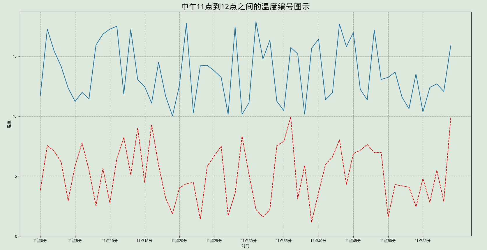
# 需求:模拟一小时内(60分钟)北京和上海的温度变化数据

import matplotlib.pyplot as plt     # 导入绘图库
import random                       # 导入随机数包
from pylab import mpl

# 设置显示中文字体
mpl.rcParams["font.sans-serif"] = ["SimHei"]

# 数据准备
x = range(60)                                        # X轴时间范围:0-59分钟(共60个点)
y_shanghai = [random.uniform(10, 18) for i in x]     # 生成上海温度模拟数据(15-18℃之间)
y_beijing  = [random.uniform(1, 10) for i in x]     # 生成上海温度模拟数据(1-10℃之间)

# 创建画布
# figsize控制图表物理尺寸,dpi影响输出图像的清晰度(适合打印场景)
plt.figure(figsize=(20, 10), dpi=100)                # 创建20英寸宽、10英寸高的画布,分辨率100像素/英寸

# 画折线图
plt.plot(x, y_shanghai)                              # 绘制折线图,默认蓝色实线[2,4]
plt.plot(x, y_beijing, color='r', linestyle='--')

# 添加x和y轴刻度
x_ticks_label = ["11点{}分".format(i) for i in x]    # 生成中文时间标签
y_ticks = range(20)                                  # Y轴范围0-20℃

plt.xticks(x[::5], x_ticks_label[::5])               # 设置X轴刻度(步长5)
plt.yticks(y_ticks[::5])                             # 设置Y轴刻度(步长5)

# 网格虚线
plt.grid(True, linestyle="--", alpha=1)              # alpha透明度

# 添加标题
plt.title("中午11点到12点之间的温度编号图示", fontsize=20)
plt.xlabel("时间", fontsize=10)
plt.ylabel("温度", fontsize=10)

# 保存图片
plt.savefig("./test.png")

# 显示图像
plt.show()
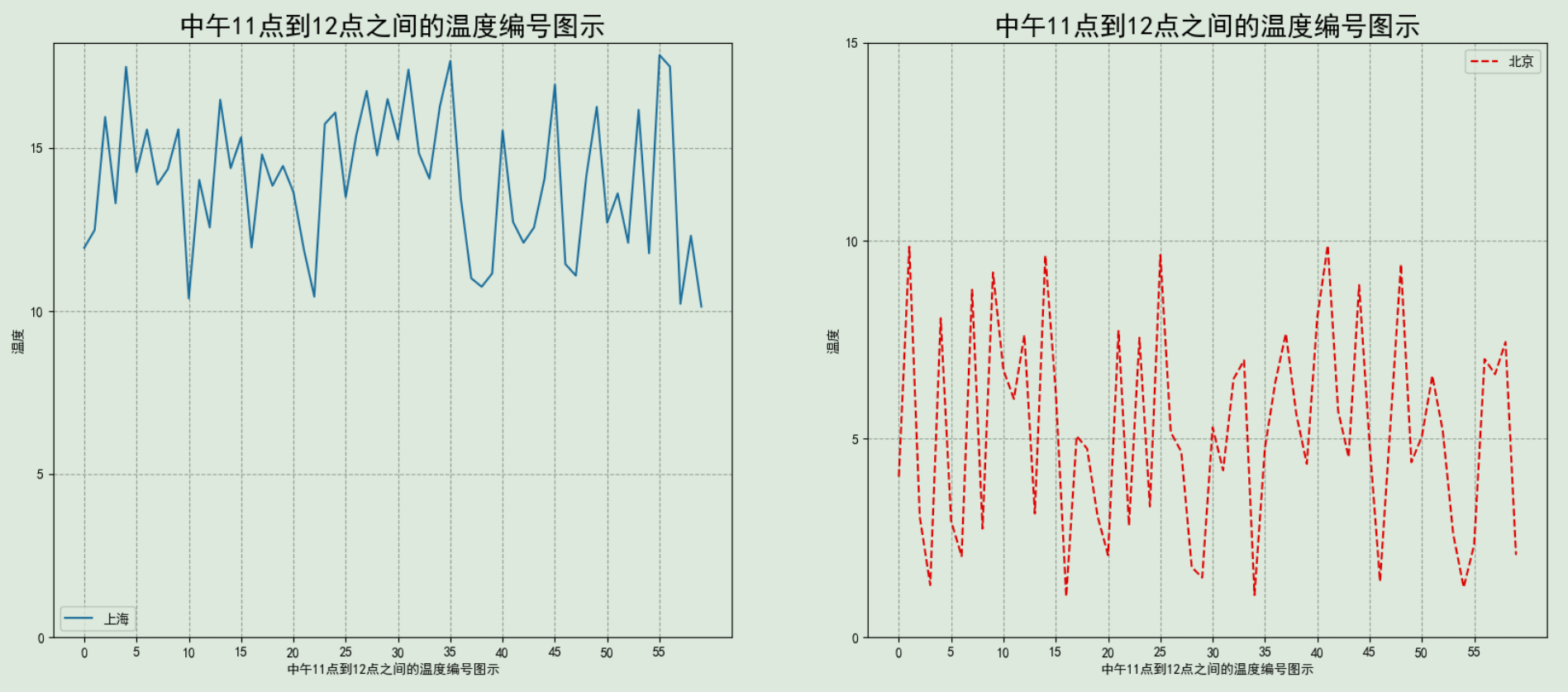
两个坐标两张图(左-右)
# plt.plot()  面向过程画图
# axes.set_() 面向对象画图

import matplotlib.pyplot as plt
import random
from pylab import mpl

# 设置显示中文字体
mpl.rcParams["font.sans-serif"] = ["SimHei"]

# 数据准备
x = range(60)
y_shanghai = [random.uniform(10, 18) for i in x]
y_beijing  = [random.uniform(1, 10) for i in x]

# 创建画布
fig, axes = plt.subplots(nrows=1, ncols=2, figsize=(20,8), dpi=100)

# 画折线图
axes[0].plot(x, y_shanghai, label='上海')
axes[1].plot(x, y_beijing, color='r', linestyle='--', label='北京')

# 添加x和y轴刻度
x_ticks_label = ["11点{}分".format(i) for i in x]
y_ticks = range(20)

axes[0].set_xticks(x[::5])
axes[0].set_yticks(y_ticks[::5])
axes[1].set_xticks(x[::5])
axes[1].set_yticks(y_ticks[::5])

# 网格虚线
axes[0].grid(True, linestyle="--", alpha=1)
axes[1].grid(True, linestyle="--", alpha=1)

# 添加标题
axes[0].set_xlabel("中午11点到12点之间的温度编号图示", fontsize=10)
axes[0].set_ylabel("温度", fontsize=10)
axes[0].set_title("中午11点到12点之间的温度编号图示", fontsize=20)

axes[1].set_xlabel("中午11点到12点之间的温度编号图示", fontsize=10)
axes[1].set_ylabel("温度", fontsize=10)
axes[1].set_title("中午11点到12点之间的温度编号图示", fontsize=20)

# 保存图片
plt.savefig("./test2.png")

# 添加图例
axes[0].legend(loc=0)
axes[1].legend(loc=0)

# 显示图像
plt.show()


 浙公网安备 33010602011771号