CSS-2
day 39
学习链接:https://www.cnblogs.com/yuanchenqi/articles/5977825.html
4 文本属性
font-size: 10px;

text-align: center;   横向排列

line-height: 200px;   文本行高 通俗的讲,文字高度加上文字上下的空白区域的高度 50%:基于字体大小的百分比

vertical-align:-4px  设置元素内容的垂直对齐方式 ,只对行内元素有效,对块级元素无效


text-indent: 150px;   首行缩进
letter-spacing: 10px;
word-spacing: 20px;
text-transform: capitalize;   所有单词的首字母大写
5 边框属性
<!DOCTYPE html>
<html lang="en">
<head>
    <meta charset="UTF-8">
    <title>Title</title>

    <style>
        div{
            background-color: turquoise;
            height: 100px;
            /*text-align: center;*/
            line-height:100px;
            /*这里height 设置值和line-height 相同值的话。我们可以让文本内容居中*/
        }
        .div1{
            border: 1px solid rebeccapurple;
        }
    </style>
</head>
<body>


<div class="div1">介绍文本</div>

</body>
</html>


border-style: solid;

border-color: chartreuse;

border-width: 20px;

简写:border: 30px rebeccapurple solid;
5 列表属性
ul,ol{   list-style: decimal-leading-zero;
         list-style: none; <br>       这个比较重要
         list-style: circle;
         list-style: upper-alpha;
         list-style: disc; }
7 dispaly属性
none 隐藏标签(位置也消失)
block
inline
inline-block
内联标签不能设置长和宽,块级元素可以
但是我们可以再内联标签的属性值加上一个属性 display:block
<!DOCTYPE html>
<html lang="en">
<head>
    <meta charset="UTF-8">
    <title>Title</title>

    <style>
        div,p,span,a{
            width: 100px;
            height: 100px;
        }
        div{
            background-color: red;
        }
        p{
            background-color: blue;
        }
        span{
            background-color: greenyellow;
            display: inline-block;
            /*display: block;*/
        }
        a{
            background-color: blueviolet;
            display: inline-block;
        }
    </style>
</head>
<body>


<div>介绍文本</div>
<p>heloo world</p>
<span>xxx</span>
<a href="xx">click</a>
</body>
</html>
display:inline-block可做列表布局,其中的类似于图片间的间隙小bug可以通过如下设置解决:
<!DOCTYPE html>
<html lang="en">
<head>
    <meta charset="UTF-8">
    <title>Title</title>

    <style>
        .div2,p,span,a{
            width: 100px;
            height: 100px;
        }
        .div2{
            background-color: red;
        }
        p{
            background-color: blue;
        }
        span{
            background-color: greenyellow;
            display: inline-block;
            /*display: block;*/
        }
        a{
            background-color: blueviolet;
            display: inline-block;
        }
        .outer{
            word-spacing: -5px;

        }
    </style>
</head>
<body>


<div class="div2">介绍文本</div>
<p>heloo world</p>

<!--我们想让span 和 a 标签之前的空隙去掉,所以我们在他两的上方添加一个父级标签,设置属性-->
<div class="outer">
    <span>xxx</span>
    <a href="xx">click</a>
</div>
</body>
</html>
8 外边距和内边
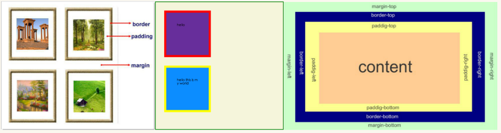
- margin(外边距): 用于控制元素与元素之间的距离(标签与标签之间的距离);margin的最基本用途就是控制元素周围空间的间隔,从视觉角度上达到相互隔开的目的。
- padding: 用于控制内容与边框之间的距离;
- Border(边框) 围绕在内边距和内容外的边框。
- Content(内容) 盒子的内容,显示文本和图像。
<!DOCTYPE html>
<html lang="en">
<head>
    <meta charset="UTF-8">
    <title>Title</title>
    <style>
        .test1{
            width: 200px;
            height: 200px;
            background-color: turquoise;
            border: 30px solid red;
            padding: 40px;
            margin: 20px;
        }
        .test2{
            width: 200px;
            height: 200px;
            background-color: yellow;
            border: 30px solid darkslategray;
            padding: 40px;
        }

     body{
         border: 2px solid darkslateblue;
         /*margin: 0px;*/
     }
    </style>
</head>
<body>
<!--   body 标签和 html 标签默认有一个距离,如果要是想修改的话,我们加一个margin:0px-->

<div class="test1">
    hello world
</div>
<div class="test2">
    hello bigbao
</div>


</body>
</html>
代码效果如下图所示

思考2:
margin collapse(边界塌陷或者说边界重叠)
外边距的重叠只产生在普通流文档的上下外边距之间,这个看起来有点奇怪的规则,其实有其现实意义。设想,当我们上下排列一系列规则的块级元素(如段 落P)时,那么块元素之间因为外边距重叠的存在,段落之间就不会产生双倍的距离。又比如停车场
1兄弟div:上面div的margin-bottom和下面div的margin-top会塌陷,也就是会取上下两者margin里最大值作为显示值
2父子div
if 父级div中没有 border,padding,inline content其中的任意一个,子级div的margin会一直向上找,直到找到某个标签包括border,padding,inline content 中的其中一个,然后按此div 进行margin(这个如果是兄弟的话,那么兄弟之间不需要满足这个条件,也就是说兄弟之间即使 border,padding,inline content其中的任意一个,也可以实现margin) ,就比如下面我们想实现test1 和 outer 之前实现margin top : 50px,这里我们要是不在outer 的content 里写内容或者不在.outer 设置border的话,他会和往上找也就是找到了body ,从而实现和body50px
<!DOCTYPE html>
<html lang="en">
<head>
    <meta charset="UTF-8">
    <title>Title</title>
    <style>
        .test1{
            width: 200px;
            height: 200px;
            background-color: turquoise;
            border: 30px solid red;
            padding: 40px;
            margin-top: 50px;
        }
        .test2{
            width: 200px;
            height: 200px;
            background-color: yellow;
            border: 30px solid darkslategray;
            padding: 40px;
        }
        .outer{
            border: 5px solid hotpink;
            background-color: darkcyan;

        }
     body{
         border: 10px solid darkslateblue;
         margin: 0px;
     }
    </style>
</head>
<body>
<!--    if  父级div中没有 border,padding,inline content,子级div的margin会一直向上找,
直到找到某个标签包括border,padding,inline content中的其中一个,然后按此div 进行margin -->

<div class="outer">
    <!--inline content 文本-->
    <div class="test1">
        hello world
    </div>
    <div class="test2">
        hello bigbao
    </div>
</div>


</body>
</html>
9 float属性××××××
先来了解一下block元素和inline元素在文档流中的排列方式。
block元素通常被现实为独立的一块,独占一行,多个block元素会各自新起一行,默认block元素宽度自动填满其父元素宽度。block元素可以设置width、height、margin、padding属性;
inline元素不会独占一行,多个相邻的行内元素会排列在同一行里,直到一行排列不下,才会新换一行,其宽度随元素的内容而变化。inline元素设置width、height属性无效。inline元素的margin和padding属性。水平方向的padding-left, padding-right, margin-left, margin-right都产生边距效果;但竖直方向的padding-top, padding-bottom, margin-top, margin-bottom不会产生边距效果。
- 常见的块级元素有 div、form、table、p、pre、h1~h5、dl、ol、ul 等。
- 常见的内联元素有span、a、strong、em、label、input、select、textarea、img、br等
所谓的文档流,指的是元素排版布局过程中,元素会自动从左往右,从上往下的流式排列。
脱离文档流,也就是将元素从普通的布局排版中拿走,其他盒子在定位的时候,会当做脱离文档流的元素不存在而进行定位。
只有绝对定位absolute和浮动float才会脱离文档流。
---部分无视和完全无视的区别?需要注意的是,使用float脱离文档流时,其他盒子会无视这个元素,但其他盒子内的文本依然会为这个元素让出位置,环绕在周围(可以说是部分无视)。而对于使用absolute position脱离文档流的元素,其他盒子与其他盒子内的文本都会无视它。(可以说是完全无视)
浮动的表现
定义:浮动的框可以向左或向右移动,直到它的外边缘碰到包含框或另一个浮动框的边框为止。由于浮动框不在文档的普通流中,所以文档的普通流中的浮动框之后的块框表现得就像浮动框不存在一样。(注意这里是块框而不是内联元素;浮动框只对它后面的元素造成影响)
注意 当初float被设计的时候就是用来完成文本环绕的效果,所以文本不会被挡住,这是float的特性,即float是一种不彻底的脱离文档流方式。无论多么复杂的布局,其基本出发点均是:“如何在一行显示多个div元素”。
现象1:
假如某个div元素A是浮动的,如果A元素上一个元素也是浮动的,那么A元素会跟随在上一个元素的后边(如果一行放不下这两个元素,那么A元素会被挤到下一行);如果A元素上一个元素是标准流中的元素,那么A的相对垂直位置不会改变,也就是说A的顶部总是和上一个元素的底部对齐。此外,浮动的框之后的block元素元素会认为这个框不存在,但其中的文本依然会为这个元素让出位置。 浮动的框之后的inline元素,会为这个框空出位置,然后按顺序排列。
现象2:
(1)左右结构div盒子重叠现象,一般是由于相邻两个DIV一个使用浮动一个没有使用浮动。如上面的例1:相邻的两个盒子box2向左浮动、box3未浮动。一个使用浮动一个没有导致DIV不是在同个“平面”上,但内容不会照成覆盖现象,只有DIV形成覆盖现象。
解决方法:要么都不使用浮动;要么都使用float浮动;要么对没有使用float浮动的DIV设置margin样式。
(2)上下结构div盒子重叠现象
<!DOCTYPE html>
<html lang="en">
<head>
    <meta charset="UTF-8">
    <title>Title</title>
    <style type="text/css">
         * {
             margin:0;padding:0;
         }
        .container{
            border:1px solid red;width:500px;
        }
        #box1{
            background-color:green;float:left;width:100px;height:100px;
        }
        #box2{
            background-color:deeppink; float:right;width:100px;height:100px;
        }
         #box3{
             background-color:pink;height:40px;
         }
    </style>
</head>

<body>

<div class="container">
    <div id="box1">box1 向左浮动</div>
    <div id="box2">box2 向右浮动</div>
</div>
<div id="box3">box3</div>
</body>
</html>

这里我们看到"box1 块"左浮动    “box2块” 右浮动
这样我们的box3 就顶上去了跑到container下面了(container 飘在box3 上方)。现在想办法去把box3 落到下面来,清除浮动
清除浮动:
在非IE浏览器(如Firefox)下,当容器的高度为auto,且容器的内容中有浮动(float为left或right)的元素,在这种情况下,容器的高度不能自动伸长以适应内容的高度,使得内容溢出到容器外面而影响(甚至破坏)布局的现象。这个现象叫浮动溢出,为了防止这个现象的出现而进行的CSS处理,就叫CSS清除浮动。
clear语法:
clear : none | left | right | both

取值:
none : 默认值。允许两边都可以有浮动对象
left : 不允许左边有浮动对象
right : 不允许右边有浮动对象
both : 不允许有浮动对象

但是需要注意的是:clear属性只会对自身起作用,而不会影响其他元素。如果一个元素的右侧有一浮动对象,而这个元素设置了不允许右边有浮动对象,即clear:right,则这个元素会自动下移一格,达到本元素右边没有浮动对象的目的。
.clearfix:after {             <----在类名为“clearfix”的元素内最后面加入内容;
content: ".";                 <----内容为“.”就是一个英文的句号而已。也可以不写。
display: block;               <----加入的这个元素转换为块级元素。
clear: both;                  <----清除左右两边浮动。
visibility: hidden;           <----可见度设为隐藏。注意它和display:none;是有区别的。visibility:hidden;仍然占据空间,只是看不到而已;
line-height: 0;               <----行高为0;
height: 0;                    <----高度为0;
font-size:0;                  <----字体大小为0;
}
.clearfix { *zoom:1;}         <----这是针对于IE6的,因为IE6不支持:after伪类,这个神奇的zoom:1让IE6的元素可以清除浮动来包裹内部元素。
整段代码就相当于在浮动元素后面跟了个宽高为0的空div,然后设定它clear:both来达到清除浮动的效果。
之所以用它,是因为,你不必在html文件中写入大量无意义的空标签,又能清除浮动。
<!DOCTYPE html>
<html lang="en">
<head>
    <meta charset="UTF-8">
    <title>Title</title>
    <style type="text/css">
         * {
             margin:0;padding:0;
         }
        .container{
            border:1px solid red;width:500px;
        }
        #box1{
            background-color:green;float:left;width:100px;height:100px;
        }
        #box2{
            background-color:deeppink; float:right;width:100px;height:100px;
        }
         #box3{
             background-color:pink;height:40px;
             border:5px solid red;
         }
        .clearfix:after{
            content: "";
            display: block;
            clear: both;
        }

    </style>
</head>

<body>

<div class="container clearfix">
    <div id="box1">box1 向左浮动</div>
    <div id="box2">box2 向右浮动</div>
</div>
<div id="box3">box3</div>
</body>
</html>
话说回来,你这段代码真是个累赘啊,这样写不利于维护。
只要写一个.clearfix就行了,然后在需要清浮动的元素中 添加clearfix类名就好了。
如:
<div class="head clearfix"></div>
方式2:(不推荐)
overflow:hidden;
overflow:hidden的含义是超出的部分要裁切隐藏,float的元素虽然不在普通流中,但是他是浮动在普通流之上的,可以把普通流元素+浮动元素想象成一个立方体。如果没有明确设定包含容器高度的情况下,它要计算内容的全部高度才能确定在什么位置hidden,这样浮动元素的高度就要被计算进去。这样包含容器就会被撑开,清除浮动。
10 position(定位)
1 static
static 默认值,无定位,不能当作绝对定位的参照物,并且设置标签对象的left、top等值是不起作用的的。
2 position: relative/absolute
relative 相对定位。相对定位是相对于该元素在文档流中的原始位置,即以自己原始位置为参照物。有趣的是,即使设定了元素的相对定位以及偏移值,元素还占有着原来的位置,即占据文档流空间。对象遵循正常文档流,但将依据top,right,bottom,left等属性在正常文档流中偏移位置。而其层叠通过z-index属性定义。
注意:position:relative的一个主要用法:方便绝对定位元素找到参照物。
relative  相对偏移(相对定位是相对于该元素在文档流中的原始位置,这里要是改成absolute的话,相对于最近的已定位祖先元素定位,如果元素没有已定位的祖先元素,那么它的位置相对于最初的包含块(即body元素))
<!DOCTYPE html>
<html lang="en">
<head>
    <meta charset="UTF-8">
    <title>Title</title>
<style type="text/css">
    * {
        margin:0;padding:0;
         }
    .div1{
        width: 200px;
        height: 200px;
        background-color: yellow;
    }
    .div2{
        width: 200px;
        height: 200px;
        background-color: chartreuse;
        position: relative;
        left: 100px;
        top:100px;
    }
    .div3{
        width: 200px;
        height: 200px;
        background-color: blue;
    }
    .outer{
        position: ;
    }
</style>
</head>

<body>


<div class="outer">
    <div class="div1"></div>
    <div class="div2"></div>
    <div class="div3"></div>
</div>

</body>
</html>
absolute 绝对定位。
定义:设置为绝对定位的元素框从文档流完全删除,并相对于最近的已定位祖先元素定位,如果元素没有已定位的祖先元素,那么它的位置相对于最初的包含块(即body元素)。元素原先在正常文档流中所占的空间会关闭,就好像该元素原来不存在一样。元素定位后生成一个块级框,而不论原来它在正常流中生成何种类型的框。
重点:如果父级设置了position属性,例如position:relative;,那么子元素就会以父级的左上角为原始点进行定位。这样能很好的解决自适应网站的标签偏离问题,即父级为自适应的,那我子元素就设置position:absolute;父元素设置position:relative;,然后Top、Right、Bottom、Left用百分比宽度表示。
另外,对象脱离正常文档流,使用top,right,bottom,left等属性进行绝对定位。而其层叠通过z-index属性定义。
总结:参照物用相对定位,子元素用绝对定位,并且保证相对定位参照物不会偏移即可。
3 position:fixed(固定死位置)
fixed:对象脱离正常文档流,使用top,right,bottom,left等属性以窗口为参考点进行定位,当出现滚动条时,对象不会随着滚动。而其层叠通过z-index属性 定义。 注意点: 一个元素若设置了 position:absolute | fixed; 则该元素就不能设置float。这 是一个常识性的知识点,因为这是两个不同的流,一个是浮动流,另一个是“定位流”。但是 relative 却可以。因为它原本所占的空间仍然占据文档流。
在理论上,被设置为fixed的元素会被定位于浏览器窗口的一个指定坐标,不论窗口是否滚动,它都会固定在这个位置。
<!DOCTYPE html>
<html lang="en">
<head>
    <meta charset="UTF-8">
    <title>Title</title>
<style type="text/css">
    * {
        margin:0;padding:0;
         }
    .div1{
        width: 200px;
        height: 200px;
        background-color: yellow;
    }
    .div2{
        width: 200px;
        height: 200px;
        background-color: chartreuse;
        position: absolute;
        left: 100px;
        top:100px;
    }
    .div3{
        width: 200px;
        height: 200px;
        background-color: blue;
    }
    /*.outer{*/
        /*width: 2000px;*/
        /*height: 2000px;*/
        /*background-color: darkslateblue;*/
    /*}*/
    .returnTop{
        width: 80px;
        height: 50px;
        background-color: darkgray;
        text-align: center;
        line-height: 50px;
        color: azure;
        position: fixed;
        bottom: 20px;
        right: 8px;
    }
</style>
</head>

<body>

<div style="height: 200px;background-color: aqua"></div>
<div class="outer">
    <div class="div1"></div>
    <div class="div2"></div>
    <div class="div3"></div>
</div>
<div style="height: 2000px;background-color: rosybrown"></div>
<div class="returnTop"> 返回顶部 </div>
</body>
</html>


        text-align: center;
        line-height: 50px;

这一步是文档居中
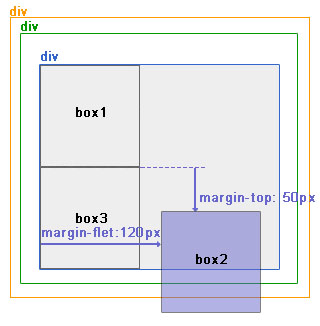
4 仅使用margin属性布局绝对定位元素
此情况,margin-top 和margin-left 的值不再对文档流中的元素产生影响,因为该元素已经脱离了文档流。另外,不管它的祖先元素有没有定位,都是以文档流中原来所在的位置上偏移参照物。
图9中,使用margin属性布局相对定位元素。
层级关系为:
<div ——————————— position:relative;
<div—————————-没有设置为定位元素,不是参照物
<div———————-没有设置为定位元素,不是参照物
<div box1
<div box2 ——–position:absolute; margin-top:50px; margin-left:120px;(这里设置的不是top,left,而是找的margin)
<div box3
效果图:

 浙公网安备 33010602011771号