Viewport
Pixels
The pixel is a display unit of the smallest possible “spec” that your screen (be it a computer, phone laptop, TV…etc) can show, while pixel is an abstract concept. A pixel is not necessarily a small square block, nor does it have the standard width and height, just a "dot" used to display rich colors.
There are several important concepts for you to understand pixels in web development.
Device pixels
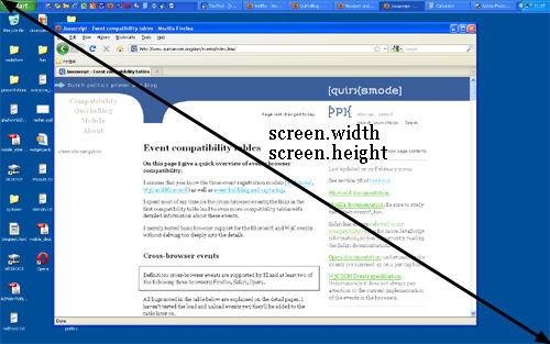
Device pixels are also known as physical pixels, which is a fixed property of your moniter. They are the actual number of pixels in a device’s screen. It can (at zoom level 100%) be read out from screen.width/height.
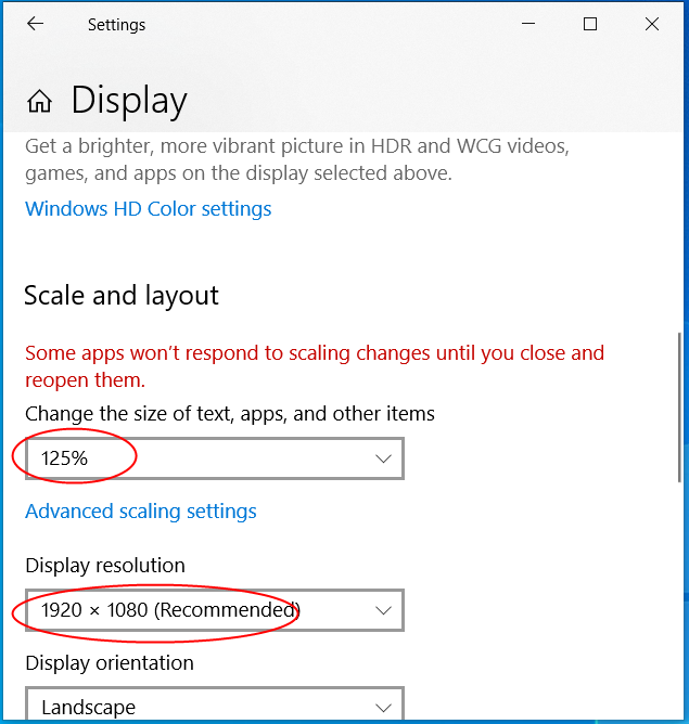
On the desktop, you can set Display resolution and Scale of layout. At higher resolutions, such as 1600 x 1200 pixels, items appear sharper. They also appear smaller so more items can fit on the screen. At lower resolutions, such as 800 x 600 pixels, fewer items fit on the screen, but they appear larger.
By this behavior, the value of screen.width/height will change and be not same as the actual device pixels no longer.
Device-independent pixels(dips or dp)
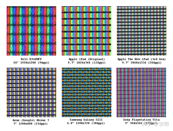
Device-independent pixels, also known as logical pixels, or DIP for short.This concept was developed primarily for Retina screen by Apple.
Retina compresses more pixels into one screen to get a higher resolution and better display. Let's take a look at the difference:
- iPhone3GS without retina
- iPhone 4 with retina
Apple doubled the resolution of the iPhone 4, but its size didn't change. This means that in the same screen size, the number of pixels has doubled, and meanwhite the pixel density has been doubled. It improves the level of content detail.
We know, on desktop monitors, when we adjust the display resolution from 800 * 600 to 1024 * 768, the text ICONS on the screen get smaller and show more content. But the Retina display doesn't have that problem. Retina Display solves the problem of how clear the screen is, not how much content the screen shows.
How that can be?
Take the third-generation MacBook Pro with Retina Display as an example. Its graphics card renders 2880x1880 device pixels in pixel groups, and each pixel group includes 4 device pixels. This pixel group is actually rendered as one pixel. This gives the user the same size of the icon and text as the original 1440x900 resolution display, but with four times of the sharpness.
This pixel group, can be called device-independent pixels, or density-independent pixels, and it is a virtual pixel that can be used by the program and then converted into device pixels.
Now, 1 device-independent pixel is equal to 4 device pixels, if it is scaled to 200%, 1 device-independent pixel will be equal to 8 device pixels.
The desktop monitors show more content when their resolution increases, but the retina stays the same, why?
Retina device-independent pixel is fixed, when we increase the device pixels, more device pixels is rendered into a device-independent pixel area, this makes image more exquisite. But on desktop display, a device-independent pixel includes only one device pixel. with the higher resolution, there will be more device pixels and also more and smaller device-independent pixels, so more content will be shown.
The device-independent pixels can be read out from screen.width/height.
CSS pixels
The “pixels” that are used in CSS declarations by browsers. If you give a certain element a width: 128px, and your browser is 1024px wide, the element would take up 1/8 of your browser's width.
In general, css pixels is equal to device-independent pixels. But if you zoom in or zoom out you browsers, css pixels wil become bigger or smaller.
Zooming as implemented in modern browsers consists of nothing more than “stretching up” pixels. That is, the width of the element is not changed from 128 to 256 pixels; instead the device pixels are doubled in size. Formally, the element still has a width of 128 CSS pixels, even though it happens to take the space of 256 device pixels.
In other words, zooming to 200% makes one CSS pixel grow to four times the size of one device pixels. (Two times the width, two times the height, yields four times in total).
Now let’s zoom out. The CSS pixels start to shrink, meaning that one device pixel now overlaps several CSS pixels.

If you zoom in, the opposite happens. The CSS pixels start to grow, and now one CSS pixels overlaps several device pixels.
devicePixelRatio
window.devicePixelRatio = device pixels / css pixels
The window.devicePixelRatio returns the ratio of the resolution in device pixels to the resolution in CSS pixels for the current display device. This value could also be interpreted as the ratio of pixel sizes: the size of one CSS pixel to the size of one physical pixel. In simpler terms, this tells the browser how many of the screen's actual pixels should be used to draw a single CSS pixel.
Screen Size
The screen size contains the total width and height of the user’s screen.
Viewport
The browser's viewport is the area of the window in which web content can be seen.
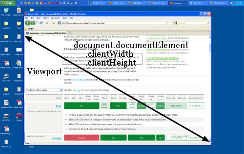
The CSSOM View spec defines both window.innerHeight/Width and document.documentElement.clientHeight/Width in terms of the same viewport, just differing in whether the scrollbars are included or not, so they should always change together.
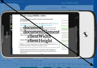
HTML Element
In theory, the width of the <html> element is restricted by the width of the viewport. The <html> element takes 100% of the width of that viewport. However, the viewport is one level higher, so to speak; it’s the element that contains the <html> element. If you give the <html> element a width (Not recommend that), document.documentElement.clientWidth and - Height still gives the dimensions of the viewport, and not of the <html> element.
So clientWidth/Height gives the viewport dimensions in all cases. But where can we find the dimensions of the <html> element itself?
They’re stored in document.documentElement.offsetWidth and -Height.
Event coordinates
When a mouse event occurs, no less than five property pairs are exposed to give you information about the exact place of the event.Three of them are important here:
- pageX/Y gives the coordinates relative to the
<html>element. - clientX/Y gives the coordinates relative to the viewport.
- screenX/Y gives the coordinates relative to the screen.
Mobile browsers
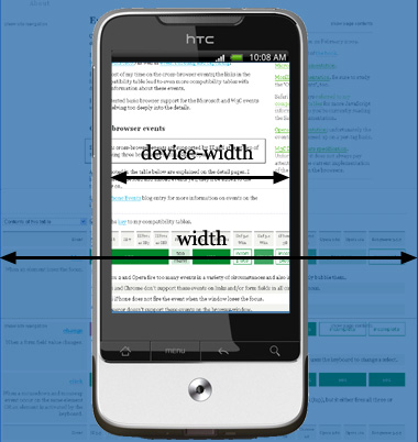
Web pages are often not the same size as the viewport, in which case the browser on desktop provides scrollbars for the user to scroll around and access all the content.
A mobile screen is far smaller than a desktop screen.The viewport on the desktop and mobiles is slightly different. Browsers on mobiles has no windows, scroll bars, or resize buttons. The user pans by flicking a finger. The user zooms in by double-tapping and pinch opening, and zooms out by pinch closing—gestures that are not available for browsers on the desktop.
So how could mobile screen show a wide web page?
Narrow screen devices (e.g. mobiles) render pages in a virtual window or viewport(Layout Viewport), which is usually wider than the screen, and then shrink the rendered result down so it can all be seen at once. Users can then pan and zoom to see different areas of the page. For example, if a mobile screen has a width of 640px, pages might be rendered with a virtual viewport of 980px, and then it will be shrunk down to fit into the 640px space.
This is done because many pages are not mobile optimized, and break when rendered at a small viewport width. This virtual viewport is a way to make non-mobile-optimized sites in general look better on narrow screen devices.
Layout Viewport
What is the layout viewport? It’s the area (in CSS pixels) that the browser uses to calculate the dimensions of elements with percentual width. It’s usually quite a bit larger than the device screen: 980px on the iPhone, 850px on Opera, 800 on Android, etc.
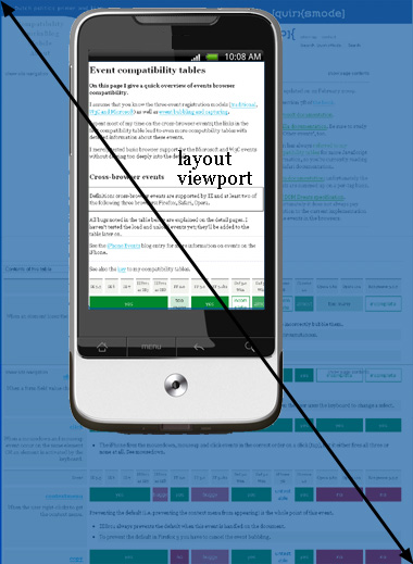
If you rotate your phone, the width of layout viewport keep the same, but its height will change, which is now far less than in portrait mode. But web developers don’t care about the height in general.
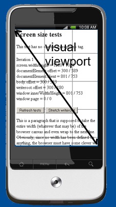
Visual Viewport
The visual viewport is the part of the page that’s currently shown on-screen. The user may scroll to change the part of the page he sees, or zoom to change the size of the visual viewport.
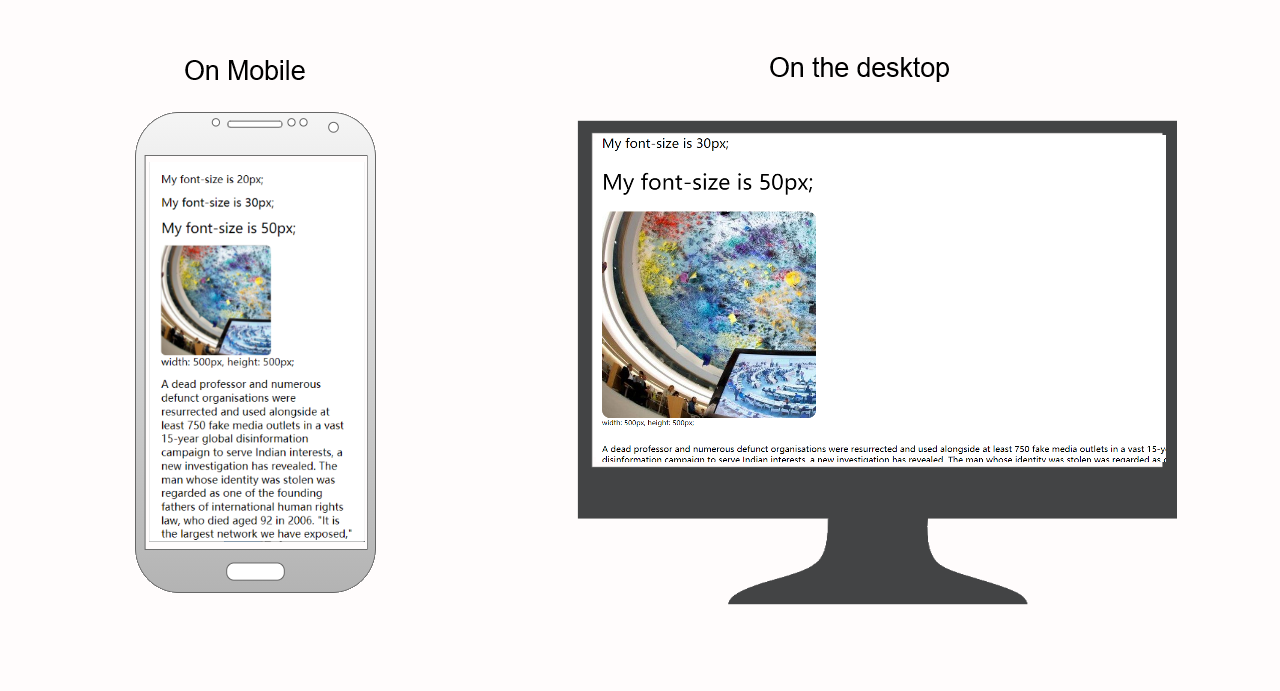
Responsive Layout
Sometimes, we don't want our pages to be shrunk down so small on narrow screens. The UI designers have created multiple views for our website to fit different browser sizes. So the website can adapt and deliver the best experience to users, whether they’re on their desktop, laptop, tablet, or smartphone. For that to happen, though, the website needs a responsive design.
Here is an example of responsive design:
- Screen width is greater than 1300 pixels
- Screen width is between 600 and 1300 pixels
- Screen is between 400 and 600 pixels

- Screen width is less than 400 pixels

From mediaqueri.esyou can find more examples.
How could we implement responsive web pages?
The <meta> tag
The first thing to develop a responsive web page, is adding a viewport meta tag in <head>.
<meta name="viewport" content="width=device-width, initial-scale=1" />
By width=device-width, the width of the layout viewport is constrained to the device width in device pixels.
The initial-scale=1.0 part sets the initial zoom level when the page is first loaded by the browser.
Other attributes that are available are minimum-scale, maximum-scale, and user-scalable. These properties affect the initial scale and width, as well as limiting changes in zoom level.
All major browsers support this tag, including IE9.
Use CSS media queries to apply different styling for small and large screens
Media query is a CSS technique introduced in CSS3. It uses the @media rule to include a block of CSS properties only if a certain condition is true.
Media queries can be used to check many things, such as:
- width and height of the viewport
- width and height of the device
- orientation (is the tablet/phone in landscape or portrait mode?)
- resolution
1 @media not|only mediatype and (mediafeature and|or|not mediafeature) {
2   CSS-Code;
3 }
Using media queries are a popular technique for delivering a tailored style sheet to desktops, laptops, tablets, and mobile phones.
For responsive web design, the idea is very simple: you can define special CSS rules that are executed only if the width of the page is larger than, equal to, or smaller than a certain size.
E.G.
 1 div.sidebar {
 2     width: 300px;
 3 }
 4
 5 @media all and (max-width: 400px) {
 6     // styles assigned when width is smaller than 400px;
 7     div.sidebar {
 8         width: 100px;
 9     }
10 }
Now the sidebar is 300px wide, except when the width is smaller than 400px, in which case the sidebar becomes 100px wide.
NOTE:
The width media query measures the total width of the page in CSS pixels. The width/height uses the same values as document.documentElement.clientWidth/Height (the viewport, in other words). It works with CSS pixels.
Web developers are not interested in the device width; it’s the width of the browser window that counts.

 浙公网安备 33010602011771号