CSS3——3D效果
1.效果1
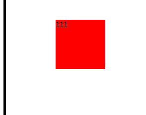
<!DOCTYPE HTML>
<html>
<head>
<meta http-equiv="Content-Type" content="text/html; charset=utf-8">
<title>无标题文档</title>
<style>
.box{width:100px;height:100px;padding:100px;border:5px solid #000;margin:30px auto; -webkit-transform-style:preserve-3d;-webkit-perspective:100px;}
.div{width:100px;height:100px;background:Red; transition:1s;}
.box:hover .div{-webkit-transform:rotateX(180deg);}
</style>
</head>
<body>
<div class="box">
    <div class="div">111</div>
</div>
</body>
</html>
2.效果2

<!DOCTYPE HTML>
<html>
<head>
<meta http-equiv="Content-Type" content="text/html; charset=utf-8">
<title>无标题文档</title>
<style>
.box{width:100px;height:100px;padding:100px;border:5px solid #000;margin:30px auto; -webkit-transform-style:preserve-3d;-webkit-perspective:100px;}
.div{width:100px;height:100px;background:Red; transition:1s;}
.box:hover .div{-webkit-transform:rotateY(180deg);}
</style>
</head>
<body>
<div class="box">
    <div class="div">111</div>
</div>
</body>
</html>
3.效果3

<!DOCTYPE HTML>
<html>
<head>
<meta http-equiv="Content-Type" content="text/html; charset=utf-8">
<title>无标题文档</title>
<style>
.box{width:100px;height:100px;padding:100px;border:5px solid #000;margin:30px auto; -webkit-transform-style:preserve-3d;-webkit-perspective:200px;}
.div{width:100px;height:100px;background:Red; transition:1s;}
.box:hover .div{-webkit-transform:translateZ(-100px);}
</style>
</head>
<body>
<div class="box">
    <div class="div">111</div>
</div>
</body>
</html>
4.效果4

<!DOCTYPE HTML>
<html>
<head>
<meta http-equiv="Content-Type" content="text/html; charset=utf-8">
<title>无标题文档</title>
<style>
.wrap{width:100px;height:100px;padding:100px; border:5px solid #000; margin:100px auto; -webkit-perspective:200px; -webkit-transform:scale(2);}
.box{width:100px;height:100px;background:red; position:relative; -webkit-transform-style:preserve-3d; transition:2s; -webkit-transform-origin:center center -50px;}
.box div{width:100px;height:100px; position:absolute; color:#fff;font-size:50px; text-align:center;line-height:100px;}
.box div:nth-of-type(1){left:0;top:-100px;background:#9C0; -webkit-transform-origin:bottom; -webkit-transform:rotateX(90deg);}
.box div:nth-of-type(2){left:-100px;top:0px;background:#CF3; -webkit-transform-origin:right; -webkit-transform:rotateY(-90deg);}
.box div:nth-of-type(3){left:0px;top:0px;background:#CCF;}
.box div:nth-of-type(4){left:100px;top:0;background:#0C9;-webkit-transform-origin:left;-webkit-transform:rotateY(90deg);}
.box div:nth-of-type(5){left:0px;top:100px;background:#69C;-webkit-transform-origin:top;-webkit-transform:rotateX(-90deg);}
.box div:nth-of-type(6){left:0;top:0;background:#F0C;-webkit-transform:translateZ(-100px) rotateX(180deg);}
.wrap:hover .box{ -webkit-transform:rotateX(180deg);}
</style>
</head>
<body>
<div class="wrap">
    <div class="box">
        <div>1</div>
        <div>2</div>
        <div>3</div>
        <div>4</div>
        <div>5</div>
        <div>6</div>
    </div>
</div>
</body>
</html>
幻灯片效果

<!DOCTYPE HTML>
<html>
<head>
<meta http-equiv="Content-Type" content="text/html; charset=utf-8">
<title>无标题文档</title>
<style id="css">
body,ul,ol{margin:0;padding:0;}
li{ list-style:none;}
.wrap{width:800px;margin:100px auto 0;}
#picList{width:800px;height:360px; -webkit-perspective:800px; }
#picList li{width:50px;height:360px; position:relative; -webkit-transform-style:preserve-3d; -webkit-transform-origin:center center -180px;float:left;}
#picList a{width:100%;height:100%; position:absolute;left:0;top:0;}
#picList li a:nth-of-type(1){ background:url(3d幻灯片/1.jpg) no-repeat; }
#picList li a:nth-of-type(2){ background:url(3d幻灯片/2.jpg) no-repeat; top:-360px; -webkit-transform-origin:bottom; -webkit-transform:rotateX(90deg)}
#picList li a:nth-of-type(3){ background:url(3d幻灯片/3.jpg) no-repeat; -webkit-transform:translateZ(-360px) rotateX(180deg);}
#picList li a:nth-of-type(4){ background:url(3d幻灯片/4.jpg) no-repeat; -webkit-transform-origin:top; -webkit-transform:rotateX(-90deg); top:360px;}
#picList li span{ position:absolute;width:360px;height:360px;background:#333;}
#picList li span:nth-of-type(1){ -webkit-transform-origin:left; -webkit-transform:rotateY(90deg);left:0;}
#picList li span:nth-of-type(2){ -webkit-transform-origin:right; -webkit-transform:rotateY(-90deg);right:0;}

#btns{float:right; padding:10px 0;}
#btns li{width:40px;height:40px;background:#000;color:#fff; border-radius:50%; font:italic 30px/40px Arial;float:left;margin:0 5px; text-align:center; cursor:pointer;}
#btns .active{ background:#f60;}

</style>
<script>
window.onload=function()
{
    var oPicList=document.getElementById("picList");
    var oCss=document.getElementById("css");
    var aBtns=document.getElementById("btns").getElementsByTagName("li");
    var aLi=null;
    var sLi="";
    var sCss="";
    var iLiw=50;
    var iZindex=0;
    var iNow=0;
    var iLength=oPicList.clientWidth/iLiw;
    for(var i=0;i<iLength;i++)
    {
        i>iLength/2?iZindex--:iZindex++;
        sLi+='<li><a href="#"></a><a href="#"></a><a href="#"></a><a href="#"></a><span></span><span></span></li>';
        sCss+="#picList li:nth-of-type("+(i+1)+") a{ background-position:-"+i*iLiw+"px 0;}";
        sCss+="#picList li:nth-of-type("+(i+1)+"){z-index:"+iZindex+"}";

    }
    oPicList.innerHTML=sLi;
    oCss.innerHTML+=sCss;
    aLi=oPicList.children;
    for(var i=0;i<aBtns.length;i++)
    {
        (function(a){
            aBtns[a].onclick=function()
            {
                for(var i=0;i<aLi.length;i++)
                {
                    aLi[i].style.transition="0.5s "+i*50+"ms";
                    aLi[i].style.WebkitTransform="rotateX(-"+a*90+"deg)";
                }
                this.className="active";
                aBtns[iNow].className="";
                iNow=a;
            };
        })(i)
    }
};
</script>
</head>
<body>
<div class="wrap">
    <ul id="picList">

    </ul>
    <ol id="btns">
        <li class="active">1</li>
        <li>2</li>
        <li>3</li>
        <li>4</li>
    </ol>
</div>
</body>
</html>

<!DOCTYPE HTML>
<html>
<head>
<meta http-equiv="Content-Type" content="text/html; charset=utf-8">
<title>无标题文档</title>
<style>
@-webkit-keyframes move
{
    50%
    {
        width:1000px;
    }
}
@-moz-keyframes move
{
    50%
    {
        width:1000px;
    }
}
@keyframes move
{
    50%
    {
        width:1000px;
    }
}
.box{width:100px;height:100px;background:red; -webkit-animation:2s move;
-moz-animation:2s move;animation:2s move;}
</style>
</head>
<body>
<div class="box"></div>
</body>
</html>

<!DOCTYPE HTML>
<html>
<head>
<meta http-equiv="Content-Type" content="text/html; charset=utf-8">
<title>无标题文档</title>
<style>
@-webkit-keyframes move
{
    0%{
        left:0;
    }
    100%
    {
        left:-500px;
    }
}
#wrap{ width:500px;height:100px;border:1px solid #000; position:relative;margin:100px auto; overflow:hidden;}
#list{ position:absolute;left:0;top:0;margin:0;padding:0; -webkit-animation:3s move infinite linear; width:200%;}
#list li{ list-style:none;width:98px;height:98px;border:1px solid #fff;background:#000; color:#fff; font:50px/98px Arial; text-align:center; float:left;}
#wrap:hover #list{ -webkit-animation-play-state:paused;}
</style>
</head>
<body>
<div id="wrap">
    <ul id="list">
        <li>1</li>
        <li>2</li>
        <li>3</li>
        <li>4</li>
        <li>5</li>
        <li>1</li>
        <li>2</li>
        <li>3</li>
        <li>4</li>
        <li>5</li>
    </ul>
</div>
</body>
</html>

<!DOCTYPE HTML>
<html>
<head>
<meta http-equiv="Content-Type" content="text/html; charset=utf-8">
<title>无标题文档</title>
<style>
@-webkit-keyframes domove
{
    0%
    {
        top:0;left:0;
    }
    25%
    {
        top:0;left:300px;
    }
    50%
    {
        top:300px;left:300px;
    }
    75%
    {
        top:300px;left:0px;
    }
    100%
    {
        top:0;left:0;
    }
}
#wrap{width:400px;height:400px;border:1px solid #000; position:relative; border:5px solid #000;}
.box{width:100px;height:100px;background:red; position:absolute;left:0;top:0; -webkit-animation:4s domove infinite linear alternate;}
</style>
</head>
<body>
<div id="wrap">
<div class="box"></div>
</div>
</body>
</html>
折纸布局
 '
'
<!DOCTYPE HTML>
<html>
<head>
<meta http-equiv="Content-Type" content="text/html; charset=utf-8">
<title>无标题文档</title>
<style>
#wrap{ width:500px;margin:0 auto; -webkit-perspective:800px; -webkit-transform-style:preserve-3d;}
#wrap div{ height:100px;border:1px solid #000;background:#ccc;}
#wrap div:nth-of-type(1){ -webkit-transform-origin:bottom; -webkit-transform:rotateX(45deg);}
#wrap div:nth-of-type(2){ -webkit-transform-origin:top; -webkit-transform:rotateX(-45deg);}
#wrap div:nth-of-type(3){ -webkit-transform-origin:top; -webkit-transform:rotateX(45deg);}
</style>
</head>
<body>
<div id="wrap">
    <div>1</div>
    <div>2</div>
    <div style="height:auto;">
    <div>3</div>
    </div>
</div>
</body>
</html>

<!DOCTYPE HTML>
<html>
<head>
<meta http-equiv="Content-Type" content="text/html; charset=utf-8">
<title>无标题文档</title>
<style>
#wrap{ width:500px;margin:0 auto; -webkit-perspective:800px; -webkit-transform-style:preserve-3d; position:relative;}
#wrap div{position:absolute;top:102px;left:0;width:500px; -webkit-transform-origin:top;-webkit-transform-style:preserve-3d;}
#wrap span{height:100px;border:1px solid #000;background:#ccc; display:block;}
#wrap>div:nth-of-type(1){top:0;}
</style>
</head>
<body>
<div id="wrap">
    <div style="-webkit-transform:rotateX(-45deg);">
        <span>1</span>
        <div style="-webkit-transform:rotateX(90deg);">
            <span>2</span>
            <div style="-webkit-transform:rotateX(-90deg);">
                <span>3</span>
                <div style="-webkit-transform:rotateX(90deg);">
                    <span>4</span>
                </div>
            </div>
        </div>
    </div>
</div>
</body>
</html>

<!DOCTYPE HTML>
<html>
<head>
<meta http-equiv="Content-Type" content="text/html; charset=utf-8">
<title>无标题文档</title>
<style>
@-webkit-keyframes open
{
    0%
    {
        -webkit-transform:rotateX(-120deg);
    }
    25%
    {
        -webkit-transform:rotateX(30deg);
    }
    50%
    {
        -webkit-transform:rotateX(-15deg);
    }
    75%
    {
        -webkit-transform:rotateX(8deg);
    }
    100%
    {
        -webkit-transform:rotateX(0deg);
    }
}
@-webkit-keyframes clos
{
    0%
    {
        -webkit-transform:rotateX(0deg);
    }
    100%
    {
        -webkit-transform:rotateX(-120deg);
    }
}
body{margin:0;}
#wrap{ width:160px;margin:30px auto; position:relative; -webkit-perspective:800px;}
#wrap h2{ height:40px;background:#F60; color:#fff; font: bold 16px/40px "微软雅黑"; text-align:center;margin:0; position:relative;z-index:10;}
#wrap div{ position:absolute;top:32px; width:100%;left:0; -webkit-transform-style:preserve-3d; -webkit-transform-origin:top;-webkit-transform:rotateX(-120deg);}
#wrap span{ display:block;height:30px;background:#9F0; font:12px/30px "宋体"; color:#fff; text-indent:20px; box-shadow:inset 0 0 0 20px rgba(0,0,0,1); transition:1s;}
#wrap>div{top:40px;}
#wrap .show{-webkit-animation:2s open;-webkit-transform:rotateX(0deg);}
#wrap .hide{-webkit-animation:0.8s clos;-webkit-transform:rotateX(-120deg);}
#wrap .show>span{ box-shadow:inset 0 0 0 20px rgba(0,0,0,0);}
#btn{ position:absolute;}
</style>
</head>
<body>
<input type="button" value="按钮" id="btn" />
<div id="wrap">
    <h2>我是标题奥</h2>
    <div>
        <span>选项1</span>
        <div>
            <span>选项2</span>
            <div>
                <span>选项3</span>
                <div>
                    <span>选项4</span>
                    <div>
                        <span>选项5</span>
                        <div>
                            <span>选项6</span>
                            <div style="">
                                <span>选项7</span>
                            </div>
                        </div>
                    </div>
                </div>
            </div>
        </div>
    </div>
</div>
<script>
var oBtn=document.getElementById("btn");
var oWrap=document.getElementById("wrap");
var aDiv=oWrap.getElementsByTagName("div");
var iDelay=200;
var oTimer=null;
var i=0;
var bOff=true;
oBtn.onclick=function()
{
    if(oTimer)
    {
        return;
    }
    if(bOff)
    {
        i=0;
        oTimer=setInterval(function(){
            aDiv[i].className="show";
            i++;
            if(i==aDiv.length)
            {
                clearInterval(oTimer);
                oTimer=null;
                bOff=false;
            }
        },iDelay);
    }
    else
    {
        i=aDiv.length-1;
        oTimer=setInterval(function(){
            aDiv[i].className="hide";
            i--;
            if(i<0)
            {
                clearInterval(oTimer);
                bOff=true;
                oTimer=null;
            }
        },iDelay);
    }
};
</script>
</body>
</html>

<!DOCTYPE HTML>
<html>
<head>
<meta http-equiv="Content-Type" content="text/html; charset=utf-8">
<title>无标题文档</title>
<style>
@-webkit-keyframes open{
    0%
    {
        -webkit-transform:rotateX(-120deg);
    }
    25%
    {
        -webkit-transform:rotateX(30deg);
    }
    50%
    {
        -webkit-transform:rotateX(-15deg);
    }
    75%
    {
        -webkit-transform:rotateX(8deg);
        box-shadow:inset 0 0 0 0 #ccc;
    }
    100%
    {
        -webkit-transform:rotateX(0deg);
    }
}
@-webkit-keyframes clos
{
    0%
    {
        -webkit-transform:rotateX(0deg);
    }
    100%
    {
        -webkit-transform:rotateX(-120deg);
    }
}
.wrap{width:240px; position:relative; -webkit-perspective:800px; margin:0 auto;}
.wrap h3{ margin:0;height:40px;background:#f60; color:#fff; line-height:40px; text-align:center; font-size:16px; position:relative; z-index:10;}
.wrap div{ position:absolute;top:30px;left:0; -webkit-transform-style:preserve-3d; width:100%; -webkit-transform-origin:top; -webkit-transform:rotateX(-120deg); z-index:1;}
.wrap>div:nth-of-type(1){top:40px;}
.wrap span{ display:block;height:28px;background:#CF3; color:#fff; font:14px/28px "宋体"; text-indent:20px; box-shadow:inset 0 0 100px 20px rgba(0,0,0,1); transition:1s;}
.wrap .open{-webkit-transform:rotateX(0deg); -webkit-animation:1.5s open ease-in;}
.wrap .open>span{box-shadow:inset 0 0 100px 20px rgba(0,0,0,0);}
.wrap .clos{-webkit-transform:rotateX(-120deg); -webkit-animation:0.7s clos ease;}
.wrap .clos>span{box-shadow:inset 0 0 100px 20px rgba(0,0,0,1);}
#btn{ position:absolute;left:0;top:0; width:100px;height:30px; transition:1s;}
</style>
<script>
window.onload=function()
{
    var oBtn=document.getElementById("btn");
    var oWrap=document.getElementById("wrap");
    var aDiv=oWrap.getElementsByTagName("div");
    var i=0;
    var oTimer=null;
    var iDelay=200;
    var Boff=true;
    oBtn.onclick=function()
    {
        oBtn.style.left="-300px";
        if(Boff)
        {
            i=0;
            oTimer=setInterval(function(){
                    aDiv[i].className="open";
                    if(i==aDiv.length-1)
                    {
                        clearInterval(oTimer);
                        oBtn.style.left="0px";
                        oBtn.value="关闭";
                    }
                    i++;
            },iDelay);
        }
        else
        {
            i=aDiv.length-1;
            oTimer=setInterval(function(){
                    aDiv[i].className="clos";
                    if(i==0)
                    {
                        clearInterval(oTimer);
                        oBtn.style.left="0px";
                        oBtn.value="展开";
                    }
                    i--;
            },100);
        }
        Boff=!Boff;
    };

};
</script>
</head>
<body>
<input type="button" value="展开" id="btn" />
<div class="wrap" id="wrap">
    <h3>这是标题</h3>
    <div>
        <span>选项1</span>
        <div>
            <span>选项2</span>
            <div>
                <span>选项3</span>
                <div>
                    <span>选项4</span>
                    <div>
                        <span>选项5</span>
                        <div>
                            <span>选项6</span>
                            <div>
                                <span>选项7</span>
                                <div>
                                    <span>选项8</span>
                                </div>
                            </div>
                        </div>
                    </div>
                </div>
            </div>
        </div>
    </div>
</div>
</body>
</html>
百闻不如一见,百见不如一做,只有做了,才知道问题出现在哪儿,才能去解决问题。

 浙公网安备 33010602011771号