React中使用ECharts——柱状图
柱形图实例1
import React, { Component } from 'react'
import { Card } from 'antd'
// import echarts from 'echarts'
//按需导入
import echarts from 'echarts/lib/echarts'
//导入柱形图
import 'echarts/lib/chart/bar'
import 'echarts/lib/component/tooltip'
import 'echarts/lib/component/title'
import 'echarts/lib/component/legend'
import 'echarts/lib/component/markPoint'
import ReactEcharts from 'echarts-for-react'
//引入样式
import '../common.less'

export default class BarA extends Component {
    getOption = ()=>{
        let option = {
            title: {
                text: '用户订单'
            },
            tooltip:{
                trigger: 'axis'
            },
            xAxis: {
                data: ['星期一','星期二','星期三','星期四','星期五','星期六','星期日']
            },
            yAxis: {
                type: 'value'
            },
            series : [
                {
                    name:'订单量',
                    type:'bar',
                    barWidth: '50%',
                    data:[1000, 1500, 2000, 3000, 2500, 1800, 1200]
                }
            ]
        }
        return option;
    }
    render() {
        return (
            <Card.Grid className="bar_a">
                <ReactEcharts option={this.getOption()}/>
            </Card.Grid>
        )
    }
}

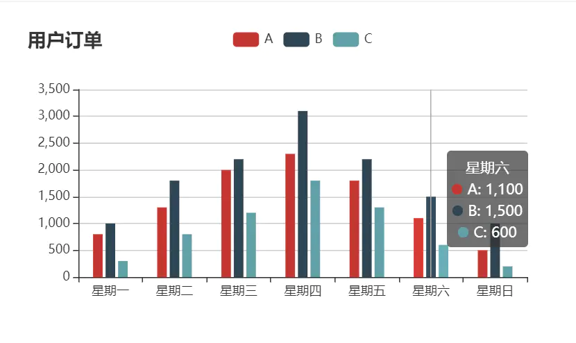
柱形图实例2
import React, { Component } from 'react'
import { Card } from 'antd'
// import echarts from 'echarts'
//按需导入
import echarts from 'echarts/lib/echarts'
//导入柱形图
import 'echarts/lib/chart/bar'
import 'echarts/lib/component/tooltip'
import 'echarts/lib/component/title'
import 'echarts/lib/component/legend'
import 'echarts/lib/component/markPoint'
import ReactEcharts from 'echarts-for-react'
//引入样式
import '../common.less'

export default class BarB extends Component {
    getOption = ()=>{
        let option = {
            title: {
                text: '用户订单'
            },
            tooltip:{
                trigger: 'axis'
            },
            legend: {
                data:['A','B','C']
            },
            xAxis: {
                data: ['星期一','星期二','星期三','星期四','星期五','星期六','星期日']
            },
            yAxis: {
                type: 'value'
            },
            series : [
                {
                    name:'A',
                    type:'bar',
                    barWidth: '15%',
                    data:[800, 1300, 2000, 2300, 1800, 1100, 500]
                },
                {
                    name:'B',
                    type:'bar',
                    barWidth: '15%',
                    data:[1000, 1800, 2200, 3100, 2200, 1500, 1000]
                },
                {
                    name:'C',
                    type:'bar',
                    barWidth: '15%',
                    data:[300, 800, 1200, 1800, 1300, 600, 200]
                }
            ]
        }
        return option;
    }
    render() {
        return (
            <Card.Grid className="bar_b">
                <ReactEcharts option={this.getOption()}/>
            </Card.Grid>
        )
    }
}
1) legend: 图例组件。图例组件展现了不同系列的标记(symbol),颜色和名字。可以通过点击图例控制哪些系列不显示。
--- data[i] (object):图例的数据数组。数组项通常为一个字符串,每一项代表一个系列的
如果
如果要设置单独一项的样式,也可以把该项写成配置项对象。此时必须使用
示例:
--- data[i] (object):图例的数据数组。数组项通常为一个字符串,每一项代表一个系列的
name(如果是饼图,也可以是饼图单个数据的 name)。图例组件会自动根据对应系列的图形标记(symbol)来绘制自己的颜色和标记,特殊字符串 ''(空字符串)或者 '\n'(换行字符串)用于图例的换行。如果
data 没有被指定,会自动从当前系列中获取。多数系列会取自 series.name 或者 series.encode 的 seriesName 所指定的维度。如 饼图 and 漏斗图 等会取自 series.data 中的 name。如果要设置单独一项的样式,也可以把该项写成配置项对象。此时必须使用
name 属性对应表示系列的 nam示例:
data: [{
    name: '系列1',
    // 强制设置图形为圆。
    icon: 'circle',
    // 设置文本为红色
    textStyle: {
        color: 'red'
    }
}]

 浙公网安备 33010602011771号