
数据大屏布局
经典布局模板(直接套用)
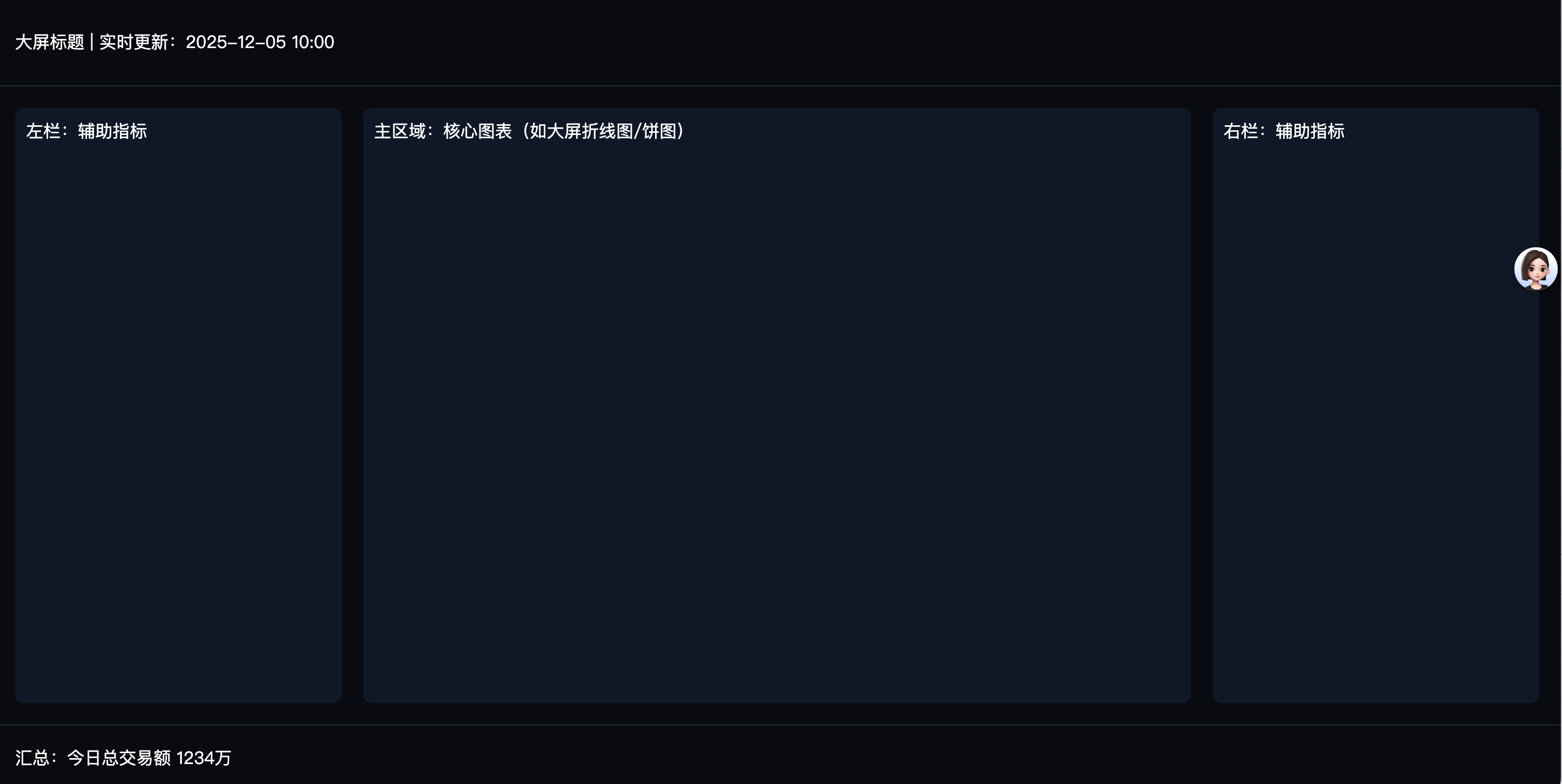
模板1:16:9通用大屏(核心居中,两侧辅助)
Flex实现核心(原生CSS):
<!DOCTYPE html>
<html lang="en">

    <head>
        <meta charset="UTF-8">
        <meta name="viewport"
            content="width=device-width, initial-scale=1.0, maximum-scale=1.0, user-scalable=no,user-scalable=no">
        <title>三栏布局</title>
        <style>
            * {
                margin: 0;
                padding: 0;
            }

            /* 大屏容器:16:9比例,占满屏幕 */
            .screen-container {
                width: 100vw;
                height: 100vh;
                background: #0a0c10;
                /* 大屏常用深色背景,突出数据 */
                color: #fff;
                display: flex;
                flex-direction: column;
                /* 头部+主体+底部垂直排列 */
            }

            /* 头部:通栏,占比小 */
            .header {
                height: 80px;
                line-height: 80px;
                padding: 0 20px;
                border-bottom: 1px solid #1f2937;
            }

            /* 主体:占满剩余高度,水平分栏 */
            .main {
                flex: 1;
                /* 自动填充剩余高度 */
                display: flex;
                /* 左+主+右水平排列 */
                padding: 20px;
                gap: 20px;
                /* 模块间距 */
            }

            .main-left {
                width: 20%;
                background: #111827;
                border-radius: 8px;
                padding: 10px;
            }

            .main-center {
                flex: 1;
                /* 占剩余60%(因为左右各20%) */
                background: #111827;
                border-radius: 8px;
                padding: 10px;
            }

            .main-right {
                width: 20%;
                background: #111827;
                border-radius: 8px;
                padding: 10px;
            }

            /* 底部:通栏 */
            .footer {
                height: 60px;
                line-height: 60px;
                padding: 0 20px;
                border-top: 1px solid #1f2937;
            }
        </style>
    </head>

    <body>
        <div class="screen-container">
            <!-- 头部 -->
            <div class="header">大屏标题 | 实时更新:2025-12-05 10:00</div>
            <!-- 主体(左+主+右) -->
            <div class="main">
                <div class="main-left">左栏:辅助指标</div>
                <div class="main-center">主区域:核心图表(如大屏折线图/饼图)</div>
                <div class="main-right">右栏:辅助指标</div>
            </div>
            <!-- 底部 -->
            <div class="footer">汇总:今日总交易额 1234万</div>
        </div>


    </body>

</html>
模板2:21:9宽屏/拼接屏(多列均分)
<!DOCTYPE html>
<html lang="en">

    <head>
        <meta charset="UTF-8">
        <meta name="viewport"
            content="width=device-width, initial-scale=1.0, maximum-scale=1.0, user-scalable=no,user-scalable=no">
        <title>三栏布局</title>
        <style>
            * {
                margin: 0;
                padding: 0;
            }

            .main {
                flex: 1;
                display: grid;
                grid-template-columns: repeat(3, 1fr);
                /* 3列均分 */
                grid-template-rows: repeat(3, 1fr);
                /* 3行均分 */
                gap: 20px;
                padding: 20px;
            }

            .main>div {
                background: #111827;
                border-radius: 8px;
                padding: 10px;
            }
        </style>
    </head>

    <body>
        <div class="main">
            <div class="">汇总:今日总交易额 1234万</div>
            <div class="">汇总:今日总交易额 1234万</div>
            <div class="">汇总:今日总交易额 1234万</div>
            <div class="">汇总:今日总交易额 1234万</div>
            <div class="">汇总:今日总交易额 1234万</div>
            <div class="">汇总:今日总交易额 1234万</div>
            <div class="">汇总:今日总交易额 1234万</div>
        </div>


    </body>

</html>
完整代码(HTML+CSS+ECharts基础示例)
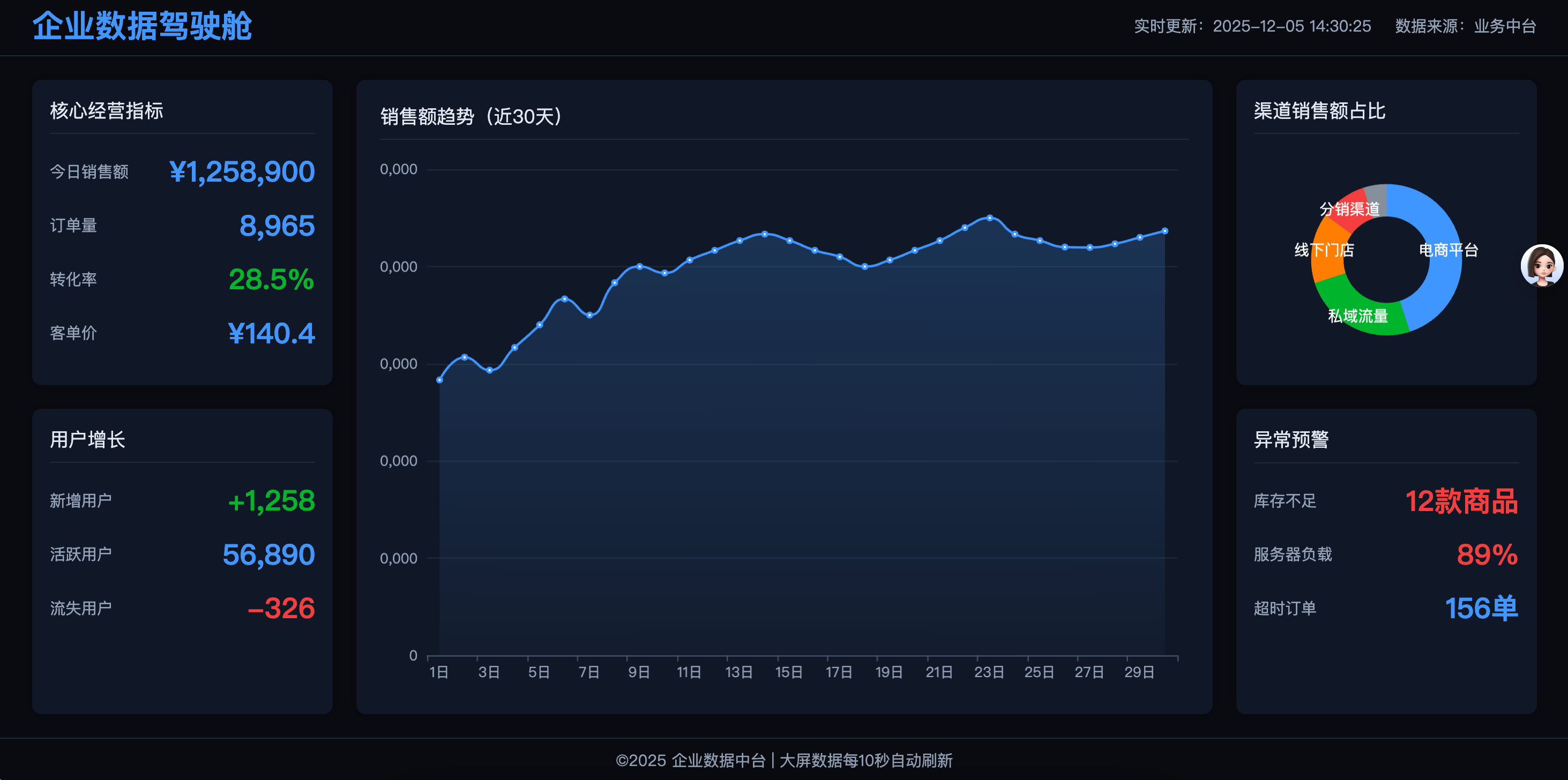
<!DOCTYPE html>
<html lang="zh-CN">
<head>
  <meta charset="UTF-8">
  <meta name="viewport" content="width=device-width, initial-scale=1.0, user-scalable=no">
  <title>数据可视化大屏 | 16:9适配版</title>
  <!-- 引入ECharts(图表库,按需替换) -->
  <script src="https://cdn.jsdelivr.net/npm/echarts@5.4.3/dist/echarts.min.js"></script>
  <style>
    /* 全局重置 */
    * {
      margin: 0;
      padding: 0;
      box-sizing: border-box;
      font-family: "PingFang SC", "Microsoft YaHei", sans-serif;
    }
    body {
      background-color: #0a0c10; /* 大屏深色背景 */
      overflow: hidden; /* 隐藏页面滚动条 */
    }

    /* ========== 核心适配容器 ========== */
    /* 外层容器:占满屏幕,居中缩放内容 */
    .screen-wrapper {
      width: 100vw;
      height: 100vh;
      display: flex;
      justify-content: center;
      align-items: center;
      overflow: hidden;
    }
    /* 内容容器:基准1920*1080,16:9比例 */
    .screen-container {
      width: 1920px;
      height: 1080px;
      color: #fff;
      /* 等比缩放:适配不同屏幕 */
      transform: scale(calc(min(100vw / 1920, 100vh / 1080)));
      transform-origin: left top; /* 缩放原点,避免偏移 */
      display: flex;
      flex-direction: column; /* 头部+主体+底部垂直排列 */
    }

    /* ========== 头部样式 ========== */
    .screen-header {
      height: 80px;
      padding: 0 30px;
      display: flex;
      justify-content: space-between;
      align-items: center;
      border-bottom: 1px solid #1f2937; /* 浅边框分割 */
    }
    .header-title {
      font-size: clamp(1.5rem, 2vw, 2rem); /* 自适应字体 */
      font-weight: bold;
      color: #4096ff; /* 主色调 */
    }
    .header-info {
      display: flex;
      gap: 20px;
      font-size: clamp(0.8rem, 1vw, 1rem);
      color: #94a3b8;
    }

    /* ========== 主体布局(左+主+右) ========== */
    .screen-main {
      flex: 1; /* 填充剩余高度 */
      display: flex;
      gap: 20px; /* 模块间距 */
      padding: 20px 30px;
    }
    /* 左栏:20%宽度 */
    .main-left {
      width: 20%;
      display: flex;
      flex-direction: column;
      gap: 20px;
    }
    /* 主区域:60%宽度(自动填充) */
    .main-center {
      flex: 1;
      background: #111827;
      border-radius: 8px;
      padding: 20px;
      box-shadow: 0 0 10px rgba(0, 0, 0, 0.3);
    }
    /* 右栏:20%宽度 */
    .main-right {
      width: 20%;
      display: flex;
      flex-direction: column;
      gap: 20px;
    }

    /* ========== 通用模块样式 ========== */
    .module {
      background: #111827;
      border-radius: 8px;
      padding: 15px;
      box-shadow: 0 0 10px rgba(0, 0, 0, 0.3);
      flex: 1; /* 垂直排列时均分高度 */
      display: flex;
      flex-direction: column;
    }
    .module-title {
      font-size: clamp(0.9rem, 1.2vw, 1.1rem);
      color: #e2e8f0;
      margin-bottom: 15px;
      padding-bottom: 8px;
      border-bottom: 1px solid #1f2937;
    }
    /* 核心数据样式 */
    .data-item {
      display: flex;
      justify-content: space-between;
      align-items: center;
      margin-bottom: 12px;
    }
    .data-label {
      font-size: clamp(0.8rem, 1vw, 0.9rem);
      color: #94a3b8;
    }
    .data-value {
      font-size: clamp(1.2rem, 1.8vw, 1.5rem);
      font-weight: bold;
      color: #4096ff;
    }
    .data-value.red { color: #f53f3f; }
    .data-value.green { color: #00b42a; }

    /* ========== 底部样式 ========== */
    .screen-footer {
      height: 60px;
      padding: 0 30px;
      display: flex;
      justify-content: center;
      align-items: center;
      border-top: 1px solid #1f2937;
      font-size: clamp(0.8rem, 1vw, 0.9rem);
      color: #94a3b8;
    }

    /* ========== 图表容器 ========== */
    .chart-box {
      width: 100%;
      height: 100%;
      flex: 1; /* 填充模块剩余高度 */
    }
  </style>
</head>
<body>
  <!-- 适配外层容器 -->
  <div class="screen-wrapper">
    <!-- 大屏核心内容容器(1920*1080) -->
    <div class="screen-container">
      <!-- 头部 -->
      <div class="screen-header">
        <div class="header-title">企业数据驾驶舱</div>
        <div class="header-info">
          <div>实时更新:2025-12-05 14:30:25</div>
          <div>数据来源:业务中台</div>
        </div>
      </div>

      <!-- 主体 -->
      <div class="screen-main">
        <!-- 左栏:辅助指标 -->
        <div class="main-left">
          <!-- 模块1:核心KPI -->
          <div class="module">
            <div class="module-title">核心经营指标</div>
            <div class="data-item">
              <span class="data-label">今日销售额</span>
              <span class="data-value">¥1,258,900</span>
            </div>
            <div class="data-item">
              <span class="data-label">订单量</span>
              <span class="data-value">8,965</span>
            </div>
            <div class="data-item">
              <span class="data-label">转化率</span>
              <span class="data-value green">28.5%</span>
            </div>
            <div class="data-item">
              <span class="data-label">客单价</span>
              <span class="data-value">¥140.4</span>
            </div>
          </div>
          <!-- 模块2:用户数据 -->
          <div class="module">
            <div class="module-title">用户增长</div>
            <div class="data-item">
              <span class="data-label">新增用户</span>
              <span class="data-value green">+1,258</span>
            </div>
            <div class="data-item">
              <span class="data-label">活跃用户</span>
              <span class="data-value">56,890</span>
            </div>
            <div class="data-item">
              <span class="data-label">流失用户</span>
              <span class="data-value red">-326</span>
            </div>
          </div>
        </div>

        <!-- 主区域:核心图表 -->
        <div class="main-center">
          <div class="module-title">销售额趋势(近30天)</div>
          <!-- ECharts图表容器 -->
          <div id="main-chart" class="chart-box"></div>
        </div>

        <!-- 右栏:辅助模块 -->
        <div class="main-right">
          <!-- 模块1:渠道占比 -->
          <div class="module">
            <div class="module-title">渠道销售额占比</div>
            <div id="channel-chart" class="chart-box"></div>
          </div>
          <!-- 模块2:预警信息 -->
          <div class="module">
            <div class="module-title">异常预警</div>
            <div class="data-item">
              <span class="data-label">库存不足</span>
              <span class="data-value red">12款商品</span>
            </div>
            <div class="data-item">
              <span class="data-label">服务器负载</span>
              <span class="data-value red">89%</span>
            </div>
            <div class="data-item">
              <span class="data-label">超时订单</span>
              <span class="data-value">156单</span>
            </div>
          </div>
        </div>
      </div>

      <!-- 底部 -->
      <div class="screen-footer">
        ©2025 企业数据中台 | 大屏数据每10秒自动刷新
      </div>
    </div>
  </div>

  <!-- ECharts初始化脚本 -->
  <script>
    // 主图表:销售额趋势
    const mainChart = echarts.init(document.getElementById('main-chart'));
    mainChart.setOption({
      backgroundColor: 'transparent', // 透明背景适配大屏
      grid: { top: 10, right: 10, bottom: 30, left: 40 },
      xAxis: {
        type: 'category',
        data: ['1日','2日','3日','4日','5日','6日','7日','8日','9日','10日','11日','12日','13日','14日','15日','16日','17日','18日','19日','20日','21日','22日','23日','24日','25日','26日','27日','28日','29日','30日'],
        axisLine: { lineStyle: { color: '#475569' } },
        axisLabel: { color: '#94a3b8' }
      },
      yAxis: {
        type: 'value',
        axisLine: { lineStyle: { color: '#475569' } },
        axisLabel: { color: '#94a3b8' },
        splitLine: { lineStyle: { color: '#1f2937' } }
      },
      series: [{
        data: [850000,920000,880000,950000,1020000,1100000,1050000,1150000,1200000,1180000,1220000,1250000,1280000,1300000,1280000,1250000,1230000,1200000,1220000,1250000,1280000,1320000,1350000,1300000,1280000,1260000,1258900,1270000,1290000,1310000],
        type: 'line',
        smooth: true,
        itemStyle: { color: '#4096ff' },
        areaStyle: {
          color: new echarts.graphic.LinearGradient(0, 0, 0, 1, [
            { offset: 0, color: 'rgba(64, 150, 255, 0.3)' },
            { offset: 1, color: 'rgba(64, 150, 255, 0.05)' }
          ])
        },
        lineStyle: { width: 2 }
      }]
    });

    // 渠道占比饼图
    const channelChart = echarts.init(document.getElementById('channel-chart'));
    channelChart.setOption({
      backgroundColor: 'transparent',
      tooltip: { trigger: 'item' },
      series: [{
        name: '渠道占比',
        type: 'pie',
        radius: ['40%', '70%'],
        avoidLabelOverlap: false,
        label: {
          show: true,
          position: 'inside',
          color: '#fff',
          fontSize: clampFont(0.7, 1, 0.8)
        },
        labelLine: { show: false },
        data: [
          { value: 45, name: '电商平台' },
          { value: 25, name: '私域流量' },
          { value: 15, name: '线下门店' },
          { value: 10, name: '分销渠道' },
          { value: 5, name: '其他' }
        ],
        itemStyle: {
          color: function(params) {
            const colorList = ['#4096ff', '#00b42a', '#ff7d00', '#f53f3f', '#86909c'];
            return colorList[params.dataIndex];
          }
        }
      }]
    });

    // 自适应字体辅助函数
    function clampFont(min, max, def) {
      return clamp(`${min}rem`, `${max}vw`, `${def}rem`);
    }
    function clamp(min, val, max) {
      return `clamp(${min}, ${val}, ${max})`;
    }

    // 窗口缩放时重绘图表
    window.addEventListener('resize', () => {
      mainChart.resize();
      channelChart.resize();
    });
  </script>
</body>
</html>
原文:https://blog.csdn.net/m0_50037012/article/details/155612897
给心灵一个纯净空间,让思想,情感,飞扬!

 浙公网安备 33010602011771号