
CSS3 文字渐变动画
背景剪裁
语法:background-clip: border-box || padding-box || context-box || no-clip || text
本次用到的就是: -webkit-background-clip:text;(谷歌浏览器)
示例:从局部到全局渐变
 1 <!DOCTYPE html>
 2 <html lang="en">
 3 <head>
 4   <meta charset="UTF-8">
 5   <title>文字渐变动画</title>
 6   <style>
 7 .slideShine{
 8
 9      background:#871317 -webkit-linear-gradient(left,#561214,#febaf7 50%,#ff0 90%,#561214) no-repeat 0 0;
10
11      background-size:20% 100%;
12
13      -webkit-background-clip: text;
14
15      -webkit-text-fill-color: transparent;
16
17      font-size: 36px;
18
19      text-align: center;
20
21      font-weight: bold;
22
23      text-decoration: underline;
24
25 }
26
27 .slideShine {-webkit-animation: slideShine 4s linear infinite;animation: slideShine 4s linear infinite;}
28
29 @-webkit-keyframes slideShine {
30
31      0% {
32
33           background-position: 0 0;
34
35         }
36
37      100% {
38
39           background-position: 100% 100%;
40
41       }
42
43  }
44
45  @keyframes slideShine {
46
47       0% {background-position: 0 0; }
48
49      100% {background-position: 100% 100%; }
50
51  }
52 </style>
53
54 </head>
55 <body>
56
57 <p class="slideShine" >→css3文字渐变动画效果 >></p>
58
59
60 </body>
61 </html>
效果图:
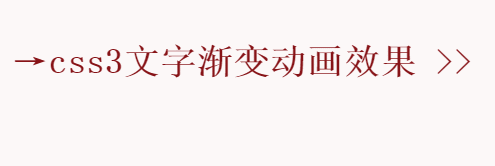
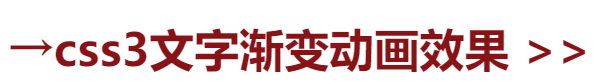

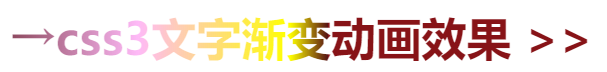
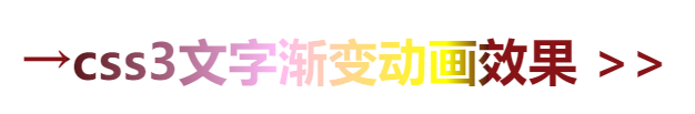
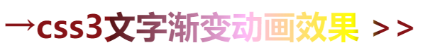
这是一个动态的图片,截屏如上图所示。
说明:
-webkit-text-fill-color: transparent;(这里必须填充透明颜色,这样渐变的颜色才会填充到文字上面,去掉这个或者填充别的颜色,效果不明显)
检索或设置对象中的文字填充颜色,若同时设置 <' text-fill-color '> 和 <' color '>,<' text-fill-color '> 定义的颜色将覆盖 <' color '> 属性;
希望有所帮助!!!

 浙公网安备 33010602011771号