
Seaborn教程之初识(一)
一、简介
seaborn 是一个用 Python 制作统计图形的库。它建立在matplotlib之上,并与pandas数据结构紧密集成。
Seaborn 帮助您探索和理解您的数据。它的绘图函数对包含整个数据集的数据帧和数组进行操作,并在内部执行必要的语义映射和统计聚合以生成信息图。其面向数据集的声明式 API 让您可以专注于绘图中不同元素的含义,而不是如何绘制它们的细节。
这是 seaborn 的示例:
# Import seaborn
import seaborn as sns
from matplotlib import pyplot as plt

# Apply the default theme
sns.set_theme()

# Load an example dataset
tips = sns.load_dataset("tips")

# Create a visualization
sns.relplot(
    data=tips,
    x="total_bill", y="tip", col="time",
    hue="smoker", style="smoker", size="size",
)

# Display graphics
plt.show()
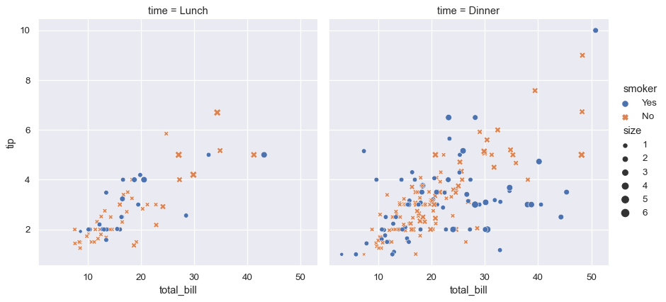
上面的示例中:
- 导入seaborn库
- 设置sns默认的主题样式
- 加载内置的数据集
- 通过relplot方法创建视图
- 显示图形
注意:seaborn 使用 matplotlib 绘制绘图。对于交互式工作,建议在matplotlib 模式下使用 Jupyter/IPython 接口,否则您必须matplotlib.pyplot.show()在要查看绘图时调用
二、sns.relplot方法
对于sns.relplot,包含很多参数,详见:https://seaborn.pydata.org/generated/seaborn.relplot.html#seaborn.relplot
seaborn.relplot(data=None, *, x=None, y=None, hue=None, size=None, style=None, units=None, row=None, col=None, col_wrap=None, row_order=None, col_order=None, palette=None, hue_order=None, hue_norm=None, sizes=None, size_order=None, size_norm=None, markers=None, dashes=None, style_order=None, legend='auto', kind='scatter', height=5, aspect=1, facet_kws=None, **kwargs)
主要参数:
data
pandas.DataFrame,numpy.ndarray, mapping, or sequenceInput data structure. Either a long-form collection of vectors that can be assigned to named variables or a wide-form dataset that will be internally reshaped.
x, yvectors or keys in
dataVariables that specify positions on the x and y axes.
huevector or key in
dataGrouping variable that will produce elements with different colors. Can be either categorical or numeric, although color mapping will behave differently in latter case.
sizevector or key in
dataGrouping variable that will produce elements with different sizes. Can be either categorical or numeric, although size mapping will behave differently in latter case.
stylevector or key in
dataGrouping variable that will produce elements with different styles. Can have a numeric dtype but will always be treated as categorical.
unitsvector or key in
dataGrouping variable identifying sampling units. When used, a separate line will be drawn for each unit with appropriate semantics, but no legend entry will be added. Useful for showing distribution of experimental replicates when exact identities are not needed.
row, colvectors or keys in
dataVariables that define subsets to plot on different facets.
...
tips = sns.load_dataset("tips")
tips.head()
| total_bill | tip | sex | smoker | day | time | size | |
|---|---|---|---|---|---|---|---|
| 0 | 16.99 | 1.01 | Female | No | Sun | Dinner | 2 |
| 1 | 10.34 | 1.66 | Male | No | Sun | Dinner | 3 |
| 2 | 21.01 | 3.50 | Male | No | Sun | Dinner | 3 |
| 3 | 23.68 | 3.31 | Male | No | Sun | Dinner | 2 |
| 4 | 24.59 | 3.61 | Female | No | Sun | Dinner | 4 |
Assigning x and y and any semantic mapping variables will draw a single plot:
sns.relplot(data=tips, x="total_bill", y="tip", hue="day")

Assigning a col variable creates a faceted figure with multiple subplots arranged across the columns of the grid:
sns.relplot(data=tips, x="total_bill", y="tip", hue="day", col="time")

When the variable assigned to col has many levels, it can be “wrapped” across multiple rows:
sns.relplot(data=tips, x="total_bill", y="tip", hue="time", col="day", col_wrap=2)

Different variables can be assigned to facet on both the columns and rows:
sns.relplot(data=tips, x="total_bill", y="tip", hue="time", col="day", col_wrap=2)

更多参数用法详见:https://seaborn.pydata.org/generated/seaborn.relplot.html#seaborn.relplot

 浙公网安备 33010602011771号