

Matplotlib之文字、图例(四)
一、Figure和Axes上的文本
Matplotlib具有广泛的文本支持,包括对数学表达式的支持、对栅格和矢量输出的TrueType支持、具有任意旋转的换行分隔文本以及Unicode支持。
(一)文本API示例
下面的命令是介绍了通过pyplot API和objected-oriented API分别创建文本的方式。
| pyplot API | OO API | description |
|---|---|---|
text |
text |
在子图axes的任意位置添加文本 |
annotate |
annotate |
在子图axes的任意位置添加注解,包含指向性的箭头 |
xlabel |
set_xlabel |
为子图axes添加x轴标签 |
ylabel |
set_ylabel |
为子图axes添加y轴标签 |
title |
set_title |
为子图axes添加标题 |
figtext |
text |
在画布figure的任意位置添加文本 |
suptitle |
suptitle |
为画布figure添加标题 |
通过一个综合例子,以OO模式展示这些API是如何控制一个图像中各部分的文本:
import matplotlib
import matplotlib.pyplot as plt

fig = plt.figure()
ax = fig.add_subplot()


# 分别为figure和ax设置标题,注意两者的位置是不同的
fig.suptitle('bold figure suptitle', fontsize=14, fontweight='bold')
ax.set_title('axes title')

# 设置x和y轴标签
ax.set_xlabel('xlabel')
ax.set_ylabel('ylabel')

# 设置x和y轴显示范围均为0到10
ax.axis([0, 10, 0, 10])

# 在子图上添加文本
ax.text(3, 8, 'boxed italics text in data coords', style='italic',
        bbox={'facecolor': 'red', 'alpha': 0.5, 'pad': 10})

# 在画布上添加文本,一般在子图上添加文本是更常见的操作,这种方法很少用
fig.text(0.4,0.8,'This is text for figure')

ax.plot([2], [1], 'o')
# 添加注解
ax.annotate('annotate', xy=(2, 1), xytext=(3, 4),arrowprops=dict(facecolor='black', shrink=0.05));

plt.show()
(二)text-Axes上的文本
text的调用方式为Axes.text(x, y, s, fontdict=None, **kwargs),其中:
- x,y为文本出现的位置,默认状态下即为当前坐标系下的坐标值
- s为文本的内容
- fontdict是可选参数,用于覆盖默认的文本属性
- **kwargs为关键字参数,也可以用于传入文本样式参数
fontdict和**kwargs参数,这两种方式都可以用于调整呈现的文本样式,最终效果是一样的,不仅text方法,其他文本方法如set_xlabel,set_title等同样适用这两种方式修改样式。通过一个例子演示这两种方法是如何使用的。
fig = plt.figure(figsize=(10,3))
axes = fig.subplots(1,2)

# 使用关键字参数修改文本样式
axes[0].text(0.3, 0.8, 'modify by **kwargs', style='italic',
        bbox={'facecolor': 'red', 'alpha': 0.5, 'pad': 10});

# 使用fontdict参数修改文本样式
font = {'bbox':{'facecolor': 'red', 'alpha': 0.5, 'pad': 10}, 'style':'italic'}
axes[1].text(0.3, 0.8, 'modify by fontdict', fontdict=font);
matplotlib中所有支持的样式参数请参考官网文档说明,大多数时候需要用到的时候再查询即可。
下表列举了一些常用的参数供参考。
| Property | Description |
|---|---|
alpha |
float or None 透明度,越接近0越透明,越接近1越不透明 |
backgroundcolor |
color 文本的背景颜色 |
bbox |
dict with properties for patches.FancyBboxPatch 用来设置text周围的box外框 |
color or c |
color 字体的颜色 |
fontfamily or family |
{FONTNAME, 'serif', 'sans-serif', 'cursive', 'fantasy', 'monospace'} 字体的类型 |
fontsize or size |
float or {'xx-small', 'x-small', 'small', 'medium', 'large', 'x-large', 'xx-large'} 字体大小 |
fontstyle or style |
{'normal', 'italic', 'oblique'} 字体的样式是否倾斜等 |
fontweight or weight |
{a numeric value in range 0-1000, 'ultralight', 'light', 'normal', 'regular', 'book', 'medium', 'roman', 'semibold', 'demibold', 'demi', 'bold', 'heavy', 'extra bold', 'black'} 文本粗细 |
horizontalalignment or ha |
{'center', 'right', 'left'} 选择文本左对齐右对齐还是居中对齐 |
linespacing |
float (multiple of font size) 文本间距 |
rotation |
float or {'vertical', 'horizontal'} 指text逆时针旋转的角度,“horizontal”等于0,“vertical”等于90 |
verticalalignment or va |
{'center', 'top', 'bottom', 'baseline', 'center_baseline'} 文本在垂直角度的对齐方式 |
(三)xlabel和ylabel - Axes的x、y轴标签
xlabel的调用方式为:
Axes.set_xlabel(xlabel, fontdict=None, labelpad=None, *, loc=None, **kwargs)
ylabel方式与之类似。
其中:
xlabel即为标签内容fontdict和**kwargs用来修改样式,labelpad为标签和坐标轴的距离,默认为4loc为标签位置,可选的值为left,center,right之一,默认为居中
# 观察labelpad和loc参数的使用效果
fig = plt.figure(figsize=(10,3))
axes = fig.subplots(1,2)
axes[0].set_xlabel('xlabel',labelpad=20,loc='left')

# loc参数仅能提供粗略的位置调整,如果想要更精确的设置标签的位置,可以使用position参数,horizontalalignment参数来定位
# position由一个元组过程,第一个元素0.2表示x轴标签在x轴的位置,第二个元素对于xlabel其实是无意义的,随便填一个数都可以
# horizontalalignment='left'表示左对齐,这样设置后x轴标签就能精确定位在x=0.2的位置处
axes[1].set_xlabel('xlabel', position=(0.2, _), horizontalalignment='left');
(四)suptitle和title - Figure和Axes的标题
1、figure.suptitle
suptitle的调用方式为:
figure.suptitle(t, **kwargs)
其中:
t为Figure的标题内容
2、Axes.set_title
title的调用方式为:
Axes.set_title(label, fontdict=None, loc=None, pad=None, *, y=None, **kwargs)
其中:
- label为子图标签的内容,
fontdict,loc,**kwargs和之前介绍相同 pad是指标题偏离图表顶部的距离,默认为6y是title所在子图垂向的位置。默认值为1,即title位于子图的顶部。
# 观察pad参数的使用效果
fig = plt.figure(figsize=(10,3))
fig.suptitle('This is figure title',y=1.2) # 通过参数y设置高度
axes = fig.subplots(1,2)
axes[0].set_title('This is title',pad=15)
axes[1].set_title('This is title',pad=6);
(五)annotate - Axes注解
annotate的调用方式为:
Axes.annotate(text, xy, *args, **kwargs)
其中:
text为注解的内容xy为注解箭头指向的坐标,
其他常用的参数包括:
xytext为注解文字的坐标xycoords用来定义xy参数的坐标系textcoords用来定义xytext参数的坐标系arrowprops用来定义指向箭头的样式
annotate的参数非常复杂,这里仅仅展示一个简单的例子,更多参数可以查看官方文档中的annotate介绍
fig = plt.figure()
ax = fig.add_subplot()
ax.annotate("",
            xy=(0.2, 0.2), xycoords='data',
            xytext=(0.8, 0.8), textcoords='data',
            arrowprops=dict(arrowstyle="->", connectionstyle="arc3,rad=0.2")
            );
(六)字体属性设置
字体设置一般有全局字体设置和自定义局部字体设置两种方法。
# 在matplotlib里面,修改字体默认属性,完成全局字体的更改。
plt.rcParams['font.sans-serif'] = ['SimSun']    # 指定默认字体为新宋体。
plt.rcParams['axes.unicode_minus'] = False      # 解决保存图像时 负号'-' 显示为方块和报错的问题。
# 局部字体的修改方法
plt.plot(np.arange(6),np.arange(6), label='小示例图标签')

# 直接用字体的名字
plt.xlabel('x 轴名称参数', fontproperties='Microsoft YaHei', fontsize=16)         # 设置x轴名称,采用微软雅黑字体
plt.ylabel('y 轴名称参数', fontproperties='Microsoft YaHei', fontsize=14)         # 设置Y轴名称
plt.title('坐标系的标题',  fontproperties='Microsoft YaHei', fontsize=20)         # 设置坐标系标题的字体
plt.legend(loc='lower right', prop={"family": 'Microsoft YaHei'}, fontsize=10) ;   # 小示例图的字体设置
二、Tick上的文本
设置tick(刻度)和ticklabel(刻度标签)也是可视化中经常需要操作的步骤,matplotlib既提供了自动生成刻度和刻度标签的模式(默认状态),同时也提供了许多让使用者灵活设置的方式。
- 简单模式
- Tick Locators and Formatters
(一)简单模式
可以使用axis的set_ticks方法手动设置标签位置,使用axis的set_ticklabels方法手动设置标签格式
x1 = np.linspace(0.0, 5.0, 100)
y1 = np.cos(2 * np.pi * x1) * np.exp(-x1)
# 使用axis的set_ticks方法手动设置标签位置的例子,该案例中由于tick设置过大,所以会影响绘图美观,不建议用此方式进行设置tick
fig, axs = plt.subplots(2, 1, figsize=(5, 3), tight_layout=True)
axs[0].plot(x1, y1)
axs[1].plot(x1, y1)
axs[1].xaxis.set_ticks(np.arange(0., 10.1, 2.));

# 使用axis的set_ticklabels方法手动设置标签格式的例子
fig, axs = plt.subplots(2, 1, figsize=(5, 3), tight_layout=True)
axs[0].plot(x1, y1)
axs[1].plot(x1, y1)
ticks = np.arange(0., 8.1, 2.)
tickla = [f'{tick:1.2f}' for tick in ticks]
axs[1].xaxis.set_ticks(ticks)
axs[1].xaxis.set_ticklabels(tickla);

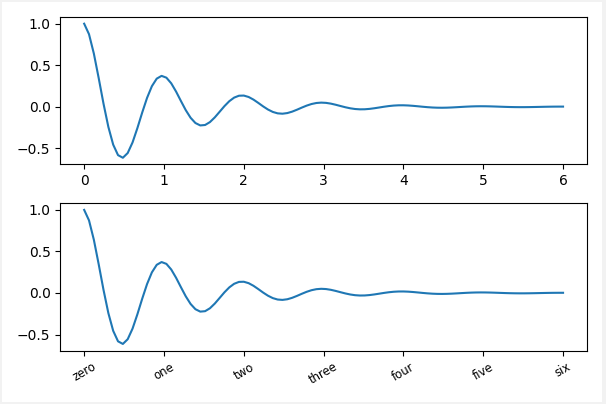
#一般绘图时会自动创建刻度,而如果通过上面的例子使用set_ticks创建刻度可能会导致tick的范围与所绘制图形的范围不一致的问题。
#所以在下面的案例中,axs[1]中set_xtick的设置要与数据范围所对应,然后再通过set_xticklabels设置刻度所对应的标签
import numpy as np
import matplotlib.pyplot as plt
fig, axs = plt.subplots(2, 1, figsize=(6, 4), tight_layout=True)
x1 = np.linspace(0.0, 6.0, 100)
y1 = np.cos(2 * np.pi * x1) * np.exp(-x1)
axs[0].plot(x1, y1)
axs[0].set_xticks([0,1,2,3,4,5,6])

axs[1].plot(x1, y1)
axs[1].set_xticks([0,1,2,3,4,5,6])#要将x轴的刻度放在数据范围中的哪些位置
axs[1].set_xticklabels(['zero','one', 'two', 'three', 'four', 'five','six'],#设置刻度对应的标签
                   rotation=30, fontsize='small')#rotation选项设定x刻度标签倾斜30度。
axs[1].xaxis.set_ticks_position('bottom')#set_ticks_position()方法是用来设置刻度所在的位置,常用的参数有bottom、top、both、none
print(axs[1].xaxis.get_ticklines());
(二)Tick Locators and Formatters
除了上述的简单模式,还可以使用Tick Locators and Formatters完成对于刻度位置和刻度标签的设置。 其中Axis.set_major_locator和Axis.set_minor_locator方法用来设置标签的位置,Axis.set_major_formatter和Axis.set_minor_formatter方法用来设置标签的格式。这种方式的好处是不用显式地列举出刻度值列表。
set_major_formatter和set_minor_formatter这两个formatter格式命令可以接收字符串格式(matplotlib.ticker.StrMethodFormatter)或函数参数(matplotlib.ticker.FuncFormatter)来设置刻度值的格式 。
1、Tick Locators
在普通的绘图中,我们可以直接通过上图的set_ticks进行设置刻度的位置,缺点是需要自己指定或者接受matplotlib默认给定的刻度。当需要更改刻度的位置时,matplotlib给了常用的几种locator的类型。如果要绘制更复杂的图,可以先设置locator的类型,然后通过axs.xaxis.set_major_locator(locator)绘制即可。
- locator=plt.MaxNLocator(nbins=7) 自动选择合适的位置,并且刻度之间最多不超过7(nbins)个间隔
- locator=plt.FixedLocator(locs=[0,0.5,1.5,2.5,3.5,4.5,5.5,6]) 直接指定刻度所在的位置
- locator=plt.AutoLocator() 自动分配刻度值的位置
- locator=plt.IndexLocator(offset=0.5, base=1) 面元间距是1,从0.5开始
- locator=plt.MultipleLocator(1.5) 将刻度的标签设置为1.5的倍数
- locator=plt.LinearLocator(numticks=5) 线性划分5等分,4个刻度
# 接收各种locator的例子
fig, axs = plt.subplots(2, 2, figsize=(8, 5), tight_layout=True)
for n, ax in enumerate(axs.flat):
    ax.plot(x1*10., y1)

locator = matplotlib.ticker.AutoLocator()
axs[0, 0].xaxis.set_major_locator(locator)

locator = matplotlib.ticker.MaxNLocator(nbins=3)
axs[0, 1].xaxis.set_major_locator(locator)


locator = matplotlib.ticker.MultipleLocator(5)
axs[1, 0].xaxis.set_major_locator(locator)


locator = matplotlib.ticker.FixedLocator([0,7,14,21,28])
axs[1, 1].xaxis.set_major_locator(locator);
此外matplotlib.dates 模块还提供了特殊的设置日期型刻度格式和位置的方式:
import datetime
import numpy as np
from matplotlib import pyplot as plt
from matplotlib.dates import DayLocator, DateFormatter

# 特殊的日期型locator和formatter
locator = DayLocator(bymonthday=[1,15,25])
formatter = DateFormatter('%b %d')

fig, ax = plt.subplots(figsize=(5, 3), tight_layout=True)
ax.xaxis.set_major_locator(locator)
ax.xaxis.set_major_formatter(formatter)
base = datetime.datetime(2017, 1, 1, 0, 0, 1)
time = [base + datetime.timedelta(days=x) for x in range(len(x1))]
ax.plot(time, y1)
ax.tick_params(axis='x', rotation=70);
2、Tick Formatters
# 接收字符串格式的例子
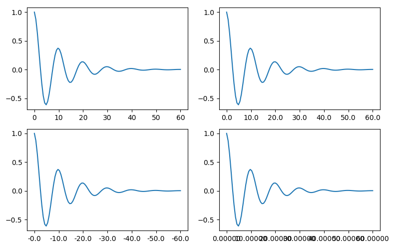
fig, axs = plt.subplots(2, 2, figsize=(8, 5), tight_layout=True)
for n, ax in enumerate(axs.flat):
    ax.plot(x1*10., y1)

formatter = matplotlib.ticker.FormatStrFormatter('%1.1f')
axs[0, 1].xaxis.set_major_formatter(formatter)

formatter = matplotlib.ticker.FormatStrFormatter('-%1.1f')
axs[1, 0].xaxis.set_major_formatter(formatter)

formatter = matplotlib.ticker.FormatStrFormatter('%1.5f')
axs[1, 1].xaxis.set_major_formatter(formatter);
# 接收函数的例子
def formatoddticks(x, pos):
    """Format odd tick positions."""
    if x % 2:
        return f'{x:1.2f}'
    else:
        return ''

fig, ax = plt.subplots(figsize=(5, 3), tight_layout=True)
ax.plot(x1, y1)
ax.xaxis.set_major_formatter(formatoddticks);
三、Legends图例
(一)术语解释
在具体学习图例之前,首先解释几个术语:
- legend entry(图例条目)
每个图例由一个或多个legend entries组成。一个entry包含一个key和其对应的label。 - legend key(图例键)
每个legend label左面的colored/patterned marker(彩色/图案标记) - legend label(图例标签)
描述由key来表示的handle的文本 - legend handle(图例句柄)
用于在图例中生成适当图例条目的原始对象
以下面这个图为例:
- 右侧的方框中的共有两个legend entry
- 两个legend key,分别是一个蓝色和一个黄色的legend key
- 两个legend label,一个名为Line up和一个名为Line Down

(二)常用参数
legend其他常用的几个参数如下:
- 设置图例位置
- 设置图例边框及背景
- 设置图例标题
1、设置图例位置
loc参数接收一个字符串或数字表示图例出现的位置 ax.legend(loc='upper center') 等同于 ax.legend(loc=9)
| Location String | Location Code |
|---|---|
| 'best' | 0 |
| 'upper right' | 1 |
| 'upper left' | 2 |
| 'lower left' | 3 |
| 'lower right' | 4 |
| 'right' | 5 |
| 'center left' | 6 |
| 'center right' | 7 |
| 'lower center' | 8 |
| 'upper center' | 9 |
| 'center' | 10 |
fig,axes = plt.subplots(1,4,figsize=(10,4))
for i in range(4):
    axes[i].plot([0.5],[0.5])
    axes[i].legend(labels='a',loc=i)  # 观察loc参数传入不同值时图例的位置
fig.tight_layout()
2、设置图例边框及背景
fig = plt.figure(figsize=(10,3))
axes = fig.subplots(1,3)
for i, ax in enumerate(axes):
    ax.plot([1,2,3],label=f'ax {i}')
axes[0].legend(frameon=False) #去掉图例边框
axes[1].legend(edgecolor='blue') #设置图例边框颜色
axes[2].legend(facecolor='gray'); #设置图例背景颜色,若无边框,参数无效
3、设置图例标题
fig,ax =plt.subplots()
ax.plot([1,2,3],label='label')
ax.legend(title='legend title');

 浙公网安备 33010602011771号