
Python交互图表可视化Bokeh:7. 工具栏
ToolBar工具栏设置
① 位置设置
② 移动、放大缩小、存储、刷新
③ 选择
④ 提示框、十字线
1. 位置设置
import numpy as np
import pandas as pd
import matplotlib.pyplot as plt
% matplotlib inline

import warnings
warnings.filterwarnings('ignore')
# 不发出警告

from bokeh.io import output_notebook
output_notebook()
# 导入notebook绘图模块

from bokeh.plotting import figure,show
from bokeh.models import ColumnDataSource
# 导入图表绘制、图标展示模块
# 导入ColumnDataSource模块

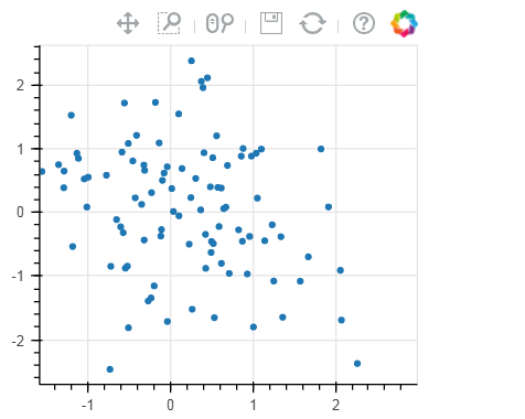
# 工具栏 tools
# (1)设置位置

p = figure(plot_width=300, plot_height=300,
          toolbar_location="above")
# 工具栏位置:"above","below","left","right"

p.circle(np.random.randn(100),np.random.randn(100))
show(p)
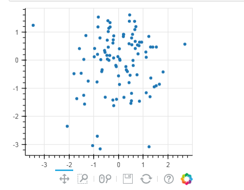
# 工具栏 tools
# (1)设置位置

p = figure(plot_width=300, plot_height=300,
           toolbar_location="below",
           toolbar_sticky=False)
# 工具栏位置设置为"below"时,可增加toolbar_sticky参数使得toolsbar不被遮挡
p.circle(np.random.randn(100),np.random.randn(100))
show(p)
2. 移动、放大缩小、存储、刷新
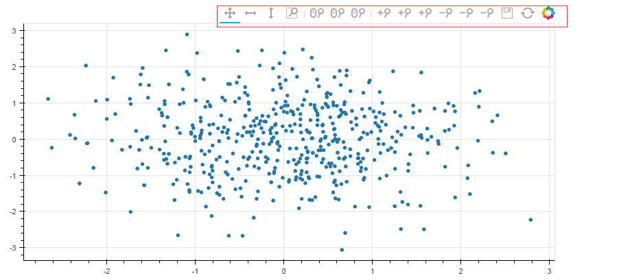
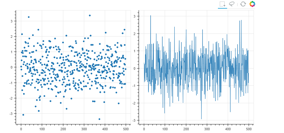
# 工具栏 tools
# (2)移动、放大缩小、存储、刷新

TOOLS = '''
        pan, xpan, ypan,
        box_zoom,
        wheel_zoom, xwheel_zoom, ywheel_zoom,
        zoom_in, xzoom_in, yzoom_in,
        zoom_out, xzoom_out, yzoom_out,
        save,reset
        '''
#pan是直接移动;xpan和ypan分别是横轴、竖轴移动;box_zoom是矩形框放大,wheel_zoom滚轮缩放:直接缩放、X轴缩放、Y轴缩放;通过鼠标点击缩放zoom_in
p = figure(plot_width=800, plot_height=400,toolbar_location="above",
           tools = TOOLS)
# 添加toolbar
# 这里tools = '' 则不显示toolbar

p.circle(np.random.randn(500),np.random.randn(500))
show(p)
3. 选择
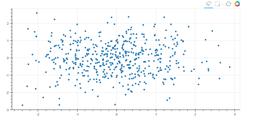
# 工具栏 tools
# (3)选择

TOOLS = '''
        box_select,lasso_select,
        reset
        '''
#画多边形和矩形
p = figure(plot_width=800, plot_height=400,toolbar_location="above",
           tools = TOOLS)
# 添加toolbar

p.circle(np.random.randn(500),np.random.randn(500))
show(p)
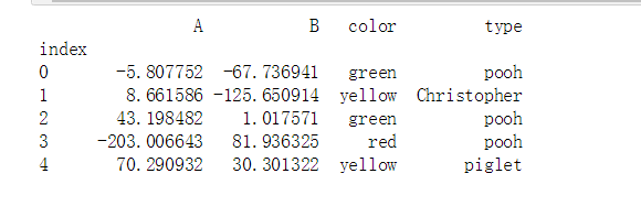
#联动
from bokeh.layouts import gridplot


TOOLS = '''
        box_select,lasso_select,
        reset
        '''
df = pd.DataFrame(np.random.randn(500,2), columns = ['A', 'B'])
source = ColumnDataSource(data=df)

p1 = figure(plot_width=400, plot_height=400,toolbar_location="above",tools = TOOLS)
p2 = figure(plot_width=400, plot_height=400,toolbar_location="above",tools = TOOLS)


p1.circle(x='index', y='A',source=source)
p2.line(x='index', y='B',source=source)
s = gridplot([[p1, p2]])
show(s)
4. 提示框、十字线
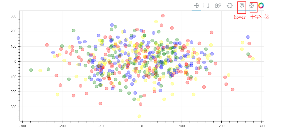
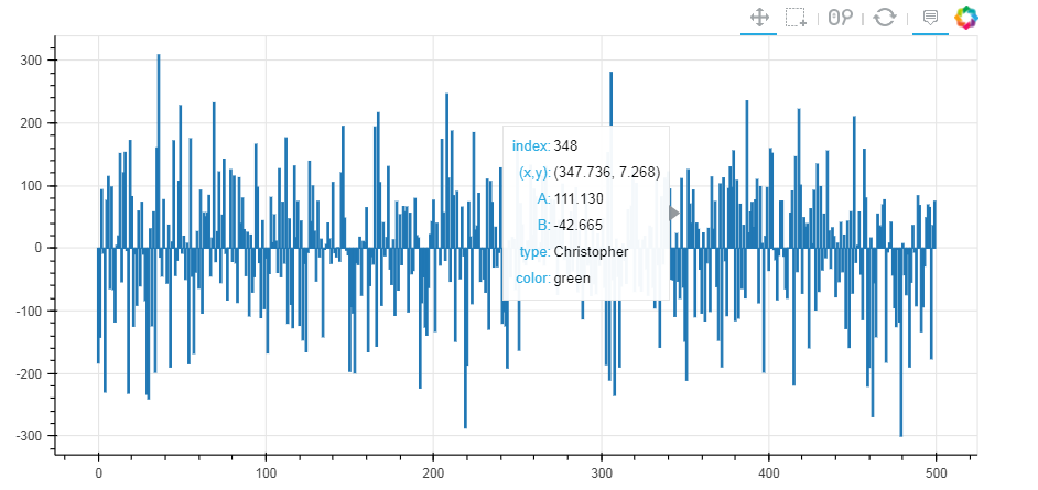
# 工具栏 tools
# (4)提示框、十字线

from bokeh.models import HoverTool
# 用于设置显示标签内容

df = pd.DataFrame({'A':np.random.randn(500)*100,
                  'B':np.random.randn(500)*100,
                  'type':np.random.choice(['pooh', 'rabbit', 'piglet', 'Christopher'],500),
                  'color':np.random.choice(['red', 'yellow', 'blue', 'green'],500)})
df.index.name = 'index'
source = ColumnDataSource(df)
print(df.head())
# 创建数据 → 包含四个标签

p1 = figure(plot_width=800, plot_height=400,toolbar_location="above",
            tools=['hover,box_select,reset,wheel_zoom,pan,crosshair'])   # 注意这里书写方式;  hover它的作用是只是会显示出点的每个标签;crossshair是显示十字叉
# 如果不设置标签,就只写hover,例如 tools='hover,box_select,reset,wheel_zoom,pan,crosshair'
p1.circle(x = 'A',y = 'B',source = source,size = 10,alpha = 0.3, color = 'color')
show(p1)
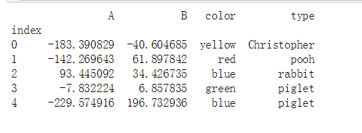
from bokeh.models import HoverTool
# 用于设置显示标签内容

df = pd.DataFrame({'A':np.random.randn(500)*100,
                  'B':np.random.randn(500)*100,
                  'type':np.random.choice(['pooh', 'rabbit', 'piglet', 'Christopher'],500),
                  'color':np.random.choice(['red', 'yellow', 'blue', 'green'],500)})
df.index.name = 'index'
source = ColumnDataSource(df)
print(df.head())
# 创建数据 → 包含四个标签

hover = HoverTool(tooltips=[
                            ("index", "$index"),
                            ("(x,y)", "($x, $y)"),
                            ("A", "@A"),
                            ("B", "@B"),
                            ("type", "@type"),
                            ("color", "@color"),
                        ])
# 设置标签显示内容
# $index:自动计算 → 数据index
# $x:自动计算 → 数据x值
# $y:自动计算 → 数据y值
# @A:显示ColumnDataSource中对应字段值

p1 = figure(plot_width=800, plot_height=400,toolbar_location="above",
            tools=[hover,'box_select,reset,wheel_zoom,pan,crosshair'])   # 注意这里书写方式;  hover它的作用是只是会显示出点的每个标签;crossshair是显示十字叉
# 如果不设置标签,就只写hover,例如 tools='hover,box_select,reset,wheel_zoom,pan,crosshair'
p1.circle(x = 'A',y = 'B',source = source,size = 10,alpha = 0.3, color = 'color')
show(p1)

p2 = figure(plot_width=800, plot_height=400,toolbar_location="above",
           tools=[hover,'box_select,reset,wheel_zoom,pan'])
p2.vbar(x = 'index', width=1, top='A',source = source)
show(p2)
print(hover) #就是一个生成器

HoverTool(id='3b80258a-2940-4c8a-af3e-9a3905cb7c09', ...)
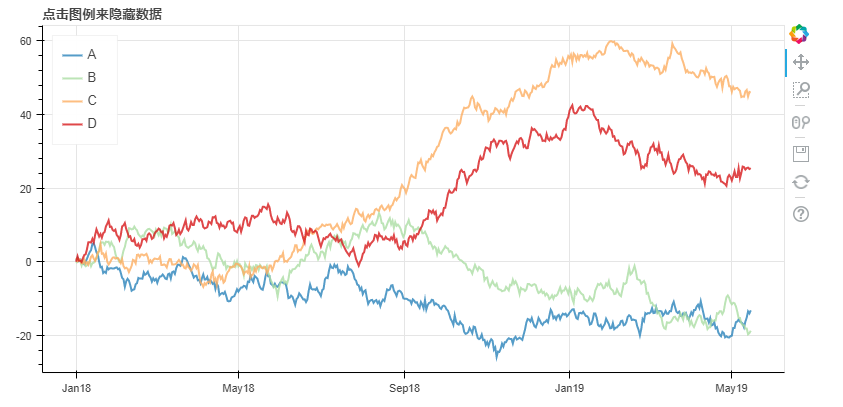
5. 筛选数据
隐藏
# 1、筛选数据 - 隐藏
# legend.click_policy

from bokeh.palettes import Spectral4
# 导入颜色模块

df = pd.DataFrame({'A':np.random.randn(500).cumsum(),
                  'B':np.random.randn(500).cumsum(),
                  'C':np.random.randn(500).cumsum(),
                  'D':np.random.randn(500).cumsum()},
                 index = pd.date_range('20180101',freq = 'D',periods=500))
# 创建数据

p = figure(plot_width=800, plot_height=400, x_axis_type="datetime")
p.title.text = '点击图例来隐藏数据'

for col,color in zip(df.columns.tolist(),Spectral4):
    p.line(df.index,df[col],line_width=2, color=color, alpha=0.8,legend = col)

p.legend.location = "top_left"
p.legend.click_policy="hide"
# 设置图例,点击隐藏

show(p)

消隐
# 1、筛选数据 - 消隐
# legend.click_policy

from bokeh.palettes import Spectral4
# 导入颜色模块

df = pd.DataFrame({'A':np.random.randn(500).cumsum(),
                  'B':np.random.randn(500).cumsum(),
                  'C':np.random.randn(500).cumsum(),
                  'D':np.random.randn(500).cumsum()},
                 index = pd.date_range('20180101',freq = 'D',periods=500))
# 创建数据

p = figure(plot_width=800, plot_height=400, x_axis_type="datetime")
p.title.text = '点击图例来隐藏数据'

for col,color in zip(df.columns.tolist(),Spectral4):
    p.line(df.index,df[col],line_width=2, color=color, alpha=0.8,legend = col,
           muted_color=color, muted_alpha=0.2)   # 设置消隐后的显示颜色、透明度 可以设置muted_color = 'black'

p.legend.location = "top_left"
p.legend.click_policy="mute"
# 设置图例,点击隐藏

show(p)
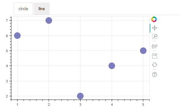
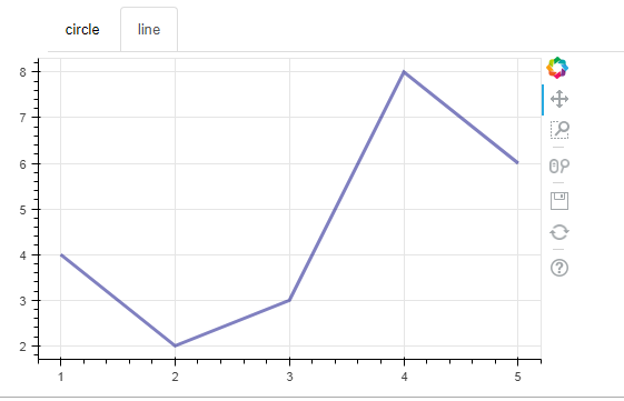
6. 交互工具
# 2、交互小工具
# 图表分页

from bokeh.models.widgets import Panel, Tabs
# 导入panel,tabs模块

p1 = figure(plot_width=500, plot_height=300)
p1.circle([1, 2, 3, 4, 5], [6, 7, 2, 4, 5], size=20, color="navy", alpha=0.5)
tab1 = Panel(child=p1, title="circle")
# child → 页码
# title → 分页名称

p2 = figure(plot_width=500, plot_height=300)
p2.line([1, 2, 3, 4, 5], [4, 2, 3, 8, 6], line_width=3, color="navy", alpha=0.5)
tab2 = Panel(child=p2, title="line")

tabs = Tabs(tabs=[ tab1, tab2 ])
# 设置分页图表

show(tabs)

 浙公网安备 33010602011771号