python 用 matplotlib 制作瀑布图步骤详解
1、加载库
import numpy as np
import pandas as pd
import matplotlib as mpl
import matplotlib.pyplot as plt
2、绘图
# 配置字体,显示中文
mpl.rcParams['font.sans-serif'] = ['SimHei']
# 配置坐标轴刻度值模式,显示负号
mpl.rcParams['axes.unicode_minus'] = True

# 定义数据
x = np.array([1, 2, 3, 4, 5, 6, 7])*2
y1 = np.array([0.5, 0.0, 1.4, 2.7, 1.5, 3.3, 1.5])
y2 = np.array([0.4, 0.5, 0.3, 0.3, 0.4, 0.3, 0.25])
y3 = np.array([20.66, 21.5, 23, 7, 24.5, 32, 20])
y4 = np.array([0.7, 0.4, 2.2, 0.9, 0.7, 0.3, 0.5])
y5 = np.array([3, 16, 12.2, 13.6, 10, 50, 19])
labels = list('ABCDEFG')

w = 0.2

fig, ax = plt.subplots(figsize=(12, 8),
                       facecolor='cornsilk')

# 绘制柱状图
## 第 1 层柱状图
i = 0
ax.bar(x=x,    # 柱体在 x 轴上的坐标位置
       bottom=0,
       height=y1,    # 柱体的高度
       width=w,
       color='dodgerblue',
#        edgecolor='m',
       )
## 第 2 层柱状图
i = 1
ax.bar(x= x+w*i,  # 柱体在 x 轴上的坐标位置
       bottom=y1,
       height=y2,    # 柱体的高度
       width=w,
       color='orange',
#        edgecolor='g',
       )

## 第 3层柱状图
i = 2
ax.bar(x= x+w*i,    # 柱体在 x 轴上的坐标位置
       bottom=y1+y2,
       height=y3,    # 柱体的高度
       width=w,
       color='gray',
       alpha=0.5,
#        edgecolor='g',
       tick_label=labels,
       )

## 第 4 层柱状图
i = 3
ax.bar(x= x+w*i,    # 柱体在 x 轴上的坐标位置
       bottom=y1+y2+y3,
       height=y4,    # 柱体的高度
       width=w,
       color='orange',
#        alpha=0.5,
#        edgecolor='g',
       )
## 第 5 层柱状图
i = 4
ax.bar(x= x+w*i,    # 柱体在 x 轴上的坐标位置
       bottom=y1+y2+y3+y4,
       height=y5,    # 柱体的高度
       width=w,
       color='dodgerblue',
#        alpha=0.5,
#        edgecolor='g',
       )
for i, j in zip(x+w*3, y1+y2+y3+y4+y5+1):
    ax.text(x=i,
            y=j,
            s=f'{j:.2f}',
            size=12,
            color='black',
            family='Arial')
ax.set_yticks(ticks=range(0, 101, 10))
# 添加图例
# ax.legend()

# 设置网格线
ax.grid(axis='y',
          ls=':'
#           alpha=0.6
       )
图形

3、用 DataFrame 和 for 循环简化上面的代码
# 配置字体,显示中文
mpl.rcParams['font.sans-serif'] = ['SimHei']
# 配置坐标轴刻度值模式,显示负号
mpl.rcParams['axes.unicode_minus'] = True
# 定义数据
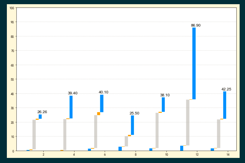
x = np.arange(1, 15, 2)
y1 = [0.5, 0.0, 1.4, 2.7, 1.5, 3.3, 1.5]
y2 = [0.4, 0.5, 0.3, 0.3, 0.4, 0.3, 0.25]
y3 = [20.66, 21.5, 23, 7, 24.5, 32, 20]
y4 = [0.7, 0.4, 2.2, 0.9, 0.7, 0.3, 0.5]
y5 = [3, 16, 12.2, 13.6, 10, 50, 19]
df = pd.DataFrame(np.array([y1, y2, y3, y4, y5]).T)
cs = ['dodgerblue', 'orange', 'lightgray', 'orange', 'dodgerblue']
w = 0.2
fig, ax = plt.subplots(figsize=(12, 8),
facecolor='cornsilk')
# 绘制柱状图
for i, c in enumerate(cs) :
ax.bar(x=x+w*i, # 柱体在 x 轴上的坐标位置
bottom=df.iloc[:, :i].sum(axis=1),
height=df[i], # 柱体的高度
width=w,
color=c,
)
# 添加数据标签
for i, j in zip(x+w*3, df.sum(axis=1)+1):
ax.text(x=i,
y=j,
s=f'{j:.2f}',
size=12,
color='black',
family='Arial')
ax.set_yticks(ticks=range(0, 101, 10))
# 设置网格线
ax.grid(axis='y',
ls=':'
)
图形:
非学无以广才,非志无以成学。

 浙公网安备 33010602011771号