vue3项目中安装使用echarts,以及记录使用图表的option属性
下载echarts插件
npm install echarts -S
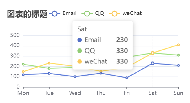
效果图
关键代码 (这里是写成了组件)
<template>
  <div>
    <div
      id="chartone"
      :style="{ width: props.width, height: props.height }"
    ></div>
  </div>
</template>

<script setup>
import { ref, reactive, onMounted,defineProps} from "vue";
import * as echarts from "echarts";
const props=defineProps({
    width:{type:String,default:'400px'},
    height:{type:String,default:'200px'}
})
const initChart = () => {
  let chartDom = document.getElementById("chartone");
  let mychart = echarts.init(chartDom);
  //echarts.init(dom容器) 创建一个Echarts实例,注意:不能在单个容器上初始化多个Echarts实例,所以推荐父子组件传动态的id.

  let option = reactive({
    title: {
      text: "图表的标题",
    },
    tooltip: {
      trigger: "axis",
    },
    legend: {
      data: ["Email", "QQ", "weChat"],
    },
    grid: {
      left: "3%",
      right: "4%",
      bottom: "3%",
      containLabel: true,
    },
    xAxis: {
      type: "category",
      boundaryGap: false,
      data: ["Mon", "Tue", "Wed", "Thu", "Fri", "Sat", "Sun"],
    },
    yAxis: {
      type: "value",
    },
    series: [
      {
        name: "Email",
        type: "line",
        // stack: "Total",
        data: [120, 132, 101, 134, 90, 230, 210],
      },
      {
        name: "QQ",
        type: "line",
        // stack: "Total",
        data: [220, 182, 191, 234, 290, 330, 310],
      },
      {
        name: "weChat",
        type: "line",
        // stack: "Total",
        data: [150, 232, 201, 154, 190, 330, 410],
      },
    ],
  });

  option && mychart.setOption(option);
//设置图表实例的配置项以及数据,
};

onMounted(() => {
  initChart();
});
</script>

<style scoped>
</style>
注意: 在Echarts中遇到折线图的X轴数据与Y轴数据不匹配的问题,黄色折线的实际数值为234,但在图表上显示为8000多。通过移除series中的'stack'属性,成功解决了这个问题,使得黄色折线与Y轴数据对应。
注意:图表必须设置width和height,否者图表无法展示。
图表配置项
title: 标题组件,包含主标题和副标题
#text :标题文本
#show:是否展示标题
#textStyle:标题样式
#color:主标题文字颜色
#fontStyle:主标题文字的风格
#fontWeight:加粗
#fontSize:字体大小
#overflow :换行,配合width时有效
#subtext:副标题文本
legend:图例组件。图例组件展现了不同系列的标记,颜色和名字。
可以通过点击图例控制哪些系列不显示。当图例数量过多时,可以使用 滚动图例(垂直) 或 滚动图例(水平),参见:legend.type

#show:是否展示图例
#type:图例展示的类型
#data:Array图例的数据数组 ,每一项代表一个系列的name (如果是饼图,也可以是饼图单个数据的name )。如果 data 没有被指定,会自动从当前系列中获取。多数系列会取自 series.name
#left:图例离左侧的距离
#top:头部
#width:图例宽度
#orient:图例的布局朝向 'horizontal' 'vertical'
#itemGap:number 图例每项之间的间隔
#itemStyle 图例的样式
#color:颜色
grid:直角坐标系内绘制网格,可以设置图表的位置
#show:是否展示
#left:
#right:
#top:
#bottom:
xAxis:直角坐标系grid中的x轴
#show:是否展示
#type:value 数值轴,category类目轴 time时间轴
#name:坐标轴名称
#nameLocation :坐标轴名称显示位置 start middle|center end
#nameTextStyle: x轴名称文本样式
#padding
yAxis:直角坐标系grid中的y轴
#postion:Y轴位置 left左侧 right右侧
#type:value 数值轴,category类目轴 time时间轴
#nameGap :number 坐标轴名字与轴线之间的距离
#min :number|string|Function 坐标轴值的最小值
#max:最大值
#splitNumber:number 坐标轴的分割段数,这只是预估值
#axisLine:坐标轴轴线相关设置
#show :Y轴线是否显示
#name:Y轴名字
#nameLocation:坐标轴名称显示位置 start middle|center end
#nameTextStyle: x轴名称文本样式
#padding
#color
#fontStyle
#fontWeight:number
#fontFamily
#fontSize:number
#align:文字水平对齐方式 left center right
#verticalAlign:文字垂直对齐方式
未完待续……

 浙公网安备 33010602011771号