关于CSS3盒模型
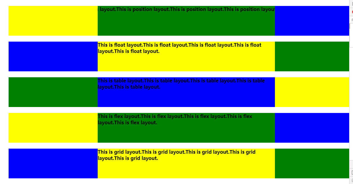
实现一种布局,容器高度固定,容器内有三列,左面和右面的两部分宽度为300像素,中间部分宽度自适应。
已下是对上述问题的五种实现方式。
五中实现方式的通用样式:
 1 /* 通用样式 */
 2 html * {
 3     margin: 0;
 4     padding: 0;
 5     font-weight: bold;
 6 }
 7 article {
 8     width: 100%;
 9     height: 100px;
10     margin: 20px 50px;
11 }
12 article div {
13     height: 100px;
14 }
15 .left, .right {
16     width: 300px;
17 }
使用float浮动进行实现:
html代码:
 1 <!-- float布局 -->
 2 <section>
 3     <article class="layoutFloat">
 4         <div class="left"></div>
 5         <div class="right"></div>
 6         <div class="center">
 7             This is float layout.This is float layout.This is float layout.This is float layout.This is float layout.
 8         </div>
 9     </article>
10 </section>
css样式:
 1 /* float布局样式 */
 2 .layoutFloat .left {
 3      float: left;
 4      background-color: blue;
 5 }
 6 .layoutFloat .right {
 7      float: right;
 8      background-color: green;
 9 }
10 .layoutFloat .center {
11      background-color: yellow;
12 }
因为高度固定,所以只需在左右两块加上float浮动即可,不用考虑高度不一致出现的情况。
使用position定位进行实现:
html代码:
 1 <!-- position布局 -->
 2 <section>
 3     <article class="layoutPosition">
 4         <div class="left"></div>
 5         <div class="right"></div>
 6         <div class="center">
 7             This is position layout.This is position layout.This is position layout.This is position layout.This is position layout.
 8         </div>
 9     </article>
10 </section>
css样式:
 1 /* position布局样式 */
 2 .layoutPosition {
 3     position: relative;
 4 }
 5 .layoutPosition .left {
 6     position: absolute;
 7     left: 0;
 8     background-color: yellow;
 9 }
10 .layoutPosition .right {
11     position: absolute;
12     right: 0;
13     background-color: blue;
14 }
15 .layoutPosition .center {
16     background-color: green;
17 }
使用flex弹性布局实现:
html代码:
 1 <!-- flex布局 -->
 2 <section>
 3     <article class="layoutFlex">
 4         <div class="left"></div>
 5         <div class="center">
 6             This is flex layout.This is flex layout.This is flex layout.This is flex layout.This is flex layout.
 7         </div>
 8         <div class="right"></div>
 9     </article>
10 </section>
css样式:
 1 /* flex布局样式 */
 2 .layoutFlex {
 3     display: flex;
 4 }
 5 .layoutFlex .left {
 6     background-color: yellow;
 7 }
 8 .layoutFlex .center {
 9     background-color: green;
10     flex: 1;
11 }
12 .layoutFlex .right {
13     background-color: blue;
14 }
使用table表格布局实现:
html代码:
 1 <!-- table布局 -->
 2 <section>
 3     <article class="layoutTable">
 4         <div class="left"></div>
 5         <div class="center">
 6             This is table layout.This is table layout.This is table layout.This is table layout.This is table layout.
 7         </div>
 8         <div class="right"></div>
 9     </article>
10 </section>
css样式:
 1 /* table布局样式 */
 2 .layoutTable {
 3     display: table;
 4 }
 5 .layoutTable .left {
 6     background-color: green;
 7     display: table-cell;
 8 }
 9 .layoutTable .center {
10     background-color: blue;
11     display: table-cell;
12 }
13 .layoutTable .right {
14     background-color: yellow;
15     display: table-cell;
16 }
使用grid网格布局实现:
html代码:
 1 <!-- grid布局 -->
 2 <section>
 3     <article class="layoutGrid">
 4         <div class="left"></div>
 5         <div class="center">
 6             This is grid layout.This is grid layout.This is grid layout.This is grid layout.This is grid layout.
 7         </div>
 8         <div class="right"></div>
 9     </article>
10 </section>
css样式:
 1 /* grid布局样式 */
 2 .layoutGrid {
 3     display: grid;
 4     grid-template-columns: 300px auto 1fr;
 5 }
 6 .layoutGrid .left {
 7     background-color: blue;
 8 }
 9 .layoutGrid .center {
10     background-color: yellow;
11 }
12 .layoutGrid .right {
13     background-color: green;
14 }
实现效果:
总结:
以上是对于一个问题的五种实现方式,但是还没有进行完善,比如grid网格布局的实现目前是存在问题的。之后会继续进行改进。

 浙公网安备 33010602011771号