H5+CSS3 学习
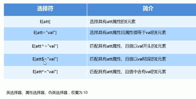
1.属性选择器
2.css3结构伪类选择器
n也可以是关键词 even是偶数 odd是奇数
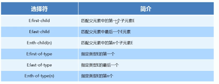
选择div下面第一个span div后面加空格
<style type="text/css">
            div span:nth-child(2){
                background-color: pink;
            }
        </style>
<body>
        <div>
            <p>我是一个p</p>
            <span>我是span</span>
            <span>我是span</span>
            <span>我是span</span>
        </div>
    </body>
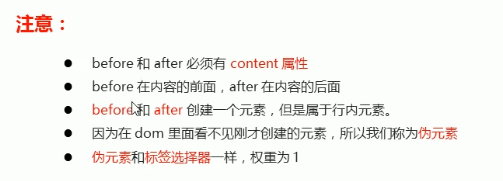
3.伪元素选择器
::before 在元素内部的前面插入内容
::after 在元素内部的后面插入内容
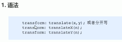
4. 2D转换
转换(transform)是css3中具有颠覆性的特征之一,可以实现元素的位移,旋转、缩放等效果
转换(transform)可以简单理解为变形
·移动:translate
·旋转:rotate
·缩放:scale
②重点
·定义2D转换中的移动,沿着X和Y轴移动元素
·translate最大的优点:不会影响到其他元素的位置
·translate中的百分比单位是相对于自身元素的translate:(50%,50%);
·对行内标签没有效果
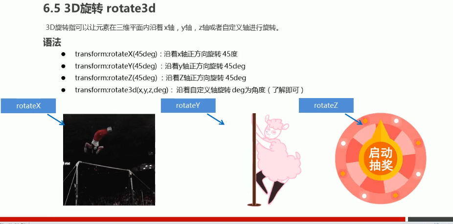
4.2 2D转换之旋转rotate
2D旋转指的是让元素在2维平面内顺时针旋转或者逆时针旋转。
①语法
transform:rotate(度数)
②重点
·rotate里面跟度数,单位是deg比如 rotate(45deg)
·角度为正时,顺时针,负时,为逆时针
·默认旋转的中心点是元素的中心点
<style type="text/css">
            div{
                position: relative;
                width: 249px;
                height: 35px;
                border: 1px solid pink;
            }
            div::after{
                content: '';
                position: absolute;
                width: 10px;
                height: 10px;
                top: 10px;
                right: 8px;
                border-bottom: 1px solid #000;
                border-right: 1px solid #000;
                transform: rotate(45deg);
            }
            div:hover::after{
                transform: rotate(225deg);
                /*过渡写到本身上,谁做动画给谁加*/
                transition: all .2s;
            }
        </style>
4.3 2D转换中心点transform-origin
①语法
transform-origin:x y;
②重点
· 注意后面的参数x和y用空格隔开
· xy默认转换的中心点是元素的中心点(50% 50%)
· 还可以给xy设置像素或者方位名词(top bottom left right center)
![]()
![]()
![]() View Code
View Code
![]() View Code
View Code
![]() View Code
View Code
![]() View Code
View Code
![]() View Code
View Code
![]()
![]()
![]()
4.4 2D转换之缩放scale
①语法
transform:scale(x,y);
②注意
·注意其中的x和y用逗号分隔
·sacle缩放最大的优势:可以设置转换中心点缩放,默认以中心点缩放的,而且不影响其他盒子
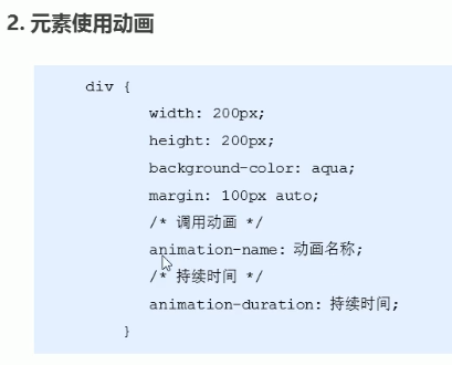
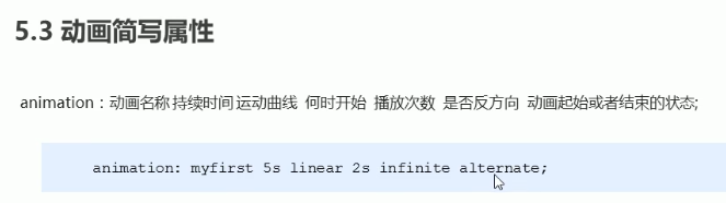
5.动画(animation)
制作动画分为两步:
①先定义动画
②在使用(调用)动画
5.1用keyframes定义动画(类似定义类选择器)
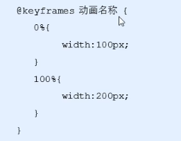
动画序列
·0%是动画的开始,100%是动画的完成。这样的规则就是动画序列。
·在@keyframes中规定某项css样式,就能创建由当前样式逐渐改为新样式的动画效果。
·请用百分比来规定变化发生的时间,或用关键词“from”和“to”,等同于0%和100%
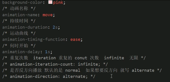
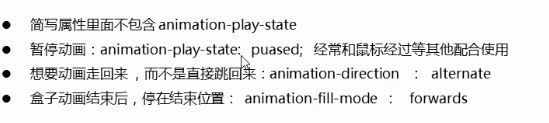
<style type="text/css">
        /*定义动画*/
        @keyframes move{
            from{
                transform: translateX(0);
            }
            to{
                transform: translateX(1000px);
            }
        }
        div{
            width: 300px;
            height: 300px;
            background-color: pink;
            /*调用动画名称*/
            animation-name: move;
            /*持续时间*/
            animation-duration: 2s;
            animation: move 2s linear 0s infinite alternate forwards;
        }
        div:hover{
            animation-play-state:paused;
        }
    </style>


案例 奔跑的小熊


<style type="text/css">
            body{background-color: #ccc;}
            div{
                position: absolute;
                width: 200px;
                height: 100px;
                background: url(img/bear.png)no-repeat;
                animation: run 1s steps(8) infinite,mov 4s forwards;

            }
            @keyframes run{
                from{
                    background-position: 0 0;
                }
                to{
                    background-position: -1600px 0;
                }
            }
            @keyframes mov{
                from{
                    left: 0;
                }
                to{
                    left: 50%;
                    transform: translate(-50%);
                }
            }
        </style>

案例 地图标注
<!DOCTYPE html>
<html>
    <head>
        <meta charset="UTF-8">
        <title></title>
        <style type="text/css">
            body{background-color: #ccc;}
            .map{
                background:url(img/map.png) no-repeat;
                width: 953px;
                height: 472px;
                margin: 0 auto;
            }
            .city{
                position: absolute;
                top: 164px;
                left: 712px;
            }
            .dotted{
                position: absolute;
                width: 8px;
                height: 8px;
                background-color: pink;
                border-radius: 50%;
            }
            .city div[class^='pusle']{
                /*保证小波纹在父盒子里水平垂直居中 放大之后就会中心向四周发散*/
                position: absolute;
                top: 50%;
                left: 50%;
                transform: translate(-50%,-50%);

                width: 8px;
                height: 8px;
                box-shadow: 0 0 12px hotpink;
                border-radius: 50%;
                animation: pusle 1.2s linear infinite forwards;
            }
            .city div.pusle2{
                animation-delay: 0.4s;
            }
            .city div.pusle3{
                animation: .8s;
            }
            @keyframes pusle{
                0%{
                    opacity: 1;
                }
                70%{
                    width: 40px;
                    height: 40px;
                    opacity: 1;
                }
                100%{
                    width: 70px;
                    height: 70px;
                    opacity: 0;
                }
            }
        </style>
    </head>
    <body>
        <div class="map">
            <div class="city">
                <div class="dotted"></div>
                <div class="pusle1"></div>
                <div class="pusle2"></div>
                <div class="pusle3"></div>
            </div>
        </div>
    </body>
</html>
6.3D转换
3D转换常用的3D位移和3D旋转
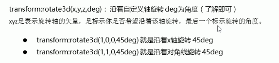
·3D位移:translate3d(x,y,z)
·3D旋转:rotate3d(x,y,z)
·透视:perspective
·3D呈现:transfrom-style
![]()
![]()
![]()
![]()
![]()
6.2 3D移动 translate3d
3D移动在2D移动的基础上多加了一个可以移动的方向,就是z轴方向。
·transform:translateX(100px):仅仅在x轴上移动
·transform:translateY(100px):仅仅在y轴上移动
·transform:translateZ(100px):仅仅在z轴上移动(注意:translateZ一般用px单位)
·transform:translate3d(x,y,z):其中x、y、z分别指要移动的轴的方向的距离
6.6 3D呈现 transform-style
· 控制子元素是否开启三维立体环境。
·transform-style:flat 子元素不开启3D立体空间 默认的
·transform-style:preserve-3d; 子元素开启立体空间
· 代码写给父级,但是影响的是子盒子
· 这个属性很重要,后面必用
案例 旋转的盒子
案例 旋转的盒子
<!DOCTYPE html>
<html>
    <head>
        <meta charset="UTF-8">
        <title></title>
        <style type="text/css">
            body{
                perspective: 500px;
            }
            .box{
                position: relative;
                width: 300px;
                height: 300px;
                margin: 0 auto;
                transform-style: preserve-3d;
                transition: all .4s;
            }
            .box:hover{
                transform: rotateY(180deg);
            }
            .front,
            .back{
                position: absolute;
                top: 0;
                left: 0;
                width: 300px;
                height: 300px;
                text-align: center;
                line-height: 300px;
                color: #fff;
                border-radius: 50%;
            }
            .front{
                background-color: pink;
            }
            .back{
                background-color: plum;
                transform: rotateY(180deg);
            }
        </style>
    </head>
    <body>
        <div class="box">
            <div class="front">粉色盒子</div>
            <div class="back">这里紫色盒子</div>
        </div>
    </body>
</html>
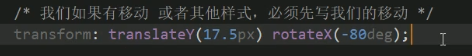
案例 3D导航
<!DOCTYPE html>
<html>
    <head>
        <meta charset="UTF-8">
        <title></title>
        <style type="text/css">
            *{
                padding: 0;
                margin: 0;
            }
            ul li{
                float: left;
                list-style: none;
                width: 100px;
                height: 35px;
                margin: 0 5px;
                perspective: 500px;
                text-align: center;
                line-height: 35px;
                color: #fff;
                cursor: pointer;
            }
            .box{
                position: relative;
                width: 100%;
                height: 100%;
                transform-style: preserve-3d;
                transition: all .3s;
            }
            .box:hover{
                transform: rotateX(90deg);
            }
            .front,
            .bottom{
                width: 100%;
                height: 100%;
                position: absolute;
                top: 0;
                left: 0;
            }
            .front{
                background-color: pink;
                transform: translateZ(17.5px);
            }
            .bottom{
                background-color: purple;
                transform:translateY(17.5px) rotatex(-90deg);
            }
        </style>
    </head>
    <body>
        <ul>
            <li>
                <div class="box">
                    <div class="front">这里是导航</div>
                    <div class="bottom">Hello!</div>
                </div>
            </li>
            <li>
                <div class="box">
                    <div class="front">这里是导航</div>
                    <div class="bottom">Hello!</div>
                </div>
            </li>
            <li>
                <div class="box">
                    <div class="front">这里是导航</div>
                    <div class="bottom">Hello!</div>
                </div>
            </li>
            <li>
                <div class="box">
                    <div class="front">这里是导航</div>
                    <div class="bottom">Hello!</div>
                </div>
            </li>
            <li>
                <div class="box">
                    <div class="front">这里是导航</div>
                    <div class="bottom">Hello!</div>
                </div>
            </li>
        </ul>
    </body>
</html>
案例 旋转木马
<!DOCTYPE html>
<html>
    <head>
        <meta charset="UTF-8">
        <title></title>
        <style type="text/css">
            body{
                perspective: 1000px;
            }
            section{
                margin: 100px auto;
                position: relative;
                width: 300px;
                height: 200px;
                animation: rotate 10s linear infinite;
                transform-style: preserve-3d;
            }
            section:hover{
                animation-play-state: paused;
            }
            @keyframes rotate{
                0%{
                    transform: rotateY(0);
                }
                100%{
                    transform: rotateY(360deg);
                }
            }
            section div{
                position: absolute;
                width: 100%;
                height: 100%;
                top: 0;
                left: 0;
                background: url(img/han.JPG) no-repeat;

            }
            section div:nth-child(1){
                transform: translateZ(300px);
            }
            section div:nth-child(2){
                transform:rotateY(60deg) translateZ(300px);
            }
            section div:nth-child(3){
                transform:rotateY(120deg) translateZ(300px);
            }
            section div:nth-child(4){
                transform: rotateY(180deg) translateZ(300px);
            }
            section div:nth-child(5){
                transform:rotateY(240deg) translateZ(300px) ;
            }
            section div:nth-child(6){
                transform: rotateY(300deg) translateZ(300px);
            }
        </style>
    </head>
    <body>
        <section>
            <div></div>
            <div></div>
            <div></div>
            <div></div>
            <div></div>
            <div></div>
        </section>
    </body>
</html>
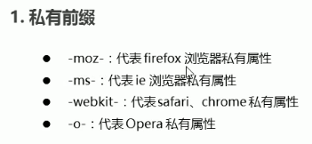
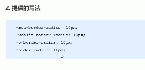
7.浏览器私有前缀
浏览器私有前缀是为了兼容老版本的写法,比较新版本的浏览器无须添加。
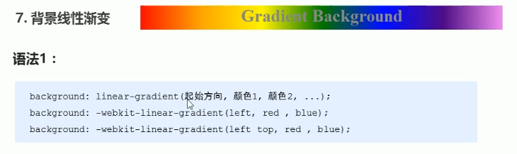
背景渐变色

 浙公网安备 33010602011771号