
CSS动画之transition属性
transition 属性
简介
transition(过渡)) 是指从一个状态到另一个状态的变化。比如当鼠标在某个元素上悬停时,我们会修改它的样式,采用 transition 可以创建一个平滑的动画效果。
简单用法
代码
transition: background 0.5s linear;
意义
在 0.5 秒的时间里,按照 linear 的时间函数(timing-function)来改变某个元素的 background 属性。
示例
当鼠标在按钮上悬停时(hover)改变按钮的 background。
-
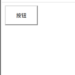
html
<button>按钮</button> -
css
button { padding:1em 2em; background: #fff; transition: background 1s linear; } button:hover { background: deeppink; } -
效果
![深度录屏_选择区域_20191108030921-201911831515]()
如果我们把 transition: background 1s linear 放到hover中则只有鼠标离开时才有动画效果;
简写transition全部参数
transition:[property] [duration] [delay] [timeing-function]
transition全写
transition-property:all;/* 规定过渡css属性名称 */transition-duration: 1s;/* 过渡持续时间 3s===3*1000ms */transition-delay: 0.1s;/* 过渡效果延迟开始时间 */transition-timing-function: ease-in;/* 时间函数 */
时间函数Steps()
参数
- 动画完成步数
- 参数类型:Number
- 第一个步进点
- 参数:start/end
- 默认:end
示例
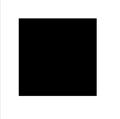
- html
<div id="block"></div> - css
#block{ position: absolute; left: 50%; top: 30%; transform: translateX(-50%); width: 12em; height: 12em; background: #000; transition: all 1s steps(5,end); /*transition: all 1s linear;*//*平滑过渡*/ } #block:hover{ width: 2em; height: 2em; } - 效果

添加多个过渡
- html
<div id="block"></div> - css
#block{ position: absolute; left: 50%; top: 30%; transform: translateX(-50%); width: 12em; height: 12em; background: #000; transition: width 1s linear,height 1s linear,background 1s ease-in-out; } #block:hover{ background: burlywood; width: 2em; height: 2em; } - 效果
添加移除类触发过渡
简单示例
- 效果
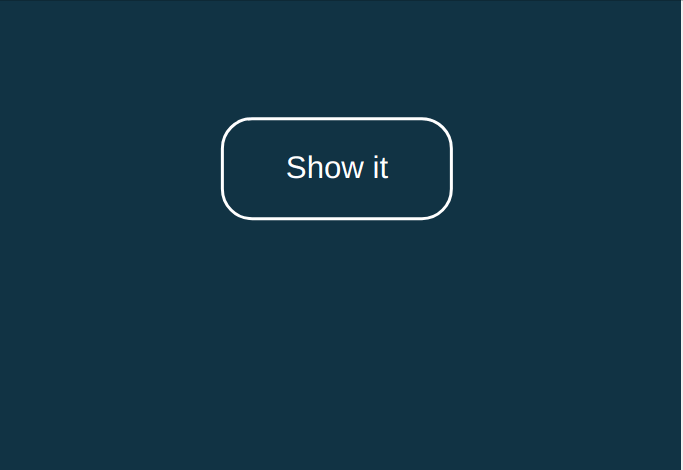
- html
<body>
    <button id="show">Show it</button>
    <div id="wait-show" class="hide">
        <h1>Title</h1>
        <p>Pressing the button shows this content.</p>
    </div>
</body>
- css
body {
  background-color: #134;
  transition: background 0.5s ease-out;
  font-family: HelveticaNeue, Arial, Sans-serif;
}
body.on {
  background-color: #099;
}

button{
  background: transparent;
  border: 2px solid #fff;
  border-radius: 1em;
  color: #fff;
  cursor: pointer;
  font-size: 24px;
  padding: 1em 2em;
  position: absolute;
  left: 50%;
  top: 50%;
  transform: translate(-50%, -50%);
  transition: all 0.4s ease-out;
  outline: 0;
}

button:hover{
  background: #fff;
  color: #099;
}

#wait-show{
  color: #fff;
  text-align: center;
  position: absolute;
  left: 50%;
  transform: translate(-50%,-50%);
  transition: all 0.5s cubic-bezier(.83,-0.43,.21,1.42);
}

.hide{
  opacity: 0;
  top:calc(50% + 10em);
}

.show{
  opacity: 1;
  top: calc(50% + 6em);
}
- js
 let showBtn = document.getElementById('show');
    let body = document.body;
    let waitShow = document.getElementById('wait-show');

    /**
    * 监听点击事件
    */
    showBtn.addEventListener('click', function (e) {
        // 更改body颜色
        body.className = body.className === 'on' ? '' : 'on';

        waitShow.className = waitShow.className === 'hide' ? 'show' : 'hide';
    })
    document.getElementsByTagName('body')
"你的指尖,拥有改变世界的力量! "
欢迎关注我的个人博客:https://sugarat.top

 浙公网安备 33010602011771号