React Native 组件介绍(一)
Text
一个用于显示文本的 React 组件,支持嵌套、样式、以及触摸处理
style 属性
color: 基本同 css 写法
fontSize: number 类型(默认大小 14)
fontStyle: enum('normal', 'italic')
fontFamily: string,只接受一种字体名称
fontWeight: enum('normal', 'bold', '100', '200', '300', '400', '500', '600', '700', '800', '900') (推荐使用 bold 和 normal,因为有很多字体对数字的支持度不是很好)
lineHeight: number 类型
letterSpacing: number 类型
textAlign: enum('auto', 'left', 'right', 'center', 'justify'<仅 iOS 和 Android>=8.0 支持>)
textDecorationLine: enum('none', 'underline', 'line-through', 'underline line-through')
容器
在 Text 内部的元素不再使用 flexbox 布局,而是采用文本布局,也就是说,Text 内部的元素不再是一个个的矩形,而是在尾部换行
嵌套
文本节点必须放在 Text 组件内,不能直接放在 View 组件内
样式继承限制
在 Web 上,很多属性(例如:字体相关)都可以从父元素继承;RN 中的继承只发生在 Text 组件上
import {StyleSheet, Text, View} from 'react-native';
import React from 'react';

const tangPoetry = (
  <>
    <Text>清明时节雨纷纷,</Text>
    <Text>路上行人欲断魂。</Text>
    <Text>借问酒家何处有,</Text>
    <Text>牧童遥指杏花村</Text>
  </>
);
export default function index() {
  return (
    <View>
      {/* view container */}
      <View>{tangPoetry}</View>
      {/* text container */}
      <Text>{tangPoetry}</Text>
      {/* 嵌套文本 */}
      <Text style={styles.baseText}>
        总金额:
        <Text style={styles.innerText}>¥3999</Text>
      </Text>
      {/* view 中直接放一段文本 */}
      {/* <View>view中直接放文本(错误)</View> */}
      {/* Render Error: Text strings must be rendered width a <Text> component */}
      {/* 查看view样式继承 */}
      <View style={{fontSize: 30, color: 'geekblue'}}>
        <Text>查看 View 组件的样式能否继承</Text>
      </View>
      {/* 继承只发生在 Text 组件上 */}
      <Text style={{fontSize: 30, color: 'lightblue'}}>
        <Text>继承只发生在 Text 组件上</Text>
        <Text>观察字体的大小和颜色变化</Text>
      </Text>
    </View>
  );
}

const styles = StyleSheet.create({
  baseText: {
    fontWeight: '600',
  },
  innerText: {
    color: 'tomato',
  },
});

View
创建 UI 时最基础的组件,支持 flexbox 布局、样式、触摸响应和一些无障碍的内容
style 属性
边框颜色:borderColor | borderRightColor | borderLeftColor | borderTopColor | borderBottomColor
边框宽度:borderWidth | borderRightWidth | borderLeftWidth | borderTopWidth | borderBottomWidth
边框圆角:borderRadius | borderBottomLeftRadius | borderBottomRightRadius | borderTopLeftRadius | borderTopRightRadius
边框样式:borderStyle <enum('solid', 'dotted', 'dashed')>
透明度:opacity <number>
投影:elevation <number> 此属性仅支持 Android5.0 及以上版本。为视图添加一个投影,并且会影响视图层叠的顺序
import {StyleSheet, Text, View} from 'react-native';
import React from 'react';
export default function index() {
return (
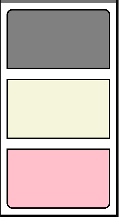
<View style={styles.container}>
<View style={styles.top} />
<View style={styles.middle} />
<View style={styles.bottom} />
</View>
);
}
const styles = StyleSheet.create({
container: {
height: '100%',
justifyContent: 'space-between',
backgroundColor: '#fff',
padding: 20,
},
top: {
flex: 0.3,
backgroundColor: 'grey',
borderWidth: 5,
borderTopLeftRadius: 20,
borderTopRightRadius: 20,
},
middle: {
flex: 0.3,
backgroundColor: 'beige',
borderWidth: 5,
},
bottom: {
flex: 0.3,
backgroundColor: 'pink',
borderWidth: 5,
borderBottomLeftRadius: 20,
borderBottomRightRadius: 20,
},
});
Button
必需属性
title:string,按钮内显示的文本
onPress:({ nativeEvent: PressEvent }),用户点击按钮时所调用的处理函数
可选属性
disabled:bool,设置为 true 时此按钮不可点击
import {View, Button, Alert} from 'react-native';
import React from 'react';

export default function index() {
  return (
    <View style={{height: 200, padding: 20, justifyContent: 'space-between'}}>
      <Button title="确认" onPress={() => Alert.alert('被点击了')} />
      <Button title="取消" color="tomato" onPress={() => alert('点击了取消')} />
      <Button title="禁用" disabled />
    </View>
  );
}
Alert
启动一个提示对话框,包含对应的标题和信息
在 Android 上最多能指定三个按钮,如:确定、取消、稍后再说
在 iOS 上可以指定任意数量的按钮,每个按钮还都可以指定自己的样式和提示类别
方法
alert()
static alert(title, message?, buttons?, options?)
title:string,必填 提示框的标题,取值为 null 或 空字符串 可以隐藏标题
message:string,可选 提示框标题下展示的一段信息
buttons:Button[]
options:仅限于 Android
-- cancelable:boolean,默认值为 false,设为 true 时点击提示框的外面可以取消提示框
-- onDismiss:function,用来捕获用户的取消操作
prompt()
static prompt(title, message?, callbackOrButtons?, type?, defaultValue?, keyboardType?)
仅用于 iOS,创建一个带表单输入内容的提示框
import {StyleSheet, Text, View, Button, Alert} from 'react-native';
import React from 'react';
export default function index() {
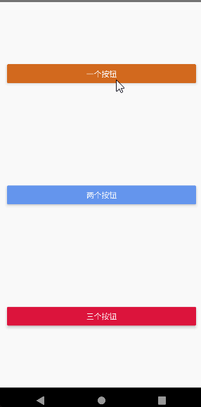
const showAlertOne = () => {
Alert.alert('温馨提示1', '查看提示框消息', [
{text: '确认', onPress: () => console.log('点击确认按钮的回调函数')},
]);
};
const showAlertTwo = () => {
Alert.alert('温馨提示2', '查看提示框消息', [
{text: '确认', onPress: () => console.log('点击确认按钮的回调函数')},
{text: '取消', onPress: () => console.log('点击取消按钮的回调函数')},
]);
};
const showAlertThree = () => {
Alert.alert('温馨提示3', '查看提示框消息', [
{text: '再看看', onPress: () => console.log('点击再看看按钮的回调函数')},
{text: '确认', onPress: () => console.log('点击确认按钮的回调函数')},
{text: '取消', onPress: () => console.log('点击取消按钮的回调函数')},
]);
};
return (
<View style={{height: '100%', padding: 20, justifyContent: 'space-around'}}>
<Button title="一个按钮" color="chocolate" onPress={showAlertOne} />
<Button title="两个按钮" color="cornflowerblue" onPress={showAlertTwo} />
<Button title="三个按钮" color="crimson" onPress={showAlertThree} />
</View>
);
}
StatusBar
控制应用状态栏的组件
StatusBar 可以在任意视图中加载,可以放置多个,后加载的会覆盖先加载的
属性
hidden:bool,是否隐藏状态栏
backgroundColor:color,状态栏的背景色。仅用于 Android
barStyle:enum('default', 'light-content', 'dark-content'),设置状态栏文本的颜色,Android 上此属性仅对 6.0 及以上版本生效
animated:bool,指定状态栏的变化是否应以动画形式呈现。目前支持这几种样式:backgroundColor,barStyle 和 hidden
Switch
跨平台通用的开关组件
这是一个受控组件,必须使用 onValueChange 回调来更新 value 属性以响应用户的操作
属性
disabled:bool,默认值为 false,是否禁用此组件的交互
thumbColor:color,开关上圆形按钮的背景颜色
trackColor:object: { false: color, true: color },关闭状态时的边框颜色(iOS)或背景颜色(Android)
value:bool,默认值为 false,表示此开关是否打开
onValueChange:function,当值改变的时候调用此回调函数,参数为新的值
onChange:function,当值改变的时候调用此回调函数,参数为事件
import {View, Text, StatusBar, Switch} from 'react-native';
import React, {useState} from 'react';
export default function index() {
const [hideStatusBar, setHideStatusBar] = useState(false);
const toggleStatusBar = () => {
setHideStatusBar(!hideStatusBar);
};
return (
<View style={{alignItems: 'flex-start'}}>
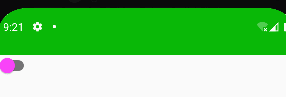
<StatusBar
hidden={hideStatusBar}
animated
backgroundColor="#09b807"
barStyle="dark-content"
/>
<Switch
value={hideStatusBar}
thumbColor={hideStatusBar ? '#f5dd4b' : '#f4f'}
trackColor={{false: '#767577', true: '#81b0ff'}}
onValueChange={toggleStatusBar}
/>
</View>
);
}
ActivityIndicator
显示一个圆形的 loading 提示符号
属性:
size:enum('small', 'large'),指示器的大小,默认为 'small'。还可以在 Android 上设定具体的数值
color:滚轮的前景颜色
animating:bool,是否要显示指示器动画,默认为 true 表示显示,false 表示隐藏
import {View, ActivityIndicator, StyleSheet} from 'react-native';
import React from 'react';
export default function index() {
return (
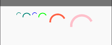
<View style={[styles.container]}>
<ActivityIndicator />
<ActivityIndicator size="large" />
<ActivityIndicator size="small" color="#0000ff" />
<ActivityIndicator size="large" color="#00ff00" />
{/* 数字指定大小,只在 Android 应用下有效 */}
<ActivityIndicator color="tomato" size={70} />
<ActivityIndicator color="pink" size={100} />
</View>
);
}
const styles = StyleSheet.create({
container: {
height: '100%',
padding: 20,
flexDirection: 'row',
justifyContent: 'center',
alignItems: 'flex-start',
},
});

 浙公网安备 33010602011771号