盒模型的属性/display显示(重要)/浮动(重要)
一.关于上篇博客的总结


1.高级选择器:

(1).后代选择器*****

选择的是儿子,孙子,重孙子

div p{}

(2).子代选择器

选择的是亲儿子

div>p

(3).组合选择器

div,p,a,span{}

(4).交集选择器

div.active{}

(5).属性选择器

input[type="text"]{}

(6),伪类选择器

爱恨准则

  a:link{}

  a:visited{}

  a:hover{}

  a:active{}

对a来设置字体颜色,一定要选中a

(7).伪元素选择器

p::first-letter{}

p:before{

  content:""

}

//与浮动有关系

p:after{

  content:""

}

2.CSS的继承性和层叠性

在CSS中,color, text-xxx, font-xxx, line-xxx这些属性是可以被继承下来

层叠性: 权重->谁的权重大就会显示谁的属性

权重大小的对比:

  选择器的个数: id class 标签

  ①权重比较:

  行内 > id > class > 标签

  ②权重比较:

  继承来的属性,它的权重为0,与选中的标签没有可比性

  ③权重比较

  都是继承来的,他们权重都为0,就近原则

  ④权重比较

  都是继承来的,他们权重都为0,描述的一样近,再去数权重
  ⑤权重比较

  权重一样大,后面的大于前面的属性

3.盒模型

  标准盒模型:

    width: 内容的宽度

    height: 内容的高度

    padding: 内边距,内容到边框的距离

    border: 边框

    margin: 外边框,一个盒子的边到另一个盒子边的距离

  计算盒模型:

    盒子的大小=width+2*padding+2*border
    如果保证盒子大小不变,那么加padding,,就要减内容的width或height
4.浮动

  浮动是实现元素并排,只要盒子浮动,就脱离标准文档流(不在文档流上占位置)
二.盒模型的属性(重要)
1.padding
(1).padding: 10px; 上下左右
(2).padding: 20px 30px; 上下 左右
(3).padding: 20px 30px 40px; 上 左右 下
(4).padding: 20px 30px 40px 50px; 顺时针 上右下左
<!DOCTYPE html>
<html>
    <head>
        <meta charset="UTF-8">
        <title>padding的使用</title>
        <style type="text/css">
            *{
                padding: 0;
                margin: 0;
            }
            .box{
                width: 200px;
                height: 200px;
                background-color: red;
                /*上下左右*/
                padding: 10px;
                /*上下  左右*/
                padding: 20px 30px;
                /*上  左右  下*/
                padding: 20px 30px 40px;
                /*顺时针 上 右 下 左*/
                padding: 20px 30px 40px 50px;
            }
        </style>
    </head>
    <body>
        <!-- padding是标准文档流,父子之间调整位置 -->
        <div class="box">娃哈哈</div>
    </body>
</html>
2.border
三要素:线性的宽度, 线性的样式, 颜色
border: 1px solid red;
border-left: 1px solid red
<!DOCTYPE html>
<html>
    <head>
        <meta charset="UTF-8">
        <title>border是的使用</title>
        <style type="text/css">
            .box{
                width: 200px;
                height: 200px;
                background-color: red;
                /*四个边框均为5px*/
                /*border: 5px solid blue;*/

                /*上下边框 蓝色实线,左右边框 黑色双线*/
                /*bored-width: 5px 10px;
                border-color: blue black;
                border-style: solid double;*/

                /*左边框黄色5px实线*/
                /*border-left-style: solid;
                border-left-width: 5px;
                border-left-color: yellow;*/

                /*左黑 右蓝 上黄 下紫*/
                border-left: 5px solid black;
                border-right: 2px solid blue;
                border-top: 5px solid yellow;
                border-bottom: 2px solid purple;
            }
        </style>
    </head>
    <body>
        <!-- padding是标准文档流,父子之间调整位置 -->
        <div class="box">娃哈哈</div>
    </body>
</html>
<!DOCTYPE html>
<html>
    <head>
        <meta charset="UTF-8">
        <title>制作三角形</title>
        <style type="text/css">
            div{
                width: 0px;
                height: 0px;
                border-bottom: 20px solid red;
                border-left: 20px solid transparent;
                border-right: 20px solid transparent;
            }
        </style>
    </head>
    <body>
        <div></div>
    </body>
</html>
<!DOCTYPE html>
<html>
    <head>
        <meta charset="UTF-8">
        <title>制作圆</title>
        <style type="text/css">
            div{
                width: 200px;
                height: 200px;
                background-color: red;
                /*制作圆角*/
                /*border-radius: 3px;*/

                /*制作圆*/
                /*border-radius: 100px;*/
                border-radius: 50%;
            }
        </style>
    </head>
    <body>
        <div></div>
    </body>
</html>
3.margin
前提是必须是在标准文档流下
margin的水平不会出现任何问题
垂直方向上margin会出现"塌陷问题"
<!DOCTYPE html>
<html>
    <head>
        <meta charset="UTF-8">
        <title>margin的应用</title>
        <style type="text/css">
            .a1{
                background-color: red;
                margin-right: 30px;
            }
            .a2{
                background-color: rgb(0,123,0);
                margin-left: 30px;
            }
        </style>
    </head>
    <body>
        <span class="a1">娃哈哈</span><span class="a2">爽歪歪</span>
    </body>
</html>
<!DOCTYPE html>
<html lang="en">
<head>
    <meta charset="UTF-8">
    <title>Document</title>
    <style>
        .s1{
            width: 200px;
            height: 200px;
            background-color: red;
            margin-bottom: 40px;
        }
        .s2{
            width: 200px;
            height: 200px;
            background-color:rgb(0,128,0);
            margin-top: 100px;

        }
    </style>
</head>
<body>
    <!-- 塌陷,两盒子之间的距离为100px -->
    <div class="s1"></div>
    <div class="s2"></div>

</body>
</html>
<!DOCTYPE html>
<html lang="en">
<head>
    <meta charset="UTF-8">
    <title></title>

    <style>
        .box{
            width: 300px;
            height: 300px;
            background-color: red;
            /*float: left;*/
        }
        .child{
            width: 100px;
            height: 100px;
            background-color: green;
            margin-left: 50px;
            margin-top: 50px;
        }
    </style>
</head>
<body>
    <!-- 子盒子向上推50px,结果带着父盒子一起推了 -->
    <div class="box">
        <div class="child"></div>
    </div>
</body>
</html>
三.display 显示(重要)
前提是必须在标准文档流下
1.属性:
(1).block 块级标签
独占一行
可以设置宽高,如果不设置宽,默认父盒子宽度为100%
(2).inline 行内标签
在一行内显示
不可以设置宽高,根据内容来显示宽高
(3).inline-block 行内块
在一行内显示
可以设置宽高
(4)none 不显示,隐藏,不在文档上占位置
(5)visibility:hidden; 隐藏,在文档上占位置
<!DOCTYPE html>
<html>
    <head>
        <meta charset="UTF-8">
        <title>display的应用</title>
        <style type="text/css">
            .box{
                width: 100px;
                height: 100px;
                background-color: red;
                border: 1px solid blue;
                display: inline;
            }

            div a{
                display: block;
                width: 300px;
                height: 300px;
            }
            span{
                display: inline-block;
                width: 300px;
                height: 200px;
                background-color: black;
            }
        </style>
    </head>
    <body>
        <div class="box">哇哈哈哈哈哈哈哈哈哈哈哈哈哈</div>
        <div class="box">呵呵呵</div>

        <div>
            <a href="#">
                <img src="img/1.jpg" alt="" width="300px" height="200px" />
            </a>
        </div>
        <input type="text" />
        <span>啊啊啊啊啊</span>
        <span>啊啊啊啊啊</span>
    </body>
</html>
四.浮动(重要)
浮动是css里面布局最多的一个属性,也是很重要的一个属性
float:表示浮动的意思。它有四个值
none: 表示不浮动,默认
left: 表示左浮动
right: 表示右浮动
1.四大特性:
(1).浮动的元素脱标
脱标:就是说脱离了标准文档流
(2).浮动的元素互相贴靠
(3).浮动的元素由"子围"效果
<!DOCTYPE html>
<html lang="en">
<head>
    <meta charset="UTF-8">
    <title>Document</title>
    <style>
        .box{
            width: 200px;
            height: 200px;
            background-color: cornflowerblue;
            float: left;
        }
        .box2{
            border: 1px solid red;
        }
    </style>
</head>
<body>

    <div class="box"></div>
    <div class="box2">
        姚明文字文字文字文字文字文字文字文字文字文字文字文字文字文字文字文字文字字文字文字文字文字文字文字文字文字文字文字文字文字文字文字文字文字文字文字文字文字文字文字文字文字文字文字文字文字文字文字文字文字文字文字文字文字文字文字文字文字文字文字文字文字文字文字文字文字文字文字文字文字文字文字文字文字文字文字文字文字文字文字文字文字文字文字文字文字文字文字文字文字文字文字文字文字文字文字文字文字字文字文字文字文字文字文字文字文字文字文字文字文字文字文字文字文字文字文字文字文字文字文字文字文字文字文字文字文字文字文字文字文字文字文字文字文字文字文字文字文字文字文字文字文字文字文字文字文字文字文字文字文字文字文字文字文字文字文字文字文字文字文字文字文字文字文字文字文字文字文字文字文字文字文字文字文字文字文字文字文字字文字文字文字文字文字文字文字文字文字文字文字文字文字文字文字文字文字文字文字文字文字文字文字文字文字文字文字文字文字文字文字文字文字文字文字文字文字文字文字文字文字文字文字文字文字文字文字文字文字文字文字文字文字文字文字文字文字文字文字文字文字文字文字文字文字文字文字文字文字文字文字文字文字文字文字文字文字文字文字文字字文字文字文字文字文字文字文字文字文字文字文字文字文字文字文字文字文字文字文字文字文字文字文字文字文字文字文字文字文字文字文字文字文字文字文字文字文字文字文字文字文字文字文字文字文字文字文字文字文字文字文字文字文字文字文字文字文字文字文字文字文字文字文字文字文字文字文字文字文字文字文字文字文字文字文字文字文字文字文字文字字文字文字文字文字文字文字文字文字文字文字文字文字文字文字文字文字文字文字文字文字文字文字文字文字文字文字文字文字文字文字文字文字文字文字文字文字文字文字文字文字文字文字文字文字文字文字文字文字文字文字文字文字文字文字文字文字文字文字文字文字文字文字文字文字文字文字文字文字文
    </div>
</body>
</html>
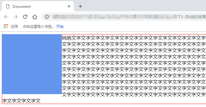
(4).收缩的效果
2.作用好处:使元素实现并排(布局)
就在页面上占位置
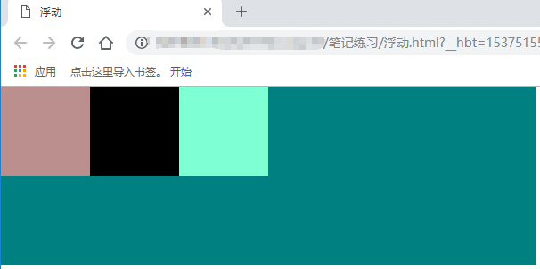
3.浮动带来的问题:
子盒子浮动,不在页面占位置,如果父盒子不设置高度,那么撑不起父盒子的高度,页面出现紊乱
<!DOCTYPE html>
<html>
    <head>
        <meta charset="UTF-8">
        <title>浮动</title>
        <style type="text/css">
            *{
                padding: 0;
                margin: 0;
            }
            .father{
                width:100%;
            }
            .child1{
                width: 100px;
                height: 100px;
                background-color: rosybrown;
                float: left;
            }
            .child2{
                width: 100px;
                height: 100px;
                background-color: black;
                float: left;
            }
            .child3{
                width: 100px;
                height: 100px;
                background-color: aquamarine;
                float: left;
            }
            .father1{
                width: 600px;
                height: 200px;
                background-color: teal;
            }
        </style>
    </head>
    <body>
        <div class="father">
            <div class="child1"></div>
            <div class="child2"></div>
            <div class="child3"></div>
        </div>
        <div class="father1"></div>
    </body>
</html>
4.清除浮动
(1).给父盒子设置固定的高度(后期不好维护)
<!DOCTYPE html>
<html>
    <head>
        <meta charset="UTF-8">
        <title>浮动</title>
        <style type="text/css">
            *{
                padding: 0;
                margin: 0;
            }
            .father{
                width:100%;
                /*固定高度*/
                height: 100px;
            }
            .child1{
                width: 100px;
                height: 100px;
                background-color: rosybrown;
                float: left;
            }
            .child2{
                width: 100px;
                height: 100px;
                background-color: black;
                float: left;
            }
            .child3{
                width: 100px;
                height: 100px;
                background-color: aquamarine;
                float: left;
            }
            .father1{
                width: 600px;
                height: 200px;
                background-color: teal;
            }
        </style>
    </head>
    <body>
        <div class="father">
            <div class="child1"></div>
            <div class="child2"></div>
            <div class="child3"></div>
        </div>
        <div class="father1"></div>
    </body>
</html>

(2).clear:both;
clear:意思就是清除的意思
有三个值:
left:当前元素左边不允许有浮动元素
fight:当前元素右边不允许有浮动元素
both:当前元素左右两边不允许有浮动元素
给浮动原色的最后面,加一个空的块级标签(标准文档流的块级标签),给当前这个标签设置一个clearfix类名,设置该标签属性为clear:both
<!DOCTYPE html>
<html>
    <head>
        <meta charset="UTF-8">
        <title>浮动</title>
        <style type="text/css">
            *{
                padding: 0;
                margin: 0;
            }
            .father{
                width:100%;
            }
            .child1{
                width: 100px;
                height: 100px;
                background-color: rosybrown;
                float: left;
            }
            .child2{
                width: 100px;
                height: 100px;
                background-color: black;
                float: left;
            }
            .child3{
                width: 100px;
                height: 100px;
                background-color: aquamarine;
                float: left;
            }
            .father1{
                width: 600px;
                height: 200px;
                background-color: teal;
            }
            /*clear方法*/
            .clearfix{
                clear: both;
            }
        </style>
    </head>
    <body>
        <div class="father">
            <div class="child1"></div>
            <div class="child2"></div>
            <div class="child3"></div>
            <!-- 内墙法 clear -->
            <div class="clearfix"></div>
        </div>
        <div class="father1"></div>
    </body>
</html>
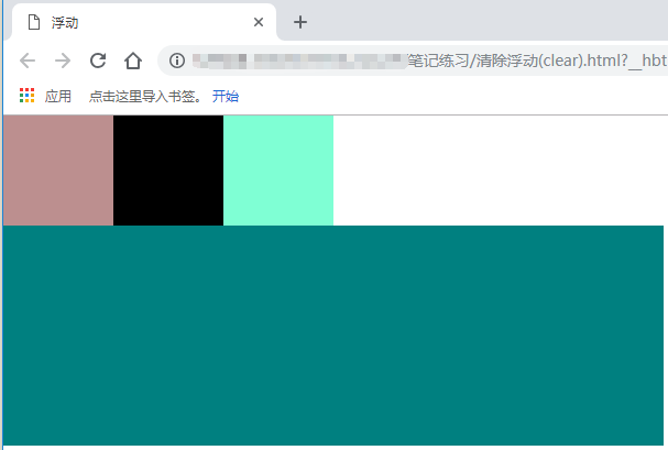
问题:代码冗余
(3).伪元素清除法(常用)
①.给浮动子元素的父盒子,也就是不浮动的元素,添加一个clearfix的类 ,然后设置
.clearfix:after{
    /*必须要写这三句话*/
    content: '.';
    clear: both;
    display: block;
}
②.新浪首页推荐伪元素清除法的写法:
.clearfix:after{
    content: '.';
    clear:both;
    display: block;
    visibility: hidden;
    height: 0;
}
<!DOCTYPE html>
<html>
    <head>
        <meta charset="UTF-8">
        <title>浮动</title>
        <style type="text/css">
            *{
                padding: 0;
                margin: 0;
            }
            .father{
                width:100%;
            }
            .child1{
                width: 100px;
                height: 100px;
                background-color: rosybrown;
                float: left;
            }
            .child2{
                width: 100px;
                height: 100px;
                background-color: black;
                float: left;
            }
            .child3{
                width: 100px;
                height: 100px;
                background-color: aquamarine;
                float: left;
            }
            .father1{
                width: 600px;
                height: 200px;
                background-color: teal;
            }
            .clearfix:after{
                content: ".";
                clear: both;
                display: block;
                visibility: hidden;
                height: 0;
            }
        </style>
    </head>
    <body>
        <div class="father clearfix">
            <div class="child1"></div>
            <div class="child2"></div>
            <div class="child3"></div>
        </div>
        <div class="father1"></div>
    </body>
</html>

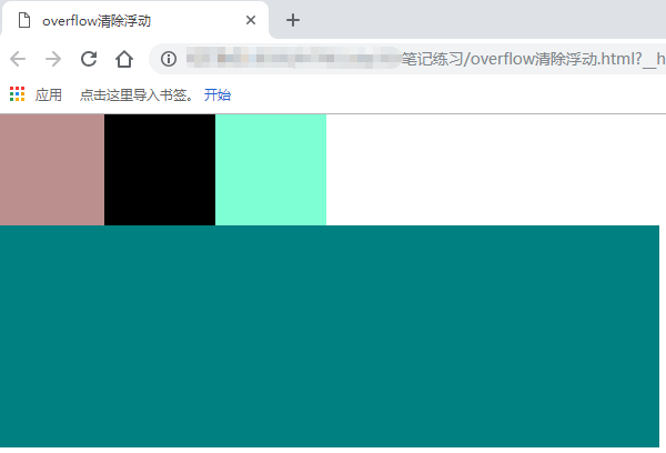
(4).overflow:hidden(常用)
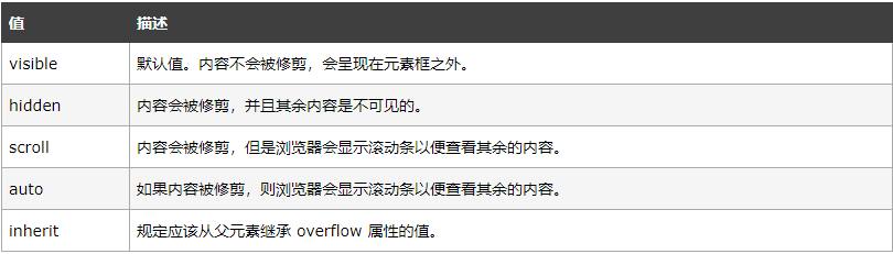
overflow属性规定当内容溢出元素框时发生的事情
说明:
这个属性定义溢出元素内容区的内容会如何处理,如果值为scroll, 不论是否需要, 用户代理都会提供一种滚动机制, 因此, 有可能即使元素框中可以放下所有内容也会出现滚动条
<!DOCTYPE html>
<html>
    <head>
        <meta charset="UTF-8">
        <title>overflow清除浮动</title>
        <style type="text/css">
            *{
                padding: 0;
                margin: 0;
            }
            .father{
                width:100%;
                overflow: hidden;
            }
            .child1{
                width: 100px;
                height: 100px;
                background-color: rosybrown;
                float: left;
            }
            .child2{
                width: 100px;
                height: 100px;
                background-color: black;
                float: left;
            }
            .child3{
                width: 100px;
                height: 100px;
                background-color: aquamarine;
                float: left;
            }
            .father1{
                width: 600px;
                height: 200px;
                background-color: teal;
            }
        </style>
    </head>
    <body>
        <div class="father">
            <div class="child1"></div>
            <div class="child2"></div>
            <div class="child3"></div>
        </div>
        <div class="father1"></div>
    </body>
</html>
5.总结:
要浮动一起浮动,有浮动,清除浮动
五.小米的导航栏
<!DOCTYPE html>
<html lang="en">
<head>
    <meta charset="UTF-8">
    <title>Document</title>
    <style>
        *{
            padding: 0;
            margin: 0;
        }
        *body{
            font-size: 12px;
            color: #333;
        }
        a{
            text-decoration: none;
        }
        ul{
            list-style: none;
        }
        .top{
            width: 100%;
            background-color: #333;

        }
        .container{
            width: 1226px;
            overflow: hidden;
            margin: 0 auto;
        }
        .top .top-l{
            /*高度=行高 让文本垂直居中*/
            height: 40px;
            line-height: 40px;
            float: left;

        }
        .top-l a{
            color: #b0b0b0;
            font-size: 12px;
        }
        .top-l a:hover{
            color: #fff;
        }
        .top .sep{
            color: #424242;
            margin: 0 .5em;
        }

    </style>
</head>
<body>
    <div class="top">
        <div class="container">
            <div class="top-l">
                <a href="#">小米商城</a>
                <span class="sep">|</span>
                <a href="#">MIUI</a>
                <span class="sep">|</span>
                <a href="#">loT</a>
                <span class="sep">|</span>
                <a href="#">小米商城</a>
                <span class="sep">|</span>
                <a href="#">小米商城</a>
                <span class="sep">|</span>
                <a href="#">小米商城</a>
                <span class="sep">|</span>
                <a href="#">小米商城</a>
                <span class="sep">|</span>
                <a href="#">小米商城</a>

            </div>
            <div class="top-shop"></div>
            <div class="top-info"></div>

        </div>
    </div>

</body>
</html>
六.购物车的图标
<!DOCTYPE html> <html lang="en"> <head> <meta charset="UTF-8"> <title></title> <style> /*第一步:拷贝项目下面生成的font-face*/ @font-face {font-family: 'iconfont'; src: url('./font/iconfont.eot'); src: url('./font/iconfont.eot?#iefix') format('embedded-opentype'), url('./font/iconfont.woff') format('woff'), url('./font/iconfont.ttf') format('truetype'), url('./font/iconfont.svg#iconfont') format('svg'); } .iconfont{ font-family:"iconfont" !important; font-size:16px;font-style:normal; -webkit-font-smoothing: antialiased; -webkit-text-stroke-width: 0.2px; -moz-osx-font-smoothing: grayscale; } .aa{ font-size: 20px; } .tt{ font-size: 26px; } </style> </head> <body> <i class="iconfont aa"></i> <span class="iconfont tt"></span> </body> </html>

 浙公网安备 33010602011771号