python之路[14] - css样式选择器 - 迁
CSS
css的4种引入方式
1.行内式
行内式是在标记的style属性中设定CSS样式。这种方式没有体现出CSS的优势,不推荐使用。
<div style='font-size:20px;'> Hello </div>
2.嵌入式
嵌入式是将CSS样式集中写在网页的<head></head>标签对的<style></style>标签对中。格式如下:
<head>
    <meta charset="UTF-8">
    <title>Document</title>
    <style type="text/css">
        div{
            font-size: 20px;
        }
    </style>
</head>
3.导入式
将一个独立的.css文件引入HTML文件中,导入式使用CSS规则引入外部CSS文件,<style>标记也是写在<head>标记中,使用的语法如下
<head>
<style type="text/css">
          @import"mystyle.css";  此处要注意.css文件的路径
</style>
</head>
4.链接式
也是将一个.css文件引入到HTML文件中
<head>
    <link href="mystyle.css" rel="stylesheet" type="text/css"/>
</head>
注意:
导入式 会在整个网页装载完后再装载CSS文件,因此这就导致了一个问题,如果网页比较大,则会先显示无样式的页面,闪烁一下之后,再出现网页的样式。这是导入式固有的一个缺陷。
使用 链接式 时与导入式不同的是它会以网页文件主体装载前装载CSS文件,因此显示出来的网页从一开始就是带样式的效果的,它不会象导入式那样先显示无样式的网页,然后再显示有样式的网页,这是链接式的优点
样式应用顺序:
-
行内样式优先级最高
-
针对相同的样式属性,不同的样式属性将以合并的方式呈现
-
相同样式并且相同属性,呈现方式在<head>中的顺序决定,后面会覆盖前面属性
-
!important 指定样式规则应用最优先
.div {
    color: red !important;
}

CSS优先级:
所谓CSS优先级,即是指CSS样式在浏览器中被解析的先后顺序。
样式表中的特殊性描述了不同规则的相对权重,它的基本规则是:
1 内联样式表的权值最高 style="" ------------------- 1000
2 统计选择符中的ID属性个数。 #id -------------100
3 统计选择符中的CLASS属性个数。 .class ------------- 10
4 统计选择符中的HTML标签名个数。 p --------------1
css的选择器(Selector)
“选择器”指明了{ } 中的“样式”的作用对象,也就是“样式”作用于网页中的哪些元素
1 基础选择器:
*:
通用元素选择器,匹配任何元素
*{  #通配符
    margin:0;
    padding:0;
}
E:
标签选择器,匹配所有使用E标签的元素p
div{
    color:green;
}
.info和E.info:
class选择器,匹配所有class属性中包含info的元素
.info{
    font-size:20px;
}
p.info{
    background:blue;
}

<div class='info'> Hello </div>
<p class='info'> World! </div>
#info和E#info:
id选择器,匹配所有id属性等于info的元素
#info{
    font-size:20px;
}
p#info{
    background:blue;
}

<div id='info'> Hello </div>
注意:
标签中,id的值是唯一的,而class可重复!
2 组合选择器
E,F
多元素选择器,同时匹配所有E元素或F元素,E和F之间用逗号分隔
div,p{
    color:red;
}
E F
后代元素选择器,匹配所有属于E元素后代的F元素,E和F之间用空格分隔
div p{
    font-size: 20px;
    color:red;
}
E > F 子元素选择器,匹配所有E元素的子元素F
div > strong {
    color:#f00;
}
E + F 毗邻元素选择器,匹配所有紧随E元素之后的同级元素F
div+p{
    font-size: 20px;
    color:red;
}
注意嵌套规则:
-
块级元素可以包含内联元素或某些块级元素,但内联元素不能包含块级元素,它只能包含其它内联元素。
-
块级元素不能放在<p>里面。
-
有几个特殊的块级元素只能包含内联元素,不能包含块级元素。如h1,h2,h3,h4,h5,h6,p,dt
-
li内可以包含div
-
块级元素与块级元素并列、内联元素与内联元素并列。(错误的:<div><h2></h2><span></span></div>)
3 属性选择器
E[att] 匹配所有具有att属性的E元素,不考虑它的值。
(注意:E在此处可以省略,比如“[cheacked]”。以下同。)
div[att]{
    font-size: 20px;
    color: red;
}

<div att='abc'>Hello</div>
E[att=val] 匹配所有att属性等于“val”的E元素
div[att='abc']{
    font-size: 20px;
    color: red;
}

<div att='abc'>Hello</div>
E[att~=val] 匹配所有att属性具有多个空格分隔的值、其中一个值等于“val”的E元素
div[att~='aaa']{
    font-size: 20px;
    color: red;
}

<div att='aaa bbb ccc'>Hello</div>
E[att|=val] 匹配所有att属性具有多个连字号分隔(hyphen-separated)的值、其中一个值以“val”开头的E元素。
主要用于lang属性,如“en”、“en-us”、“en-gb”等等
div[att|='aaa']{
    font-size: 20px;
    color: red;
}

<div att='aaa-bbb-ccc'>Hello</div>
E[attr^=val] 匹配属性值以指定值开头的每个元素
E[attr$=val] 匹配属性值以指定值结尾的每个元素
E[attr*=val] 匹配属性值中包含指定值的每个元素
p:before 在每个 <p> 元素的内容之前插入内容
p:after 在每个 <p> 元素的内容之前插入内容
p:before{
    content: 'Start';
    color: red;
}
p:after{
    content: 'Fin';
    color: red;
}

<p >Hello</p>
4 伪类选择器:
专用于控制链接的显示效果,visited与active必须写在最后!! :
a:link(没有接触过的链接),用于定义了链接的常规状态。
a:hover(鼠标放在链接上的状态),用于产生视觉效果。
a:visited(访问过的链接),用于阅读文章,能清楚的判断已经访问过的链接。
a:active(在链接上按下鼠标时的状态),用于表现鼠标按下时的链接状态。
伪类选择器 : 伪类指的是标签的不同状态:
a ==> 点过状态 没有点过的状态 鼠标悬浮状态 激活状态
a:link {color: #FF0000}  /* 未访问的链接 */

a:visited {color: #00FF00}  /* 已访问的链接 */

a:hover {color: #FF00FF}  /* 鼠标移动到链接上 */

a:active {color: #0000FF}  /* 选定的链接 */ 格式: 标签:伪类名称{ css代码; }
CSS的常用属性
1 颜色属性:
color 👉 常用网页颜色搭配
-
HEX(十六进制色:color: #FFFF00 --> 缩写:#FF0)
-
RGB(红绿蓝,使用方式:color:rgb(255,255,0)或者color:rgb(100%,100%,0%))
-
RGBA(红绿蓝透明度,A是透明度在0~1之间取值。使用方式:color:rgba(255,255,0,0.5))
-
HSL(CSS3有效,H表示色调,S表示饱和度,L表示亮度,使用方式:color:hsl(360,100%,50%))
-
HSLA(和HSL相似,A表示Alpha透明度,取值0~1之间。)
transparent
-
全透明,使用方式:color: transparent;
opacity
-
元素的透明度,语法:opacity: 0.5;
-
属性值在0.0到1.0范围内,0表示透明,1表示不透明。
-
filter滤镜属性(只适用于早期的IE浏览器,语法:filter:alpha(opacity:20);)。
<div style="color:blueviolet">ppppp</div>

<div style="color:#ffee33">ppppp</div>

<div style="color:rgb(255,0,0)">ppppp</div>

<div style="color:rgba(255,0,0,0.5)">ppppp</div>     # a为透明度

border: 3px solid transparent  #透明色    占用位置,却肉眼看不出来,

opacity:0.6;    #设置背景颜色透明度
background-color: rgba(0,0,0,.6)
2 字体属性:
font-style: 用于规定斜体文本
-
normal 文本正常显示
-
italic 文本斜体显示
-
oblique 文本倾斜显示
font-weight: 设置文本的粗细
-
normal(默认)
-
bold(加粗)
-
bolder(相当于<strong>和<b>标签)
-
lighter (常规)
-
100 ~ 900 整百(400=normal,700=bold)
font-size: 设置字体的大小
-
默认值:medium
-
<absolute-size>可选参数值:xx-small、 x-small、 small、 medium、 large、 x-large、 xx-large
-
<relative-size>相对于父标签中字体的尺寸进行调节。可选参数值:smaller、 larger
-
<percentage>百分比指定文字大小。
-
<length>用长度值指定文字大小,不允许负值。
font-family:字体名称
- 使用逗号隔开多种字体(优先级从前向后,如果系统中没有找到当前字体,则往后面寻找)
font:简写属性
-
语法:顺序:
font-style | font-variant | font-weight | font-size | line-height | font-family -
font 属性的值应按以下次序书写(各个属性之间用空格隔开)
-
font-size和line-height只能通过斜杠/组成一个值,不能分开写
-
这种简写方法只有在同时指定font-size和font-family属性时才起作用。
-
如果你没有设定font-weight, font-style, 以及 font-varient ,他们会使用缺省值
font-size:  20px / 50% / larger

font-family:  'Lucida Bright'

font-weight:  lighter / bold / border

<h1 style="font-style: oblique">Abcd</h1>  #字体倾斜

.font{font:italic small-caps bold 12px/1.5em arial,verdana;}
3 背景属性:
background-color 背景颜色
background-image 设置图像为背景
-
url("http://images.cnblogs.com/cnblogs_com/DOnkey-fly/603718/o_background.png"); 图片地址
-
background-image:linear-gradient(green,blue,yellow,red,black); 颜色渐变效果
background-position 设置背景图像的位置坐标
-
background-position: center center; 图片置中,x轴center,y轴center
-
1px -195px 截取图片某部分,分别代表坐标x,y轴
background-repeat 设置背景图像不重复平铺
-
no-repeat 设置图像不重复,常用
-
round 自动缩放直到适应并填充满整个容器
-
space 以相同的间距平铺且填充满整个容器
background-attachment 背景图像是否固定或者随着页面的其余部分滚动
background 简写
-
background: url("o_ns.png") no-repeat 0 -196px;
-
background: url("o_ns.png") no-repeat center bottom 15px;
-
background: url("o_ns.png") no-repeat left 30px bottom 15px;
background-color: cornflowerblue

background-image: url('1.jpg');

background-repeat: no-repeat;  (repeat:平铺满)

background-position: center center  /(20px 20px);
                     (横向:left center right)    (纵向:top center bottom)

组合简写:
<body style="background: 20px 20px no-repeat #ff4 url('1.jpg')">

<div style="width: 300px;height: 300px;background: 20px 20px no-repeat #ff4 url('1.jpg')">
注意:
如果将背景属性加在body上,要记得给body加上一个height,否则结果异常,这是因为body为空,无法撑起背景图片,
另外,如果此时要设置一个width=100px,你也看不出效果,除非你设置出html。
<!DOCTYPE html>
<html lang="en">
<head>
    <meta charset="UTF-8">
    <title>Title</title>
    <style>
        html{
            background-color: antiquewhite;

        }
        body{
            width: 100px;
            height: 600px;
            background-color: deeppink;
            background-image: url(1.jpg);
            background-repeat: no-repeat;
            background-position: center center;
        }
    </style>
</head>
<body>

</body>
</html>
4 文本属性:
white-space: 设置元素中空白的处理方式
-
normal:默认处理方式。
-
pre:保留空格,当文字超出边界时不换行
-
nowrap:不保留空格,强制在同一行内显示所有文本,直到文本结束或者碰到br标签
-
pre-wrap:保留空格,当文字碰到边界时换行
-
pre-line:不保留空格,保留文字的换行,当文字碰到边界时换行
注意: 此处所说的空白处理为标签内的内容间的空白以及换行。
<div>Hello !</div>

<div>                   # 空格
    Hello !             # 换行
</div>
direction: 规定文本的方向
-
ltr 默认,文本方向从左到右。
-
rtl 文本方向从右到左。
text-align: 文本的水平对齐方式
-
left
-
center
-
right
line-height: 文本行高
-
normal 默认
关于 line-height 和 height 居中效果
a{
display:inline-block;
height: 40px;
text-align:center;
}

line-height是把多余的高度平分到上面和下面 所以明显会居中。设置height就是自然而然的从上到下排列所以贴顶了!
vertical-align: 文本所在行高的垂直对齐方式
-
baseline 默认
-
sub 垂直对齐文本的下标,和<sub>标签一样的效果
-
super 垂直对齐文本的上标,和<sup>标签一样的效果
-
top 对象的顶端与所在容器的顶端对齐
-
text-top 对象的顶端与所在行文字顶端对齐
-
middle 元素对象基于基线垂直对齐
-
bottom 对象的底端与所在行的文字底部对齐
-
text-bottom 对象的底端与所在行文字的底端对齐
text-indent: 文本缩进
letter-spacing: 添加字母之间的空白
word-spacing: 添加每个单词之间的空白
text-transform: 属性控制文本的大小写
-
capitalize 文本中的每个单词以大写字母开头。
-
uppercase 定义仅有大写字母。
-
lowercase 定义仅有小写字母。
text-overflow: 文本溢出样式
-
clip 修剪文本。
-
ellipsis 显示省略符号...来代表被修剪的文本。
-
string 使用给定的字符串来代表被修剪的文本。
不可独立使用必须结合overflow:hidden; white-space:nowrap;才生效。
单行文字溢出demo
<!DOCTYPE html>
<html>
    <head>
        <meta charset="UTF-8">
        <title></title>

        <style type="text/css">
            .t1{
                width: 400px;
                border: 1px solid red;
                white-space: nowrap;
                overflow: hidden;
                text-overflow: ellipsis;
            }
            .t1:hover{

                overflow: visible;
            }
        </style>
    </head>
    <body>
        <div class="t1">
            2016年首次中央深改组会议清晰划分了各类改革主体的责任:专项小组对本领域改革负有牵头抓总、特别是协调解决矛盾的责任,既要抓统筹部署,也要抓督察落实;改革牵头部门是落实中央部署具体改革任务的责任主体;地方党委对本地区全面深化改革承担主体责任;党委书记作为第一责任人,既要挂帅、又要出征……

2016年4月,来到中国农村改革的发源地安徽小岗村。在这里,他又谆谆告诫各级党委和政府及其领导干部,要把自己摆进去想改革、议改革、抓改革,争当击楫中流的改革先锋。在党中央率先垂范下,中央和国家有关部门算大账、总账、长远账,坚决地破、坚决地改,一步一步往前推、一层一层往下落,以更加积极主动的精神研究和推进改革;地方各级党委真刀真枪抓实目标任务、抓实精准落地、抓实探索创新、抓实跟踪问效、抓实机制保障,使各项改革更加富有成效。


        </div>
    </body>
</html>

单行文字溢出demo
多行文字溢出
<!DOCTYPE html>
<html>
    <head>
        <meta charset="UTF-8">
        <title></title>

        <style type="text/css">
            .t1{
                width: 400px;
                border: 1px solid red;
                overflow: hidden;
                text-overflow: ellipsis;
                display: -webkit-box;
                -webkit-line-clamp: 3;
                -webkit-box-orient: vertical;
            }
            .t1:hover{
                overflow: visible;
            }
        </style>
    </head>
    <body>
        <div class="t1">
            2016年首次中央深改组会议清晰划分了各类改革主体的责任:专项小组对本领域改革负有牵头抓总、特别是协调解决矛盾的责任,既要抓统筹部署,也要抓督察落实;改革牵头部门是落实中央部署具体改革任务的责任主体;地方党委对本地区全面深化改革承担主体责任;党委书记作为第一责任人,既要挂帅、又要出征……

2016年4月,来到中国农村改革的发源地安徽小岗村。在这里,他又谆谆告诫各级党委和政府及其领导干部,要把自己摆进去想改革、议改革、抓改革,争当击楫中流的改革先锋。在党中央率先垂范下,中央和国家有关部门算大账、总账、长远账,坚决地破、坚决地改,一步一步往前推、一层一层往下落,以更加积极主动的精神研究和推进改革;地方各级党委真刀真枪抓实目标任务、抓实精准落地、抓实探索创新、抓实跟踪问效、抓实机制保障,使各项改革更加富有成效。


        </div>
    </body>
</html>

多行文字溢出demo
text-decoration: 文本的装饰
-
none 默认。
-
underline 下划线。
-
overline 上划线。
-
line-through 中线。
text-shadow:文本阴影
-
第一个参数是左右位置
-
第二个参数是上下位置
-
第三个参数是虚化效果
-
第四个参数是颜色
-
text-shadow: 5px 5px 5px #888;
word-wrap:允许长单词或 URL 地址换行到下一行
- word-wrap: break-word;
word-break:在恰当的断字点进行换行, 在边界换行
- word-break: break-all;
font-size: 10px;

text-align: center;    文本对齐方式

line-height: 200px;  文本行高 通俗的讲,文字高度加上文字上下的空白区域的高度 50%:基于字体大小的百分比

p{
width: 200px;
height: 200px;
text-align: center;
background-color: aquamarine;
line-height: 200px;
}

text-indent: 150px; 首行缩进,50%:基于父元素(weight)的百分比

letter-spacing: 10px;   每一个字母的间隔

word-spacing: 20px;    每一个单词的间隔

direction: rtl;    设置文本方向

text-transform: capitalize;     控制文本的大小写
#capitalize         文本中的每个单词以大写字母开头。
#uppercase  定义仅有大写字母。
#owercase   定义无大写字母,仅有小写字母。
5 边框属性:
border-style:边框样式
-
solid 默认,实线
-
double 双线
-
dotted 点状线条
-
dashed 虚线
border-color:边框颜色
border-width:边框宽度
border-radius:圆角
-
1个参数:四个角都应用
-
2个参数:第一个参数应用于 左上、右下;第二个参数应用于 左下、右上
-
3个参数:第一个参数应用于 左上;第二个参数应用于 左下、右上;第三个参数应用于右下
-
4个参数:左上、右上、右下、左下(顺时针)
border: 简写
- border: 2px yellow solid;
box-shadow:边框阴影
-
第一个参数是左右位置
-
第二个参数是上下位置
-
第三个参数是虚化效果
-
第四个参数是颜色
-
box-shadow: 10px 10px 5px #888;
border-style: solid;

border-color: chartreuse;

border-width: 20px;

组合简写:border: 30px rebeccapurple solid;
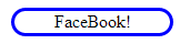
圆角应用
<!DOCTYPE html>
<html>
    <head>
        <meta charset="UTF-8">
        <title></title>

        <style type="text/css">
            .d1{
                width: 140px;
                border:3px solid blue;
                border-radius: 25px;
                text-align: center;
            }

        </style>
    </head>
    <body>
        <div class="d1"> FaceBook! </div>
    </body>
</html>
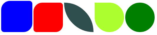
圆角应用-demo2
<!DOCTYPE html>
<html>
    <head>
        <meta charset="UTF-8">
        <title></title>

        <style type="text/css">
            .d1{
                width: 100px;
                height: 100px;
                border:3px solid blue;
                background-color: blue;
                border-radius: 30px 10px;
                display: inline-block;
            }
            .d2{
                width: 100px;
                height: 100px;
                background-color: red;
                border-radius: 30px 10px 25px;
                display: inline-block;
            }
            .d3{
                width: 100px;
                height: 100px;
                background-color: darkslategray;
                border-radius: 0 100px 0 100px;
                display: inline-block;
            }
            .d4{
                width: 100px;
                height: 100px;
                background-color: greenyellow;
                border-radius: 0 100px 100px;
                display: inline-block;
            }
            .d5{
                width: 100px;
                height: 100px;
                background-color: green;
                border-radius: 50px;
                display: inline-block;
            }
        </style>
    </head>
    <body>
        <div class="d1"></div>
        <div class="d2"></div>
        <div class="d3"></div>
        <div class="d4"></div>
        <div class="d5"></div>
    </body>
</html>

圆角应用-demo2
边框应用-demo3
<!DOCTYPE html>
<html>
    <head>
        <meta charset="UTF-8">
        <title></title>
        <style>
            .d1{
                display: inline-block;
                border-top: 50px solid red;
                border-right: 50px solid blue;
                border-bottom: 50px solid yellow;
                border-left: 50px solid green;
            }
            .d2{
                display: inline-block;
                border-top: 50px solid red;
                border-right: 0px solid blue;
                border-bottom: 0px solid yellow;
                border-left: 50px solid green;
            }
            .d3{
                display: inline-block;
                border: 50px transparent solid;
                border-top: 50px red solid;
            }
            .d4{
                display: inline-block;
                border: 50px transparent solid;
                border-top: 50px black solid;
                border-right:0;
            }
        </style>
    </head>
    <body>
        <div class="d1"></div>
        <div class="d2"></div>
        <div class="d3"></div>
        <div class="d4"></div>
    </body>
</html>

边框应用-demo3
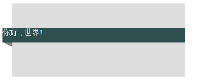
边框应用-demo4
<!DOCTYPE html>
<html>
    <head>
        <meta charset="UTF-8">
        <title></title>
        <style>
            .outer{
                width: 400px;
                height: 150px;
                border: 1px solid red;
                position: relative;
            }
            .inner{
                width: 350px;
                height: 150px;
                background-color: #ddd;
                float: right;
            }
            .content{
                width: 370px;
                height: 30px;
                color: white;
                background-color: #2F4F4F;
                position: absolute;
                left: 30px;
                top:50px;
                z-index: 20;
            }
            .little-block{
                display: inline-block;
                border: 20px transparent solid;
                border-top:10px solid gray;
                border-right:0px solid blue;
                position: absolute;
                top: 79px;
                left: 30px;
                z-index: 10;
            }
        </style>
    </head>
    <body>
        <div class="outer">
            <div class="inner"></div>
            <div class="content">你好 , 世界!</div>
            <div class="little-block"></div>
        </div>
    </body>
</html>

边框应用-demo4
6 列表属性
list-style-type: 列表项标志的类型
-
none 去除标志
-
decimal-leading-zero; 02.
-
square; 方框
-
circle; 空心圆
-
upper-alph; 大写字母
-
disc; 实心圆
list-style-image:将图象设置为列表项标志
list-style-position:列表项标志的位置
-
inside
-
outside
list-style:缩写
- list-style:square inside url('/i/arrow.gif');
ul,ol{ list-style: decimal-leading-zero;    # 数字01,02,
  list-style: none;    # 不显示
  list-style: circle;    # 空心圆
  list-style: upper-alpha;    # 字母A,B,
  list-style: disc;   # 实心圆(默认)
}
7 dispaly属性
none      # 不显示
block     # 块元素
inline    # 设置为内联 , 内联标签不能设置宽和高!!
inline-block  # 设置为内联,并且可以设置高度,宽度!!
8 盒子模型
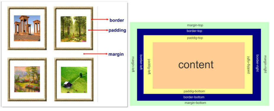
padding:用于控制内容与边框之间的距离;
margin: 用于控制元素与元素之间的距离;margin的最基本用途就是控制元素周围空间的间隔,从视觉角度上达到相互隔开的目的。
我们通过设置width 和 height 只是设置了content的宽度与高度!
盒子的宽度(高度)=content+padding+border+margin
实例: 300px*300px的盒子装着100px*100px的盒子,分别通过margin和padding设置将小盒子移到大盒子的中间
注意1:边框在默认情况下会定位于浏览器窗口的左上角,但是并没有紧贴着浏览器的窗口的边框。
这是因为body本身也是一个盒子(外层还有html),在默认情况下,body距离html会有若干像素的margin,具体数值因各个浏览器不尽相同,所以body中的盒子不会紧贴浏览器窗口的边框了。
# 验证方法:
body{
    border: 1px solid;
    background-color: cadetblue;
}

>>>>解决方法:

body{
    margin: 0;
}
注意2:margin collapse(边界塌陷或者说边界重叠)
外边距的重叠只产生在普通流文档的上下外边距之间,这个看起来有点奇怪的规则,其实有其现实意义。
设想,当我们上下排列一系列规则的块级元素(如段落P)时,那么块元素之间因为外边距重叠的存在,段落之间就不会产生双倍的距离。
1.兄弟div:上面div的margin-bottom和下面div的margin-top会塌陷,也就是会取上下两者margin里最大值作为显示值
2.父子div:如果 父级div中没有 border,padding,inline content,子级div的margin会一直向上找,直到找到某个标签包括border,padding,inline content 中的其中一个,然后按此div 进行margin !!!
<!DOCTYPE html>
<html lang="en">
<head>
    <meta charset="UTF-8">
    <title>Document</title>
    <style  rel='stylesheet' type="text/css">
            body{
                margin: 0px;
            }

            .div1{
                background-color: aqua;
                width: 300px;
                height: 300px;
            }
            .div2{
                background-color: blueviolet;
                width: 100px;
                height: 100px;
                margin: 20px;

            }
            .div3{
                background-color: blueviolet;
                width: 100px;
                height: 100px;
                margin: 100px;

            }

    </style>
</head>
<body>
    <div style="background-color: cadetblue;width: 300px;height: 300px;border: solid">

        <div  class="div3"></div>
    </div>

    <div class="div1">
        <div class="div2"></div>
        <div class="div2"></div>
    </div>
</html>
解决方法:
    1: border:1px solid transparent;
    2: padding:1px;   必须大于0
    3: overflow:hidden;
9 float
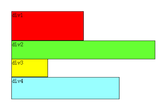
首先要知道,div是块级元素,在页面中独占一行,自上而下排列,也就是传说中的流。
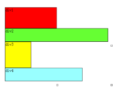
可以看出,即使div1的宽度很小,页面中一行可以容下div1和div2,div2也不会排在div1后边,因为div元素是独占一行的。注意,以上这些理论,是指标准流中的div。
无论多么复杂的布局,其基本出发点均是:“如何在一行显示多个div元素”。
浮动可以理解为让某个div元素脱离标准流,漂浮在标准流之上,和标准流不是一个层次。
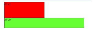
例如,假设上图中的绿色div2浮动,那么它将脱离标准流,但div1、div3、div4仍然在标准流当中,所以div3会自动向上移动,占据div2的位置,重新组成一个流。如图:
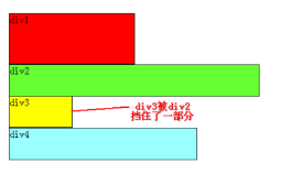
从图中可以看出,由于对div2设置浮动,因此它不再属于标准流,div3自动上移顶替div2的位置,div1、div3、div4依次排列,成为一个新的流。
又因为浮动是漂浮在标准流之上的,因此div2挡住了一部分div3,div3看起来变“矮”了
这里div2用的是左浮动( float:left;),可以理解为漂浮起来后靠左排列,右浮动(float:right;)当然就是靠右排列。 这里的靠左、靠右是说页面的左、右边缘。
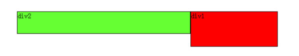
如果我们把div2采用右浮动,会是如下效果:

此时div2靠页面右边缘排列,不再遮挡div3,读者可以清晰的看到上面所讲的div1、div3、div4组成的流。
目前为止我们只浮动了一个div元素,多个呢?
下面我们把div2和div3都加上左浮动,效果如图:
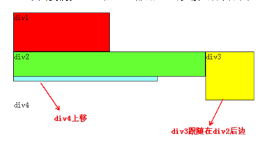
同理,由于div2、div3浮动,它们不再属于标准流,因此div4会自动上移,与div1组成一个“新”标准流,而浮动是漂浮在标准流之上,因此div2又挡住了div4。
当同时对div2、div3设置浮动之后,div3会跟随在div2之后,不知道读者有没有发现,一直到现在,div2在每个例子中都是浮动的,但并没有跟随到div1之后。
因此,我们可以得出一个重要结论:
1.假如某个div元素A是浮动的,如果A元素上一个元素也是浮动的,那么A元素会跟随在上一个元素的后边(如果一行放不下这两个元素,那么A元素会被挤到下一行);如果A元素上一个元素是标准流中的元素,那么A的相对垂直位置不会改变,也就是说A的顶部总是和上一个元素的底部对齐。
2.div的顺序是HTML代码中div的顺序决定的。
3.靠近页面边缘的一端是前,远离页面边缘的一端是后。
为了帮助读者理解,再举几个例子。
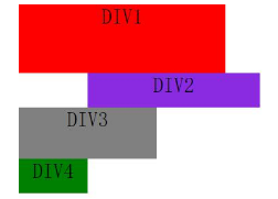
假如我们把div2、div3、div4都设置成左浮动,效果如下:

先从div4开始分析,它发现上边的元素div3是浮动的,所以div4会跟随在div3之后;div3发现上边的元素div2也是浮动的,所以div3会跟随在div2之后;而div2发现上边的元素div1是标准流中的元素,因此div2的相对垂直位置不变,顶部仍然和div1元素的底部对齐。由于是左浮动,左边靠近页面边缘,所以左边是前,因此div2在最左边。
假如把div2、div3、div4都设置成右浮动,效果如下:

道理和左浮动基本一样,只不过需要注意一下前后对应关系。由于是右浮动,因此右边靠近页面边缘,所以右边是前,因此div2在最右边。
假如我们把div2、div4左浮动,效果图如下:
依然是根据结论,div2、div4浮动,脱离了标准流,因此div3将会自动上移,与div1组成标准流。div2发现上一个元素div1是标准流中的元素,因此div2相对垂直位置不变,与div1底部对齐。div4发现上一个元素div3是标准流中的元素,因此div4的顶部和div3的底部对齐,并且总是成立的,因为从图中可以看出,div3上移后,div4也跟着上移,div4总是保证自己的顶部和上一个元素div3(标准流中的元素)的底部对齐。
至此,恭喜读者已经掌握了添加浮动,但还有清除浮动,有上边的基础清除浮动非常容易理解。
经过上边的学习,可以看出:元素浮动之前,也就是在标准流中,是竖向排列的,而浮动之后可以理解为横向排列。
清除浮动可以理解为打破横向排列。
清除浮动的关键字是clear,官方定义如下:
语法:

clear : none | left | right | both

取值:

none  :  默认值。允许两边都可以有浮动对象
left   :  不允许左边有浮动对象
right  :  不允许右边有浮动对象
both  :  不允许有浮动对象
定义非常容易理解,但是读者实际使用时可能会发现不是这么回事。
定义没有错,只不过它描述的太模糊,让我们不知所措。
根据上边的基础,假如页面中只有两个元素div1、div2,它们都是左浮动,场景如下:

此时div1、div2都浮动,根据规则,div2会跟随在div1后边,但我们仍然希望div2能排列在div1下边,就像div1没有浮动,div2左浮动那样。
这时候就要用到清除浮动(clear),如果单纯根据官方定义,读者可能会尝试这样写:在div1的CSS样式中添加clear:right;,理解为不允许div1的右边有浮动元素,由于div2是浮动元素,因此会自动下移一行来满足规则。
其实这种理解是不正确的,这样做没有任何效果。
对于CSS的清除浮动(clear),一定要牢记:这个规则只能影响使用清除的元素本身,不能影响其他元素。
怎么理解呢?就拿上边的例子来说,我们是想让div2移动,但我们却是在div1元素的CSS样式中使用了清除浮动,试图通过清除div1右边的浮动元素(clear:right;)来强迫div2下移,这是不可行的,因为这个清除浮动是在div1中调用的,它只能影响div1,不能影响div2。
要想让div2下移,就必须在div2的CSS样式中使用浮动。
本例中div2的左边有浮动元素div1,因此只要在div2的CSS样式中使用 clear:left; 来指定div2元素左边不允许出现浮动元素,这样div2就被迫下移一行。
那么假如页面中只有两个元素div1、div2,它们都是右浮动呢?读者此时应该已经能自己推测场景,如下:
此时如果要让div2下移到div1下边,要如何做呢?
我们希望移动的是div2,就必须在div2的CSS样式中调用浮动,因为浮动只能影响调用它的元素。
可以看出div2的右边有一个浮动元素div1,那么我们可以在div2的CSS样式中使用 clear:right; 来指定div2的右边不允许出现浮动元素,这样div2就被迫下移一行,排到div1下边。

效果影响背景色
子级div 使用float 效果时,父级div的背景色会失效
原因: 当块元素的高度是默认或者auto时,W3C 在可视化格式模型中规定了高度的计算细节,其中有一条就是:如果元素包含浮动元素,那么浮动元素不参与高度计算。所以没有撑起父级元素颜色失效。
<!DOCTYPE html>
<html>
    <head>
        <meta charset="UTF-8">
        <title></title>
        <style type="text/css">
            .father{
                background-repeat-y: red;
                width: 200px;
                height: 200px;
            }
            .father .item{
                background-color: green;
                float: left;
            }
        </style>
    </head>
    <body>
        <div class="father">
            <div class="item">123</div>
            <div class="item">456</div>
        </div>
    </body>
</html>
解决方法:
1. 父级div中 添加 overflow:hidden
# 当块元素上有 “overflow:hidden” 时,会创建 Block Formatting context,这时,元素在计算其高度时,浮动的子元素会被计算在内。

2.父级div里面 额外添加一个<div style="clear:both"></div>

3.自定义一个样式, 添加到父级div class 后面
.clearfix:after{
    content: 'x';            //在div末尾插入一个x
    visibility: hidden;      //隐藏这个x值
    height: 0px;             //设置高度为0
    clear:both;
    display:block;
}

<div class="father clearfix">
    <div class="item">123</div>
    <div class="item">456</div>
</div>
总结:
float : 先判断上一个是不是浮动对象, 如果是 紧跟其后(还要判断浮动方向), 如果不是,自己浮起来,脱离文档流! (原来的位置可以被顶替)
clear : both => 左右都不能有浮动,只针对自己!
清除浮动:
在非IE浏览器(如Firefox)下,当容器的高度为auto,且容器的内容中有浮动(float为left或right)的元素,
在这种情况下,容器的高度不能自动伸长以适应内容的高度,使得内容溢出到容器外面而影响(甚至破坏)布局的现象。
这个现象叫浮动溢出,为了防止这个现象的出现而进行的CSS处理,就叫CSS清除浮动。
.clearfix:after {             <----在类名为“clearfix”的元素内最后面加入内容;
content: ".";                 <----内容为“.”就是一个英文的句号而已。也可以不写。
display: block;               <----加入的这个元素转换为块级元素。
clear: both;                  <----清除左右两边浮动。
visibility: hidden;           <----可见度设为隐藏。注意它和display:none;是有区别的。visibility:hidden;仍然占据空间,只是看不到而已;
line-height: 0;               <----行高为0;
height: 0;                    <----高度为0;
font-size:0;                  <----字体大小为0;
}
.clearfix { *zoom:1;}         <----这是针对于IE6的,因为IE6不支持:after伪类,这个神奇的zoom:1让IE6的元素可以清除浮动来包裹内部元素。
整段代码就相当于在浮动元素后面跟了个宽高为0的空div,然后设定它clear:both来达到清除浮动的效果。
之所以用它,是因为,你不必在html文件中写入大量无意义的空标签,又能清除浮动。
方式二:
overflow:hidden;
overflow:hidden的含义是超出的部分要裁切隐藏
float的元素虽然不在普通流中,但是他是浮动在普通流之上的,可以把普通流元素+浮动元素想象成一个立方体。
如果没有明确设定包含容器高度的情况下,它要计算内容的全部高度才能确定在什么位置hidden,这样浮动元素的高度就要被计算进去。这样包含容器就会被撑开,清除浮动。
10 position
1.static,默认值 static:无特殊定位,对象遵循正常文档流。
top,right,bottom,left 等属性不会被应用。说到这里我们不得不提一下一个定义——文档流,文档流其实就是文档的输出顺序,也就是我们通常看到的由左到右、由上而下的输出形式,在网页中每个元素都是按照这个顺序进行排序和显示的,而float和position两个属性可以将元素从文档流脱离出来显示。 默认值就是让元素继续按照文档流显示,不作出任何改变。
2.position : relative / absolute
relative:(相对定位) 对象遵循正常文档流,仅仅定义对本参无影响. 但将依据top,right,bottom,left等属性在正常文档流中偏移位置。而其层叠通过z-index属性定义。
元素实际上依然占据文档中的原有位置,只是视觉上相对于它在文档中的原有位置移动了
absolute:(绝对定位) 对象脱离正常文档流,使用top,right,bottom,left等属性进行绝对定位。而其层叠通过z-index属性定义。
当指定 position:absolute 时,元素就脱离了文档[即在文档中已经不占据位置了],可以准确的按照设置的 top,bottom,left 和 right 来定位了。
如果一个元素绝对定位后,其参照物是以离自身最近元素是否设置了相对定位,如果有设置将以离自己最近元素定位,如果没有将往其祖先元素寻找相对定位元素, 一直找到html为止。

<!DOCTYPE html>
<html lang="en">
<head>
    <meta charset="UTF-8">
    <title>Document</title>
    <style  rel='stylesheet' type="text/css">
            body{
                margin: 0px;
            }
            .father{

                position:relative;
            }
            .div1{
                background-color: red;
                width: 600px;
                height: 200px;

            }
            .div2{
                background-color: blueviolet;
                width: 500px;
                height: 100px;
                position:absolute;
                left:300px;
                top:80px;

            }
            .div3{
                background-color: gray;
                width: 400px;
                height: 150px;
            }
            .div4{
                background-color: green;
                width: 200px;
                height: 100px;

            }

    </style>
</head>
<body>
    <div class='father'>
    <div class='div1' style='font-size:60px;text-align:center;'>DIV1</div>
    <div class='div2' style='font-size:60px;text-align:center;'>DIV2</div>
    <div class='div3' style='font-size:60px;text-align:center;'>DIV3</div>
    <div class='div4' style='font-size:60px;text-align:center;'>DIV4</div>
    </div>
</html>
3.position:fixed
在理论上,被设置为fixed的元素会被定位于浏览器窗口的一个指定坐标,不论窗口是否滚动,它都会固定在这个位置。
fixed:对象脱离正常文档流,使用top,right,bottom,left等属性以窗口为参考点进行定位,当出现滚动条时,对象不会随着滚动。而其层叠通过z-index属性定义。
注意点: 一个元素若设置了 position:absolute | fixed; 则该元素就不能设置float。这是一个常识性的知识点,因为这是两个不同的流,一个是浮动流,另一个是“定位流”。
但是 relative 却可以。因为它原本所占的空间仍然占据文档流。
仅使用margin属性布局绝对定位元素
此情况,margin-bottom 和margin-right的值不再对文档流中的元素产生影响,因为该元素已经脱离了文档流。
另外,不管它的祖先元素有没有定位,都是以文档流中原来所在的位置上偏移参照物。
图9中,使用margin属性布局相对定位元素。
层级关系为:
<div ——————————— position:relative;
<div—————————-没有设置为定位元素,不是参照物
<div———————-没有设置为定位元素,不是参照物
<div box1
<div box2 ——–position:absolute; margin-top:50px; margin-left:120px;
<div box3
效果图:

补充
1.css属性可以定义给多个class!
<style>
.bd .div1{
    background-color: red;
    width: 600px;
    height: 200px;
}
.bd .test{
    background-color:#ddd;
}
</style>


<div class='bd'>
    <div class='div1 test'>DIV1</div>    # 最终效果为:#ddd
</div>
2.background-position:
定位背景图像
background-position 属性设置背景图像的起始位置。
这个属性设置背景原图像(由 background-image 定义)的位置,背景图像如果要重复,将从这一点开始。
实例:
.dj{
    width:18px;
    height:16px;
    border:solid 1px red;
    background:url('http://misc.360buyimg.com/jdf/1.0.0/unit/globalImages/1.0.0/jd2015img.png');
    background-repeat:no-repeat;
    background-position:0 -58px;
}

<div class='dj'></div>
可以通过调节:background-position 的值,显示图像!
 background-position : 0 0px
 background-position : 0 -58px
通过background-position 实现了从图片上抠图的效果!
3.z-index:
z-index 属性设置元素的堆叠顺序。拥有更高堆叠顺序的元素 总是会处于 堆叠顺序较低的元素的前面 !
仅在定位元素上有效(例:position:absolute;)
.z-index1 {
    width: 100px;
    height: 100px;
    background-color: yellow;
    position: absolute;
    z-index: -1;
}
.z-index2 {
    width: 100px;
    height: 100px;
    background-color: red;
    position: absolute;
    top: 20px;
    left: 20px;
    z-index: 5;
}

<div class="z-index1"></div>
<div class="z-index2"></div>

4.overflow
-
visible 默认值,内容不会被修剪,会呈现在元素框之外。
-
hidden 内容会被修剪,并且其余内容是不可见的。
-
scroll 内容会被修剪,但是浏览器会显示滚动条以便查看其余的内容。
-
auto 如果内容被修剪,则浏览器会显示滚动条以便查看其余的内容。

5.outline 边框轮廓
轮廓不占据页面空间,也不一定是矩形。
outline: none; # 可以去除input标签的轮廓!!
除了IE以外的浏览器都直接支持outline。只有规定了!DOCUMENT之后的IE8以上版本的浏览器才支持outline。
-
outline-width 轮廓宽度
-
outline-color 轮廓颜色
-
outline-style 轮廓样式
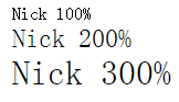
6.zoom 缩放比例
<!DOCTYPE html>
<html lang="en">
<head>
    <meta charset="UTF-8">
    <title>Title</title>
    <style>
        .zoom1 {
            zoom: 100%;
        }
        .zoom2 {
            zoom: 150%;
        }
        .zoom3 {
            zoom: 200%;
        }
    </style>
</head>
<body>
    <div class="zoom1">Nick 100%</div>
    <div class="zoom2">Nick 200%</div>
    <div class="zoom3">Nick 300%</div>
</body>
</html>
7.transform、transition 动画效果
transform 转换,变形
-
origin 定义旋转基点(left top center right bottom 坐标值) transform-origin: 50px 50px; transform-origin: left;。
-
rotate 旋转 transform:rotate(50deg) 旋转角度可以为负数,需要先定义origin。
-
skew 扭曲 transform:skew(50deg,50deg) 分别为相对x轴倾斜,相对y轴倾斜。
-
scale 缩放 transform:scale(2,3) 横向放大2倍,纵向放大3倍;transform:scale(2) 横竖都放大2倍。
-
translate 移动 transform:translate(50px, 50px) 分别为相对x轴移动,相对y轴移动。
<!DOCTYPE html>
<html>
<head>
<meta http-equiv="Content-Type" content="text/html; charset=utf-8" />
<title>nick</title>
<meta charset="utf-8" />
<style type="text/css">
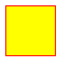
div {
border: 1px solid black;
height: 30px;
width: 30px;
background-color: yellow;
/*transform-origin: 50px 50px;*/
transform-origin: left;
transform: rotate(50deg);
/*transform: skew(50deg,50deg);*/
/*transform: translate(50px,50px);*/
/*transform: scale(2);*/
}
</style>
</head>
<body>
<div></div>
</body>
</html>
demo
Transition 平滑过渡
-
transition-property: 变换的属性(none(没有属性改变)、all(所有属性改变)、具体属性)
-
transition-duration: 变换持续时间
-
transition-timing-function: 变换的速率(ease:(逐渐变慢)、linear:(匀速)、ease-in:(加速)、ease-out:(减速)、ease-in-out:(加速然后减速)、cubic-bezier:(自定义时间曲线))
-
transition-delay: 变换延迟时间
-
transition: 缩写
支持执行transition效果的属性
Property Name    Type
background-color    as color
background-position    as repeatable list of simple list of length, percentage, or calc
border-bottom-color    as color
border-bottom-width    as length
border-left-color    as color
border-left-width    as length
border-right-color    as color
border-right-width    as length
border-spacing    as simple list of length
border-top-color    as color
border-top-width    as length
bottom    as length, percentage, or calc
clip    as rectangle
color    as color
font-size    as length
font-weight    as font weight
height    as length, percentage, or calc
left    as length, percentage, or calc
letter-spacing    as length
line-height    as either number or length
margin-bottom    as length
margin-left    as length
margin-right    as length
margin-top    as length
max-height    as length, percentage, or calc
max-width    as length, percentage, or calc
min-height    as length, percentage, or calc
min-width    as length, percentage, or calc
opacity    as number
outline-color    as color
outline-width    as length
padding-bottom    as length
padding-left    as length
padding-right    as length
padding-top    as length
right    as length, percentage, or calc
text-indent    as length, percentage, or calc
text-shadow    as shadow list
top    as length, percentage, or calc
vertical-align    as length
visibility    as visibility
width    as length, percentage, or calc
word-spacing    as length
z-index    as integer
#property 指定属性对应类型
1、color: 通过红、绿、蓝和透明度组件变换(每个数值单独处理),如:background-color,border-color,color,outline-color等CSS属性;

2、length:真实的数字,如:word-spacing,width,vertical- align,top,right,bottom,left,padding,outline-width,margin,min-width,min- height,max-width,max-height,line-height,height,border-width,border- spacing,background-position等属性;

3、percentage:真实的数字,如:word-spacing,width,vertical- align,top,right,bottom,left,min-width,min- height,max-width,max-height,line-height,height,background-position等属性;

4、integer 离散步骤(整个数字),在真实的数字空间,以及使用floor()转换为整数时发生,如:outline-offset,z-index等属性;

5、number真实的(浮点型)数值,如:zoom,opacity,font-weight等属性;

6、transform list。

7、rectangle:通过x、 y、 width和height(转为数值)变换,如:crop;

8、visibility:离散步骤,在0到1数字范围之内,0表示“隐藏”,1表示完全“显示”,如:visibility;

9、shadow:作用于color、x、y、和blur(模糊)属性,如:text-shadow;

10、gradient:通过每次停止时的位置和颜色进行变化。它们必须有相同的类型(放射状的或是线性的)和相同的停止数值以便执行动画,如:background-image;

11、paint server (SVG):只支持下面的情况:从gradient到gradient以及color到color,然后工作与上面类似;

12、space-separated list of above:如果列表有相同的项目数值,则列表每一项按照上面的规则进行变化,否则无变化;

13、a shorthand property:如果缩写的所有部分都可以实现动画,则会像所有单个属性变化一样变化。
实例:demo
<!DOCTYPE html>
<html>
    <head>
        <meta charset="UTF-8">
        <title></title>
        <style type="text/css">
        .div2{
            width:100px;
            height:100px;
            background:pink;
            transition:width 3s,background-color 3s;
        }
        .div2:hover{
            width: 300px;
            background-color:gray;
        }
        .img-1{
            width: 600px;
            height: 300px;
            background-image: url("http://images.cnblogs.com/cnblogs_com/suoning/845162/o_sea.jpg");
            background-repeat: no-repeat;
            background-size: 600px;
            transition-duration: 10s;
            transition-timing-function: ease;
            transition-property: background-size;
        }
        .img-1:hover{
            background-size: 2000px;
        }
    </style>
    </head>
    <body>
        <div class="div1"></div>
        <div class="div2"></div>
        <p>鼠标放在以下图片上,There will be a miracle:</p>

        <div class="img-1"></div>
    </body>
</html>

demo
2.float 效果影响背景色
子级div 使用float 效果时,父级div的背景色会失效
原因: 当块元素的高度是默认或者auto时,W3C 在可视化格式模型中规定了高度的计算细节,其中有一条就是:如果元素包含浮动元素,那么浮动元素不参与高度计算。所以没有撑起父级元素颜色失效。
<!DOCTYPE html>
<html>
    <head>
        <meta charset="UTF-8">
        <title></title>
        <style type="text/css">
            .father{
                background-repeat-y: red;
                width: 200px;
                height: 200px;
            }
            .father .item{
                background-color: green;
                float: left;
            }
        </style>
    </head>
    <body>
        <div class="father">
            <div class="item">123</div>
            <div class="item">456</div>
        </div>
    </body>
</html>
解决方法:
1. 父级div中 添加 overflow:hidden
# 当块元素上有 “overflow:hidden” 时,会创建 Block Formatting context,这时,元素在计算其高度时,浮动的子元素会被计算在内。

2.父级div里面 额外添加一个<div style="clear:both"></div>

3.自定义一个样式, 添加到父级div class 后面
.clearfix:after{
    content: 'x';            //在div末尾插入一个x
    visibility: hidden;      //隐藏这个x值
    height: 0px;             //设置高度为0
    clear:both;
    display:block;
}

<div class="father clearfix">
    <div class="item">123</div>
    <div class="item">456</div>
</div>
3.hover
hover 后可以添加选择器指明需要修改的样式
.c:hover .item{
    background-color:red;
}
4.透明色
border: 3px solid transparent  #透明色    占用位置,却肉眼看不出来,

opacity:0.6;   设置背景颜色透明度
background-color: rgba(0,0,0,.6)
5.图片的使用
如果需要在div里面插入img标签的图片,div中需要使用 overflow:hidden 来防止图片超出边界撑开div
6.position 使用
position 常使用于 div的定位
# position: relative 对本身div没影响

position:absolute
left:0
top:0
right:0
buttom:0
=>  表示全部占满一个屏幕
7.小尖角
.angle{
    border-top:30px solid red ;
    border-left:30px solid blue ;
    border-bottom:30px solid green ;
    border-right:30px solid yellow ;
    display: inline-block;
}
.up{
    border: 30px solid transparent;
    border-top:30px solid red ;
    display: inline-block;
}
.down{
    border: 30px solid transparent;
    border-bottom:30px solid red ;
    display: inline-block;
}


<div class="angle"></div>
<div class="up"></div>
<div class="down"></div>
8.图标素材
现成的图标网站, http://fontawesome.io/ 里面有各种小图标, 下载解压,页面中,引用css即可
<link rel="stylesheet" href="font-awesome-4.7.0/css/font-awesome.css">

<span class="fa fa-bullhorn"></span>  #具体参考官方网站中演示代码
9.a标签中嵌套图片(默认样式)
a 标签中有边框 (ie浏览器下)
img{
    border:0;
}
10.目录结构
hao123.com
    -app
        -s1.html
        -s2.html
    -css
        -commons.css
    -script
        -commons.js
    -plugin
        -bootstrap
        -bxslider
11.样式.重复修改
.c1{
    background-color: red;
}
.c2{
    background-color: green;
}

<div class="c1 c2">1</div>   # c2离得近所以,使用c2中样式, div背景色被设置成绿色!

# 为了避免这种情况可以使用 !important; 保证了使用原来定义的背景色c1,防止被篡改
.c1{
    background-color: red  !important;
}
.c2{
    background-color: green;
}
12.布局,分左右
使用position方法 效果最好!
.pg-left{
    width: 180px;
    position: absolute;
    left: 0;
    background-color: red;
}
.pg-right{
    height: 600px;
    position: absolute;
    left: 184px;
    right: 0;
    overflow: auto;
    background-color: lightcoral;
}
13.设置滚动条
先设置一个高度,再使用 overflow:auto 超出大小,出现滚动条!
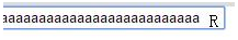
14.input框插入图标
思路: 利用 absolute 插入图标 ,padding 来设置内边距,留出空白位置
.c1{
  position: relative;
}
.c1-input{
  width: 180px;
  padding-right: 20px;
}
.c1-icon{
  position: absolute;
  left:190px;
  top:4px;
}

<div class="c1">
    <input type="text" class="c1-input" />
    <span class="c1-icon">R</span>
</div>
15.全屏提示框(模态对话框)
思路:底层 + 遮罩层(position:fixed 透明) + 顶层 (div fixed)居中显示
1.两个fixed 在一起. z-index设置顺序
2.居中 top left 可以用百分比! margin-left 负值左移
.middle{
    position: fixed;
    left: 0;
    right: 0;
    top: 0;
    bottom: 0;
    background-color: rgba(0,0,0,.5);
    z-index: 10;
}
.roof{
    position: fixed;
    top: 50%;
    left: 50%;
    margin-left:-200px;        # 使用百分比后,左上角在中心点,还需要适当调整
    margin-top: -200px;
    width: 500px;
    height: 300px;
    background-color: white;
    z-index: 99;
}

<div class="middle"></div>
<div class="roof"></div>
16.加降框
input 默认有个padding 需要使用 padding:0 去除
<!DOCTYPE html>
<html>
    <head>
        <meta charset="UTF-8">
        <title></title>
        <style>
            .left{
                float: left;
            }
            .count{
                width: 120px;
                height: 20px;
                border: 1px solid #ddd;
            }
            .cut{
                width: 20px;
                height: 20px;
                text-align: center;
                line-height: 20px;
                cursor: pointer;
            }
            .plus{
                width: 20px;
                height: 20px;
                text-align: center;
                line-height: 20px;
                cursor: pointer;
            }
            .user-insert{
                padding: 0;
                border: 0;
                width: 78px;
                height: 20px;
                border-left: 1px solid #ddd;
                border-right: 1px solid #ddd;
            }
        </style>
    </head>
    <body>
        <div class="count">
            <div class="cut left"  onclick="Cut();">-</div>
            <div><input type="text" id='bugs' class='user-insert left' value="1" /></div>
            <div class="plus left" onclick="Plus();">+</div>
        </div>


        <script type="text/javascript">
            function Plus(){
                var old_str = document.getElementById('bugs').value;
                var old_int = parseInt(old_str);
                var new_int = old_int + 1;
                document.getElementById('bugs').value = new_int;
            }
            function Cut(){
                var old_str = document.getElementById('bugs').value;
                var old_int = parseInt(old_str);
                var new_int = old_int - 1;
                document.getElementById('bugs').value = new_int;
            }
        </script>
    </body>
</html>

17.cursor: 鼠标的类型形状
cursor:pointer
请把鼠标移动到单词上,可以看到鼠标指针发生变化:
Auto
Crosshair
Default
Pointer
Move
e-resize
ne-resize
nw-resize
n-resize
se-resize
sw-resize
s-resize
w-resize
text
wait
help
not-allowed
18. display: inline-block
设置 inline-block 让元素刚好占满一行,却无法实现
设置父级 font-size:0 然后子级元素重新设置font-size 就可以了
产生原因: 标签与标签之间的空白位置,占用了1个字符!
19. 防止缩小浏览器宽度,页面内容挤在一起
设置一个width 固定宽度,不要用百分比!
20.去掉谷歌input记住账号或密码时默认出现的黄色背景
在谷歌浏览器会默认记住账号,而记住账号之后其input的背景会变成黄色,解决的办法如下:
方法一:直接用css的内阴影来覆盖黄色,代码如下:
input:-webkit-autofill {
-webkit-box-shadow: 0 0 0px 1000px white inset;
}
在form标签上直接关闭了表单的自动填充功能: autocomplete = ”off”
21.英文换行显示,边界单词切割成两部分,显示
word-break: break-all;
word-wrap:break-word;
22.垂直对齐
22.垂直对齐
23.上传表单,美化
Dom结构
<a href="javascript:;" class="a-upload">
    <input type="file" name="" id="">点击这里上传文件
</a>

<a href="javascript:;" class="file">选择文件
    <input type="file" name="" id="">
</a>

Dom结构
样式一
/*a  upload */
.a-upload {
    padding: 4px 10px;
    height: 20px;
    line-height: 20px;
    position: relative;
    cursor: pointer;
    color: #888;
    background: #fafafa;
    border: 1px solid #ddd;
    border-radius: 4px;
    overflow: hidden;
    display: inline-block;
    *display: inline;
    *zoom: 1
}

.a-upload  input {
    position: absolute;
    font-size: 100px;
    right: 0;
    top: 0;
    opacity: 0;
    filter: alpha(opacity=0);
    cursor: pointer
}

.a-upload:hover {
    color: #444;
    background: #eee;
    border-color: #ccc;
    text-decoration: none
}
样式二
.file {
    position: relative;
    display: inline-block;
    background: #D0EEFF;
    border: 1px solid #99D3F5;
    border-radius: 4px;
    padding: 4px 12px;
    overflow: hidden;
    color: #1E88C7;
    text-decoration: none;
    text-indent: 0;
    line-height: 20px;
}
.file input {
    position: absolute;
    font-size: 100px;
    right: 0;
    top: 0;
    opacity: 0;
}
.file:hover {
    background: #AADFFD;
    border-color: #78C3F3;
    color: #004974;
    text-decoration: none;
}

上面美化,把默认显示的文件名也给隐藏掉了,那么如何显示文件名称呢?没关系,我们可以用jquery来获取文件的文件名。
我们可以写个change事件
$(".a-upload").on("change","input[type='file']",function(){
    var filePath=$(this).val();
    if(filePath.indexOf("jpg")!=-1 || filePath.indexOf("png")!=-1){
        $(".fileerrorTip").html("").hide();
        var arr=filePath.split('\\');
        var fileName=arr[arr.length-1];
        $(".showFileName").html(fileName);
    }else{
        $(".showFileName").html("");
        $(".fileerrorTip").html("您未上传文件,或者您上传文件类型有误!").show();
        return false
    }
})

 浙公网安备 33010602011771号