


WPF自定义控件与样式(3)-TextBox & RichTextBox & PasswordBox样式、水印、Label标签、功能扩展(转载)
WPF自定义控件与样式(3)-TextBox & RichTextBox & PasswordBox样式、水印、Label标签、功能扩展
一.前言.预览
申明:WPF自定义控件与样式是一个系列文章,前后是有些关联的,但大多是按照由简到繁的顺序逐步发布的等,若有不明白的地方可以参考本系列前面的文章,文末附有部分文章链接。
本文主要是对文本输入控件进行样式开发,及相关扩展功能开发,主要内容包括:
- 基本文本框TextBox控件样式及扩展功能,实现了样式、水印、Label标签、功能扩展;
- 富文本框RichTextBox控件样式;
- 密码输入框PasswordBox控件样式及扩展功能;
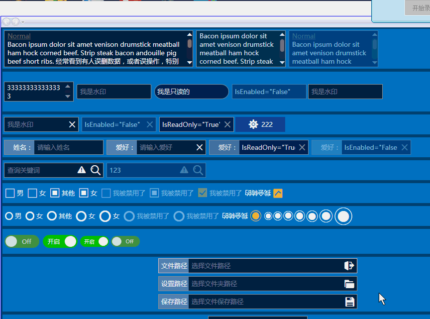
效果图:

二.基本文本框TextBox控件样式及扩展功能
2.1 TextBox基本样式
样式代码如下:

    <!--TextBox默认样式-->
    <Style TargetType="{x:Type TextBox}" x:Key="DefaultTextBox">
        <Setter Property="ContextMenu" Value="{DynamicResource TextBoxContextMenu}" />
        <Setter Property="SelectionBrush" Value="{StaticResource TextSelectionBrush}" />
        <Setter Property="FontFamily" Value="{StaticResource FontFamily}" />
        <Setter Property="FontSize" Value="{StaticResource FontSize}" />
        <Setter Property="BorderThickness" Value="1" />
        <Setter Property="MinHeight" Value="26" />
        <Setter Property="Width" Value="100" />
        <Setter Property="Background" Value="{StaticResource TextBackground}" />
        <Setter Property="Foreground" Value="{StaticResource TextForeground}" />
        <Setter Property="Padding" Value="0" />
        <Setter Property="BorderBrush" Value="{StaticResource ControlBorderBrush}" />
        <Setter Property="local:ControlAttachProperty.FocusBorderBrush" Value="{StaticResource FocusBorderBrush}" />
        <Setter Property="local:ControlAttachProperty.MouseOverBorderBrush" Value="{StaticResource MouseOverBorderBrush}" />
        <Setter Property="VerticalContentAlignment" Value="Center" />
        <!-- change SnapsToDevicePixels to True to view a better border and validation error -->
        <Setter Property="SnapsToDevicePixels" Value="True" />
        <!--英 ['kærət]  美 ['kærət]  插入符号-->
        <Setter Property="CaretBrush" Value="{StaticResource TextForeground}" />
        <Setter Property="Template">
            <Setter.Value>
                <ControlTemplate TargetType="{x:Type TextBox}">
                    <Grid x:Name="PART_Root">
                        <Border x:Name="Bg" SnapsToDevicePixels="{TemplateBinding SnapsToDevicePixels}"
                                CornerRadius="{TemplateBinding local:ControlAttachProperty.CornerRadius}"
                                BorderBrush="{TemplateBinding BorderBrush}" BorderThickness="{TemplateBinding BorderThickness}" Background="{TemplateBinding Background}" />
                        <Grid x:Name="PART_InnerGrid">
                            <Grid.ColumnDefinitions>
                                <ColumnDefinition  Width="Auto" />
                                <ColumnDefinition Width="*" />
                                <ColumnDefinition  Width="Auto" />
                            </Grid.ColumnDefinitions>
                            <!--Label区域-->
                            <ContentControl x:Name="Label" Margin="1" Template="{TemplateBinding local:ControlAttachProperty.LabelTemplate}"
                                            Content="{TemplateBinding local:ControlAttachProperty.Label}"/>
                            <!--内容区域-->
                            <ScrollViewer x:Name="PART_ContentHost" BorderThickness="0" Grid.Column="1" IsTabStop="False" Margin="2"
                                          VerticalAlignment="Stretch" Background="{x:Null}" />
                            <!--水印-->
                            <TextBlock x:Name="Message"  Padding="{TemplateBinding Padding}" Visibility="Collapsed"
                                       Text="{TemplateBinding local:ControlAttachProperty.Watermark}" Grid.Column="1"
                                       Foreground="{TemplateBinding Foreground}" IsHitTestVisible="False" Opacity="{StaticResource WatermarkOpacity}"
                                       HorizontalAlignment="{TemplateBinding HorizontalContentAlignment}"
                                       VerticalAlignment="{TemplateBinding VerticalContentAlignment}" Margin="5,2,5,2" />
                            <!--附加内容区域-->
                            <Border x:Name="PART_AttachContent" Grid.Column="2" Margin="2" VerticalAlignment="Center" HorizontalAlignment="Center" >
                                <ContentControl VerticalAlignment="Center" VerticalContentAlignment="Center" Template="{TemplateBinding local:ControlAttachProperty.AttachContent}" />
                            </Border>
                        </Grid>
                    </Grid>
                    <ControlTemplate.Triggers>
                        <!--显示水印-->
                        <DataTrigger Binding="{Binding RelativeSource={RelativeSource Self}, Path=Text}" Value="">
                            <Setter TargetName="Message" Property="Visibility" Value="Visible" />
                        </DataTrigger>

                        <Trigger Property="IsMouseOver" Value="True">
                            <Setter Property="BorderBrush" Value="{Binding Path=(local:ControlAttachProperty.MouseOverBorderBrush),RelativeSource={RelativeSource Self}}"/>
                        </Trigger>
                        <Trigger Property="IsFocused" Value="True">
                            <Setter  Property="BorderBrush" Value="{Binding Path=(local:ControlAttachProperty.FocusBorderBrush),RelativeSource={RelativeSource Self}}"/>
                        </Trigger>
                        <!--不可用-->
                        <Trigger Property="IsEnabled" Value="False">
                            <Setter TargetName="PART_Root" Property="Opacity" Value="{StaticResource DisableOpacity}" />
                        </Trigger>
                        <!--只读时,禁用PART_AttachContent-->
                        <Trigger Property="IsReadOnly" Value="True">
                            <Setter TargetName="PART_AttachContent" Property="IsEnabled" Value="False" />
                            <Setter TargetName="Bg" Property="Opacity" Value="{StaticResource ReadonlyOpacity}" />
                            <Setter TargetName="PART_ContentHost" Property="Opacity" Value="{StaticResource ReadonlyOpacity}" />
                            <Setter TargetName="Label" Property="Opacity" Value="{StaticResource ReadonlyOpacity}" />
                        </Trigger>
                    </ControlTemplate.Triggers>
                </ControlTemplate>
            </Setter.Value>
        </Setter>
    </Style>
模板内容主要包含四部分:
- 用于实现Label标签的预留区域;
- TextBox本身的文本输入显示部分;
- 水印显示部分;
- 功能扩展的预留区域;
其中Label标签、功能扩展,还有输入框的不同状态显示效果都是通过附加属性来实现的,其实从本质上附加属性和控件上定义的依赖属性是同一个概念,有些时候附加属性会更加方便,对于一些可共用的属性,就比较方便,这一点怎本文是有体现的。上面代码使用到的附加属性代码:
 View Code
2.2 水印效果实现
通过2.1的代码示例,可以看出,水印是内置了一个TextBlock,用附加属性ControlAttachProperty.Watermark设置水印内容,在触发器中检测,当TextBox中有输入值,则隐藏水印的TextBlock,使用示例:
        <StackPanel>
            <TextBox Width="140" Height="40" Margin="3" TextWrapping="Wrap" VerticalScrollBarVisibility="Visible">333333333333333</TextBox>
            <TextBox Width="150" Height="30" Margin="3" core:ControlAttachProperty.Watermark="我是水印" core:ControlAttachProperty.CornerRadius="2"></TextBox>
            <TextBox Width="150" Height="30" Margin="3" IsReadOnly="True" core:ControlAttachProperty.CornerRadius="15" SnapsToDevicePixels="True" >我是只读的</TextBox>
            <TextBox Width="150" Height="30" Margin="3" IsEnabled="False">IsEnabled="False"</TextBox>
            <TextBox Width="150" Height="30" core:ControlAttachProperty.Watermark="我是水印"></TextBox>
        </StackPanel>
效果:

2.3 Label标签实现
参考2.1的代码,预留了Label的区域,通过设置附加属性local:ControlAttachProperty.Label设置标签文本,local:ControlAttachProperty.LabelTemplate设置Label标签的模板样式,即可自定义实现Label标签,自定义样式:
    <!--TextBox包含附加属性Label的样式-->
    <Style TargetType="{x:Type TextBox}" x:Key="LabelTextBox" BasedOn="{StaticResource DefaultTextBox}">
        <Setter Property="local:ControlAttachProperty.LabelTemplate" >
            <Setter.Value>
                <ControlTemplate TargetType="ContentControl">
                    <Border Width="60" Background="{StaticResource TextLabelBackground}">
                        <TextBlock VerticalAlignment="Center" HorizontalAlignment="Right" Margin="3" Text="{TemplateBinding Content}"></TextBlock>
                    </Border>
                </ControlTemplate>
            </Setter.Value>
        </Setter>
    </Style>
使用示例及效果:
            <TextBox Width="200" Height="30" Margin="3" core:ControlAttachProperty.Watermark="请输入姓名"
                         Style="{StaticResource LabelTextBox}" core:ControlAttachProperty.Label="姓名:"></TextBox>

2.4 扩展功能及自定义扩展
思路和2.3的Label标签实现相似,清除文本框内的内容是一个常用需求,我们就线扩展一个这么一个功能的TextBox,通过附加属性ControlAttachProperty.AttachContent定义扩展功能的模板,模板内定义的是一个按钮FButton(可参考上一篇,本文末尾附录中有链接)
<!--TextBox包含清除Text按钮的样式-->
<Style TargetType="{x:Type TextBox}" x:Key="ClearButtonTextBox" BasedOn="{StaticResource DefaultTextBox}">
<Setter Property="local:ControlAttachProperty.AttachContent">
<Setter.Value>
<ControlTemplate>
<local:FButton FIcon="" Style="{StaticResource FButton_Transparency}" IsTabStop="False" FIconMargin="0"
local:ControlAttachProperty.IsClearTextButtonBehaviorEnabled="True" Command="local:ControlAttachProperty.ClearTextCommand"
CommandParameter="{Binding RelativeSource={RelativeSource FindAncestor,AncestorType={x:Type TextBox}}}"
Margin="1,3,1,4" FIconSize="14" Foreground="{StaticResource TextForeground}" Cursor="Arrow"/>
</ControlTemplate>
</Setter.Value>
</Setter>
</Style>
这里定义的是显示效果,清除TextBox内容的逻辑代码如何实现的呢?还是附加属性:
- ControlAttachProperty.IsClearTextButtonBehaviorEnabled="True" :注入事件到当前Button
- Command="local:ControlAttachProperty.ClearTextCommand":定义Fbutton的命令对象实例Command
- CommandParameter="{Binding RelativeSource={RelativeSource FindAncestor,AncestorType={x:Type TextBox}}}":把TextBox作为参数传入
逻辑代码如下,从代码不难看出,它是支持多种输入控件的内容清除的,也就是说该扩展功能可以轻松支持其他输入控件,第四节密码数据的清除也是这样使用的。
View Code效果:

当然我们也可以自定义扩展其他功能,如:
<TextBox Width="200" Height="30" Margin="3" core:ControlAttachProperty.Watermark="查询关键词" IsEnabled="True">
<core:ControlAttachProperty.AttachContent>
<ControlTemplate>
<StackPanel Orientation="Horizontal">
<core:FButton FIcon="" Style="{StaticResource FButton_Transparency}" IsTabStop="False" FIconMargin="0"
FIconSize="18" Margin="1,1,2,3" Foreground="{StaticResource TextForeground}" Cursor="Arrow"/>
<core:FButton FIcon="" Style="{StaticResource FButton_Transparency}" IsTabStop="False" FIconMargin="0"
FIconSize="22" Foreground="{StaticResource TextForeground}" Cursor="Arrow"/>
</StackPanel>
</ControlTemplate>
</core:ControlAttachProperty.AttachContent>
</TextBox>
效果:

由上不难同时实现Label标签和清除文本内容的样式:
<!--TextBox包含附加属性Label,以及ClearText按钮的样式-->
<Style TargetType="{x:Type TextBox}" x:Key="LabelClearButtonTextBox" BasedOn="{StaticResource DefaultTextBox}">
<Setter Property="local:ControlAttachProperty.LabelTemplate" >
<Setter.Value>
<ControlTemplate TargetType="ContentControl">
<Border Width="60" Background="{StaticResource TextLabelBackground}">
<TextBlock VerticalAlignment="Center" HorizontalAlignment="Right" Margin="3" Text="{TemplateBinding Content}"></TextBlock>
</Border>
</ControlTemplate>
</Setter.Value>
</Setter>
<Setter Property="local:ControlAttachProperty.AttachContent">
<Setter.Value>
<ControlTemplate>
<local:FButton FIcon="" Style="{StaticResource FButton_Transparency}" IsTabStop="False" FIconMargin="0"
local:ControlAttachProperty.IsClearTextButtonBehaviorEnabled="True" Command="local:ControlAttachProperty.ClearTextCommand"
CommandParameter="{Binding RelativeSource={RelativeSource FindAncestor,AncestorType={x:Type TextBox}}}"
Margin="0,3,1,4" FIconSize="14" Foreground="{StaticResource TextForeground}" Cursor="Arrow"/>
</ControlTemplate>
</Setter.Value>
</Setter>
</Style>
2.6 文件选择输入相关扩展
先看看效果,就明白了。
具体实现原理和上面2.4差不多 ,实现了三个文件、文件夹选择相关的功能扩展,样式代码:
<!--LabelOpenFileTextBox-->
<Style TargetType="{x:Type TextBox}" x:Key="LabelOpenFileTextBox" BasedOn="{StaticResource LabelClearButtonTextBox}">
<Setter Property="local:ControlAttachProperty.Label" Value="文件路径"/>
<Setter Property="local:ControlAttachProperty.Watermark" Value="选择文件路径"/>
<Setter Property="local:ControlAttachProperty.AttachContent">
<Setter.Value>
<ControlTemplate>
<local:FButton FIcon="" Style="{StaticResource FButton_Transparency}" IsTabStop="False" FIconMargin="0"
local:ControlAttachProperty.IsOpenFileButtonBehaviorEnabled="True" Command="local:ControlAttachProperty.OpenFileCommand"
CommandParameter="{Binding RelativeSource={RelativeSource FindAncestor,AncestorType={x:Type TextBox}}}"
Margin="0,1,0,1" FIconSize="22" Foreground="{StaticResource TextForeground}" Cursor="Arrow"/>
</ControlTemplate>
</Setter.Value>
</Setter>
</Style>
<!--LabelOpenFolderTextBox-->
<Style TargetType="{x:Type TextBox}" x:Key="LabelOpenFolderTextBox" BasedOn="{StaticResource LabelClearButtonTextBox}">
<Setter Property="local:ControlAttachProperty.Label" Value="设置路径"/>
<Setter Property="local:ControlAttachProperty.Watermark" Value="选择文件夹路径"/>
<Setter Property="local:ControlAttachProperty.AttachContent">
<Setter.Value>
<ControlTemplate>
<local:FButton FIcon="" Style="{StaticResource FButton_Transparency}" IsTabStop="False" FIconMargin="0"
local:ControlAttachProperty.IsOpenFolderButtonBehaviorEnabled="True" Command="local:ControlAttachProperty.OpenFolderCommand"
CommandParameter="{Binding RelativeSource={RelativeSource FindAncestor,AncestorType={x:Type TextBox}}}"
Margin="0,1,0,1" FIconSize="22" Foreground="{StaticResource TextForeground}" Cursor="Arrow"/>
</ControlTemplate>
</Setter.Value>
</Setter>
</Style>
<!--LabelSaveFileTextBox-->
<Style TargetType="{x:Type TextBox}" x:Key="LabelSaveFileTextBox" BasedOn="{StaticResource LabelClearButtonTextBox}">
<Setter Property="local:ControlAttachProperty.Label" Value="保存路径"/>
<Setter Property="local:ControlAttachProperty.Watermark" Value="选择文件保存路径"/>
<Setter Property="local:ControlAttachProperty.AttachContent">
<Setter.Value>
<ControlTemplate>
<local:FButton FIcon="" Style="{StaticResource FButton_Transparency}" IsTabStop="False" FIconMargin="0"
local:ControlAttachProperty.IsSaveFileButtonBehaviorEnabled="True" Command="local:ControlAttachProperty.SaveFileCommand"
CommandParameter="{Binding RelativeSource={RelativeSource FindAncestor,AncestorType={x:Type TextBox}}}"
Margin="0,1,0,1" FIconSize="20" Foreground="{StaticResource TextForeground}" Cursor="Arrow"/>
</ControlTemplate>
</Setter.Value>
</Setter>
</Style>
当然实现原理和2.4一样,都是依赖属性来实现事件的注入和绑定的,所以就不多废话了:
View Code三.富文本框RichTextBox控件样式
RichTextBox的样式比较简单:
    <!--***************************DefaultRichTextBox***************************-->

    <Style x:Key="DefaultRichTextBox" TargetType="{x:Type RichTextBox}">
        <Setter Property="ContextMenu" Value="{DynamicResource TextBoxContextMenu}" />
        <Setter Property="SelectionBrush" Value="{StaticResource TextSelectionBrush}" />
        <Setter Property="FontFamily" Value="{StaticResource FontFamily}" />
        <Setter Property="FontSize" Value="{StaticResource FontSize}" />
        <Setter Property="BorderThickness" Value="1" />
        <Setter Property="BorderBrush" Value="{StaticResource ControlBorderBrush}" />
        <Setter Property="MinHeight" Value="26" />
        <Setter Property="MinWidth" Value="10" />
        <Setter Property="Background" Value="{StaticResource TextBackground}" />
        <Setter Property="Foreground" Value="{StaticResource TextForeground}" />
        <Setter Property="CaretBrush" Value="{StaticResource TextForeground}" />
        <Setter Property="local:ControlAttachProperty.FocusBorderBrush" Value="{StaticResource FocusBorderBrush}" />
        <Setter Property="local:ControlAttachProperty.MouseOverBorderBrush" Value="{StaticResource MouseOverBorderBrush}" />
        <Setter Property="Padding" Value="1" />
        <Setter Property="AllowDrop" Value="True" />
        <Setter Property="VerticalScrollBarVisibility" Value="Auto" />
        <Setter Property="FocusVisualStyle" Value="{x:Null}" />
        <Setter Property="ScrollViewer.PanningMode" Value="VerticalFirst" />
        <!--该值指示是否启用了笔势-->
        <Setter Property="Stylus.IsFlicksEnabled" Value="False" />
        <!--SnapsToDevicePixels:该值来确定呈现此元素是否应使用特定于设备的像素设置-->
        <Setter Property="SnapsToDevicePixels" Value="True" />
        <Setter Property="Template">
            <Setter.Value>
                <ControlTemplate TargetType="{x:Type TextBoxBase}">
                    <Grid>
                        <Border x:Name="Bd"
                                BorderBrush="{TemplateBinding BorderBrush}" BorderThickness="{TemplateBinding BorderThickness}"
                                Background="{TemplateBinding Background}" SnapsToDevicePixels="{TemplateBinding SnapsToDevicePixels}">
                            <ScrollViewer x:Name="PART_ContentHost" SnapsToDevicePixels="{TemplateBinding SnapsToDevicePixels}" />
                        </Border>
                    </Grid>
                    <ControlTemplate.Triggers>
                        <Trigger Property="IsMouseOver" Value="True">
                            <Setter Property="BorderBrush" Value="{Binding Path=(local:ControlAttachProperty.MouseOverBorderBrush),RelativeSource={RelativeSource Self}}"/>
                        </Trigger>
                        <Trigger Property="IsFocused" Value="True">
                            <Setter  Property="BorderBrush" Value="{Binding Path=(local:ControlAttachProperty.FocusBorderBrush),RelativeSource={RelativeSource Self}}"/>
                        </Trigger>
                        <Trigger Property="IsEnabled" Value="False">
                            <Setter TargetName="Bd" Property="Opacity" Value="0.5" />
                        </Trigger>
                        <Trigger Property="IsReadOnly" Value="True">
                            <Setter TargetName="Bd" Property="Opacity" Value="0.85" />
                        </Trigger>
                    </ControlTemplate.Triggers>
                </ControlTemplate>
            </Setter.Value>
        </Setter>
    </Style>
使用实力及效果:

四.密码输入框PasswordBox控件样式及扩展功能
密码输入控件的样式和第二节文本框TextBox基本一致,就不做详细的说明了,直接上样式的代码,相关逻辑(C#) 代码和上面是一样的(复用)。

<!--TextBox默认样式-->
<Style TargetType="{x:Type PasswordBox}" x:Key="DefaultPasswordBox">
<Setter Property="ContextMenu" Value="{DynamicResource TextBoxContextMenu}" />
<Setter Property="SelectionBrush" Value="{StaticResource TextSelectionBrush}" />
<Setter Property="FontFamily" Value="{StaticResource FontFamily}" />
<Setter Property="FontSize" Value="{StaticResource FontSize}" />
<Setter Property="BorderThickness" Value="1" />
<Setter Property="PasswordChar" Value="●"/>
<Setter Property="Height" Value="30" />
<Setter Property="Width" Value="200" />
<Setter Property="Background" Value="{StaticResource TextBackground}" />
<Setter Property="Foreground" Value="{StaticResource TextForeground}" />
<Setter Property="Padding" Value="0" />
<Setter Property="BorderBrush" Value="{StaticResource ControlBorderBrush}" />
<Setter Property="local:ControlAttachProperty.FocusBorderBrush" Value="{StaticResource FocusBorderBrush}" />
<Setter Property="local:ControlAttachProperty.MouseOverBorderBrush" Value="{StaticResource MouseOverBorderBrush}" />
<Setter Property="VerticalContentAlignment" Value="Center" />
<!-- change SnapsToDevicePixels to True to view a better border and validation error -->
<Setter Property="SnapsToDevicePixels" Value="True" />
<!--英 ['kærət] 美 ['kærət] 插入符号-->
<Setter Property="CaretBrush" Value="{StaticResource TextForeground}" />
<Setter Property="Template">
<Setter.Value>
<ControlTemplate TargetType="{x:Type PasswordBox}">
<Grid x:Name="PART_Root">
<Border x:Name="Bg" SnapsToDevicePixels="{TemplateBinding SnapsToDevicePixels}"
CornerRadius="{TemplateBinding local:ControlAttachProperty.CornerRadius}"
BorderBrush="{TemplateBinding BorderBrush}" BorderThickness="{TemplateBinding BorderThickness}" Background="{TemplateBinding Background}" />
<Grid x:Name="PART_InnerGrid">
<Grid.ColumnDefinitions>
<ColumnDefinition Width="Auto" />
<ColumnDefinition Width="*" />
<ColumnDefinition Width="Auto" />
</Grid.ColumnDefinitions>
<!--Label区域-->
<ContentControl x:Name="Label" Margin="1" Template="{TemplateBinding local:ControlAttachProperty.LabelTemplate}"
Content="{TemplateBinding local:ControlAttachProperty.Label}"/>
<!--内容区域-->
<ScrollViewer x:Name="PART_ContentHost" BorderThickness="0" Grid.Column="1" IsTabStop="False" Margin="2"
VerticalAlignment="Stretch" Background="{x:Null}" />
<!--附加内容区域-->
<Border x:Name="PART_AttachContent" Grid.Column="2" Margin="2" VerticalAlignment="Center" HorizontalAlignment="Center" >
<ContentControl VerticalAlignment="Center" VerticalContentAlignment="Center" Template="{TemplateBinding local:ControlAttachProperty.AttachContent}" />
</Border>
</Grid>
</Grid>
<ControlTemplate.Triggers>
<Trigger Property="IsMouseOver" Value="True">
<Setter Property="BorderBrush" Value="{Binding Path=(local:ControlAttachProperty.MouseOverBorderBrush),RelativeSource={RelativeSource Self}}"/>
</Trigger>
<Trigger Property="IsFocused" Value="True">
<Setter Property="BorderBrush" Value="{Binding Path=(local:ControlAttachProperty.FocusBorderBrush),RelativeSource={RelativeSource Self}}"/>
</Trigger>
<!--不可用-->
<Trigger Property="IsEnabled" Value="False">
<Setter TargetName="PART_Root" Property="Opacity" Value="{StaticResource DisableOpacity}"></Setter>
</Trigger>
</ControlTemplate.Triggers>
</ControlTemplate>
</Setter.Value>
</Setter>
</Style>
<!--TextBox包含清除Text按钮的样式-->
<Style TargetType="{x:Type PasswordBox}" x:Key="ClearButtonPasswordBox" BasedOn="{StaticResource DefaultPasswordBox}">
<Setter Property="local:ControlAttachProperty.AttachContent">
<Setter.Value>
<ControlTemplate>
<local:FButton FIcon="" Style="{StaticResource FButton_Transparency}" IsTabStop="False" FIconMargin="0"
local:ControlAttachProperty.IsClearTextButtonBehaviorEnabled="True" Command="local:ControlAttachProperty.ClearTextCommand"
CommandParameter="{Binding RelativeSource={RelativeSource FindAncestor,AncestorType={x:Type PasswordBox}}}"
Margin="1,3,1,4" FIconSize="14" Foreground="{StaticResource TextForeground}" Cursor="Arrow"/>
</ControlTemplate>
</Setter.Value>
</Setter>
</Style>
<!--TextBox包含附加属性Label的样式-->
<Style TargetType="{x:Type PasswordBox}" x:Key="LabelPasswordBox" BasedOn="{StaticResource DefaultPasswordBox}">
<Setter Property="local:ControlAttachProperty.LabelTemplate" >
<Setter.Value>
<ControlTemplate TargetType="ContentControl">
<Border Width="60" Background="{StaticResource TextLabelBackground}">
<TextBlock VerticalAlignment="Center" HorizontalAlignment="Right" Margin="3" Text="{TemplateBinding Content}"></TextBlock>
</Border>
</ControlTemplate>
</Setter.Value>
</Setter>
</Style>
<!--TextBox包含附加属性Label,以及ClearText按钮的样式-->
<Style TargetType="{x:Type PasswordBox}" x:Key="LabelClearButtonPasswordBox" BasedOn="{StaticResource DefaultPasswordBox}">
<Setter Property="local:ControlAttachProperty.LabelTemplate" >
<Setter.Value>
<ControlTemplate TargetType="ContentControl">
<Border Width="60" Background="{StaticResource TextLabelBackground}">
<TextBlock VerticalAlignment="Center" HorizontalAlignment="Right" Margin="3" Text="{TemplateBinding Content}"></TextBlock>
</Border>
</ControlTemplate>
</Setter.Value>
</Setter>
<Setter Property="local:ControlAttachProperty.AttachContent">
<Setter.Value>
<ControlTemplate>
<local:FButton FIcon="" Style="{StaticResource FButton_Transparency}" IsTabStop="False" FIconMargin="0"
local:ControlAttachProperty.IsClearTextButtonBehaviorEnabled="True" Command="local:ControlAttachProperty.ClearTextCommand"
CommandParameter="{Binding RelativeSource={RelativeSource FindAncestor,AncestorType={x:Type PasswordBox}}}"
Margin="0,3,1,4" FIconSize="14" Foreground="{StaticResource TextForeground}" Cursor="Arrow"/>
</ControlTemplate>
</Setter.Value>
</Setter>
</Style>
使用示例及效果:


 浙公网安备 33010602011771号