Vue_Echarts : 解决__ob__: Observer
在Vue+Echarts做表中遇到一个问题,__ob__: Observer无法展示数据,
在这之前推荐一篇文章看一下,个人觉得挺不错的。
文章链接:
https://blog.csdn.net/weixin_38345306/article/details/123090611
话不多说,咱们上代码。
<template>
<div class="ThecondChart">
<div class="main" ref="myChart"></div>
<!-- {{ this.TotalData.tableData}}-->
</div>
</template>
<script>
import * as echarts from 'echarts'
import { GetRollData } from '@/api/commonApi'
require('echarts/theme/macarons') // echarts theme echarts主题皮肤
export default {
name: 'Chart02',
props: ['lineCity'],
data() {
return {
xData: [],
yData: [],
TotalData: {
tableData: [],
curveData: []
},
}
},
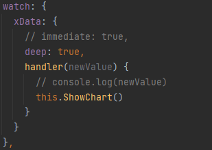
watch: {
xData: {
deep: true,
handler(newValue) {
// console.log(newValue)
this.ShowChart()
}
}
},
mounted() {
this.$nextTick(() => {
this.GetChartData()
})
},
methods: {
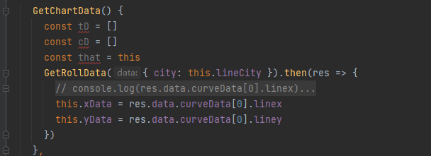
GetChartData() {
const tD = []
const cD = []
const that = this
GetRollData({ city: this.lineCity }).then(res => {
this.xData = res.data.curveData[0].linex
this.yData = res.data.curveData[0].liney
})
},
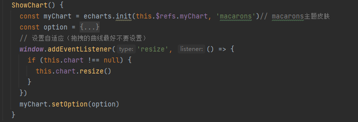
ShowChart() {
const myChart = echarts.init(this.$refs.myChart, 'macarons')// macarons主题皮肤
const option = {
title: {
text: '折线图',
subtext: '副标题'
},
tooltip: {
backgroundColor: 'pink'
},
legend: {
textStyle: { color: '#ffffff' }
},
xAxis: {
type: 'category',
// 数据
data: this.xData,
boundaryGap: false,
axisLine: {
lineStyle: {
width: 1, // 线的大小
type: 'solid'// 轴线的类型
},
onZero: false
},
axisLabel: { // 文字倾斜
rotate: 80,
textStyle: {
fontSize: 12,
fontWeight: 'bold'
}
// 坐标轴刻度标签的相关设置。
// interval: 0,
}
},
yAxis: {
name: '温度(℃)',
nameTextStyle: {
fontSize: 14,
padding: [10, 10, 10, 10],
fontWeight: 'bold'
},
type: 'value',
axisLine: {
lineStyle: {
width: 1, // 线的大小
type: 'solid'// 轴线的类型
},
onZero: false
},
axisLabel: {
textStyle: {
fontSize: 12,
fontWeight: 'bold'
},
// 坐标轴刻度标签的相关设置。
interval: 0
},
splitArea: {
show: false
}
},
dataZoom: [
{
type: 'slider',
height: 20,
xAxisIndex: 0,
filterMode: 'none',
textStyle: { color: '#ffffff' }
},
{
type: 'inside',
xAxisIndex: 0,
height: 20,
filterMode: 'none',
textStyle: { color: '#ffffff' }
}
],
series: {
name: '逐时温度(℃)',
type: 'line',
data: this.yData,
emphasis: {
focus: 'series' // 聚焦当前的区域高亮
}
}
}
// 设置自适应(拖拽的曲线最好不要设置)
window.addEventListener('resize', () => {
if (this.chart !== null) {
this.chart.resize()
}
})
myChart.setOption(option)
}
}
}
</script>
<style scoped lang="scss">
.main {
width: 1200px;
height: 600px;
margin: 0 auto;
border: #00ff9d 1px solid;
}
</style>
在这里我是用监视属性解决的这个问题。
下面我们拆分一下代码,详细解读一下,其实也很简单。
引入echarts,新版本引入写法。

主题皮肤

在后端接口获取数据。将x轴和y轴的数据赋值给data中的两个空数组分别为xData和yData。
创建图表,引入主题皮肤,option内为配置项。
监视属性(watch),开启深度监视,监视xData数组的数据变化,创建图表。
这样就可以正常展示图表数据了。

 浙公网安备 33010602011771号