
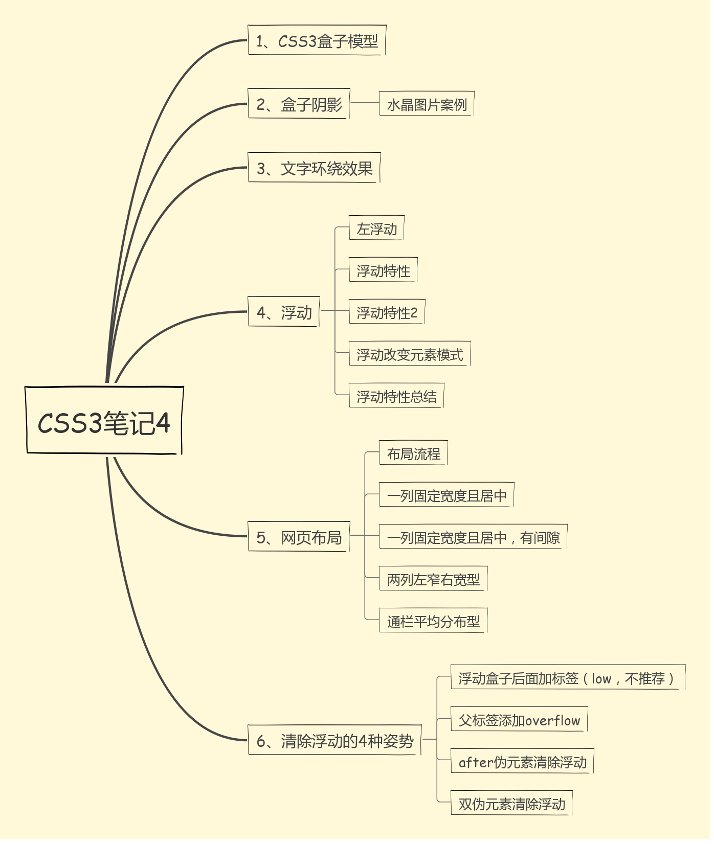
CSS3笔记4
1.CSS3盒子模型


 1 <!DOCTYPE html>
 2 <html lang="en">
 3 <head>
 4     <meta charset="UTF-8">
 5     <title>Document</title>
 6     <style>
 7     div:first-child {
 8         width: 200px;
 9         height: 200px;
10         background-color: pink;
11         box-sizing: content-box; /*以前的盒子模型 w3c标准*/
12         padding: 10px;
13         border: 15px solid red;
14         /*盒子大小为 width + padding + border content-box:此值为其默认值,其让元素维持W3C的标准Box mode;*/
15     }
16     div:last-child {
17         width: 200px;
18         height: 200px;
19         background-color: purple;
20         padding: 10px;
21         box-sizing: border-box; /*padding border 不撑开盒子*/
22         border: 15px solid red;
23         /*盒子大小为width padding和border是包含到width里面的*/
24
25     }
26     </style>
27 </head>
28 <body>
29     <div>content-box</div>
30     <div>border-box</div>
31 </body>
32 </html>

2.盒子阴影
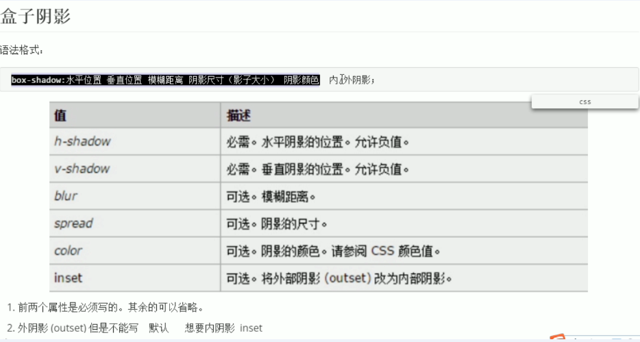
 1 <!DOCTYPE html>
 2 <html lang="en">
 3 <head>
 4     <meta charset="UTF-8">
 5     <title>Document</title>
 6     <style>
 7     h1 {
 8         font-size: 100px;
 9         /*text-shadow: 水平距离 垂直距离 模糊距离 阴影颜色*/
10         text-shadow: 10px 3px 3px rgba(0, 0, 0, .5);
11
12     }
13     div {
14         width: 200px;
15         height: 200px;
16         border: 10px solid red;
17         /*box-shadow: 5px 5px 3px 4px rgba(0, 0, 0, .4);*/
18         box-shadow: 0 15px 30px rgba(0, 0, 0, .4) inset;
19         /*box-shadow: 水平位置 垂直位置 模糊距离 阴影尺寸 (颜色大小) 阴影颜色 内外阴影*/
20
21     }
22     </style>
23 </head>
24 <body>
25     <h1>文字阴影演示</h1>
26     <div>盒子阴影演示</div>
27 </body>
28 </html>

<!DOCTYPE html>
<html lang="en">
<head>
    <meta charset="UTF-8">
    <title>Document</title>
    <style>
    div {
        width: 249px;
        height: 249px;
        line-height: 249px;
        background-color: pink;
        margin: 100px;
        background: url(images/shui.jpg) 0 0 no-repeat;
        font-size: 30px;
        text-align: center;
        color: rgba(255, 255, 255, 0.7); /*颜色半透明*/
        border-radius: 50%; /*变成一个圆 圆角*/
        box-shadow: 5px 5px 10px 16px rgba(255, 255, 255, 0.4) inset,
        5px 4px 10px rgba(0, 0, 0, 0.3) /*内阴影*/
    </style>
</head>
<body>
    <div>水晶图片</div>
</body>
</html>

3.文字环绕效果
 1 <!DOCTYPE html>
 2 <html lang="en">
 3 <head>
 4     <meta charset="UTF-8">
 5     <title>Document</title>
 6     <style>
 7     div {
 8         width: 500px;
 9         height: 500px;
10         border: 1px solid hotpink;
11         margin: 0 auto; /*让盒子居中对齐*/
12     }
13     img {
14         float: right; 浮动发明的目的是用来做文字环绕效果*/
15     }
16     </style>
17 </head>
18 <body>
19     <div>
20         JavaScript一种直译式脚本语言,是一种动态类型、弱类型、基于原型的语言,内置支持类型。它的解释器被称为JavaScript引擎,为浏览器的一部分,广泛用于客户端的脚本语言,最早是在HTML(标准通用标记语言下的一个应用)网页上使用,用来给HTML网页增加动态功能。
21         <img src="images/shui.jpg" height="220" width="171" alt="">
22 在1995年时,由Netscape公司的Brendan Eich,在网景导航者浏览器上首次设计实现而成。因为Netscape与Sun合作,Netscape管理层希望它外观看起来像Java,因此取名为JavaScript。但实际上它的语法风格与Self及Scheme较为接近。 [1]
23
24 为了取得技术优势,微软推出了JScript,CEnvi推出ScriptEase,与JavaScript同样可在浏览器上运行。为了统一规格,因为JavaScript兼容于ECMA标准,因此也称为ECMAScript。
25
26
27     </div>
28 </body>
29 </html>

4.浮动
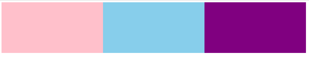
 1 <!DOCTYPE html>
 2 <html lang="en">
 3 <head>
 4     <meta charset="UTF-8">
 5     <title>Document</title>
 6     <style>
 7     div {
 8         width: 400px;
 9         height: 200px;
10         background-color: pink;
11         /*display: inline-block;*/
12         /*转换成行内快元素 就可以放一行上 有宽度高度 但是元素之间有空隙 不方便处理*/
13         float: left; /*让元素浮动起来就能解决有缝隙的问题啦*/
14     }
15     div:nth-child(2) {
16         background-color: skyblue;
17     }
18     div:nth-child(3) {
19         background-color: purple;
20     }
21     </style>
22 </head>
23 <body>
24     <div></div>
25     <div></div>
26     <div></div>
27 </body>
28 </html>
<!DOCTYPE html>
<html lang="en">
<head>
    <meta charset="UTF-8">
    <title>Document</title>
    <style>
    .father {
        width: 500px;
        height: 300px;
        background-color: pink;
        border: 10px solid red;
        padding: 10px; /*子盒子浮动不会压住父盒子的padding和margin值*/
    }
    .son {
        width: 100px;
        height: 100px;
        background-color: purple;
        float: left;
    }
    </style>
</head>
<body>
    <div class="father">
        <div class="son">
        </div>
    </div>
</body>
</html>

<!DOCTYPE html>
<html lang="en">
<head>
    <meta charset="UTF-8">
    <title>Document</title>
    <style>
    section {
        width: 800px;
        height: 500px;
        background-color: pink;
    }
    section div:first-child {
        width: 200px;
        height: 200px;
        background-color: purple;
    }
    section div:last-child {
        width: 249px;
        height: 300px;
        background-color: skyblue;
        float: left;
        /*熊大和熊二都浮动,则盒子会顶对齐*/
        /*熊大不浮动 熊二浮动,熊二则会跑到下一行*/
    }
    </style>
</head>
<body>
    <section>
        <div>熊大</div>
        <div>熊二</div>
    </section>
</body>
</html>

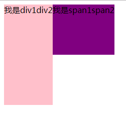
<!DOCTYPE html>
<html lang="en">
<head>
    <meta charset="UTF-8">
    <title>Document</title>
    <style>
    div {
        height: 200px;
        background-color: pink;
        float: left; /*块级元素添加浮动之后,具有行内快的特性*/
    }
    span {
        background-color: purple;
        height: 100px;
        float: left; /*行内元素添加浮动之后,具有行内快的特性*/
    }
    /*行内快特性 可以一行放多个 有宽度和高度 盒子的大小是有内容决定的*/
    </style>
</head>
<body>
    <div>我是div1</div>
    <div>div2</div>
    <span>我是span1</span>
    <span>span2</span>
</body>
</html>
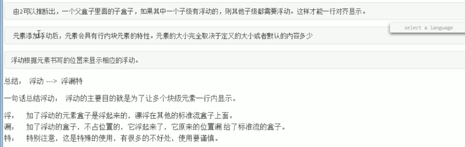
浮动特性总结
5.网页布局
布局流程

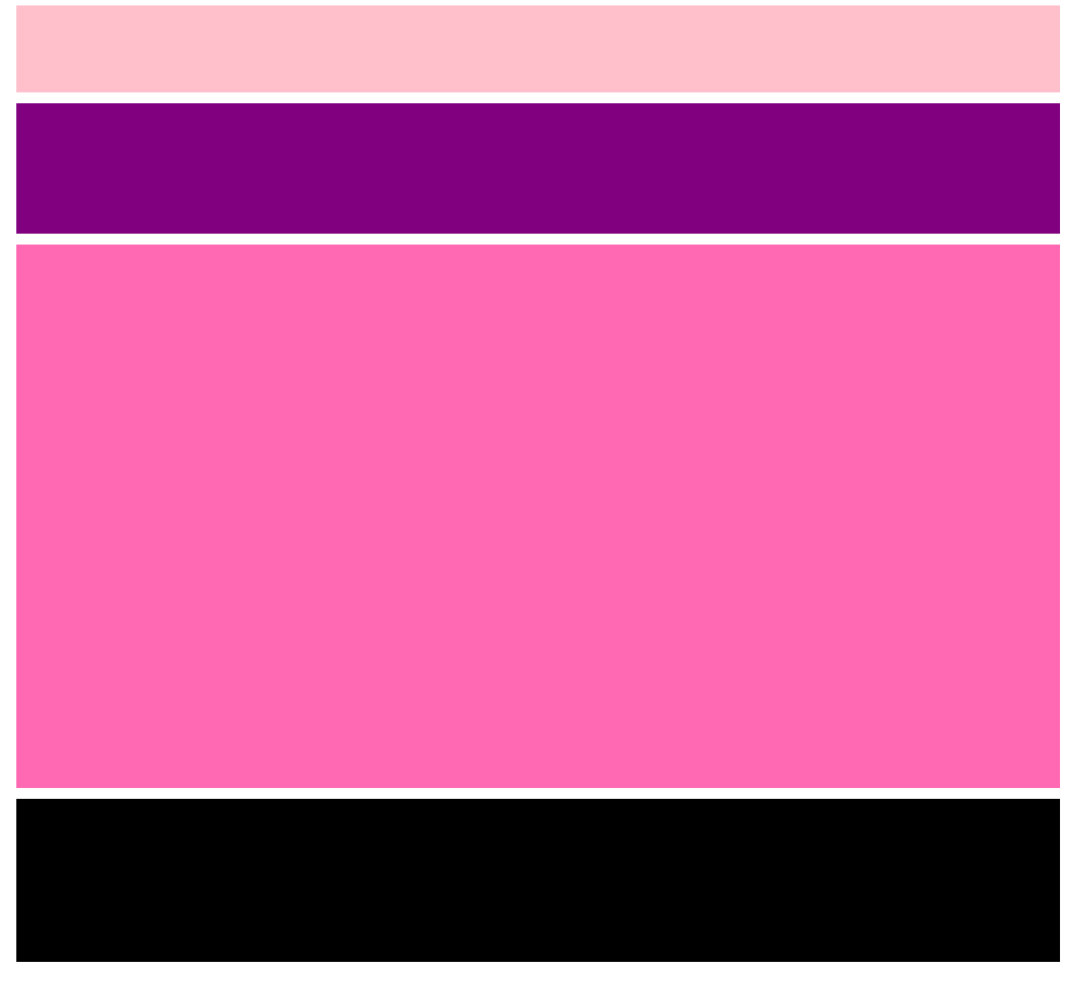
<!DOCTYPE html>
<html lang="en">
<head>
    <meta charset="UTF-8">
    <title>Document</title>
    <style>
    .top {
        width: 960px;
        height: 80px;
        background-color: pink;
        text-align: center; /*文字居中对齐*/
        margin: 0 auto; /*盒子居中对齐*/
    }
    .banner {
        width: 960px;
        height: 120px;
        background-color: purple;
        margin: 0 auto;
        text-align: center;
    }
    .main {
        width: 960px;
        height: 200px;
        background-color: skyblue;
        margin: 0 auto;
        text-align: center;
    }
    .footer {
        width: 960px;
        height: 80px;
        background-color: black;
        margin: 0 auto;
        text-align: center;
    }
    </style>
</head>
<body>
    <div class="top">top</div>
    <div class="banner">banner</div>
    <div class="main">main</div>
    <div class="footer">footer</div>
</body>
</html>

<!DOCTYPE html>
<html lang="en">
<head>
    <meta charset="UTF-8">
    <title>Document</title>
    <style>
    .top,
    .banner,
    .main,
    .footer {
        width: 960px;
        text-align: center;
        margin: 0 auto;
        margin-bottom: 10px;
    }
    .top {
        height: 80px;
        background-color: pink;
    }
    .banner {
        height: 120px;
        background-color: purple;
    }
    .main {
        height: 500px;
        background-color: hotpink;
    }
    .footer {
        height: 150px;
        background-color: black;
    }
    </style>
</head>
<body>
    <div class="top"></div>
    <div class="banner"></div>
    <div class="main"></div>
    <div class="footer"></div>
</body>
</html>
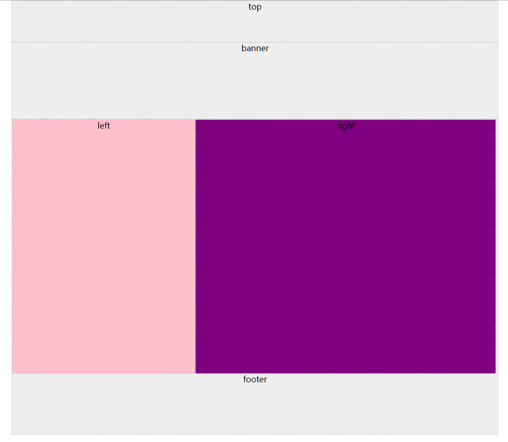
<!DOCTYPE html>
<html lang="en">
<head>
    <meta charset="UTF-8">
    <title>Document</title>
    <style>
    * {
        margin: 0;
        padding: 0;
    }
    .top,
    .banner,
    .main,
    .left,
    .right,
    .footer {
        width: 960px;
        margin: 0 auto;
        text-align: center;
        background-color: #eee; /*灰色*/
        border: 1px dashed #ccc; /*类似灰色*/
    }
    .top {
        height: 80px;
    }
    .banner {
        height: 150px;
    }
    .main {
        height: 500px;
    }
    .left {
        width: 360px;
        height: 500px;
        background-color: pink;
        float: left;
    }
    .right {
        width: 592px;
        height: 500px;
        background-color: purple;
        float: left;
    }
    .footer {
        height: 120px;
    }
    </style>
</head>
<body>
    <div class="top">top</div>
    <div class="banner">banner</div>
    <div class="main">
        <div class="left">left</div>
        <div class="right">right</div>
    </div>
    <div class="footer">footer</div>
</body>
</html>
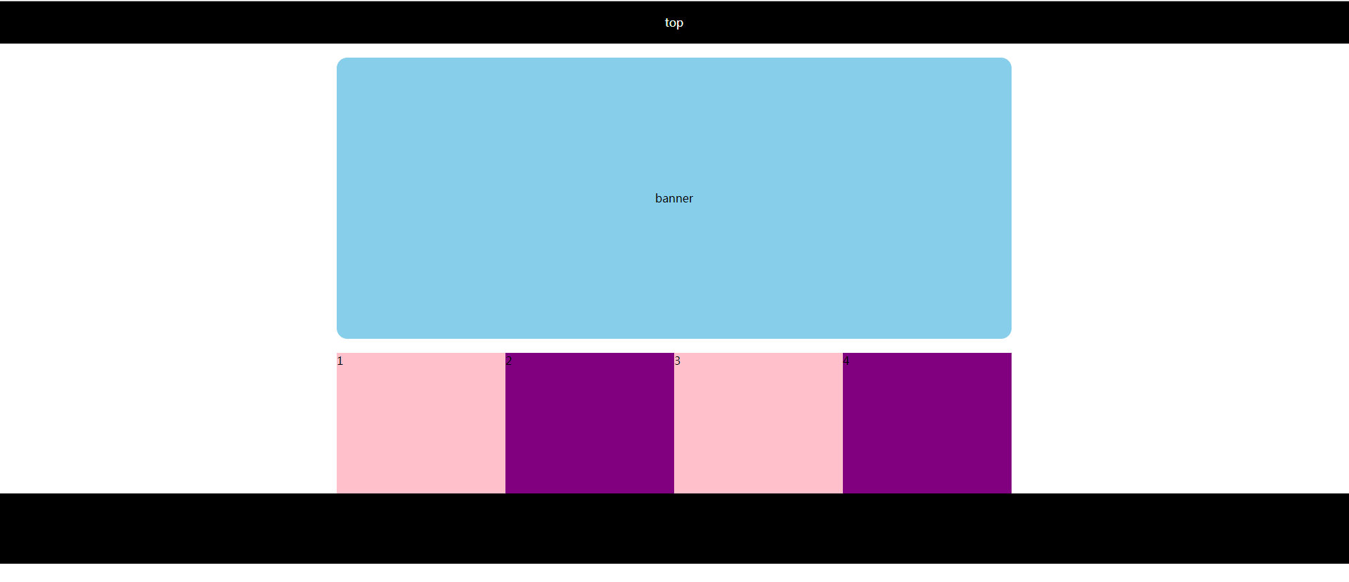
<!DOCTYPE html>
<html lang="en">
<head>
    <meta charset="UTF-8">
    <title>Document</title>
    <style>
    * {
        margin: 0;
        padding: 0;
    }
    ul {
        list-style: none; /*取消列表默认的小点样式*/
    }
    .top {
        height: 60px;
        background-color: #000;
        color: white;
        text-align: center;
        line-height: 60px;
    }
    .banner {
        width: 960px;
        height: 400px;
        background-color: skyblue;
        margin: 20px auto;
        border-radius: 15px;
        text-align: center;
        line-height: 400px;
    }
    .main {
        width: 960px;
        height: 200px;
        margin: 0 auto;
    }
    .main ul li {
        width: 240px;
        height: 200px;
        background-color: pink;
        float: left; /*浮动的目的是让多个块级li 一行显示 而且没有缝隙哟*/
    }
    .main ul li:nth-child(even) { /*让偶数li元素变成紫色*/
        background-color: purple;
    }
    .footer {
        height: 100px;
        background-color: #000;
    }
    </style>
</head>
<body>
    <div class="top">top</div>
    <div class="banner">banner</div>
    <div class="main">
        <ul>
            <li>1</li>
            <li>2</li>
            <li>3</li>
            <li>4</li>
        </ul>
    </div>
    <div class="footer">footer</div>
</body>
</html>
6.清除浮动的4种姿势
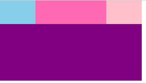
<!DOCTYPE html>
<html lang="en">
<head>
    <meta charset="UTF-8">
    <title>Document</title>
    <style>
    * {
        margin: 0;
        padding: 0;
    }
    .box1 {
        width: 600px;
        background-color: pink;
    }
    .box2 {
        width: 600px;
        height: 240px;
        background-color: purple;
    }
    .son1 {
        width: 150px;
        height: 100px;
        background-color: skyblue;
        float: left;
    }
    .son2 {
        width: 300px;
        height: 100px;
        background-color: hotpink;
        float: left;
    }
    /*如果son1和son2都浮动了,浮动元素不占有位置,父亲又没有高度
    此时底下的盒子就会跑上来*/
    .clear {
        clear: both; /*清除浮动的影响*/
    }
    </style>
</head>
<body>
    <div class="box1">
        <div class="son1"></div>
        <div class="son2"></div>
        <!-- 在浮动盒子的后面添加一个空盒子
        缺点是添加很多额外的标签,不推荐使用 -->
        <div class="clear"></div>
    </div>
    <div class="box2"></div>
</body>
</html>
后面效果与这个效果一样。
<!DOCTYPE html>
<html lang="en">
<head>
    <meta charset="UTF-8">
    <title>Document</title>
    <style>
    * {
        margin: 0;
        padding: 0;
    }
    .box1 {
        /*height: 200px; 很多情况下,我们父级盒子,不方便给高度,考虑孩子会变*/
        width: 600px;
        background-color: pink;
        overflow: hidden; /*触发BFC BFC可以清除浮动 这是解决方案 BFC以后讲解 overflow: auto/scroll也行*/
    }
    .box2 {
        width: 600px;
        height: 240px;
        background-color: purple;
    }
    .son1 {
        width: 150px;
        height: 100px;
        background-color: skyblue;
        float: left;
    }
    .son2 {
        width: 300px;
        height: 100px;
        background-color: hotpink;
        float: left;
    }
    /*如果son1和son2都浮动了,浮动元素不占有位置,父亲有没有高度 此时底下盒子就会跑上来*/

    </style>
</head>
<body>
    <div class="box1">
        <div class="son1"></div>
        <div class="son2"></div>
    </div>
    <div class="box2"></div>
</body>
</html>
<!DOCTYPE html>
<html lang="en">
<head>
    <meta charset="UTF-8">
    <title>Document</title>
    <style>
    * {
        margin: 0;
        padding: 0;
    }
    .box1 {
        /*height: 200px; 很多情况下,我们父级盒子,不方便给高度,考虑孩子会变*/
        width: 600px;
        background-color: pink;
    }
    .box2 {
        width: 600px;
        height: 240px;
        background-color: purple;
    }
    .son1 {
        width: 150px;
        height: 100px;
        background-color: skyblue;
        float: left;
    }
    .son2 {
        width: 300px;
        height: 100px;
        background-color: hotpink;
        float: left;
    }
    /*如果son1和son2都浮动了,浮动元素不占有位置,父亲有没有高度 此时底下盒子就会跑上来*/
    .clearfix:after { /*伪元素选择器*/
        content: "."; /*内容为小点,尽量不要空, 否则旧版浏览器有空隙.*/
        display: block; /*转换为块级元素*/
        height: 0; /*高度为0*/
        visibility: hidden; /*隐藏盒子*/
        clear: both; /*清除浮动*/
    }
    .clearfix { /*ie6/7浏览器的处理方式*/
        *zoom: 1; /*ie6/7能识别的特殊符号 带有这个*的属性 只有ie6/7才能执行 zoom就是ie6/7清除浮动的方法*/
    }
    </style>
</head>
<body>
    <div class="box1 clearfix">
        <div class="son1"></div>
        <div class="son2"></div>
    </div>
    <div class="box2"></div>
</body>
</html>
<!DOCTYPE html>
<html lang="en">
<head>
    <meta charset="UTF-8">
    <title>Document</title>
    <style>
    * {
        margin: 0;
        padding: 0;
    }
    .box1 {
        /*height: 200px; 很多情况下,我们父级盒子,不方便给高度,考虑孩子会变*/
        width: 600px;
        background-color: pink;
    }
    .box2 {
        width: 600px;
        height: 240px;
        background-color: purple;
    }
    .son1 {
        width: 150px;
        height: 100px;
        background-color: skyblue;
        float: left;
    }
    .son2 {
        width: 300px;
        height: 100px;
        background-color: hotpink;
        float: left;
    }
    /*如果son1和son2都浮动了,浮动元素不占有位置,父亲有没有高度 此时底下盒子就会跑上来*/
    .clearfix:before,.clearfix:after {
        content: "";
        display: table; /*这句话可以触发BFC BFC可以清除浮动*/
    }
    .clearfix:after {
        clear: both;
    }
    .clearfix {
        *zoom: 1; /*兼容IE6/IE7浏览器*/
    }
    </style>
</head>
<body>
    <div class="box1 clearfix">
        <div class="son1"></div>
        <div class="son2"></div>
    </div>
    <div class="box2"></div>
</body>
</html>
7.思维导图总结

 浙公网安备 33010602011771号