css水平居中
1、元素水平居中
margin:0 auto;
为居中的原因
①元素没有设置宽度,没有宽度无法居中
②设置宽度依然不好使,可能设置的行内元素。
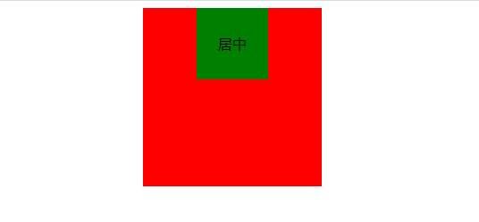
示例1:
<!DOCTYPE html>
<html lang="en">
<head>
    <meta charset="UTF-8">
    <title></title>
    <meta name="keywords" content="css html">
    <meta name="description" content="css html study">
    <style>
.wrapper{
    width: 200px;
    height: 200px;
    background-color: red;
    margin: 0 auto;
}
.content{
    width: 80px;
    height: 80px;
    background-color: green;
    margin: 0 auto;
     /*文字居中*/
    text-align: center;
    /*文字在块内垂直居中*/
    line-height: 80px;

}
</style>
</head>
<body>
    <div class="wrapper">
        <div class="content">
居中
    </div>
    </div>

</body>
</html>
2、元素水平垂直居中
方案1、position元素已知宽度
父元素设置为position:relative
子元素设置为position:absolute
距离上50% 据左50% 然后减去元素自身的宽度的距离就可以实现
小贴士:
margin标记可以带一个、二个、三个、四个参数,各有不同的含义。
margin: 20px;(上、下、左、右各20px。)
margin: 20px 40px;(上、下20px;左、右40px。)
margin: 20px 40px 60px;(上20px;左、右40px;下60px。)
margin: 20px 40px 60px 80px;(上20px;右40px;下60px;左80px。)
示例2:
<!DOCTYPE html>
<html lang="en">
<head>
    <meta charset="UTF-8">
    <title></title>
    <meta name="keywords" content="css html">
    <meta name="description" content="css html study">
    <style>

.wrapper1{
    background-color: red;
    width: 200px;
    height: 200px;
    position: relative;
}
.content1{
position: absolute;
background-color: blue;
width: 80px;
height: 80px;
top: 50%;
left: 50%;
margin: -40px  0 0 -40px;
}
</style>
</head>
<body><div class="wrapper1">
        <div class="content1 "></div>
    </div>

</body>
</html>
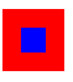
方案2:position tran's'f'orm元素未知宽度
将margin改为transform
transform:translate(-50%,-50%)
示例3:
<!DOCTYPE html>
<html lang="en">
<head>
    <meta charset="UTF-8">
    <title></title>
    <meta name="keywords" content="css html">
    <meta name="description" content="css html study">
    <style>
.wrapper2{
    background-color: red;
    width: 200px;
    height: 200px;
    position: relative;
}
.content2{
position: absolute;
background-color: blue;
width: 80px;
height: 80px;
top: 50%;
left: 50%;
 transform: translate(-50%,-50%);
}
</style>
</head>
<body>
          <div class="wrapper2">
        <div class="content2 "></div>
    </div>

</body>
</html>
方案3:flexe(布局)
示例4:
<!DOCTYPE html>
<html lang="en">
<head>
    <meta charset="UTF-8">
    <title></title>
    <meta name="keywords" content="css html">
    <meta name="description" content="css html study">
    <style>
.wrapper3{
    background-color: red;
    width: 200px;
    height: 200px;
    /*flex布局*/
    display: flex;
    /*使子项目水平居中*/
    justify-content: center;
    /*使子项目垂直居中*/
    align-items: center;
}
.content3{
background-color: blue;
width: 80px;
height: 80px;
</style>
</head>
<body>

    <div class="wrapper3">
        <div class="content3 "></div>
    </div>


</body>
</html>
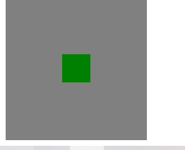
方案4:table-cell布局
示例5:
因为table-cell相当于表格的td,td为行内元素,无法设置宽和高,所以嵌套一层,嵌套一层必须设置display:inline-block
<!DOCTYPE html>
<html lang="en">
<head>
    <meta charset="UTF-8">
    <title></title>
    <meta name="keywords" content="css html">
    <meta name="description" content="css html study">
    <style>
.wrapper4{
    background-color: black;
    width: 200px;
    height: 200px;
    display: table;
}
.content4{
background-color: gray;
display: table-cell;
/*使子元素垂直居中*/
vertical-align: middle;
/*使子元素水平居中*/
text-align: center;
}
.inner{
    background-color: green;
    display: inline-block;
    width: 20%;
    height: 20%;
}

</style>
</head>
<body>

    <div class="wrapper4">
        <div class="content4">
            <div class="inner"></div>
        </div>
    </div>

</body>
</html>
I hope all of us can learn to progress!

 浙公网安备 33010602011771号