Bootstrap入门七:按钮
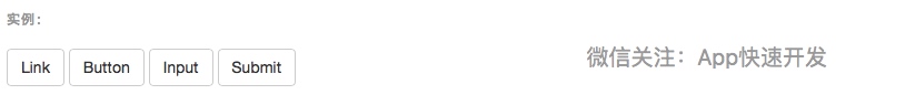
1.可作为按钮使用的标签或元素
为 <a>、<button> 或 <input> 元素添加按钮类(button class)即可使用 Bootstrap 提供的样式。
<a class="btn btn-default" href="#" role="button">Link</a>
<button class="btn btn-default" type="submit">Button</button>
<input class="btn btn-default" type="button" value="Input">
<input class="btn btn-default" type="submit" value="Submit">

针对组件的注意事项
虽然按钮类可以应用到 <a> 和 <button> 元素上,但是,导航和导航条组件只支持 <button> 元素。
链接被作为按钮使用时的注意事项
如果 <a> 元素被作为按钮使用 -- 并用于在当前页面触发某些功能 -- 而不是用于链接其他页面或链接当前页面中的其他部分,那么,务必为其设置 role="button" 属性。
跨浏览器展现
我们总结的最佳实践是:强烈建议尽可能使用 <button> 元素来获得在各个浏览器上获得相匹配的绘制效果。
另外,我们还发现了 Firefox <30 版本的浏览器上出现的一个 bug,其表现是:阻止我们为基于 input 元素所创建的按钮设置 line-height 属性,这就导致在 Firefox 浏览器上不能完全和其他按钮保持一致的高度。
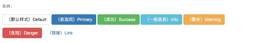
2.预定义样式
使用下面列出的类可以快速创建一个带有预定义样式的按钮。
<!-- Standard button -->
<button type="button" class="btn btn-default">(默认样式)Default</button>
<!-- Provides extra visual weight and identifies the primary action in a set of buttons -->
<button type="button" class="btn btn-primary">(首选项)Primary</button>
<!-- Indicates a successful or positive action -->
<button type="button" class="btn btn-success">(成功)Success</button>
<!-- Contextual button for informational alert messages -->
<button type="button" class="btn btn-info">(一般信息)Info</button>
<!-- Indicates caution should be taken with this action -->
<button type="button" class="btn btn-warning">(警告)Warning</button>
<!-- Indicates a dangerous or potentially negative action -->
<button type="button" class="btn btn-danger">(危险)Danger</button>
<!-- Deemphasize a button by making it look like a link while maintaining button behavior -->
<button type="button" class="btn btn-link">(链接)Link</button>

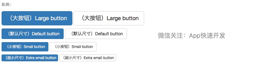
3.尺寸
需要让按钮具有不同尺寸吗?使用 .btn-lg、.btn-sm 或 .btn-xs 就可以获得不同尺寸的按钮。
<p>
  <button type="button" class="btn btn-primary btn-lg">(大按钮)Large button</button>
  <button type="button" class="btn btn-default btn-lg">(大按钮)Large button</button>
</p>
<p>
  <button type="button" class="btn btn-primary">(默认尺寸)Default button</button>
  <button type="button" class="btn btn-default">(默认尺寸)Default button</button>
</p>
<p>
  <button type="button" class="btn btn-primary btn-sm">(小按钮)Small button</button>
  <button type="button" class="btn btn-default btn-sm">(小按钮)Small button</button>
</p>
<p>
  <button type="button" class="btn btn-primary btn-xs">(超小尺寸)Extra small button</button>
  <button type="button" class="btn btn-default btn-xs">(超小尺寸)Extra small button</button>
</p>

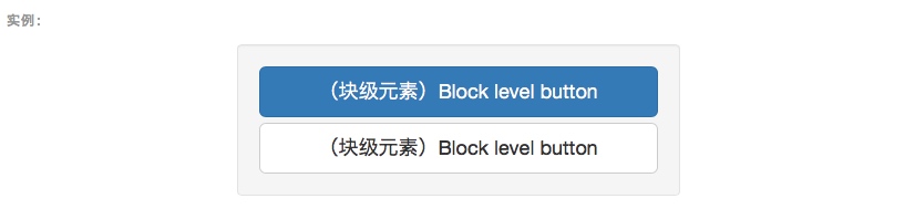
通过给按钮添加 .btn-block 类可以将其拉伸至父元素100%的宽度,而且按钮也变为了块级(block)元素。
<button type="button" class="btn btn-primary btn-lg btn-block">(块级元素)Block level button</button>
<button type="button" class="btn btn-default btn-lg btn-block">(块级元素)Block level button</button>

4.激活状态
当按钮处于激活状态时,其表现为被按压下去(底色更深、边框夜色更深、向内投射阴影)。对于 <button> 元素,是通过 :active 状态实现的。对于 <a> 元素,是通过 .active 类实现的。然而,你还可以将 .active 应用到 <button> 上(包含 aria-pressed="true" 属性)),并通过编程的方式使其处于激活状态。
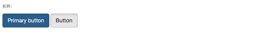
button 元素
由于 :active 是伪状态,因此无需额外添加,但是在需要让其表现出同样外观的时候可以添加 .active 类。
<button type="button" class="btn btn-primary btn-lg active">Primary button</button>
<button type="button" class="btn btn-default btn-lg active">Button</button>

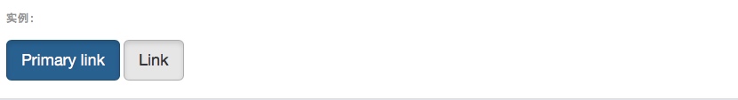
链接(<a>)元素
可以为基于 <a> 元素创建的按钮添加 .active 类。
<a href="#" class="btn btn-primary btn-lg active" role="button">Primary link</a>
<a href="#" class="btn btn-default btn-lg active" role="button">Link</a>

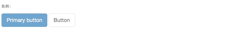
5.禁用状态
通过为按钮的背景设置 opacity 属性就可以呈现出无法点击的效果。
button 元素
为 <button> 元素添加 disabled 属性,使其表现出禁用状态。
<button type="button" class="btn btn-lg btn-primary" disabled="disabled">Primary button</button>
<button type="button" class="btn btn-default btn-lg" disabled="disabled">Button</button>

跨浏览器兼容性
如果为 <button> 元素添加 disabled 属性,Internet Explorer 9 及更低版本的浏览器将会把按钮中的文本绘制为灰色,并带有恶心的阴影,目前我们还没有解决办法。
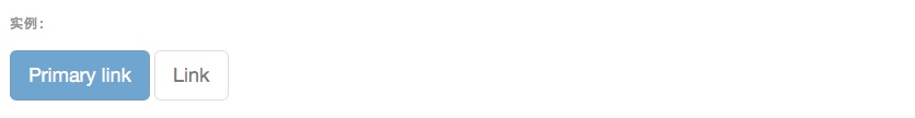
链接(<a>)元素
为基于 <a> 元素创建的按钮添加 .disabled 类。
<a href="#" class="btn btn-primary btn-lg disabled" role="button">Primary link</a>
<a href="#" class="btn btn-default btn-lg disabled" role="button">Link</a>

我们把 .disabled 作为工具类使用,就像 .active 类一样,因此不需要增加前缀。
链接的原始功能不受影响
上面提到的类只是通过设置 pointer-events: none 来禁止 <a> 元素作为链接的原始功能,但是,这一 CSS 属性并没有被标准化,并且 Opera 18 及更低版本的浏览器并没有完全支持这一属性,同样,Internet Explorer 11 也不支持。In addition, even in browsers that do support pointer-events: none, keyboard navigation remains unaffected, meaning that sighted keyboard users and users of assistive technologies will still be able to activate these links. 因此,为了安全起见,建议通过 JavaScript 代码来禁止链接的原始功能。
专注App快速开发,欢迎关注微信公众号"App快速开发"。

 浙公网安备 33010602011771号