
margin合并 margin无效的情形 margin:auto
margin是盒模型几个属性中一个非常特殊的属性。
如:只有margin不显示当前元素背景,只有margin可以设置为负值,margin和宽高支持auto,以及margin具有非常奇怪的重叠特性。
margin 重叠
margin重叠又叫margin合并,发生这种情况有两个前提
1、只发生在block元素上(不包括float、absolute、inline-block元素)
2、只发生在垂直方向上(不考虑writing-mode)
margin重叠的3种场景
1,相邻兄弟元素margin重叠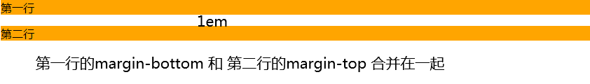
 <style>
        p{
            margin: 1em 0;
            background-color: orange;
        }
    </style>

    <p>第一行</p>
    <p>第二行</p>
2,父级和第一个 / 最后一个子元素 父子级的margin重叠又叫margin传递
3. 空块级元素的margin重叠
margin合并的计算规则
正正取大值 正负值相加 负负最负值
正正取大值
  <style>
        /* a 和 b 两个div之间的间距是50px  取最大值 */
        .a{margin-bottom: 50px;background-color: orange;}
        .b{margin-top:20px;background-color: pink;}

        /* father元素等同于设置margin-top:50px  取大的那个值*/
        .father{margin-top: 20px;background-color:orange;}
        .son{margin-top: 50px;background-color:pink;}

        /* c的外部尺寸是50px */
        .c{
            margin-top: 20px;
            margin-bottom: 50px;
            background: orange;
        }

    </style>

    <!-- 相邻兄弟合并 -->
    <div class="a">a</div>
    <div class="b">b</div>
<br/>
<br/>
<br/>

    <!-- 父子合并 -->
    <div class="father">父元素father
        <div class="son">子元素son</div>
    </div>
    <br/>
    <br/>
    <br/>

    <!-- 自身合并 -->
    <div class="c">c</div>
正负值相加
 <style>
        /* a 和 b 两个div之间的间距是30px  -20px+50px的计算值 */
        .a{margin-bottom: 50px;background-color: orange;}
        .b{margin-top:-20px;background-color: pink;}

        /* father元素等同于设置margin-top:30px  -20px+50px的计算值*/
        .father{margin-top: 20px;background-color:orange;}
        .son{margin-top: 50px;background-color:pink;}

        /* c的外部尺寸是30px  -20px+50px的计算值*/
        .c{
            margin-top: 20px;
            margin-bottom: 50px;
            background: orange;
        }

    </style>

    <!-- 相邻兄弟合并 -->
    <div class="a">a</div>
    <div class="b">b</div>
<br/>
<br/>
<br/>

    <!-- 父子合并 -->
    <div class="father">父元素father
        <div class="son">子元素son</div>
    </div>
    <br/>
    <br/>
    <br/>

    <!-- 自身合并 -->
    <div class="c">c</div>
负负最负值
 <style>
        /* a 和 b 两个div之间的间距是-50px  取绝对负值最大值 */
        .a{margin-bottom: -50px;background-color: orange;}
        .b{margin-top:-20px;background-color: pink;}

        /* father元素等同于设置margin-top:-50px  取绝对负值最大值*/
        .father{margin-top: -20px;background-color:orange;}
        .son{margin-top: -50px;background-color:pink;}

        /* c的外部尺寸是-50px  取绝对负值最大值*/
         .c{
            margin-top: -20px;
            margin-bottom: -50px;
            background: orange;
        }
    </style>
</head>
<body>
    <!-- 相邻兄弟合并 -->
    <div class="a">a</div>
    <div class="b">b</div>
<br/>

    <!-- 父子合并 -->
 <div class="father">父元素father
        <div class="son">子元素son</div>
    </div>
    <br/>

    <!-- 自身合并 -->
 <div class="c">c</div>
margin重叠的意义
如<h2> <p> <ul> 默认全都是垂直方向的margin值,且单位都是em
字体默认是16px 如果字体增大,且margin是像素大小 ,则字体文字变大但间距不变,原本段落有秩序的阅读会让人窒息 em 是相对单位,无论字体变的多大字体都排版的很好
css世界的设计本意是图文信息展示,有了默认的margin值,我们的文章 新闻都不会挤在一起,垂直方向层次分明
兄弟margin重叠的意义 :和em类似,都是让图文信息的排版更加舒服 自然,可保证元素上下间距一致,无论是<h2>标题这种margin 偏大的元素,还是中规中距的<p>元素 可根据取值规则来取 如正正取大值
父子margin重叠的意义 :在页面中任何地方嵌套或直接放入任何裸<div> 都不会影响原来的块状布局
有了父子margin合并,外面在嵌套一次<div>元素就跟没有嵌套一样,表现为margin-top:20px 就好像是设置在最外面的<div>元素上一样
<div style="margin-top:20px ;"></div>
自身margin重叠的意义 :可避免不小心遗落或者生产的空标签影响排版和布局
 <style>
     /*
所以遇到列表 或者模块 全部都是保留上下margin设置
因为有margin合并,无需担心列表间距很大, 就是15px
*/
     .list{
         margin-top: 15px;
         margin-bottom: 15px;
     }

<body>
    <p>第一行</p>
    <p></p>
    <p></p>
    <p></p>
    <p></p>
    <p>第二行</p>

    <!-- 最终效果和下面的一样  如果没有margin上面第一行 到 第二行 需要间隔很多行-->
    <p>第一行</p>
    <p>第二行</p>
margin :auto
元素没有设置width 或 height 会自动填充对应的方位 .元素如果设置了width 或 height ,自动填充的特性就会被覆盖
margin:auto 的计算规则
1,如果一侧定值,一侧auto ,则auto为剩余空间大小
2, 如果两边都是auto, 则平分剩余空间
例子:总剩余大小是100px ,其中margin-right :80px 那margin-left :auto 计算值就是剩余的20px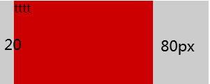
 <style>
   .father{
       width:300px;
       background-color:#ccc;
   }

   .son{
       width: 200px;
       height: 120px;
       margin-right: 80px;
       margin-left: auto;
       background-color: #cd0000;
   }
</style>

  <div class="father">
      <div class="son">tttt</div>
  </div>
margin 的初始值大小是0 ,块级元素实现右对齐 除了float:right 还可以用margin-left :auto
margin属性的auto计算 就是为了块级元素左中右对齐而设计的,
内联元素使用text-align 控制左中右对齐
  <style>
   .father{
       width:300px;
       background-color:#ccc;
   }

   .son{
       width: 200px;
       height: 120px;

       margin-left: auto;
       background-color: #cd0000;
   }
</style>
居中对齐 左右两侧同时设置 auto计算; 即可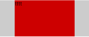
  .father{
       width:300px;
       background-color:#ccc;
   }

   .son{
       width: 200px;
       height: 120px;
       margin-right:auto;
       margin-left: auto;
       background-color: #cd0000;
   }
有时 元素定高 容器定高,margin:auto 无法垂直居中
原因:触发margin:auto 计算有一个前提条件,就是width 或 height 为auto时,元素是具有对应方向的自动填充特性的
例如,把下面例子中 .son元素的height:100px 去掉, .son的高度会自动和父元素等高变成200px吗 ,显然不会 也就无法触发margin:auto 计算 也就无法垂直居中
margin实现垂直居中有 2种方法,
1,使用writing-mode改变文档流的方向 能垂直居中,但不能水平居中
  <style>
  .father{

       height: 150px;
       background-color:#ccc;
       writing-mode: vertical-lr;
   }

   .son{
       height: 100px;
       margin: auto;
       background-color: #cd0000;
   }
</style>

  <div class="father">
      <div class="son">111</div>
  </div>
2,绝对定位元素的margin:auto; 既能水平居中 也能垂直居中 这个IE8及以上浏览器才支持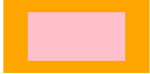
    <style>

 .father{
     width:300px;
     height: 150px;
     position: relative;
     background-color: orange;
 }

 .son{
     /*
     此时的.son 元素尺寸表现为, "格式化宽度和格式化高度"
     和<div>"正常流宽度" 一样 同属于外部尺寸
     也就是尺寸自动填充父级元素的可以尺寸
      */
     position:absolute;
     left: 0;
     top:0;
     right: 0;
     bottom: 0;
     background-color: pink;
     /*
     宽高被限制,原本应该填充的空间 就被空余了出来
     这空余的空间就是margin:auto计算的空间
     这样水平和垂直方向同时的居中
      */
     width: 200px;
     height: 100px;
     margin:auto;

 }
</style>

  <div class="father">
      <div class="son"></div>
  </div>
绝对定位元素 的格式化高度 即使父元素height :auto 也是支持的
margin无效情形分析

 <!-- 水平有位移 400px ,垂直没有效果 -->
    <div style="background-color: #ccc;">
        <span style="margin:400px;background-color: green;">margin:400px</span>
      </div>
2 . margin重叠
3. display : table-cell / table-row 等声明的margin无效
例: 无论内联元素还是水平元素 如 一旦设置了display :table-cell 那 margin无效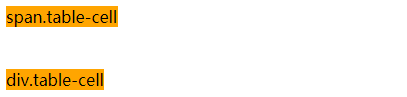
 <style>
        /*
        无论块级元素 还是行内元素 一旦设置了 display: table-cell;
        在去设置margin 是无效的
         */
        span,div{
            background-color: orange;
        }
        .table-cell{
           display: table-cell;
            margin:0 100px;
        }

</style>

  <span class="table-cell">span.table-cell</span>
  <br/>
  <br/>
  <div class="table-cell">div.table-cell</div>
如图片 和文字间隔开,设置table-cell元素 添加margin撑开间距 无效 只能给img 添加margin-right 来撑开间距 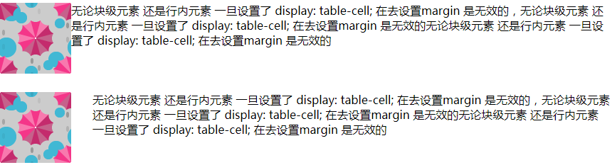
 <style>
        .wrap1 img{
            float: left;
        }

       .wrap1 .d1{
           /* 通过给table-cell元素 添加margin撑开间距  无反应 */
           display: table-cell;
           margin-right: 30px;
       }

        /*
        通过给table-cell元素 添加margin撑开间距  无反应
        只能给img 添加margin-right 来撑开间距
         */
       .wrap2 img{
            float: left;
            margin-right: 30px;
        }

       .wrap2 .d2{
           display: table-cell;

       }


</style>

<div class="wrap1">
    <img src="./img/bg-1.png"/>
    <div class="d1">无论块级元素 还是行内元素 一旦设置了 display: table-cell;
        在去设置margin 是无效的,无论块级元素 还是行内元素 一旦设置了 display: table-cell;
        在去设置margin 是无效的无论块级元素 还是行内元素 一旦设置了 display: table-cell;
        在去设置margin 是无效的</div>
</div>
<br/>
<br/>
<br/>
<div class="wrap2">
    <img src="./img/bg-1.png"/>
    <div class="d2">无论块级元素 还是行内元素 一旦设置了 display: table-cell;
        在去设置margin 是无效的,无论块级元素 还是行内元素 一旦设置了 display: table-cell;
        在去设置margin 是无效的无论块级元素 还是行内元素 一旦设置了 display: table-cell;
        在去设置margin 是无效的</div>
</div>
例外的 替换元素
图片 设置display:table-cell 且设置margin是有效果的
<style>
        .wrap1{
            background-color: orange;
        }
        .wrap1 img{
            display:table-cell;
            margin:100px;
        }

</style>

<div class="wrap1">
    <img src="./img/bg-1.png"/>
</div>
同样是替换元素如buttom 但与img 又有不同
设置display:table-cell margin:15px 用js获取当前值的时候返回的是display:inline-block margin:15px
也就是说按钮 在谷歌浏览器下 按钮永远是display:inline-block水平 这时的margin也是起作用的
替换元素设置 display:table-cell 在规范里是没有的,作为一种非定义行为。使得各个浏览器表现都有差异
FireFox :table-cell类型 inline-block的渲染行为
IE : table-cell类型 也是table-cell渲染行为
总之替换元素 tell-cell 能与margin发生作用的 (一般也不会给替换元素设置tell-cell 无任何意义)
4. position:absolute 与margin 注意:是加引号的无效
绝对定位元素 非定位方位的margin 是无效值 "无效" 也就是说定位方位的margin 是有效的
图片设置了top:10% left:30% ,此时right 和 bottom都属于auto状态 ,如果设置margin-right margin-bottom 是无效 看不到定位变化的
5,鞭长莫及导致的margin无效
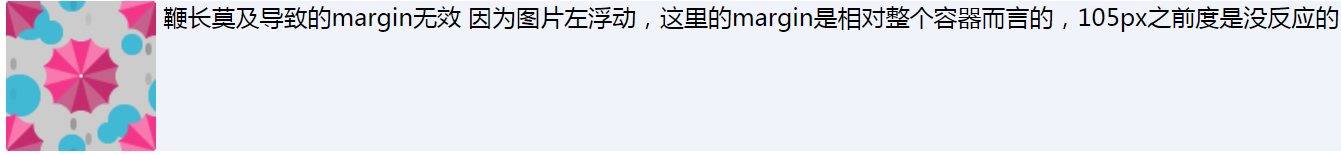
 <div style="background-color: #f0f3f9;overflow: hidden;">
        <img src="./img/bg-1.png" style="float: left;" />
        <div style="margin-left:105px;">
          鞭长莫及导致的margin无效 因为图片左浮动,这里的margin是相对整个容器而言的,105px之前度是没反应的
        </div>

      </div>
<style>
/*
margin-left:180px 是有效的,如果margin-left的值<=156 都是无效的
*/
.box>img{
float: left;
width: 156px;
}
.box>p{
margin-left: 180px;
}
</style>
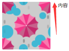
<div class="box">
<img src="./img/bg-1.png"/>
<p>内容</p>
</div>
6,内联特性导致的margin无效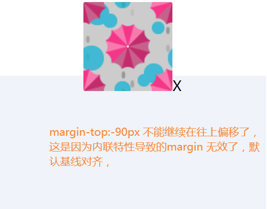
   <div style="background-color: #f0f3f9;height: 150px;width: 300px;margin: 100px auto;text-align: center;">
        <img src="./img/bg-1.png" style="margin-top: -90px;" />X
      </div>

 浙公网安备 33010602011771号