
进度条后台数据渲染
首先,后台返回的数据已经明确给出了进度条的区间startValue和endValue和数据的数值:
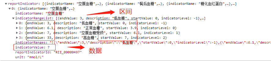
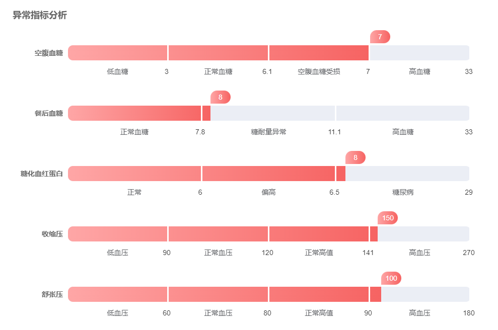
有了区间我们只需要按照区间渲染上去即可,实现的页面如下
很显然,数据的数值和进度条区间并不对应
经过和项目组的多方讨论这个逻辑,终于有了思路
借助大神的辅助,我直接封装了一个进度条的组件:
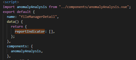
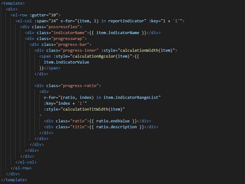
父页面html:
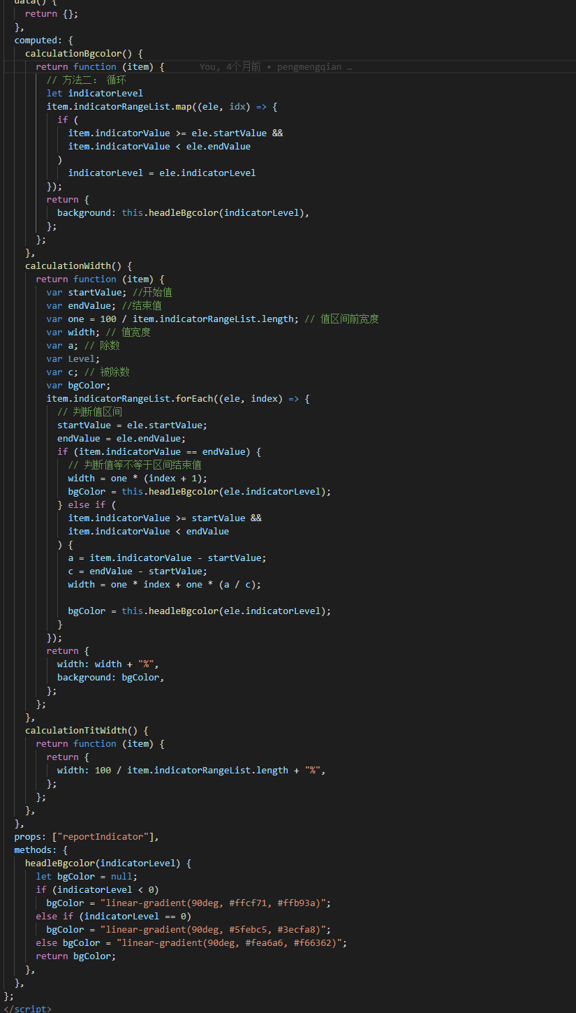
script:
获取接口的方法涉及机密在这里就不发出来了。。
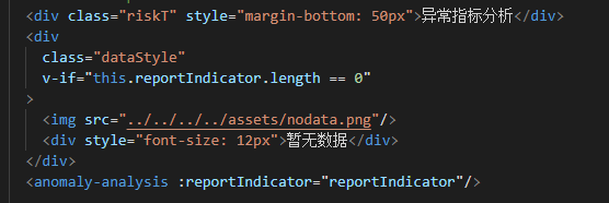
子页面html:
script:
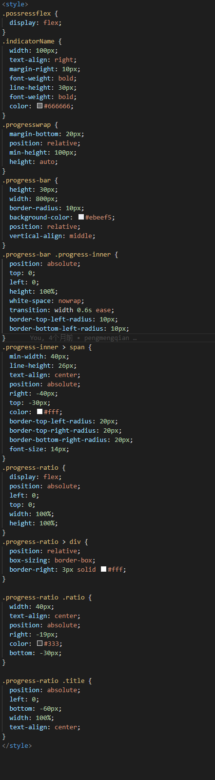
css:
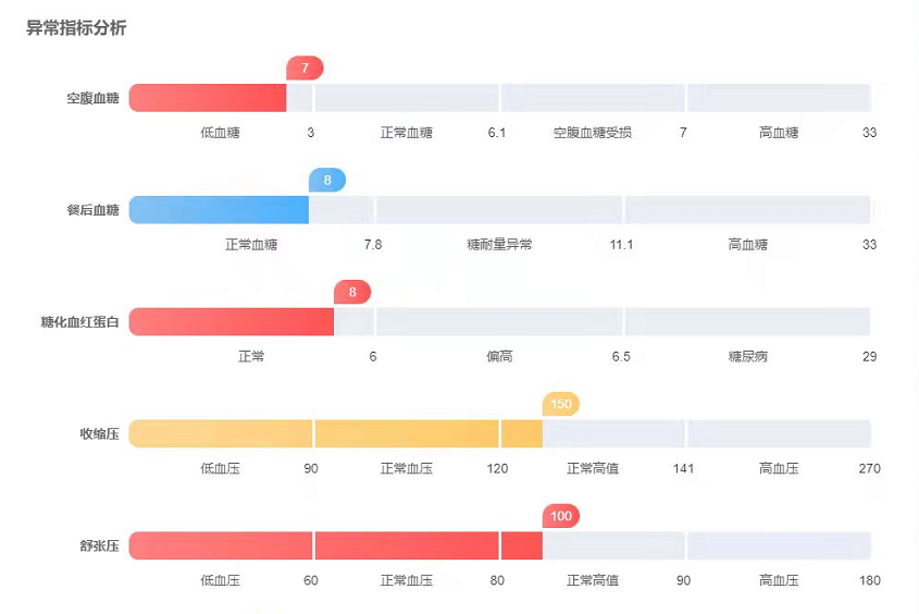
最终实现的效果如下:
最最最后,附上代码(子页面):
<template>
  <div>
    <el-row :gutter="10">
      <el-col :span="24" v-for="(item, i) in reportIndicator" :key="i + 'i'">
        <div class="possressflex">
          <div class="indicatorName">{{ item.indicatorName }}</div>
          <div class="progresswrap">
            <div class="progress-bar">
              <div class="progress-inner" :style="calculationWidth(item)">
                <span :style="calculationBgcolor(item)">{{
                  item.indicatorValue
                }}</span>
              </div>

              <div class="progress-ratio">
                <div
                  v-for="(ratio, index) in item.indicatorRangeList"
                  :key="index + 'i'"
                  :style="calculationTitWidth(item)"
                >
                  <div class="ratio">{{ ratio.endValue }}</div>
                  <div class="title">{{ ratio.description }}</div>
                </div>
              </div>
            </div>
          </div>
        </div>
      </el-col>
    </el-row>
  </div>
</template>
<script>
export default {
  data() {
    return {};
  },
  computed: {
    calculationBgcolor() {
      return function (item) {
        // 方法二: 循环
        let indicatorLevel
        item.indicatorRangeList.map((ele, idx) => {
          if (
            item.indicatorValue >= ele.startValue &&
            item.indicatorValue < ele.endValue
          )
            indicatorLevel = ele.indicatorLevel
        });
        return {
          background: this.headleBgcolor(indicatorLevel),
        };
      };
    },
    calculationWidth() {
      return function (item) {
        var startValue; //开始值
        var endValue; //结束值
        var one = 100 / item.indicatorRangeList.length; // 值区间前宽度
        var width; // 值宽度
        var a; // 除数
        var Level;
        var c; // 被除数
        var bgColor;
        item.indicatorRangeList.forEach((ele, index) => {
          // 判断值区间
          startValue = ele.startValue;
          endValue = ele.endValue;
          if (item.indicatorValue == endValue) {
            // 判断值等不等于区间结束值
            width = one * (index + 1);
            bgColor = this.headleBgcolor(ele.indicatorLevel);
          } else if (
            item.indicatorValue >= startValue &&
            item.indicatorValue < endValue
          ) {
            a = item.indicatorValue - startValue;
            c = endValue - startValue;
            width = one * index + one * (a / c);

            bgColor = this.headleBgcolor(ele.indicatorLevel);
          }
        });
        return {
          width: width + "%",
          background: bgColor,
        };
      };
    },
    calculationTitWidth() {
      return function (item) {
        return {
          width: 100 / item.indicatorRangeList.length + "%",
        };
      };
    },
  },
  props: ["reportIndicator"],
  methods: {
    headleBgcolor(indicatorLevel) {
      let bgColor = null;
      if (indicatorLevel < 0)
        bgColor = "linear-gradient(90deg, #ffcf71, #ffb93a)";
      else if (indicatorLevel == 0)
        bgColor = "linear-gradient(90deg, #5febc5, #3ecfa8)";
      else bgColor = "linear-gradient(90deg, #fea6a6, #f66362)";
      return bgColor;
    },
  },
};
</script>
<style>
.possressflex {
  display: flex;
}
.indicatorName {
  width: 100px;
  text-align: right;
  margin-right: 10px;
  font-weight: bold;
  line-height: 30px;
  font-weight: bold;
  color: #666666;
}
.progresswrap {
  margin-bottom: 20px;
  position: relative;
  min-height: 100px;
  height: auto;
}
.progress-bar {
  height: 30px;
  width: 800px;
  border-radius: 10px;
  background-color: #ebeef5;
  position: relative;
  vertical-align: middle;
}
.progress-bar .progress-inner {
  position: absolute;
  top: 0;
  left: 0;
  height: 100%;
  white-space: nowrap;
  transition: width 0.6s ease;
  border-top-left-radius: 10px;
  border-bottom-left-radius: 10px;
}
.progress-inner > span {
  min-width: 40px;
  line-height: 26px;
  text-align: center;
  position: absolute;
  right: -40px;
  top: -30px;
  color: #fff;
  border-top-left-radius: 20px;
  border-top-right-radius: 20px;
  border-bottom-right-radius: 20px;
  font-size: 14px;
}
.progress-ratio {
  display: flex;
  position: absolute;
  left: 0;
  top: 0;
  width: 100%;
  height: 100%;
}
.progress-ratio > div {
  position: relative;
  box-sizing: border-box;
  border-right: 3px solid #fff;
}

.progress-ratio .ratio {
  width: 40px;
  text-align: center;
  position: absolute;
  right: -19px;
  color: #333;
  bottom: -30px;
}

.progress-ratio .title {
  position: absolute;
  left: 0;
  bottom: -60px;
  width: 100%;
  text-align: center;
}
</style>


 浙公网安备 33010602011771号