
CSS3怎么给背景图片添加动态变色效果
本文给大家介绍一种创建炫酷背景图像方法,带大家了解一下如何利用CSS3创建变色背景图像动画,让你的网页更吸引人!
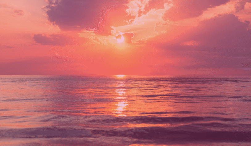
我们先来看看效果图
下面我们来研究一下是怎么实现这个效果的:
首先我们不创建标签,直接在body标签上设置背景图片
body {
  background-image: url("001.jpg");
  background-size: cover;
  background-repeat: no-repeat;
  background-attachment: fixed;
  background-position: center;
}
此时这个还是静态效果,怎么实现不断变色的动态效果?我们可以利用@keyframes和animation属性来实现--添加动画效果:
利用animation属性设置动画名称、播放时间、播放次数等:
body {
  background-image: url("001.jpg");
  background-size: cover;
  background-repeat: no-repeat;
  background-attachment: fixed;
  background-position: center;
  animation-name: background-overlay-animation;
  animation-duration: 5s;
  animation-iteration-count: infinite;
  animation-direction: alternate;
  animation-timing-function: linear;
}
animation-name:指定要绑定到选择器的关键帧的名称
animation-duration:动画指定需要多少秒或毫秒完成
animation-timing-function:设置动画将如何完成一个周期
animation-delay:设置动画在启动前的延迟间隔。
animation-iteration-count:定义动画的播放次数。
animation-direction:指定是否应该轮流反向播放动画。
animation-fill-mode:规定当动画不播放时(当动画完成时,或当动画有一个延迟未开始播放时),要应用到元素的样式。
animation-play-state:指定动画是否正在运行或已暂停。
利用@keyframes定义每一帧动画:
@keyframes background-overlay-animation {
  0%   {
      background-image:
        linear-gradient(4deg, rgba(255,78,36,0.3) 50%, rgba(255,78,36,0.3) 100%),
        url("001.jpg");
  }
  25%  {
      background-image:
         linear-gradient(4deg, rgba(213,49,127,0.3) 50%, rgba(213,49,127,0.3) 100%),
         url("001.jpg");
  }
  50%  {
    background-image:
       linear-gradient(4deg, rgba(36,182,255,0.3) 50%, rgba(36,182,255,1) 100%),
     url("001.jpg");
  }

  100% {
    background-image:
        linear-gradient(4deg, rgba(0,255,254,0.3) 50%, rgba(0,255,254,0.3) 100%),
        url("001.jpg");
  }
}
下面给出完整代码:
<!DOCTYPE html>
<html>
<head>
<meta charset="utf-8">
<style>
body{
  background-image: url("001.jpg");
  background-size: cover;
  background-repeat: no-repeat;
  background-attachment: fixed;
  background-position: center;
  animation-name: background-overlay-animation;
  animation-duration: 5s;
  animation-iteration-count: infinite;
  animation-direction: alternate;
  animation-timing-function: linear;
}
@keyframes background-overlay-animation {
  0%   {
      background-image:
        linear-gradient(4deg, rgba(255,78,36,0.3) 50%, rgba(255,78,36,0.3) 100%),
        url("001.jpg");
  }
  25%  {
      background-image:
         linear-gradient(4deg, rgba(213,49,127,0.3) 50%, rgba(213,49,127,0.3) 100%),
         url("001.jpg");
  }
  50%  {
    background-image:
       linear-gradient(4deg, rgba(36,182,255,0.3) 50%, rgba(36,182,255,1) 100%),
     url("001.jpg");
  }

  100% {
    background-image:
        linear-gradient(4deg, rgba(0,255,254,0.3) 50%, rgba(0,255,254,0.3) 100%),
        url("001.jpg");
  }
}
</style>
</head>
<body>
<!--   你的内容放在这里 -->
</body>
</html>
以上就是CSS3怎么给背景图片添加动态变色效果的详细内容。(拼多多培训)


 浙公网安备 33010602011771号