前端 --- CSS3
0. 简介
0.1 官方地址
https://www.w3.org/Style/CSS/curent-work.html
0. 2 新特性
- 新增了更加使用的选择器,如: 动态伪类选择器、目标伪类选择器、伪元素选择器等等
- 新增了更好的视觉效果,如: 圆角、阴影、渐变等
- 新增了丰富的背景效果,如: 支持多个背景图片,同时新增了若干个背景相关的属性
- 新增了全新的布局方案,弹性盒子
- 新增了Web字体,可以显示用户电脑上没有安装的字体
- 增强了颜色,如: HSL、HSLA、RGBA几种新的颜色模式,新增 opacity 属性来控制透明度
- 增加了2D和3D变换,如: 旋转、扭曲、缩放、位移等
- 增加动画与过度效果,让效果的变换更具流线型、平滑性
- .....
0.3 私有前缀
如下代码中的 -webkit- 就是私有前缀
div {
    width: 400px;
    height: 400px;
    -webkit-border-radius: 20px;
}
为什么要有私有前缀
W3C 标准提出的某个 CSS 特性,在被浏览器正式支持之前,浏览器厂商会根据浏览器的内核,使用私有前缀来测试该 CSS 特性,在浏览器正式支持该 CSS 特性后,就不需要私有前缀了
常见的浏览器私有前缀
- Chrome 浏览器:
-webkit- - Safari 浏览器:
-webkit- - Firefox 浏览器:
-moz- - Edge 浏览器:
-webkit- - 旧 Opera 浏览器:
-o- - 旧 IE 浏览器 -ms-
0.4 查看 CSS3 兼容性的官方网站
https://caniuse.com
1. 新增长度单位
1.1 vw
vw指的是整个视口宽度的百分比,并根据视口的不断变小而自动调整,常用在移动端
div {
    width: 50vw;
    height: 20vw;
    background-color: green;
}
1.2 vh
vh指的是整个视口高度的百分比,并根据视口的不断变小而自动调整,常用在移动端
div {
    width: 50vh;
    height: 20vh;
    background-color: green;
}
1.3 vmax
视口宽高中,哪个大就是哪个的百分比,并根据视口的不断变小而自动调整,不常用
div {
    width: 20vmax;
    height: 20vmax;
    background-color: green;
}
1.4 vmin
视口宽高中,哪个小就是哪个的百分比,并根据视口的不断变小而自动调整,不常用
div {
    width: 20vmin;
    height: 20vmin;
    background-color: green;
}
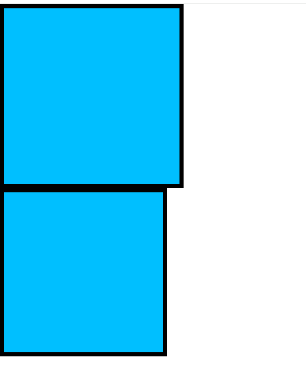
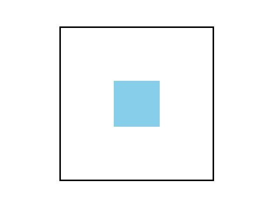
2. 新增盒子模型属性
2.1 盒模型分类
效果图
代码示例
<!DOCTYPE html>
<html lang="en">
<head>
    <meta charset="UTF-8">
    <title>Title</title>
    <!-- 让IE浏览器处于最优渲染模式 -->
    <meta http-equiv="X-UA-Compatible" content="IE=edge">
    <!-- 针对国产的"双核"浏览器的设置,让浏览器优先使用webkit内核渲染网页 -->
    <meta name="render" content="webkit">

    <style>
        *{
            margin: 0;
            padding: 0;
        }
        .box1 {
            width: 200px;
            height: 200px;
            background-color: deepskyblue;
            padding: 5px;
            border: 5px solid black;
            box-sizing: content-box; /* content-box(标准盒模型,总宽高为200px+padding+border),此为默认值*/
        }
        .box2 {
            width: 200px;
            height: 200px;
            background-color: deepskyblue;
            padding: 5px;
            border: 5px solid black;
            box-sizing: border-box; /* border-box(怪异(IE)盒模型,总宽高为200px,内容区为200px-padding5px*2-border5px*2) */
        }
    </style>
</head>
<body>
<div class="box1"></div>
<div class="box2"></div>
</body>
</html>
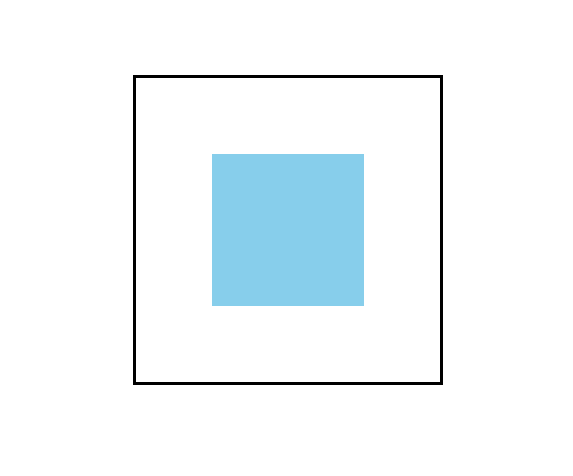
2.2 大小调整
效果图
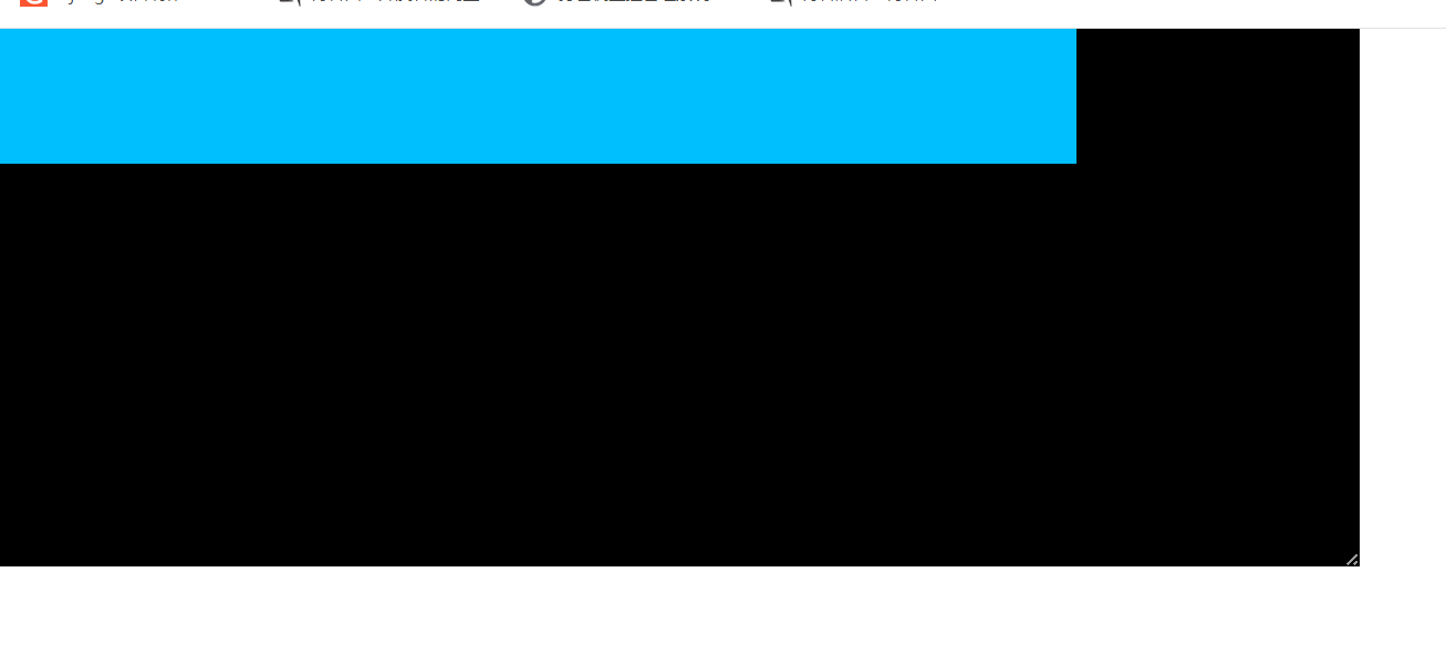
调整宽度后的效果图
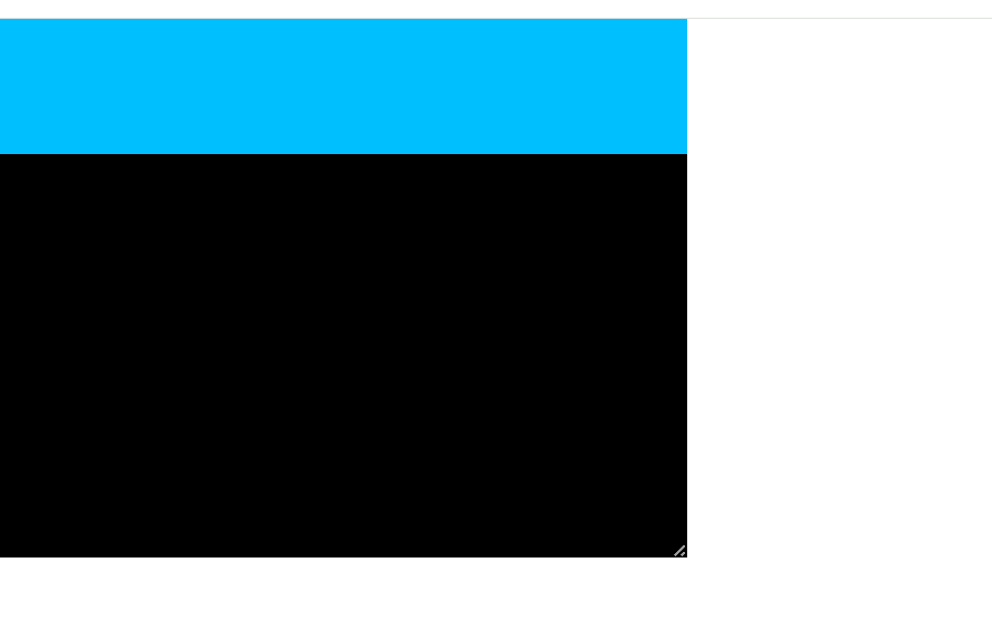
即是有超出的可能性的,所以必须提前设置overflow属性
代码实现
<style>
    *{
        margin: 0;
        padding: 0;
    }
    .box1 {
        width: 400px;
        height: 400px;
        background-color: black;
        overflow: hidden;/* 想调整盒子大小,前提必须有overflow属性,值无所谓 */
        resize: horizontal;
    }
    .box2{
        width: 800px;
        height: 100px;
        background-color: deepskyblue;
    }

</style>


<div class="box1">
    <div class="box2"></div>
</div>
resize 值表
| 值名 | 标识 | 描述 |
|---|---|---|
| resize:initial | 默认值 | 不调整 |
| resize: horizontal | 水平方向调整大小 | |
| resize: vertical | 垂直方向调整大小 | |
| resize: both | 水平和垂直方向都可以调整大小 |
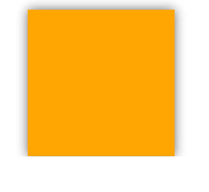
2.3 阴影
效果图
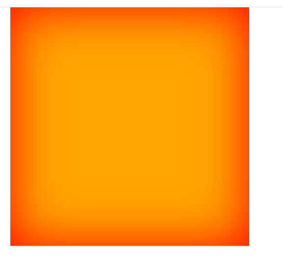
代码示例
.box1 {
    width: 400px;
    height: 400px;
    background-color: orange;
    margin: 0 auto;
    /* 阴影在水平方向距原位置的距离;阴影在垂直方向距原位置的距离;阴影颜色  */
    /*box-shadow: 100px 100px blue;*/

    /* 阴影在水平方向距原位置的距离;阴影在垂直方向距原位置的距离;阴影的模糊程度 */
    /*box-shadow: 100px 100px 500px;*/

    /* 阴影在水平方向距原位置的距离;阴影在垂直方向距原位置的距离;阴影的模糊程度;阴影颜色 --- 常用 */
    /*box-shadow: 100px 100px 500px blue;*/

    /* 阴影在水平方向距原位置的距离;阴影在垂直方向距原位置的距离;阴影的模糊程度;阴影外沿;阴影颜色 */
    /*box-shadow: 100px 100px 500px -20px blue;*/

    /* 阴影在水平方向距原位置的距离;阴影在垂直方向距原位置的距离;阴影的模糊程度;阴影外沿;阴影颜色;阴影在盒子里面,默认在外面 */
    box-shadow: 0 0 80px 0 red inset;

}

<div class="box1"></div>
应用场景
鼠标悬浮时,出现阴影,并且盒子往出动
效果图
代码实现
<!DOCTYPE html>
<html lang="en">
<head>
    <meta charset="UTF-8">
    <title>Title</title>
    <!-- 让IE浏览器处于最优渲染模式 -->
    <meta http-equiv="X-UA-Compatible" content="IE=edge">
    <!-- 针对国产的"双核"浏览器的设置,让浏览器优先使用webkit内核渲染网页 -->
    <meta name="render" content="webkit">

    <style>
        * {
            margin: 0;
            padding: 0;
        }
        .warpper{
            overflow: hidden;
        }
        .box1 {
            width: 400px;
            height: 400px;
            background-color: orange;
            margin: 0 auto;
            margin-top: 50px;
            position: relative;
            top: 0;
            left: 0;
            transition: 0.35s linear all;
        }

        .box1:hover{
            box-shadow: 0 0 30px #666;
            top: -3px;
            left: 0;
        }

    </style>
</head>
<body>
<div class="warpper">
    <div class="box1"></div>
</div>
</body>
</html>
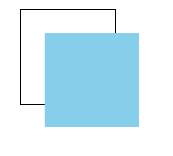
2.4 透明度
效果图
代码示例
.box1 {
    width: 200px;
    height: 200px;
    opacity: 0.5;  /* 透明度范围为: 0-1之间 */
}
应用场景
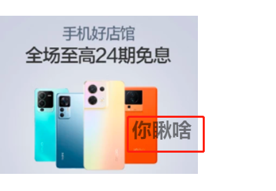
<style>
    * {
        margin: 0;
        padding: 0;
    }
    .warpper{
        overflow: hidden;
    }
    .box1 {
        margin-top: 200px;
        position: absolute;
    }
    h2{
        position: absolute;
        top: 120px;
        left: 160px;
        opacity: 0.5;
    }
</style>

<div class="warpper">
    <div class="box1">
        <img src="./banner3.png" alt="">
        <h2>你瞅啥</h2>
    </div>
</div>
3. 新增背景属性
3.1 显示原点
1. padding-box (默认值)
效果图
<style>
* {
    margin: 0;
    padding: 0;
}
.warpper{
    overflow: hidden;
}

.box1{
    width: 400px;
    height: 400px;
    padding: 50px;
    border: 50px dashed rgba(255,0,0,0.4);
    margin-top: 200px;
    margin-left: 200px;
    background-image: url("banner3.png");
    background-origin: padding-box;  /* 以padding的左上角为起点开始铺背景图片,此为默认值 */
    background-repeat: no-repeat;
}
</style>


<div class="warpper">
    <div class="box1">
    </div>
</div>
2. content-box
效果图
代码示例
<style>
    * {
        margin: 0;
        padding: 0;
    }
    .warpper{
        overflow: hidden;
    }

    .box1{
        width: 400px;
        height: 400px;
        padding: 50px;
        border: 50px dashed rgba(255,0,0,0.4);
        margin-top: 200px;
        margin-left: 200px;
        background-image: url("banner3.png");
        background-origin: content-box;  /* 以content的左上角为起点开始铺背景图片,此为默认值 */
        background-repeat: no-repeat;
    }
</style>


<div class="warpper">
    <div class="box1">
    </div>
</div>
3. border-box
效果图
代码示例
<style>
    * {
        margin: 0;
        padding: 0;
    }
    .warpper{
        overflow: hidden;
    }

    .box1{
        width: 400px;
        height: 400px;
        padding: 50px;
        border: 50px dashed rgba(255,0,0,0.4);
        margin-top: 200px;
        margin-left: 200px;
        background-image: url("banner3.png");
        background-origin: border-box;  /* 以border的左上角为起点开始铺背景图片,此为默认值 */
        background-repeat: no-repeat;
    }
</style>


<div class="warpper">
    <div class="box1">
    </div>
</div>
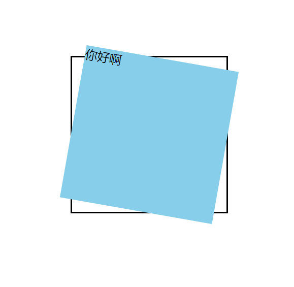
3.2 裁剪
1. border-box (默认值)
效果图
背景是超出border区域的,border-box对于超出border的部分裁剪掉了
代码示例
<style>
    * {
        margin: 0;
        padding: 0;
    }
    .warpper{
        overflow: hidden;
    }

    .box1{
            width: 120px;
            height: 120px;
            padding: 20px;
            border: 20px dashed rgba(255,0,0,0.4);
            margin-top: 200px;
            margin-left: 200px;
            background-image: url("banner3.png");
            background-repeat: no-repeat;
            background-clip: border-box;  /* 裁剪掉超出border的区域 */
    }
</style>


<div class="warpper">
    <div class="box1">
    </div>
</div>
2. padding-box
背景是超出padding区域的,padding-box对于超出padding的部分裁剪掉了
效果图

<style>
* {
    margin: 0;
    padding: 0;
}
.warpper{
    overflow: hidden;
}

.box1{
    width: 120px;
    height: 120px;
    padding: 20px;
    border: 20px dashed rgba(255,0,0,0.4);
    margin-top: 200px;
    margin-left: 200px;
    background-image: url("banner3.png");
    background-repeat: no-repeat;
    background-clip: padding-box;/* 裁剪掉超出padding的区域 */
}
</style>


<div class="warpper">
    <div class="box1">
    </div>
</div>
3. content-box
背景是超出content区域的,content-box对于超出content的部分裁剪掉了
效果图
代码示例
<style>
    * {
        margin: 0;
        padding: 0;
    }
    .warpper{
        overflow: hidden;
    }

	.box1{
        width: 120px;
        height: 120px;
        padding: 20px;
        border: 20px dashed rgba(255,0,0,0.4);
        margin-top: 200px;
        margin-left: 200px;
        background-image: url("banner3.png");
        background-repeat: no-repeat;
        background-clip: content-box;
    }
</style>


<div class="warpper">
    <div class="box1">
    </div>
</div>
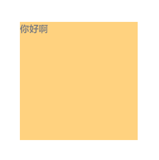
4. text
只在有文字的地方呈现背景
效果图
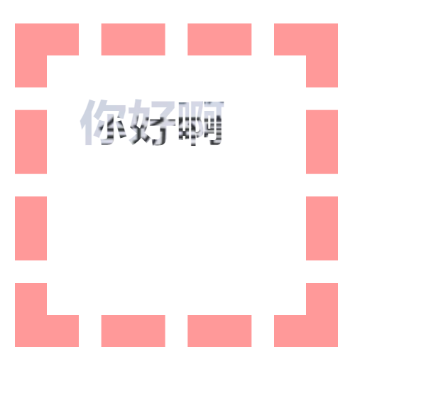
代码示例
<style>
    * {
        margin: 0;
        padding: 0;
    }
    .warpper{
        overflow: hidden;
    }

    .box1{
        width: 120px;
        height: 120px;
        padding: 20px;
        border: 20px dashed rgba(255,0,0,0.4);
        margin-top: 200px;
        margin-left: 200px;
        font-weight: bold;
        font-size: 30px;
        color: transparent;  /* 前提文字必须为透明的 */
        background-image: url("banner3.png");
        background-repeat: no-repeat;
        -webkit-background-clip: text; /* 使用前缀 -webkit- */
    }
</style>


<div class="warpper">
    <div class="box1">
        你好啊
    </div>
</div>
3.3 大小
1. 自定义宽高
如果是正方形的图片,其实效果还不错
效果图
代码示例
<style>
    * {
        margin: 0;
        padding: 0;
    }
    .warpper{
        overflow: hidden;
    }

    .box1{
        width: 80px;
        height: 80px;
        border: 1px solid rgba(255,0,0,0.4);
        margin-top: 200px;
        margin-left: 200px;
        background-image: url("banner3.png");
        background-repeat: no-repeat;
        /* 可以通过 px 或 百分比 设置图片大小,但是整张图片会压缩,走形 */
        background-size: 100px 100px;
        /*background-size: 100% 100%;*/
    }
</style>


<div class="warpper">
    <div class="box1">
    </div>
</div>
2. 等比例缩放,有留白
效果图
代码示例
<style>
    * {
        margin: 0;
        padding: 0;
    }
    .warpper{
        overflow: hidden;
    }

    .box1{
        width: 100px;
        height: 100px;
        border: 1px solid rgba(255,0,0,0.4);
        margin-top: 200px;
        margin-left: 200px;
        background-image: url("banner3.png");
        background-repeat: no-repeat;
        background-size: contain;  /* 等比例缩放,先从左上角开始对齐,宽大于高,底部留白,高大于宽,右侧留白 */
    }
</style>


<div class="warpper">
    <div class="box1">
    </div>
</div>
3. 等比例缩放,无留白 (相对最好的解决方案)
效果图
代码示例
<style>
    * {
        margin: 0;
        padding: 0;
    }
    .warpper{
        overflow: hidden;
    }

    .box1{
        width: 100px;
        height: 100px;
        border: 1px solid rgba(255,0,0,0.4);
        margin-top: 200px;
        margin-left: 200px;
        background-image: url("banner3.png");
        background-repeat: no-repeat;
        background-size: cover; /* 等比例缩放,从左上角开始对齐,一旦完整填充整个div,则裁剪多余的部分,不会有留白 */
    }
</style>


<div class="warpper">
    <div class="box1">
    </div>
</div>
4. 完美解决方案
找UI设计师,设置和盒子宽高一样的图片
3.4 复合属性
<style>
    * {
        margin: 0;
        padding: 0;
    }
    .warpper{
        overflow: hidden;
    }

    .box1{
        width: 100px;
        height: 100px;
        padding: 20px;
        border: 20px dashed rgba(255,0,0,0.4);
        margin-top: 200px;
        margin-left: 200px;
        /* 背景颜色;背景url;是否重复;位置/大小;背景显示原点;裁剪方式 */
        background: skyblue url("banner3.png") no-repeat 10px 10px/180px 180px border-box content-box;
    }
</style>


<div class="warpper">
    <div class="box1">
    </div>
</div>
注意
- 如果 origin 和 clip的值一样,可以只写一个值来表示两个都设置
- size 必须写在 position 后面,并且以 / 分开
3.5 多背景图
效果图
代码示例
<style>
    * {
        margin: 0;
        padding: 0;
    }
    .warpper{
        overflow: hidden;
    }

    .box1{
        width: 400px;
        height: 400px;
        margin: 200px auto;
        border: 1px solid rgba(41,94,160);
        background:  url("./bg-lt.png") no-repeat left top,  /* 左上角图片,left top 用来控制图片位置在左上角 */
            		url("bg-rt.png") no-repeat right top,   /* 右上角图片,right top 用来控制图片位置在右上角 */
            		url("bg-lb.png") no-repeat left bottom, /* 左下角图片,left bottom 用来控制图片位置在左下角 */
            		url("bg-rb.png") no-repeat right bottom;/* 右下角图片,right bottom 用来控制图片位置在右下角 */
    }
</style>


<div class="warpper">
    <div class="box1">
    </div>
</div>
4. 新增边框属性
4.1 圆角
1. 统一设置
效果图
代码示例
<style>
    * {
        margin: 0;
        padding: 0;
    }
    .warpper{
        overflow: hidden;
    }

    .box1{
        width: 400px;
        height: 400px;
        margin: 200px auto;
        background-color: orange;
        border: 2px solid rgba(41,94,160);
        border-radius: 50%; /* 从四个边的50%的位置开启变圆 */
        box-shadow: 0 0 80px 0 red inset;
    }
</style>


<div class="warpper">
    <div class="box1">
    </div>
</div>
2. 分别设置
效果图
代码示例
<style>
    * {
        margin: 0;
        padding: 0;
    }
    .warpper{
        overflow: hidden;
    }

    .box1{
        width: 400px;
        height: 400px;
        margin: 200px auto;
        background-color: orange;
        border: 2px solid rgba(41,94,160);
        border-top-left-radius: 50%;        /* 左上角变圆 */
        border-top-right-radius: 50%;       /* 右上角变圆 */
        border-bottom-left-radius: 50%;     /* 左下角变圆 */
        border-bottom-right-radius: 50%;    /* 右下角变圆 */
        box-shadow: 0 0 80px 0 red inset;
    }
</style>


<div class="warpper">
    <div class="box1">
    </div>
</div>
3. 椭圆
效果图
代码示例
<style>
    * {
        margin: 0;
        padding: 0;
    }

    .warpper {
        overflow: hidden;
    }

    .box1 {
        width: 400px;
        height: 400px;
        margin: 200px auto;
        background-color: orange;
        border: 2px solid rgba(41, 94, 160);
        border-top-left-radius: 200px 50px; /* 左上角变椭圆 */
        border-top-right-radius: 200px 50px; /* 右上角变椭圆 */
        border-bottom-left-radius: 200px 50px; /* 左下角变椭圆 */
        border-bottom-right-radius: 200px 50px; /* 右下角变椭圆 */
        box-shadow: 0 0 80px 0 red inset;
    }
</style>


<div class="warpper">
    <div class="box1">
    </div>
</div>
4. 复合属性
<style>
    * {
        margin: 0;
        padding: 0;
    }

    .warpper {
        overflow: hidden;
    }

    .box1 {
        width: 400px;
        height: 400px;
        margin: 200px auto;
        background-color: orange;
        border: 2px solid rgba(41, 94, 160);
        box-shadow: 0 0 80px 0 red inset;
        /* 左上角的x方向;右上角的x方向;右下角的x方向;左下角的x方向 / 左上角的y方向;右上角的y方向;右下角的y方向;左下角的y方向 */
        border-radius: 200px 200px 200px 200px / 50px 50px 50px 50px;
    }
</style>


<div class="warpper">
    <div class="box1">
    </div>
</div>
4.2 外轮廓
效果图
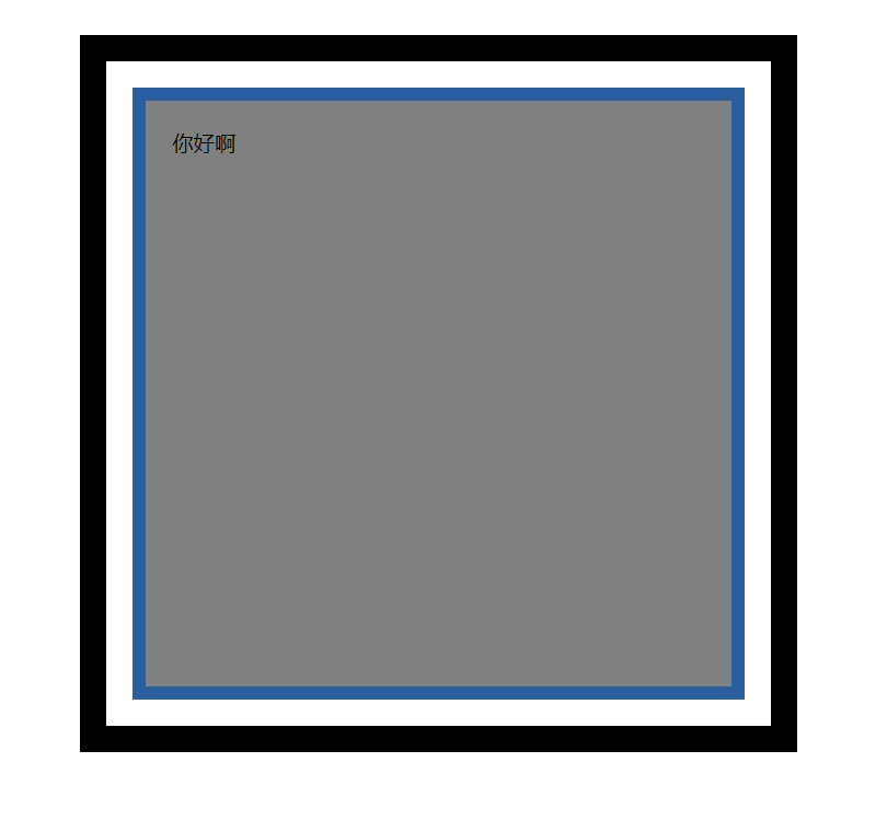
代码示例
<style>
    * {
        margin: 0;
        padding: 0;
    }

    .warpper {
        overflow: hidden;
    }

    .box1 {
        width: 400px;
        height: 400px;
        margin: 200px auto;
        background-color: gray;
        padding: 20px;
        border: 10px solid rgba(41, 94, 160);

        /* 外轮廓不参与盒子大小的计算,且不占位置 */
        /*outline-width: 20px;*/
        /*outline-color: black;*/
        /*outline-style: solid;*/
        /*outline-offset: 20px; !* 外轮廓距边框的位置 *!*/

        /* 复合属性写法 */
        outline: 20px solid black;
        outline-offset: 20px; /* 外轮廓距边框的位置 */
    }
</style>


<div class="warpper">
    <div class="box1">
        你好啊
    </div>
</div>
>
轮廓风格可选值
| 值名 | 描述 |
|---|---|
| none | 无轮廓 |
| dotted | 点状轮廓 |
| dashed | 虚线轮廓 |
| solid | 实现轮廓 |
| double | 双实线轮廓 |
5. 新增文本属性
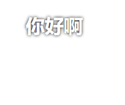
5.1 阴影
效果图
代码示例
<style>
    h1 {
        text-align: center;
        color: white; /* 白色文字,白色背景,默认是看不到文字的,可以使用阴影来凸显文字 */

        /* 水平偏移量;垂直偏移量;模糊度;颜色 */
        text-shadow: 0 0 5px black;
    }
</style>


<h1>你好啊</h1>
效果图

代码示例
<style>
    body{
        background-color: black;
    }
    h1 {
        text-align: center;
        color: white; /* 白色文字,白色背景,默认是看不到文字的,可以使用阴影来凸显文字 */
        /* 水平偏移量;垂直偏移量;模糊度;颜色 */
        text-shadow: 0 0 30px red;
    }
</style>


<h1>欢迎光临红浪漫</h1>
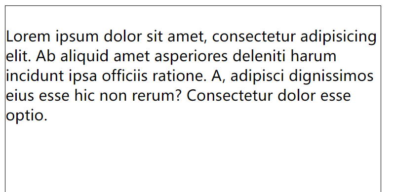
5.2 换行
效果图
代码示例
<style>
    div{
        width: 400px;
        height: 400px;
        border: 1px solid black;
        white-space: nowrap;
    }
</style>


<div>
    Lorem ipsum dolor sit amet, consectetur adipisicing elit. Ab aliquid amet asperiores deleniti harum incidunt ipsa officiis ratione. A, adipisci dignissimos eius esse hic non rerum? Consectetur dolor esse optio.
</div>
可选值表
| 值名 | 描述 |
|---|---|
| white-space: pre | 按原文显示 |
| white-space: pre-wrap | 按原文显示,超出盒子部分自动换行 |
| white-space: pre-line | 按原文显示,超出盒子部分自动换行,并删除每行始末的空格,保留文字中间的空格 |
| white-space: nowrap | 强制全部不换行 |
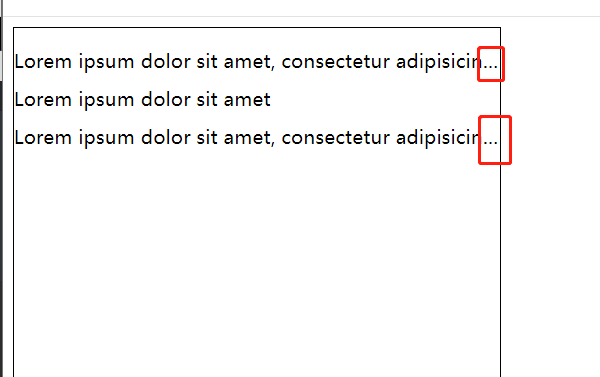
5.3 溢出
效果图
代码示例
<style>
    div {
        width: 400px;
        height: 400px;
        border: 1px solid black;
        white-space: nowrap;
        text-overflow: clip;
    }

    ul {
        list-style: none;
        padding-left: 0;
    }

    li {
        margin-bottom: 10px;
        white-space: nowrap; 	/* 步骤1. 强制不换行 */
        overflow: hidden; 		/* 步骤2. 设置overflow属性 */
        text-overflow: ellipsis; /* 步骤3. 超出部分以...代替 */
    }
</style>


<div>
    <ul>
        <li>
            Lorem ipsum dolor sit amet, consectetur adipisicing elit.onsectetur dolor esse optio.
        </li>
        <li> Lorem ipsum dolor sit amet</li>
        <li> Lorem ipsum dolor sit amet, consectetur adipisicing e</li>
        <li></li>
    </ul>
</div>
可选值表
| 值名 | 描述 | 标识 |
|---|---|---|
| text-overflow: clip | 超出部分裁剪 | |
| text-overflow: ellipsis | 超出部分以...代替 | 常用 |
5.4 修饰
效果图
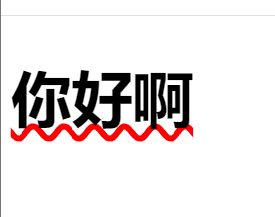
代码示例
<style>
    h1{
        font-size: 50px;
        /*text-decoration-line: underline;*/
        /*text-decoration-style: dashed;*/
        /*text-decoration-color: red;*/

        /* 复合属性写法 */
        text-decoration: underline wavy red;
    }
</style>

<div>
    <h1>你好啊</h1>
</div>
5.5 描边
只有 webkit 内核的浏览器可以使用
效果图
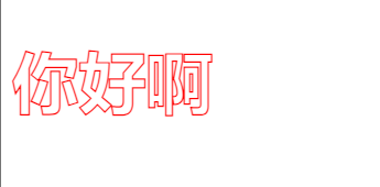
代码示例
<style>
    h1 {
        font-size: 50px;
        color: transparent;
        -webkit-text-stroke-width: 1px;
        -webkit-text-stroke-color: red;

        /* 复合属性写法 */
        -webkit-text-stroke: 1px orange;
    }
</style>

<div>
    <h1>你好啊</h1>
</div>
6. 新增渐变
6.1 线性渐变
效果图
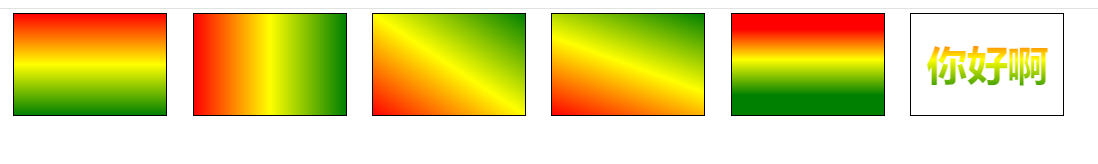
代码示例
<style>
    .box{
        width: 300px;
        height: 200px;
        border: 1px solid black;
        float: left;
        margin-left: 50px;
    }
    .box1{
        /* 默认从上到下,可以写多个颜色的渐变效果 */
        background-image: linear-gradient(red,yellow,green);
    }
    .box2{
        /* 从左到右,可以写多个颜色的渐变效果 */
        background-image: linear-gradient(to right,red,yellow,green);
    }
    .box3{
        /* 从左下角到右上角,可以写多个颜色的渐变效果 */
        background-image: linear-gradient(to right top,red,yellow,green);
    }
    .box4{
        /* 默认从上到下,20deg为根据原位置对角线顺时针旋转20度,可以写多个颜色的渐变效果 */
        background-image: linear-gradient(20deg,red,yellow,green);
    }
    .box5{
        /* 50px高度时必须为纯红色,100px高度时必须为纯黄色,50-100之间为黄色渐变红,150px高度时必须为纯绿色,100-150为黄色渐变绿,150以后为纯绿 */
        background-image: linear-gradient(red 30px,yellow 90px,green 160px);
    }

    .box6{
        text-align: center;
        line-height: 200px;
        font-size: 80px;
        font-weight: bold;
        color: transparent;
        -webkit-background-clip: text;
        background-image: linear-gradient(red 30px,yellow 90px,green 160px);
    }
</style>


<div class="box box1"></div>
<div class="box box2"></div>
<div class="box box3"></div>
<div class="box box4"></div>
<div class="box box5"></div>
<div class="box box6">你好啊</div>
6.2 径向渐变
效果图
代码示例
<style>
    .box{
        width: 300px;
        height: 200px;
        border: 1px solid black;
        float: left;
        margin-left: 50px;
    }
    .box1{
        /* 默认从四周到中心,可以写多个颜色的渐变效果 */
        background-image: radial-gradient(red,yellow,green);
    }
    .box2{
        width: 300px;
        height: 300px; /* 宽高一样就是正圆,不一样就是椭圆 */
        /* 默认从四周到中心,可以写多个颜色的渐变效果 */
        background-image: radial-gradient(red,yellow,green);
    }
    .box3{
        /* 调整圆心的位置,左上角,可以写多个颜色的渐变效果 */
        background-image: radial-gradient(at left top,red,yellow,green);
    }
    .box4{
        /* 调整圆心的位置,通过像素调整,可以写多个颜色的渐变效果 */
        background-image: radial-gradient(at 100px 50px,red,yellow,green);
    }
    .box5{
        /* 调整圆的x轴和y轴的半径,可以写多个颜色的渐变效果 */
        background-image: radial-gradient(100px 100px,red,yellow,green);
    }
    .box6{
        /* 调整渐变的区域,30px高度时必须为纯红色,90px高度时必须为纯黄色,50-100之间为黄色渐变红,160px高度时必须为纯绿色,90-160为黄色渐变绿,160以后为纯绿 */
        background-image: radial-gradient(red 30px,yellow 90px,green 160px);
    }

    .box7{
        text-align: center;
        line-height: 200px;
        font-size: 80px;
        font-weight: bold;
        color: transparent;
        -webkit-background-clip: text;
        /* 50px高度时必须为纯红色,100px高度时必须为纯黄色,50-100之间为黄色渐变红,150px高度时必须为纯绿色,100-150为黄色渐变绿,150以后为纯绿 */
        background-image: linear-gradient(red 30px,yellow 90px,green 160px);
    }
</style>


<div class="box box1"></div>
<div class="box box2"></div>
<div class="box box3"></div>
<div class="box box4"></div>
<div class="box box5"></div>
<div class="box box6"></div>
<div class="box box7">你好啊</div>
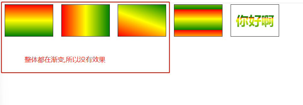
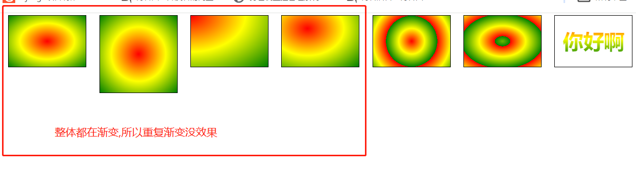
6.3 重复渐变
在没有发生渐变的区域再次发生渐变
1. 重复线性渐变
效果图
代码示例
<style>
    .box{
        width: 300px;
        height: 200px;
        border: 1px solid black;
        float: left;
        margin-left: 50px;
    }
    .box1{
        /* 默认从上到下,可以写多个颜色的渐变效果 */
        background-image: repeating-linear-gradient(red,yellow,green);
    }
    .box2{
        /* 从左到右,可以写多个颜色的渐变效果 */
        background-image: repeating-linear-gradient(to right,red,yellow,green);
    }
    .box3{
        /* 默认从上到下,20deg为根据原位置对角线顺时针旋转20度,可以写多个颜色的渐变效果 */
        background-image: repeating-linear-gradient(20deg,red,yellow,green);
    }


    /* 30px及以下为纯色,160px以后为纯色,会找到纯色的部分继续渐变 */
    .box4{
        /* 50px高度时必须为纯红色,100px高度时必须为纯黄色,50-100之间为黄色渐变红,150px高度时必须为纯绿色,100-150为黄色渐变绿,150以后为纯绿 */
        background-image: repeating-linear-gradient(red 30px,yellow 90px,green 160px);
    }

    .box5{
        text-align: center;
        line-height: 200px;
        font-size: 80px;
        font-weight: bold;
        color: transparent;
        -webkit-background-clip: text;
        background-image: repeating-linear-gradient(red 80px,yellow 90px,green 160px);
    }
</style>


<div class="box box1"></div>
<div class="box box2"></div>
<div class="box box3"></div>
<div class="box box4"></div>
<div class="box box5">你好啊</div>
2. 重复径向渐变
效果图
代码示例
<style>
    .box{
        width: 300px;
        height: 200px;
        border: 1px solid black;
        float: left;
        margin-left: 50px;
    }
    .box1{
        /* 默认从四周到中心,可以写多个颜色的渐变效果 */
        background-image: repeating-radial-gradient(red,yellow,green);
    }
    .box2{
        width: 300px;
        height: 300px; /* 宽高一样就是正圆,不一样就是椭圆 */
        /* 默认从四周到中心,可以写多个颜色的渐变效果 */
        background-image: repeating-radial-gradient(red,yellow,green);
    }
    .box3{
        /* 调整圆心的位置,左上角,可以写多个颜色的渐变效果 */
        background-image: repeating-radial-gradient(at left top,red,yellow,green);
    }
    .box4{
        /* 调整圆心的位置,通过像素调整,可以写多个颜色的渐变效果 */
        background-image: repeating-radial-gradient(at 100px 50px,red,yellow,green);
    }
    .box5{
        /* 调整圆的x轴和y轴的半径,可以写多个颜色的渐变效果 */
        background-image: repeating-radial-gradient(100px 100px,red,yellow,green);
    }
    .box6{
        /* 调整渐变的区域,30px高度时必须为纯红色,90px高度时必须为纯黄色,50-100之间为黄色渐变红,160px高度时必须为纯绿色,90-160为黄色渐变绿,160以后为纯绿 */
        background-image: repeating-radial-gradient(red 30px,yellow 90px,green 160px);
    }

    .box7{
        text-align: center;
        line-height: 200px;
        font-size: 80px;
        font-weight: bold;
        color: transparent;
        -webkit-background-clip: text;
        /* 50px高度时必须为纯红色,100px高度时必须为纯黄色,50-100之间为黄色渐变红,150px高度时必须为纯绿色,100-150为黄色渐变绿,150以后为纯绿 */
        background-image: repeating-linear-gradient(red 30px,yellow 90px,green 160px);
    }
</style>

<div class="box box1"></div>
<div class="box box2"></div>
<div class="box box3"></div>
<div class="box box4"></div>
<div class="box box5"></div>
<div class="box box6"></div>
<div class="box box7">你好啊</div>
6.4 案例
1. 横格纸
效果图
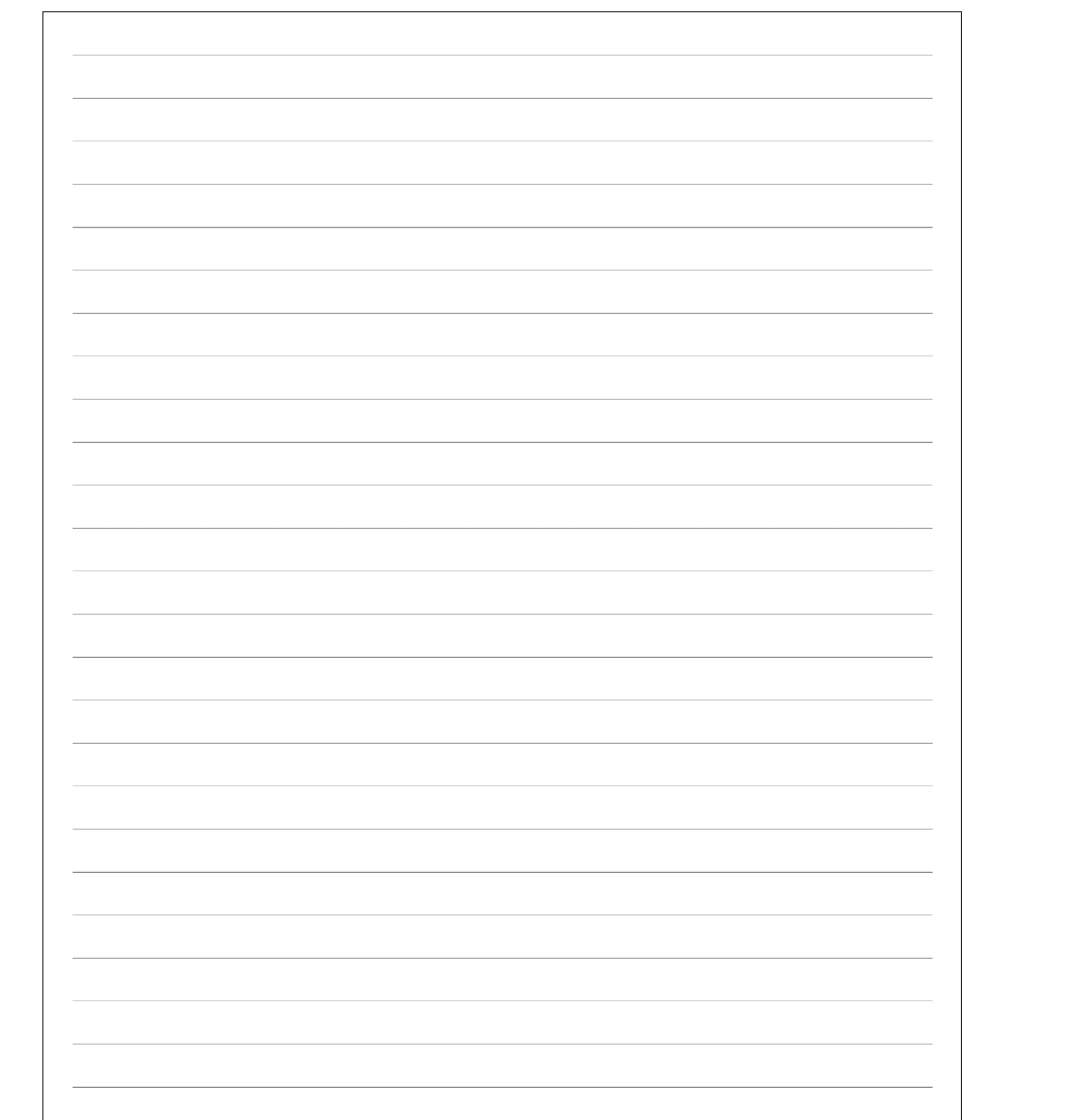
代码示例
<style>
    .box{
        width: 600px;
        height: 800px;
        padding: 20px;
        border: 1px solid black;
        float: left;
        margin-left: 50px;
        background-image: repeating-linear-gradient(transparent 0px,transparent 29px,gray 30px);
        background-clip: content-box; /* 背景默认填充padding区域 */
    }

</style>

<div class="box box1"></div>
2. 立体球型
效果图
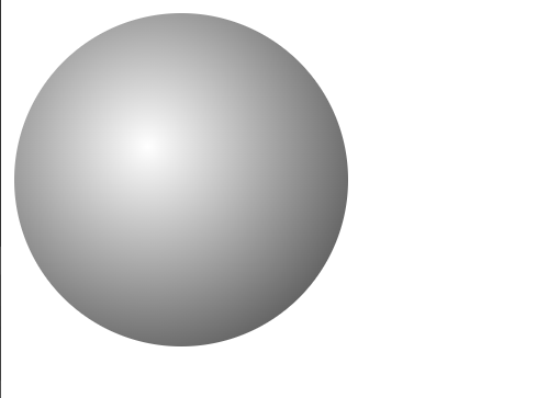
代码示例
<style>
    .box{
        width: 200px;
        height: 200px;
        border-radius: 50%;
        background-image: radial-gradient(at 80px 80px,white,#333);
    }

</style>


<div class="box box1"></div>
7. 新增web字体
7.1 web字体
1. 直接引入
<style>
@font-face {
font-family: "xx";
src: url("http://127.0.0.1:8000/方正手迹.ttf");
}
h1{
font-size: 40px;
}
</style>
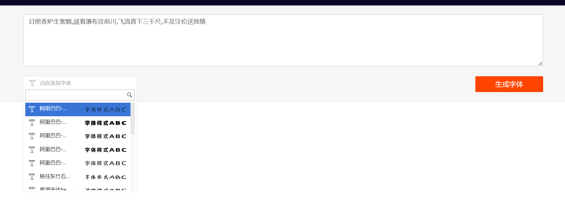
<h1>日照香炉生紫烟,遥看瀑布挂前川,飞流直下三千尺,不及汪伦送我情</h1>
缺点:
大部分字体文件都是多少MB,给网络带宽带来了极大的压力,更好的方式是提前定制字体
2. 提前定制字体 (推荐方式)
阿里web字体在线定制平台
https://www.iconfont.cn/webfont#!/webfont/index
1. 将想要的字粘贴到输入框中,生成字体
2. 本地下载
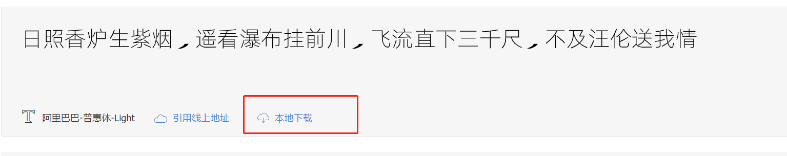
3. 除 demo.html 外的其他文件全部复制到项目中
4. 根据 demo.html 的步骤使用字体
第一步:使用font-face声明字体
@font-face {
    font-family: 'webfont';
    font-display: swap;
    src: url('./font/webfont.eot'); /* IE9 */
    src: url('./font/webfont.eot?#iefix') format('embedded-opentype'), /* IE6-IE8 */
    url('./font/webfont.woff2') format('woff2'),
    url('./font/webfont.woff') format('woff'), /* chrome、firefox */
    url('./font/webfont.ttf') format('truetype'), /* chrome、firefox、opera、Safari, Android, iOS 4.2+*/
    url('./font/webfont.svg#webfont') format('svg'); /* iOS 4.1- */
}
第二步:定义使用 webfont 的样式
.web-font {
    font-family: "webfont" !important;
    font-size: 16px;
    font-style: normal;
    -webkit-font-smoothing: antialiased;
    -moz-osx-font-smoothing: grayscale;
}
第三步:为文字加上对应的样式
<i class="web-font">日照香炉生紫烟,遥看瀑布挂前川,飞流直下三千尺,不及汪伦送我情</i>
7.2 字体图标
将图标以字体的方式设计出来,在页面中直接使用
1. 对比图片图标的优势
- 相比图片更加清晰
- 灵活性高,更方便改变大小、颜色、风格等
- 兼容性好, IE 也能支持
2. 阿里矢量图标库
https://www.iconfont.cn/collections/index
3. 准备工作
1. 登录
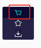
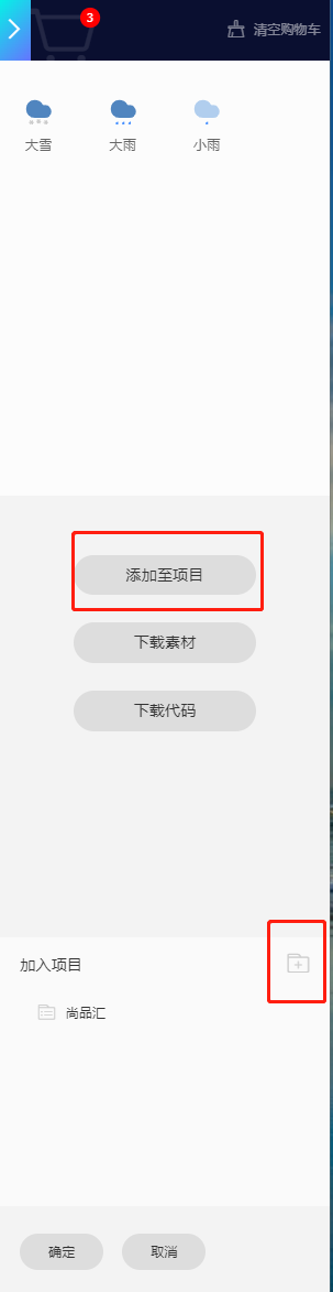
2. 将图标加入购物车
3. 点击购物车,随意创建一个项目,将图标添加到项目中
4. 项目中使用图标
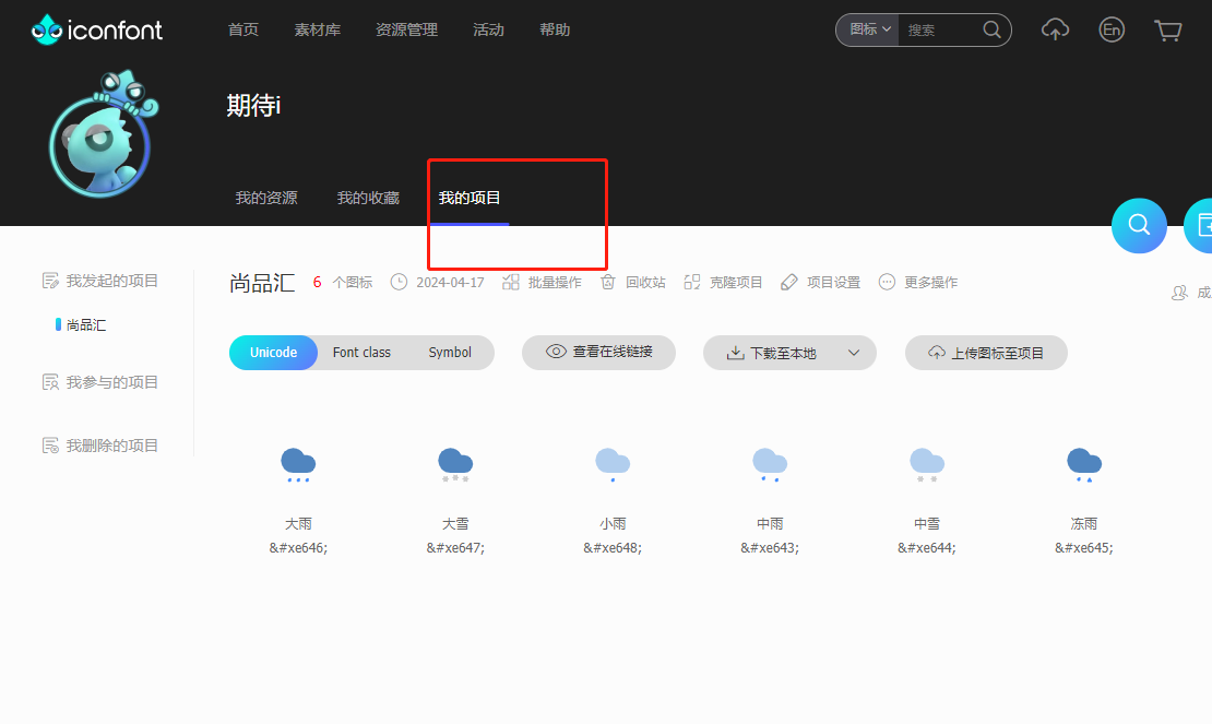
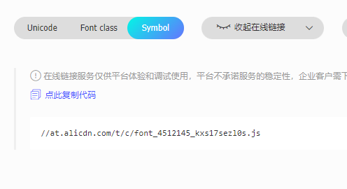
1. 在线使用
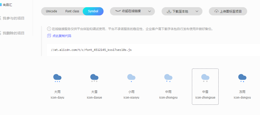
1. 生成在线连接
2.使用
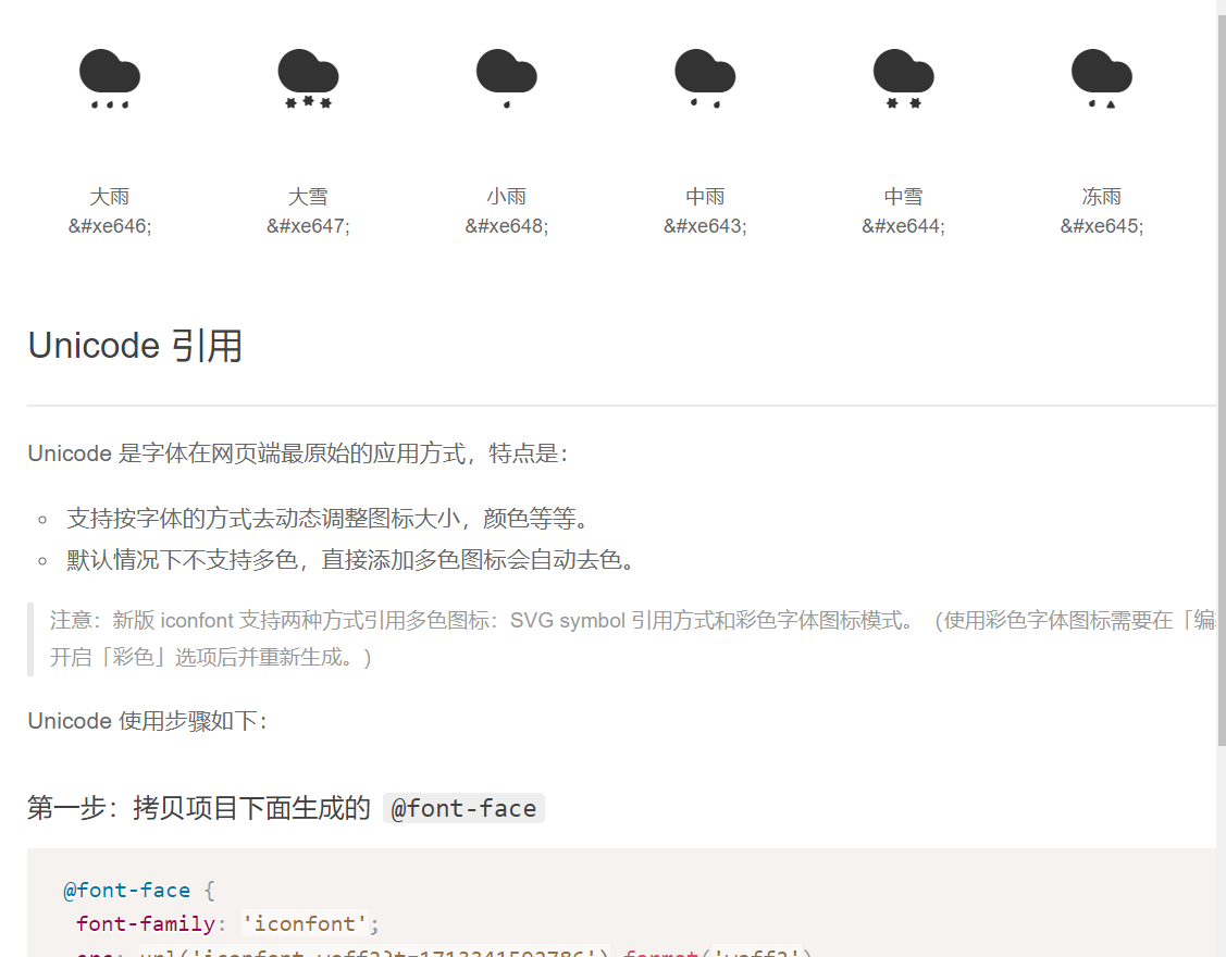
1. Unicode 方式使用
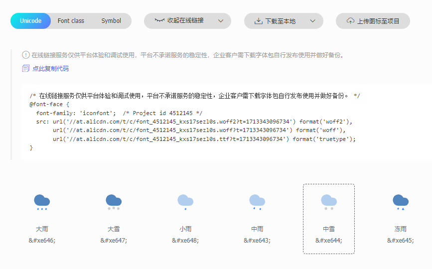
<style>
@font-face {
font-family: 'iconfont'; /* Project id 4512145 */
src: url('//at.alicdn.com/t/c/font_4512145_kxs17sezl0s.woff2?t=1713343096734') format('woff2'),
url('//at.alicdn.com/t/c/font_4512145_kxs17sezl0s.woff?t=1713343096734') format('woff'),
url('//at.alicdn.com/t/c/font_4512145_kxs17sezl0s.ttf?t=1713343096734') format('truetype');
}
.iconfont {
font-family: "iconfont" !important;
font-size: 16px;
font-style: normal;
-webkit-font-smoothing: antialiased;
-moz-osx-font-smoothing: grayscale;
}
</style>
<div>
<span class="iconfont"></span>
</div>
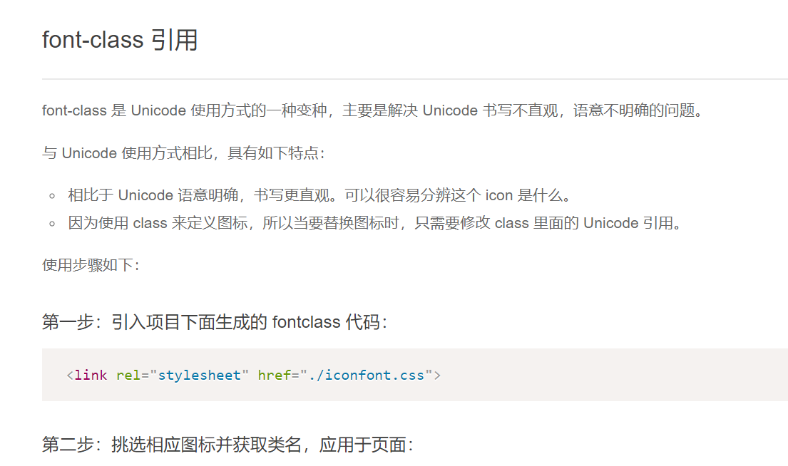
2. Font class 方式使用
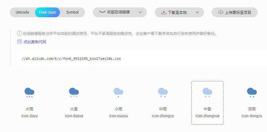
<!DOCTYPE html>
<html lang="en">
<head>
    <meta charset="UTF-8">
    <title>Title</title>
    <!-- 1. 引入css -->
    <link rel="stylesheet" href="https://at.alicdn.com/t/c/font_4512145_kxs17sezl0s.css">
</head>
<body>
<div>
    <!-- 2. 写图标的class类值 -->
    <span class="iconfont icon-dayu"></span>
</div>
<body>
</html>
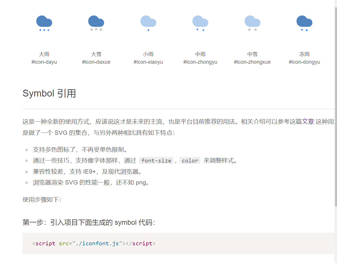
3. Symbol 方式使用
<!DOCTYPE html>
<html lang="en">
<head>
    <meta charset="UTF-8">
    <title>Title</title>
    <!-- 1. 引入js -->
    <script src="./icons/iconfont.js"></script>
    <!-- 2. 编写图标的通用的css,可以自定义 -->
    <style>
        .icon {
            width: 1em;
            height: 1em;
            vertical-align: -0.15em;
            fill: currentColor;
            overflow: hidden;
        }
    </style>
</head>
<body>
<div>
    <!-- 3. 直接使用 -->
    <svg class="icon" aria-hidden="true">
        <use xlink:href="#icon-dayu"></use>
    </svg>
</div>
</body>
</html>
2. 本地下载
1. 下载到本地
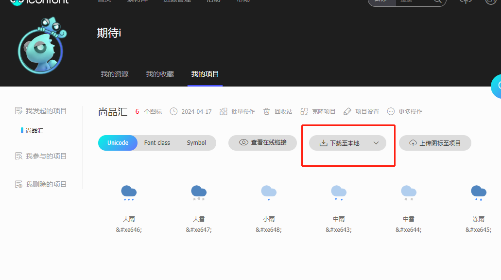
2. 解压后的文件目录
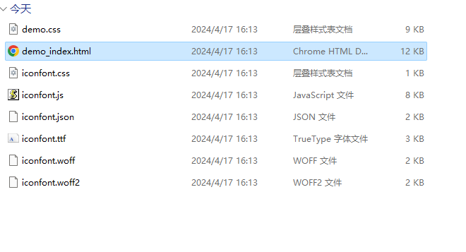
3. 将除 demo_index.html 外的其他文件复制到项目中
4. 根据 demo_index.html 中的步骤使用
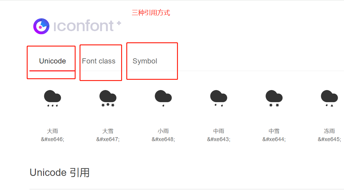
1. Unicode 方式引入
<style>
@font-face {
font-family: 'iconfont';
src: url('./icons/iconfont.woff2?t=1713341592786') format('woff2'),
url('./icons/iconfont.woff?t=1713341592786') format('woff'),
url('./icons/iconfont.ttf?t=1713341592786') format('truetype');
}
.iconfont {
font-family: "iconfont" !important;
font-size: 16px;
font-style: normal;
-webkit-font-smoothing: antialiased;
-moz-osx-font-smoothing: grayscale;
}
</style>
<div>
<span class="iconfont"></span>
</div>
2. Font class 方式引入 (常用)
<!DOCTYPE html>
<html lang="en">
<head>
    <meta charset="UTF-8">
    <title>Title</title>
    <!-- 1. 引入css -->
    <link rel="stylesheet" href="./icons/iconfont.css">
</head>
<body>
<div>
    <!-- 2. 写图标的class类值 -->
    <span class="iconfont icon-dayu"></span>
</div>
</body>
</html>
3. Symbol 方式引入
<!DOCTYPE html>
<html lang="en">
<head>
    <meta charset="UTF-8">
    <title>Title</title>
    <!-- 1. 引入js -->
    <script src="./icons/iconfont.js"></script>
    <!-- 2. 编写图标的通用的css,可以自定义 -->
    <style>
        .icon {
            width: 1em;
            height: 1em;
            vertical-align: -0.15em;
            fill: currentColor;
            overflow: hidden;
        }
    </style>
</head>
<body>
<div>
    <!-- 使用 -->
    <svg class="icon" aria-hidden="true">
        <use xlink:href="#icon-dayu"></use>
    </svg>
</div>
</body>
</html>
5. svg 格式字体图标与其他文字的垂直居中
/* 容器高度50px */
.container{
  height: 50px;
}

/* i标签是容器高度的一半, 并设置 vertical-align: middle */
i{
  height: 25px;
  vertical-align: middle;
}
8. 2D变换
8.1 位移
原始坐标系
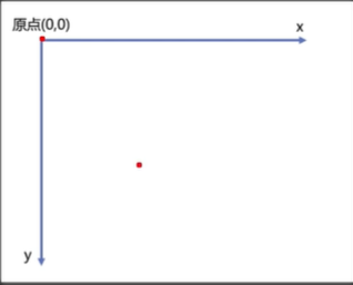
效果图
代码示例
<style>
    .outer{
        width: 200px;
        height: 200px;
        border: 2px solid black;
        margin: 0 auto;
        margin-top: 100px;
    }
    .inner{
        width: 200px;
        height: 200px;
        background-color: skyblue;

        /* 根据像素值位移 */
        /*transform: translateX(50px) translateY(50px);*/

        /* 百分比是自身宽高的 50% */
        /*transform: translateX(50%) translateY(50%);*/

        /* translate(x轴,y轴) */
        transform: translate(50px,50px);
    }
</style>

<div class="outer">
    <div class="inner">
    </div>
</div>
水平垂直居中案例
效果图
代码示例
<!DOCTYPE html>
<html lang="en">
<head>
    <meta charset="UTF-8">
    <title>Title</title>
    <style>
        .outer{
            width: 200px;
            height: 200px;
            border: 2px solid black;
            margin: 0 auto;
            margin-top: 100px;
            position: relative;
        }
        .inner{
            width: 60px;
            height: 60px;
            background-color: skyblue;
            position: absolute;
            top: 50%;
            left: 50%;
            /* 之前的方式,不能使用百分比,因为绝对定位参考的父定位元素 */
            margin-left: -30px;
            margin-top: -30px;

            /* 另一种方式,这里的百分比是参考自身元素 */
            transform: translate(-50%,-50%);
        }
    </style>
</head>
<body>
<div class="outer">
    <div class="inner">
    </div>
</div>
</body>
</html>
8.2 缩放
效果图
代码示例
<!DOCTYPE html>
<html lang="en">
<head>
    <meta charset="UTF-8">
    <title>Title</title>
    <style>
        .outer{
            width: 200px;
            height: 200px;
            border: 2px solid black;
            margin: 0 auto;
            margin-top: 100px;
        }
        .inner{
            width: 200px;
            height: 200px;
            background-color: skyblue;

            /* 必须是倍数,不能是像素单位 px */
            /*transform: scaleX(0.5) scaleY(0.5);*/

            transform: scale(0.5,0.5)
        }
    </style>
</head>
<body>
<div class="outer">
    <div class="inner">
    </div>
</div>
</body>
</html>
浏览器的默认文字大小最小为12px,可以通过缩放将文字进一步变小
<style>
    .inner span{
        font-size: 20px;
        display: inline-block;
        transform: scale(0.5,0.5);
    }
</style>

<div class="outer">
    <div class="inner">
        <span>你好啊</span>
    </div>
</div>
</body>
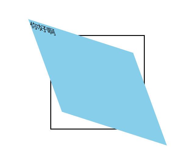
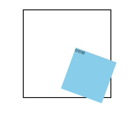
8.3 旋转
旋转后,坐标系会根据元素一起旋转
效果图
代码示例
<style>
    .outer{
        width: 200px;
        height: 200px;
        border: 2px solid black;
        margin: 0 auto;
        margin-top: 100px;
    }
    .inner{
        width: 200px;
        height: 200px;
        background-color: skyblue;

        /* 绕元素的中心旋转,在Z轴方向旋转是2D,在XY旋转是3D */
        /*transform: rotate(10deg);*/

        transform: rotateZ(30deg);
    }
</style>


<div class="outer">
    <div class="inner">
        <span>你好啊</span>
    </div>
</div>
8.4 扭曲
效果图
代码示例
<style>
    .outer{
        width: 200px;
        height: 200px;
        border: 2px solid black;
        margin: 0 auto;
        margin-top: 100px;
    }
    .inner{
        width: 200px;
        height: 200px;
        background-color: skyblue;

        transform: skew(20deg,20deg);

        transform: skewX(20deg) skewY(20deg);
    }
</style>

<div class="outer">
    <div class="inner">
        <span>你好啊</span>
    </div>
</div>
8.5 多重变换
效果图
代码示例
<style>
    .outer{
        width: 200px;
        height: 200px;
        border: 2px solid black;
        margin: 0 auto;
        margin-top: 100px;
    }
    .inner{
        width: 200px;
        height: 200px;
        background-color: skyblue;
        /* 不区分顺序,但是顺序不一样,效果差异较大,旋转一般放在最后 */
        transform: scale(0.5,0.5) translate(100px,100px) rotate(20deg);
    }
</style>


<div class="outer">
    <div class="inner">
        <span>你好啊</span>
    </div>
</div>
8.6 变换 旋转/缩放 原点
默认旋转和缩放是对角线的中心点变换的
<!DOCTYPE html>
<html lang="en">
<head>
    <meta charset="UTF-8">
    <title>Title</title>
    <style>
        .outer{
            width: 200px;
            height: 200px;
            border: 2px solid black;
            margin: 0 auto;
            margin-top: 100px;
        }
        .inner{
            width: 200px;
            height: 200px;
            background-color: skyblue;

            /* 以左上角为原点进行旋转 */
            transform-origin: left top;

            /* 以右下角为原点进行旋转 */
            transform-origin: right bottom;

            /* 以宽50px 高50px为原点进行旋转 */
            transform-origin: 50px 50px;

             /* 以宽20% 高20%的位置为原点进行旋转 */
            transform-origin: 20% 20%;

            /* 以x轴的最左侧,y轴的中心位置为原点进行旋转 */
            transform-origin: left;

            /* 以y轴的最顶部,x轴的中心位置为原点进行旋转 */
            transform-origin: top;

            transform:rotate(20deg);
        }
    </style>
</head>
<body>
<div class="outer">
    <div class="inner">
        <span>你好啊</span>
    </div>
</div>
</body>
</html>
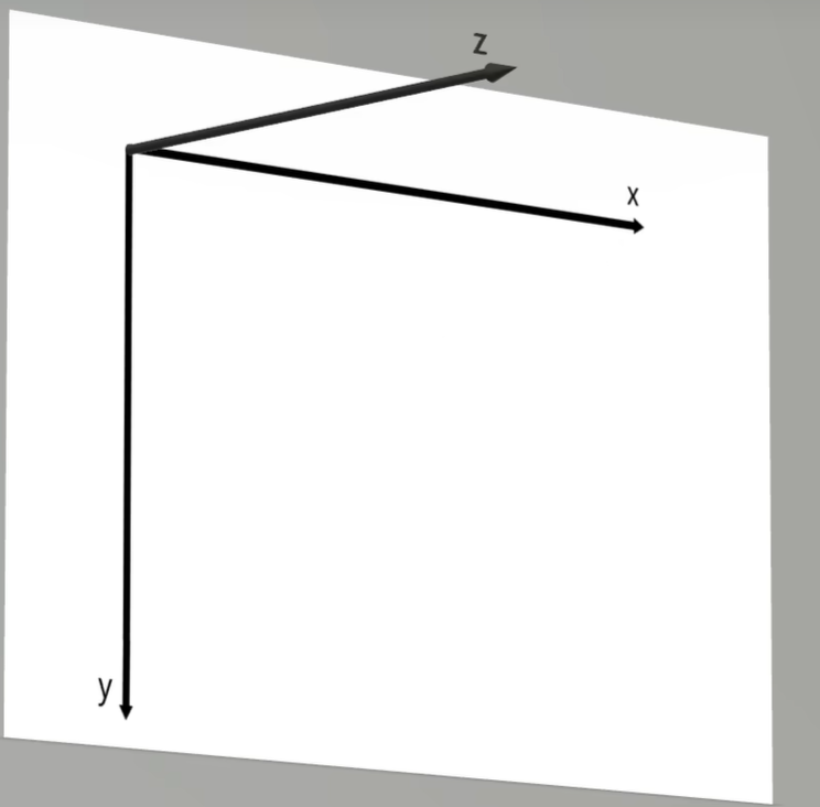
9. 3D变换
9.1 开启3D 空间与景深
1. 坐标系
<style>
    .outer{
        width: 200px;
        height: 200px;
        border: 2px solid black;
        margin: 0 auto;
        margin-top: 100px;

        /* 1. 父元素开启3D空间 */
        transform-style: preserve-3d;
        /* 2. 父元素设置景深(有了透视效果,近大远小),建议是高度的2.5倍,慢慢调整 */
        perspective: 500px;
    }
    .inner{
        width: 200px;
        height: 200px;
        background-color: deepskyblue;

        /* 3. 开启3D旋转,3D是根据x轴和y轴进行变换的 */
        transform: rotateX(60deg);
    }
</style>

<div class="outer">
    <div class="inner">
        <span>你好啊</span>
    </div>
</div>
9.2 透视点(观察者)位置
透视点的位置号,默认为正中心
<style>
    .outer{
        width: 200px;
        height: 200px;
        border: 2px solid black;
        margin: 0 auto;
        margin-top: 100px;

        /* 1. 父元素开启3D空间 */
        transform-style: preserve-3d;
        /* 2. 设置景深 */
        perspective: 600px;

        /* 3. 设置透视点位置,默认为正中心 */
        perspective-origin: 30px 30px;
    }
    .inner{
        width: 200px;
        height: 200px;
        background-color: deepskyblue;

        /* 3D是根据x轴和y轴进行变换的 */
        transform: rotateX(45deg);
    }
</style>

<div class="outer">
    <div class="inner">
        <span>你好啊</span>
    </div>
</div>
9.3 位移
相对于z轴进行移动,即离眼睛越来越近
<!DOCTYPE html>
<html lang="en">
<head>
    <meta charset="UTF-8">
    <title>Title</title>
    <style>
        .outer {
            width: 200px;
            height: 200px;
            border: 2px solid black;
            margin: 0 auto;
            margin-top: 100px;

            /* 1. 父元素开启3D空间 */
            transform-style: preserve-3d;
            /* 2. 设置景深 */
            perspective: 600px;
        }

        .inner {
            width: 200px;
            height: 200px;
            background-color: deepskyblue;

            /* z轴移动*/
            transform: rotateZ(20px);

            /* x轴 y轴 z轴 */
            transform: translate3d(100px,100px,200px);

        }
    </style>
</head>
<body>
<div class="outer">
    <div class="inner">
        <span>你好啊</span>
    </div>
</div>
</body>
</html>
9.4 旋转
<style>
    .outer {
        width: 200px;
        height: 200px;
        border: 2px solid black;
        margin: 0 auto;
        margin-top: 100px;

        /* 1. 父元素开启3D空间 */
        transform-style: preserve-3d;
        /* 2. 设置景深 */
        perspective: 600px;

    }

    .inner {
        width: 200px;
        height: 200px;
        background-color: deepskyblue;

        /* 3D旋转是根据x轴,或y轴旋转 */
        transform: rotateX(30deg) rotatey(30deg);

        /* 前三个为x轴,y轴,z轴 是否旋转,为布尔值, */
        transform: rotate3d(1,1,1,30deg);
    }
</style>

<div class="outer">
    <div class="inner">
        <span>你好啊</span>
    </div>
</div>
9.5 缩放
<style>
    .outer {
        width: 200px;
        height: 200px;
        border: 2px solid black;
        margin: 0 auto;
        margin-top: 100px;

        /* 1. 父元素开启3D空间 */
        transform-style: preserve-3d;
        /* 2. 设置景深 */
        perspective: 600px;
    }

    .inner {
        width: 200px;
        height: 200px;
        background-color: deepskyblue;

        /* z轴缩放,为改变元素的厚度,需要旋转后才能看出效果,scalez()相当于调整了景深 */
        transform: scalez(2) rotateY(80deg);

        /* x轴,y轴,z轴 */
        transform: scale(0,0,0);
    }
</style>

<div class="outer">
    <div class="inner">
        <span>你好啊</span>
    </div>
</div>
9.6 多重变换
<style>
    .outer{
        width: 200px;
        height: 200px;
        border: 2px solid black;
        margin: 0 auto;
        margin-top: 100px;
        /* 1. 父元素开启3D空间 */
        transform-style: preserve-3d;
        /* 2. 设置景深 */
        perspective: 600px;
    }
    .inner{
        width: 200px;
        height: 200px;
        background-color: skyblue;
        /* 不区分顺序,但是顺序不一样,效果差异较大,旋转一般放在最后 */
        transform: scale(0.5,0.5) translate(100px,100px) rotate(20deg);
    }
</style>


<div class="outer">
    <div class="inner">
        <span>你好啊</span>
    </div>
</div>
9.7 变换原点
<style>
    .outer{
        width: 200px;
        height: 200px;
        border: 2px solid black;
        margin: 0 auto;
        margin-top: 100px;
        /* 1. 父元素开启3D空间 */
        transform-style: preserve-3d;
        /* 2. 设置景深 */
        perspective: 600px;
    }
    .inner{
        width: 200px;
        height: 200px;
        background-color: skyblue;


        transform-origin: 50px 0px;     /* 变换原点 */
        transform:rotatex(20deg);

        transform-origin: 0px 100px;
        transform:rotatey(20deg);
    }
</style>

<div class="outer">
    <div class="inner">
        <span>你好啊</span>
    </div>
</div>
9.7 背部可见性
<style>
    .outer {
        width: 200px;
        height: 200px;
        border: 2px solid black;
        margin: 0 auto;
        margin-top: 100px;

        /* 1. 父元素开启3D空间 */
        transform-style: preserve-3d;
        /* 2. 设置景深 */
        perspective: 600px;
    }

    .inner {
        width: 200px;
        height: 200px;
        background-color: deepskyblue;
        transform: rotateY(180deg);
        /* 背部可见性,隐藏 */
        backface-visibility: hidden;
    }
</style>

<div class="outer">
    <div class="inner">
        <span>你好啊</span>
    </div>
</div>
10. 过度
10.1 基本使用
常见的支持过度的属性有: 颜色、长度值、百分比、层级(z-index)、透明度(opacity)、2D变换属性、3D变换属性、阴影这些用数字表示的属性
<style>
    .outer {
        width: 200px;
        height: 200px;
        border: 2px solid black;
        margin: 0 auto;
        margin-top: 100px;
    }

    .inner {
        width: 200px;
        height: 200px;
        background-color: deepskyblue;
        /* 过度属性,可以分别控制 宽,高,背景颜色,文字颜色等 */
        /*transition-property: height,width,background-color,color;*/
        /* 持续时间,可以分别控制 宽,高,背景颜色,文字颜色 的过度时间 */
        /*transition-duration: 0.5s,3s,3s,2s,3s;*/

        /* 让所有能过度的属性过度,即能用数字来表示的属性 */
        transition-property: all;
        transition-duration: 2s;


    }

    .inner:hover {
        height: 400px;
        width: 100px;
        background-color: green;
        color: red;
        transform: rotate(45deg);
        box-shadow: 0 0 50px black;
        opacity: 0.5;
    }
</style>

<div class="outer">
    <div class="inner">
        <span>你好啊</span>
    </div>
</div>
10.2 过度效果
<style>
    .outer {
        width: 1300px;
        height: 900px;
        border: 2px solid black;
    }
    .box{
        width: 200px;
        height: 100px;
        transition-property: all;
        transition-duration: 5s;

        /* 过度延迟,开始过度和结束过度时先等待2s */
        /*transition-delay: 1s;*/
    }
    .outer:hover .box{
        width: 1300px;
    }
    .box1{
        background-color: skyblue;
        transition-timing-function: ease; /* 平滑过度,先慢,中间快,最后慢,默认值 */
    }
    .box2{
        background-color: orange;
        transition-timing-function:linear; /* 平稳过渡,匀速 */
    }
    .box3{
        background-color: gray;
        transition-timing-function: ease-in; /* 先慢,后快 */
    }
    .box4{
        background-color: tomato;
        transition-timing-function: ease-out; /* 先快,后慢 */
    }
    .box5{
        background-color: green;
        transition-timing-function: ease-in-out; /* 先慢,中间快,后慢,相比平滑过度更慢,更快,更慢 */
    }
    .box6{
        background-color: purple;
        transition-timing-function: step-start; /* 直接完成过度,不考虑持续时间 */
    }
    .box7{
        background-color: deepskyblue;
        transition-timing-function: step-end;   /* 先不过度,最过度时间的最后的一瞬间完成过度 */
    }
    .box8{
        background-color: chocolate;
        transition-timing-function: steps(20,end);   /* 分步过度,整个过度分为20步,每一步的时间过去后执行每一步的过度效果,直到最后过度完成 */
        /*transition-timing-function: steps(20,start);   !* 分步过度,整个过度分为20步,先执行每一步的过度效果,然后等待每一步的时间,直到最后过度完成 *!*/
    }
    .box9{
        background-color: black;
        transition-timing-function: cubic-bezier(1,.98,.06,2.18); /* 自定义贝塞尔曲线过度效果, 官网:https://cubic-bezier.com/  */
    }

</style>

<div class="outer">
    <div class="box box1"></div>
    <div class="box box2"></div>
    <div class="box box3"></div>
    <div class="box box4"></div>
    <div class="box box5"></div>
    <div class="box box6"></div>
    <div class="box box7"></div>
    <div class="box box8"></div>
    <div class="box box9"></div>
</div>
10.3 复合属性
<style>
    .outer {
        width: 1300px;
        height: 100px;
        border: 2px solid black;
    }
    .box{
        width: 200px;
        height: 100px;
        /* 持续时间,过度属性,延迟时间,过度效果 */
        transition: 3s all 0.5s linear;
    }
    .outer:hover .box{
        width: 1300px;
    }
    .box1{
        background-color: skyblue;
    }

</style>

<div class="outer">
    <div class="box box1"></div>
</div>
10.4 小案例
<style>
    .outer {
        width: 400px;
        height: 224px;
        border: 2px solid black;
        position: relative;
        margin-top: 300px;
        margin-left: 300px;
        overflow: hidden;
    }
    img {
        /* 哪个元素想有过度效果,就将过度加载它身上 */
        transition: 0.8s all;
    }
    .outer:hover img{
        transform: scale(1.5) rotate(15deg);

    }
    .outer:hover .mask{
        cursor: pointer;
        display: block;
    }
    .mask{
        width: 400px;
        height: 224px;
        color: white;
        text-align: center;
        line-height: 224px;
        font-size: 100px;
        background-color: black;
        opacity: 0.5;
        position: absolute;
        top: 0;
        left: 0;
        display: none;
    }

</style>


<div class="outer">
    <img src="./shanghai.jpg" alt="">
    <div class="mask">上海</div>
</div>
11. 动画
11.1 基本使用
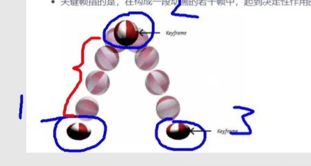
1. 帧
一段动画,就是一段时间内连续播放 n 个画面,每一张画面,就是"帧",一定时间内连续快速播放若干个帧,就成了人们眼中的动画,同样时间内,播放的帧数越多,画面看起来越流畅,1s24帧是人眼看起来较流畅的画面,现在一般是60帧,更流畅舒服些
2. 关键帧
在构成一段动画的若干帧中,起到决定性作用的2-3帧
3. 使用
简单使用
<style>
    .outer {
        width: 1300px;
        height: 100px;
        border: 2px solid black;
    }

    .inner {
        width: 100px;
        height: 100px;
        background-color: deepskyblue;


        /* 应用动画名 */
        animation-name: move-to-right;
        /* 动画的持续时间 */
        animation-duration: 10s;
    }

    /* 定义一组关键帧 */
    @keyframes move-to-right {
        /* 第一帧 */
        from {
            transform: translate(0);
        }

        /* 定义百分之29位置的动画效果 */
        30%{

        }
        /* 最后一帧 */
        to {
            transform: translate(1200px);
            background-color: red;
            /* 动画延迟时间 */
            animation-delay: 0.5s;
        }
    }


</style>


<div class="outer">
    <div class="inner"></div>
</div>
精细配置
<style>
    .outer {
        width: 1300px;
        height: 100px;
        border: 2px solid black;
    }

    .inner {
        width: 100px;
        height: 100px;
        background-color: deepskyblue;


        /* 应用动画名 */
        animation-name: move-to-right;
        /* 动画的持续时间 */
        animation-duration: 3s;
    }

    /* 定义一组关键帧 */
    @keyframes move-to-right {
        /* 定义第一帧 */
        0% {
            transform: translate(0);
        }
        /* 定义百分之29位置的动画效果 */
        29%{
            background-color: purple;
        }
        /* 定义百分之46位置的动画效果 */
        46%{
            background-color: orange;
        }
        /* 定义百分之72位置的动画效果 */
        72%{
            background-color: green;
        }
        /* 定义最后一帧 */
        100% {
            transform: translate(1200px);
            background-color: red;
            /* 动画延迟时间 */
            animation-delay: 0.5s;
            border-radius: 50%;
        }
    }


</style>

<div class="outer">
    <div class="inner"></div>
</div>
11.2 其他属性
<style>
    .outer {
        width: 1300px;
        height: 100px;
        border: 2px solid black;
    }

    .inner {
        width: 100px;
        height: 100px;
        background-color: deepskyblue;


        /* 应用动画名 */
        animation-name: move-to-right;
        /* 动画的持续时间 */
        animation-duration: 3s;

        /* 其他属性 */
        animation-timing-function: linear;      /* 调整动画效果,和过度效果的可选值一样 */
        /*animation-iteration-count: infinite;    !* 动画播放次数,infinite无限次数,也可以写次数3 *!*/
        animation-direction: alternate; /* 改变动画播放的方向,normal为默认值,从0%-100%,reverse是从100%-0%,alternate为0%-100%的交替运动,alternate-reverse是100%-0%的交替运动 */
        animation-fill-mode: backwards   /* 调整动画以外的状态,不发生动画的时候在哪里,需要关闭无限播放,backwards是返回第一帧的位置,forwards是最后一帧的位置*/

    }
    .outer:hover .inner{
        animation-play-state: paused; /* 暂停动画,默认是running */
    }

    /* 定义一组关键帧 */
    @keyframes move-to-right {

        /* 定义第一帧 */
        from {
            transform: translate(0);
        }

        /* 定义最后一帧 */
        to {
            transform: translate(1200px) rotate(360deg);
            background-color: red;
            /* 动画延迟时间 */
            animation-delay: 0.5s;
            border-radius: 50%;
        }
    }


</style>


<div class="outer">
    <div class="inner"></div>
</div>
11.3 复合属性
<style>
    .outer {
        width: 1300px;
        height: 100px;
        border: 2px solid black;
    }

    .inner {
        width: 100px;
        height: 100px;
        background-color: deepskyblue;

        /* 动画名,持续时间,延迟时间,播放效果,播放次数,播放方向,播放完毕停留在哪里, */
        animation: move-to-right 3s 0.5s linear 3 alternate-reverse forwards;

    }
    .outer:hover .inner{
        animation-play-state: paused; 	/* 暂停动画,需要与用户交互来确定什么时候暂停,所以需要单独写 */
    }

    /* 定义一组关键帧 */
    @keyframes move-to-right {

        /* 定义第一帧 */
        from {
            transform: translate(0);
        }

        /* 定义最后一帧 */
        to {
            transform: translate(1200px) rotate(360deg);
            background-color: red;
            /* 动画延迟时间 */
            animation-delay: 0.5s;
            border-radius: 50%;
        }
    }
</style>


<div class="outer">
    <div class="inner"></div>
</div>
11.4 和过度的区别
- 动画不需要任何触发条件,而过度需要触发条件
- 动画可以在每一帧来精细的调整,而过度只关注开始和结束
11.5 小案例
自行车手动画

代码实现
<!DOCTYPE html>
<html lang="en">
<head>
    <meta charset="UTF-8">
    <title>Title</title>
    <style>
        div{
            width: 130px;
            height: 130px;
            margin: 0 auto;
            margin-top: 200px;
            background-image: url("./bike.png");
            animation: bike 0.25s steps(31) infinite;
        }


        @keyframes bike {
            from{}
            to{
                background-position: 0,-4030px;
            }
        }
    </style>
</head>
<body>
<div></div>
</body>
</html>
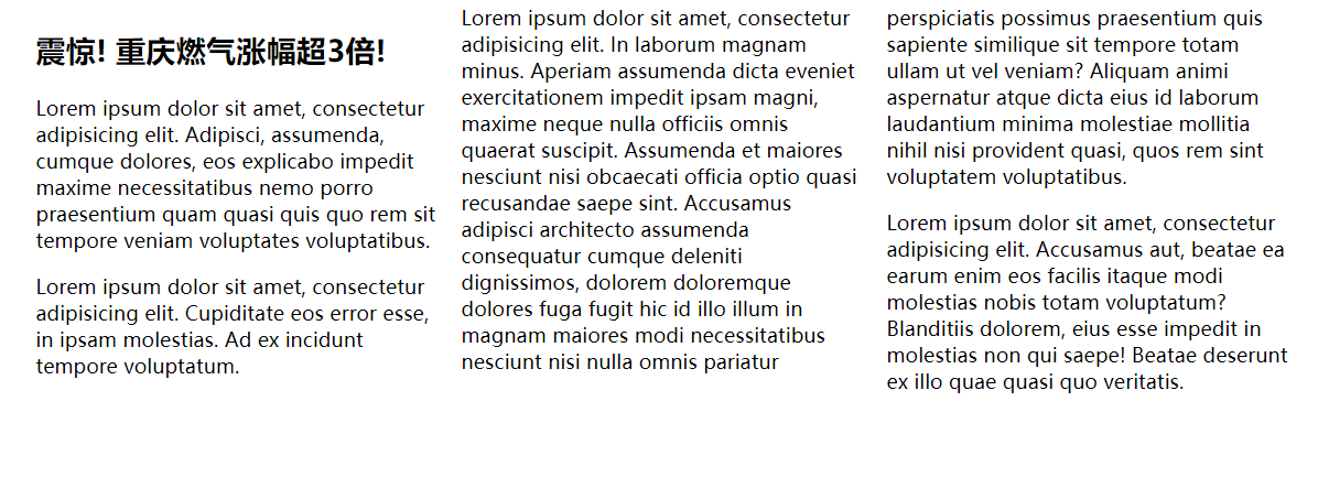
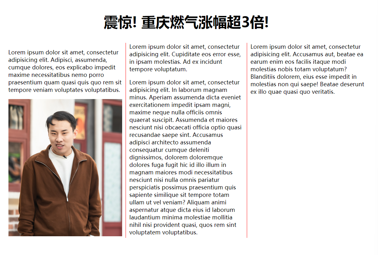
12. 多列布局
12.1 基本使用
效果图
代码实现
<!DOCTYPE html>
<html lang="en">
<head>
<meta charset="UTF-8">
<title>Title</title>
<style>
div{
width: 1000px;
margin: 0 auto;
columns: 3;
/* 调整列间距 */
column-gap: 20px;
/* 每一列之间的边框效果 */
column-rule: 1px solid red;
}
h2 {
/* 是否跨列显示 */
column-span: all; /* 默认值为none,不跨列 */
text-align: center;
font-size: 40px;
}
/* 如果有图片,需要给图片设置宽度为每一列的宽度100%,高度自适应 */
img{
width: 100%;
}
</style>
</head>
<body>
<div>
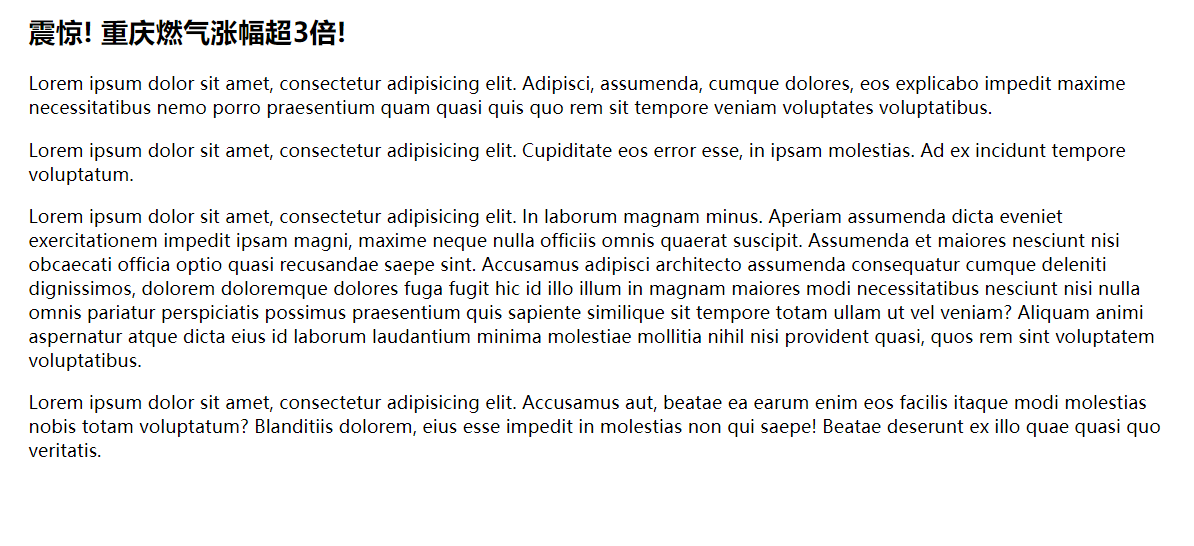
<h2>震惊! 重庆燃气涨幅超3倍!</h2>
<p>Lorem ipsum dolor sit amet, consectetur adipisicing elit. Adipisci, assumenda, cumque dolores, eos explicabo impedit maxime necessitatibus nemo porro praesentium quam quasi quis quo rem sit tempore veniam voluptates voluptatibus.</p>
<img src="./img11.jpg" alt="">
<p>Lorem ipsum dolor sit amet, consectetur adipisicing elit. Cupiditate eos error esse, in ipsam molestias. Ad ex incidunt tempore voluptatum.</p>
<p>Lorem ipsum dolor sit amet, consectetur adipisicing elit. In laborum magnam minus. Aperiam assumenda dicta eveniet exercitationem impedit ipsam magni, maxime neque nulla officiis omnis quaerat suscipit. Assumenda et maiores nesciunt nisi obcaecati officia optio quasi recusandae saepe sint. Accusamus adipisci architecto assumenda consequatur cumque deleniti dignissimos, dolorem doloremque dolores fuga fugit hic id illo illum in magnam maiores modi necessitatibus nesciunt nisi nulla omnis pariatur perspiciatis possimus praesentium quis sapiente similique sit tempore totam ullam ut vel veniam? Aliquam animi aspernatur atque dicta eius id laborum laudantium minima molestiae mollitia nihil nisi provident quasi, quos rem sint voluptatem voluptatibus.</p>
<p>Lorem ipsum dolor sit amet, consectetur adipisicing elit. Accusamus aut, beatae ea earum enim eos facilis itaque modi molestias nobis totam voluptatum? Blanditiis dolorem, eius esse impedit in molestias non qui saepe! Beatae deserunt ex illo quae quasi quo veritatis.</p>
</div>
</body>
</html>
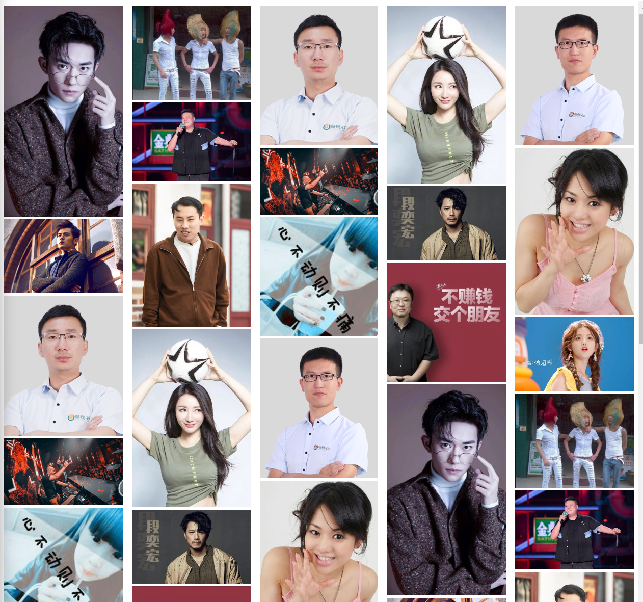
12.2 多列图片案例
效果图
代码实现
<!DOCTYPE html>
<html lang="en">
<head>
    <meta charset="UTF-8">
    <title>Title</title>
    <style>
        .outer{
            columns: 5;
        }
        img{
            width: 100%;
        }
    </style>
</head>
<body>
<div class="outer">
    <img src="./images/img1.jpg" alt="">
    <img src="./images/img2.jpg" alt="">
    <img src="./images/img3.jpg" alt="">
    <img src="./images/img4.jpg" alt="">
    <img src="./images/img5.jpg" alt="">
    <img src="./images/img6.jpg" alt="">
    <img src="./images/img7.jpg" alt="">
    <img src="./images/img8.jpg" alt="">
    <img src="./images/img9.jpg" alt="">
    <img src="./images/img10.jpg" alt="">
    <img src="./images/img11.jpg" alt="">
    <img src="./images/img12.jpg" alt="">
    <img src="./images/img13.jpg" alt="">
    <img src="./images/img14.jpg" alt="">
 </div>
</body>
</html>
呼吸效果图

代码实现
<!DOCTYPE html>
<html lang="en">
<head>
    <meta charset="UTF-8">
    <title>Title</title>
    <style>
        .outer{
            columns: 5;
        }
        img{
            width: 100%;
            transition: 0.2s ;
        }
        img:hover{
            box-shadow: 0 0 20px black;
            transform: scale(1.05);
        }
    </style>
</head>
<body>
<div class="outer">
    <img src="./images/img1.jpg" alt="">
    <img src="./images/img2.jpg" alt="">
    <img src="./images/img3.jpg" alt="">
    <img src="./images/img4.jpg" alt="">
    <img src="./images/img5.jpg" alt="">
    <img src="./images/img6.jpg" alt="">
    <img src="./images/img7.jpg" alt="">
    <img src="./images/img8.jpg" alt="">
    <img src="./images/img9.jpg" alt="">
    <img src="./images/img10.jpg" alt="">
    <img src="./images/img11.jpg" alt="">
    <img src="./images/img12.jpg" alt="">
    <img src="./images/img13.jpg" alt="">
    <img src="./images/img14.jpg" alt="">
    <img src="./images/img1.jpg" alt="">
    <img src="./images/img2.jpg" alt="">
    <img src="./images/img3.jpg" alt="">
    <img src="./images/img4.jpg" alt="">
    <img src="./images/img5.jpg" alt="">
    <img src="./images/img6.jpg" alt="">
    <img src="./images/img7.jpg" alt="">
    <img src="./images/img8.jpg" alt="">
    <img src="./images/img9.jpg" alt="">
    <img src="./images/img10.jpg" alt="">
    <img src="./images/img11.jpg" alt="">
    <img src="./images/img12.jpg" alt="">
    <img src="./images/img13.jpg" alt="">
    <img src="./images/img14.jpg" alt="">
    <img src="./images/img1.jpg" alt="">
    <img src="./images/img2.jpg" alt="">
    <img src="./images/img3.jpg" alt="">
    <img src="./images/img4.jpg" alt="">
    <img src="./images/img5.jpg" alt="">
    <img src="./images/img6.jpg" alt="">
    <img src="./images/img7.jpg" alt="">
    <img src="./images/img8.jpg" alt="">
    <img src="./images/img9.jpg" alt="">
    <img src="./images/img10.jpg" alt="">
    <img src="./images/img11.jpg" alt="">
    <img src="./images/img12.jpg" alt="">
    <img src="./images/img13.jpg" alt="">
    <img src="./images/img14.jpg" alt="">
 </div>
</body>
</html>
13. 伸缩盒子模型( flex 布局)
13.1 简介
- 2009年,W3C 提出了一种新的盒子模型 -- Flexble Box(伸缩盒模型,又称弹性盒子)
- 它可以轻松的控制: 元素分布方式、元素对齐方式、元素视觉顺序....
- 截至目前,除了在部分IE浏览器不支持,其他浏览器均已全部支持
- 伸缩盒模型的出现,逐渐演变出了一套新的布局方案 -- flex 布局
传统布局: 基于传统盒模型,主要靠 display 属性 + postion 属性 + float 属性
flex布局: 目前在移动端应用比较广泛,因为传统布局不能很好的呈现在移动设备上
13.2 容器与项目
<style>
    .outer{
        background-color: gray;
        width: 800px;
        height: 608px;

        /* 父元素开启flex布局 */
        display: flex;

        /* 该元素开启了inline-flex布局,变了为行内块元素,一般不用 */
        /*display: inline-flex;*/
    }
    .box{
        width: 200px;
        height: 200px;
        border: 1px solid black;
        background-color: skyblue;
    }
</style>


<div class="outer">
    <!-- 开启flex布局元素的子元素变为了伸缩项目,只要是伸缩项目就变为了块元素 -->
    <div class="box box1"></div>
    <div class="box box2"></div>
    <div class="box box3"></div>
</div>
13.3 主轴方向
主轴为从左到右的水平方向,侧轴为从上到下的垂直方向,并不在乎原点位置,在乎的是方向,所有的元素是沿着主轴的方向排列的
<style>
    .outer{
        background-color: gray;
        width: 800px;
        height: 608px;
        margin: 0 auto;

        /* 伸缩盒模型相关的属性 */

        /* 该元素开启了flex布局 */
        display: flex;

        /* 调整主轴方向 */
        /* 默认值为row,从左到右;
        row-reverse为主轴方向从右到左;
        column为主轴方向从上到下,
        column-reverse为主轴方向从下到上,
        一般使用主轴的默认方向
        */
        flex-direction: column-reverse;


    }
    .box{
        width: 200px;
        height: 200px;
        border: 1px solid black;
        background-color: skyblue;
    }
</style>


<div class="outer">
    <!-- 开启flex布局元素的子元素变为了伸缩项目,只要是伸缩项目就变为了块元素 -->
    <div class="box box1">1</div>
    <div class="box box2">2</div>
    <div class="box box3">3</div>
</div>
13.4 主轴换行方式
效果图
主轴方向是伸缩的,而侧轴方向是分散的,如果下面没有元素,高度足够,会自动调整距离,距离顶部元素剩余父高度的1/4
示例代码
<style>
    .outer{
        background-color: gray;
        width: 800px;
        height: 608px;
        margin: 0 auto;

        /* 伸缩盒模型相关的属性 */

        /* 该元素开启了flex布局 */
        display: flex;

        /* 主轴的换行方式,默认是自动压缩项目宽度 */
        flex-wrap: wrap; /* 默认值为nowrap,不换行;wrap为换行;wrap-revers为反转换行方向,从下到上换行 */

    }
    .box{
        width: 200px;
        height: 200px;
        border: 1px solid black;
        background-color: skyblue;
    }
</style>

<div class="outer">
    <div class="box box1">1</div>
    <div class="box box2">2</div>
    <div class="box box3">3</div>
    <div class="box box3">4</div>
    <div class="box box3">5</div>
    <div class="box box3">6</div>
</div>
13.5 flex-flow 复合属性 (不常用)
<style>
    .outer{
        background-color: gray;
        width: 800px;
        height: 608px;
        margin: 0 auto;

        /* 伸缩盒模型相关的属性 */
        display: flex;

        flex-flow: row wrap-reverse;

    }
    .box{
        width: 200px;
        height: 200px;
        border: 1px solid black;
        background-color: skyblue;
    }
</style>

<div class="outer">
    <div class="box box1">1</div>
    <div class="box box2">2</div>
    <div class="box box3">3</div>
    <div class="box box3">4</div>
    <div class="box box3">5</div>
    <div class="box box3">6</div>
</div>
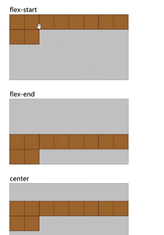
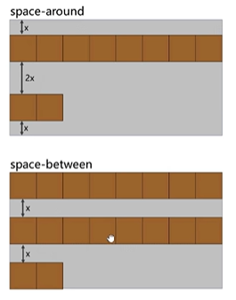
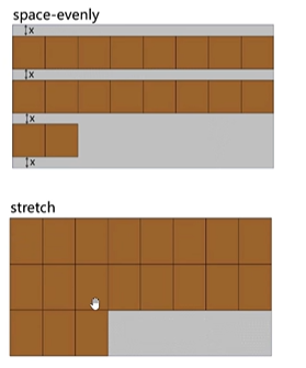
13.6 主轴对齐方式
效果图
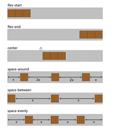
代码示例
<style>
    .outer{
        background-color: gray;
        width: 1200px;
        height: 608px;
        margin: 0 auto;

        /* 伸缩盒模型相关的属性 */
        display: flex;
        /*
        flex-start,默认跟主轴的起始位置对齐(左对齐)
        flex-end,主轴的结束位置对齐(右对齐)
        center,居中对齐
        space-around,均匀分布,项目与项目之间的距离为2x,距左右边缘的距离为x
        space-between,均匀分布,项目与项目之间的距离是相等的,距左右边缘没有距离
        space-evenly,均匀分布,项目与项目之间的距离和左右边缘距离都是相等的
        */
        justify-content: space-evenly;

    }
    .box{
        width: 200px;
        height: 200px;
        border: 1px solid black;
        background-color: skyblue;
    }
</style>


<div class="outer">
    <div class="box box1">1</div>
    <div class="box box2">2</div>
    <div class="box box3">3</div>
</div>
13.7 侧轴对齐方式
1. 一行
效果图
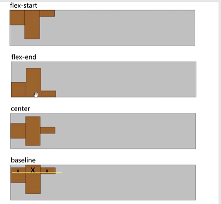
代码示例
<style>
.outer{
background-color: gray;
width: 1200px;
height: 608px;
margin: 0 auto;
/* 伸缩盒模型相关的属性 */
display: flex;
/*
flex-start,侧轴的起始位置对齐(顶部)
flex-end,侧轴的结束位置对齐(底部)
center,居中对齐
baseline,文字的基线对齐,
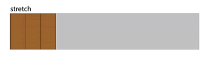
stretch,默认值,拉伸,仅在伸缩项目没有高度的时候有效,直接充满父容器的高度,
*/
align-items: stretch;
}
.box{
border: 1px solid black;
background-color: skyblue;
}
.box1{
width: 200px;
height: 200px;
}
.box2{
width: 300px;
height: 300px;
}
.box3{
width: 100px;
height: 100px;
}
</style>
<div class="outer">
<div class="box box1">1</div>
<div class="box box2">2</div>
<div class="box box3">3</div>
</div>
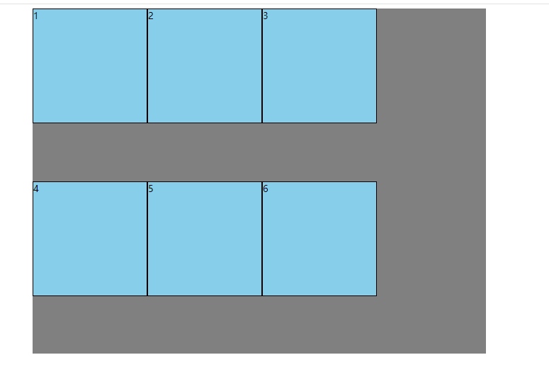
2. 多行
效果图
代码示例
<style>
    .outer{
        background-color: gray;
        width: 1200px;
        height: 1200px;
        margin: 0 auto;

        /* 伸缩盒模型相关的属性 */
        display: flex;
        flex-wrap: wrap;

        /*
        flex-start,侧轴的起始位置对齐(顶部)
        flex-end,侧轴的结束位置对齐(底部)
        center,居中对齐
        space-around,均匀分布,项目与项目之间的距离为2x,距左右边缘的距离为x
        space-between,均匀分布,项目与项目之间的距离是相等的,距左右边缘没有距离
        space-evenly,均匀分布,项目与项目之间的距离和左右边缘距离都是相等的
        stretch,默认值,拉伸,仅在伸缩项目没有高度的时候有效,多行平分整个父元素的高度,
        */
        align-content: stretch;

    }
    .box{
        border: 1px solid black;
        background-color: skyblue;
    }

    .box1{
        width: 200px;
        height: 200px;
    }
    .box2{
        width: 300px;
        height: 300px;
    }
    .box3{
        width: 100px;
        height: 100px;
    }
</style>


<div class="outer">
    <div class="box box1">1</div>
    <div class="box box2">2</div>
    <div class="box box3">3</div>
    <div class="box box1">4</div>
    <div class="box box2">5</div>
    <div class="box box3">7</div>
    <div class="box box1">8</div>
    <div class="box box2">9</div>
    <div class="box box3">10</div>
    <div class="box box1">11</div>
    <div class="box box2">12</div>
    <div class="box box3">13</div>
</div>
13.8 元素的水平垂直居中
1. 主侧轴居中对齐
<style>
    .outer{
        background-color: gray;
        width: 1200px;
        height: 1200px;
        margin: 0 auto;

        /* 1. 父元素开启flex布局 */
        display: flex;
        /* 2. 主轴居中对齐 */
        justify-content: center;
        /* 2. 侧轴居中对齐 */
        align-items: center;
    }
    .box{
        border: 1px solid black;
        background-color: skyblue;
    }

    .box1{
        width: 200px;
        height: 200px;
    }
</style>


<div class="outer">
    <div class="box box1">1</div>
</div>
2. flex + margin auto
<style>
    .outer{
        background-color: gray;
        width: 1200px;
        height: 1200px;
        margin: 0 auto;

        /* 1. 父元素开启flex布局 */
        display: flex;

    }
    .box{
        border: 1px solid black;
        background-color: skyblue;
    }

    .box1{
        width: 200px;
        height: 200px;

        /* 2. 子元素直接 margin: auto */
        margin: auto;
    }
</style>


<div class="outer">
    <div class="box box1">1</div>
</div>
3. 块元素的居中对齐
<style>
    .outer{
        background-color: gray;
        width: 1200px;
        height: 1200px;
        margin: 0 auto;

        /* 1. 父元素开启溢出隐藏 */
        overflow: hidden;

        /* 4. 父元素开启相对定位 */
        position:relative;

    }
    .box{
        border: 1px solid black;
        background-color: skyblue;
    }

    .box1{
        width: 200px;
        height: 200px;
        /* 2. 水平对齐 */
        margin: 0 auto;
        /* 3. 水平对齐( (父元素高度-子元素高度) / 2) */
        margin-top: 500px;
        /* 3. 或者使用2D变换的位移,移动位置 */
        transform: translateY(500px);

        /* 3. 或者直接距离顶端父元素高度的一半 */
        margin-top: 600px;
        /* 3. 再用2D变换的位移,移动自身高度的50% */
        transform: translateY(-50%);

        /* 4. 子元素开启绝对定位 */
        position:abs;
        top:0;
        bottom:0;
        lef:0;
        right:0;
        magin:auto;
    }
</style>


<div class="outer">
    <div class="box box1">1</div>
</div>
4. 行内元素的居中对齐
<style>
    .outer{
        background-color: gray;
        width: 1200px;
        height: 1200px;
        margin: 0 auto;
        /* 1. 在父元素设置子元素水平对齐 */
        text-align: center;
        /* 2. 在父元素设置子元素垂直对齐 */
        line-height: 1200px;
    }
    .box{
        border: 1px solid black;
        background-color: skyblue;
    }
</style>


<div class="outer">
    <span class="box box1">1</span>
</div>
5. 2D变换的位移
<style>
    .outer{
        background-color: gray;
        width: 1200px;
        height: 1200px;
        margin: 0 auto;
    }
    .box{
        width: 200px;
        height: 200px;
        border: 1px solid black;
        background-color: skyblue;

        /* (父元素高度 - 子元素高度) / 2 */
        transform: translate(500px,500px);
    }
</style>


<div class="outer">
    <div class="box box1">1</div>
</div>
13.9 主轴方向的基准长度
<style>
    .outer{
        background-color: gray;
        width: 1200px;
        height: 1200px;
        margin: 0 auto;

        display: flex;
    }
    .box{
        width: 200px;
        height: 200px;
        border: 1px solid black;
        background-color: skyblue;
    }
    .box2{
        /* 修改伸缩项目在主轴方向的基准长度,若主轴是水平方向的是修改的宽度,若主轴是垂直方向的是修改的高度 */
        /* 浏览器是根据 flex-basis 的值来计算剩余的,默认值为auto,及设置的宽或高 */
        flex-basis: 300px;
    }
</style>


<div class="outer">
    <div class="box box1">1</div>
    <div class="box box2">2</div>
    <div class="box box3">3</div>
</div>
13.10 伸缩性
1. 拉伸
<style>
    .outer{
        background-color: gray;
        width: 1200px;
        height: 1200px;
        margin: 0 auto;

        display: flex;
    }
    .box{
        width: 200px;
        height: 200px;
        border: 1px solid black;
        background-color: skyblue;

    }
    .box1{
        flex-grow: 1;

    }
    .box2{
        width: 300px;
        height: 200px;
        flex-grow: 1;
    }
    .box3{
        /* 所有设置了flex-grow的属性值相加,计算出每个元素的占比,在每个元素的原基础上加上父元素剩余宽度的占比 */
        /* 父元素宽度为 1200px - box1宽度200px - box2宽度300px - box3宽度200px = 500 */
        /* box3 占了 1 / 1+1+1 所以宽度为 200 + 500 * 1/3 */
        flex-grow: 1;
    }
</style>


<div class="outer">
    <div class="box box1">1</div>
    <div class="box box2">2</div>
    <div class="box box3">3</div>
</div>
2. 压缩
压缩的算法是: 分母,各伸缩项目在主轴的长度 * flex-shrink的值(默认为1)相加: 200*1 + 300*1 + 100*1 = 600,收缩比: 伸缩项目1: (200*1) / 700;伸缩项目2: (300*1) / 600;伸缩项目3: (100*1) / 600,收缩的像素值为: 假如容器要收缩200px,伸缩项目1: 200 * 伸缩项目1的比例值,伸缩项目的边框会影响最终的值,有些许误差,压缩的极限值为最低保证伸缩项目中的子元素的宽度正常显示
<style>
    .outer{
        width: 1200px;
        height: 1200px;
        background-color: gray;
        border: 1px solid black;
        display: flex;
    }
    .box{
        background-color: skyblue;
        border: 1px solid black;
    }
    .box1{
        width: 200px;
        height: 200px;
        flex-shrink: 1;
    }
    .box2{
        width: 300px;
        height: 200px;
        flex-shrink: 1;
    }
    .box3{
        width: 100px;
        height: 200px;
        flex-shrink: 1;  /* 默认为1 */
    }
</style>


<div class="outer">
    <div class="box box1">1</div>
    <div class="box box2">2</div>
    <div class="box box3">3</div>
 </div>
13.11 复合属性
<style>
    .outer{
        width: 1200px;
        height: 1200px;
        background-color: gray;
        border: 1px solid black;
        display: flex;
    }
    .box{
        background-color: skyblue;
        border: 1px solid black;
    }
    .box1{
        width: 200px;
        height: 200px;
        /* 设置拉伸比;设置压缩比;设置基准长度 */
        /*flex: 1 1 100px;*/

        /* 设置拉伸比;设置压缩比;不设置基准长度 */
        flex: 1 1 auto;
        flex: auto;      /* 简写方式 */

        /* 设置拉伸比;设置压缩比;设置基准长度为0,让伸缩项目均分容器主轴长度 */
        flex: 1 1 0;
        flex: 1; 		/* 简写方式 */

        /* 不设置拉伸比;不设置压缩比;不设置基准长度 */
        flex: 0 0 auto;
        flex:none; 		/* 简写方式 */

        /* 不设置拉伸比;设置压缩比;不设置基准长度,此为默认值 */
        flex: 0 1 auto;
        flex: 0 auto; 		/* 简写方式 */
    }
    .box2{
        width: 300px;
        height: 200px;
    }
    .box3{
        width: 100px;
        height: 200px;
    }
</style>


<div class="outer">
    <div class="box box1">1</div>
    <div class="box box2">2</div>
    <div class="box box3">3</div>
 </div>
13.12 项目排序
效果图
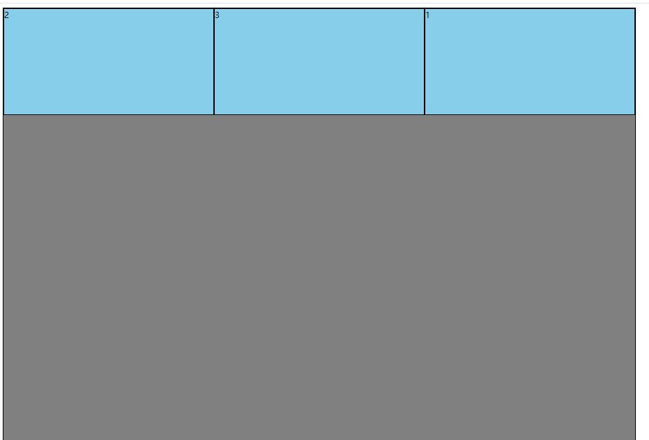
代码示例
<style>
    .outer{
        width: 1200px;
        height: 1200px;
        background-color: gray;
        border: 1px solid black;
        display: flex;
    }
    .box{
        background-color: skyblue;
        border: 1px solid black;
    }
    .box{
        width: 200px;
        height: 200px;
        flex: 1;
    }
    .box2{
        order: -1;  /* 每个伸缩项目的默认值都为0,order值越小的排在前面,越大的排在后面 */
    }
    .box1{
        order: 1;
    }
</style>


<div class="outer">
    <div class="box box1">1</div>
    <div class="box box2">2</div>
    <div class="box box3">3</div>
 </div>
13.13 单独对齐
<style>
    .outer{
        width: 1200px;
        height: 1200px;
        background-color: gray;
        border: 1px solid black;
        display: flex;
    }
    .box{
        background-color: skyblue;
        border: 1px solid black;
    }
    .box{
        width: 200px;
        height: 200px;
        flex: 1;
    }
    .box2{
        align-self: flex-end;  /* 单独设置伸缩项目在侧轴的对齐方式 */
    }
</style>

<div class="outer">
    <div class="box box1">1</div>
    <div class="box box2">2</div>
    <div class="box box3">3</div>
 </div>
13.14 小案例
效果图
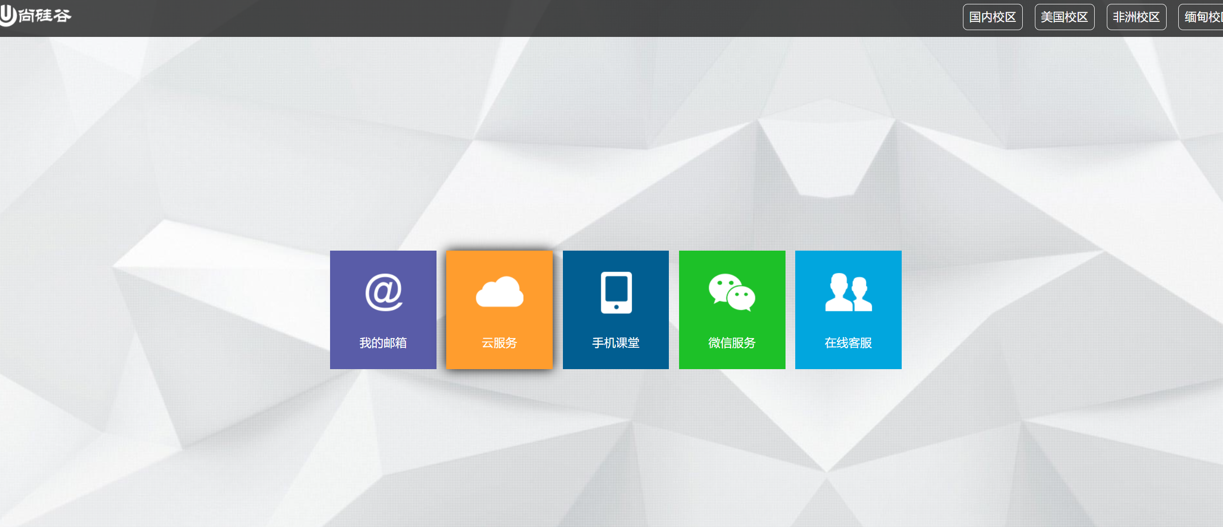
代码示例
<style>
    * {
        font-family: Arial;
        font-size: 14px;
        margin: 0;
        padding: 0;
        border: none;
    }
    a {
        text-decoration: none;
    }
    ul{
        list-style: none;
    }

    html,body{
        width: 100%;
        height: 100%;
    }

    body{
        background-image: url("./images/bg.jpg");
        background-repeat: no-repeat;
        background-size: cover;  /* 背景图自适应占满整个屏幕 */
    }

    .page-header{
        height: 70px;
        background-color: rgba(0,0,0,0.7);
        display: flex;
        justify-content: space-between;
        align-items: center;
    }

    .school-list{
        display: flex;
        align-items: center;
    }

    .school-list li a{
        padding: 10px;
        margin-right: 20px;
        border: 1px solid;
        border-radius: 8px;
        font-size: 20px;
        color: white;
    }
    .school-list li:last-child a{
        margin-right: 0;
    }

    .page-content{
        display: flex;
        height: calc(100vh - 70px);  /* 根据不同的设备,动态计算出当前content区的高度 */
    }

    .page-content .content-nav{
        width: 1000px;
        height: 300px;
        margin: auto;
    }

    .content-nav .item-list{
        height: 100%;
        display: flex;
        justify-content: space-evenly;
        align-items: center;
        transition: 0.2s linear;
    }
    .content-nav .item:hover{
        box-shadow: 0 0 20px black;
        cursor: pointer;
    }
    .content-nav .item a{
        width: 180px;
        height: 200px;
        display: flex;
        flex-direction: column;
        align-items: center;
        justify-content: space-evenly;

    }
    .content-nav .item-list .item span{
        font-size: 20px;
        color: white;
    }
    .content-nav .item-list li:nth-child(1) a{
        background-color: #595CA8;
    }
    .content-nav .item-list li:nth-child(2) a{
        background-color: #FF9D2E;
    }
    .content-nav .item-list li:nth-child(3) a{
        background-color: #015E91;
    }
    .content-nav .item-list li:nth-child(4) a{
        background-color: #1DC128;
    }
    .content-nav .item-list li:nth-child(5) a{
        background-color: #01A6DE;
    }

</style>

<header class="page-header">
    <a href="#">
        <img src="./images/logo.png" alt="">
    </a>

    <ul class="school-list">
        <li><a href="#">国内校区</a></li>
        <li><a href="#">美国校区</a></li>
        <li><a href="#">非洲校区</a></li>
        <li><a href="#">缅甸校区</a></li>
    </ul>
</header>

<div class="page-content">
    <div class="content-nav">
        <ul class="item-list">
            <li class="item">
                <a href="#">
                    <img src="./images/item1.png" alt="">
                    <span>我的邮箱</span>
                </a>
            </li>
            <li class="item">
                <a href="#">
                    <img src="./images/item2.png" alt="">
                    <span>云服务</span>
                </a>
            </li>
            <li class="item">
                <a href="#">
                    <img src="./images/item3.png" alt="">
                    <span>手机课堂</span>
                </a>
            </li>
            <li class="item">
                <a href="#">
                    <img src="./images/item4.png" alt="">
                    <span>微信服务</span>
                </a>
            </li>
            <li class="item">
                <a href="#">
                    <img src="./images/item5.png" alt="">
                    <span>在线客服</span>
                </a>
            </li>
        </ul>
    </div>
</div>
14. 响应式布局 (媒体查询)
随着视口的不断缩小,呈现不同的布局
14.1 媒体类型
<style>
    h1 {
        width: 600px;
        height: 400px;
        line-height: 400px;
        background-image: linear-gradient(30deg, red, yellow, green);
        margin: 0 auto;
        text-align: center;
        font-size: 100px;
        color: white;
        text-shadow: 0 0 10px black;
    }

    /* 只有在打印机或者打印预览器应用的样式,此类属性需要写在样式之后 */
    @media print {
        h1 {
            background-image: none;
        }
    }

    /* 只有在屏幕上才应用的样式 */
    @media screen {
        h1 {
            background-image: url("./images/img11.jpg");
        }
    }

    /* 一直都应用的样式 */
    @media all {
        h1 {
            background-image: url("./images/img11.jpg");
        }
    }

</style>

<h1><span>新年快乐</span></h1>
14.2 媒体特性
<style>
    h1 {
        width: 600px;
        height: 400px;
        line-height: 400px;
        background-image: linear-gradient(30deg, red, yellow, green);
        margin: 0 auto;
        text-align: center;
        font-size: 100px;
        color: white;
        text-shadow: 0 0 10px black;
    }

    /* 检测到视口的宽度 == 800px时,应用如下样式,后写的会覆盖先写的 */
    /*@media (width: 732.73px) {*/
    /*    h1 {*/
    /*        background: transparent;*/
    /*        color: green;*/
    /*    }*/
    /*}*/

    /* 检测到视口的宽度 <= 700px时,应用如下样式 */
    /*@media (max-width: 700px) {*/
    /*    h1 {*/
    /*        background: green;*/
    /*        color: red;*/
    /*    }*/
    /*}*/

    /* 检测到视口的宽度 >= 900px时,应用如下样式 */
    /*@media (min-width: 900px) {*/
    /*    h1 {*/
    /*        background: orange;*/
    /*        color: skyblue;*/
    /*    }*/
    /*}*/

    /* 检测到视口的高度 == 800px时,应用如下样式,一般不用 */
    /*@media (height: 732.73px) {*/
    /*    h1 {*/
    /*        background: transparent;*/
    /*        color: green;*/
    /*    }*/
    /*}*/

    /* 检测到视口的高度 <= 700px时,应用如下样式,一般不用  */
    /*@media (max-height: 700px) {*/
    /*    h1 {*/
    /*        background: green;*/
    /*        color: red;*/
    /*    }*/
    /*}*/

    /* 检测到视口的高度 >= 900px时,应用如下样式,一般不用  */
    /*@media (min-height: 900px) {*/
    /*    h1 {*/
    /*        background: orange;*/
    /*        color: skyblue;*/
    /*    }*/
    /*}*/


    /* 检测到屏幕的宽度 == 1920,需要注意电脑设置的缩放比,如果时125%,这里像素值为:分辨率的1920 / 1.25,应用如下样式 */
    @media (device-width: 1920px) {
        h1 {
            color: red;
        }
    }

    /* 检测到屏幕的宽度 <= 1920,需要注意电脑设置的缩放比,如果时125%,这里像素值为:分辨率的1920 / 1.25,应用如下样式 */
    @media (max-device-width: 1920px) {
        h1 {
            color: red;
        }
    }

    /* 检测到屏幕的宽度 >= 1920,需要注意电脑设置的缩放比,如果时125%,这里像素值为:分辨率的1920 / 1.25,应用如下样式 */
    @media (min-device-width: 1920px) {
        h1 {
            color: red;
        }
    }

    /* 检测视口的旋转方向,视口处于纵向,即高度大于宽度 */
    @media (orientation: portrait) {
        h1 {
            color: red;
        }
    }

    /* 检测视口的旋转方向,视口处于横向,即宽度大于高度 */
    @media (orientation: landscape) {
        h1 {
            color: red;
        }
    }
</style>

<h1><span>新年快乐</span></h1>
14.3 运算符
<!DOCTYPE html>
<html lang="en">
<head>
    <meta charset="UTF-8">
    <title>Title</title>

    <style>
        h1 {
            width: 600px;
            height: 400px;
            line-height: 400px;
            background-image: linear-gradient(30deg, red, yellow, green);
            margin: 0 auto;
            text-align: center;
            font-size: 100px;
            color: white;
            text-shadow: 0 0 10px black;
        }

        /* 宽度 >= 700 且 宽度 <= 800 */
        @media (min-width: 700px) and (max-width: 800px) {
            h1 {
                color: red;
            }
        }

        /* 屏幕 且 宽度 >= 700 且 宽度 <= 800 */
        @media screen and (min-width: 700px) and (max-width: 800px) {
            h1 {
                color: red;
            }
        }

        /* 是屏幕,宽度 ,= 700 或 宽度 >= 800 */
        @media screen and (max-width: 700px) or (min-width: 800px) {
            h1 {
                color: red;
            }
        }


        /* 不是屏幕,宽度 ,= 700 或 宽度 >= 800 */
        @media not screen and (max-width: 700px) or (min-width: 800px) {
            h1 {
                color: red;
            }
        }

        /* 肯定运算符,一般用来处理IE的兼容性问题,IE会忽略这个条件,不会乱显示样式 */
        @media only screen and (max-width: 700px) or (min-width: 800px) {
            h1 {
                color: red;
            }
        }

    </style>
</head>
<body>
<h1><span>新年快乐</span></h1>
</body>
</html>
14.4 常用宽度阈值
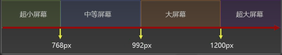
<style>
    h1 {
        width: 600px;
        height: 400px;
        line-height: 400px;
        background-image: linear-gradient(30deg, red, yellow, green);
        margin: 0 auto;
        text-align: center;
        font-size: 100px;
        color: white;
        text-shadow: 0 0 10px black;
    }

    /* 超小屏幕 */
    @media screen and (max-width: 768px){

    }

    /* 中等屏幕 */
    @media screen and (min-width: 768px) and (max-width: 992px){

    }


    /* 大屏幕 */
    @media screen and (min-width: 992px) and (max-width: 1200px){

    }


    /* 超大屏幕 */
    @media screen and (min-width: 1200px){

    }

</style>

<h1><span>新年快乐</span></h1>
14.5 css 分包
第一种写法: 一般会划分出多个css
small.css
/* 超小屏幕 */
@media screen and (max-width: 768px){

}
middle.css
/* 中等屏幕 */
@media screen and (min-width: 768px) and (max-width: 992px){

}
large.css
/* 大屏幕 */
@media screen and (min-width: 992px) and (max-width: 1200px){

}
huge.css
/* 超大屏幕 */
@media screen and (min-width: 1200px){

}
css/index.css
h1 {
    width: 600px;
    height: 400px;
    line-height: 400px;
    background-image: linear-gradient(30deg, red, yellow, green);
    margin: 0 auto;
    text-align: center;
    font-size: 100px;
    color: white;
    text-shadow: 0 0 10px black;
}
index.html
<!DOCTYPE html>
<html lang="en">
<head>
    <meta charset="UTF-8">
    <title>Title</title>
    <!-- 先引入正常的css -->
    <link rel="stylesheet" href="./css/index.css">
    <link rel="stylesheet" href="./css/small.css">
    <link rel="stylesheet" href="./css/middle.css">
    <link rel="stylesheet" href="./css/large.css">
    <link rel="stylesheet" href="./css/huge.css">
</head>
<body>
<h1><span>新年快乐</span></h1>
</body>
</html>
或者另一种写法,在导入css时,判断当前设备是否满足条件,满足才应用对应的css
small.css
/* 直接写样式 */
 h1{

}
middle.css
/* 直接写样式 */
 h1{

}
large.css
/* 直接写样式 */
 h1{

}
huge.css
/* 直接写样式 */
 h1{

}
css/index.css
h1 {
    width: 600px;
    height: 400px;
    line-height: 400px;
    background-image: linear-gradient(30deg, red, yellow, green);
    margin: 0 auto;
    text-align: center;
    font-size: 100px;
    color: white;
    text-shadow: 0 0 10px black;
}
index.html
<!DOCTYPE html>
<html lang="en">
<head>
    <meta charset="UTF-8">
    <title>Title</title>
    <!-- 先引入正常的css -->
    <link rel="stylesheet" href="./css/index.css">
    <!-- 当满足media条件时,就会使用对应的css -->
    <link rel="stylesheet" media="screen and (max-width: 768px)" href="./css/small.css">
    <link rel="stylesheet" media="screen and (min-width: 768px) and (max-width: 992px)" href="./css/middle.css">
    <link rel="stylesheet" media="screen and (min-width: 992px) and (max-width: 1200px)" href="./css/large.css">
    <link rel="stylesheet" media="screen and (min-width: 1200px)" href="./css/huge.css">
</head>
<body>
<h1><span>新年快乐</span></h1>
</body>
</html>
15. BFC (面试题)
15.1 简介
1. W3C 对 BFC 的定义
浮动、绝对定位元素,不是块盒子的块容器(如inline-blocks,table-cells和table-captions),以及overflow属性的值除visible以外的块盒,将为其内容建立新的块格式化上下文
2. MDN 对 BFC 的定义
块格式化上下文(Block Formatting Context,BFC),是Web页面的可是CSS渲染的一部分,是块盒子的布局过程发生的区域,也是浮动元素与其他元素交互的区域
3. 通俗易懂的定义
BFC是Block Formatting Context简称BFC,可以理解成元素的一个"特异功能"- 该"特异功能",在默认情况下处于关闭状态;当元素满足了某些条件后,该"特异功能"被激活
- 所谓激活"特异功能",专业点说就是: 该元素创建了
BFC(又称,开启了BFC)
15.2 开启BFC能解决什么问题
- 父元素开启
BFC后,其子元素不会在产生margin塌陷问题 - 当前元素开启
BFC后,自己不会被其他浮动元素所覆盖 - 父元素元素开启
BFC后,就算其子元素浮动,元素自身高度也不会塌陷
15.3 如何开启BFC?
1. html根元素
默认开启了BFC
2. 浮动元素
默认开启了BFC
3. 绝对定位、固定定位的元素
默认开启了BFC
4. 行内块元素
默认开启了BFC
5. 表格单元格
默认开启了BFC
6. overflow的值不为 visible 的块元素
默认开启了BFC
7. 伸缩项目
默认开启了BFC
8. 多列容器
默认开启了BFC
9. solumn-span 为 all 的元素,横跨多列的元素(即使该元素没有包裹在多列容器中)
默认开启了BFC
10. display的值,设置为flow-root的元素,这个副作用是最低的,但是IE不支持
默认开启了BFC
11. 通过如下手段开启BFC,解决上面的三个问题
<!DOCTYPE html>
<html lang="en">
<head>
    <meta charset="UTF-8">
    <title>Title</title>
    <style>
        * {
            margin: 0;
            padding: 0;
        }

        .outer {
            width: 400px;
            background-color: #888;
            /*float: left;*/            /* 通过开启浮动,开启BFC */
            /*position: absolute;*/     /* 开启绝对定位,开启BFC */
            /*position: fixed;          !* 开启固定定位,开启BFC *!*/
            /*display: inline-block;    !* 变为行内块元素,开启BFC *!*/
            /*display: table;           !* 变为表格元素,开启BFC *!*/
            /*overflow: hidden;         !* overflow 不为 visible,开启BFC *!*/
            /*column-count: 1;          !* 变为多列容器,开启BFC *!*/
            /*column-span: all;         !* column-span为all,开启BFC *!*/
            /*display: flow-root;        !* display的值为flow-root,开启BFC *!*/
        }

        /*body{*/
        /*    display: flex;          !* 变为伸缩容器,儿子outer变为伸缩项目,开启BFC *!*/
        /*}*/

        .inner {
            width: 100px;
            height: 100px;
            margin: 20px;
        }

        .inner1 {
            background-color: orange;
        }

        .inner2 {
            background-color: green;
        }

        .inner3 {
            background-color: deepskyblue;
        }
    </style>
</head>
<body>
<div class="outer">
    <div class="inner inner1"></div>
    <div class="inner inner2"></div>
    <div class="inner inner3"></div>
</div>
</body>
</html>

 浙公网安备 33010602011771号