前端 --- CSS2
0. 概述
CSS(Cascading Style Sheets) 层叠样式表
1. 像素
屏幕是由很多发光的小点组成的,即像素点,像素点越多,屏幕呈现的效果越细腻
1. 引入方式
1.1 外部文件( 常用 )
<head>
	<link rel="stylesheet" href="h1.css">
</head>
1.2 内接式
<head>
	<style>
   		div{
         	color:red-->
     	}
	</style>
</head>
1.3 内联式
<div style="color:red">床前明月光</div>
1.4 文件导入
<head>
	<style>
 		@import url("h1.css");-->
	</style>
</head>
1. 选择器
1.1 通配选择器
* {    /* `*`指定整个页面的所有的标签都是根据下面的属性进行渲染 */
    属性名: 属性值;
}
1.2 元素选择器
h1 {     /* 使用 h1 的方式,指定所有的 h1 标签 */
    属性名: 属性值;
}
1.3 类名选择器
<style>
    .say{    /* 指定所有 class="say" 的标签 */
        color: red;
    }
</style>

<p class="say">Hello World</p>
<p class="say">The Earth</p>
<p>Hi</p>
1.4 ID 选择器
<style>
    #say{    /* 指定所有 id="say" 的标签 */
        color: red;
    }
</style>

<p id="say">Hello World</p>
<p id="earth">The Earth</p>
1.5 交集选择器
<style>
    p.say{    /* 指定所有是 p标签,并且 class="say" 的标签 */
        color: red;
    }
    .say.earth{    /* 指定所有 class="say earth" 的标签 */
        color: orange;
    }
</style>

<p class="say">Hello World</p>
<p class="earth">The Earth</p>
<p class="say earth">The Earth</p>
1.6 并集选择器
<style>
    .say,
    .earth{    /* 指定所有 class="say" 或者 class="earth"的标签 */
        color: orange;
    }
</style>

<p class="say">Hello World</p>
<p class="earth">The Earth</p>
1.7 后代选择器
<style>
    ul li a{    /* 指定所有 ul 中的 li 中的 a标签 */
        color: orange;
    }
    .say li a{  /* 指定 class="say"的ul 中的 li 的 a标签 */
        color: red;
    }
</style>
<ul>
    <li>Python</li>
    <li>Java</li>
    <li>Golang</li>
</ul>

<ul class="say">
    <li>Python <a href="#">百度</a></li>
    <li>Java</li>
    <li>Golang</li>
</ul>
1.8 儿子选择器
只选择儿子
<style>
    .warpper > a{    /* 指定所有 class="warpper"的div 中的 儿子辈的a标签 */
        color: red;
    }
    div > div{    /* 指定所有 div 中的 儿子辈的div标签 */
        color: orange;
    }
</style>

<div class="warpper">
    <a href="#">张三</a>
    <div>
        <div>
            <a href="#">王五</a>
        </div>
        <a href="#">赵六</a>
    </div>
</div>
1.9 兄弟选择器(弟弟)
<style>
    div + p { /* 指定所有 和 div标签 下面相邻的兄弟 p标签 */
        color: red;
    }

    p + p { /* 指定所有 和 p标签 下面相邻的兄弟 p标签 */
        color: green;
    }

    div ~ p{  /* 指定所有 div 下面的兄弟 p标签 */
       color: blue;
    }
</style>

<div>Hello World</div>
<p>Python</p>
<p>Java</p>
<p>Golang</p>
1.10 属性选择器
<style>
    [title]{   /* 指定所有有 title属性 的标签 */
        color: red;
    }

    [title="Java"]{ /* 指定所有有 title属性并且值为Java 的标签 */
            color: skyblue;
    }

    [title^="D"]{ /* 指定所有有 title属性并且值为D开头 的标签 */
            color: orange;
    }

    [title$="D"]{ /* 指定所有有 title属性并且值为D结尾 的标签 */
            color: orange;
    }

    [title*="o"]{ /* 指定所有有 title属性并且值中包含o 的标签 */
            color: saddlebrown;
    }
</style>

<div title="Python">Python</div>
<div title="Java">Java</div>
<div title="Do">Do</div>
<div title="Dubble">Dubble</div>
<div>Golang</div>
1.11 伪类选择器
1. link
<style>
    a:link{ /* 选中所有 a标签 没有被访问过的 标签 */
        color: red;
    }
</style>

<a href="https://www.baidu.com">百度</a>
<a href="https://www.jd.com">京东</a>
2. visited
<style>
    a:visited{ /* 选中所有 a标签 被访问过的 标签 */
        color: orange;
    }
</style>

<a href="https://www.baidu.com">百度</a>
<a href="https://www.jd.com">京东</a>
3. hover
<style>
    a:hover{ /* 鼠标悬浮在 a标签 时 */
        color: orange;
    }
</style>

<a href="https://www.baidu.com">百度</a>
<a href="https://www.jd.com">京东</a>
4. active
如果四个选择器同时存在,必须按照link visited hover active 的顺序定义
a:active{ /* 鼠标点击还未抬起 时 */
    color: orange;
}
5. focus
input:focus{ /* 获取焦点时触发的样式 */
    color: orange;
}
6. first
a:first{ /* 选中 第一个 a 标签 */
    color: orange;
}
7. first-child
div>a:first-child{ /* 选中div的后代中的 第一个儿子a标签 */
    color: orange;
}
8. last-child
div>a:last-child{ /* 选中div的后代中的 最后一个儿子a标签 */
    color: orange;
}
9. nth-child()
div>a:nth-child(3){ /* 第几个儿子 */
    color: orange;
}
div>a:nth-child(2n){ /* 2*n 的儿子 */
    color: orange;
}
div>a:nth-child(even){ /* 偶数的儿子 */
    color: orange;
}
div>a:nth-child(2n+1){ /* 2n+1 的儿子 */
    color: orange;
}
div>a:nth-child(odd){ /* 奇数 的儿子 */
    color: orange;
}
div>a:nth-child(-n+5){ /* 前五 的儿子 */
    color: orange;
    }
10. first-of-type
div>a:first-of-type){ /* 同类型的第一个儿子 */
    color: orange;
}
11. last-of-type
div>a: last-of-type { /* 同类型的最后一个儿子 */
    color: orange;
}
12. nth-of-type()
div>a:nth-of-type(5) { /* 同类型的第5个儿子 */
    color: orange;
}
13. only-child
div>a:only-child { /* 独生子 */
    color: orange;
}
14. empty
div:empty { /* 内容是空的 */
	color: orange;
}
15 not()
div:not(.fail) { /* 选择所有的div标签,排除 class="fail" 的标签 */
    color: orange;
}
16 checked
input:checked {   /* 被勾选的输入框 */
	color: orange;
}
17. disabled
input:disabled{   /* 不可用的输入框 */

}
18. enabled
input:enabled{	/* 可用的输入框 */

}
19. target
input:target{	/* 选中锚点所指向的元素 */

}
20. lang()
input:lang(en){	/* 选中语言为英文的标签 */

}
1.12 伪元素选择器
1. ::first-letter
div::first-letter{	/* 首字母 */

}
2. ::first-line
div::first-line{	/* 首行 */

}
3. ::selection
div::selection{	/* 被鼠标选中的 */

}
4. ::placeholder
input::placeholder{	/* input标签中的提示信息 */

}
5. ::before
p::before{	/* 在p标签最前面加内容 */
    content: "¥"
}
6. ::after
p::after{	/* 在p标签最后面加内容 */
    content: "¥"
}
1.13 优先级
样式中的!important > 行内样式 > ID选择器 > 类选择器 > 元素选择器 > 通配选择器(*)

同类型选择器按照style中定义的顺序,后定义的优先级更高
1.14 权重
1. 首先比较 ID选择器的个数,如果相同,就继续比较,如果不同,哪个个数多,则显示这个样式
2. 其次比较类、伪类、属性选择器的总个数,如果相同,就继续比较,如果不同,哪个个数多,则显示这个样式
3. 其次再比较元素、伪元素选择器的总个数,如果全部相同,则显示style中后定义的样式,如果不同,哪个个数多,则显示这个样式
2. 三大特性
1. 层叠性: 如果发生了样式变化,那就会根据一定的规则(选择器的优先级),和权重,进行样式的层叠,最终生出的样式会将其他覆盖
2. 继承性: 元素会自动拥有其父元素或其祖先元素上所设置的某些样式,优先集成离得近的
**3. **
3. 字体
3.1 大小
chrome浏览器默认对于字体的大小限制最低为12px
由于字体设计的原因,文字最终呈现的大小,并不一定与font-size的值一致,可能大也可能小
通常情况下,文字相对字体设计框,并不是垂直居中的,通常都靠下一些
.d1{
	font-size: 40px;
}
3.2 家族
.d1{
	font-family: "华文琥珀","华文彩云","微软雅黑";  /* 根据顺序匹配,如果匹配到就使用当前字体格式 */
    font-family: "STHupo YaHei","STCaiyun","Microsoft YaHei",sans-serif;  /* 通常使用英文的字体名,通过百度查询, sans-serif指的是如果前面都没有就让操作系统随便选择一个非衬线字体使用,serif为衬线 */
}
3.3 风格
代码示例
.d1{
    font-style: normal;
}
属性表
| 属性名 | 标识 | 选项 | 备注 |
|---|---|---|---|
| font-style: normal | 默认值 | 正常 | |
| font-style: italic | 使用字体自带的字体倾斜效果 | ||
| font-style: oblique | 强制倾斜产生的字体倾斜效果 |
3.4 粗细
代码示例
.d1{
    font-weight: lighter;
}
属性表
| 属性名 | 标识 | 选项 | 备注 |
|---|---|---|---|
| font-weight: lighter | 可以使用数字 100~300 代替lighter关键字 | 细的 | |
| font-weight: normal | 默认值 | 可以使用数字 400~500 代替normal关键字 | 正常 |
| font-weight: bold | 可以使用数字 600及以上 代替bold关键字 | 粗的 | |
| font-weight: bolder | 更粗的,如果该字体没有设计更粗的,则默认使用粗的 |
3.5 混合属性
代码示例
.d1{
    font: bold italic 100px "STHupo YaHei","STCaiyun",sans-serif;  /* 注意属性的顺序 */
}
4. 文本
4.1 颜色
1. rgb / rgba
.warpper{
    color: rgb(0,255,255,0.1)  /* 红,绿,蓝  颜色的范围为: 0-255 */
}

.inner{
    color: rgba(0,255,255,0.1)  /* 红,绿,蓝,透明度  颜色的范围为: 0-255,透明度的范围为: 0-1 */
}
2. HEX / HEXA
十六进制的 rgb,IE浏览器支持HEX 但是不支持HEXA
.warpper{
    color: #0a1b20   /* 每两位代表一个颜色单位,红,绿,蓝 十六进制 */
}

.inner{
    color: #0a1b20ff  /* 每两位代表一个单位,红,绿,蓝,透明度 */
}
3. HSL / HSLA
根据色相环来显示颜色

.warpper{
    color: hsl(色相,饱和度,亮度)
}

.warpper{
    color: hsl(0,100%,50%)
}

.inner{
    color: hsl(0,100%,50%,0.5)
}
4.2 间距
代码示例
.d1{
    letter-spacing: 20px;
}
属性表
| 属性名 | 标识 | 选项 | 备注 |
|---|---|---|---|
| letter-spacing: 20px | 每个字母或文字之间的间距 | ||
| word-spacing: 20px | 每个英文单词之间的间距 |
4.3 修饰
代码示例
.d1{
    text-decoration: overline;
}
属性表
| 属性名 | 标识 | 选项 | 备注 |
|---|---|---|---|
| text-decoration: overline | 上划线 | ||
| text-decoration: underline | 下划线 | ||
| text-decoration: underline dotted | 下划虚线 | ||
| text-decoration: underline wavy | 下划波浪线 | ||
| text-decoration: underline wavy red | 下划红色虚线 | ||
| text-decoration: line-through | 删除线 | ||
| text-decoration: none | 无装饰线 | ||
| text-decoration: line-through | 中划线 |
4.4 缩进
代码示例
.d1{
    font-size:40px;
    text-indent: 80px;  /* 根据文字大小计算缩进空间 */
}
4.5 水平对齐
代码示例
.d1{
    text-align: center;
}
属性表
| 属性名 | 标识 | 选项 | 备注 |
|---|---|---|---|
| text-align: left | 默认值 | 左对齐 | |
| text-align: center | 居中 | ||
| text-align: right | 右对齐 |
4.6 垂直对齐
代码示例
.d1{
    vertical-align: center;
}
属性表
| 属性名 | 标识 | 选项 | 备注 |
|---|---|---|---|
| vertical-align: top | 子元素顶部对齐 | ||
| vertical-align: baseline | 默认值 | 子元素基线对齐 | |
| vertical-align: middle | 子元素的中部与父元素的基线加上父元素 x-heignt的一半对齐 | ||
| vertical-align: bottom | 子元素底部对齐 |
4.7 行高
代码示例
.d1{
    line-height: 80px;
}
属性表
| 属性名 | 标识 | 选项 | 备注 |
|---|---|---|---|
| line-height: normal | 默认值 | 自适应行高 | |
| line-height: 1.5 | 推荐值 | 1.5倍的font-size | |
| text-align: 150% | 150%的font-size |
4.8 超出隐藏并追加省略号
.text{
	width: 100%;
	font-size: 24rpx;
    color: #333;
	padding: 6rpx 0;

	overflow: hidden;
	text-overflow: ellipsis;
	white-space: nowrap;
	display: -webkit-box;
	-webkit-line-clamp: 2;   /* 两行文字, 超出的变为省略号 */
	-webkit-box-orient: vertical;
	word-break: break-all;
}
5. 列表
5.1 符号样式
代码示例
ul {
    list-style-type: none;
}
属性表
| 属性名 | 标识 | 选项 | 备注 |
|---|---|---|---|
| list-style-type: none | 常用值 | 无标识 | |
| list-style-type: square | 方块形 | ||
| list-style-type: lower-roman | 小写罗马数字 | ||
| list-style-type: upper-roman | 大写罗马数字 | ||
| list-style-type: decimal | 阿拉伯数字 |
5.2 符号位置
代码示例
ul {
    list-style-position: inside;
}
属性表
| 属性名 | 标识 | 选项 | 备注 |
|---|---|---|---|
| list-style-position: inside | 符号在li里面 | ||
| list-style-position: outside | 默认值 | 符号在li的外面 |
5.3 符号自定义
代码示例
ul {
    list-style-image: url("图片路径");
}
5.4 复合属性
代码示例
ul {
    list-style: decimal inside url("图片路径");
}
6. 表格
6.1 边框
代码示例
table {
    border-width: 2px;
    border-color: red;
    border-style: solid;
}
属性表
| 属性名 | 标识 | 选项 | 备注 |
|---|---|---|---|
| border-width: 2px | 边框宽度 | ||
| border-color: red | 边框颜色 | ||
| border-style: solid | border-style: solid 实线 border-style: dashed 虚线 border-style: dotted 点线 border-style: double 双实线 |
边框样式 | |
| border: 2px black solid | 边框混合属性 | ||
6.2 单元格
代码示例
table {
    border-spacing:0px
}
属性表
| 属性名 | 标识 | 选项 | 备注 |
|---|---|---|---|
| border-spacing: 0px | 单元格间距 | ||
| border-collapse: separate | border-collapse: separate 不合并 border-collapse: separate 重叠 |
合并单元格边框 | |
| empt-cells: show | empt-cells: show 展示 empt-cells: hide 隐藏 |
隐藏没有内容的单元格边框 |
7. 背景
7.1 颜色
代码示例
#inner {
    background-color: red;  /* 默认值为 transparent  透明的 */
}
7.2 图片
代码示例
#inner {
    background-image: url("图片路径");
    background-repeat: repeat;
}
属性表
| 属性名 | 标识 | 选项 | 备注 |
|---|---|---|---|
| border-spacing: 0px | 单元格间距 | ||
| background-repeat: repeat | background-repeat: repeat 默认值: 全部平铺 background-repeat: no-repeat 不平铺 background-repeat: repeat-x 水平平铺 background-repeat: repeat-y 垂直平铺 |
背景图的重复方式 | |
| background-position: left top | background-position: left top 左上方 background-position: right top 右上方 background-position: left bottom 左下方 background-position: right bottom 右下方 background-position: center top 中上方 background-position: center bottom 中下方 background-position: 10px 20px 左上角10px,上20px |
背景图的位置 |
8. 鼠标
代码示例
#inner {
    cursor: move;
}
属性表
| 属性名 | 标识 | 选项 | 备注 |
|---|---|---|---|
| cursor: move | 可移动图标 | ||
| cursor: wait | 加载中图标 | ||
| cursor: url("图片链接"),pointer | 自定义图标 | ||
| cursor: pointer | 可点击图标 |
9. 盒子模型
9.1 长度单位
1. px
#inner {
    width:200px
}
2. em
10em 相当于 当前元素的font-size的10倍,如果当前元素没有font-size,那么就找父元素....,如果都没有就用默认的16px
#inner {
    width:10em;
    font-size:20px;
}
3. rem
10rem 相当于 根元素(html)的font-size的10倍,如果没有就用默认的16px
#inner {
    width:10rem;
}
4. 百分比
10% 相当于 父元素的width的10%
#inner {
    width:10%;
}
9.2 元素显示模式
| 元素分类 | 特点 |
|---|---|
| 块元素 | 1. 在页面中独占一行,不会与任何元素共用一行,从上到下依次排列 2. 默认宽度: 撑满父元素 3. 默认高度: 由内容撑开 4. 可以通过 css 设置宽高 |
| 行内元素 | 1. 在页面中不独占一行,一行中不能容纳下的行内元素,会在下一行继续从左到右依次排列 2. 默认宽度: 由内容撑开 3. 默认高度: 由内容撑开 4. 无法通过 css 设置宽高 |
| 行内块元素 | 1. 在页面中不独占一行,一行中不能容纳下的行内元素,会在下一行继续从左到右依次排列 2. 默认宽度: 由内容撑开 3. 默认高度: 由内容撑开 4. 可以通过 css 设置宽高 |
1. 块级元素变为行内块元素
div {
    display: inline-block
}
2. 块级元素变为行内元素
div {
    display: inline
}
3. 行内元素变为块级元素
a {
    display: block
}
4. 行内元素变为行内块级元素
a {
    display: inline-block
}
5. 隐藏元素
a {
    display: none
}
9.3 组成部分
1. 概述
- 外边距 -- margin
- 边框 -- border
- 内边距(补白) -- padding
- 内容区 -- centent
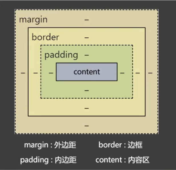
盒子的大小 = cotent + 左右padding + 左右border,外边距margin不影响盒子的大小,但影响盒子的位置
2. content
1. 宽高
div {
    width: 500px;
    min-width: 600px;
    max-width:800px;

    height: 200px;
    min-height: 200px;
    max-height:300px;
}
2. 默认宽度
不设置width属性时,元素所呈现的宽度
总宽度 = 父的content - 自身的左右margin
内容区的宽度 = 父的content - 自身的左右margin - 自身的左右border - 自身的左右padding
3. padding
div {
    padding-left: 20px;
    padding-top: 30px;
    padding-right: 40px;
    padding-bottom: 50px;

    padding: 20px;  /* 上下左右内边距都是20px */
    padding: 20px 30px 40px 50px; /* 上、右、下、左, 即顺时针设置*/
}
4. border
默认的边框宽度为3px
div {
    border-width:10px;
    border-color: red;
    border-style: solid;

    border-top-width:10px;
    border-right-width:10px;
    border-bottom-width:10px;
    border-left-width:10px;

    border-top-color:red;
    border-right-color:green;
    border-bottom-color:black;
    border-left-color:gray;

    border-top-style:solid;
    border-right-style:dashed;
    border-bottom-style:double;
    border-left-style:dotted;

    border-top:10px solid red;
    border-right:10px solid red;
    border-bottom:10px solid red;
    border-left:10px solid red;

    border: 10px solid red
}
5. margin
div {
    margin-top:10px;
    margin-right:10px;
    margin-bottom:10px;
    margin-lef:10px;

    margin: 20px;  /* 上下左右外边距都是20px */
    margin: 20px 30px 40px 50px; /* 上、右、下、左, 即顺时针设置*/
}
注意事项
- 子元素的 margin 是参考父元素的 content 实现的
margin塌陷问题: 父元素中的第一个子元素添加上外边距时,和最后一个子元素加下外边距时,会作用在父元素的身上,可以通过给父元素设置 overflow:hidden 解决这个问题
margin上下合并现象: 上下两个元素之间,上面的元素设置下外边距,下面的元素设置上外边距,以最大值作为两个元素之间的距离,左右不会
9.4 内容溢出
对于内容溢出,可以给父元素添加 overflow 来解决
div {
    overflow: visible;  /* 超出部分显示,默认值 */
    overflow: hidden;   /* 超出部分隐藏 */
    overflow: scroll;   /* 超出部分出现滚动条 */
    overflow: auto;     /* 超出部分自动显示 */
}
9.5 隐藏元素
.box{
    display: none;       /* 隐藏当前元素,不在页面占据原来元素的位置 */
    visibility: hidden;  /* 隐藏当前元素,并在页面占据原来元素的位置 */
}
9.6 元素之间的空白
行内元素、行内块元素彼此之间的换行会被浏览器解析为一个空白字符
问题图

代码实现
<!DOCTYPE html>
<html lang="en">
<head>
    <meta charset="UTF-8">
    <title>Title</title>

    <style>
        .d1{
            font-size: 0; /* 通过指定父元素的 font-size:0 来消除空白*/
        }
        .s1{
            font-size: 20px; /* 单独设置文字的 font-size */
            background-color: orange;
        }
        .s2{
            font-size: 20px;
            background-color: tomato;
        }
        .s3{
            font-size: 20px;
            background-color: skyblue;
        }
        .s4{
            font-size: 20px;
            background-color: gray;
        }
    </style>
</head>
<body>
<div class="d1">
    <span class="s1">人之初</span>
    <span class="s2">性本善</span>
    <span class="s3">性相近</span>
    <span class="s4">习相远</span>
    <hr>
    <img style="width: 100px" src="https://q1.itc.cn/q_70/images03/20240320/fcf023d835c54f78bac6c7efc98fbb4c.jpeg" alt="">
    <img style="width: 100px" src="https://q1.itc.cn/q_70/images03/20240320/fcf023d835c54f78bac6c7efc98fbb4c.jpeg" alt="">
    <img style="width: 100px" src="https://q1.itc.cn/q_70/images03/20240320/fcf023d835c54f78bac6c7efc98fbb4c.jpeg" alt="">
</div>
</body>
</html>
9.7 行内块元素的幽灵空白
由于图片和x的基线对齐所产生的缝隙
问题图
代码示例
<!DOCTYPE html>
<html lang="en">
<head>
    <meta charset="UTF-8">
    <title>Title</title>

    <style>
        .d1{
            background-color: skyblue;
            font-size:0; /* 方法2: 如果子元素中没有文字可以通过这种方法设置,调整父元素的文字大小 */
        }
        span{
            font-size: 40px;
            vertical-align: bottom; /* 方法2.1: 如果有文字,必须并调整文字的对齐方式 */
        }
        img {
            vertical-align: bottom;  /* 方法1: 调整图片的对齐方式,top,bottom,middle,不再使用默认的基线对齐 */
        }

    </style>
</head>
<body>
<div class="d1">
    <img style="width: 100px" src="https://q1.itc.cn/q_70/images03/20240320/fcf023d835c54f78bac6c7efc98fbb4c.jpeg" alt="">
    <span>xg</span>
</div>
</body>
</html>
10. 常规布局
10.1 块元素垂直水平居中
1. 效果图

2. 代码实现
<!DOCTYPE html>
<html lang="en">
<head>
    <meta charset="UTF-8">
    <title>Title</title>

    <style>
        .d1 {
            width: 400px;
            height: 400px;
            background-color: gray;
            text-align: center;
            overflow: hidden; /* 解决 margin 塌陷问题 */
        }

        .inner {
            width: 200px;
            height: 100px;
            background-color: orange;
            margin: 0 auto; 	 /* 块元素水平居中: 上下为0,左右自适应 */
            margin-top: 150px; 	 /* 块元素垂直居中: 子元素距离上面的边距为 (400-100) / 2 */
        }
    </style>
</head>
<body>
<div class="d1">
    <div class="inner">
        inner
    </div>
</div>
</body>
</html>
10.2 行内元素垂直水平居中
1. 效果图

2. 代码实现
<!DOCTYPE html>
<html lang="en">
<head>
    <meta charset="UTF-8">
    <title>Title</title>

    <style>
        .d1 {
            width: 400px;
            height: 400px;
            background-color: gray;
            text-align: center;  /* 行内元素/文本/行内块元素的水平居中 */
            line-height: 400px;  /* 行内元素/文本/行内块元素的垂直居中: line-height = height */
        }
        span{
            background-color: orange;
            font-size: 20px;
        }


    </style>
</head>
<body>
<div class="d1">
    <span>出来玩啊</span>
</div>
</body>
</html>
10.3 多种元素垂直水平居中
效果图

2. 代码实现
<!DOCTYPE html>
<html lang="en">
<head>
    <meta charset="UTF-8">
    <title>Title</title>

    <style>
        .d1 {
            width: 400px;
            height: 400px;
            background-color: gray;
            text-align: center;  /* 水平居中 */
            line-height: 400px;
            font-size: 0; /* 让父元素的文字不再影响图片的位置,使其真正垂直居中 */
        }
        span{
            background-color: orange;
            font-size: 40px;  /* 单独设置文字大小 */
            vertical-align: middle;  /* 垂直居中 */
        }
        img{
            width: 100px;
            vertical-align: middle;  /* 垂直居中 */
        }


    </style>
</head>
<body>
<div class="d1">
    <span>出来玩啊</span>
    <img src="https://q1.itc.cn/q_70/images03/20240320/fcf023d835c54f78bac6c7efc98fbb4c.jpeg" alt="">
</div>
</body>
</html>
11. 浮动布局
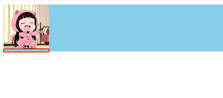
11.1 文字环绕
1. 效果图

2. 代码实现
<!DOCTYPE html>
<html lang="en">
<head>
    <meta charset="UTF-8">
    <title>Title</title>

    <style>
        .d1{
            width: 700px;
            height: 700px;
            background-color: skyblue;
        }
        img{
            width:200px;
            float: left; /* 图片浮动到左边,其余元素依次排列 */
            margin-right: 0.5em;
        }

    </style>
</head>
<body>
<div class="d1">
    <img src="https://q1.itc.cn/q_70/images03/20240320/fcf023d835c54f78bac6c7efc98fbb4c.jpeg" alt="">
    <div>Lorem ipsum dolor sit amet, consectetur adipisicing elit. Accusamus asperiores beatae cupiditate eaque eum exercitationem expedita facilis id nam natus odit perferendis perspiciatis praesentium quaerat quas quidem reprehenderit rerum, sequi tenetur ut veniam, vitae voluptates voluptatibus? Accusamus alias aliquid aspernatur consectetur consequatur consequuntur cumque cupiditate distinctio dolorum earum eligendi error eveniet ex fuga fugiat in ipsa ipsam itaque labore laborum laudantium molestias natus nihil odit optio possimus, quae quas quasi qui quia quibusdam quisquam quod quos reprehenderit repudiandae sed voluptas. Accusamus blanditiis commodi dolores harum, magni, minima natus nemo neque nulla odit omnis quaerat sapiente similique suscipit vero voluptas voluptatibus.</div>
</div>
</body>
</html>
11.2 浮动后的特点
- 浮动后的元素会脱离文档流
- 不管浮动前是什么元素,浮动后都是: 默认宽与高都是比内容撑开(尽可能小),而且可以设置宽高
- 不会独占一行,可以与其他元素共用一行
- 不会
margin合并,也不会margin塌陷,能够完美的设置四个方向的margin和padding - 不会像行内块元素一样被当做文本处理(没有行内块元素的留白问题)
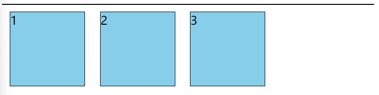
11.3 浮动练习
1. 初始效果图

代码实现
<!DOCTYPE html>
<html lang="en">
<head>
    <meta charset="UTF-8">
    <title>Title</title>

    <style>
        .outer {
            width: 500px;
            background-color: gray;
            border: 1px solid black;
        }
        .box{
            width: 100px;
            height: 100px;
            background-color: skyblue;
            border: 1px solid black;
            margin: 10px;
        }
    </style>
</head>
<body>
<div class="outer">
    <div class="box box1">1</div>
    <div class="box box2">2</div>
    <div class="box box3">3</div>
</div>
</body>
</html>
2. 盒子1有浮动效果图

代码实现
<!DOCTYPE html>
<html lang="en">
<head>
    <meta charset="UTF-8">
    <title>Title</title>

    <style>
        .outer {
            width: 500px;
            background-color: gray;
            border: 1px solid black;
        }
        .box{
            width: 100px;
            height: 100px;
            background-color: skyblue;
            border: 1px solid black;
            margin: 10px;
        }
        .box1{
            float: right;  /* 盒子1 右浮动 */
        }
    </style>
</head>
<body>
<div class="outer">
    <div class="box box1">1</div>
    <div class="box box2">2</div>
    <div class="box box3">3</div>
</div>
</body>
</html>
3. 盒子1左浮动,同时盒子2的文字被挤出

代码实现
<!DOCTYPE html>
<html lang="en">
<head>
    <meta charset="UTF-8">
    <title>Title</title>

    <style>
        .outer {
            width: 500px;
            background-color: gray;
            border: 1px solid black;
        }
        .box{
            width: 100px;
            height: 100px;
            background-color: skyblue;
            border: 1px solid black;
            margin: 10px;
        }
        .box1{
            float: left;  /* 盒子1 向左浮动,由于浮动设计的初衷是文字环绕效果,所以盒子2的文字环绕盒子2,被挤出 */
        }
    </style>
</head>
<body>
<div class="outer">
    <div class="box box1">1</div>
    <div class="box box2">2</div>
    <div class="box box3">3</div>
</div>
</body>
</html>
4. 全部左浮动效果图
代码实现
<!DOCTYPE html>
<html lang="en">
<head>
    <meta charset="UTF-8">
    <title>Title</title>

    <style>
        .outer {
            width: 500px;
            background-color: gray;
            border: 1px solid black;
        }
        .box{
            width: 100px;
            height: 100px;
            background-color: skyblue;
            border: 1px solid black;
            margin: 10px;
            float: left;  /* 盒子1,2,3全部浮动 */
        }

    </style>
</head>
<body>
<div class="outer">
    <div class="box box1">1</div>
    <div class="box box2">2</div>
    <div class="box box3">3</div>
</div>
</body>
</html>
5. 盒子3下落至第二排
效果图

代码实现
<!DOCTYPE html>
<html lang="en">
<head>
    <meta charset="UTF-8">
    <title>Title</title>

    <style>
        .outer {
            width: 500px;
            background-color: gray;
            border: 1px solid black;
        }
        .box{
            width: 200px;  /* 由于父元素的高度总共500px,每个盒子的宽度为200px,第三个盒子占不下,自动往后排,所以盒子3落下来第二排 */
            height: 200px;
            background-color: skyblue;
            border: 1px solid black;
            margin: 10px;
            float: left;  /* 盒子1,2,3全部浮动 */
        }

    </style>
</head>
<body>
<div class="outer">
    <div class="box box1">1</div>
    <div class="box box2">2</div>
    <div class="box box3">3</div>
</div>
</body>
</html>
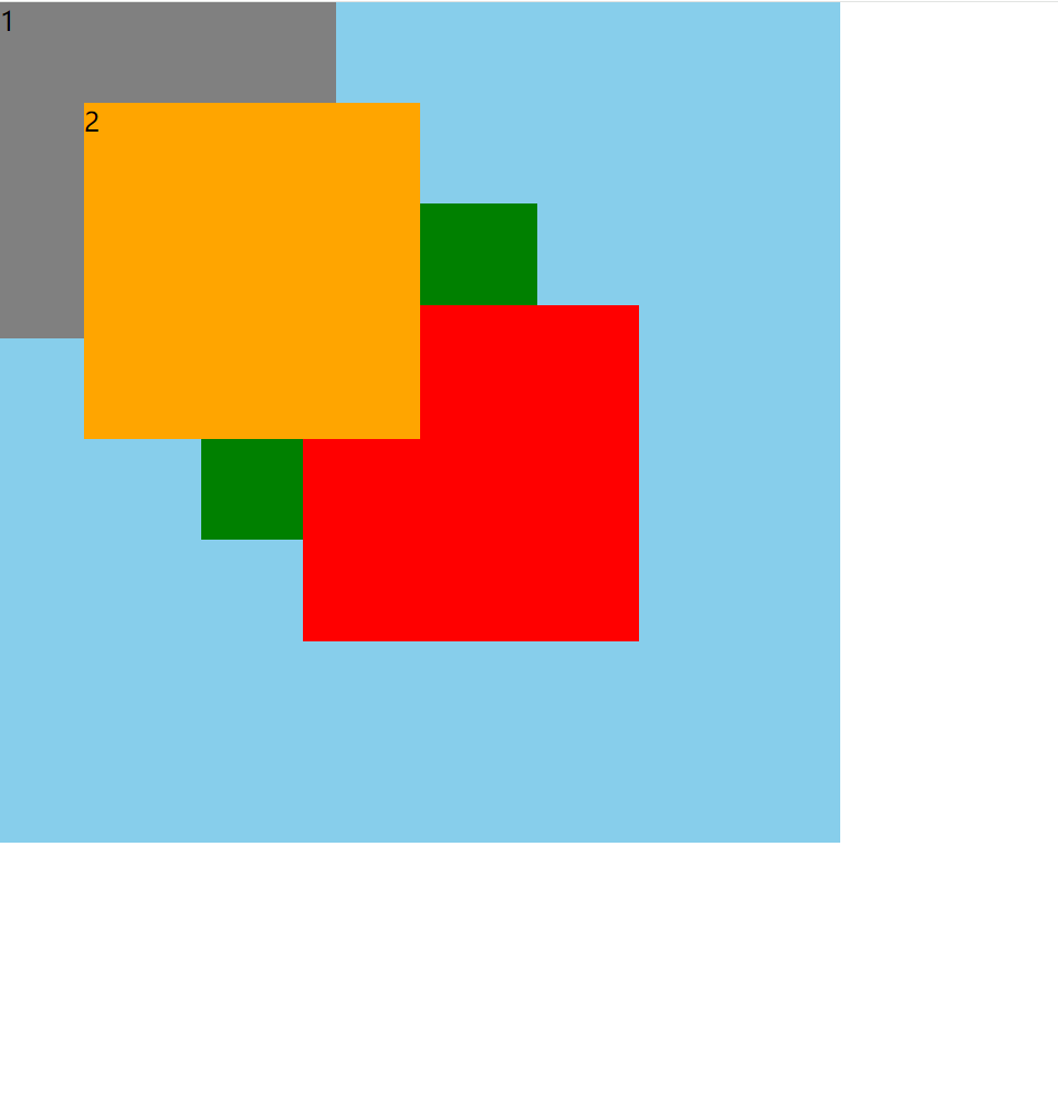
6. 卡住盒子3
效果图

代码实现
<!DOCTYPE html>
<html lang="en">
<head>
    <meta charset="UTF-8">
    <title>Title</title>

    <style>
        .outer {
            width: 500px;
            background-color: gray;
            border: 1px solid black;
        }

        .box{
            width: 200px;
            height: 200px;
            background-color: skyblue;
            border: 1px solid black;
            margin: 10px;
            float: left;  /* 盒子1,2,3全部浮动 */
        }
        .box1{
            height: 250px;  /* 由于盒子1的高度占用了第二排的空间,所以盒子3自动往后排 */
        }

    </style>
</head>
<body>
<div class="outer">
    <div class="box box1">1</div>
    <div class="box box2">2</div>
    <div class="box box3">3</div>
</div>
</body>
</html>
11.4 浮动后的影响
- 对兄弟元素的影响: 浮动元素后面的兄弟元素,会占据浮动元素之前的位置在浮动元素的下面,对前面的兄弟无影响
- 对父元素的影响: 父元素如果没有设置高度,子元素浮动后,导致父元素的高度塌陷,没有高度了
11.5 解决浮动后的影响
1. 父元素的高度不塌陷

第一种方案: 给父元素设置高度
<!DOCTYPE html>
<html lang="en">
<head>
    <meta charset="UTF-8">
    <title>Title</title>

    <style>
        .outer {
            width: 500px;
            background-color: gray;
            border: 1px solid black;
            height: 120px;  /* 给父元素根据子元素的高度和外边距相加,设置高度 */
        }

        .box {
            width: 100px;
            height: 100px;
            background-color: skyblue;
            border: 1px solid black;
            margin: 10px;
        }

        .box1, .box2, .box3 {
            float: left;
        }

    </style>
</head>
<body>
<div class="outer">
    <div class="box box1">1</div>
    <div class="box box2">2</div>
    <div class="box box3">3</div>
</div>
</body>
</html>
第二种方案: 给父元素添加浮动
<!DOCTYPE html>
<html lang="en">
<head>
    <meta charset="UTF-8">
    <title>Title</title>

    <style>
        .outer {
            width: 500px;
            background-color: gray;
            border: 1px solid black;
            float: left;      /* 给父元素添加浮动 */
        }

        .box {
            width: 100px;
            height: 100px;
            background-color: skyblue;
            border: 1px solid black;
            margin: 10px;
        }

        .box1, .box2, .box3 {
            float: left;
        }

    </style>
</head>
<body>
<div class="outer">
    <div class="box box1">1</div>
    <div class="box box2">2</div>
    <div class="box box3">3</div>
</div>
</body>
</html>
第三种方案: 给父元素添加overflow
<!DOCTYPE html>
<html lang="en">
<head>
    <meta charset="UTF-8">
    <title>Title</title>

    <style>
        .outer {
            width: 500px;
            background-color: gray;
            border: 1px solid black;
            overflow: hidden;  /* 父元素添加overflow */
        }

        .box {
            width: 100px;
            height: 100px;
            background-color: skyblue;
            border: 1px solid black;
            margin: 10px;
        }

        .box1, .box2, .box3 {
            float: left;
        }

    </style>
</head>
<body>
<div class="outer">
    <div class="box box1">1</div>
    <div class="box box2">2</div>
    <div class="box box3">3</div>
</div>
</body>
</html>
2. 解决后面兄弟元素位置被占据的问题

第一种方案: 如果盒子4没有浮动,则可以通过消除前面所有浮动产生的影响解决问题
<!DOCTYPE html>
<html lang="en">
<head>
    <meta charset="UTF-8">
    <title>Title</title>

    <style>
        .outer {
            width: 500px;
            background-color: gray;
            border: 1px solid black;
        }

        .box {
            width: 100px;
            height: 100px;
            background-color: skyblue;
            border: 1px solid black;
            margin: 10px;
        }

        .box1, .box2, .box3 {
            float: left;
        }
        .box4{
            clear: both;  /* 消除前面元素浮动产生的影响 */
        }

    </style>
</head>
<body>
<div class="outer">
    <div class="box box1">1</div>
    <div class="box box2">2</div>
    <div class="box box3">3</div>
    <div class="box box4">4</div>
</div>
</body>
</html>
第二种方案: 如果盒子4也浮动了,则通过在后面追加空白的块元素,清除前面浮动产生的影响
<!DOCTYPE html>
<html lang="en">
<head>
    <meta charset="UTF-8">
    <title>Title</title>

    <style>
        .outer {
            width: 500px;
            background-color: gray;
            border: 1px solid black;
            float: left; /* 给父元素添加浮动 */
        }

        .box {
            width: 100px;
            height: 100px;
            background-color: skyblue;
            border: 1px solid black;
            margin: 10px;
        }

        .box1, .box2, .box3,.box4 {
            float: left;
        }
        .box5{
            clear: both;  /* 添加空标签,用于消除前面元素浮动产生的影响 */
        }

    </style>
</head>
<body>
<div class="outer">
    <div class="box box1">1</div>
    <div class="box box2">2</div>
    <div class="box box3">3</div>
    <div class="box box4">4</div>
    <div class="box5"></div>
</div>
</body>
</html>
第三种方案: 所有的子元素全部浮动的完美解决方案
<!DOCTYPE html>
<html lang="en">
<head>
    <meta charset="UTF-8">
    <title>Title</title>

    <style>
        .outer {
            width: 500px;
            background-color: gray;
            border: 1px solid black;
            float: left; /* 给父元素添加浮动 */
        }

        .box {
            width: 100px;
            height: 100px;
            background-color: skyblue;
            border: 1px solid black;
            margin: 10px;
        }

        .box1, .box2, .box3,.box4 {
            float: left;
        }
        .outer::after{  /* 用伪类选择器,给父元素的后面加空的块元素,并消除前面所有浮动产生的影响 */
            content: "";
            display: block;
            clear: both;
        }

    </style>
</head>
<body>
<div class="outer">
    <div class="box box1">1</div>
    <div class="box box2">2</div>
    <div class="box box3">3</div>
    <div class="box box4">4</div>
</div>
</body>
</html>
重要原则: 所有的子元素,要么全部一起浮动,要么全部不浮动
11.6 浮动进阶练习
效果图
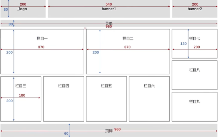
思路
- 整个容器包裹全部元素
- logo banner1 banner2 宽高单独设置,背景颜色直接添加类名即可
- 找到中间元素 banner1 添加左右外边距,即可很方便的分开三个元素
- 栏目区:分为左(1,2,3,4,5,6)右(7,8,9)两侧,左侧元素向左浮动,右侧元素向右浮动,浮动完立刻向其共同父元素添加清除浮动的类名,以便不影响其他元素
- 注意子元素宽度和高度,和在父元素的宽度高度限制内,子元素要减去border的左右上下的2px,不然元素会由于装不下而被挤走
- 栏目7,8,9 纵向排列即,每个元素占一行,这是块级元素的特性,所以不用浮动
代码实现
<!DOCTYPE html>
<html lang="en">
<head>
    <meta charset="UTF-8">
    <title>Title</title>

    <style>
        * {
            margin:0;
            padding: 0;
        }
        /* start 准备好关于浮动的类名,当需要浮动时,加类名即可 */
        .left-fix{
            float: left;
        }
        .right-fix{
            float: left;
        }
        .clear-fix::after{
            content: "";
            display: block;
            clear: both;
        }
        /* end 准备好关于浮动的类名,当需要浮动时,加类名即可 */


        /* start 整个容器的公共属性 */
        .container{
            width: 960px;
            margin: 0 auto;     /* 块级元素水平居中 */
            text-align: center; /* 文字水平居中 */
            line-height: 80px;  /* 文字垂直居中 */
        }

        /* end 整个容器的公共属性 */

        /* start 顶部 */
        .logo,.banner1,.banner2,.menu,.foot{
            background-color: gray;
        }

        .logo {
            height: 80px;
            width: 200px;
        }

        .banner1 {
            height: 80px;
            width: 540px;
            margin: 0 10px;  /* 找到中间元素加左右外边距 */
        }

        .banner2 {
            height: 80px;
            width: 200px;
        }
        /* end 顶部 */

        /* start 菜单 */
        .menu {
            height: 30px;
            width: 960px;
            line-height: 30px;
            margin-top: 10px;
        }
        /* end 菜单 */

        /* start 页脚 */
        .foot {
            height: 60px;
            width: 960px;
            line-height: 60px;
        }
        /* end 页脚 */

        /* start 内容区 */
        .content {
            width: 960px;
            height: 420px;
        }

        .border-item{
            border: 1px solid black;
        }
        .content-left-top-item{
            width: 368px;
            height: 200px;
        }

        .content-right-item{
            width: 198px;
            height: 130px;
        }

        .content,.content8{
            margin: 10px 0;
        }
        .content-left-top{
            margin-bottom: 10px;
        }

        .content-left-bottom-item{
            margin-right: 10px;
        }
        .content2{
            margin: 0 9px;
        }


        .content-left-bottom-item{
            width: 178px;
            height: 200px;
        }

        /* end 内容区 */

    </style>

</head>
<body>
<div class="container">
    <div class="clear-fix top"> <!-- clear-fix 父元素清除浮动 -->
        <div class="left-fix logo">logo</div>
        <div class="left-fix banner1">banner1</div>
        <div class="left-fix banner2">banner2</div>
    </div>
    <div class="menu">菜单</div>
    <div class="clear-fix content">
        <div class="left-fix clear-fix content-left">
            <div class="clear-fix content-left-top">
                <div class="left-fix content-left-top-item border-item content1">栏目一</div>
                <div class="left-fix content-left-top-item border-item content2">栏目二</div>
            </div>
            <div class="clear-fix content-left-bottom">
                <div class="left-fix content-left-bottom-item border-item content3">栏目三</div>
                <div class="left-fix content-left-bottom-item border-item content4">栏目四</div>
                <div class="left-fix content-left-bottom-item border-item content5">栏目五</div>
                <div class="left-fix content-left-bottom-item border-item content6">栏目六</div>
            </div>
        </div>
        <div class="right-fix content-right">
            <div class="border-item content-right-item content7">栏目七</div>
            <div class="border-item content-right-item content8">栏目八</div>
            <div class="border-item content-right-item content9">栏目九</div>
        </div>

    </div>
    <div class="foot">页脚</div>


</div>
</body>
</html>
12. 定位
开启定位的元素,并未脱离文档流,下面的元素不会占元素原来的位置
12.1 相对定位
相对原来的位置,开始定位,原来的空间还占着,通常和绝对定位一起使用
效果图
定位前
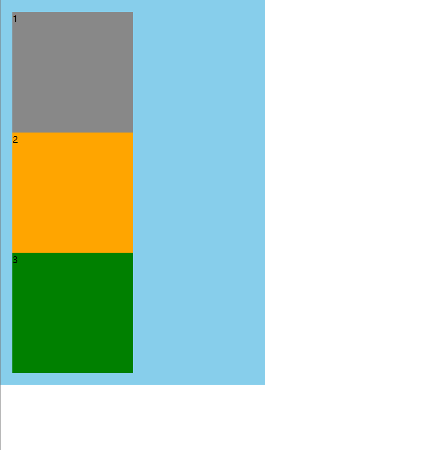
定位后
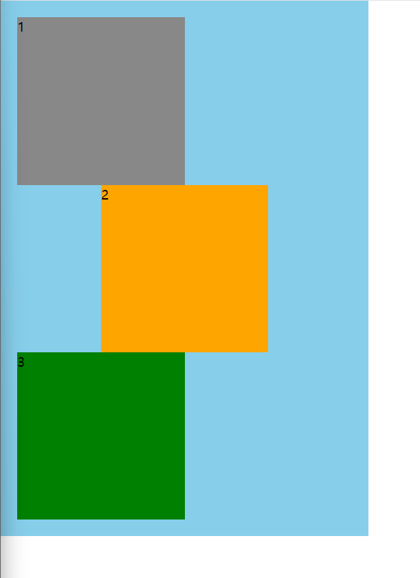
代码实现
<!DOCTYPE html>
<html lang="en">
<head>
    <meta charset="UTF-8">
    <title>Title</title>

    <style>
        .container {
            width: 400px;
            background-color: skyblue;
            padding: 20px;
        }

        .box {
            width: 200px;
            height: 200px;
        }

        .box1 {
            background-color: #888;
        }
        .box2 {
            background-color: orange;
            position: relative; /* 开启相对定位 */
            left: 100px; 		/*  相对于发生定位之前的位置,距离左边100px */
            /* top: 100px;  	    相对于发生定位之前的位置,距离上边100px */
            /* right: 100px;        相对于发生定位之前的位置,距离右边100px */
            /* bottom: 100px;       相对于发生定位之前的位置,距离下边100px */
            /* bottom: -20px;       可以写负值 */
            /* xxxx和margin-xxxx 是成对出现的,否则无效 */
        }
        .box3 {
            background-color: green;
        }
    </style>

</head>
<body>
<div class="container">
    <div class="box box1">1</div>
    <div class="box box2">2</div>
    <div class="box box3">3</div>
</div>
</body>
</html>
12.2 绝对定位
绝对定位的定位是参考的开启了定位的祖先元素,如果所有的祖先元素都没有开启定位,则参考根元素(html)来定位的
效果图

代码实现
<!DOCTYPE html>
<html lang="en">
<head>
    <meta charset="UTF-8">
    <title>Title</title>

    <style>
        .container {
            width: 400px;
            background-color: skyblue;
            padding: 20px;
            position: relative; /* 父元素开启定位 */
        }

        .box {
            width: 200px;
            height: 200px;
        }

        .box1 {
            background-color: #888;
        }
        .box2 {
            background-color: orange;
            position: absolute;
            right: 0;
            bottom: 0;
            /* xxxx和margin-xxxx 是成对出现的,否则无效 */

        }
        .box3 {
            background-color: green;
        }
    </style>

</head>
<body>
<div class="container">
    <div class="box box1">1</div>
    <div class="box box2">2</div>
    <div class="box box3">3</div>
</div>
</body>
</html>
特点
- 脱离文档流,会对后面的兄弟元素、父元素有影响
left不能和right一起设置,top和bottom不能一起设置- 绝对定位、浮动不能同时设置,如果同时设置,浮动生效,以定位为主
- 绝对定位的元素.也能通过
margin调整位置,但不推荐这样做 - 无论是什么元素(行内、行内块、块级)设置为绝对定位之后,都变成了定位元素(默认宽高都被内容所撑开,且能自由设置宽高)
12.3 固定定位
例如:京东的鼠标悬浮在商品分类菜单栏,右侧出现的商品
根据整个视口的位置来定位,且脱离文档流,且一直固定在定位的位置,不会随着滚轮的滚动消失
效果图
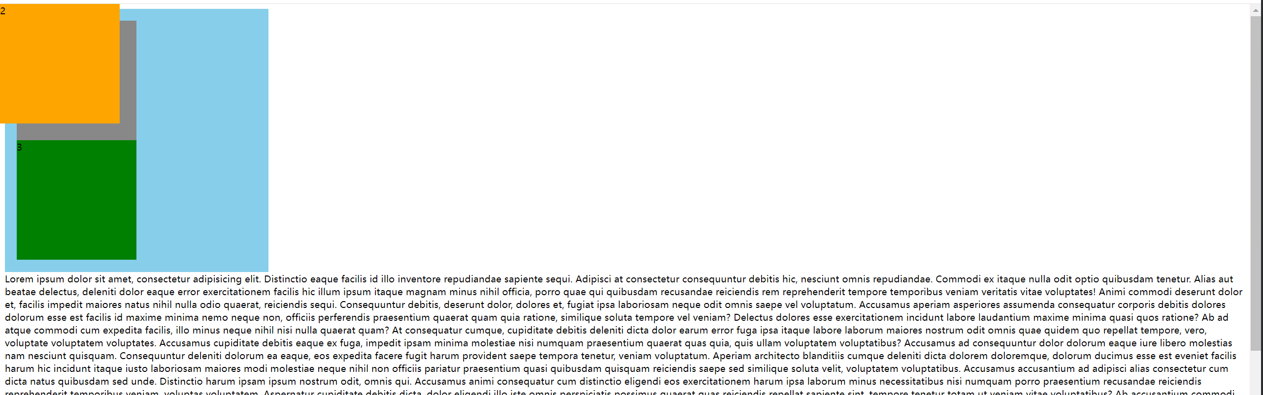
滚动滑轮后

代码实现
<!DOCTYPE html>
<html lang="en">
<head>
    <meta charset="UTF-8">
    <title>Title</title>

    <style>
        .container {
            width: 400px;
            background-color: skyblue;
            padding: 20px;
        }

        .box {
            width: 200px;
            height: 200px;
        }

        .box1 {
            background-color: #888;
        }
        .box2 {
            background-color: orange;
            position: fixed; /* 开启固定定位 */
            left: 0;
            top: 0;
            /* xxxx和margin-xxxx 是成对出现的,否则无效 */
        }
        .box3 {
            background-color: green;
        }
    </style>

</head>
<body>
<div class="container">
    <div class="box box1">1</div>
    <div class="box box2">2</div>
    <div class="box box3">3</div>
</div>
<div>lorem1000</div>
</body>
</html>
特点
- 脱离文档流,会对后面的兄弟元素,父元素有影响
- left不能和right一起设置,top和bottom不能一起设置
- 固定定位和浮动不能同时设置,如果同时设置,浮动失效,以固定定位为主
- 固定定位的元素,也能通过margin调整位置,但不推荐这样做
- 无论是什么元素(行内、行内块、块级)设置为固定定位之后,都变成了定位元素(默认宽高都被内容所撑开,且能自由设置宽高)
12.4 粘性定位
例如:微信的通讯录中滑动时,左上角的字母
效果图

往下滚动时,A被粘住

A的父容器滚动完毕后,B元素被粘住
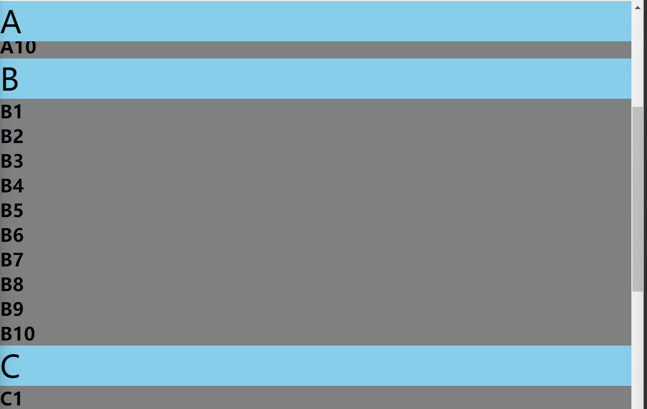

代码实现
<!DOCTYPE html>
<html lang="en">
<head>
    <meta charset="UTF-8">
    <title>Title</title>

    <style>
        * {
            margin: 0;
            padding: 0;
        }
        body{
            height: 2500px;
        }

        .head {
            height: 100px;
            background-color: orange;
            text-align: center;
            line-height: 100px;
            font-size: 20px;
        }

        .item {
            background-color: gray;
        }
        .first-item{
            background-color: skyblue;
            font-size: 40px;
            position: sticky; /* 开启粘性定位 */
            top: 0; /* 当离顶端0px时,被粘住 */
        }
    </style>

</head>
<body>
<div class="container">
    <div class="head">头部元素</div>
    <div class="content">
        <div class="item">
            <div class="first-item">A</div>
            <h2>A1</h2>
            <h2>A2</h2>
            <h2>A3</h2>
            <h2>A4</h2>
            <h2>A5</h2>
            <h2>A6</h2>
            <h2>A7</h2>
            <h2>A8</h2>
            <h2>A9</h2>
            <h2>A10</h2>
        </div>

        <div class="item">
            <div class="first-item">B</div>
            <h2>B1</h2>
            <h2>B2</h2>
            <h2>B3</h2>
            <h2>B4</h2>
            <h2>B5</h2>
            <h2>B6</h2>
            <h2>B7</h2>
            <h2>B8</h2>
            <h2>B9</h2>
            <h2>B10</h2>
        </div>

        <div class="item">
            <div class="first-item">C</div>
            <h2>C1</h2>
            <h2>C2</h2>
            <h2>C3</h2>
            <h2>C4</h2>
            <h2>C5</h2>
            <h2>C6</h2>
            <h2>C7</h2>
            <h2>C8</h2>
            <h2>C9</h2>
            <h2>C10</h2>
        </div>
    </div>
</div>
</body>
</html>
特点
- 粘性定位的参考点为: 离它最近的一个拥有"滚动机制"的祖先元素,即便这个祖先不是真实可滚动的祖先
- 不会脱离文档流,它是一种专门用于窗口滚动时的新的定位方式
- 最常用的值是
top - 粘性定位和浮动可以同时设置,但不推荐这样做
- 粘性定位的元素,也能通过
margin调整位置,但不推荐这样做 - 粘性定位和相对定位的特点基本一致,不同的是粘性定位可以在元素到达某个位置时将其固定
12.5 定位的层级(z-index)
必须开启定位,设置 z-index 才有效果
效果图

代码实现
<!DOCTYPE html>
<html lang="en">
<head>
    <meta charset="UTF-8">
    <title>Title</title>

    <style>
        * {
            margin: 0;
            padding: 0;
        }
        .container{
            height: 500px;
            width: 500px;
            background-color: skyblue;
        }
        .content{
            width: 200px;
            height: 200px;
            position: relative; /* 父元素开启相对定位,为子元素的参考元素 */
        }

        .content1{
            background-color: gray;
        }

        .content2{
            background-color: orange;
            position: relative;  /* 相对定位,参考元素初始的位置 */
            top: -140px;
            left: 50px;
        }

        .content3{
            background-color: green;
            position: absolute; /* 绝对定位,参考开启定位的父元素位置 */
            top:120px;
            left: 120px;
        }
        .content4{
            background-color: red;
            position: fixed;
            top: 180px;
            left: 180px;
        }
    </style>

</head>
<body>
<div class="container">
    <div class="content content1">1</div>
    <div class="content content2">2</div>
    <div class="content content3">3</div>
    <div class="content content4">4</div>
</div>
</body>
</html>
调整层级后的效果图
代码实现
<!DOCTYPE html>
<html lang="en">
<head>
    <meta charset="UTF-8">
    <title>Title</title>

    <style>
        * {
            margin: 0;
            padding: 0;
        }
        .container{
            height: 500px;
            width: 500px;
            background-color: skyblue;
        }
        .content{
            width: 200px;
            height: 200px;
            position: relative; /* 父元素开启相对定位,为子元素的参考元素 */
        }

        .content1{
            background-color: gray;
        }

        .content2{
            background-color: orange;
            position: relative;
            top: -140px;
            left: 50px;
            z-index: 1; /* z-index 默认为auto,得出的值为0,设置为1,即层级比其他的高,必须开启定位,设置 z-index 才有效果*/
        }

        .content3{
            background-color: green;
            position: absolute;
            top:120px;
            left: 120px;
        }
        .content4{
            background-color: red;
            position: fixed;
            top: 180px;
            left: 180px;
        }
    </style>

</head>
<body>
<div class="container">
    <div class="content content1">1</div>
    <div class="content content2">2</div>
    <div class="content content3">3</div>
    <div class="content content4">4</div>
</div>
</body>
</html>
总结
- 定位元素的显示层级比普通元素高,无论什么定位,显示层级都是一样的
- 如果位置发生重叠,默认情况是: 后面的元素,会显示在前面的元素之上
- 可以通过
css属性z-index调整元素的显示层级 z-index的属性值是数字,没有单位,值越大显示层级越高- 只有定位的元素设置
z-index才有效 - 如果
z-index值大的元素,依然没有覆盖掉z-index值小的元素,那么请检查其包含块的层级
12.6 定位的特殊应用
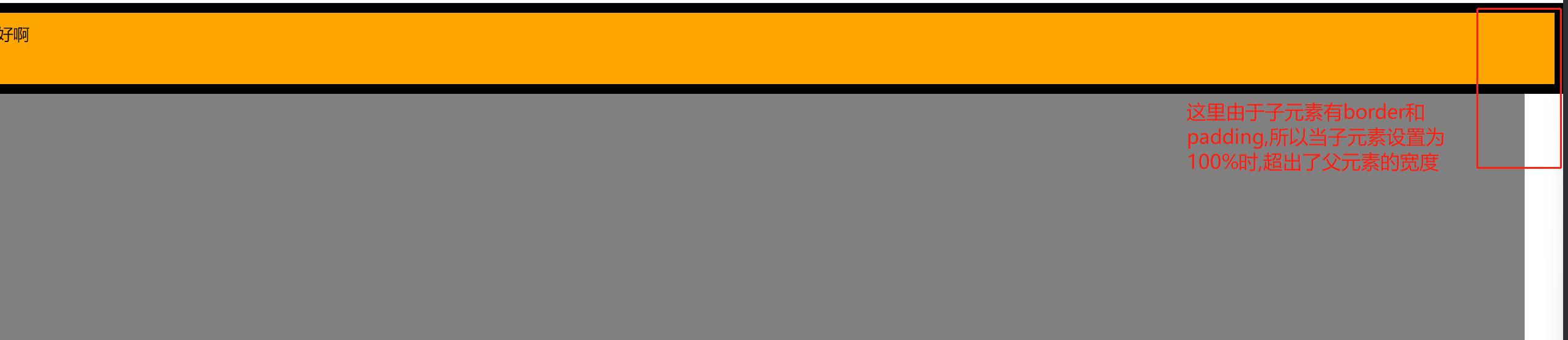
1. 撑满父元素
要求: 父元素没有设置宽,需要子元素占满父元素的宽度,且不能超出
效果图
代码实现
<!DOCTYPE html>
<html lang="en">
<head>
    <meta charset="UTF-8">
    <title>Title</title>

    <style>
        * {
            margin: 0;
            padding: 0;
        }


        .warper{
            height: 500px;
            background-color: gray;
            position: relative;
        }

        .inner{
            border: 10px solid black;
            padding: 10px;
            background-color: orange;
            position: absolute;
            width: 100%;  /* 这个宽度设置的是内容区的宽度,此元素还有border和padding的20px,所以当设置此元素的宽度时会超出父元素的宽度 */
        }


    </style>

</head>
<body>
<div class="warper">
    <div class="inner">你好啊</div>
</div>
</body>
</html>
解决方案

<!DOCTYPE html>
<html lang="en">
<head>
    <meta charset="UTF-8">
    <title>Title</title>

    <style>
        * {
            margin: 0;
            padding: 0;
        }


        .warper{
            height: 500px;
            background-color: gray;
            position: relative;
        }

        .inner{
            height: 50px;
            border: 10px solid black;
            padding: 10px;
            background-color: orange;
            position: absolute;
            left: 0;   /* 距左侧0 */
            right: 0;  /* 距右侧0 */
        }


    </style>

</head>
<body>
<div class="warper">
    <div class="inner">你好啊</div>
</div>
</body>
</html>
子元素撑满整个父元素

<!DOCTYPE html>
<html lang="en">
<head>
    <meta charset="UTF-8">
    <title>Title</title>

    <style>
        * {
            margin: 0;
            padding: 0;
        }


        .warper{
            height: 500px;
            background-color: gray;
            position: relative;
        }

        .inner{
            border: 10px solid black;
            padding: 10px;
            background-color: orange;
            position: absolute;
            left: 0;     /* 距左侧0 */
            right: 0;    /* 距右侧0 */
            top: 0;      /* 距顶部0 */
            bottom: 0;   /* 距底部0,即可撑满整个父元素 */
        }


    </style>

</head>
<body>
<div class="warper">
    <div class="inner">你好啊</div>
</div>
</body>
</html>
2. 块元素水平垂直居中
前提是子元素必须设置宽高

<!DOCTYPE html>
<html lang="en">
<head>
    <meta charset="UTF-8">
    <title>Title</title>

    <style>
        * {
            margin: 0;
            padding: 0;
        }


        .warper{
            height: 500px;
            width: 800px;
            background-color: gray;
            position: relative; /* 1. 父元素开启相对定位 */
        }

        .inner{
            width: 400px;  /* 子元素必须设置宽高 */
            height: 100px; /* 子元素必须设置宽高 */
            background-color: orange;
            position: absolute; /* 2. 子元素开启绝对定位 */
            left: 0;        /* 2.1 设置距左侧为0 */
            right: 0;       /* 2.2 设置距右侧为0 */
            top: 0;         /* 2.3 设置距顶部为0 */
            bottom: 0;      /* 2.4 设置距底部为0 */
            margin: auto;   /* 2.5 设置外边距为自动 */
        }


    </style>

</head>
<body>
<div class="warper">
    <div class="inner">你好啊</div>
</div>
</body>
</html>
13. 布局规范
13.1 版心
最外侧的盒子不给宽度,让其撑满屏幕的宽度,内嵌一个居中的固定宽度的盒子,这个盒子就叫做版心,固定宽度一般在960px-1200px,版心可以是一个,也可以是多个
13.2 常用布局名词
| 位置 | 类名 |
|---|---|
| 头部导航条 | topbar |
| 页头 | header、page-header |
| 导航 | nav、navigator、navbar |
| 搜索框 | search、search-box |
| 横幅、广告、宣传图 | banner |
| 主要内容 | content、main |
| 侧边栏 | aside、sidebar |
| 页脚 | footer、page-footer |
13.3 标签默认效果重置
1. reset.css
将默认的一些标签元素的默认样式做自定义修改
/* 基础设置 */
body,h1,h2,h3,h4,h5,h6,hr,p,blockquote,dl,dt,dd,ul,ol,li,pre,form,fieldset,legend,button,input,textarea,th,td{
    margin: 0;
    padding: 0;
}

ul,ol {
    list-style: none;
}

img {
    /* 底部留白 */
    display: block;
	border:0;
}

b,strong {
    font-weight: 400;
}

h1,h2,h3,h4,h5,h6 {
    /* 父元素字号的百分比 */
    font-size: 100%;
    font-weight: normal;
}

i,em {
    /* 不倾斜 */
    font-style: normal;
}

u,ins,s,del {
    /* 去掉中划线和下划线 */
    text-decoration: none;
}

table {
    border: 1px solid #999;
    /* 相当于是cellspacing */
    border-spacing: 0;
    /* 1px边框 */
    border-collapse: collapse;
}

td,th {
    border: 1px solid #999;
}

input,button {
    /* 去掉轮廓线 */
    outline: none;
    border:none;
}

/* 风格设置 */
body {
    font: 12px/1.5 "Microsoft YaHei", Tahoma, Helvetica, Arial, "\5b8b\4f53", sans-serif;
    color: #333;
}

a {
    text-decoration: none;
    color: #666;
}

a:hover {
    color:#DD302D;
    text-decoration: none;
}

.leftfix {
    float: left;
}

.rightfix {
    float: right;
}

.clearfix::after {
    content: "";
    display: block;
    clear: both;
}
2. Normalize.css
在清除默认样式的基础上,保留了一些有价值的默认样式
https://necolas.github.io/normalize.css/
/*! normalize.css v8.0.1 | MIT License | github.com/necolas/normalize.css */

/* Document
   ========================================================================== */

/**
 * 1. Correct the line height in all browsers.
 * 2. Prevent adjustments of font size after orientation changes in iOS.
 */

html {
  line-height: 1.15; /* 1 */
  -webkit-text-size-adjust: 100%; /* 2 */
}

/* Sections
   ========================================================================== */

/**
 * Remove the margin in all browsers.
 */

body {
  margin: 0;
}

/**
 * Render the `main` element consistently in IE.
 */

main {
  display: block;
}

/**
 * Correct the font size and margin on `h1` elements within `section` and
 * `article` contexts in Chrome, Firefox, and Safari.
 */

h1 {
  font-size: 2em;
  margin: 0.67em 0;
}

/* Grouping content
   ========================================================================== */

/**
 * 1. Add the correct box sizing in Firefox.
 * 2. Show the overflow in Edge and IE.
 */

hr {
  box-sizing: content-box; /* 1 */
  height: 0; /* 1 */
  overflow: visible; /* 2 */
}

/**
 * 1. Correct the inheritance and scaling of font size in all browsers.
 * 2. Correct the odd `em` font sizing in all browsers.
 */

pre {
  font-family: monospace, monospace; /* 1 */
  font-size: 1em; /* 2 */
}

/* Text-level semantics
   ========================================================================== */

/**
 * Remove the gray background on active links in IE 10.
 */

a {
  background-color: transparent;
}

/**
 * 1. Remove the bottom border in Chrome 57-
 * 2. Add the correct text decoration in Chrome, Edge, IE, Opera, and Safari.
 */

abbr[title] {
  border-bottom: none; /* 1 */
  text-decoration: underline; /* 2 */
  text-decoration: underline dotted; /* 2 */
}

/**
 * Add the correct font weight in Chrome, Edge, and Safari.
 */

b,
strong {
  font-weight: bolder;
}

/**
 * 1. Correct the inheritance and scaling of font size in all browsers.
 * 2. Correct the odd `em` font sizing in all browsers.
 */

code,
kbd,
samp {
  font-family: monospace, monospace; /* 1 */
  font-size: 1em; /* 2 */
}

/**
 * Add the correct font size in all browsers.
 */

small {
  font-size: 80%;
}

/**
 * Prevent `sub` and `sup` elements from affecting the line height in
 * all browsers.
 */

sub,
sup {
  font-size: 75%;
  line-height: 0;
  position: relative;
  vertical-align: baseline;
}

sub {
  bottom: -0.25em;
}

sup {
  top: -0.5em;
}

/* Embedded content
   ========================================================================== */

/**
 * Remove the border on images inside links in IE 10.
 */

img {
  border-style: none;
}

/* Forms
   ========================================================================== */

/**
 * 1. Change the font styles in all browsers.
 * 2. Remove the margin in Firefox and Safari.
 */

button,
input,
optgroup,
select,
textarea {
  font-family: inherit; /* 1 */
  font-size: 100%; /* 1 */
  line-height: 1.15; /* 1 */
  margin: 0; /* 2 */
}

/**
 * Show the overflow in IE.
 * 1. Show the overflow in Edge.
 */

button,
input { /* 1 */
  overflow: visible;
}

/**
 * Remove the inheritance of text transform in Edge, Firefox, and IE.
 * 1. Remove the inheritance of text transform in Firefox.
 */

button,
select { /* 1 */
  text-transform: none;
}

/**
 * Correct the inability to style clickable types in iOS and Safari.
 */

button,
[type="button"],
[type="reset"],
[type="submit"] {
  -webkit-appearance: button;
}

/**
 * Remove the inner border and padding in Firefox.
 */

button::-moz-focus-inner,
[type="button"]::-moz-focus-inner,
[type="reset"]::-moz-focus-inner,
[type="submit"]::-moz-focus-inner {
  border-style: none;
  padding: 0;
}

/**
 * Restore the focus styles unset by the previous rule.
 */

button:-moz-focusring,
[type="button"]:-moz-focusring,
[type="reset"]:-moz-focusring,
[type="submit"]:-moz-focusring {
  outline: 1px dotted ButtonText;
}

/**
 * Correct the padding in Firefox.
 */

fieldset {
  padding: 0.35em 0.75em 0.625em;
}

/**
 * 1. Correct the text wrapping in Edge and IE.
 * 2. Correct the color inheritance from `fieldset` elements in IE.
 * 3. Remove the padding so developers are not caught out when they zero out
 *    `fieldset` elements in all browsers.
 */

legend {
  box-sizing: border-box; /* 1 */
  color: inherit; /* 2 */
  display: table; /* 1 */
  max-width: 100%; /* 1 */
  padding: 0; /* 3 */
  white-space: normal; /* 1 */
}

/**
 * Add the correct vertical alignment in Chrome, Firefox, and Opera.
 */

progress {
  vertical-align: baseline;
}

/**
 * Remove the default vertical scrollbar in IE 10+.
 */

textarea {
  overflow: auto;
}

/**
 * 1. Add the correct box sizing in IE 10.
 * 2. Remove the padding in IE 10.
 */

[type="checkbox"],
[type="radio"] {
  box-sizing: border-box; /* 1 */
  padding: 0; /* 2 */
}

/**
 * Correct the cursor style of increment and decrement buttons in Chrome.
 */

[type="number"]::-webkit-inner-spin-button,
[type="number"]::-webkit-outer-spin-button {
  height: auto;
}

/**
 * 1. Correct the odd appearance in Chrome and Safari.
 * 2. Correct the outline style in Safari.
 */

[type="search"] {
  -webkit-appearance: textfield; /* 1 */
  outline-offset: -2px; /* 2 */
}

/**
 * Remove the inner padding in Chrome and Safari on macOS.
 */

[type="search"]::-webkit-search-decoration {
  -webkit-appearance: none;
}

/**
 * 1. Correct the inability to style clickable types in iOS and Safari.
 * 2. Change font properties to `inherit` in Safari.
 */

::-webkit-file-upload-button {
  -webkit-appearance: button; /* 1 */
  font: inherit; /* 2 */
}

/* Interactive
   ========================================================================== */

/*
 * Add the correct display in Edge, IE 10+, and Firefox.
 */

details {
  display: block;
}

/*
 * Add the correct display in all browsers.
 */

summary {
  display: list-item;
}

/* Misc
   ========================================================================== */

/**
 * Add the correct display in IE 10+.
 */

template {
  display: none;
}

/**
 * Add the correct display in IE 10.
 */

[hidden] {
  display: none;
}
14. 常用示例
1. 回到顶部
.c1,.c3{
            background-color: red;
            height: 500px;
            width: 600px;
        }
        .c2{
            background-color: green;
            height: 500px;
            width: 600px;
        }

        #back_top{
            height: 40px;
            width: 80px;

            position: fixed;
            right: 40px;
            bottom: 40px;
            background-color: black;

            text-align: center;
            line-height: 40px;
        }
        #back_top a{
            color:white;
            text-decoration: none;
        }


<a name="xxx">这是顶部位置</a>

<div class="c1"></div>
<div class="c2"></div>
<div class="c3"></div>

<span id="back_top">
    <a href="#xxx">回到顶部</a>
</span>
2. 模态对话框
<head>
	<style>
		.shadow{
            background-color: rgba(0,0,0,0.7); /* rgba可以设置透明度,0-1之间的数字 */
            position: fixed;
            top:0;
            left: 0;
            right: 0;
            bottom: 0;
            z-index: 90;

        }

        .mode{
            width: 440px;
            height: 480px;
            background-color: white;
            position:fixed;
            top:50%;
            left: 50%;
            z-index: 100;
            margin-left: -220px;
            margin-top: -240px;

        }

        .mode h2,.mode h3{
            text-align: center;
        }
        .xxx{
            text-align: right;
        }
        .xxx span{

        }
        .xxx span:hover{
            cursor: pointer;
        }
    </style>
</head>

<h1>24期皇家spa会所</h1>

<div>金牌技师李业和陈硕,30年捏脚经验,技师一流,服务到位,倒贴200</div>


<div>
    30年捏脚经验,技师一流,服务到位

    <img src="cs.png" alt="" width="400" height="400">
</div>
<div class="mode">
    <div class="xxx">
        <span>x</span>
    </div>
    <h2>不正经的24期会所入口</h2>
    <h3>会员登录</h3>
    <div class="iii">
        <div>
            <label>
                用户名:<input type="text">
            </label>
        </div>

        <div>
            <label>
                密码:<input type="text">
            </label>
        </div>


    </div>
</div>  <!-- 对话框白框 -->

<div class="shadow"></div>  <!-- 黑色阴影遮罩层 -->
15. opacity透明度和rgba透明度的区别
opactiy是整个标签的透明度
rgba是单独给某个属性设置透明度

.c1{
    width: 100px;
    height: 100px;

    background-color: rgba(255,0,0,0.3);
}
.c2{
    width: 100px;
    height: 100px;

    /*background-color: rgba(255,0,0,0.3);*/
    background-color: rgb(255,0,0);

    opacity: 0.3; /* 0-1之间的数字,这是设置整个标签的透明度 */

}
16. 优化
1. 风格优化
html、css、js都可以使用 webpack 工具来优化代码体积
/* 展开风格 */
h1 {
    color: red;
    font-size: 100px;
}

/* 使用 webpack 构建工具,将其变为紧凑风格,减少文件体积,节约网络流量,同时能让用户打开网页是的速度更快 */
h1{color: red;font-size: 100px;}

 浙公网安备 33010602011771号