

自动适应
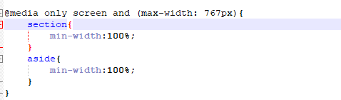
@media only screen 表示下面的CSS针对屏幕有效果
(max-width: 767px) 当屏幕分辨率最大为767px时下面的css起作用
完整代码:thml代码
 1 <html lang="en">
 2 <head>
 3     <meta charset="UTF-8">
 4     <title>首页</title>
 5     <link rel="stylesheet" type="text/css" href="css/style.css" />
 6 </head>
 7 <body>
 8
 9 <div id="content">
10           <nav>导航菜单</nav>
11           <section>博客项</section>
12           <aside>侧边栏</aside>
13           <footer><p>版权</p></footer>
14
15 </div>
16
17 </body>
18 </html>
css代码:
 1 #content{
 2     width:980px;
 3     margin: 0 auto;
 4     background-color:#555;
 5 }
 6 section{
 7     width:700px;
 8     float:left;
 9     background-color:red;
10 }
11 aside{
12     width:270px;
13     padding-left:5px;
14     padding-right:5px;
15     float:left;
16     background-color:yellow;
17 }
18
19 @media only screen and (max-width: 767px){
20     section{
21         min-width:100%;
22     }
23     aside{
24         min-width:100%;
25     }
26 }

 浙公网安备 33010602011771号