

matplotlib画图总结--常用功能
0、内容范围
多曲线图、图例、坐标轴、注释文字等。
1、曲线图
多曲线图、图例、网格、坐标轴名称、图标名、坐标轴范围等。
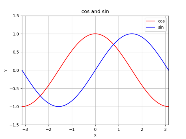
from matplotlib import pyplot as plt
import numpy as np

x = np.linspace(-np.pi, np.pi, 200, endpoint=True)
c, s = np.cos(x), np.sin(x)
plt.xlim(-np.pi, np.pi)
# p1 = plt.plot(x,c,'r', label = 'cos')
# p2 = plt.plot(x,s,'b', label =  'sin')
p1 = plt.plot(x,c,'r')
p2 = plt.plot(x,s,'b')
plt.xlabel('x')
plt.ylabel('y')
plt.title('cos and sin')
plt.legend( ['cos', 'sin'])
plt.grid(True)
plt.show()
知识点:
1)一个图里绘制条曲线
方法1:
plt.plot(x,c,'r', x,s,'b')
方法2:
p1 = plt.plot(x,c,'r')
p2 = plt.plot(x,s,'b')
2)给图添加图例
方法1:
p1 = plt.plot(x,c,'r', label = 'cos')
p2 = plt.plot(x,s,'b', label = 'sin')
plt.legend()
方法2:
p1 = plt.plot(x,c,'r')
p2 = plt.plot(x,s,'b')
plt.legend( ['cos', 'sin'])
推荐使用方法1,因为方法2必须注意添加曲线的顺序。
2、柱状图
学习柱状图、为图形添加字符坐标轴.
import numpy as np
import matplotlib.pyplot as plt

N = 5
menMeans = (20, 35, 30, 35, 27)
womenMeans = (25, 32, 34, 20, 25)
menStd = (2, 3, 4, 1, 2)
womenStd = (3, 5, 2, 3, 3)
ind = np.arange(N)    # the x locations for the groups
width = 0.35       # the width of the bars: can also be len(x) sequence

p1 = plt.bar(ind, menMeans, width, yerr=menStd, label='men')
p2 = plt.bar(ind, womenMeans, width, bottom=menMeans, yerr=womenStd, label='women')

plt.ylabel('Scores')
plt.title('Scores by group and gender')
plt.xticks(ind, ('G1', 'G2', 'G3', 'G4', 'G5'))
plt.yticks(np.arange(0, 81, 10))
plt.legend(loc='upper right')
plt.show()

为什么会两个图层叠?
p1 = plt.bar(ind, menMeans, width, yerr=menStd, label='men')
p2 = plt.bar(ind, womenMeans, width, bottom=menMeans, yerr=womenStd, label='women')
bar函数的x坐标一样,并且y坐标值是bottom=menMeans,所以第二个图会堆叠在第一个图上面。
下面实现2条柱状图。
import matplotlib
import matplotlib.pyplot as plt
import numpy as np

labels = ['G1', 'G2', 'G3', 'G4', 'G5']
men_means = [20, 34, 30, 35, 27]
women_means = [25, 32, 34, 20, 25]

x = np.arange(len(labels))  # the label locations
width = 0.35  # the width of the bars

fig, ax = plt.subplots()
rects1 = ax.bar(x - width/2, men_means, width, label='Men')
rects2 = ax.bar(x + width/2, women_means, width, label='Women')

# Add some text for labels, title and custom x-axis tick labels, etc.
ax.set_ylabel('Scores')
ax.set_title('Scores by group and gender')
ax.set_xticks(x)
ax.set_xticklabels(labels)
ax.legend()

plt.show()
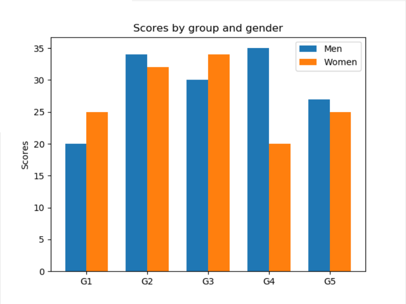
x轴的坐标不是数子,实现方法如下,先设定坐标轴的tick,然后把ticklabel改为字符值。
ax.set_xticks(x)
ax.set_xticklabels(labels)
如果需要实现水平柱状图,则使用ax.barh(y_pos, performance, xerr=error, align='center')函数。
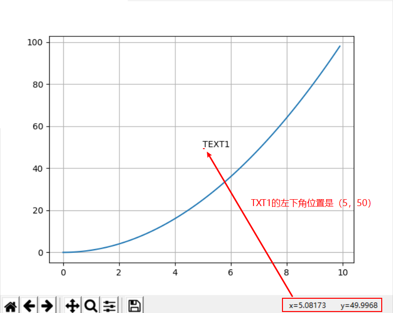
3、添加文字、注释、箭头指示、花式文字
其中,text 函数可以做文本注释,且支持 LaTeX 格式,可以在图例中写公式。
text(x,y,string,fontsize=15,verticalalignment="top",horizontalalignment="right")
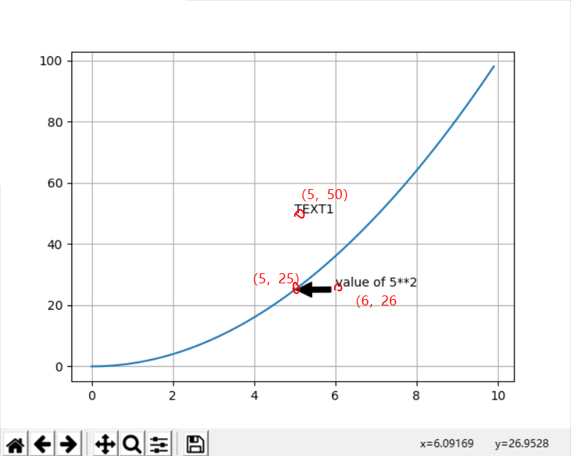
x = np.arange(0, 10, 0.1)
plt.plot(x, x**2)
plt.grid(True)  # 设置网格线
plt.text(5,50, "TEXT1")
plt.show()
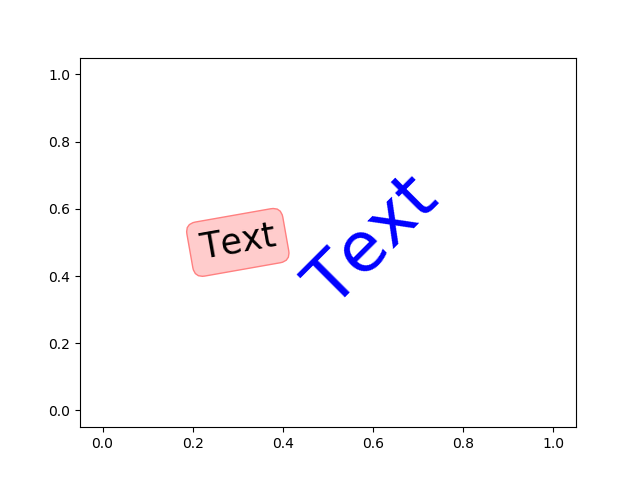
花式文本:
You can put a rectangular box around the text instance (e.g., to set a background color) by using the keyword bbox. bbox is a dictionary of Rectangle properties. For example:
>>> text(x, y, s, bbox=dict(facecolor='red', alpha=0.5))
import matplotlib.pyplot as plt
import numpy as np

plt.text(0.6, 0.5, "Text", size=50, rotation=45, ha="center", va="center", color='b')
plt.text(0.3, 0.5, "Text", size=25, rotation=10, ha="center", va="center", bbox=dict(boxstyle="round",ec=(1, 0.5, 0.5),fc=(1., 0.8, 0.8),)) #颜色ec、fc

plt.plot()
plt.show()
添加箭头和说明信息
plt.annotate('value of 5**2', xy=(5, 25), xytext=(6, 26), arrowprops=dict(facecolor='black', shrink=0.05))


 浙公网安备 33010602011771号