SVG学习笔录(二)
一、svg动画SMIL
SVG采用的是使用文本来定义图形,这种文档结构非常适合于创建动画。要改变图形的位置、大小和颜色,只需要调整相应的属性就可以了。事实上,SVG有为各种事件处理而专门设计的属性,甚至很多还是专门为动画量身定做的。在SVG中,实现动画通常使用SVG SMIL animation。
通过SMIL可以实现的基本动画:
•动画元素的数值属性(X, Y, …)
•动画属性变换(平移或旋转)
•动画颜色属性
•沿着运动路径运动(这一点非常有趣)
对svg动画浏览器兼容情况:
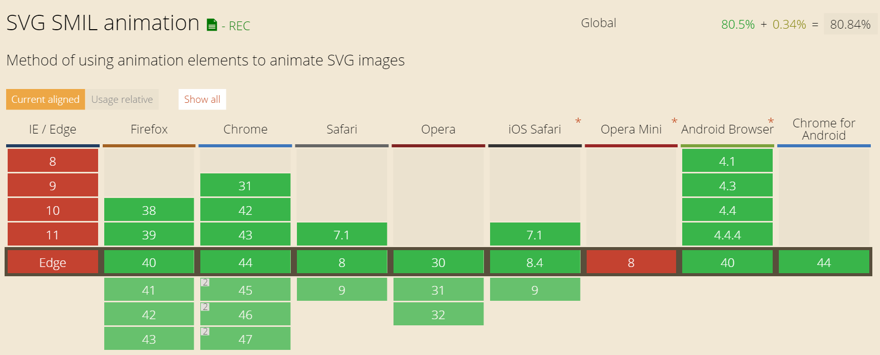
可以看到ie都不支持svg动画,移动端andriod4.1才开始支持svg动画。
二、svg动画元素
1. animate元素
这个是最基本的动画元素,可以直接为相关属性提供不同时间点的值。
2. set元素
这个是animate元素的简写形式,支持所有的属性类型,尤其是当对非数字型的属性(例如visibility)进行动画时很方便。set元素是非增量的,相关的属性对之无效。 to指定的动画结束值类型一定要符合属性的取值类型。
3. animateMotion元素
路劲动画元素。
4. animateColor元素
颜色动画元素。这是一个过时的元素,基本上所有功能都可以用animate代替,所以还是不要用了。
5. animateTransform元素
变换动画元素。看看特殊的一些属性:
type = "translate | scale | rotate | skewX | skewY"
这个属性指定了变换的类型,translate是默认值,这里的rotate是以svg容器的端点为圆心旋转。
from,by和to的值相应的都是对应变换的参数,这个还是与前面讲的变换是一致的。values则是一组分号隔开的这样的值系列。
支持动画效果的元素和属性
基本上所有图形元素(path,rect,ellipse,text,image...),容器元素(svg, g, defs, use, switch, clipPath, mask...)都支持动画。基本上大多数的属性都支持动画效果。
animate元素--基本元素动画
<svg width="200" height="200" >
  <rect x="0" y="40" width="200" height="200" fill="rgba(0,0,0,.4)"  />
    <text font-family="microsoft yahei" font-size="40" y="80" x="0" fill="red" stroke="green" stroke-width="1">
      hello
      <animate attributeName="x" attributeType="XML" from="0" to="100" begin="0s" dur="2s" repeatCount="indefinite"/>
    </text>
</svg>
set动画,可以方便设置延迟
<!-- set 可以实现基本的延迟功能 -->
<svg width="200" height="200" >
  <rect x="0" y="40" width="200" height="200" fill="rgba(0,0,0,.4)"  />
    <text font-family="microsoft yahei" font-size="40" y="80" x="0" fill="red" stroke="green" stroke-width="1">
      hello
      <set attributeName="x" attributeType="XML" to="80" begin="3s" />
    </text>
</svg>
animateMotion动画
<svg width="360" height="200" xmlns="http://www.w3.org/2000/svg">
  <text font-family="microsoft yahei" font-size="40" x="0" y="0" fill="#cd0000">hello
    <animateMotion path="M10,80 q100,120 120,20 q140,-50 160,0" begin="0s" dur="3s"  rotate="40"  repeatCount="indefinite"/>
  </text>
  <path d="M10,80 q100,120 120,20 q140,-50 160,0" stroke="#cd0000" stroke-width="2" fill="none" />
</svg>
animateTransform动画
<svg width="200" height="200" >
  <rect x="0" y="40" width="200" height="200" fill="rgba(0,0,0,.4)"  />
    <text font-family="microsoft yahei" font-size="40" y="80" x="0" fill="red" stroke="green" stroke-width="1">
      hello
      <animate attributeName="x" attributeType="XML" from="0" to="100" begin="0s" dur="2s" repeatCount="indefinite"/>
      <animateTransform attributeName="transform" type="scale" from="1" to="1.2" begin="0s" dur="2s" repeatCount="indefinite"/>
    </text>
</svg>
相关属性解释:
attributeName = <attributeName>
要变化的元素属性名称,① 可以是元素直接暴露的属性,例如,对于本文反复出现的「马」对应的text元素上的x, y或者font-size; ② 可以是CSS属性。例如,透明度opacity.
attributeType = “CSS | XML | auto”
这个属性指定了属性取值的命名空间,这几个值的含义如下:
CSS:代表attributeName指定的属性是CSS属性。
XML:代表attributeName指定的属性是XML默认命名空间下的属性(注意svg文档本质上是xml文档)。
auto:代表先在CSS属性中查找attributeName指定的属性,如果没找到,则在默认的XML命名空间下寻找该属性。
注意:如果你不确信某属性是XML类别还是CSS类别的时候,我的建议是不设置attributeType值,直接让浏览器自己去判断
begin = "begin-value-list"
该属性定义了动画的开始时间。可以是分号分开的一系列时间值。也可以是一些其他触发动画开始的值。比如事件,快捷键等。
dur = Clock-value | "media" | "indefinite"
定义了动画的持续时间。可以设置为以时钟格式显示的值。也可以设置为下列两个值:
media:指定动画的时间为内部多媒体元素的持续时间。
indefinite:指定动画时间为无限。
repeatCount = numeric value | "indefinite"
设置了动画重复的次数。 indefinite代表无限重复。
repeatDur = Clock-value | "indefinite"
设置重复的总的动画时间。indefinite代表无限重复。
fill = "freeze" | "remove(默认值)"
设置了动画结束后元素的状态。freeze表示动画结束后元素停留在动画的最后状态。remove代表动画结束以后元素回到动画前的状态,这个是默认值。
三、svg动画实例解析
1.利用stroke属性实现线框效果
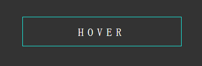
在做这个动画之前,我们先讲一下,做这个动画的stroke相关属性:
1. 如果不提供stroke属性,则默认不绘制图形边框。
2. 可以设置边的透明度,就是stroke-opacity,值的范围是0到1
3. 线的端点 - stroke-linecap属性,这个属性定义了线段端点的风格,这个属性可以使用butt,square(方形),round(圆形)三个值
4.线的连接 - stroke-linejoin属性,定义了线段连接处的风格,这个属性可以使用miter,round,bevel三个值
5. 线的虚实 - stroke-dasharray属性
这个属性是设置一些列数字,不过这些数字必须是逗号隔开的。属性中当然可以包含空格,但是空格不作为分隔符。每个数字定义了实线段的长度,分别是按照绘制、不绘制这个顺序循环下去。
6.stroke-miterlimit:这个和canvas中的一样,它处理什么时候画和不画线连接处的miter效果。
7.stroke-dashoffset:这个属性设置开始画线的位置。
下面看看我们如何实现效果:
		html, body {
		  background: #333;
		  height: 100%;
		  overflow: hidden;
		  text-align: center;
		}

		.svg-wrapper {
		  height: 60px;
		  margin: 0 auto;
		  position: relative;
		  top: 50%;
		  transform: translateY(-50%);
		  width: 320px;
		}
         //初始我们通过stroke-dasharray:140 540  即实线140 虚线540 但是总长度320*2+60*2=760 则说明最终能看到的实线为140
         //然后通过stroke-dashoffset设置画线的位置
		.shape {
		  fill: transparent;
		  stroke-dasharray: 140 540;
		  stroke-dashoffset: -474;
		  stroke-width: 8px;
		  stroke: #19f6e8;
		}

		.text {
		  color: #fff;
		  font-family: 'Roboto Condensed';
		  font-size: 22px;
		  letter-spacing: 8px;
		  line-height: 32px;
		  position: relative;
		  top: -48px;
		}
          //通过animation切换即可
		@keyframes draw {
		  0% {
		    stroke-dasharray: 140 540;
		    stroke-dashoffset: -474;
		    stroke-width: 8px;
		  }
		  100% {
		    stroke-dasharray: 760;
		    stroke-dashoffset: 0;
		    stroke-width: 2px;
		  }
		}

		.svg-wrapper:hover .shape {
		  -webkit-animation: 0.5s draw linear forwards;
		  animation: 0.5s draw linear forwards;
		}
	</style>
	<!-- SVG stroke-dasharray 属性 -->
	<div class="svg-wrapper">
	  <svg height="60" width="320" xmlns="http://www.w3.org/2000/svg">
	    <rect class="shape" height="60" width="320" />
	  </svg>
	   <div class="text">HOVER</div>
	</div>
二.线条中心到两边扩张效果
两种方案:
第一种: css+svg实现
        .path{
            stroke-dasharray:0,200;
            stroke-dashoffset:-100;
          -webkit-animation: move 1s  linear  0.5s forwards;
          animation: move 1s linear 0.5s forwards;
        }
        @-webkit-keyframes move{
            0%{
              stroke-dasharray:0,200;
              stroke-dashoffset:-100;
            }
            100%{
              stroke-dasharray:200,0;
              stroke-dashoffset:0;
            }
        }

    <path class="path" d="M 10 75 L 200 75" stroke="red" stroke-linecap="round" stroke-width="1"  fill="none">
    </path>
第二种: svg实现
    <svg width="200" height="200">
        <path  d="M 10 100 L 200 100" stroke="orange" stroke-linecap="round" stroke-width="1" stroke-dasharray="0,200"  stroke-dashoffset="-100" fill="none">
                <animate attributeName="stroke-dashoffset" attributeType="XML" from="-100" to="0" begin="0s" dur="1s" />
                <!--   fill = "freeze" | "remove(默认值)" freeze表示动画结束后元素停留在动画的最后状态 remove代表动画结束以后元素回到动画前的状态,这个是默认值-->
                <animate attributeName="stroke-dasharray" attributeType="XML" from="0,200" to="200,0" begin="0s" dur="1s" fill="freeze"/>
        </path>
    </svg>
这里注意两个知识点:
fill = "freeze" | "remove(默认值)" freeze表示动画结束后元素停留在动画的最后状态 remove代表动画结束以后元素回到动画前的状态,这个是默认值
在直线上面stroke-dashoffset="100"和stroke-dashoffset="-100"在同一个位置,只是最终画的位置由stroke-dasharray="20 0"和stroke-dashoffset一起确定,例前面两个值起始点120(100+20) 和80(|-100+20|)
三.填坑animateTransform中rotate针对的svg左上角那个点移动到元素中心点
实例代码:
	<svg width="400" height="400">
			<rect x="0" y="0" fill="green" rx="4" width="200" height="200">
				<animateTransform attributeName="transform" type="rotate" form="0" to="360" begin="0" dur="5s" repeatCount="indefinite" /></rect>
	</svg>
例上面的代码我们让200x200的方形元素,做旋转运动,但是在svg里面rotate旋转针对的点是svg的左上角。我们想在针对元素中心点运动怎么办。
通常的解决方案:
	<svg width="400" height="400">
		<g transform="translate(200,200)">
			<rect x="-100" y="-100" fill="green" rx="4" width="200" height="200">
				<animateTransform attributeName="transform" type="rotate" form="0" to="360" begin="0" dur="5s" repeatCount="indefinite" />
		<g>
	</svg>
我们加了一个组合标签<g transform="translate(200,200)"></g>将svg的坐标起始点移动到容器的中心点(svg的占位位置还是没有变化),然后元素再根据这个新的起始点画出来,进行旋转就可以了。
四.简单的用js操作动画的案例
	<svg width="400" height="400">
		<g transform="translate(200,200)">
			<rect id="rect" x="-100" y="-100" fill="green" rx="4" width="200" height="200">
			<!-- 	<animateTransform attributeName="transform" type="rotate" form="0" to="360" begin="0" dur="5s" repeatCount="indefinite" /> -->
		<g>
	</svg>

	<script>
		var cur = 0;
		var rect=document.getElementById("rect");
               //requestAnimationFrame调用的频率是每秒60次逐帧动画
		var frames = window.requestAnimationFrame(doAnim);
		function doAnim(){
			if(cur>=360){
                                //取消帧动画
				window.cancelAnimationFrame(frames);
				return;
			}
			cur++;
			console.log(cur);
			rect.setAttribute("transform", "rotate(" + cur + ")");
			frames = window.requestAnimationFrame(doAnim);
		}

	</script>
参考资料:
突袭HTML5之SVG 2D入门(svg教程写的很全,推荐指数5星)
SVG 教程(w3school的svg教程,也不错)
mozilla svg教程(推荐给喜欢看英文教程的朋友)
知乎上面对svg的一些讨论(大家在使用时,有必要可以看一下)
推荐svg库:

 浙公网安备 33010602011771号