条形竞赛图
import pandas as pd
import numpy as np
from faker import Faker
import matplotlib.pyplot as plt
import matplotlib.ticker as ticker
import matplotlib.animation as animation
from IPython.display import HTML
df = pd.DataFrame()
name,country,value,year = [],[],[],[]


# 默认生成的数据为为英文,使用zh_CN指定为中文
f = Faker('zh_CN')

#生成随机数据
for i in range(1000):
    name.append(f.city())
    country.append(f.random_digit_not_null())
    year.append(f.year())
    value.append(f.numerify())

df['name'] = name
df['country'] = country
df['value'] = value
df['year'] = year
df.head()
| name | country | value | year | |
|---|---|---|---|---|
| 0 | 海口市 | 4 | 513 | 1977 |
| 1 | 兴安盟县 | 4 | 611 | 1970 |
| 2 | 拉萨市 | 2 | 322 | 2006 |
| 3 | 杭州县 | 1 | 135 | 1981 |
| 4 | 建县 | 3 | 438 | 2013 |
colors = dict(zip(df.country.unique(),[f.color() for i in range(len(df.country.unique()))]))
colors
{4: '#e8c278',
2: '#3988b2',
1: '#d84906',
3: '#74f25e',
9: '#eda1b5',
5: '#a1fcde',
8: '#d4a7e8',
6: '#edadd3',
7: '#0668e8'}
group_lk = df.set_index('name')['country'].to_dict()
df['value'] = df['value'].astype('int')
df['year'] = df['year'].astype('int')
fig, ax = plt.subplots(figsize=(15, 8))
plt.rcParams['font.family'] = 'Fangsong' # 设置字体样式
plt.rcParams['font.size'] = '20' # 设置字体大小
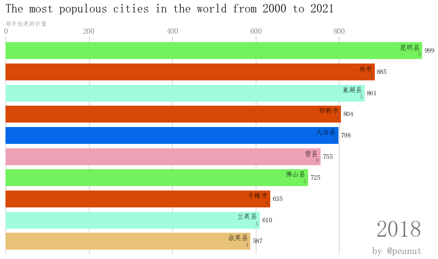
def draw_barchart(year):
#获取每一年排名前10的数据
dff = df[df['year'].eq(year)].sort_values(by='value', ascending=True).tail(10)
ax.clear()
#绘制柱状图
ax.barh(dff['name'], dff['value'], color=[colors[group_lk[x]] for x in dff['name']])
dx = dff['value'].max() / 200
#添加标签
for i, (value, name) in enumerate(zip(dff['value'], dff['name'])):
#城市
ax.text(value-dx, i, name, size=14, weight=600, ha='right', va='bottom')
#country
ax.text(value-dx, i-.25, group_lk[name], size=10, color='#444444', ha='right', va='baseline')
#value
ax.text(value+dx, i, f'{value:,.0f}', size=14, ha='left', va='center')
#显示年份标签
ax.text(1, 0.08, year, transform=ax.transAxes, color='#777777', size=46, ha='right', weight=800)
#显示副标题
ax.text(0, 1.06, '每年创造的价值', transform=ax.transAxes, size=12, color='#777777')
#设置坐标轴精度
ax.xaxis.set_major_formatter(ticker.StrMethodFormatter('{x:,.0f}'))
#设置坐标轴标签位置top/bottom
ax.xaxis.set_ticks_position('top')
#colors:设置背景色;labelsize:设置坐标轴标签字体大小
ax.tick_params(axis='x', colors='#777777', labelsize=16)
ax.set_yticks([])
#设置ax距离两边的间距大小
ax.margins(0, 0.02)
#设置网格
ax.grid(which='major', axis='x', linestyle='-')
#让网格显示在图片的下面
ax.set_axisbelow(True)
#设置标题
ax.text(0, 1.12, 'The most populous cities in the world from 2000 to 2021',
transform=ax.transAxes, size=24, weight=600, ha='left')
#设置所有权
ax.text(1, 0, 'by @peanut', transform=ax.transAxes, ha='right',
color='#777777', bbox=dict(facecolor='white', alpha=0.8, edgecolor='white'))
plt.box(False)
#绘制2018年的图形
draw_barchart(2018)

import matplotlib.animation as animation
from IPython.display import HTML

fig, ax = plt.subplots(figsize=(15, 8))
#interval设置时间间隔
animator = animation.FuncAnimation(fig, draw_barchart, frames=range(2000, 2019),interval=1000)
HTML(animator.to_jshtml())
# or use animator.to_html5_video() or animator.save()

 浙公网安备 33010602011771号