

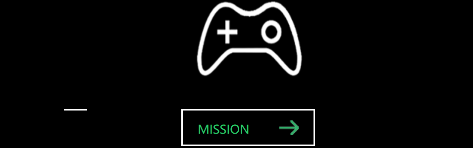
效果:鼠标悬停在图标上,图标会旋转并缩放;鼠标悬停在按钮上,按钮有线条飞入、整体变亮、箭头移动等效果。
效果图:
代码如下:
<!DOCTYPE html>
<html>
<head>
<meta charset="utf-8" />
<title>幽灵按钮</title>
<style>
* {
margin: 0;
padding: 0;
box-sizing: border-box;
}
body {
background: black;
}
.box {
width: 800px;
height: 400px;
margin: 100px auto;
}
.link {
width: 205px;
height: 280px;
}
.icon {
display: block;
width: 205px;
height: 190px;
background: url(mission.png) center no-repeat;
transform: rotate(360deg);
transition: all 0.5s ease;
}
.icon:hover {
transform: rotate(0deg) scale(1.3);
}
a {
text-decoration: none;
color: rgb(45, 203, 112);
}
.button {
display: block;
width: 180px;
height: 50px;
border: 2px solid white;
margin: 0 auto;
line-height: 50px;
padding-left: 20px;
opacity: 0.8;
background: url(allow.png) no-repeat;
background-position: 120px center;
position: relative;
}
.button:hover {
opacity: 1;
background-position: 130px center;
}
.line {
display: block;
position: absolute;
transition: all 1s ease;
}
.line-top {
width: 0px;
height: 2px;
background: white;
top: -2px;
left: -110%;
}
.link .button:hover .line-top {
width:180px;
left: -2px;
}
</style>
</head>
<body>
<div class="box">
<div class="link link-miss">
<span class="icon"></span>
<a href="#" class="button">
<span class="line line-top"></span>
<span class="line line-left"></span>
<span class="line line-right"></span>
<span class="line line-bottom"></span>
MISSION
</a>
</div>
</div>
</body>
</html>

 浙公网安备 33010602011771号