AI代码画图
前言
一时兴起,想让AI用html代码来画一个图标。
方案
html元素蒙版
使用html元素做蒙版,但是通常AI会把蒙版部分做成黑色
因为外部是渐变的,所以他设置什么颜色都不好使,而且蒙版这个方案也是噪音最多的,乱七八糟的样式和html元素。
clip-path
clip-path也是正儿八经的css写法,而且也能获得好的效果。
svg
svg是一种使用代码来描述矢量图的方式,svg格式可以视为图片。
总结
画有弧线的稍微复杂的图就应该使用svg。
简单的可以使用clip-path,使用下面这个网站。
https://www.jiangweishan.com/tool/clippy/
显然AI对于svg更加顺手,clip-path次之,最不擅长拼接html元素进行蒙版。
AI模型方面,Gemini属于裁判级别。
国内模型只有智谱把SVG画出来了,其他的全军覆没。
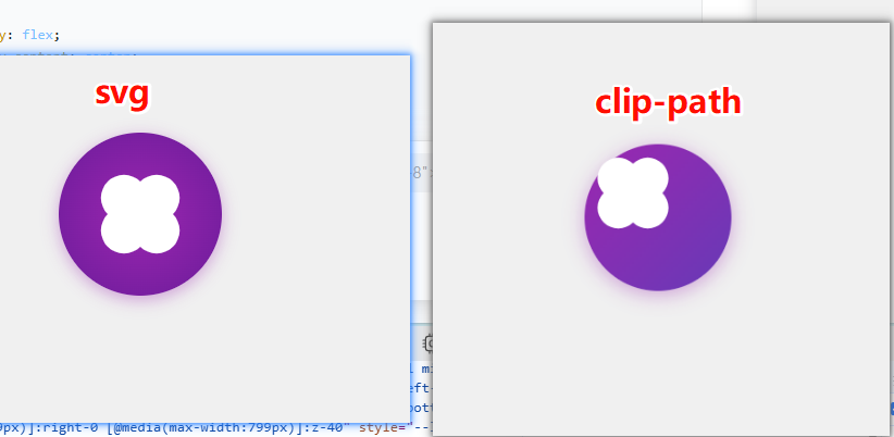
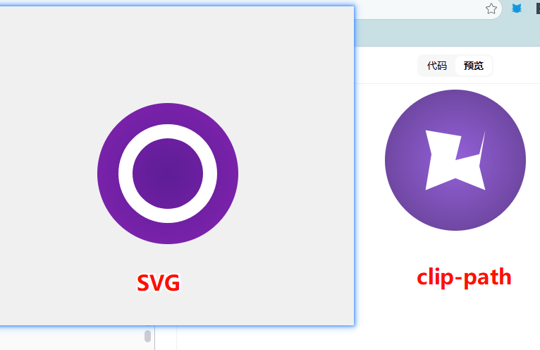
对比
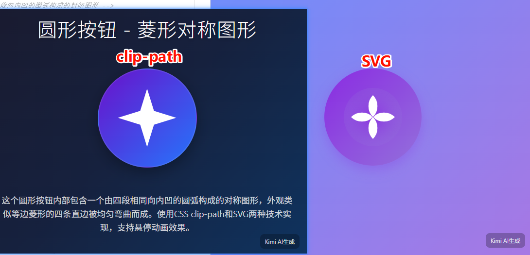
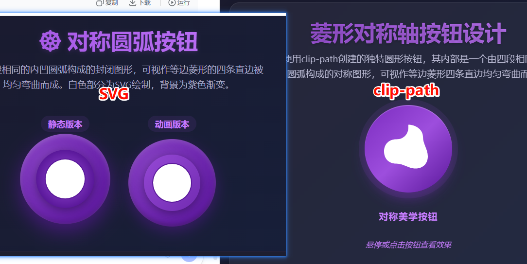
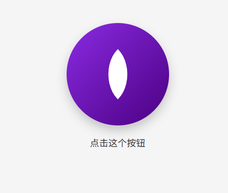
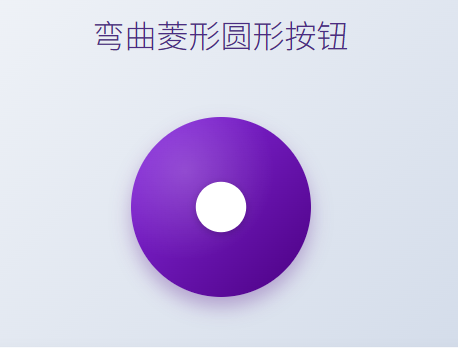
网页画一个圆形按钮,内部是一个【对称的/具有菱形对称轴的】封闭图形,由【四段相同的、向内凹的】圆弧构成,其外观可视作一个【等边的菱形】的【四条直边被均匀地弯曲而成】,封闭图形为白色,该部分使用svg完成,白色以外的部分是紫色渐变。在完整网页中实现
kimi
豆包
千问
qwen-3 max
deepseek
腾讯混元
腾讯用的deepseek模型,没什么好说的
讯飞星火
成功
智谱
<!DOCTYPE html>
<html lang="zh-CN">
<head>
<meta charset="UTF-8">
<meta name="viewport" content="width=device-width, initial-scale=1.0">
<title>紫色渐变内凹按钮展示</title>
<style>
/* CSS 变量定义,方便调整颜色 */
:root {
--btn-size: 240px;
--purple-gradient-start: #9d50bb;
--purple-gradient-end: #6e48aa;
--shadow-color: rgba(110, 72, 170, 0.4);
}
/* 基础页面重置与布局 */
* {
box-sizing: border-box;
margin: 0;
padding: 0;
}
body {
font-family: 'Segoe UI', Roboto, Helvetica, Arial, sans-serif;
background-color: #1a1a2e; /* 深色背景更能衬托紫色渐变 */
color: #ffffff;
display: flex;
flex-direction: column;
align-items: center;
justify-content: center;
min-height: 100vh;
}
/* 布局容器 */
main {
display: flex;
flex-direction: column;
align-items: center;
gap: 2rem;
text-align: center;
padding: 2rem;
}
h1 {
font-weight: 300;
letter-spacing: 1px;
margin-bottom: 0.5rem;
}
p {
color: #a0a0b0;
font-size: 0.9rem;
max-width: 400px;
line-height: 1.5;
}
/* -----------------------------------------------------------
按钮核心样式
----------------------------------------------------------- */
.showcase-btn {
position: relative;
/* 1. 设置圆形尺寸 */
width: var(--btn-size);
height: var(--btn-size);
border-radius: 50%;
/* 2. 设置紫色渐变背景 */
background: linear-gradient(135deg, var(--purple-gradient-start), var(--purple-gradient-end));
/* 3. 添加阴影使其具有立体感 */
box-shadow:
0 10px 25px var(--shadow-color),
inset 0 0 20px rgba(255, 255, 255, 0.1);
/* 4. 布局与过渡效果 */
display: flex;
align-items: center;
justify-content: center;
cursor: pointer;
transition: transform 0.3s cubic-bezier(0.175, 0.885, 0.32, 1.27), box-shadow 0.3s ease;
border: none;
outline: none;
overflow: hidden; /* 确保SVG内容严格限制在圆内(虽然图形本身设计是适配的) */
-webkit-tap-highlight-color: transparent;
}
/* 鼠标悬停时的交互效果 */
.showcase-btn:hover {
transform: translateY(-5px) scale(1.02);
box-shadow:
0 15px 35px var(--shadow-color),
inset 0 0 20px rgba(255, 255, 255, 0.2);
}
/* 鼠标按下时的交互效果 */
.showcase-btn:active {
transform: translateY(2px) scale(0.98);
box-shadow: 0 5px 15px var(--shadow-color);
}
/* -----------------------------------------------------------
SVG 样式
----------------------------------------------------------- */
.icon-svg {
width: 70%; /* 让图形占据按钮大部分空间,保留一点呼吸感 */
height: 70%;
filter: drop-shadow(0 4px 6px rgba(0,0,0,0.1)); /* 给白色图形单独加一点投影,增加层次 */
}
/* 白色图形路径 */
.concave-shape {
fill: #ffffff;
transition: fill 0.3s ease;
}
/* 按钮激活时图形微变色(可选视觉反馈) */
.showcase-btn:active .concave-shape {
fill: #f0f0f0;
}
</style>
</head>
<body>
<main>
<header>
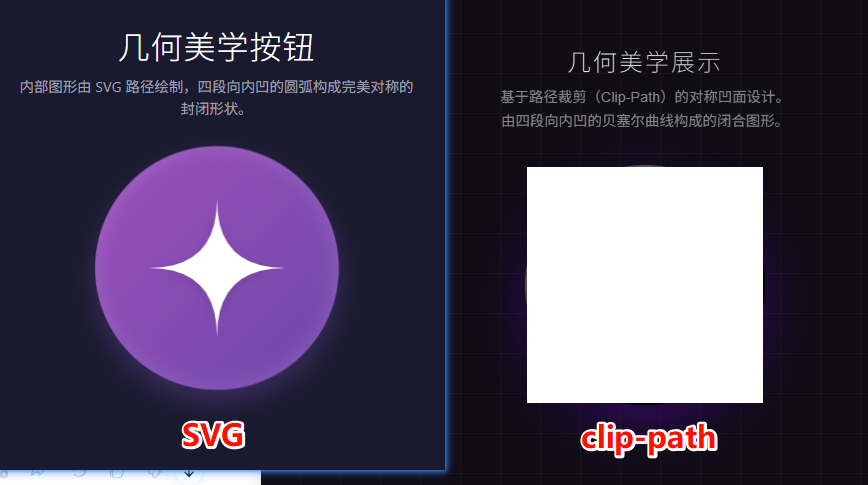
<h1>几何美学按钮</h1>
<p>内部图形由 SVG 路径绘制,四段向内凹的圆弧构成完美对称的封闭形状。</p>
</header>
<!-- 按钮主体 -->
<button class="showcase-btn" aria-label="点击交互">
<!--
SVG 视口设置为 200x200
逻辑:(100,100) 是圆心。
我们要画一个“内凹菱形”。
假设菱形的四个顶点位于 Top(100,20), Right(180,100), Bottom(100,180), Left(20,100)。
要实现“向内凹”且“均匀弯曲”,我们可以使用二次贝塞尔曲线 (Q)。
控制点设在圆心 (100,100),这样连接两个顶点的曲线就会自然地向中心凹陷。
-->
<svg class="icon-svg" viewBox="0 0 200 200" xmlns="http://www.w3.org/2000/svg">
<path class="concave-shape" d="
M 100 20
Q 100 100 180 100
Q 100 100 100 180
Q 100 100 20 100
Q 100 100 100 20
Z
" />
</svg>
</button>
</main>
</body>
</html>
gemini clip-path
<!DOCTYPE html>
<html lang="zh-CN">
<head>
    <meta charset="UTF-8">
    <meta name="viewport" content="width=device-width, initial-scale=1.0">
    <title>星形线圆形按钮</title>
    <style>
        :root {
            --bg-color: #f0f2f5;
            --btn-size: 200px;
            --inner-shape-size: 100px;
            /* 紫色渐变色值 */
            --gradient-start: #8e2de2;
            --gradient-end: #4a00e0;
        }

        body {
            display: flex;
            justify-content: center;
            align-items: center;
            height: 100vh;
            margin: 0;
            background-color: var(--bg-color);
            font-family: sans-serif;
        }

        .circle-button {
            position: relative;
            width: var(--btn-size);
            height: var(--btn-size);
            border: none;
            border-radius: 50%;
            cursor: pointer;
            /* 紫色渐变背景 */
            background: linear-gradient(135deg, var(--gradient-start), var(--gradient-end));
            box-shadow: 0 10px 20px rgba(74, 0, 224, 0.3);
            display: flex;
            justify-content: center;
            align-items: center;
            transition: transform 0.2s ease, box-shadow 0.2s ease;
        }

        .circle-button:hover {
            transform: scale(1.05);
            box-shadow: 0 15px 30px rgba(74, 0, 224, 0.4);
        }

        .circle-button:active {
            transform: scale(0.98);
        }

        /* 内部封闭图形实现 */
        .inner-shape {
            width: var(--inner-shape-size);
            height: var(--inner-shape-size);
            background-color: white;

            /* 使用 clip-path path() 绘制星形线
               M: 移动到顶部顶点 (50, 0)
               Q: 二次贝塞尔曲线,控制点向中心 (50, 50) 靠近,实现向内凹陷
               此路径在 100x100 的坐标系内绘制
            */
            clip-path: path('M 50 0 Q 50 50 100 50 Q 50 50 50 100 Q 50 50 0 50 Q 50 50 50 0 Z');

            /* 兼容性辅助:如果 path() 不生效,可以作为回退 */
            -webkit-clip-path: path('M 50 0 Q 50 50 100 50 Q 50 50 50 100 Q 50 50 0 50 Q 50 50 50 0 Z');
        }
    </style>
</head>
<body>

    <button class="circle-button">
        <div class="inner-shape"></div>
    </button>

</body>
</html>
gemini svg
<!DOCTYPE html>
<html lang="zh-CN">
<head>
    <meta charset="UTF-8">
    <meta name="viewport" content="width=device-width, initial-scale=1.0">
    <title>紫色渐变星形按钮</title>
    <style>
        /* 页面基础样式居中显示 */
        body {
            display: flex;
            justify-content: center;
            align-items: center;
            min-height: 100vh;
            margin: 0;
            background-color: #f0f2f5; /* 浅灰色背景以便突出按钮 */
        }

        /* 按钮主体样式 */
        .mystic-star-btn {
            /* 1. 定义大小和圆形外观 */
            width: 120px;
            height: 120px;
            border-radius: 50%;

            /* 2. 定义紫色渐变背景 (菱形以外的部分) */
            /* 这里使用了从深紫色到稍亮紫罗兰色的对角渐变 */
            background: linear-gradient(135deg, #7B1FA2, #E1BEE7);

            /* 3. 按钮基础重置样式 */
            border: none;
            padding: 0;
            cursor: pointer;
            outline: none;

            /* 4. 用于居中内部的 SVG */
            display: flex;
            justify-content: center;
            align-items: center;

            /* 增加一点阴影增加立体感(可选) */
            box-shadow: 0 8px 20px rgba(123, 31, 162, 0.4);

            /* 添加简单的交互动画(可选) */
            transition: transform 0.3s ease, box-shadow 0.3s ease;
        }

        /* 鼠标悬停效果(可选) */
        .mystic-star-btn:hover {
            transform: scale(1.05);
            box-shadow: 0 12px 25px rgba(123, 31, 162, 0.6);
        }

        /* 内部白色菱形(星形)的样式 */
        .star-shape-svg {
            /* 设置内部图形的大小,相对于按钮 */
            width: 65%;
            height: 65%;

            /* 5. 确保菱形本身是白色 */
            fill: white;

            /* 确保图形平滑 */
            shape-rendering: geometricPrecision;
        }
    </style>
</head>
<body>

    <button class="mystic-star-btn" aria-label="星形按钮">
        <svg class="star-shape-svg" viewBox="0 0 100 100" xmlns="http://www.w3.org/2000/svg">
            <path d="M 50 0 C 50 50 50 50 100 50 C 50 50 50 50 50 100 C 50 50 50 50 0 50 C 50 50 50 50 50 0 Z"/>
        </svg>
    </button>

</body>
</html>

 浙公网安备 33010602011771号