

折叠面板
简单封装折叠面板无需安装各个UI组件库,实现需要折叠面板样式
<template>
<div v-if="collapseFlag">
<div v-for="(item,index) in panelList" :key="index">
<div
:style="{width:width,height:height,background:color,borderTop:'1px solid #aaa',borderBottom:'1px solid #aaa'}">
<div
:style="{textAlign: 'left',height:height,lineHeight:height,paddingLeft:'10px',position:'relative'}">
{{ item.title }}
<i v-if="showIcon"
:class="{'icon-triangle-left':(item.iconName == 'icon-triangle-left'),'icon-triangle-down':(item.iconName=='icon-triangle-down')}"
@click="change(index)"></i>
<span v-if="!showIcon"
style="position: absolute;top:5px;right: 10px;background-color:#ddd;width: 60px;height: 30px;border-radius:20px;line-height: 30px;text-align: center "
@click="change(index)">
<span>{{ item.textName }}</span>
</span>
</div>
</div>
<div style="width: 100%;font-size: 18px;margin-bottom: 10px;min-height: 30px" v-if="item.collapse">
<component :is="allComps[item.name]"></component>
</div>
</div>
</div>
</template>
<script>
import allComps from '../../views/index'
export default {
name: "navigationBar",
components: {},
props: ['panelList'],
data() {
return {
collapseFlag: true,
width: "100%",
height: "40px",
color: "#fff",
iconName: "icon-triangle-left",
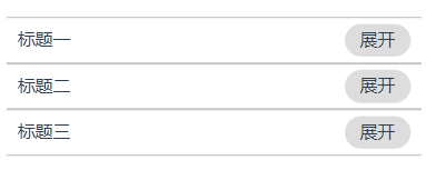
textName: "展开",
showIcon: false,
allComps: allComps
// panelList: [
// {
// title: "标题一",
// },
// {
// title: "标题二"
// },
// {
// title: "标题三"
// }
// ]
};
},
computed: {},
created() {
this.init()
console.log(this.allComps)
},
mounted() {
},
filters: {},
methods: {
init() {
var vm = this
var flag = false
vm.panelList.every((item) => {
if (item.collapse == undefined) {
flag = true
}
})
if (flag) {
vm.panelList.forEach((pItem, pIndex) => {
pItem.collapse = false
pItem.textName = '展开'
pItem.iconName = 'icon-triangle-left'
})
}
},
change(index) {
var vm = this
vm.panelList.forEach((cItem, cIndex) => {
if (cIndex == index) {
vm.panelList[cIndex].collapse = !vm.panelList[cIndex].collapse
if (vm.panelList[cIndex].collapse == true) {
vm.panelList[cIndex].textName = "收起"
vm.panelList[cIndex].iconName = "icon-triangle-down"
} else {
vm.panelList[cIndex].textName = "展开"
vm.panelList[cIndex].iconName = "icon-triangle-left"
}
}
})
vm.collapseFlag = false
vm.$nextTick(() => {
vm.collapseFlag = true
})
vm.$emit('changeName', vm.panelList)
}
},
watch: {}
};
</script>
<style scoped>
.icon-triangle-down {
width: 0;
height: 0;
position: absolute;
right: 10px;
top: 20px;
border: 12px solid #aaa;
border-left-color: transparent;
border-right-color: transparent;
border-bottom: none;
}
.icon-triangle-left {
width: 0;
height: 0;
position: absolute;
right: 10px;
top: 10px;
border-bottom: 12px solid #aaa;
border-left: 12px solid #aaa;
border-top: 12px solid #aaa;
border-top-color: transparent;
border-bottom-color: transparent;
}
</style>
index.js
const resultComps = {}
let requireComponent = require.context(
    './', // 在当前目录下查找
    false, // 不遍历子文件夹
    /\.vue$/ // 正则匹配 以 .vue结尾的文件
)
requireComponent.keys().forEach(fileName => {
    let comp = requireComponent(fileName)
    resultComps[fileName.replace(/^\.\/(.*)\.\w+$/, '$1')] = comp.default
})

export default resultComps
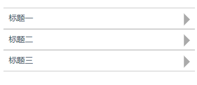
折叠面板样式
根据showIcon显示图标
使用组件
  <!-- 折叠面板-->
        <NavigationBar :panelList="panelList" @changeName="changeName"></NavigationBar>

 浙公网安备 33010602011771号