

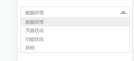
下拉框组件
简单封装一个下拉框组件,不需要安装各个组件库,用起来比较方便。
<template>
    <div class="ty-dialog">
        <div class="dialog-content">
            <div class="dialog-content-child">
                <!-- dialog-cc 为 dialog-content-child简写 -->
                <div class="dialog-cc-header" @click="changeStatus">
                    <span>{{ currentItem }}</span>
                    <i :class="{'icon-triangle-up':(iconName == 'icon-triangle-up'),'icon-triangle-down':(iconName=='icon-triangle-down')}"></i>

                </div>

                <transition name="plus-icon">
                    <div v-if="showArr" class="dialog-cc-content">
                        <div
                            v-for="(item, index) in resultList"
                            :key="index"
                            class="dialog-item"
                            @click="chooseItem(item)"
                        >
                            <div :class="{'dialog-wrap':(item.flag)}">
                                <span style="padding-left: 16px">{{ item.name }}</span>
                            </div>
                        </div>
                    </div>
                </transition>
            </div>
        </div>
    </div>
</template>

<script>
export default {
    name: "dropDown",
    props: ["resultList"],
    data() {
        return {
            showDialog: true, // 显示下拉框
            showArr: false, // 显示下拉框
            currentItem: "", // 当前选中的数据
            iconName: "icon-triangle-down",
            inputItem: "", // 输入框绑定的值
            inputChoose: "", // 输入框的值
            toChildData: {}
        };
    },
    created() {
        this.init()
    },
    methods: {
        init() {
            console.log("被调用了", this.resultList);
            // 下拉框的初始值,默认为下拉框列表第一个值
            if (this.resultList != undefined && this.resultList.length > 0) {
                var singleFlag = this.resultList.every((eItem) => eItem.flag != true);
                if (singleFlag) {
                    this.resultList[0].flag = true;
                    this.currentItem = this.resultList[0].name;
                } else {
                    var arr = this.resultList.filter((sItem) => sItem.flag == true);
                    this.currentItem = arr[0].name;
                }
            }
        },
        // 显示或隐藏下拉框
        changeStatus() {
            // 显示或隐藏下拉框
            this.showArr = !this.showArr;

            // 如果下拉框展开,图标向上,反之亦然
            if (this.showArr) {
                this.iconName = "icon-triangle-up";
            } else {
                this.iconName = "icon-triangle-down";
            }
        },
        // 选中下拉框的值
        chooseItem(item) {
            for (var i in this.resultList) {
                this.resultList[i].flag = false;
            }
            // 下拉框框内显示的值
            this.currentItem = item.name;
            this.toChildData = item;
            // 输入框显示的值
            // 选中后标志为true,即让后面的勾显示
            item.flag = !item.flag;
            // 隐藏下拉框
            this.showArr = false;
            if (this.showArr) {
                this.iconName = "icon-triangle-up";
            } else {
                this.iconName = "icon-triangle-down";
            }
            this.$emit("childShowPanel", item, this.resultList);
        }
    }
};
</script>

<style scoped>
.ty-dialog {
    color: #888;
    font-size: 16px !important;
    text-align: center !important;
}

.dialog-content {
    width: 100%;
    position: relative;
}

.dialog-cc-header {
    height: 36px;
    padding: 0 16px;
    display: flex;
    align-items: center;
    justify-content: start;
    border: 1px #bbbbbb solid;
    border-radius: 4px;
}

.dialog-cc-content {
    width: 100%;
    position: absolute;
    line-height: 30px;
    background-color: #fff;
    z-index: 999;
    text-align: left;
    /*padding-left: 16px;*/
    box-sizing: border-box;
    border-left: 1px solid #bbb;
    border-bottom: 1px solid #bbb;
    border-right: 1px solid #bbb;
}

.dialog-icon {
    position: absolute;
    right: 25px;
}

.dialog-wrap {
    background-color: #eee;
}

.plus-icon-enter-active {
    transition: opacity 1s;
}

.plus-icon-enter {
    opacity: 0;
}

.plus-icon-leave-active {
    transition: opacity 0.5s;
}

.plus-icon-leave-to {
    opacity: 0;
}

.dialog-input {
    height: 150px;
    z-index: 1;
}

.ty-dialog >>> dialog-item {
    text-align: center;
}

.ty-dialog >>> .van-dialog__header {
    color: #14c893;
    /*text-align: left;*/
    padding-left: 20px;
    font-weight: 700;
}

.icon-triangle-down {
    width: 0;
    height: 0;
    position: absolute;
    right: 10px;
    border: 12px solid #aaa;
    border-left-color: transparent;
    border-right-color: transparent;
    border-bottom: none;
}

.icon-triangle-up {
    width: 0;
    height: 0;
    position: absolute;
    right: 10px;
    border: 12px solid #aaa;
    border-left-color: transparent;
    border-right-color: transparent;
    border-top: none;

}
</style>
组件样式
使用组件
  <!--下拉框-->
         <dropDown :resultList="resultList" @childShowPanel="childShowPanel"></dropDown>

 浙公网安备 33010602011771号