前端小知识(3)--图片渐变透明
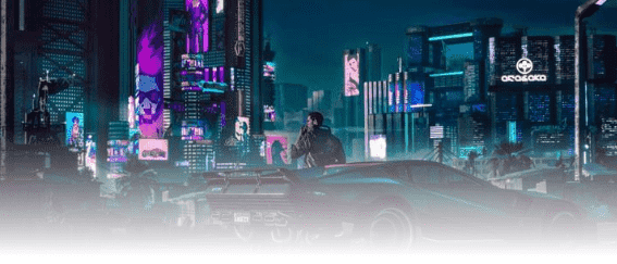
实现效果
实现方法
1.mix-blend-mode属性
使用mix-blend-model属性主要是用于源与背景颜色或背景图像混合。 详细介绍
<html>
  <head>
    <title>图片透明度渐变</title>
    <style>
      body{
        padding: 0;
        margin: 0;
      }
      .Test{
        position: relative;
        display: inline-block;
        width: 100%;
        background-image: linear-gradient(
          rgba(255,255,255,0),
          rgba(255,255,255,0),
          rgba(255,255,255,1)
        );
      }
      .Test img{
        mix-blend-mode: overlay;
        width: 100%;
      }
    </style>
  </head>
  <body>
    <div class="Test">
      <img alt="" src="https://ss1.bdstatic.com/70cFvXSh_Q1YnxGkpoWK1HF6hhy/it/u=2555483946,680280199&fm=26&gp=0.jpg">
    </div>
  </body>
</html>
2.使用蒙版
<html>
  <head>
    <title>图片透明度渐变</title>
    <style>
      body{
        padding: 0;
        margin: 0;
      }
      .Test{
        display: inline-block;
        position: relative;
      }
      .Test img{
        width: 100vw;
      }
      .Test .mengban{
        position: absolute;
        left: 0;
        right: 0;
        top: 0;
        bottom: 0;
        background-image: linear-gradient(
          rgba(255,255,255,0),
          rgba(255,255,255,0),
          rgba(255,255,255,1)
        );
      }
    </style>
  </head>
  <body>
    <div class="Test">
      <img src="https://ss1.bdstatic.com/70cFvXSh_Q1YnxGkpoWK1HF6hhy/it/u=2555483946,680280199&fm=26&gp=0.jpg" alt="">
      <div class="mengban"></div>
    </div>
  </body>
</html>
对于两种实现方式:建议使用第二种方式,在笔者实现的过程中,发现第一种方法对于图片上的文字的颜色与背景色也会发生混合,但是在写博客的时候又无法复现了,可能一开始实现的过程中添加了什么不必要的属性,但是从避免踩坑的角度,也从浏览器兼容性的角度上来说,第二种方式更加适合。

 浙公网安备 33010602011771号